По-русски

​Leaf Code

In the Nauchny Proezd, an office center has been remodeled upon the project by ADM achitects.

16 October 2014
Object
mainImg
Business park in the Nauchny Proezd. Photo courtesy by ADM / Anatoly Shostak


We already covered this project in our previous issues: built back in the 1970's in the hideous and faceless soviet style, the Vitamins Research Institute, located in the Nauchny Proezd next to "Kaluzhskaya" metro station, was in a desperate need of remodeling. By the moment the remodeling started, the building already no longer functioned as a research center but was just renting out its office premises.

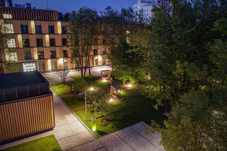
"And after the complex was completely "redressed" upon the ADM project, Moscow's southwest got, not far away from the Gasprom HQ, something that could be arguably called a unique “Smart Park” business quarter. 


Business park in the Nauchny Proezd. Photo courtesy by ADM / Anatoly Shostak

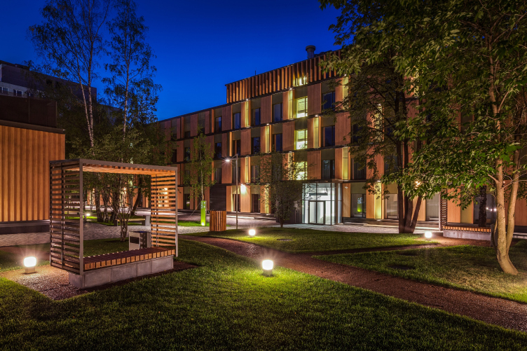
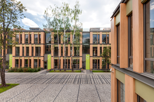
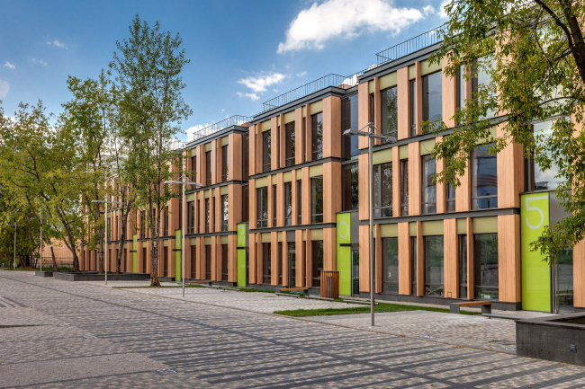
The starting point that the architects took for designing the Smart Park concept was its very environment. The business park occupies an area of two hectares and in the summertime it is so saturated with verdure that the visual border between the office buildings and the nature practically disappears. "What we did was boost this impression, making the unity of the buildings and the nature the trademark technique of our project, the golden thread that runs through it - Andrew Romanov shares - and we selected our materials in accordance with this idea: the wood-imitating alpolic, and the painted panels of fiber-cement". 

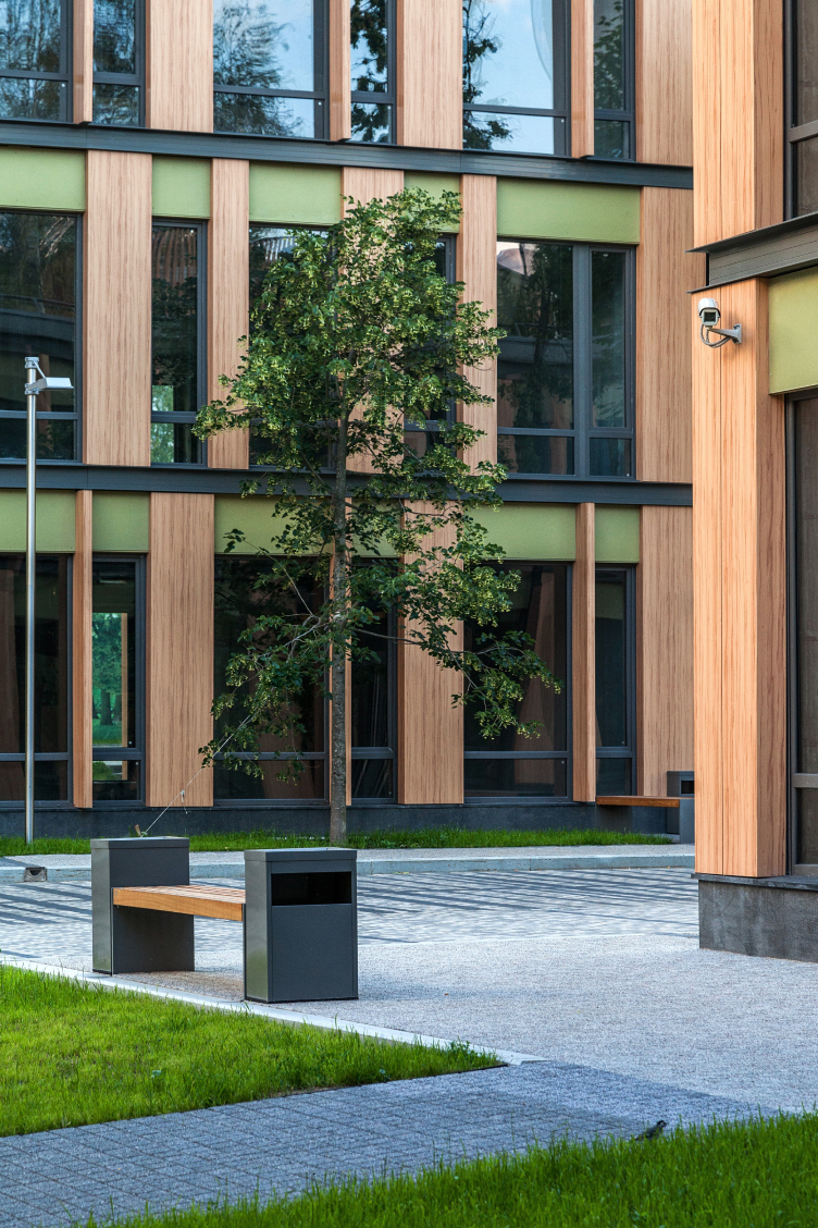
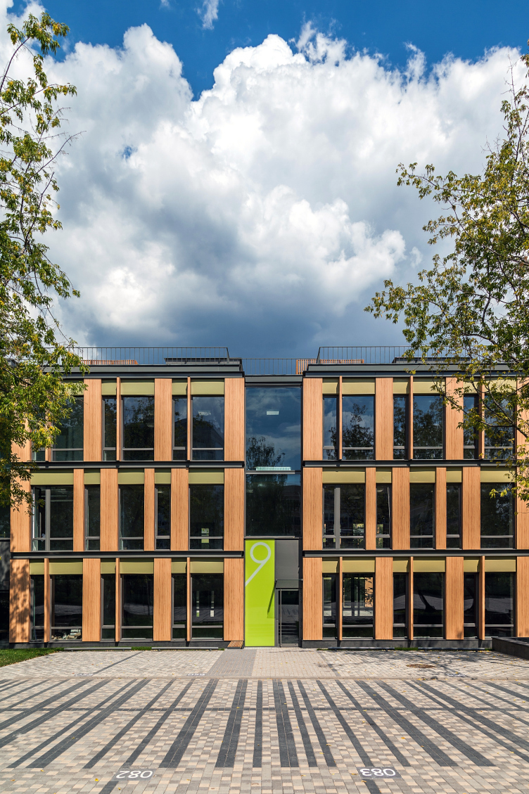
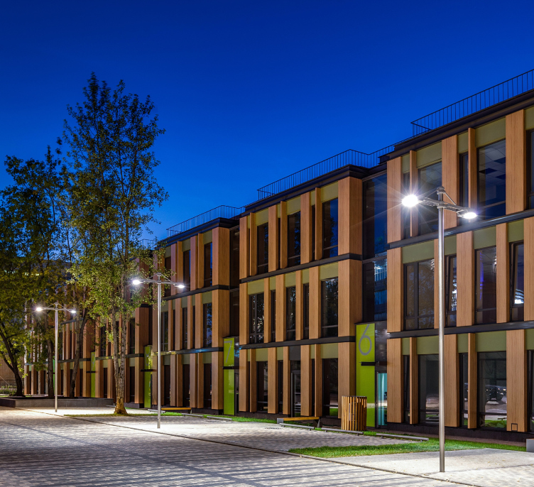
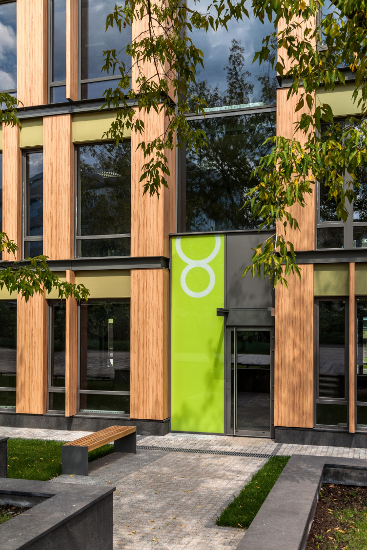
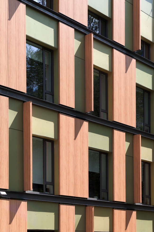
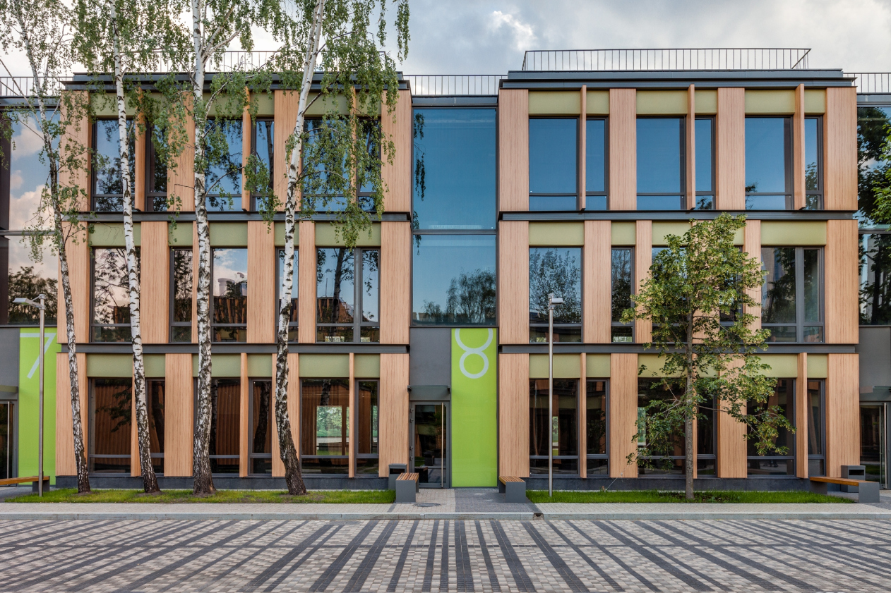
From these, relatively unassuming, materials coupled with glass, the architects made new facades that helped transform the awkward proportions of the not-too-gracious late-soviet buildings into more elegant, multilayer, and dramatic ones. The composition of the facades, as the architect puts it, resembles the furniture doors: the "open shutters" effect is created by the panels that are placed perpendicular to the facade surface - as if they were some kind of little doors rotating on a pivot - even though they perform the function of firmly fastened lamellae that protect the windows from the slanted sunbeams and thus create an interesting play of light and shade on the facades. This theme is supported by the uneven breadth of the panels that stay within the facade surface: one could think that they are capable of sliding over the rails of the double L beams. In actuality, the shutters do not either slide or turn but they endow the facade with an intrigue without turning it into a mechanical toy (the latter, though, would have been impossible with the modest budget of the reconstruction). The metallic guiding rails are also placed not quite in the places that one might think at first sight they would be: it seems like the intermediate floor must be placed directly behind them but in actuality the floor is placed higher up - what from the outside is perceived as the top of the window in fact conceals the windowsill behind it. "To a large extent, this is a decorative technique that allows to create the dramatic facade - Andrew Romanov explains – thus, what we see is a case of successful camouflage, something that is seemingly the direct opposite of the modernist principle of "reflecting the truth of the construction" but still resonant with what Le Corbusier said about the independence of the hang-on facade. Since this facade is merely a screen, it is free to play by its own rules”.

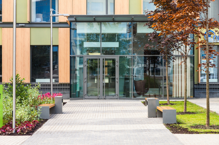
The metallic guiding rails and the wooden "shutters" make the visual framework; deeper inside the surface of the facade, the inserts of the fiber cement panels fall together to make horizontal bands, forming above the windows some semblance of a lambrequin with curtains, or, "forehead", as the Russian people of the XVII century would have said (from the outside, the green inserts look nothing short of the "top" of the window, although in actuality they are the lower partition wall and the floor line is situated exactly in the bottom part of the green band, an interesting visual effect). The vertical partitions of the main entrance building turned out a bit thicker, the wooden panels alternating with the green inserts there. 

Business park in the Nauchny Proezd. Photo courtesy by ADM / Anatoly Shostak

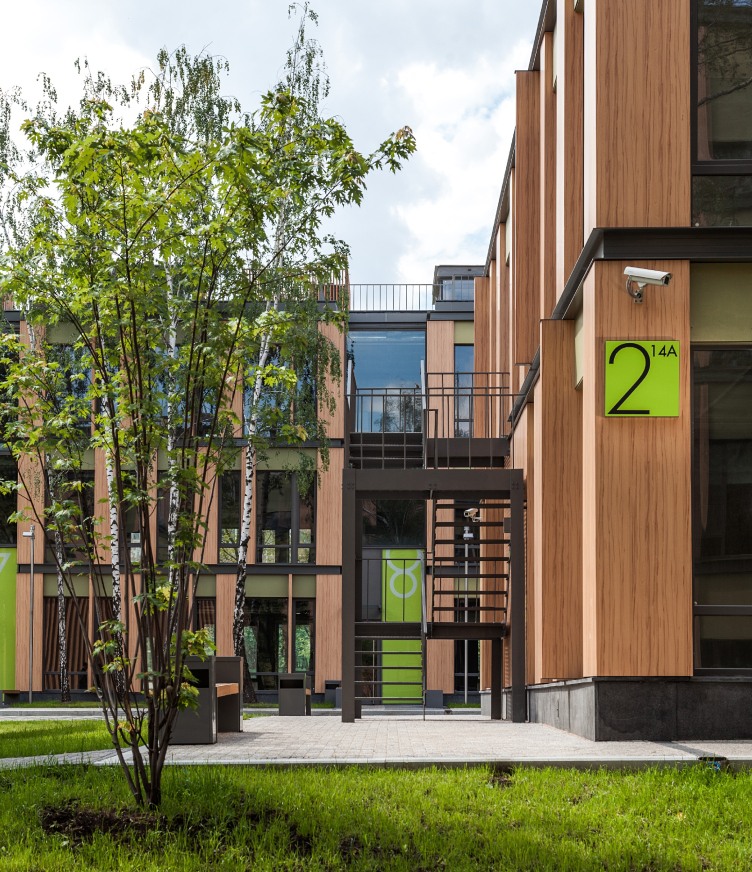
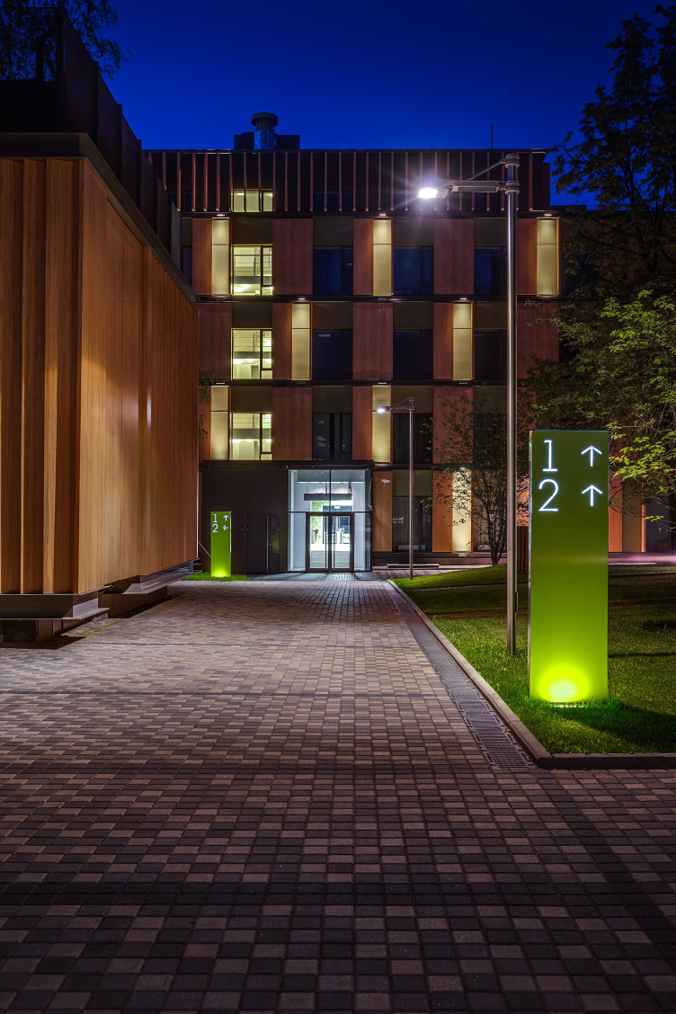
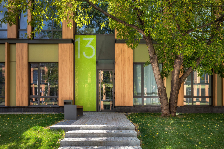
The facade grid that we just described is the main story of this reconstruction embellished by a few details: the "wooden" grilles in the top part of the buildings and on the walls of the substation in the courtyard, the pristine gray metal of the window frames matching the color of the L-beams, and the salad-green rectangles of the unit doors whose numbers are written in thin but very large numbers. 


Business park in the Nauchny Proezd. Photo courtesy by ADM / Anatoly Shostak

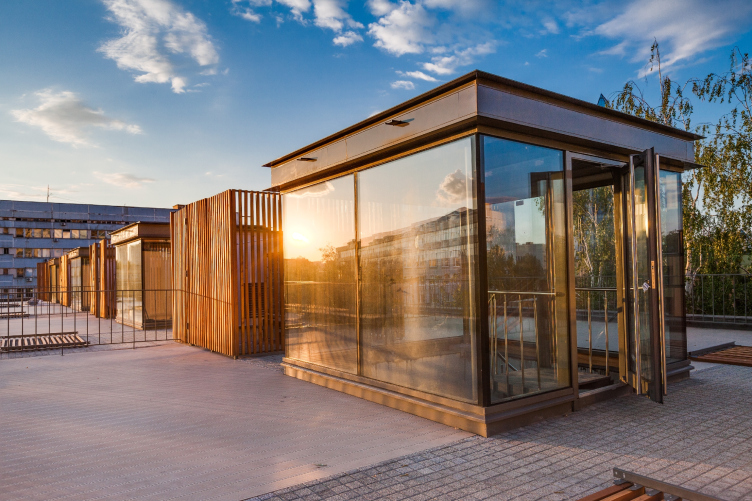
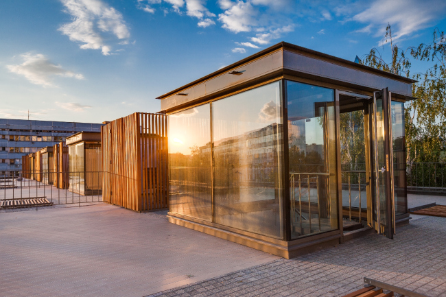
The buildings in the yard of the main entrance building decrease their height in a gradual way - from five to three and even two floors - and consist of sections, each building being long but having a lot of hallway units in it with a stairwell in the middle of each one. Due to the fact that the breadth of these buildings is also considerable, the architects lighted up the stairways with a "light well": the exit to the roof is executed in the shape of a pavilion with walls made of glass, and because there are two or three floors here, this pavilion does a good job of letting a lot of daylight inside. On the roofs of the minor buildings, the architects are planning to organize terraces - the wooden paving and the aluminum railings are already there. 

Business park in the Nauchny Proezd. Photo courtesy by ADM / Anatoly Shostak

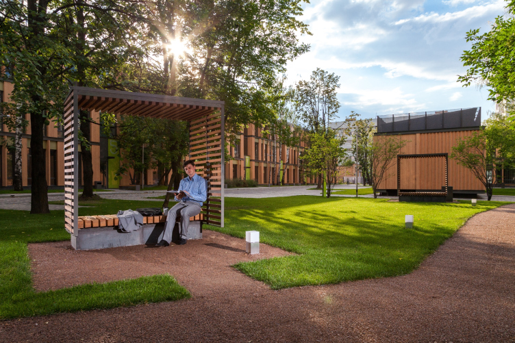
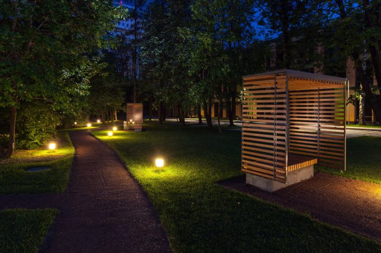
The architects were able to arrange the had scraping and the backlighting in such a way that the complex really looks like one indivisible whole, like a well-drawn painting whose with every little detail of it thought out by its careful author. Thus, the architects neatly inscribe into the paving the lines of the parking marks and even the numbers of the parking stalls, the alpolic grilles on the buildings echo the real ones around the benches and the trash bins. 


Business park in the Nauchny Proezd. Photo courtesy by ADM / Anatoly Shostak


Business park in the Nauchny Proezd. Photo courtesy by ADM / Anatoly Shostak

When ADM architects came here, this territory looked like a wasteland overgrown with trees - and the architects were able to keep them intact and even add new man-planted ones. 

Today the trees do not look exactly like the garden type - but no longer "wild" anyway; upon entering the yard, one first sees the neat landscaping job that is probably the first thing here to catch the eye. The second impression must be the differences between the territories: the first yard is larger and it has more contrastive things about it - trees and shade on the one side, and pavement and more light on the other. The other yard is long, light and transparent in some "autumn" fashion. Both buildings that form this yard are low-rise, two and three floors high, but their very floors are taller and the grid's proportions here are vertical, they have more glass in them (it is here that one notices that the massiveness of the first building is but partly concealed by the decorative techniques). Together with the not-too-abundant trees and the striped rhythm of the pavement, the whole thing looks like a light autumn-transparent watercolor painting. The architects also landscaped the "adjacent territory": the small parking lot before the entrance and the tousle next to the driveway's bend; while formally unrelated to the territory is question, they are now organized in pretty much the same way: the cut grass, the curvilinear trails, the paving... this mini-park became something like the welcoming facade of the whole complex.

Business park in the Nauchny Proezd. Photo courtesy by ADM / Anatoly Shostak

This is not the most important thing, though. Getting the overgrown land site (one that was also historically tied to the "vitamin" institute), the architects managed to make the buildings of the remodeled office center take on an "assimilative coloration" of the environment, and they were quite successful in it, too. The ever-shifting grid of green and ochre spots looks like a continuation of the thicket, only brought to a geometric order. This place might become the haunt of elfs, if there are modernists among them - the level of "resonant transparency" here, especially in the second yard, is quite a "non-Moscow". 

In order to get a better understanding of what the architects really achieved here, one has to go outside to the Nauchny Proezd and take a good look around but, better still, drive down its loop as far as the Profsoyuznaya Street. Among the buildings of the soviet and post-soviet era, the former "vitamin" institute looks now like a glitter in the darkness. It even appears in a different way - it does not loom as a huge monster but looks as if it were woven from the leaves and dappled shadows, shooting up from the coppice. It looks as though it has a different "gene code", looks as if, being of the native population of this land, it has always been here and has finally manifested itself - somehow you do not even doubt that it is the real thing. A great way to fit in with the context, I think.

16 October 2014

Headlines now
The Golden Crown
The concept for a dental clinic in Yekaterinburg, developed by CNTR Studio, revolves around the idea of a “mouth full of gold”: pristine white porcelain stoneware walls are complemented by matte brass details. To avoid an overly literal interpretation, the architects focused on the building’s proportions, skillfully navigating between sunlight requirements and fire safety regulations.
Flexibility and Integration
Not long ago, we covered the project for the fourth phase of the ÁLIA residential complex, designed by APEX. Now, we’ve been shown different fence concepts they developed to enclose the complex’s private courtyards, incorporating a variety of public functions. We believe that the sheer fact that the complex’s architects were involved in such a detail as fencing speaks volumes.
A Step Forward
The HIDE residential complex represents a major milestone for ADM architects and their leaders Andrey Romanov and Ekaterina Kuznetsova in their quest for a fresh high-rise aesthetic – one that is flexible and layered, capable of bringing vibrancy to mass and silhouette while shaping form. Over recent years, this approach has become ADM’s “signature style”, with the golden HIDE tower playing a pivotal role in its evolution. Here, we delve into the project’s story, explore the details of the complex’s design, and uncover its core essence.
Gold in the Sands
A new office for a transcontinental company specializing in resource extraction and processing has opened in Dubai. Designed by T+T Architects, masters of creating spaces that are contemporary, diverse, flexible, and original, this project exemplifies their expertise. On the executive floor, a massive brass-clad partition dominates, while layered textures of compressed earth create a contextually resonant backdrop.
Layers and Levels of Flight
This project goes way back – Reserve Union won this architectural competition at the end of 2011, and the building was completed in 2018, so it’s practically “archival”. However, despite being relatively unknown, the building can hardly be considered “dated” and remains a prime example of architectural expression, particularly in the headquarters genre. And it’s especially fitting for an aviation company office. In some ways, it resembles the Aeroflot headquarters at Sheremetyevo but with its own unique identity, following the signature style of Vladimir Plotkin. In this article, we take an in-depth look at the United Aircraft Corporation (UAC) headquarters in the Moscow agglomeration town of Zhukovsky, supplemented by recent photographs from Alexey Naroditsky – a shoot that became only recently possible due to the fact that improvements were finally made in the surrounding area.
Light and Shadow
In this article, we delve into the architectural design of the “Chaika” house by DNK ag architects, which was recently completed in 2023 as part of the collection of signature designs at ZILArt. As is well-known, all the buildings in this complex follow a design code, yet each one is distinct. This particular building stands out not only for its whiteness and minimalism but also for the refined use of a limited number of techniques that, together, create what can confidently be called synergy.
Casus Novae
A master plan was developed for a large residential area with a name of “DNS City”, but now that its implementation began, the plan has been arbitrarily reformatted and replaced with something that, while similar on the surface, is actually quite different. This is not the first time such a thing happens, but it’s always frustrating. With permission from the author, we are sharing Maria Elkina’s post.
Treasure Hunting
The GAFA bureau, in collaboration with Tegola and Arkhitail, organized an expedition to the island of Kilpola in Karelia as part of Moskomarkhitektura’s “Open City” festival. There, amidst moss and rocks, the students sought answers to questions like: what is the sacred, where does it dwell, and what sustains it? Assisting the participants in this quest were landscape engineer Evgeny Levin, artist Nicholas Roerich, a moose, and the lack of cellular connection. Here’s how the story unfolded.
Depths of the Earth, Streams of Water
In the Malaya Okhta district, the Akzent building, designed by Stepan Liphart, was constructed. It follows a classic tripartite structure, yet it’s what you might call “hand-drawn”: each façade is unique in its form and details, some of which aren’t immediately noticeable. In this article, we explore the context and, together with the architect, delve into how the form was developed.
Fir Tree Dynamics
The “Airports of Region” holding is planning to build an airport in Karachay-Cherkessia, aiming to make the Arkhyz and Dombay resorts more accessible to travelers. The project that won in an invitation-only competition, submitted by Sergey Nikeshkin’s KPLN, blends natural imagery inspired by the shape of a conifer seed, open-air waiting spaces, majestic large trees, and a green roof elevated on needle-like columns. The result is both nature-inspired and WOW.
​A Brick Shell
In the process of designing a clubhouse situated among pine trees in a prestigious suburban area near Moscow, the architectural firm “A.Len” did the façade design part. The combination of different types of brick and masonry correlates with the volumetric and plastique solutions, further enhanced by the inclusion of wood-painted fragments and metal “glazing”.
Word Forms
ATRIUM architects love ambitious challenges, and for the firm’s thirtieth anniversary, they boldly play a game of words with an exhibition that dives deep into a self-created vocabulary. They immerse their projects – especially art installations – into this glossary, as if plunging into a current of their own. You feel as if you’re flowing through the veins of pure art, immersed in a universe of vertical cities, educational spaces – of which the architects are true masters – and the cultural codes of various locations. But what truly captivates is the bold statement that Vera Butko and Anton Nadtochy make, both through their work and this exhibition: architecture, above all, is art – the art of working with form and space.
Flexibility and Acuteness of Modernity
Luxurious, fluid, large “kokoshniks” and spiral barrel columns, as if made from colorful chewing gum: there seem to be no other mansion like this in Moscow, designed in the “Neo-Russian-Modern” style. And the “Teremok” on Malaya Kaluzhskaya, previously somewhat obscure, has “come alive with new colors” and gained visibility after its restoration for the office of the “architectural ecosystem” as the architects love to call themselves. It’s evident that Julius Borisov and the architects at UNK put their hearts into finding this new office and bringing it up to date. Let’s delve into the paradoxes of this mansion’s history and its plasticity. Spoiler: two versions of modernity meet here, both balancing on the razor’s edge of “what’s current”.
Yuri Vissarionov: “A modular house does not belong to the land”
It belongs to space, or to the air... It turns out that 3D printing is more effective when combined with a modular approach: the house is built in a workshop and then adapted to the site, including on uneven terrain. Yuri Vissarionov shares his latest experience in designing tourist complexes, both in central Russia and in the south. These include houseboats, homes printed from lightweight concrete using a 3D printer, and, of course, frame houses.
​Moscow’s First
“The quality of education largely depends on the quality of the educational environment”. This principle of the last decade has been realized by Sergey Skuratov in the project for the First Moscow Gymnasium on Rostovskaya Embankment in the Khamovniki district. The building seamlessly integrates into the complex urban landscape, responding both to the pedestrian flow of the city and the quiet alleyways. It skillfully takes advantage of the height differences and aligns with modern trends in educational space design. Let’s take a closer look.
Looking at the Water
The site of Villa Sonata stretches from the road to the water’s edge, offering its own shoreline, pier, and a picturesque river panorama. To reveal these sweeping views, Roman Leonidov “cut” the façade diagonally parallel to the river, thus getting two main axes for the house and, consequently, “two heads”. The internal core – two double-height spaces, a living room and a conservatory, with a “bridge” above them – makes the house both “transparent” and filled with light.
The White Wing
Well, it’s not exactly white. It’s more of a beige, white-stone structure that plays with the color of limestone – smoother surfaces are lighter, while rougher ones are darker. This wing unites various elements: it absorbs and interprets the surrounding themes. It responds to everything, yet maintains a cohesive expression – a challenging task! – while also incorporating recognizable features of its own, such as the dynamic cuts at the bottom, top, and middle.
Urban Dunes
The XSA Ramps team designed and built a three-part sports hub for a park in Rostov-on-Don, welcoming people of all ages and fitness levels. The skate plaza, pump track, and playground are all meticulously crafted with details that attract a diverse range of visitors. The technical execution of the shapes and slopes transforms this space into a kind of sculptural composition.
Proportional Growth
The project for the fourth phase of the ÁLIA residential area has been announced. The buildings are situated on an elongated plot – almost a “ray” that shoots out from the center of the area towards the river. Their layout reflects both a response to Moscow’s architectural preferences over the past 15 years, shifting “from blocks to towers”, and an interpretation of the neighboring business park designed by SOM. Additionally, the best apartments here are not located at the very top but closer to the middle, forming a glowing “waistline”.
The “Staircase” Building
In designing the “Details” residential complex in New Moscow, Rais Baishev spiced up the now-popular Moscow theme of a “courtyard” building with an idea drawn from the surrealist drawings by Maurits Escher. He envisioned the stepped silhouettes and descending slopes as a metaphysical mega-staircase, creating a key void within the courtyard that gave the project an internal “spine”. This concept is felt both in the building’s silhouette and on its façades.
Projection of the Quarter
No one doubted that the building that Vladimir Plotkin designed as part of the “Garden Quarters” would be the most modernist of all. And it turned out just that way: while adhering to the common design code, the building successfully combines brick and white stone, rhythmically responding to the neighboring building designed by Ostozhenka, yet tactfully and persistently making a few statements of its own. This includes the projection of the ideal urban development composition “14–9–6”, which can be found right next door, mathematical calculations, including those for various types of terraces (and perhaps the only reminder of the Soviet past of the Kauchuk rubber factory!), and the white “cross-stitch” pattern of the façade grid.
Domus Aurea
In this issue, we examine the “Tessinsky-1” house, designed by Sergey Skuratov and completed in 2023. Located in the middle of the Serebryanicheskaya Embankment district, at the intersection of its main streets, this house assumes a sort of “nodal” role: it not only responds to everything around it and preserves many memories of the former EMA factory within itself, but it weaves all this into a newly directed pattern, reconciling bright “gold” and dark-colored brick, largely with the help of the new, modern-yet-archaic Columba brick, which, come to think about it, is the most precious element here.
The Chimney of Nikola-Lenivets
In this issue, we are examining the “Obelisk House” designed by KATARSIS and built for the Arkhstoyanie 2023 festival. However, it was only finished later on, and this is why we are examining it now. It seems to us that after the “Obelisk House” appeared in Nikola-Lenivets, a dialogue and a few inner connections appeared between the temporary structures built here. These houses no longer look like “accidental neighbors”, more of which below.
​Periscope by the Bay
The jury awarded the second place in the competition for a public and cultural center in Petropavlovsk-Kamchatsky to the companies GORA (“Mountain”) and M4. In the consortium’s proposal, the building resembles a sperm whale with a calf swimming next to it or a periscope, whose lenses capture the most spectacular views from the surrounding landscape.
From Arcs to Dolmens
While working on the competition project for Petropavlovsk-Kamchatsky, ASADOV Architects prioritized the value of the natural and urban environment, aiming to preserve the balance of the location while minimizing the resemblance of the volume that they designed to a “traditional building”. The task was challenging, and the architects created three versions, one of which having been developed after the competition, where their main proposal took third place. However, the point of interest here is not the competition result but the continuity of creative thinking.
Hide and Seek
The ID Moskovskiy house, designed by Stepan Liphart in St. Petersburg, in the courtyards near Moskovskiy Avenue beyond the Obvodny Canal and recently completed, is notable for several reasons. Firstly, it has been realized with considerable accuracy, which is particularly significant as this is the first building where the architect was responsible not only for the facades but also for the layouts, allowing for better integration between the two. On the other hand, this building is interesting as an example of the “germination” of new architecture in the city: it draws on the best examples from the neighborhood and becomes an improved and developed sum of ideas found by the architect in the surrounding context.
The Big Twelve
Yesterday, the winners of the Moscow Mayor’s Architecture Award were announced and honored. Let’s take a look at what was awarded and, in some cases, even critique this esteemed award. After all, there is always room for improvement, right?
Above the Golden Horn
The residential complex “Philosophy” designed by T+T architects in Vladivostok, is one of the new projects in the “Golubinaya Pad” area, changing its development philosophy (pun intended) from single houses to a comprehensive approach. The buildings are organized along public streets, varying in height and format, with one house even executed in gallery typology, featuring a cantilever leaning on an art object.
Nuanced Alternative
How can you rhyme a square and space? Easily! But to do so, you need to rhyme everything you can possibly think of: weave everything together, like in a tensegrity structure, and find your own optics too. The new exhibition at GES-2 does just that, offering its visitor a new perspective on the history of art spanning 150 years, infused with the hope for endless multiplicity of worlds and art histories. Read on to see how this is achieved and how the exhibition design by Evgeny Ace contributes to it.
Blinds for Ice
An ice arena has been constructed in Domodedovo based on a project by Yuri Vissarionov Architects. To prevent the long façade, a technical requirement for winter sports facilities, from appearing monotonous, the architects proposed the use of suspended structures with multidirectional slats. This design protects the ice from direct sunlight while giving the wall texture and detail.