По-русски

Flip-flopper House

The Asadov Bureau has built in the city of Dzerzhinsky one of the most up-to-date red-and-white houses, in the vein of neo-constructivism.

26 August 2014
Object
mainImg

Residential complex in the city of Dzerzhinsky © Asadov Architectural Bureau

The slab of this residential building stretches between the Lenin Street and the railroad line, amidst the trees, garages, and the high-rises of the northern part of the Moscow area's city of Dzerzhinsky. This spot is a kilometer and a half away from the Moscow Ring Road, and two kilometers or but a half-hour's walk away from the Nikolo-Ugreshsky Monastery, the ancient but built anew centerpiece of this area. Hence, the new residential complex got a name of "Ugreshsky". 
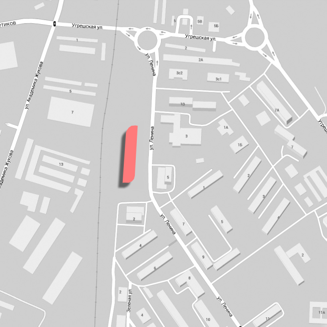

Residential complex in the city of Dzerzhinsky © Asadov Architectural Bureau

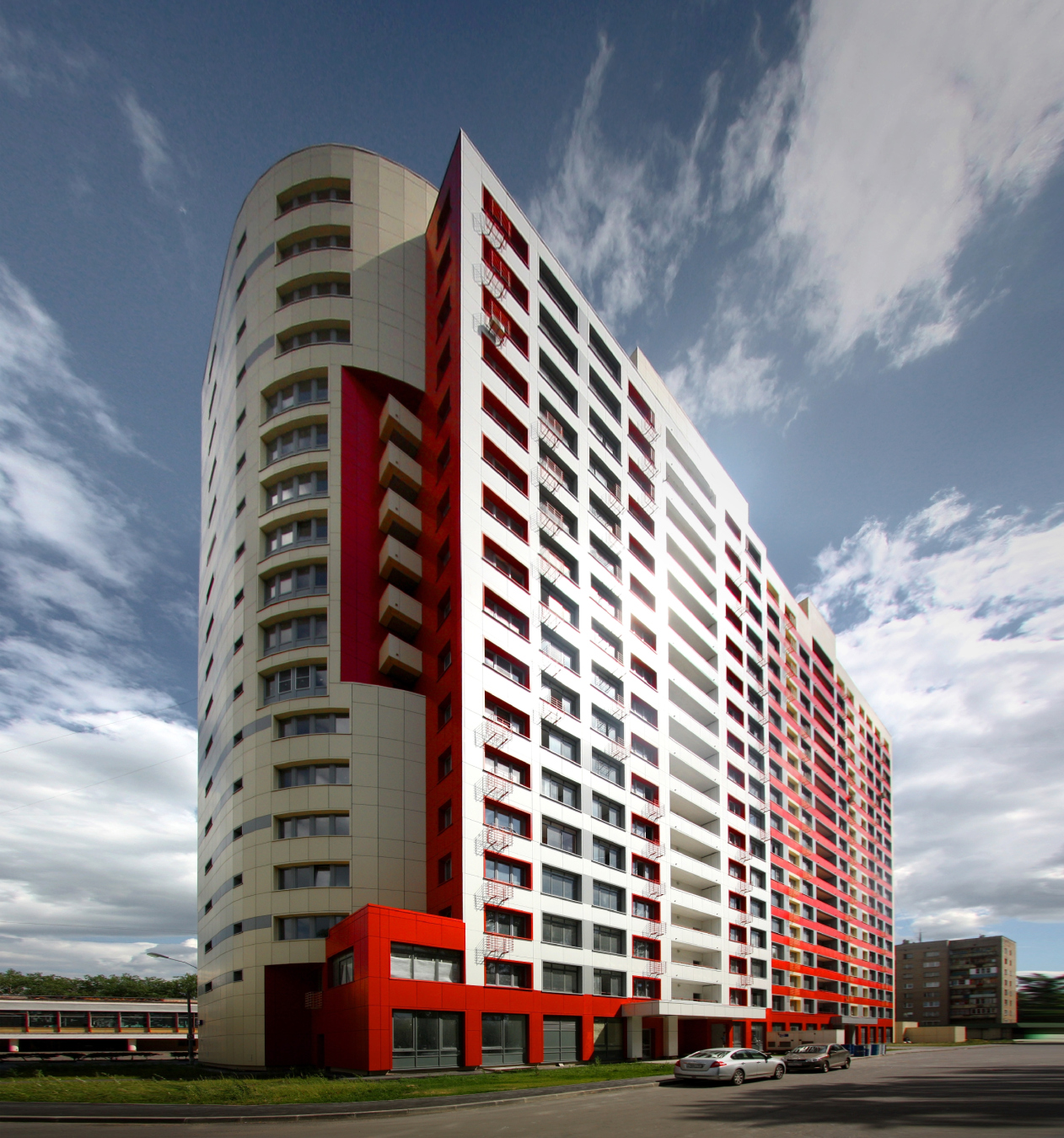
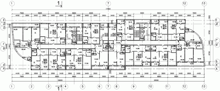
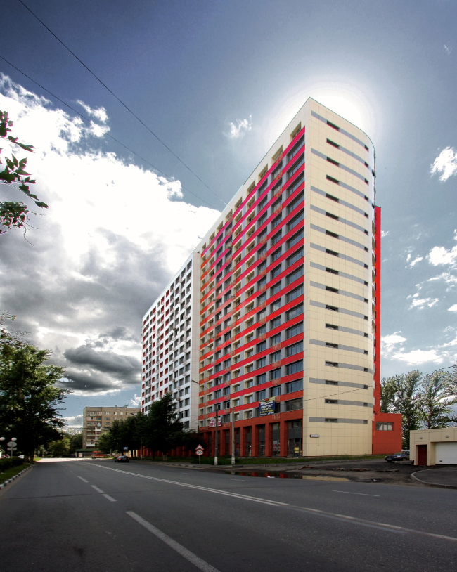
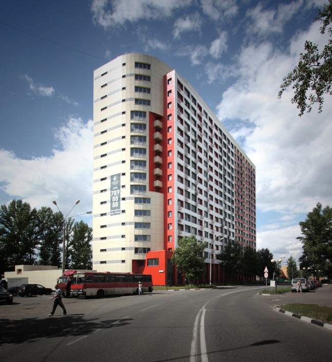
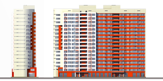
The complex, actually, consists of but one building: two floors of the 190-stall underground parking garage, a bank, cafés and shops in the ground floor, seventeen residential floors on top, and the business-class apartments consulting of one to three rooms. It was built in 2012, and "became an accent in the cityscape for its size, if for anything - Andrew Asadov shares - this is why we wanted to make it as clear-cut and structural as possible. Ultimately, from the composition standpoint, what we got was a "flip-flopper" consisting of two sections with semicircular bay windows on its side walls. The building's silhouette marks the break of the city's main street. And as for the details, they were developed as the continuation of the main idea that highlights the two-section structure and the semicircular accents on the corners". "Flip-flopper" - because the volume of the house is built according to the principle that was so much loved by the architects of the avant-garde of the 1920's and then of the neo-constructivism of the 2000's, namely that of the symmetry of rotation: one of its parts (i.e. sections) reflects the other - not in the mirror fashion but as if it was rotated on a pivot. Now, let us imagine a small paper knife with a curved blade whose one pointed end is turned exactly south and the other exactly north, like the compass needle that was spinning but a moment ago and now has finally stopped.

The imaginary movement left its trace: the parabolic outlines of the pointed "noses" that look like fan blades, point in the direction if the arrested motion (like in the solar sign) that is picked up, on turn, by the slabs of the facade extrusions. There are two such extrusions: the longer one on the side of the Lenin Street and the shorter one on the side of the yard - they also fall in with the rotation symmetry and are supported by the balcony ledges that are there at the very edges of the slab, also corresponding to the "noses" and also symmetric. 

The ledges correspond to the joints between the sections, otherwise all but invisible, also because of the fact that the slabs on the east and west facades are slightly juxtaposed, as if striving to avoid any strict division of the building into the northern and southern parts. 

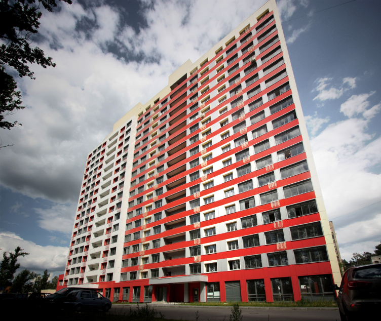
The alternating of the slabs of the extrusions is accentuated by the color: the outstanding parts of the facades are white with red side surfaces which crests a graphic impression of them "stepping forward". The neighboring surfaces that made a step back are conversely stitched with energetic red horizontals against the background of the gray vertical partitions. The general impression is that of the building being "stripped" of its "skin" and laying bare the striped structure of its "insides", almost ecorche. One could even (subject to prior agreement, of course), read this form in this way: the neat white aluminum contemporary house got chipped off and, from underneath the top layer, showed up the avant-garde core of the entire contemporary architecture. Or in this way: this city is the spawn of the commune of the homeless children "named after Felix Dzerzhinsky", a "commune" city, but after the WW2 its center got some quite respectable and Stalin-architecture buildings - they lined up closer to the city center along the Lenin Street. The facades of the "Ugreshsky" house serve as an almost literal demonstration of this "healing" process from the avant-garde homeless to the cozy domestic. All of this, of course, nothing more than suppositions - but, if they appear, then the building is suggestive of them, then it is not empty and not devoid of interesting ideas. 

Residential complex in the city of Dzerzhinsky © Asadov Architectural Bureau

Residential complex in the city of Dzerzhinsky © Asadov Architectural Bureau


Residential complex in the city of Dzerzhinsky © Asadov Architectural Bureau

At the same time, the building's geometry remains pure and simple, though supported, as the architect confesses by numerous details. The priority of the horizontals is enhanced by the gray strokes on the side-wall "blades" whose array, though, is broken by an unexpected insert, or, rather, a cutaway: the cutaway sports a bright-red niche with six balconies; it willfully moves aside the array of the windows, syncopating their rhythm. This is the accent meant to be viewable from the main vantage point, the corner that opens up from the turn of the Lenin Street pointed in the direction of the monastery (maybe this is the proverbial cryptic "red corner", the meaningful play of the traditional avant-garde is doubtlessly present here, even though in a very unobtrusive form). Other subtleties: red window frames against the white surface, gray rectangles between the windows that, again, support the horizontal, the alternating stanzas and windows, the lacework of the small grilled balconies, scattered all over the facade rather irregularly, to name but a few. 

This building can be quite safely referred to the so-popular-in-the-2000's (and even in the late 1990's) trend of neo-constructivism. Proceeding from the true, even if a bit nostalgic, statement belief that "avant-garde is our all", the architects tried to make its principles and techniques come alive, see the world through its eyes, at times suffering from the contradiction consisting in replicating the motifs of that movement that allowed of no replication in the first place. But then again, neo-constructivism has remained one of the honest and sincere attempts to turn back to one's roots, which bore its, though a bit nostalgic, fruit both on a small and grand scale. One should think that it would be fair to recognize the building in question as coming a bit late in the day but still a mature example of neo-constructivism: the symmetry of rotation, the pointed noses, the subtle stereometric play that nearly fits within the simple geometry, and especially the "billboard" red-and-white colors are the sure signs of the architecture of the 1920's. The deliberate breaks on the rhythm that are meant to lighten up the form, the thin finish, and the alien-to-collectivism little balconies (as well as the 17-floor scale and the building and finishing materials: the monolith framework and the aluminum panels) - belong to our day and age and the prefix "neo". 

The building has yet another pleasant quality to it that already distinguishes it by today's standards of the 2010's, and this is a great quality: it is just a house. After 2010, architecture got diverted from the houses per se, and shifted its main focus predominantly on the macro scale: neighborhoods, settlements, and entire neighborhoods, and the micro scale: improvements, parks, and landscaping. These are all very important areas but one cannot help but notice that the diversity of the urban environment is created not only by the different paving patterns but also by the buildings, the thought-out concepts of their volumes, as well as their details and colors. Once the architects start neglecting them, the houses fall back into the realm of typical construction, cheap and all-penetrating as it is. And one's eyes are so pleased when they see a well thought-out "architectural" house. Just a house. 

Residential complex in the city of Dzerzhinsky © Asadov Architectural Bureau


Residential complex in the city of Dzerzhinsky © Asadov Architectural Bureau


26 August 2014

Headlines now
Four Different Surveys
The “Explore the City” competition, organized this year by the Genplan Institute of Moscow, stands out as a pretty unconventional one for the architectural field but aligns perfectly well with the character of urban planning work. The winning project analyzed contemporary residential complexes, combining urban planning insights with a realtor’s perspective to propose a hybrid approach. Other entries explored public centers, motivations for car ownership, and housing vacancy rates. A fifth participant withdrew. Here’s a closer look at the four completed works.
Scheduled Evolution
ASADOV Architects unveiled the EvyCenter pavilion, a microcultural hub for fostering personal growth, organizing workshops, and doing gymnastics. Additionally, this pavilion serves as a prototype for a scalable country house, drawing inspiration from the “Loskutok” project, and constructed from CLT panels in a factory. This marks the beginning of a developer project initiated by the architectural firm (sic!), which is seeking partners to expand both small Evy settlements and even larger Evy cities, which are, according to Andrey Asadov, aimed at fostering the “evolutionary” development of the people who will inhabit them.
The Golden Crown
The concept for a dental clinic in Yekaterinburg, developed by CNTR Studio, revolves around the idea of a “mouth full of gold”: pristine white porcelain stoneware walls are complemented by matte brass details. To avoid an overly literal interpretation, the architects focused on the building’s proportions, skillfully navigating between sunlight requirements and fire safety regulations.
Flexibility and Integration
Not long ago, we covered the project for the fourth phase of the ÁLIA residential complex, designed by APEX. Now, we’ve been shown different fence concepts they developed to enclose the complex’s private courtyards, incorporating a variety of public functions. We believe that the sheer fact that the complex’s architects were involved in such a detail as fencing speaks volumes.
A Step Forward
The HIDE residential complex represents a major milestone for ADM architects and their leaders Andrey Romanov and Ekaterina Kuznetsova in their quest for a fresh high-rise aesthetic – one that is flexible and layered, capable of bringing vibrancy to mass and silhouette while shaping form. Over recent years, this approach has become ADM’s “signature style”, with the golden HIDE tower playing a pivotal role in its evolution. Here, we delve into the project’s story, explore the details of the complex’s design, and uncover its core essence.
Gold in the Sands
A new office for a transcontinental company specializing in resource extraction and processing has opened in Dubai. Designed by T+T Architects, masters of creating spaces that are contemporary, diverse, flexible, and original, this project exemplifies their expertise. On the executive floor, a massive brass-clad partition dominates, while layered textures of compressed earth create a contextually resonant backdrop.
Layers and Levels of Flight
This project goes way back – Reserve Union won this architectural competition at the end of 2011, and the building was completed in 2018, so it’s practically “archival”. However, despite being relatively unknown, the building can hardly be considered “dated” and remains a prime example of architectural expression, particularly in the headquarters genre. And it’s especially fitting for an aviation company office. In some ways, it resembles the Aeroflot headquarters at Sheremetyevo but with its own unique identity, following the signature style of Vladimir Plotkin. In this article, we take an in-depth look at the United Aircraft Corporation (UAC) headquarters in the Moscow agglomeration town of Zhukovsky, supplemented by recent photographs from Alexey Naroditsky – a shoot that became only recently possible due to the fact that improvements were finally made in the surrounding area.
Light and Shadow
In this article, we delve into the architectural design of the “Chaika” house by DNK ag architects, which was recently completed in 2023 as part of the collection of signature designs at ZILArt. As is well-known, all the buildings in this complex follow a design code, yet each one is distinct. This particular building stands out not only for its whiteness and minimalism but also for the refined use of a limited number of techniques that, together, create what can confidently be called synergy.
Casus Novae
A master plan was developed for a large residential area with a name of “DNS City”, but now that its implementation began, the plan has been arbitrarily reformatted and replaced with something that, while similar on the surface, is actually quite different. This is not the first time such a thing happens, but it’s always frustrating. With permission from the author, we are sharing Maria Elkina’s post.
Treasure Hunting
The GAFA bureau, in collaboration with Tegola and Arkhitail, organized an expedition to the island of Kilpola in Karelia as part of Moskomarkhitektura’s “Open City” festival. There, amidst moss and rocks, the students sought answers to questions like: what is the sacred, where does it dwell, and what sustains it? Assisting the participants in this quest were landscape engineer Evgeny Levin, artist Nicholas Roerich, a moose, and the lack of cellular connection. Here’s how the story unfolded.
Depths of the Earth, Streams of Water
In the Malaya Okhta district, the Akzent building, designed by Stepan Liphart, was constructed. It follows a classic tripartite structure, yet it’s what you might call “hand-drawn”: each façade is unique in its form and details, some of which aren’t immediately noticeable. In this article, we explore the context and, together with the architect, delve into how the form was developed.
Fir Tree Dynamics
The “Airports of Region” holding is planning to build an airport in Karachay-Cherkessia, aiming to make the Arkhyz and Dombay resorts more accessible to travelers. The project that won in an invitation-only competition, submitted by Sergey Nikeshkin’s KPLN, blends natural imagery inspired by the shape of a conifer seed, open-air waiting spaces, majestic large trees, and a green roof elevated on needle-like columns. The result is both nature-inspired and WOW.
​A Brick Shell
In the process of designing a clubhouse situated among pine trees in a prestigious suburban area near Moscow, the architectural firm “A.Len” did the façade design part. The combination of different types of brick and masonry correlates with the volumetric and plastique solutions, further enhanced by the inclusion of wood-painted fragments and metal “glazing”.
Word Forms
ATRIUM architects love ambitious challenges, and for the firm’s thirtieth anniversary, they boldly play a game of words with an exhibition that dives deep into a self-created vocabulary. They immerse their projects – especially art installations – into this glossary, as if plunging into a current of their own. You feel as if you’re flowing through the veins of pure art, immersed in a universe of vertical cities, educational spaces – of which the architects are true masters – and the cultural codes of various locations. But what truly captivates is the bold statement that Vera Butko and Anton Nadtochy make, both through their work and this exhibition: architecture, above all, is art – the art of working with form and space.
Flexibility and Acuteness of Modernity
Luxurious, fluid, large “kokoshniks” and spiral barrel columns, as if made from colorful chewing gum: there seem to be no other mansion like this in Moscow, designed in the “Neo-Russian-Modern” style. And the “Teremok” on Malaya Kaluzhskaya, previously somewhat obscure, has “come alive with new colors” and gained visibility after its restoration for the office of the “architectural ecosystem” as the architects love to call themselves. It’s evident that Julius Borisov and the architects at UNK put their hearts into finding this new office and bringing it up to date. Let’s delve into the paradoxes of this mansion’s history and its plasticity. Spoiler: two versions of modernity meet here, both balancing on the razor’s edge of “what’s current”.
Yuri Vissarionov: “A modular house does not belong to the land”
It belongs to space, or to the air... It turns out that 3D printing is more effective when combined with a modular approach: the house is built in a workshop and then adapted to the site, including on uneven terrain. Yuri Vissarionov shares his latest experience in designing tourist complexes, both in central Russia and in the south. These include houseboats, homes printed from lightweight concrete using a 3D printer, and, of course, frame houses.
​Moscow’s First
“The quality of education largely depends on the quality of the educational environment”. This principle of the last decade has been realized by Sergey Skuratov in the project for the First Moscow Gymnasium on Rostovskaya Embankment in the Khamovniki district. The building seamlessly integrates into the complex urban landscape, responding both to the pedestrian flow of the city and the quiet alleyways. It skillfully takes advantage of the height differences and aligns with modern trends in educational space design. Let’s take a closer look.
Looking at the Water
The site of Villa Sonata stretches from the road to the water’s edge, offering its own shoreline, pier, and a picturesque river panorama. To reveal these sweeping views, Roman Leonidov “cut” the façade diagonally parallel to the river, thus getting two main axes for the house and, consequently, “two heads”. The internal core – two double-height spaces, a living room and a conservatory, with a “bridge” above them – makes the house both “transparent” and filled with light.
The White Wing
Well, it’s not exactly white. It’s more of a beige, white-stone structure that plays with the color of limestone – smoother surfaces are lighter, while rougher ones are darker. This wing unites various elements: it absorbs and interprets the surrounding themes. It responds to everything, yet maintains a cohesive expression – a challenging task! – while also incorporating recognizable features of its own, such as the dynamic cuts at the bottom, top, and middle.
Urban Dunes
The XSA Ramps team designed and built a three-part sports hub for a park in Rostov-on-Don, welcoming people of all ages and fitness levels. The skate plaza, pump track, and playground are all meticulously crafted with details that attract a diverse range of visitors. The technical execution of the shapes and slopes transforms this space into a kind of sculptural composition.
Proportional Growth
The project for the fourth phase of the ÁLIA residential area has been announced. The buildings are situated on an elongated plot – almost a “ray” that shoots out from the center of the area towards the river. Their layout reflects both a response to Moscow’s architectural preferences over the past 15 years, shifting “from blocks to towers”, and an interpretation of the neighboring business park designed by SOM. Additionally, the best apartments here are not located at the very top but closer to the middle, forming a glowing “waistline”.
The “Staircase” Building
In designing the “Details” residential complex in New Moscow, Rais Baishev spiced up the now-popular Moscow theme of a “courtyard” building with an idea drawn from the surrealist drawings by Maurits Escher. He envisioned the stepped silhouettes and descending slopes as a metaphysical mega-staircase, creating a key void within the courtyard that gave the project an internal “spine”. This concept is felt both in the building’s silhouette and on its façades.
Projection of the Quarter
No one doubted that the building that Vladimir Plotkin designed as part of the “Garden Quarters” would be the most modernist of all. And it turned out just that way: while adhering to the common design code, the building successfully combines brick and white stone, rhythmically responding to the neighboring building designed by Ostozhenka, yet tactfully and persistently making a few statements of its own. This includes the projection of the ideal urban development composition “14–9–6”, which can be found right next door, mathematical calculations, including those for various types of terraces (and perhaps the only reminder of the Soviet past of the Kauchuk rubber factory!), and the white “cross-stitch” pattern of the façade grid.
Domus Aurea
In this issue, we examine the “Tessinsky-1” house, designed by Sergey Skuratov and completed in 2023. Located in the middle of the Serebryanicheskaya Embankment district, at the intersection of its main streets, this house assumes a sort of “nodal” role: it not only responds to everything around it and preserves many memories of the former EMA factory within itself, but it weaves all this into a newly directed pattern, reconciling bright “gold” and dark-colored brick, largely with the help of the new, modern-yet-archaic Columba brick, which, come to think about it, is the most precious element here.
The Chimney of Nikola-Lenivets
In this issue, we are examining the “Obelisk House” designed by KATARSIS and built for the Arkhstoyanie 2023 festival. However, it was only finished later on, and this is why we are examining it now. It seems to us that after the “Obelisk House” appeared in Nikola-Lenivets, a dialogue and a few inner connections appeared between the temporary structures built here. These houses no longer look like “accidental neighbors”, more of which below.
​Periscope by the Bay
The jury awarded the second place in the competition for a public and cultural center in Petropavlovsk-Kamchatsky to the companies GORA (“Mountain”) and M4. In the consortium’s proposal, the building resembles a sperm whale with a calf swimming next to it or a periscope, whose lenses capture the most spectacular views from the surrounding landscape.
From Arcs to Dolmens
While working on the competition project for Petropavlovsk-Kamchatsky, ASADOV Architects prioritized the value of the natural and urban environment, aiming to preserve the balance of the location while minimizing the resemblance of the volume that they designed to a “traditional building”. The task was challenging, and the architects created three versions, one of which having been developed after the competition, where their main proposal took third place. However, the point of interest here is not the competition result but the continuity of creative thinking.
Hide and Seek
The ID Moskovskiy house, designed by Stepan Liphart in St. Petersburg, in the courtyards near Moskovskiy Avenue beyond the Obvodny Canal and recently completed, is notable for several reasons. Firstly, it has been realized with considerable accuracy, which is particularly significant as this is the first building where the architect was responsible not only for the facades but also for the layouts, allowing for better integration between the two. On the other hand, this building is interesting as an example of the “germination” of new architecture in the city: it draws on the best examples from the neighborhood and becomes an improved and developed sum of ideas found by the architect in the surrounding context.
The Big Twelve
Yesterday, the winners of the Moscow Mayor’s Architecture Award were announced and honored. Let’s take a look at what was awarded and, in some cases, even critique this esteemed award. After all, there is always room for improvement, right?
Above the Golden Horn
The residential complex “Philosophy” designed by T+T architects in Vladivostok, is one of the new projects in the “Golubinaya Pad” area, changing its development philosophy (pun intended) from single houses to a comprehensive approach. The buildings are organized along public streets, varying in height and format, with one house even executed in gallery typology, featuring a cantilever leaning on an art object.