По-русски

Zigzag of health

Vera Butko and Anton Nadtochi gracefully fit the project of a health clinic combined with spa-resort into Moscow area hills saving its straight line architecture integrity. A harmonious scenery.

07 December 2009
Object
mainImg
Firm:
ATRIUM
Object:
Health clinic
Russia, Aleksandrovsky district, Lisunovsky country district, nearby Voskresenskoe village

Project Team:
architects: Anton Nadtochi, Vera Butko, Andrei Sizuk, Alexander Malygin, Dmitri Hudenkih; constructors: Alexey Kalashnikov, Kostas Laios; engineering: "DPM-engineering"

2007

OOO "Jim"
The soon-to-be client and the architect met at the award ceremony “Zolotoe Sechenie” of 2007. Whether they made a special visit to meet the architects or they liked Vera Butko and Anton Nadtochi’s projects which were among the award nominees. By the way, the “Atrium” received the three diplomas for the ready-built constructions from the jury of “Sechenie”. It is a rare chance when the event of professional recognition at the same moment brings clients. Well, the “Atrium” was asked to take part in the invited tendering, and the project was given the preference over the project of the other Russian and foreign agencies.
The clients have large businesses, not in medicine sphere as you might think. Construction of the health clinic is not only a money investment. The investors are planning to run the clinic, and probably gain their own health there. And most probably there will be tested the new typology: health clinic plus a spa-resort. It is unique for Russia, though it might be compared to “sanatorium”. But an elite one.
The “five-star clinic” (as the architects call it in joke) will be fully equipped: medical consultation service, laboratory examination, therapeutic courses, if necessary – surgery and rehabilitation under professional supervision. Therefore, the technical enquiry included a requirement that everything must satisfy the general concept of health care and body health treatment. There will not be night clubs, bars, internet-cafes, conference halls, even children playgrounds and game rooms. The owners of the clinic believe their guests will need privacy and possibility to focus on their health, without being distracted by friends, short visits to offices.
To achieve the privacy and distance from the city activities, they chose quite a remote territory – it is 7 and a half ha of former summer camp in a picturesque forest on the border of Moscow and Vladimir regions. Today there are no buildings of the Soviet period, but beautiful gully, birchwood and a stream flowing out of the small lake. Scenery is absolutely idyllic and serene.
The lake has almost dried up, but it will be revived, cleaned up and become a compositional centre of the health clinic with all its constructions around the lake. In detail: from one side there will be 3-storey construction with doctors’ offices, surgery, laboratories, as well as hotel rooms and a public zone. On the other side there are six isolated cottages for those clients who prefer staying incognito or want to meet their neighbors more rarely; for high-ranking officials and famous people. Also, there will be a restaurant and even a small greenhouse. Not only specialist will grow fruits and vegetables there but the gusts. Really, what is more healthy than a work within due limits?
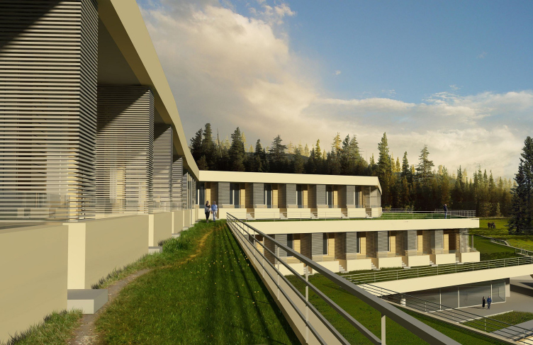
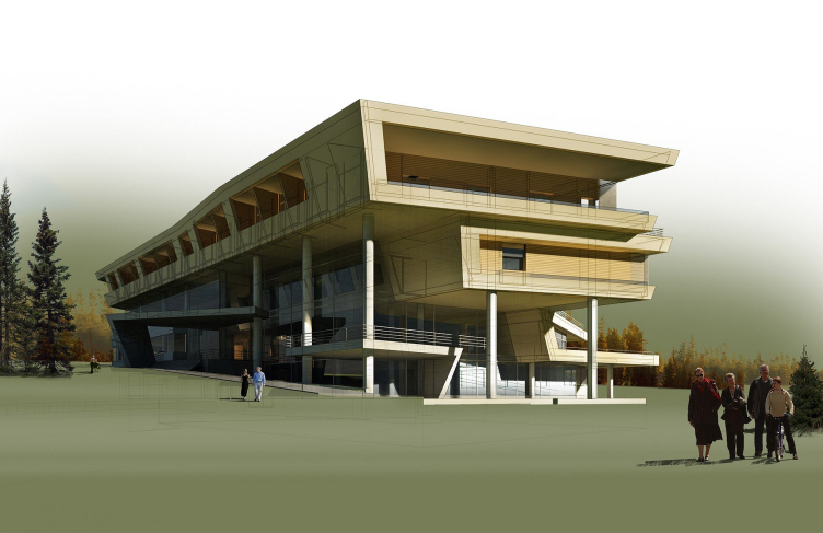
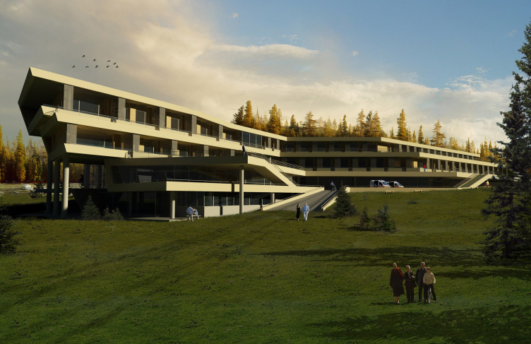
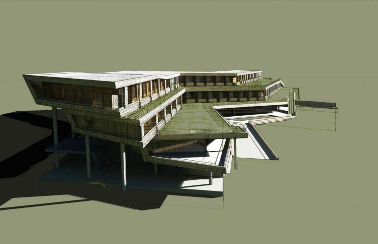
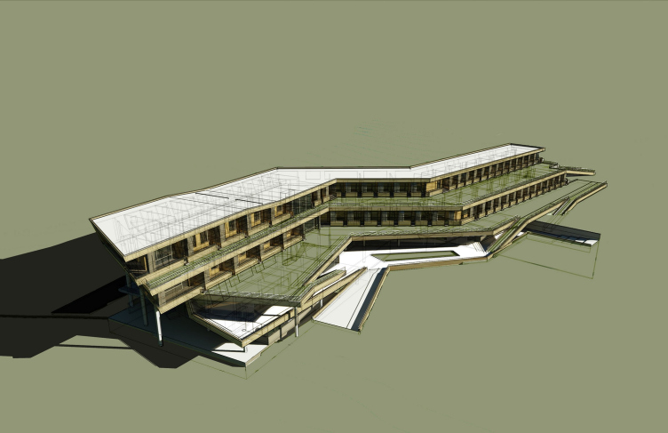
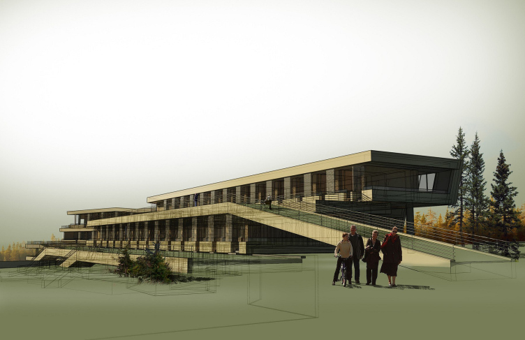
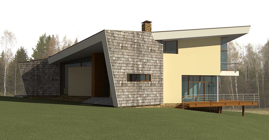
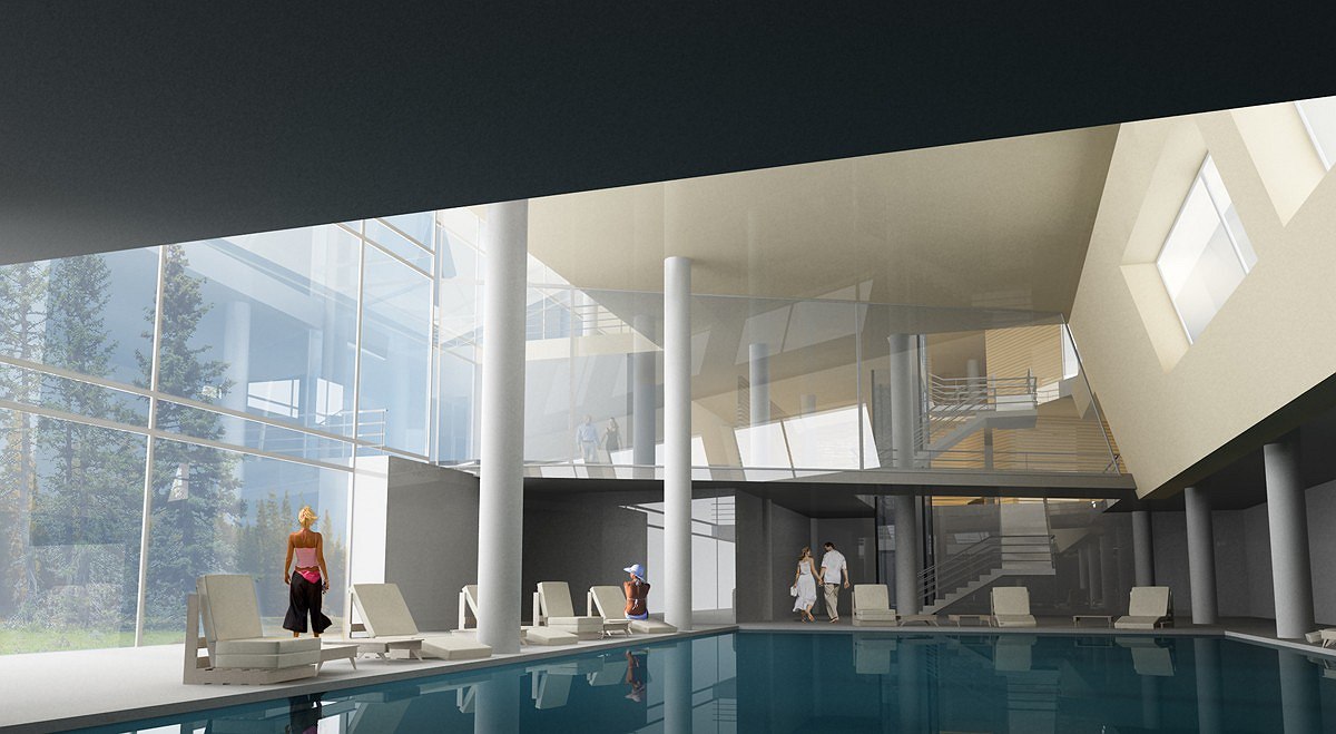
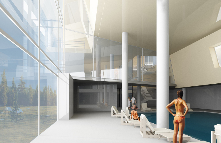
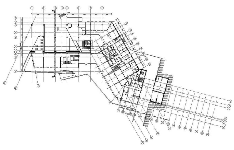
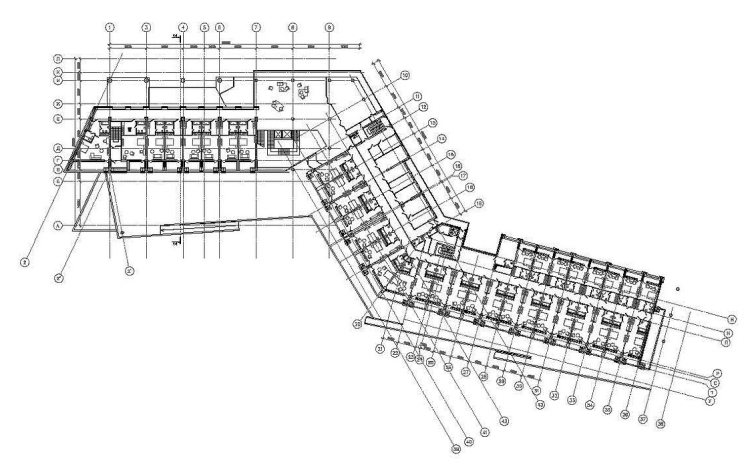
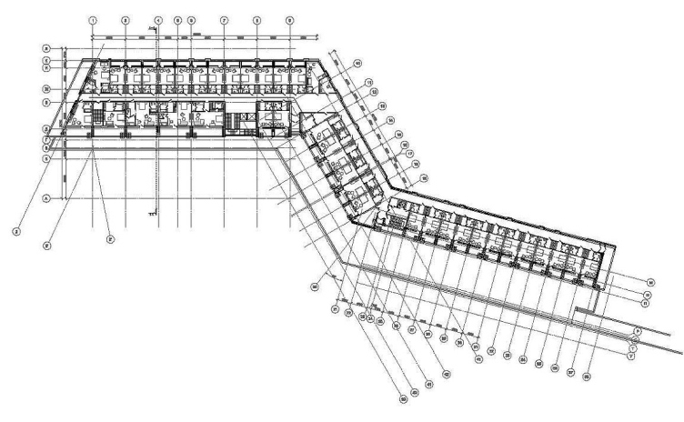
The broad zigzag of the main 3-storey building of the clinic is perpendicularly cut into the slope surface (difference in relief is considerable here,15 m, so the play with heights is reasonable). Massive plates of the concrete floors – a favorite Butko and Nadtochi’s technique, tested on countryside villages – roll down along the floors, break at different angles, go down to the ground by long rampants. They seem to have a geological nature, look like layers of some unknown chalky rocks, winded among hills and woods of common Russian landscape. Well, it will be obvious the stone zigzag is artificial: lines are quite straight, only they run somewhere all the time, stepping aside and leaning upon thin round “legs”, or pushing forward its terraces bravely hanging over the ground or over each other. Inside, there form a three lighted space of an atrium of complex construction due to the shift of floors, and general function areas group around there.
Terraces will be planted, and the authors designed there pastoral paths, stitch-paths which appear in summertime. This detail – not significant, but illustrative part of the project graphics – is fascinating and ads some faint beauty to the idea of green architecture, in its classical variant, already quite annoying for critics. Due to the paths the layers of terraces unfolded like a fan becoming a part of the field – like the Moscow region nature was handed on a platter to the guests of the wonder clinic and put by their doors.
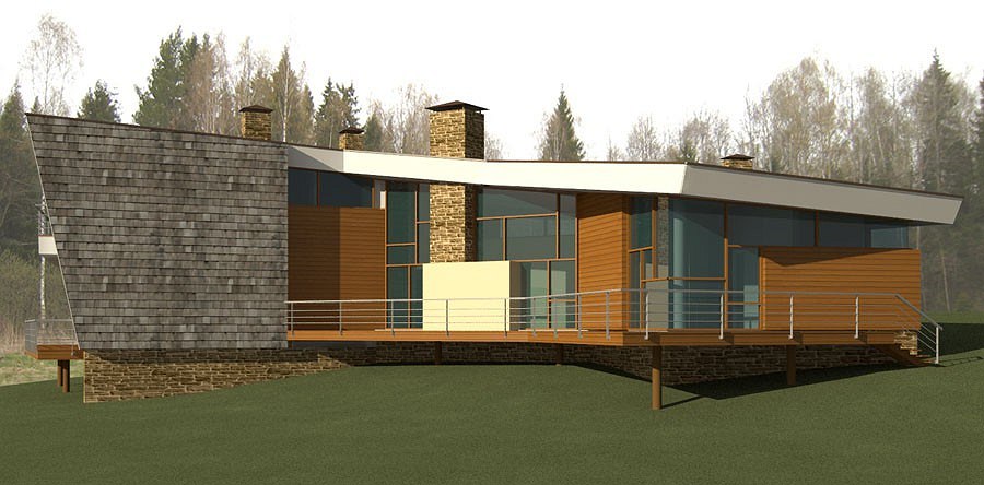
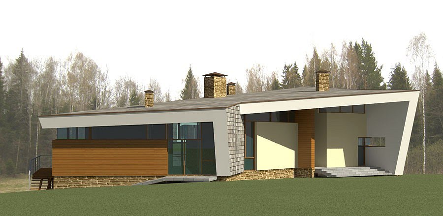
Each of the six cottages on the other side includes the two 1-storey and 2-storey “blocked” halves”. Their spaces are almost equal, but they have different configurations and layouts. It gave the architect a nontrivial solution for the practical task: if a client rents the entire cottage they get a building with a mirrored layout, a common house with a public zone in the middle, a small living room and a few bed-rooms. Also this solution avoids a dull image of “blocked housing” – each building has two parts, but outside it is not obvious.
Anton Nadtochi said the prototype of each “half” was a standard house with two-sloped roof out of which were “taken out” (cut, in some places) separated volumes and so the traditional form became unrecognizable. Slopes of the roofs almost vertically grow into the ground or are almost flat, or join with long roof overhangs which are like heavy concrete hoods. The walls are thin and light, glass alternates with wood panels, brutal and textured stone pipes grow through the ephemeral transparent surfaces. It is like the houses are hatched and got frozen having no idea what was better for them – a Russian countryside plough share (on the roof), wooden balconies of a Swiss cottage or the classics of transparent modernism.
The clients wanted modern architecture, but not urban. That is natural – bucolic. The modern architecture likes natural shapes, sometimes it curves and bends too much, trying to imitate naturalness and uncreated. The project by Butko and Nadtochi is different. Remarkably, its naturalness is not gained by curving. But right angles can hardly be found there – there are plenty of bevels and slopes. It seems, natural (rather, geological) forms were cut. Narrowed to pieces, to simplify (and reduce the costs, important as well) or to demonstrate its artificial nature. It’s a kind of agreement between the “archi” and “tectonics”, human and ecological; architecture is on the edge between both. Most probably, the “golden mean” will work for the clients of this small health resort. The construction process is started and in a couple of years there will be first results. The cottages are already built, the finishing works will be started the next summer. Construction of the main building will probably be stated the next year as well.
zooming
zooming
zooming
zooming


Firm:
ATRIUM
Object:
Health clinic
Russia, Aleksandrovsky district, Lisunovsky country district, nearby Voskresenskoe village

Project Team:
architects: Anton Nadtochi, Vera Butko, Andrei Sizuk, Alexander Malygin, Dmitri Hudenkih; constructors: Alexey Kalashnikov, Kostas Laios; engineering: "DPM-engineering"

2007

OOO "Jim"

07 December 2009

Headlines now
The Golden Crown
The concept for a dental clinic in Yekaterinburg, developed by CNTR Studio, revolves around the idea of a “mouth full of gold”: pristine white porcelain stoneware walls are complemented by matte brass details. To avoid an overly literal interpretation, the architects focused on the building’s proportions, skillfully navigating between sunlight requirements and fire safety regulations.
Flexibility and Integration
Not long ago, we covered the project for the fourth phase of the ÁLIA residential complex, designed by APEX. Now, we’ve been shown different fence concepts they developed to enclose the complex’s private courtyards, incorporating a variety of public functions. We believe that the sheer fact that the complex’s architects were involved in such a detail as fencing speaks volumes.
A Step Forward
The HIDE residential complex represents a major milestone for ADM architects and their leaders Andrey Romanov and Ekaterina Kuznetsova in their quest for a fresh high-rise aesthetic – one that is flexible and layered, capable of bringing vibrancy to mass and silhouette while shaping form. Over recent years, this approach has become ADM’s “signature style”, with the golden HIDE tower playing a pivotal role in its evolution. Here, we delve into the project’s story, explore the details of the complex’s design, and uncover its core essence.
Gold in the Sands
A new office for a transcontinental company specializing in resource extraction and processing has opened in Dubai. Designed by T+T Architects, masters of creating spaces that are contemporary, diverse, flexible, and original, this project exemplifies their expertise. On the executive floor, a massive brass-clad partition dominates, while layered textures of compressed earth create a contextually resonant backdrop.
Layers and Levels of Flight
This project goes way back – Reserve Union won this architectural competition at the end of 2011, and the building was completed in 2018, so it’s practically “archival”. However, despite being relatively unknown, the building can hardly be considered “dated” and remains a prime example of architectural expression, particularly in the headquarters genre. And it’s especially fitting for an aviation company office. In some ways, it resembles the Aeroflot headquarters at Sheremetyevo but with its own unique identity, following the signature style of Vladimir Plotkin. In this article, we take an in-depth look at the United Aircraft Corporation (UAC) headquarters in the Moscow agglomeration town of Zhukovsky, supplemented by recent photographs from Alexey Naroditsky – a shoot that became only recently possible due to the fact that improvements were finally made in the surrounding area.
Light and Shadow
In this article, we delve into the architectural design of the “Chaika” house by DNK ag architects, which was recently completed in 2023 as part of the collection of signature designs at ZILArt. As is well-known, all the buildings in this complex follow a design code, yet each one is distinct. This particular building stands out not only for its whiteness and minimalism but also for the refined use of a limited number of techniques that, together, create what can confidently be called synergy.
Casus Novae
A master plan was developed for a large residential area with a name of “DNS City”, but now that its implementation began, the plan has been arbitrarily reformatted and replaced with something that, while similar on the surface, is actually quite different. This is not the first time such a thing happens, but it’s always frustrating. With permission from the author, we are sharing Maria Elkina’s post.
Treasure Hunting
The GAFA bureau, in collaboration with Tegola and Arkhitail, organized an expedition to the island of Kilpola in Karelia as part of Moskomarkhitektura’s “Open City” festival. There, amidst moss and rocks, the students sought answers to questions like: what is the sacred, where does it dwell, and what sustains it? Assisting the participants in this quest were landscape engineer Evgeny Levin, artist Nicholas Roerich, a moose, and the lack of cellular connection. Here’s how the story unfolded.
Depths of the Earth, Streams of Water
In the Malaya Okhta district, the Akzent building, designed by Stepan Liphart, was constructed. It follows a classic tripartite structure, yet it’s what you might call “hand-drawn”: each façade is unique in its form and details, some of which aren’t immediately noticeable. In this article, we explore the context and, together with the architect, delve into how the form was developed.
Fir Tree Dynamics
The “Airports of Region” holding is planning to build an airport in Karachay-Cherkessia, aiming to make the Arkhyz and Dombay resorts more accessible to travelers. The project that won in an invitation-only competition, submitted by Sergey Nikeshkin’s KPLN, blends natural imagery inspired by the shape of a conifer seed, open-air waiting spaces, majestic large trees, and a green roof elevated on needle-like columns. The result is both nature-inspired and WOW.
​A Brick Shell
In the process of designing a clubhouse situated among pine trees in a prestigious suburban area near Moscow, the architectural firm “A.Len” did the façade design part. The combination of different types of brick and masonry correlates with the volumetric and plastique solutions, further enhanced by the inclusion of wood-painted fragments and metal “glazing”.
Word Forms
ATRIUM architects love ambitious challenges, and for the firm’s thirtieth anniversary, they boldly play a game of words with an exhibition that dives deep into a self-created vocabulary. They immerse their projects – especially art installations – into this glossary, as if plunging into a current of their own. You feel as if you’re flowing through the veins of pure art, immersed in a universe of vertical cities, educational spaces – of which the architects are true masters – and the cultural codes of various locations. But what truly captivates is the bold statement that Vera Butko and Anton Nadtochy make, both through their work and this exhibition: architecture, above all, is art – the art of working with form and space.
Flexibility and Acuteness of Modernity
Luxurious, fluid, large “kokoshniks” and spiral barrel columns, as if made from colorful chewing gum: there seem to be no other mansion like this in Moscow, designed in the “Neo-Russian-Modern” style. And the “Teremok” on Malaya Kaluzhskaya, previously somewhat obscure, has “come alive with new colors” and gained visibility after its restoration for the office of the “architectural ecosystem” as the architects love to call themselves. It’s evident that Julius Borisov and the architects at UNK put their hearts into finding this new office and bringing it up to date. Let’s delve into the paradoxes of this mansion’s history and its plasticity. Spoiler: two versions of modernity meet here, both balancing on the razor’s edge of “what’s current”.
Yuri Vissarionov: “A modular house does not belong to the land”
It belongs to space, or to the air... It turns out that 3D printing is more effective when combined with a modular approach: the house is built in a workshop and then adapted to the site, including on uneven terrain. Yuri Vissarionov shares his latest experience in designing tourist complexes, both in central Russia and in the south. These include houseboats, homes printed from lightweight concrete using a 3D printer, and, of course, frame houses.
​Moscow’s First
“The quality of education largely depends on the quality of the educational environment”. This principle of the last decade has been realized by Sergey Skuratov in the project for the First Moscow Gymnasium on Rostovskaya Embankment in the Khamovniki district. The building seamlessly integrates into the complex urban landscape, responding both to the pedestrian flow of the city and the quiet alleyways. It skillfully takes advantage of the height differences and aligns with modern trends in educational space design. Let’s take a closer look.
Looking at the Water
The site of Villa Sonata stretches from the road to the water’s edge, offering its own shoreline, pier, and a picturesque river panorama. To reveal these sweeping views, Roman Leonidov “cut” the façade diagonally parallel to the river, thus getting two main axes for the house and, consequently, “two heads”. The internal core – two double-height spaces, a living room and a conservatory, with a “bridge” above them – makes the house both “transparent” and filled with light.
The White Wing
Well, it’s not exactly white. It’s more of a beige, white-stone structure that plays with the color of limestone – smoother surfaces are lighter, while rougher ones are darker. This wing unites various elements: it absorbs and interprets the surrounding themes. It responds to everything, yet maintains a cohesive expression – a challenging task! – while also incorporating recognizable features of its own, such as the dynamic cuts at the bottom, top, and middle.
Urban Dunes
The XSA Ramps team designed and built a three-part sports hub for a park in Rostov-on-Don, welcoming people of all ages and fitness levels. The skate plaza, pump track, and playground are all meticulously crafted with details that attract a diverse range of visitors. The technical execution of the shapes and slopes transforms this space into a kind of sculptural composition.
Proportional Growth
The project for the fourth phase of the ÁLIA residential area has been announced. The buildings are situated on an elongated plot – almost a “ray” that shoots out from the center of the area towards the river. Their layout reflects both a response to Moscow’s architectural preferences over the past 15 years, shifting “from blocks to towers”, and an interpretation of the neighboring business park designed by SOM. Additionally, the best apartments here are not located at the very top but closer to the middle, forming a glowing “waistline”.
The “Staircase” Building
In designing the “Details” residential complex in New Moscow, Rais Baishev spiced up the now-popular Moscow theme of a “courtyard” building with an idea drawn from the surrealist drawings by Maurits Escher. He envisioned the stepped silhouettes and descending slopes as a metaphysical mega-staircase, creating a key void within the courtyard that gave the project an internal “spine”. This concept is felt both in the building’s silhouette and on its façades.
Projection of the Quarter
No one doubted that the building that Vladimir Plotkin designed as part of the “Garden Quarters” would be the most modernist of all. And it turned out just that way: while adhering to the common design code, the building successfully combines brick and white stone, rhythmically responding to the neighboring building designed by Ostozhenka, yet tactfully and persistently making a few statements of its own. This includes the projection of the ideal urban development composition “14–9–6”, which can be found right next door, mathematical calculations, including those for various types of terraces (and perhaps the only reminder of the Soviet past of the Kauchuk rubber factory!), and the white “cross-stitch” pattern of the façade grid.
Domus Aurea
In this issue, we examine the “Tessinsky-1” house, designed by Sergey Skuratov and completed in 2023. Located in the middle of the Serebryanicheskaya Embankment district, at the intersection of its main streets, this house assumes a sort of “nodal” role: it not only responds to everything around it and preserves many memories of the former EMA factory within itself, but it weaves all this into a newly directed pattern, reconciling bright “gold” and dark-colored brick, largely with the help of the new, modern-yet-archaic Columba brick, which, come to think about it, is the most precious element here.
The Chimney of Nikola-Lenivets
In this issue, we are examining the “Obelisk House” designed by KATARSIS and built for the Arkhstoyanie 2023 festival. However, it was only finished later on, and this is why we are examining it now. It seems to us that after the “Obelisk House” appeared in Nikola-Lenivets, a dialogue and a few inner connections appeared between the temporary structures built here. These houses no longer look like “accidental neighbors”, more of which below.
​Periscope by the Bay
The jury awarded the second place in the competition for a public and cultural center in Petropavlovsk-Kamchatsky to the companies GORA (“Mountain”) and M4. In the consortium’s proposal, the building resembles a sperm whale with a calf swimming next to it or a periscope, whose lenses capture the most spectacular views from the surrounding landscape.
From Arcs to Dolmens
While working on the competition project for Petropavlovsk-Kamchatsky, ASADOV Architects prioritized the value of the natural and urban environment, aiming to preserve the balance of the location while minimizing the resemblance of the volume that they designed to a “traditional building”. The task was challenging, and the architects created three versions, one of which having been developed after the competition, where their main proposal took third place. However, the point of interest here is not the competition result but the continuity of creative thinking.
Hide and Seek
The ID Moskovskiy house, designed by Stepan Liphart in St. Petersburg, in the courtyards near Moskovskiy Avenue beyond the Obvodny Canal and recently completed, is notable for several reasons. Firstly, it has been realized with considerable accuracy, which is particularly significant as this is the first building where the architect was responsible not only for the facades but also for the layouts, allowing for better integration between the two. On the other hand, this building is interesting as an example of the “germination” of new architecture in the city: it draws on the best examples from the neighborhood and becomes an improved and developed sum of ideas found by the architect in the surrounding context.
The Big Twelve
Yesterday, the winners of the Moscow Mayor’s Architecture Award were announced and honored. Let’s take a look at what was awarded and, in some cases, even critique this esteemed award. After all, there is always room for improvement, right?
Above the Golden Horn
The residential complex “Philosophy” designed by T+T architects in Vladivostok, is one of the new projects in the “Golubinaya Pad” area, changing its development philosophy (pun intended) from single houses to a comprehensive approach. The buildings are organized along public streets, varying in height and format, with one house even executed in gallery typology, featuring a cantilever leaning on an art object.
Nuanced Alternative
How can you rhyme a square and space? Easily! But to do so, you need to rhyme everything you can possibly think of: weave everything together, like in a tensegrity structure, and find your own optics too. The new exhibition at GES-2 does just that, offering its visitor a new perspective on the history of art spanning 150 years, infused with the hope for endless multiplicity of worlds and art histories. Read on to see how this is achieved and how the exhibition design by Evgeny Ace contributes to it.
Blinds for Ice
An ice arena has been constructed in Domodedovo based on a project by Yuri Vissarionov Architects. To prevent the long façade, a technical requirement for winter sports facilities, from appearing monotonous, the architects proposed the use of suspended structures with multidirectional slats. This design protects the ice from direct sunlight while giving the wall texture and detail.