По-русски

The Fortress by the River

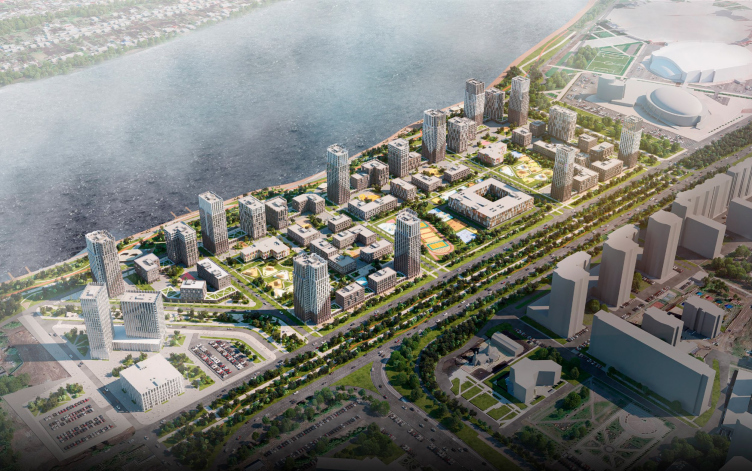
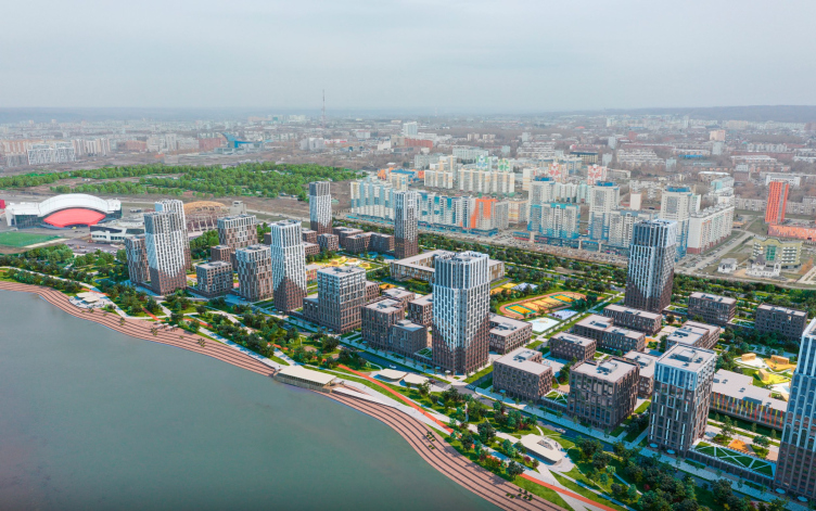
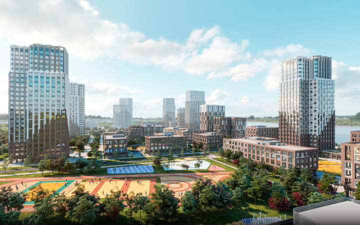
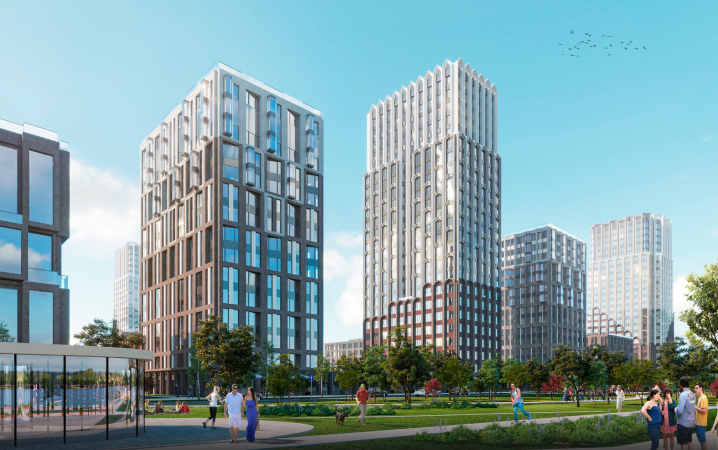
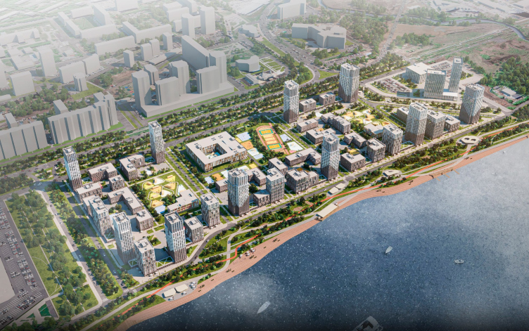
ASADOV Architects have developed a concept for a new residential district in the center of Kemerovo. To combat the harsh climate and monotonous everyday life, the architects proposed a block type of development with dominant towers, good insolation, facades detailed at eye level, and event programming.

15 April 2024
Object
mainImg
Firing up the Coals

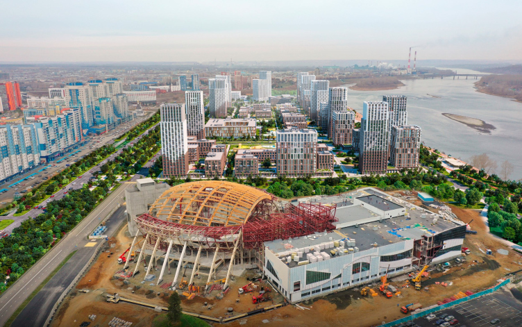
In 2021, Kuzbass celebrated its 300th anniversary. By this date, Kemerovo, as the administrative center of the region, underwent significant transformations. Since 2019, a museum-theater center has been under construction here according to the Coop Himmelb(l)au project, and the accompanying educational campus designed by the “ARENA” Project Institute has already been completed. In 2021, the new terminal of the “Leonov” airport was opened, also designed by ASADOV Architects. The city’s 300th anniversary was not only used to build iconic projects; the approach to shaping the environment as a whole is also changing. For example, on the banks of the Tom River, where there were only wastelands and wooden houses not long ago, a new residential district is expected to emerge soon.


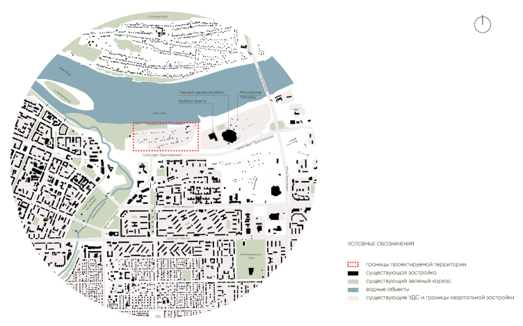
To the east of this area, the Ice Palace and the “Kuzbass-Arena” have already been built, becoming part of the Olympic Park with a promenade, pedestrian boulevard, skate park, summer theater, and a space for major urban events. Further, closer to the bridge and the intersection of Pritomsky Avenue, the “Moskovskaya Square” business district will appear with towers reaching up to 150 meters; it is currently being designed by the architectural company R1.


To the west, by the Iskitimka River, several projects are located, making this part of the city truly mixed-use: an administrative cluster, central station, philharmonic hall, justice quarter, and others. Against such an impressive background, the museum-and-theater complex will stand out, which is likely to become the main attraction in the city. In order for the functionally rich district to withstand the transportation load, the construction of a relief road of Pritomsky Avenue was completed in 2022.

To work on the concept of the last link – the modern residential complex that we are speaking about – the city authorities invited ASADOV Architects, asking them to bring metropolitan trends here.

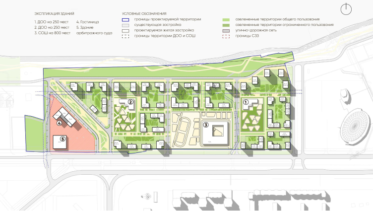
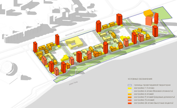
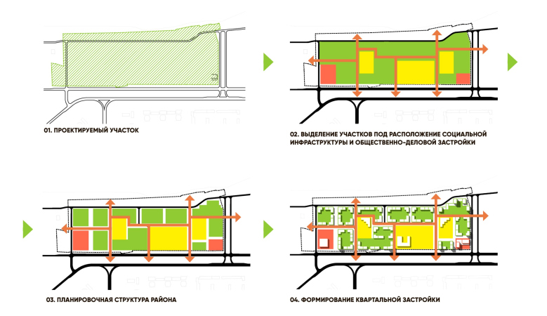
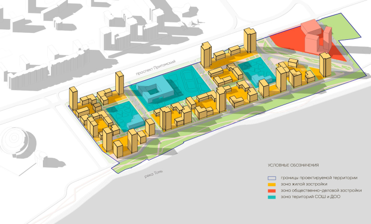
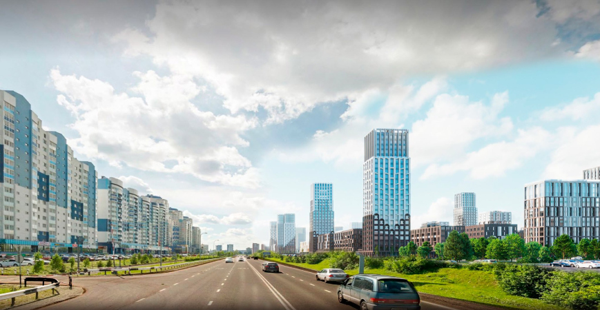
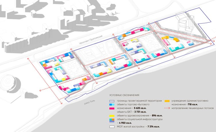
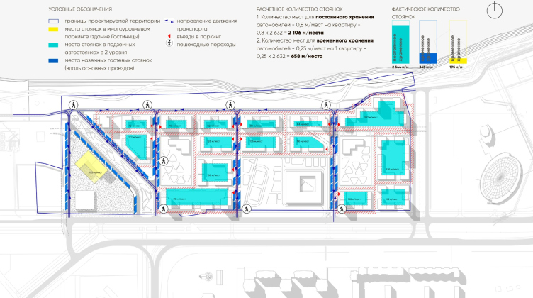
At the opening of the Leonov Airport, I met the governor of the Kemerovo Region, Sergey Tsivilyov, and he suggested that we get involved in the project to develop the area near Pritomsky Avenue, which was already being developed by our local colleagues. Having studied their experience, as well as the peculiarities of the city, we formed neighborhoods and then maximized the number of stories. The contours are accentuated by towers reaching the maximum allowed height of 50 meters, the rest of the houses have several levels of height ranging from 4 to 15 floors. The bulk of the development faces the river, schools and kindergartens are located in the depths, and several accent towers “hold” the front of Pritomsky Avenue. We tried to both capture the spirit of the harsh Siberian expanses and contrast them with a modern structure.


Softening the Harsh Climate

The lyrical hero of Boris Grebenshchikov’s song, perhaps, was tempered by the long winter, rare sun, and scant colors of these parts:

The sky will collapse on the ground,
The grass will cease to grow —
He will come and silently fix everything,
The man from Kemerovo.


In reality, harsh climatic conditions are one of the main reasons people leave the city. And while industry becomes more environmentally friendly, the city as a whole develops, and the well-being of residents grows, the effects of global warming are not expected in Siberia any time soon.

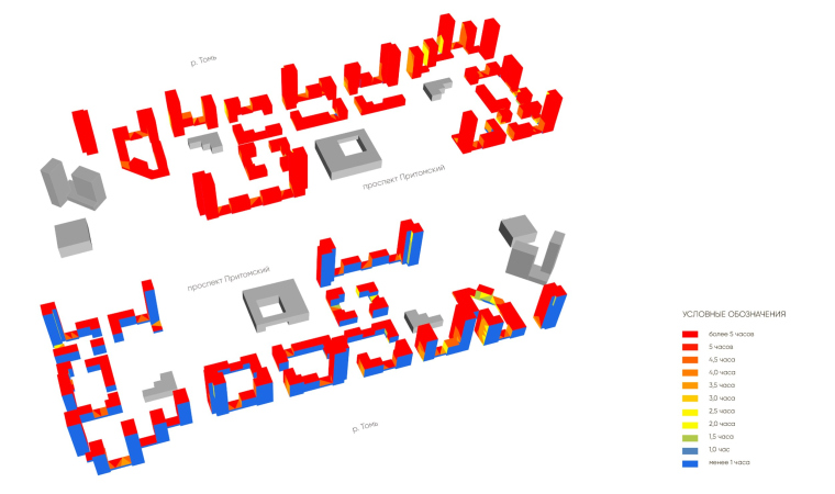
The ASADOV Architects team attempted to make the climate of Kemerovo more comfortable using architectural means, at least within the confines of a given district. Therefore, the location and height of the sections directly depend on the analysis of wind flows and the movement of the sun.

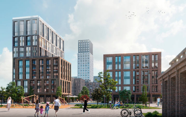
The basis of the development consists of enclosed spaces of mid-rise residential blocks, while the “regulatory” towers prevent the formation of wind corridors. Additional protection in the future can be provided by artificial hills and landscape plantings. Schools and kindergartens are shielded by residential sections. Their location in the center of the district also provides a sense of spaciousness within the new blocks.

  • zooming
    1 / 3
  • zooming
    2 / 3
  • zooming
    3 / 3


Another feature of Kemerovo that is important to mention is its seismic activity, caused not only by the movement of the Salair and Kuznetsky Alatau mountain systems but also by regular explosions at the local coal mines. After the Bachat earthquake in 2013, there was even a temporary ban on the construction of high-rise buildings in the city.

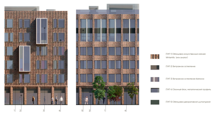
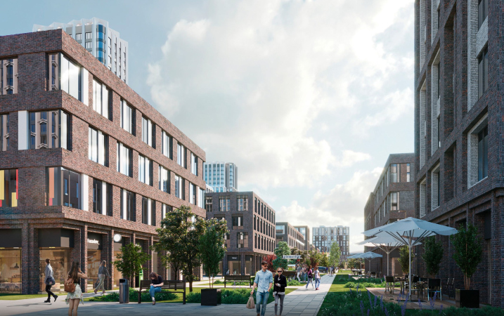
The task of making a convenient master plan and interesting facades was complicated by the need to take into account the wind pattern, harsh winters, and the district’s location on the first line from the river, as well as seismicity. The blocks are formed in such a way as to avoid wind corridors, to make the environment cozy, and from the apartments to reveal views of the river and the city. Taking into account the amount of precipitation, the volumes of the houses are laconic, with no protruding cantilevers or active plastique on the facades to avoid additional cold bridges. At the same time, the facades are more detailed at eye level: this makes the environment looks friendlier and more diverse. We also took into account the overall appearance of the buildings standing on the navigable Tomsk River side.


Accents, Landmarks, and Background

Monotony is one of the main problems of Kemerovo. To achieve a variety of perspectives and apartment layouts, as well as spatial impressions, the architects used three building typologies: accent towers, landmarks, and, finally, the background development.

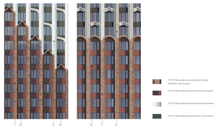
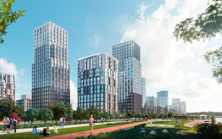
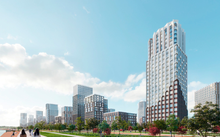
The visual axes are anchored by accent buildings with a height of 24 floors: they are visible from afar, they have more active plasticity and developed decor – for example, arched windows, dentils, shifts in the window grid. Derived from the accents are the dominant towers, which stand out physically due to their height of 9-15 floors. Together with the dominant towers, they form a silhouette and become landmarks. Accents are shaded by background architecture of 4-6 floors – calm, but not monotonous, as it varies the combination of colors or plastic solutions.

All three building types form a rhythmic and varied environment without visual “noise”. We introduce only two colors: terracotta “grounds” the building and white dematerializes the volumes. The upper floors of high-rise buildings are characterized by the visual consolidation of windows. These techniques create a sense of lower storey height.


No two houses here are identical; each has its own plastique or color technique. At the same time, they are united by a single design code and the “supergraphics” of the towers: the proposed brick cladding of the base and the tongs-like finish make it resemble a palisade of a fortress. This image refers to Kemerovo’s wooden past and the common image of a fortress-like house, which seems particularly appropriate here: what protects against the piercing wind and penetrating cold better than the sturdy walls of your sweet home?

The arch-like finials and white tongs reminiscent of New York’s stepped towers lead to other associations: corbel arches, gables, and the turrets of stone churches – all of these things have become quite trendy lately. However, the level of abstraction is such that, when viewed from another perspective, these elements can be interpreted as ice crystals, frost creeping on a frozen window, or perhaps snow whirls.

  • zooming
    1 / 7
  • zooming
    2 / 7
  • zooming
    3 / 7
  • zooming
    4 / 7
  • zooming
    5 / 7
  • zooming
    6 / 7
  • zooming
    7 / 7


Snow Lovers Society

The goal of the proposed concept is to turn Kemerovo into a pleasant city year-round. To ensure that life does not freeze inside apartments, the architects have provided scenarios that will easily integrate into residents’ daily lives and diversify or make daily routines more comfortable.

The ground floors of the buildings standing along the outer contour are entirely dedicated to commerce: this will expand career opportunities for young people, and the residents will have the necessary services available at their doorstep. Events and related businesses can also add to the overall activity: holidays, fairs, and seasonal festivals, which are unthinkable without pavilions for cafes and sports equipment rental.


The waterfront could become the main leisure area. The concept offers a possible development option: with pedestrian and bicycle paths that turn into ski tracks in winter, slopes leading down to the river, swimming and sunbathing areas, fishing piers, boat docks, and various pavilions. On the opposite bank of the Tom River is the Pine Forest Park, considered the city’s “lungs” and a place for active recreation. This park could be connected to the new “micro-district” with pedestrian bridges.


Without a doubt, apartments with a view of the river in the city center will be in high demand. It’s quite good news that this new district can become not just a collection of square meters but an example of a livable environment – with wind-sheltered courtyards, cozy and bustling streets, clear navigation, sweeping views from the windows, and various reasons to leave one’s home and go outside as well.

15 April 2024

Headlines now
The Golden Crown
The concept for a dental clinic in Yekaterinburg, developed by CNTR Studio, revolves around the idea of a “mouth full of gold”: pristine white porcelain stoneware walls are complemented by matte brass details. To avoid an overly literal interpretation, the architects focused on the building’s proportions, skillfully navigating between sunlight requirements and fire safety regulations.
Flexibility and Integration
Not long ago, we covered the project for the fourth phase of the ÁLIA residential complex, designed by APEX. Now, we’ve been shown different fence concepts they developed to enclose the complex’s private courtyards, incorporating a variety of public functions. We believe that the sheer fact that the complex’s architects were involved in such a detail as fencing speaks volumes.
A Step Forward
The HIDE residential complex represents a major milestone for ADM architects and their leaders Andrey Romanov and Ekaterina Kuznetsova in their quest for a fresh high-rise aesthetic – one that is flexible and layered, capable of bringing vibrancy to mass and silhouette while shaping form. Over recent years, this approach has become ADM’s “signature style”, with the golden HIDE tower playing a pivotal role in its evolution. Here, we delve into the project’s story, explore the details of the complex’s design, and uncover its core essence.
Gold in the Sands
A new office for a transcontinental company specializing in resource extraction and processing has opened in Dubai. Designed by T+T Architects, masters of creating spaces that are contemporary, diverse, flexible, and original, this project exemplifies their expertise. On the executive floor, a massive brass-clad partition dominates, while layered textures of compressed earth create a contextually resonant backdrop.
Layers and Levels of Flight
This project goes way back – Reserve Union won this architectural competition at the end of 2011, and the building was completed in 2018, so it’s practically “archival”. However, despite being relatively unknown, the building can hardly be considered “dated” and remains a prime example of architectural expression, particularly in the headquarters genre. And it’s especially fitting for an aviation company office. In some ways, it resembles the Aeroflot headquarters at Sheremetyevo but with its own unique identity, following the signature style of Vladimir Plotkin. In this article, we take an in-depth look at the United Aircraft Corporation (UAC) headquarters in the Moscow agglomeration town of Zhukovsky, supplemented by recent photographs from Alexey Naroditsky – a shoot that became only recently possible due to the fact that improvements were finally made in the surrounding area.
Light and Shadow
In this article, we delve into the architectural design of the “Chaika” house by DNK ag architects, which was recently completed in 2023 as part of the collection of signature designs at ZILArt. As is well-known, all the buildings in this complex follow a design code, yet each one is distinct. This particular building stands out not only for its whiteness and minimalism but also for the refined use of a limited number of techniques that, together, create what can confidently be called synergy.
Casus Novae
A master plan was developed for a large residential area with a name of “DNS City”, but now that its implementation began, the plan has been arbitrarily reformatted and replaced with something that, while similar on the surface, is actually quite different. This is not the first time such a thing happens, but it’s always frustrating. With permission from the author, we are sharing Maria Elkina’s post.
Treasure Hunting
The GAFA bureau, in collaboration with Tegola and Arkhitail, organized an expedition to the island of Kilpola in Karelia as part of Moskomarkhitektura’s “Open City” festival. There, amidst moss and rocks, the students sought answers to questions like: what is the sacred, where does it dwell, and what sustains it? Assisting the participants in this quest were landscape engineer Evgeny Levin, artist Nicholas Roerich, a moose, and the lack of cellular connection. Here’s how the story unfolded.
Depths of the Earth, Streams of Water
In the Malaya Okhta district, the Akzent building, designed by Stepan Liphart, was constructed. It follows a classic tripartite structure, yet it’s what you might call “hand-drawn”: each façade is unique in its form and details, some of which aren’t immediately noticeable. In this article, we explore the context and, together with the architect, delve into how the form was developed.
Fir Tree Dynamics
The “Airports of Region” holding is planning to build an airport in Karachay-Cherkessia, aiming to make the Arkhyz and Dombay resorts more accessible to travelers. The project that won in an invitation-only competition, submitted by Sergey Nikeshkin’s KPLN, blends natural imagery inspired by the shape of a conifer seed, open-air waiting spaces, majestic large trees, and a green roof elevated on needle-like columns. The result is both nature-inspired and WOW.
​A Brick Shell
In the process of designing a clubhouse situated among pine trees in a prestigious suburban area near Moscow, the architectural firm “A.Len” did the façade design part. The combination of different types of brick and masonry correlates with the volumetric and plastique solutions, further enhanced by the inclusion of wood-painted fragments and metal “glazing”.
Word Forms
ATRIUM architects love ambitious challenges, and for the firm’s thirtieth anniversary, they boldly play a game of words with an exhibition that dives deep into a self-created vocabulary. They immerse their projects – especially art installations – into this glossary, as if plunging into a current of their own. You feel as if you’re flowing through the veins of pure art, immersed in a universe of vertical cities, educational spaces – of which the architects are true masters – and the cultural codes of various locations. But what truly captivates is the bold statement that Vera Butko and Anton Nadtochy make, both through their work and this exhibition: architecture, above all, is art – the art of working with form and space.
Flexibility and Acuteness of Modernity
Luxurious, fluid, large “kokoshniks” and spiral barrel columns, as if made from colorful chewing gum: there seem to be no other mansion like this in Moscow, designed in the “Neo-Russian-Modern” style. And the “Teremok” on Malaya Kaluzhskaya, previously somewhat obscure, has “come alive with new colors” and gained visibility after its restoration for the office of the “architectural ecosystem” as the architects love to call themselves. It’s evident that Julius Borisov and the architects at UNK put their hearts into finding this new office and bringing it up to date. Let’s delve into the paradoxes of this mansion’s history and its plasticity. Spoiler: two versions of modernity meet here, both balancing on the razor’s edge of “what’s current”.
Yuri Vissarionov: “A modular house does not belong to the land”
It belongs to space, or to the air... It turns out that 3D printing is more effective when combined with a modular approach: the house is built in a workshop and then adapted to the site, including on uneven terrain. Yuri Vissarionov shares his latest experience in designing tourist complexes, both in central Russia and in the south. These include houseboats, homes printed from lightweight concrete using a 3D printer, and, of course, frame houses.
​Moscow’s First
“The quality of education largely depends on the quality of the educational environment”. This principle of the last decade has been realized by Sergey Skuratov in the project for the First Moscow Gymnasium on Rostovskaya Embankment in the Khamovniki district. The building seamlessly integrates into the complex urban landscape, responding both to the pedestrian flow of the city and the quiet alleyways. It skillfully takes advantage of the height differences and aligns with modern trends in educational space design. Let’s take a closer look.
Looking at the Water
The site of Villa Sonata stretches from the road to the water’s edge, offering its own shoreline, pier, and a picturesque river panorama. To reveal these sweeping views, Roman Leonidov “cut” the façade diagonally parallel to the river, thus getting two main axes for the house and, consequently, “two heads”. The internal core – two double-height spaces, a living room and a conservatory, with a “bridge” above them – makes the house both “transparent” and filled with light.
The White Wing
Well, it’s not exactly white. It’s more of a beige, white-stone structure that plays with the color of limestone – smoother surfaces are lighter, while rougher ones are darker. This wing unites various elements: it absorbs and interprets the surrounding themes. It responds to everything, yet maintains a cohesive expression – a challenging task! – while also incorporating recognizable features of its own, such as the dynamic cuts at the bottom, top, and middle.
Urban Dunes
The XSA Ramps team designed and built a three-part sports hub for a park in Rostov-on-Don, welcoming people of all ages and fitness levels. The skate plaza, pump track, and playground are all meticulously crafted with details that attract a diverse range of visitors. The technical execution of the shapes and slopes transforms this space into a kind of sculptural composition.
Proportional Growth
The project for the fourth phase of the ÁLIA residential area has been announced. The buildings are situated on an elongated plot – almost a “ray” that shoots out from the center of the area towards the river. Their layout reflects both a response to Moscow’s architectural preferences over the past 15 years, shifting “from blocks to towers”, and an interpretation of the neighboring business park designed by SOM. Additionally, the best apartments here are not located at the very top but closer to the middle, forming a glowing “waistline”.
The “Staircase” Building
In designing the “Details” residential complex in New Moscow, Rais Baishev spiced up the now-popular Moscow theme of a “courtyard” building with an idea drawn from the surrealist drawings by Maurits Escher. He envisioned the stepped silhouettes and descending slopes as a metaphysical mega-staircase, creating a key void within the courtyard that gave the project an internal “spine”. This concept is felt both in the building’s silhouette and on its façades.
Projection of the Quarter
No one doubted that the building that Vladimir Plotkin designed as part of the “Garden Quarters” would be the most modernist of all. And it turned out just that way: while adhering to the common design code, the building successfully combines brick and white stone, rhythmically responding to the neighboring building designed by Ostozhenka, yet tactfully and persistently making a few statements of its own. This includes the projection of the ideal urban development composition “14–9–6”, which can be found right next door, mathematical calculations, including those for various types of terraces (and perhaps the only reminder of the Soviet past of the Kauchuk rubber factory!), and the white “cross-stitch” pattern of the façade grid.
Domus Aurea
In this issue, we examine the “Tessinsky-1” house, designed by Sergey Skuratov and completed in 2023. Located in the middle of the Serebryanicheskaya Embankment district, at the intersection of its main streets, this house assumes a sort of “nodal” role: it not only responds to everything around it and preserves many memories of the former EMA factory within itself, but it weaves all this into a newly directed pattern, reconciling bright “gold” and dark-colored brick, largely with the help of the new, modern-yet-archaic Columba brick, which, come to think about it, is the most precious element here.
The Chimney of Nikola-Lenivets
In this issue, we are examining the “Obelisk House” designed by KATARSIS and built for the Arkhstoyanie 2023 festival. However, it was only finished later on, and this is why we are examining it now. It seems to us that after the “Obelisk House” appeared in Nikola-Lenivets, a dialogue and a few inner connections appeared between the temporary structures built here. These houses no longer look like “accidental neighbors”, more of which below.
​Periscope by the Bay
The jury awarded the second place in the competition for a public and cultural center in Petropavlovsk-Kamchatsky to the companies GORA (“Mountain”) and M4. In the consortium’s proposal, the building resembles a sperm whale with a calf swimming next to it or a periscope, whose lenses capture the most spectacular views from the surrounding landscape.
From Arcs to Dolmens
While working on the competition project for Petropavlovsk-Kamchatsky, ASADOV Architects prioritized the value of the natural and urban environment, aiming to preserve the balance of the location while minimizing the resemblance of the volume that they designed to a “traditional building”. The task was challenging, and the architects created three versions, one of which having been developed after the competition, where their main proposal took third place. However, the point of interest here is not the competition result but the continuity of creative thinking.
Hide and Seek
The ID Moskovskiy house, designed by Stepan Liphart in St. Petersburg, in the courtyards near Moskovskiy Avenue beyond the Obvodny Canal and recently completed, is notable for several reasons. Firstly, it has been realized with considerable accuracy, which is particularly significant as this is the first building where the architect was responsible not only for the facades but also for the layouts, allowing for better integration between the two. On the other hand, this building is interesting as an example of the “germination” of new architecture in the city: it draws on the best examples from the neighborhood and becomes an improved and developed sum of ideas found by the architect in the surrounding context.
The Big Twelve
Yesterday, the winners of the Moscow Mayor’s Architecture Award were announced and honored. Let’s take a look at what was awarded and, in some cases, even critique this esteemed award. After all, there is always room for improvement, right?
Above the Golden Horn
The residential complex “Philosophy” designed by T+T architects in Vladivostok, is one of the new projects in the “Golubinaya Pad” area, changing its development philosophy (pun intended) from single houses to a comprehensive approach. The buildings are organized along public streets, varying in height and format, with one house even executed in gallery typology, featuring a cantilever leaning on an art object.
Nuanced Alternative
How can you rhyme a square and space? Easily! But to do so, you need to rhyme everything you can possibly think of: weave everything together, like in a tensegrity structure, and find your own optics too. The new exhibition at GES-2 does just that, offering its visitor a new perspective on the history of art spanning 150 years, infused with the hope for endless multiplicity of worlds and art histories. Read on to see how this is achieved and how the exhibition design by Evgeny Ace contributes to it.
Blinds for Ice
An ice arena has been constructed in Domodedovo based on a project by Yuri Vissarionov Architects. To prevent the long façade, a technical requirement for winter sports facilities, from appearing monotonous, the architects proposed the use of suspended structures with multidirectional slats. This design protects the ice from direct sunlight while giving the wall texture and detail.