По-русски

​Stars for the Moscow Region

In this issue, we examine the six most interesting “star” projects prepared for the Moscow Region and showcased at Zodchestvo festival. Educational institutions prevail.

05 October 2022
Overview
mainImg
It is common knowledge that at Zodchestvo festival the booths of the regions of the Russian Federation perform several functions, one of them, the most interesting for the architectural market, being to showcase the projects. The actual purposes of these showcases may vary, but, as a rule, the information is priceless. It’s a pity the festival even ended so fast.

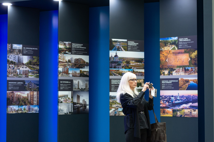
The Mosoblarkhitektura booth at Zodchestvo festival
Copyright: Photograph: provided by Mosoblarkhitektura


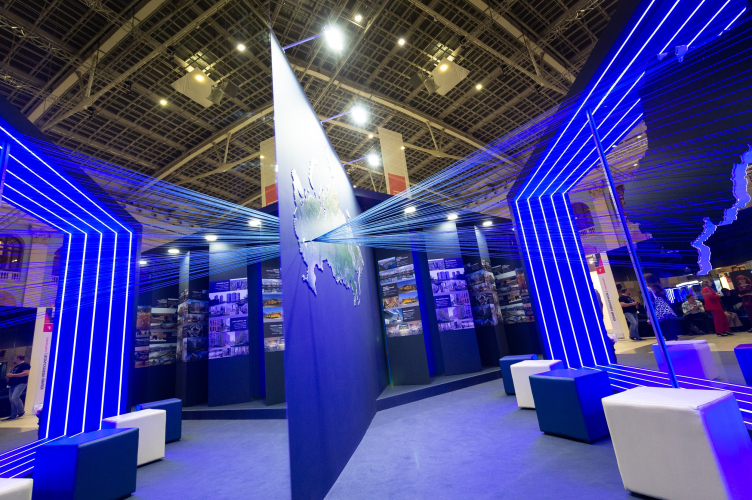
The Mosoblarkhitektura booth at Zodchestvo festival
Copyright: Photograph: provided by Mosoblarkhitektura


This year, the Moscow region’s booth was dominated not by the strings pulled through its map, not by a glowing frame, and not even by the lowercase “o” that you could sit upon – but by prismatic displays that demonstrated 42 projects in a mirror setting. The judging panel awarded the Moscow Region the “gold” diploma, and this became for us a suitable occasion for reviewing projects built or currently in construction. We decided to start with the brightest ones – some of them are really spot-on now, some not so much, and some did not get enough press coverage. However, all the projects can be considered to be “star” ones – or at least attention-worthy.
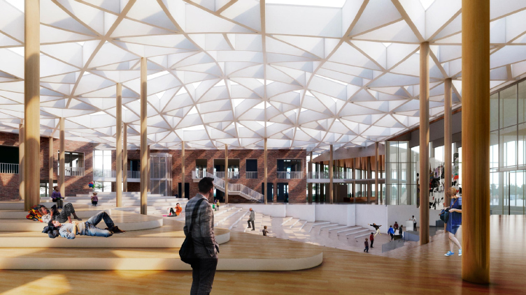
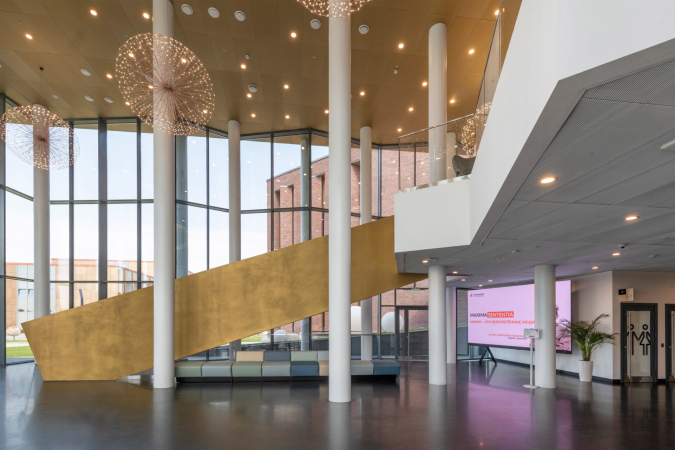
E.M. Primakov Gymnasium, 2nd stage. The lobby
Copyright: © Studio 44

Primakov Gymnasium, Stage 2

Studio
Where
Russia, Odintsovo
Date
2019 — /
Function
Education / School
Stage 2 of the Gymnasium was designed by Studio 44 – the architects of several very high-profile buildings with an educational function, and, as a consequence, the experts in this field. We have already covered this project.

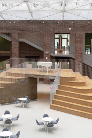
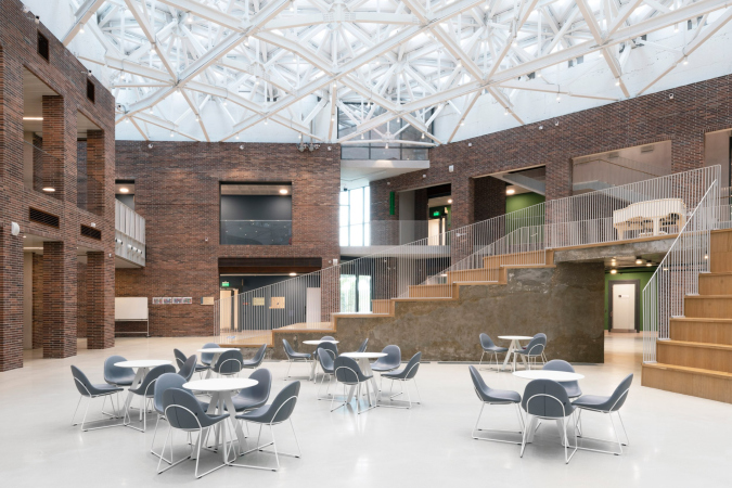
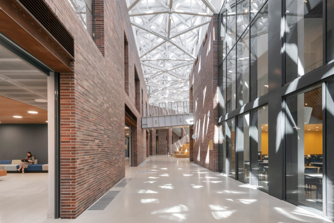
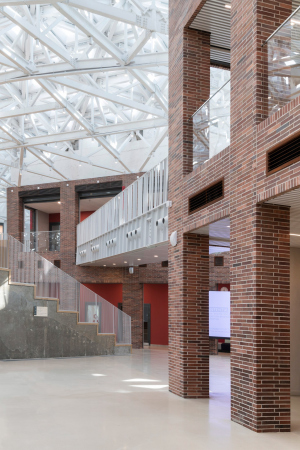
In the gymnasium, instruction is given in two languages, Russian and English, and new teaching methods are developed. The building is quite a match for that: thematic blocks are accommodated in designated volumes, grouped together around a spacious atrium/amphitheater, some of the buildings being more open and some less open to this space that can serve as a place for the students communication, or, if needed, be turned into an event hall.

The complex is being built not far away from Moscow, next to the famous settlement of Razdory, and the architects are interpreting their project as a “transition” one in terms of the scale: it stands between private residences on the one side and the building of the first stage of the gymnasium on the other. The design process was far from simple: as it turned out, the land site had an incredible number of restrictions and underground communications.
  • zooming
    1 / 7
    E.M. Primakov Gymnasium, 2nd stage. The lobby
    Copyright: © Studio 44
  • zooming
    2 / 7
    E.M. Primakov Gymnasium, 2nd stage. The academic building
    Copyright: © Studio 44
  • zooming
    3 / 7
    E.M. Primakov Gymnasium, 2nd stage
    Copyright: © Studio 44
  • zooming
    4 / 7
  • zooming
    5 / 7
    E.M. Primakov Gymnasium, 2nd stage. The students′ dormitory
    Copyright: © Studio 44
  • zooming
    6 / 7
  • zooming
    7 / 7
    E.M. Primakov Gymnasium, 2nd stage. The academic building
    Copyright: © Studio 44

Senezh Management LAB

Where
Russia, Solnechnogorsk
Date
2020 /
Function
Education / Campus
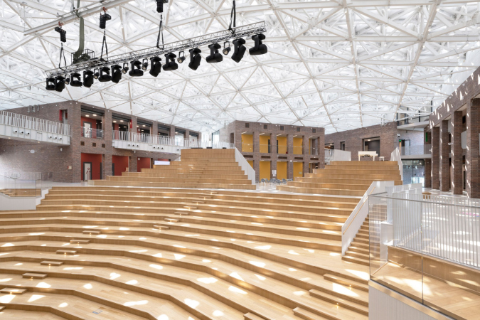
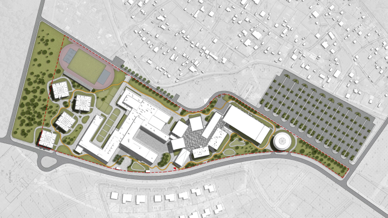
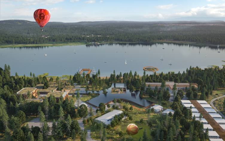
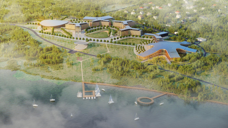
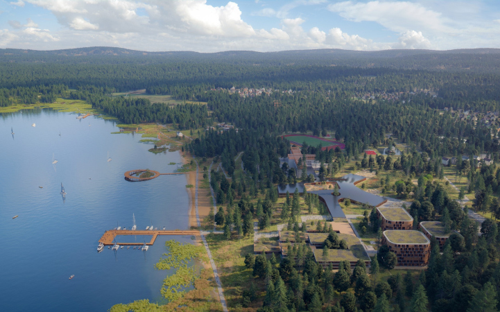
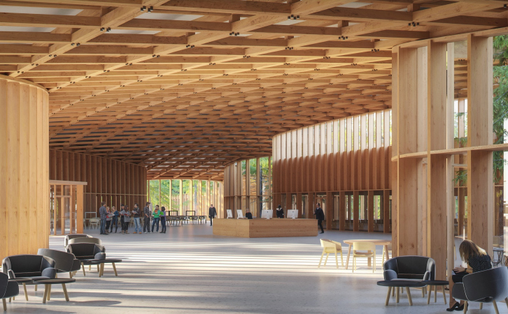
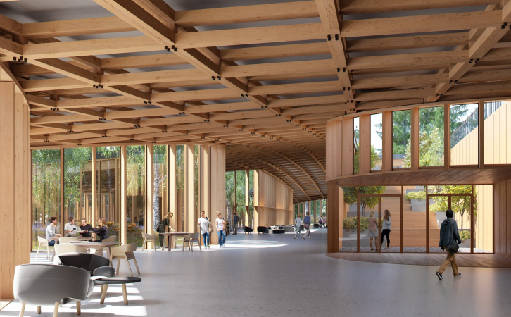
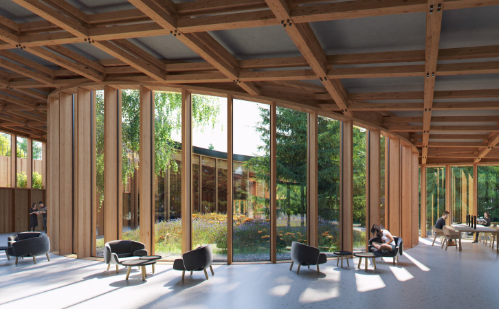
Currently, the most “stellar” (not counting the Zaha Hadid private housing construction) project of the Moscow region. This is quite an ambitious grand-scale project: about 40 buildings on an 85.3-hectare territory, which used to be a resort area on the bank of the Senezh Lake in Solnechnogorsk. As we already shared, the autonomous nonprofit organization “Russia, the Country of Opportunities” was created at Vladimir Putin’s decree in 2018; the Senezh Management LAB, which has existed since 2019, is its educational center. Senezh serves as the venue of the all-Russia educational forum “Territory of Meanings”. 

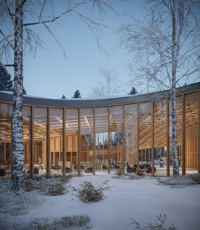
The project of land development, proposed by Mecanoo, won in the 2019 competition; it is developed by PI Arena. According to the project, the territory is divided into three parts: instructional, parkland, and lakeside. Currently, a project of the academic zone has been developed with its main building – a six-petal “Agora” in its central part. Its main features include open “flowing” space without partitions, tall seamless stained glass windows, and a wooden lattice roof. The “petal” plan, it must be said, became the signature feature of the entire complex: the building of the hotels adjoining “Agora” have three-blade plans – in both cases the “starry” shape makes it possible to provide the interiors with a maximum amount of natural light. But then again, the ice arena is circular. Yet another priority is the attention to natural materials, first of all to wood and bricks, and integrating the future buildings with the landscape.
  • zooming
    1 / 7
  • zooming
    2 / 7
  • zooming
    3 / 7
  • zooming
    4 / 7
  • zooming
    5 / 7
  • zooming
    6 / 7
  • zooming
    7 / 7
Ссылки

Wunderpark School

Studio
Firma KIRILL
Where
Russia
Date
2017 — 2018 / 2018 — 2020
Function
Education / School
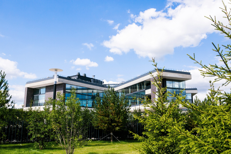
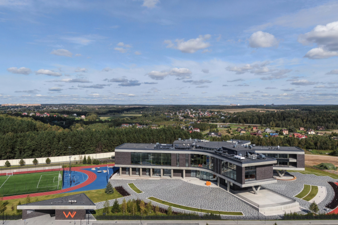
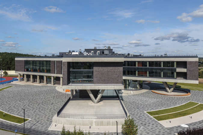
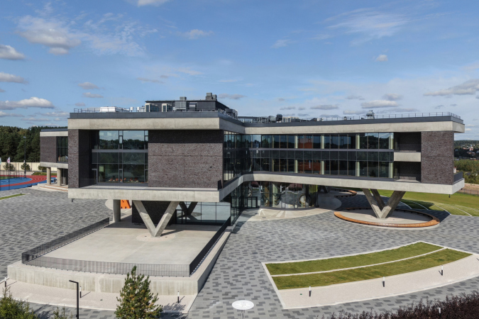
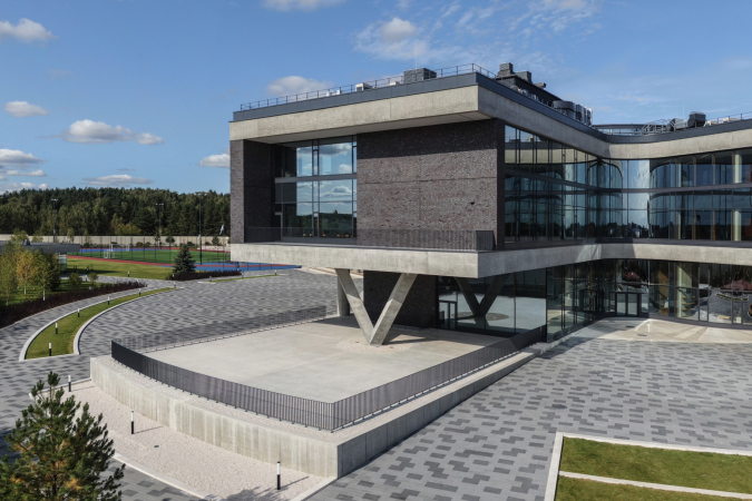
Resonant with the above-mentioned Senezh, Mecanoo – on the one side, typologically, because this is an expensive, and, partially because of this, progressive and high-quality private school that utilizes new trends – is also an educational facility project. On the other hand, one can easily see the similarity of shape: the building also does have a “petal” plan – but we will emphasize that it was designed 3 years before the Senezh project won in the competition. The thing is that a “stellar” plan is arguably considered to be one of the perfect possible options for a school building – it ensures a maximum amount of ambient light for the classrooms.

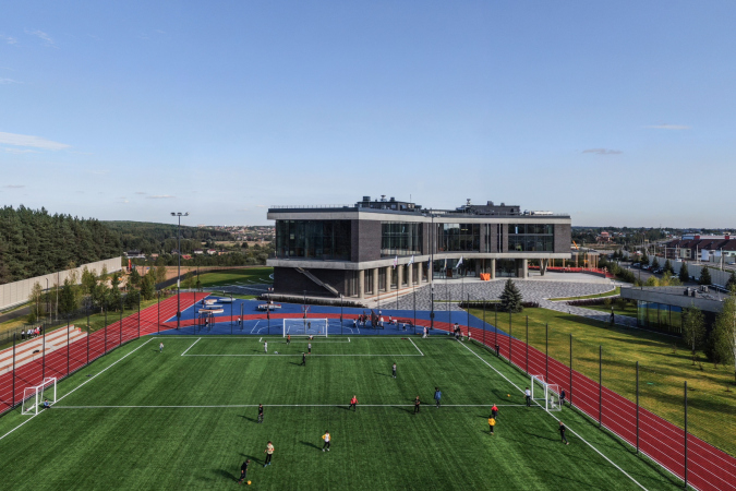
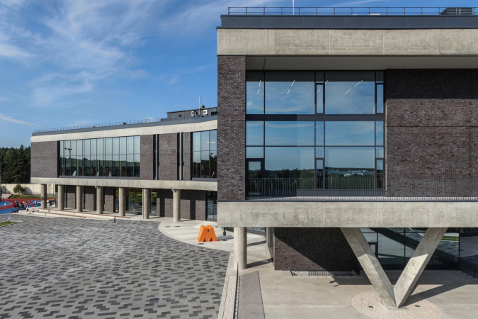
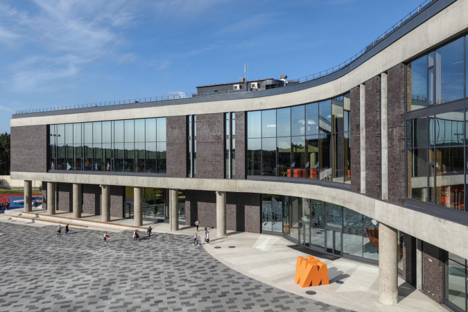
One should hardly say that the building is by no means multicolored – everything is “grown-up-style” here: dark brick, high-quality stained glass windows from floor to ceiling, imposing, yet still graceful, concrete supports. The half–disk of the amphitheater in the central atrium – a necessary accessory of progressive schools – in this case looks like a sculpture, something like a “UFO” that landed on the main school square.

The school has a museum of archaeological finds that were discovered in the process of construction.
  • zooming
    1 / 7
  • zooming
    2 / 7
  • zooming
    3 / 7
  • zooming
    4 / 7
  • zooming
    5 / 7
  • zooming
    6 / 7
  • zooming
    7 / 7

“Five Planets” multifunctional shopping complex

Architect
Totan Kuzembaev
Studio
Yukon Engineering
Totan
Where
Russia
Date
2014 — / — 2019
Function
Commercial and Retail / Shopping and leisure center
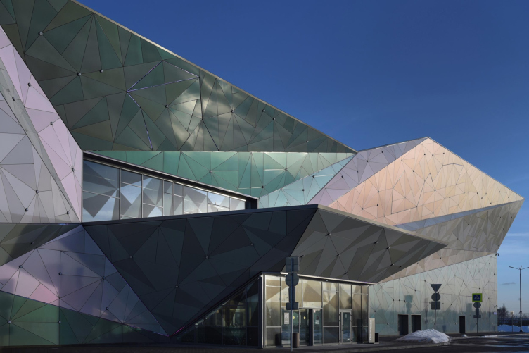
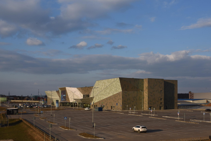
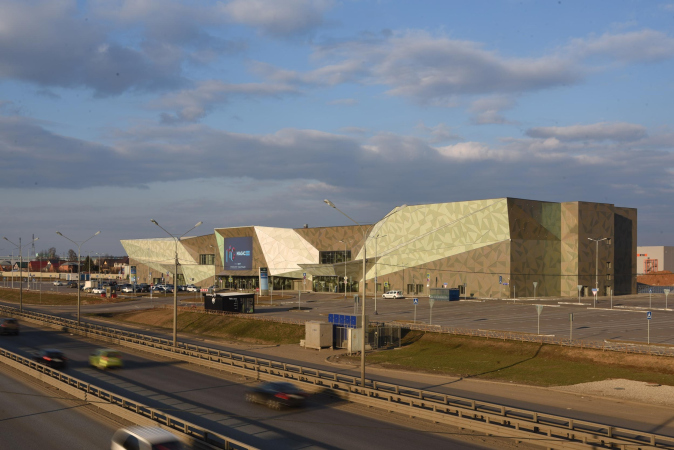
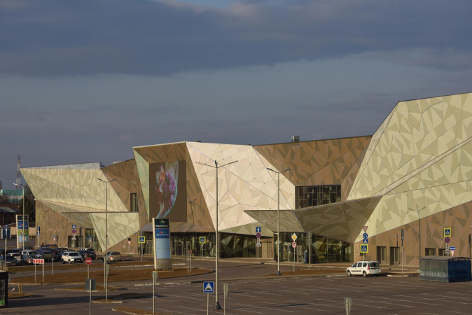
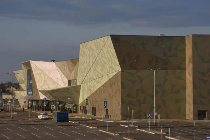
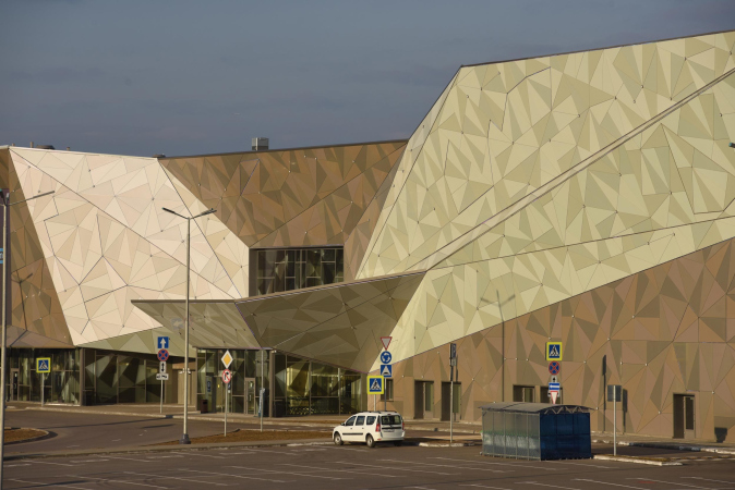
This is the oldest project on the list, designed in 2014 and completed in2019. It was authored by Totan Kuzembaev, the architect of numerous wooden buildings, cottages, and other facilities in the nearby Pirogovo Resort (the much-acclaimed master of wooden – as well as “paper” architecture recently even designed there a standardized wooden individual house). We will say outright that designing shopping malls is not exactly Totan’s specialty – we can make much more sense of his participation in exhibitions or designing the “Dream Mausoleum” at the Arkhstoyanie festival in Nikola-Lenivets. However, it seems that the architect could not help but make an exception for the Klyazma part.

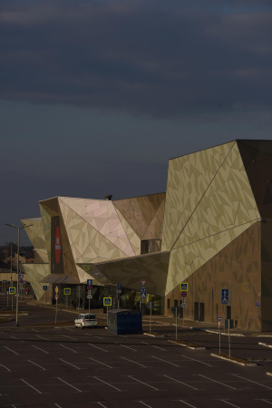
The shopping mall uses the entire potential of its typology – a shopping mall doesn’t really need that many windows, and in turns, particularly on its main facade – into a sculpture of jagged triangular facets with a similar “dragon’s hide” composed of similar metallic triangles. It looks very flashy and very fashionable. We have pretty few such shopping malls around here. We do have some, but they are few and far between.
  • zooming
    1 / 7
  • zooming
    2 / 7
  • zooming
    3 / 7
  • zooming
    4 / 7
  • zooming
    5 / 7
  • zooming
    6 / 7
  • zooming
    7 / 7

“Zoya” Museum

Architect
Dana Matkovskaya
Andrey Adamovitch
Studio
A2M
Where
Russia, Petrishhevo
Date
/ — 2020
Function
Culture / Museum
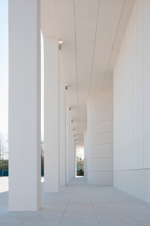
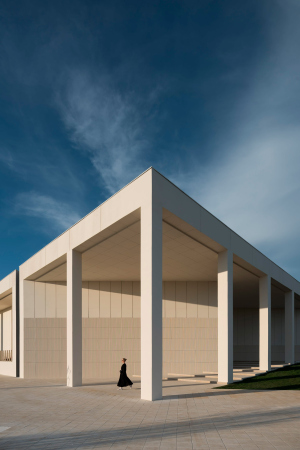
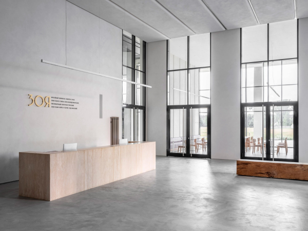
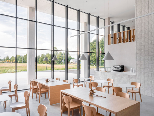
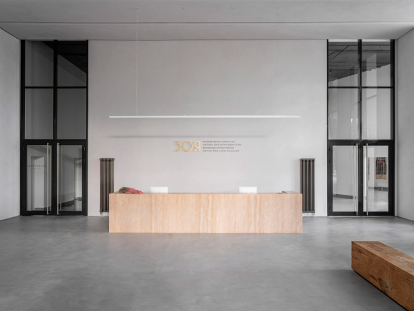
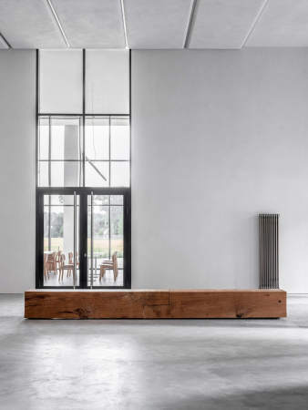
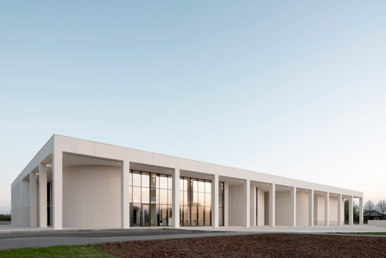
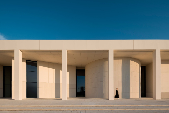
This, on the other hand, is a very fresh narrative. It seems like Zoya is the “loudest” project of all that were implemented in the Moscow region – one that every publication made a point to cover. This military museum is situated on Minsk Highway in the company of many related complexes – that is, related theme-wise, but not in terms of style.

Its thematic function puts the museum in the same row with the numerous Soviet museums of the Second World War, most of which are laconic works of individual modernism. This was the style that was reinterpreted by the authors of Zoya Kosmodemianskaya museum: the building – a light-colored elongated parallelepiped with an array of slender columns and volumetric facade plastique – embodies the ideals rather of the 1980’s than of the 1970’s, yet in the materials characteristic for the 2010’s. Once inside, however, we discover quite a modern approach to organizing the exposition: it is designed rather for emotion than for rational perception and gradual learning.
  • zooming
    1 / 7
  • zooming
    2 / 7
  • zooming
    3 / 7
  • zooming
    4 / 7
  • zooming
    5 / 7
  • zooming
    6 / 7
  • zooming
    7 / 7
The main theater and concert complex of the Moscow Region “Tchaikovsky′s Universe”.
Copyright: © 4izmerenie

The main theater and concert complex of the Moscow region “Tchaikovsky′s Universe”

Where
Russia, Klin
Date
5.2019 — 9.2019 /
Function
Culture / Concert hall
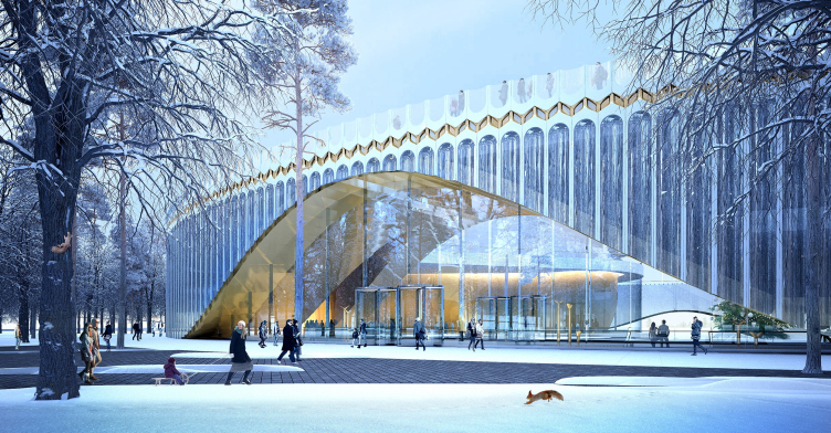
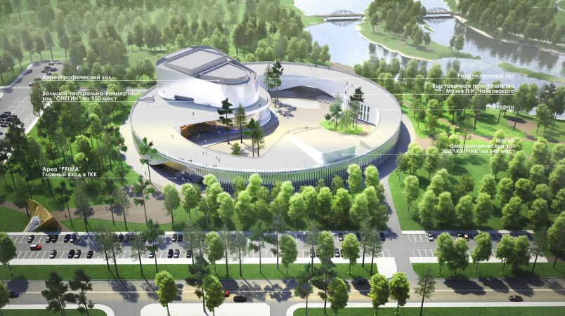
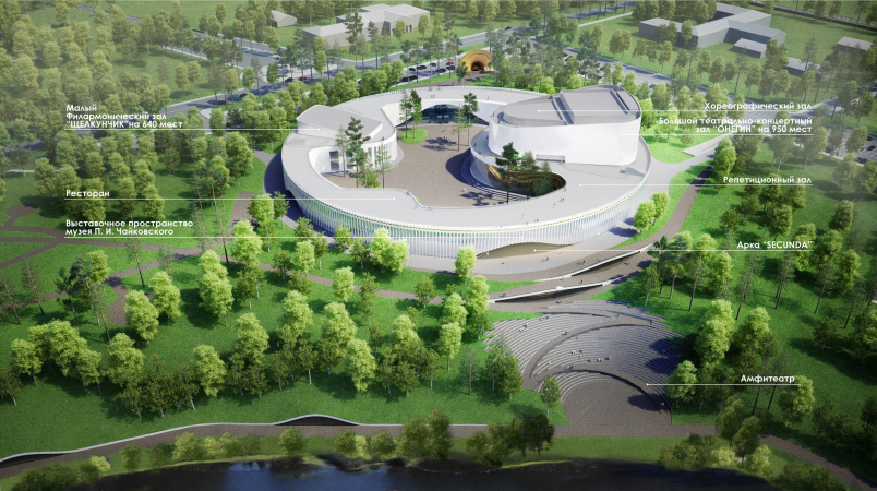
The project of the theater and concert complex of “Tchaikovsky's Universe” won the architectural competition 2019, and since then it has been one of the brightest and largest public projects of the Moscow Region. 

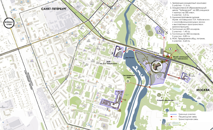
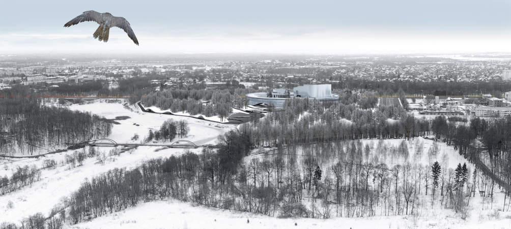
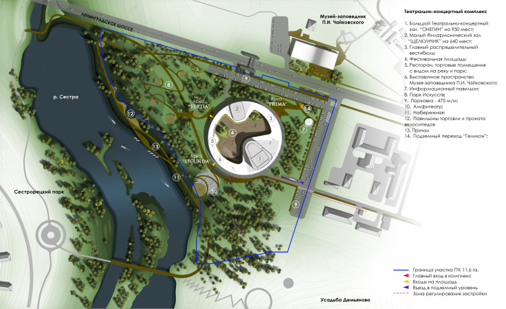
The complex will be built in the town of Klin, across the road from the existing Chaikovsky Museum, on the park on the bank of the Sestra River. We covered it in detail.

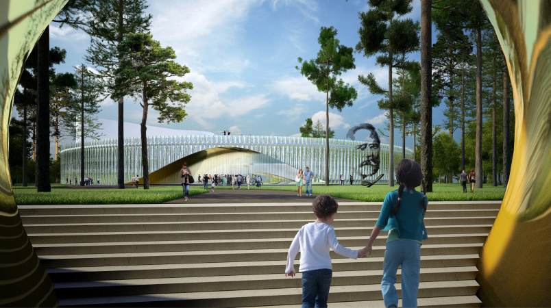
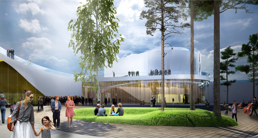
The main building is a giant ring with two concert halls (major and minor), embracing a “plaza” yard. One gets to the plaza by padding underneath wide arches with golden inner surfaces; the silver “flutes” of the outside facade were inspired by the shape of the tuning fork. The arches not just open the entrance to the square; they also shape up the route that leads from the museum towards the park and the river. The project also provides for significant landscaping of the park and the educational function.
  • zooming
    1 / 7
    The main theater and concert complex of the Moscow Region “Tchaikovsky′s Universe”.
    Copyright: © 4izmerenie
  • zooming
    2 / 7
    The main theater and concert complex of the Moscow Region “Tchaikovsky′s Universe”.
    Copyright: © 4izmerenie
  • zooming
    3 / 7
    The main theater and concert complex of the Moscow Region “Tchaikovsky′s Universe”.
    Copyright: © 4izmerenie
  • zooming
    4 / 7
    The main theater and concert complex of the Moscow Region “Tchaikovsky′s Universe”.
    Copyright: © 4izmerenie
  • zooming
    5 / 7
    The main theater and concert complex of the Moscow Region “Tchaikovsky′s Universe”.
    Copyright: © 4izmerenie
  • zooming
    6 / 7
    The main theater and concert complex of the Moscow Region “Tchaikovsky′s Universe”.
    Copyright: © 4izmerenie
  • zooming
    7 / 7
    The main theater and concert complex of the Moscow Region “Tchaikovsky′s Universe”.
    Copyright: © 4izmerenie


05 October 2022

Headlines now
The Golden Crown
The concept for a dental clinic in Yekaterinburg, developed by CNTR Studio, revolves around the idea of a “mouth full of gold”: pristine white porcelain stoneware walls are complemented by matte brass details. To avoid an overly literal interpretation, the architects focused on the building’s proportions, skillfully navigating between sunlight requirements and fire safety regulations.
Flexibility and Integration
Not long ago, we covered the project for the fourth phase of the ÁLIA residential complex, designed by APEX. Now, we’ve been shown different fence concepts they developed to enclose the complex’s private courtyards, incorporating a variety of public functions. We believe that the sheer fact that the complex’s architects were involved in such a detail as fencing speaks volumes.
A Step Forward
The HIDE residential complex represents a major milestone for ADM architects and their leaders Andrey Romanov and Ekaterina Kuznetsova in their quest for a fresh high-rise aesthetic – one that is flexible and layered, capable of bringing vibrancy to mass and silhouette while shaping form. Over recent years, this approach has become ADM’s “signature style”, with the golden HIDE tower playing a pivotal role in its evolution. Here, we delve into the project’s story, explore the details of the complex’s design, and uncover its core essence.
Gold in the Sands
A new office for a transcontinental company specializing in resource extraction and processing has opened in Dubai. Designed by T+T Architects, masters of creating spaces that are contemporary, diverse, flexible, and original, this project exemplifies their expertise. On the executive floor, a massive brass-clad partition dominates, while layered textures of compressed earth create a contextually resonant backdrop.
Layers and Levels of Flight
This project goes way back – Reserve Union won this architectural competition at the end of 2011, and the building was completed in 2018, so it’s practically “archival”. However, despite being relatively unknown, the building can hardly be considered “dated” and remains a prime example of architectural expression, particularly in the headquarters genre. And it’s especially fitting for an aviation company office. In some ways, it resembles the Aeroflot headquarters at Sheremetyevo but with its own unique identity, following the signature style of Vladimir Plotkin. In this article, we take an in-depth look at the United Aircraft Corporation (UAC) headquarters in the Moscow agglomeration town of Zhukovsky, supplemented by recent photographs from Alexey Naroditsky – a shoot that became only recently possible due to the fact that improvements were finally made in the surrounding area.
Light and Shadow
In this article, we delve into the architectural design of the “Chaika” house by DNK ag architects, which was recently completed in 2023 as part of the collection of signature designs at ZILArt. As is well-known, all the buildings in this complex follow a design code, yet each one is distinct. This particular building stands out not only for its whiteness and minimalism but also for the refined use of a limited number of techniques that, together, create what can confidently be called synergy.
Casus Novae
A master plan was developed for a large residential area with a name of “DNS City”, but now that its implementation began, the plan has been arbitrarily reformatted and replaced with something that, while similar on the surface, is actually quite different. This is not the first time such a thing happens, but it’s always frustrating. With permission from the author, we are sharing Maria Elkina’s post.
Treasure Hunting
The GAFA bureau, in collaboration with Tegola and Arkhitail, organized an expedition to the island of Kilpola in Karelia as part of Moskomarkhitektura’s “Open City” festival. There, amidst moss and rocks, the students sought answers to questions like: what is the sacred, where does it dwell, and what sustains it? Assisting the participants in this quest were landscape engineer Evgeny Levin, artist Nicholas Roerich, a moose, and the lack of cellular connection. Here’s how the story unfolded.
Depths of the Earth, Streams of Water
In the Malaya Okhta district, the Akzent building, designed by Stepan Liphart, was constructed. It follows a classic tripartite structure, yet it’s what you might call “hand-drawn”: each façade is unique in its form and details, some of which aren’t immediately noticeable. In this article, we explore the context and, together with the architect, delve into how the form was developed.
Fir Tree Dynamics
The “Airports of Region” holding is planning to build an airport in Karachay-Cherkessia, aiming to make the Arkhyz and Dombay resorts more accessible to travelers. The project that won in an invitation-only competition, submitted by Sergey Nikeshkin’s KPLN, blends natural imagery inspired by the shape of a conifer seed, open-air waiting spaces, majestic large trees, and a green roof elevated on needle-like columns. The result is both nature-inspired and WOW.
​A Brick Shell
In the process of designing a clubhouse situated among pine trees in a prestigious suburban area near Moscow, the architectural firm “A.Len” did the façade design part. The combination of different types of brick and masonry correlates with the volumetric and plastique solutions, further enhanced by the inclusion of wood-painted fragments and metal “glazing”.
Word Forms
ATRIUM architects love ambitious challenges, and for the firm’s thirtieth anniversary, they boldly play a game of words with an exhibition that dives deep into a self-created vocabulary. They immerse their projects – especially art installations – into this glossary, as if plunging into a current of their own. You feel as if you’re flowing through the veins of pure art, immersed in a universe of vertical cities, educational spaces – of which the architects are true masters – and the cultural codes of various locations. But what truly captivates is the bold statement that Vera Butko and Anton Nadtochy make, both through their work and this exhibition: architecture, above all, is art – the art of working with form and space.
Flexibility and Acuteness of Modernity
Luxurious, fluid, large “kokoshniks” and spiral barrel columns, as if made from colorful chewing gum: there seem to be no other mansion like this in Moscow, designed in the “Neo-Russian-Modern” style. And the “Teremok” on Malaya Kaluzhskaya, previously somewhat obscure, has “come alive with new colors” and gained visibility after its restoration for the office of the “architectural ecosystem” as the architects love to call themselves. It’s evident that Julius Borisov and the architects at UNK put their hearts into finding this new office and bringing it up to date. Let’s delve into the paradoxes of this mansion’s history and its plasticity. Spoiler: two versions of modernity meet here, both balancing on the razor’s edge of “what’s current”.
Yuri Vissarionov: “A modular house does not belong to the land”
It belongs to space, or to the air... It turns out that 3D printing is more effective when combined with a modular approach: the house is built in a workshop and then adapted to the site, including on uneven terrain. Yuri Vissarionov shares his latest experience in designing tourist complexes, both in central Russia and in the south. These include houseboats, homes printed from lightweight concrete using a 3D printer, and, of course, frame houses.
​Moscow’s First
“The quality of education largely depends on the quality of the educational environment”. This principle of the last decade has been realized by Sergey Skuratov in the project for the First Moscow Gymnasium on Rostovskaya Embankment in the Khamovniki district. The building seamlessly integrates into the complex urban landscape, responding both to the pedestrian flow of the city and the quiet alleyways. It skillfully takes advantage of the height differences and aligns with modern trends in educational space design. Let’s take a closer look.
Looking at the Water
The site of Villa Sonata stretches from the road to the water’s edge, offering its own shoreline, pier, and a picturesque river panorama. To reveal these sweeping views, Roman Leonidov “cut” the façade diagonally parallel to the river, thus getting two main axes for the house and, consequently, “two heads”. The internal core – two double-height spaces, a living room and a conservatory, with a “bridge” above them – makes the house both “transparent” and filled with light.
The White Wing
Well, it’s not exactly white. It’s more of a beige, white-stone structure that plays with the color of limestone – smoother surfaces are lighter, while rougher ones are darker. This wing unites various elements: it absorbs and interprets the surrounding themes. It responds to everything, yet maintains a cohesive expression – a challenging task! – while also incorporating recognizable features of its own, such as the dynamic cuts at the bottom, top, and middle.
Urban Dunes
The XSA Ramps team designed and built a three-part sports hub for a park in Rostov-on-Don, welcoming people of all ages and fitness levels. The skate plaza, pump track, and playground are all meticulously crafted with details that attract a diverse range of visitors. The technical execution of the shapes and slopes transforms this space into a kind of sculptural composition.
Proportional Growth
The project for the fourth phase of the ÁLIA residential area has been announced. The buildings are situated on an elongated plot – almost a “ray” that shoots out from the center of the area towards the river. Their layout reflects both a response to Moscow’s architectural preferences over the past 15 years, shifting “from blocks to towers”, and an interpretation of the neighboring business park designed by SOM. Additionally, the best apartments here are not located at the very top but closer to the middle, forming a glowing “waistline”.
The “Staircase” Building
In designing the “Details” residential complex in New Moscow, Rais Baishev spiced up the now-popular Moscow theme of a “courtyard” building with an idea drawn from the surrealist drawings by Maurits Escher. He envisioned the stepped silhouettes and descending slopes as a metaphysical mega-staircase, creating a key void within the courtyard that gave the project an internal “spine”. This concept is felt both in the building’s silhouette and on its façades.
Projection of the Quarter
No one doubted that the building that Vladimir Plotkin designed as part of the “Garden Quarters” would be the most modernist of all. And it turned out just that way: while adhering to the common design code, the building successfully combines brick and white stone, rhythmically responding to the neighboring building designed by Ostozhenka, yet tactfully and persistently making a few statements of its own. This includes the projection of the ideal urban development composition “14–9–6”, which can be found right next door, mathematical calculations, including those for various types of terraces (and perhaps the only reminder of the Soviet past of the Kauchuk rubber factory!), and the white “cross-stitch” pattern of the façade grid.
Domus Aurea
In this issue, we examine the “Tessinsky-1” house, designed by Sergey Skuratov and completed in 2023. Located in the middle of the Serebryanicheskaya Embankment district, at the intersection of its main streets, this house assumes a sort of “nodal” role: it not only responds to everything around it and preserves many memories of the former EMA factory within itself, but it weaves all this into a newly directed pattern, reconciling bright “gold” and dark-colored brick, largely with the help of the new, modern-yet-archaic Columba brick, which, come to think about it, is the most precious element here.
The Chimney of Nikola-Lenivets
In this issue, we are examining the “Obelisk House” designed by KATARSIS and built for the Arkhstoyanie 2023 festival. However, it was only finished later on, and this is why we are examining it now. It seems to us that after the “Obelisk House” appeared in Nikola-Lenivets, a dialogue and a few inner connections appeared between the temporary structures built here. These houses no longer look like “accidental neighbors”, more of which below.
​Periscope by the Bay
The jury awarded the second place in the competition for a public and cultural center in Petropavlovsk-Kamchatsky to the companies GORA (“Mountain”) and M4. In the consortium’s proposal, the building resembles a sperm whale with a calf swimming next to it or a periscope, whose lenses capture the most spectacular views from the surrounding landscape.
From Arcs to Dolmens
While working on the competition project for Petropavlovsk-Kamchatsky, ASADOV Architects prioritized the value of the natural and urban environment, aiming to preserve the balance of the location while minimizing the resemblance of the volume that they designed to a “traditional building”. The task was challenging, and the architects created three versions, one of which having been developed after the competition, where their main proposal took third place. However, the point of interest here is not the competition result but the continuity of creative thinking.
Hide and Seek
The ID Moskovskiy house, designed by Stepan Liphart in St. Petersburg, in the courtyards near Moskovskiy Avenue beyond the Obvodny Canal and recently completed, is notable for several reasons. Firstly, it has been realized with considerable accuracy, which is particularly significant as this is the first building where the architect was responsible not only for the facades but also for the layouts, allowing for better integration between the two. On the other hand, this building is interesting as an example of the “germination” of new architecture in the city: it draws on the best examples from the neighborhood and becomes an improved and developed sum of ideas found by the architect in the surrounding context.
The Big Twelve
Yesterday, the winners of the Moscow Mayor’s Architecture Award were announced and honored. Let’s take a look at what was awarded and, in some cases, even critique this esteemed award. After all, there is always room for improvement, right?
Above the Golden Horn
The residential complex “Philosophy” designed by T+T architects in Vladivostok, is one of the new projects in the “Golubinaya Pad” area, changing its development philosophy (pun intended) from single houses to a comprehensive approach. The buildings are organized along public streets, varying in height and format, with one house even executed in gallery typology, featuring a cantilever leaning on an art object.
Nuanced Alternative
How can you rhyme a square and space? Easily! But to do so, you need to rhyme everything you can possibly think of: weave everything together, like in a tensegrity structure, and find your own optics too. The new exhibition at GES-2 does just that, offering its visitor a new perspective on the history of art spanning 150 years, infused with the hope for endless multiplicity of worlds and art histories. Read on to see how this is achieved and how the exhibition design by Evgeny Ace contributes to it.
Blinds for Ice
An ice arena has been constructed in Domodedovo based on a project by Yuri Vissarionov Architects. To prevent the long façade, a technical requirement for winter sports facilities, from appearing monotonous, the architects proposed the use of suspended structures with multidirectional slats. This design protects the ice from direct sunlight while giving the wall texture and detail.