По-русски

The Contemplator

There is a house in one of the Moscow area villa communities that is strikingly different from its neighbors; the architects lovingly call this house a “spring”, and for a good reason: it is indeed “coiled” and “twisted” in such an interesting volumetric knot that it is fun to be both inside and outside of it.

23 May 2019
Object
mainImg

The house with a total area of about 1200 square meters is situated in a township not far away from Moscow, on a small 0.26-hectare land site with a height difference about 4.5 meters from north to south. All around it, on similar small land plots, stand the private residences that are a habitual sight for the Moscow area – two or three stories high, large and expensive looking, placed rather close to one another: a house, a small land plot around it, a fence, and so on.

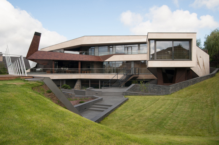
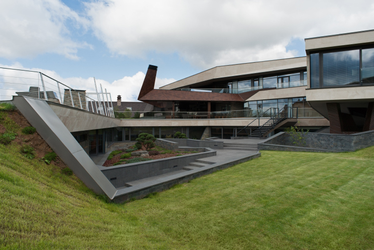
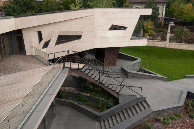
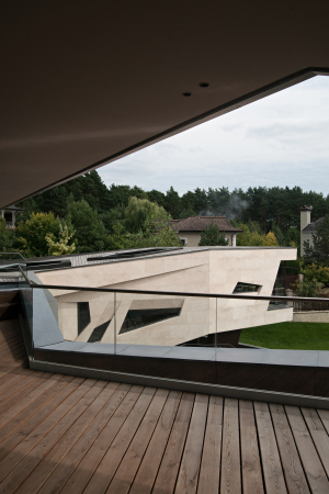
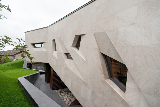
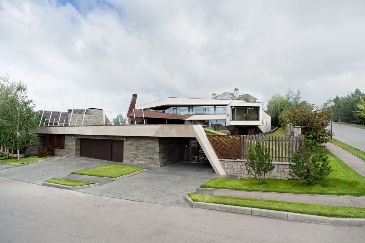
This villa, carefully designed and built by Levon Airapetov and Valeria Preobrazhenskaya, is radically different from all of its neighbors. To me, the house seems to look like a lizard lying down on a slope around a small yard with its tail stretching along the entrance, its side buried in the north slope, and its head slightly raised on short paws, enjoying the scenery – beyond the border of the land site, the slop goes down still lower, while in the perspective, on the opposite hill, a church is peeking from behind the trees.

The “Spring” house
Copyright: Photograph © Gleb Leonov | TOTEMENT/PAPER
The “Spring” house
Copyright: Photograph © Gleb Leonov | TOTEMENT/PAPER


There are two main things that set this building apart from its neighbors: first of all, the last thing it does is “stick out” towering above its neighbors – on the contrary, it “prowls” on the ground, without obscuring any views. The architects are sharing that getting the neighbors’ approvals for the proportions of the villa had a serious impact on the entire project – they ultimately had to diminish the height of the top third floor, which in the original version towered above the second tier on a glass “neck” like yet another “head” – the “neck” was removed, and the third floor dropped down on top of the second, which made the house cling to the ground still more, even though that was not the original idea. But then again, I would say that this doesn’t make things any worse: this being at one with the landscape, and “growing up from the slope” is one of the immanent qualities of this project, and now it is better emphasized; in addition, the house used to have two heads, and now, thank God, only one. But then again, it has several hearts, but we’ll get to it later on.


The second difference from the neighbors is emphasized by Levon Airapetov as the main one. Instead of standing in the middle of the land plot (which would have been the obvious choice), the house groups itself around an inner yard, stretching along the borders, even if stepping back the necessary few meters from the edge. Essentially, this is the principle of the Ancient Roman villa – the impluvium and atrium on the inside, surrounded by residential and other premises. However, Levon Airapetov, an architect who is very much into Far East culture, gives an example of a Japanese building that is organized in a similar way – around the yard. We will not contradict the author in this case – OK, let it be an oriental dragon instead of a lizard. This creature is dangerous, with a personality of its own, but when at rest, the motion not kinetic but only potential, coiled inside and ready to unwind – the TOTEMENT architects are emphasizing this image, likening their project to a spring. Meanwhile, as is often the case with architecture, the potential motion develops into a real wealth of perception as one starts moving around the house. The house is coiled in such a way that the impressions are constantly shifting, uncovering various space narratives and viewing angles – upwards and sideways. “You will have a hard time moving from such house to a city flat – Valeria Preobrazhenskaya says – It’s got so much space about it, both on the outside and in terms of inner perspectives”.

The “Spring” house
Copyright: Photograph © Gleb Leonov | TOTEMENT/PAPER


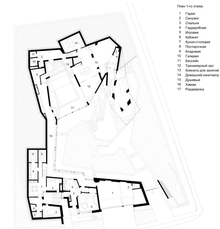
So! The entrance to the house and the driving entrance to the garage are situated on the south side. Here, along the street, from east to west, the slope is gradually getting higher – a green roof stretches over the fence door, the garage gate, and further on to the west – over the staff rooms, where there is a small covered recreation yard organized amidst the bedrooms. Between these premises and the garage entrance there is a small classroom; it can be accessed both from the inside and directly from the outside.

The “Spring” house. Plan of the 1st floor
Copyright: Photograph © Gleb Leonov | TOTEMENT/PAPER


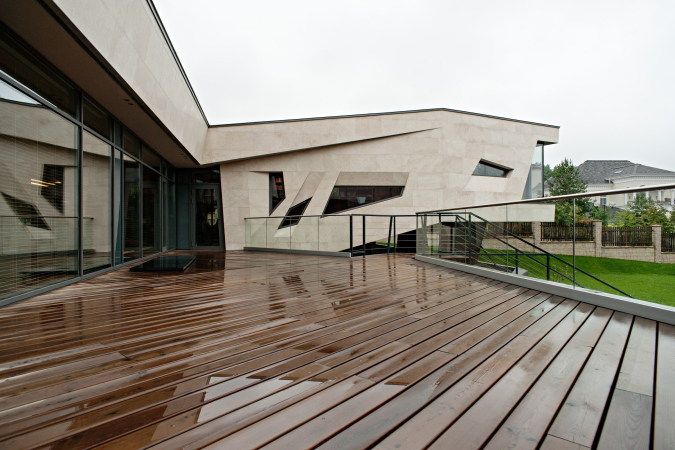
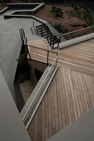
On the roof of the entrance group, there is an open-air sports field, and there is an open overpass leading to the second-floor terrace with a barbecue spot. In the eastern part, where the “tail” gradually comes to naught, the fence starts – originally, it was conceived in the spirit of the house as being diagonal and openwork, yet what survived from this idea is only a small fragment – the lath fence with small pillars in the remaining part falls in with the general rules of the township.

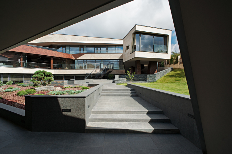
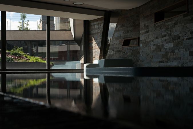
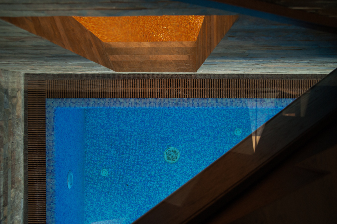
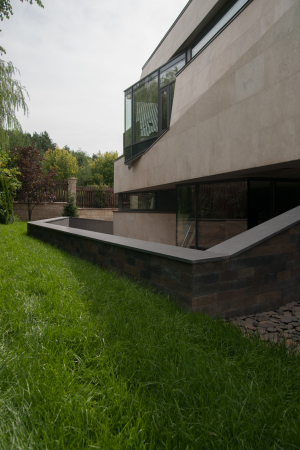
The “tail” protects the inner yard from the street glances – on the east side it is also fenced off with a small bund wall and therefore is 100% private. Passing through the little entrance door, we find ourselves in the yard, and then, descending a few stairs, to the swimming pool. The yard and the pool became the two centers, two nuclei of the house, divided and at the same time connected by lintel of a glass wall.

The “Spring” house
Copyright: Photograph © Gleb Leonov | TOTEMENT/PAPER


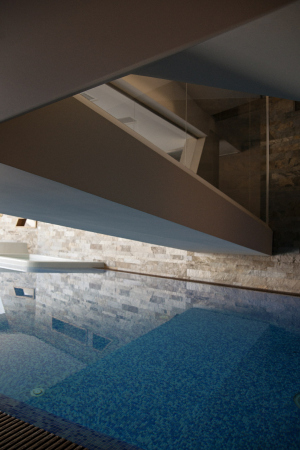
Due to the fact that Russia is generally a cold country, the path that runs through the yard, as well as the overpass, are chiefly meant to be used in the summertime; from the garage, the main entrance leads to the left, down the yard and along the gallery, whose right wall is made of glass, overlooking the yard, further on, there is a stone wall with loopholes overlooking the swimming pool, then we turn right and find ourselves standing on a bridge thrown over the (due to the fact that the pool is actually a “wet” zone, it is cornered with glass, but without any joints, and all the views are visible).

  • zooming
    1 / 6
    The “Spring” house: the overpass from the entrance zone to the house and the swimming pool
    Copyright: Photograph © Gleb Leonov | TOTEMENT/PAPER
  • zooming
    2 / 6
    The “Spring” house: the swimming pool
    Copyright: Photograph © Gleb Leonov | TOTEMENT/PAPER
  • zooming
    3 / 6
    The “Spring” house: the terrace of the third floor, the roof of the library, the skylights
    Copyright: Photograph © Gleb Leonov | TOTEMENT/PAPER
  • zooming
    4 / 6
    The “Spring” house: exit from the first floor to the yard
    Copyright: Photograph © Gleb Leonov | TOTEMENT/PAPER
  • zooming
    5 / 6
    The “Spring” house: view of the swimming pool and sauna from the overpass
    Copyright: Photograph © Gleb Leonov | TOTEMENT/PAPER
  • zooming
    6 / 6
    The “Spring” house: the skylights. Three levels
    Copyright: Photograph © Gleb Leonov | TOTEMENT/PAPER


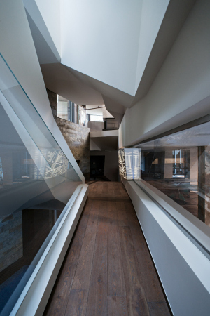
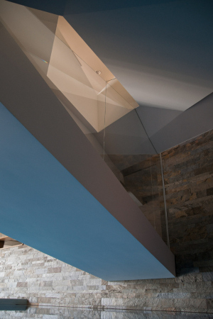
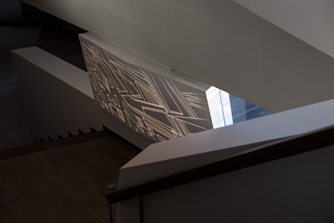
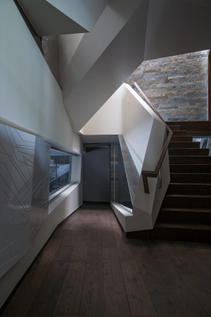
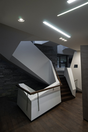
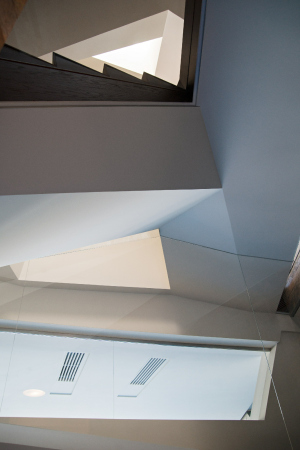
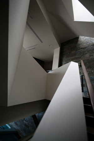
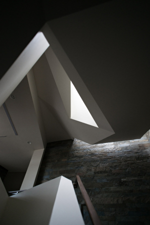
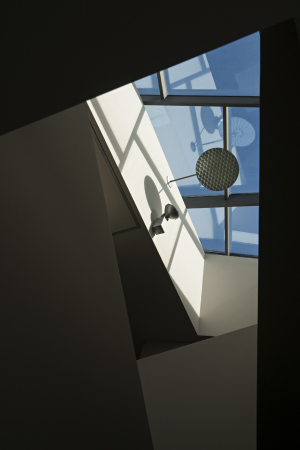
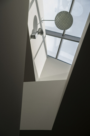
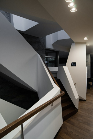
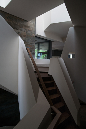
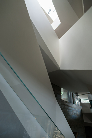
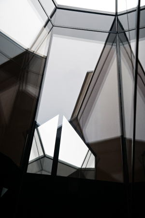
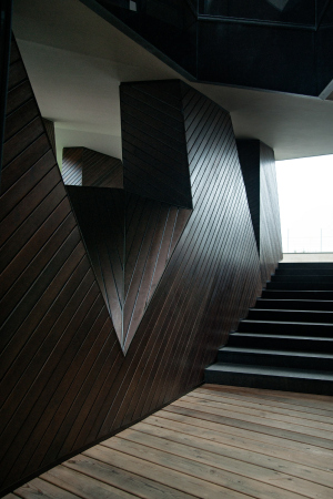
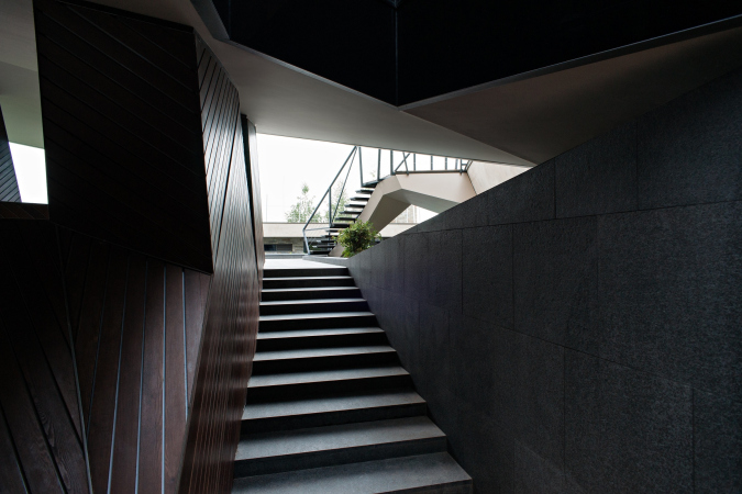
Anyway, the bridge passes over the swimming pool, and soon behind it the main staircase starts that connects the three floors: a spacious billiard room down below, the public second floor, and the private third. The staircase – a white spiral, marked by jagged slanting planes – is crowned by a glass lamplight that encases it into a column of light, a softly glowing “core” of the entire building. It is here that we see the beginning of the potential motion – between the swimming pool and the glass of the lamplight, where the conceptual communication nucleus is coiled like a spring and is hung between the water and the sky. Emphasizing the importance of this place – the crossroads between the longitudinal horizontal path and the vertical axis – the architects placed at the foot of the staircase a semblance of a “cornerstone” made of glowing Corian with a pattern of large-stroke diagonals and zigzags that symbolize the complexity of the space of the house. Levon Airapetov himself calls this the “heart” of the house, even though he at once corrects himself by saying that this house, obviously, has more than just one.

  • zooming
    1 / 9
    The “Spring” house: the ornamental panel, the nucleus of the house
    Copyright: Photograph © Gleb Leonov | TOTEMENT/PAPER
  • zooming
    2 / 9
    The “Spring” house: the overpass, the foot of the staircase
    Copyright: Photograph © Gleb Leonov | TOTEMENT/PAPER
  • zooming
    3 / 9
    The “Spring” house: the staircase
    Copyright: Photograph © Gleb Leonov | TOTEMENT/PAPER
  • zooming
    4 / 9
    The “Spring” house: the staircase
    Copyright: Photograph © Gleb Leonov | TOTEMENT/PAPER
  • zooming
    5 / 9
    The “Spring” house: the east facade. The library windows
    Copyright: Photograph © Gleb Leonov | TOTEMENT/PAPER
  • zooming
    6 / 9
    The “Spring” house: the west facade. The wall of the summer kitchen and the terrace with a fireplace
    Copyright: Photograph © Gleb Leonov | TOTEMENT/PAPER
  • zooming
    7 / 9
    The “Spring” house: the lamplight above the staircase
    Copyright: Photograph © Gleb Leonov | TOTEMENT/PAPER
  • zooming
    8 / 9
    The “Spring” house: the lamplight above the staircase
    Copyright: Photograph © Gleb Leonov | TOTEMENT/PAPER
  • zooming
    9 / 9
    The “Spring” house: the lamplight above the staircase
    Copyright: Photograph © Gleb Leonov | TOTEMENT/PAPER


However, it’s not just about the structure of the motion. Placing a swimming pool INSIDE of a house, making the entrance route run literally through it, by the bridge and over the water is a really unconventional approach by the standards of a modern house: nowadays, in the overwhelming majority of the projects, the architects place the “wet zone” of the spa somewhere in the far corner of the land site. In our instance, however, in addition to the emotional meaning of changing of impressions and the unexpected nature of the architectural solution, there is also a typological story. While Levon Airapetov himself refers his creation to the Far East tradition, it still seems to me that the architects were able, for some reason, to revive the ancient typology of the European villa, and first of all, of the Ancient Roman domus organized around the impluvium, a yard with a pool for collecting rainwater. This project is, of course, not that simple and straightforward: the swimming pool here is rather the piscina because it has nothing to do with collecting rainwater. And the staircase that “intrudes” into the system of the “pool” yard (due to the fact that it springs up immediately behind the bridge) is more reminiscent of the European palace (or its “younger brother”, the city hotel), which, starting from the Gothic epoch or even earlier, would be designed and built around the yard, with one of its corners boasting a spiral staircase, usually very beautiful. Mind, I am not speaking here about verbatim replication or any revival of the pre-classic house typology, Roman or Gothic – rather, I am speaking about the fact that through the creative impulse of TOTEMENT “grows through” a certain house pattern, just like antiquity shows through in Brodsky’s poetry – structurally, without any deliberate stylization, even though not without a fair share of nostalgia for the strong visions from the other side.

Back to the staircase, though! Not only does it provide access to all of the floors, but it also sports a few extra inclusions: between the first and the second floor, there is a small sofa; next to it, there is a small window cut through in the partition; a little further on (on the second floor), there is a bay window with a sofa of a slightly bigger size, which essentially is already part of the living room.

  • zooming
    1 / 3
    The “Spring” house: the staircase and the “pause” landing
    Copyright: Photograph © Gleb Leonov | TOTEMENT/PAPER
  • zooming
    2 / 3
    The “Spring” house: the staircase and the “pause” landing
    Copyright: Photograph © Gleb Leonov | TOTEMENT/PAPER
  • zooming
    3 / 3
    The “Spring” house: the staircase and the “pause” landing
    Copyright: Photograph © Gleb Leonov | TOTEMENT/PAPER


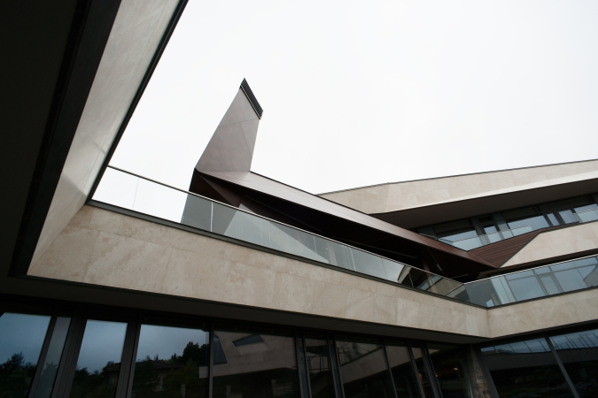
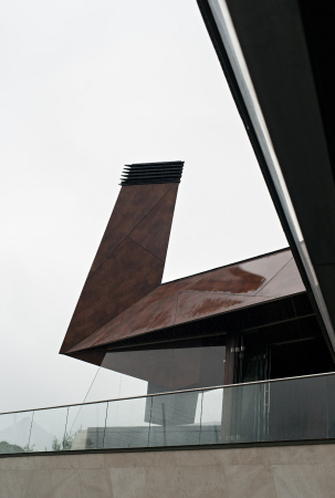
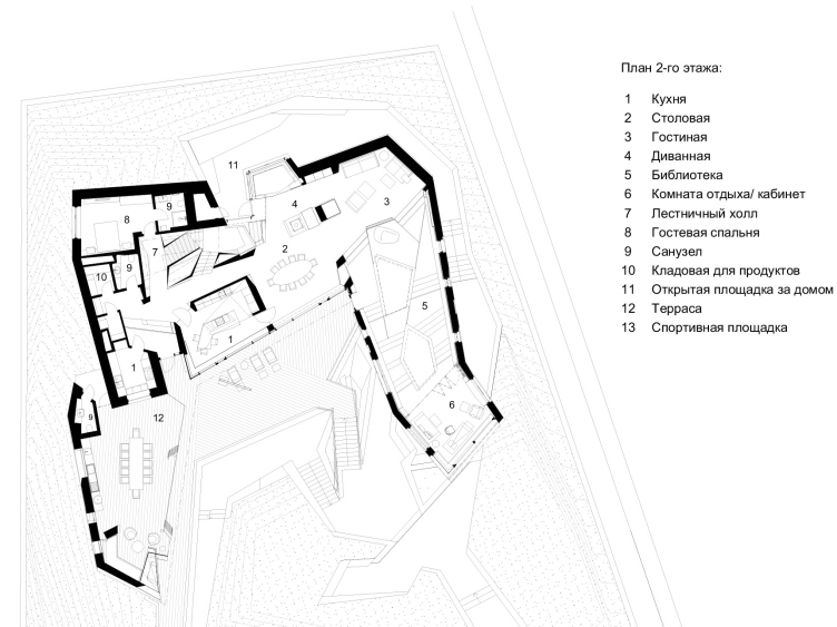
The second floor is divided roughly in half into a living room and a summer kitchen with an open air barbecue spot, whose large chimney, covered in brownish “copper” FunderMax façade panels, is plainly visible from the yard and bleeds into the awning of a large terrace.

  • zooming
    1 / 3
    The “Spring” house: the terrace of the second floor
    Copyright: Photograph © Gleb Leonov | TOTEMENT/PAPER
  • zooming
    2 / 3
    The “Spring” house: the chnimney ofthe outdoor fireplace
    Copyright: Photograph © Gleb Leonov | TOTEMENT/PAPER
  • zooming
    3 / 3
    The “Spring” house: view of the overpass from the library
    Copyright: Photograph © Gleb Leonov | TOTEMENT/PAPER


In the center of this floor there is a kitchen – the second nucleus of the house after the staircase. In the northwest corner, there is a guest bedroom, a spacious winter living room with yet another fireplace and an aquarium next to it occupying the entire eastern part of the second floor. The second floor is a public one, i.e. designed for socialization; it is essentially yet another version of an open space, parts of which bleed into one another, being not divided but tactfully zoned. It is visually permeable to the sunlight as well: from south (where the panoramic glass of the terrace is) to north (where the aforementioned bay window is with a davenport stretching along the glass).

The “Spring” house. Plan of the 2nd floor
Copyright: Photograph © Gleb Leonov | TOTEMENT/PAPER


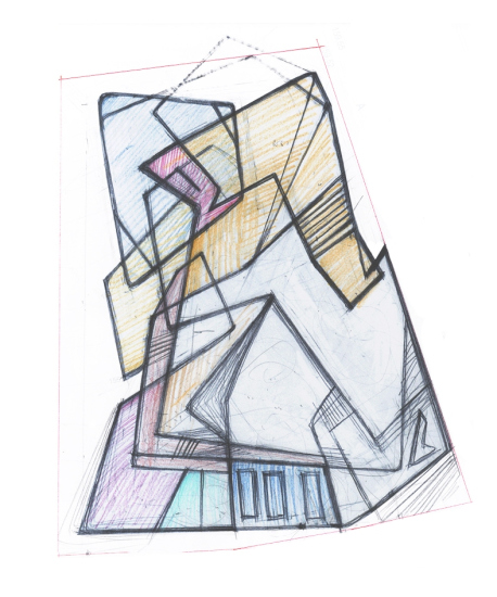
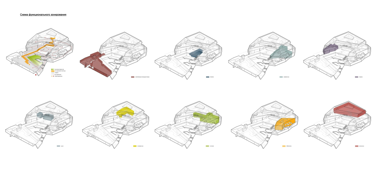
The permeability of the house for the gaze directed outside from within, as well as for the rays of sunlight is something that was crucially important for the architects – they even drew quite clear schemes demonstrating the interaction of these rays, and the jigsaw puzzle of all the rooms of the house. There are great views opening up both upwards and sideways, so there is very little chance of getting claustrophobic here.

  • zooming
    The “Spring” house: A sketch plan of the hub and the spaces
    Copyright: Photograph © Gleb Leonov | TOTEMENT/PAPER
  • zooming
    The “Spring” house: the functional plan
    Copyright: Photograph © Gleb Leonov | TOTEMENT/PAPER


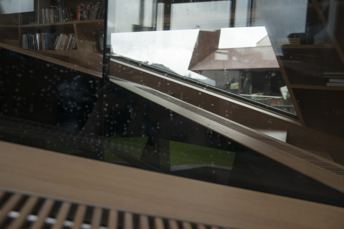
Here, in the east part of the winter living room, starts the path to the library and the master’s study – the “head” set on a long neck, turned with its side end stained glass to the panorama with the church. The library is organized as a broad corridor; it grows slightly narrower and ascends southward with a few flights of flat stairs of wooden floor. All of the walls are occupied by bookshelves, the contours of the windows being inscribed into their sophisticated diagonal pattern.

  • zooming
    1 / 9
    The “Spring” house. The volume of the library
    Copyright: Photograph © Gleb Leonov | TOTEMENT/PAPER
  • zooming
    2 / 9
    The “Spring” house: view of the library from the summer fireplace
    Copyright: Photograph © Gleb Leonov | TOTEMENT/PAPER
  • zooming
    3 / 9
    The “Spring” house: the library, skylights
    Copyright: Photograph © Gleb Leonov | TOTEMENT/PAPER
  • zooming
    4 / 9
    The “Spring” house: view of the library from the terrace on the third floor
    Copyright: Photograph © Gleb Leonov | TOTEMENT/PAPER
  • zooming
    5 / 9
    The “Spring” house: the library
    Copyright: Photograph © Gleb Leonov | TOTEMENT/PAPER
  • zooming
    6 / 9
    The “Spring” house: the library, the skylights
    Copyright: Photograph © Gleb Leonov | TOTEMENT/PAPER
  • zooming
    7 / 9
    The “Spring” house: view of the skylight from the top
    Copyright: Photograph © Gleb Leonov | TOTEMENT/PAPER
  • zooming
    8 / 9
    The “Spring” house: the library, the skylights
    Copyright: Photograph © Gleb Leonov | TOTEMENT/PAPER
  • zooming
    9 / 9
    The “Spring” house: the library, the skylights
    Copyright: Photograph © Gleb Leonov | TOTEMENT/PAPER


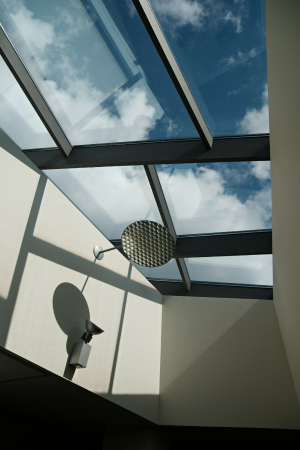
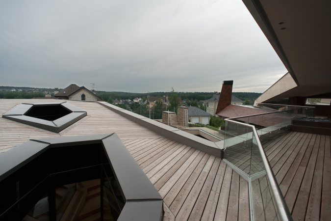
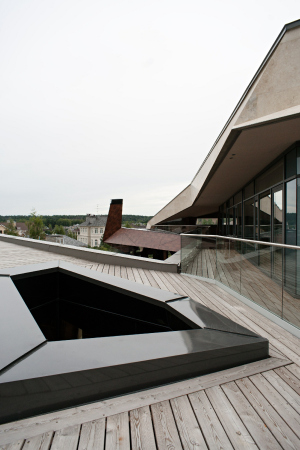
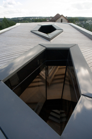
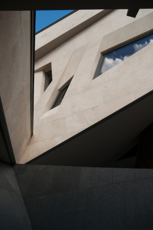
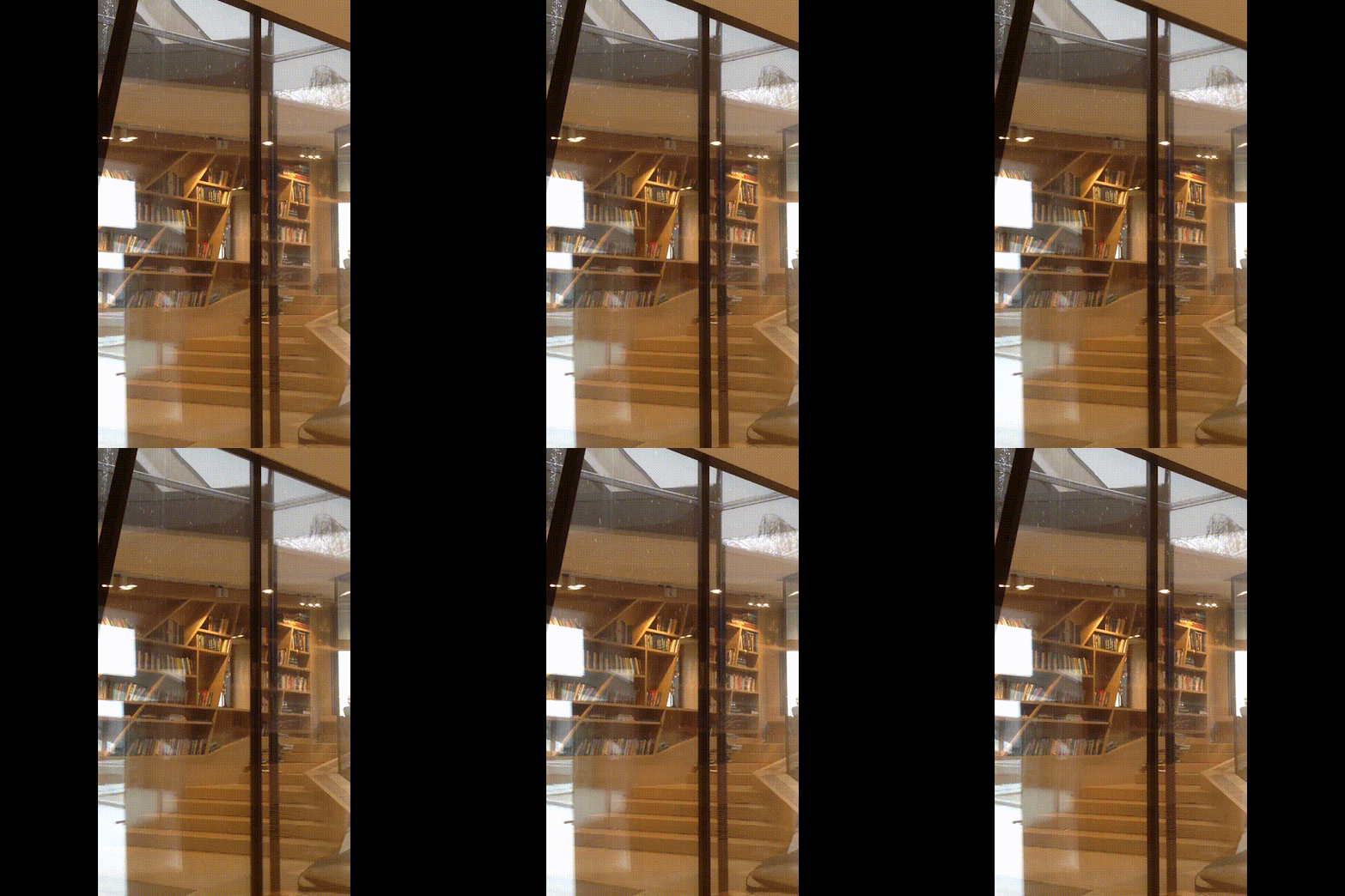
“You can take a book off the shelf, sit down anywhere you choose to, for example, on the stair by the window, and start reading it” – the architects say. However, that’s not all there is to it. This “corridor” library is pierced by two glass wells – two “glasses” completely open at the top and bottom, and completely closed from the library. Sitting on the stairs, one can also watch snow or rain through these transparent “caverns”.
zooming


Looking at these “glasses”, you again involuntarily start thinking about the antique campluvium: an open roof, through which rainwater would come pouring in. Here you can also remember about a small school with an entrance from the outside: what else can it be if not a taberna? And as for the corridor of the library – is it not the wooden Roman gallery, aka tablinum? The only significant difference is that the atrium, which is supposed to be spreading around the hearth, got “split” into two spaces – next to the summer and the winter fireplaces... But then again, I will repeat myself here, all of these associations are rather conditional, and you can just as well see parallels here not only with a Roman but with any other European home (yes, a big one, too, but 1200 square meters is just the perfect size for comparison). Rather, one wants to emphasize that specialized elements of space in this house are much more numerous than in a regular modern one, however large.

Just as the vertical axis of the staircase, the space of the library is the most intriguing in this house and full of emotion. The concrete pillars that support the library can be seen through the skylights; on the level of the first floor they are covered with wooden planks; the joints are backlit with LEDs at night, which creates a bright striped pattern and strengthens the effect of the study “head” levitating. One can also get to the foot of the first tier by exiting from the balcony of the second floor and walking alongside the house – the place generally has a lot of alternative routes in it, which duplicate and even shortcut the main paths.

  • zooming
    1 / 4
    The “Spring” house: the supports beneath the volume of the library
    Copyright: Photograph © Gleb Leonov | TOTEMENT/PAPER
  • zooming
    2 / 4
    The “Spring” house: the supports beneath the library
    Copyright: Photograph © Gleb Leonov | TOTEMENT/PAPER
  • zooming
    3 / 4
    The “Spring” house: view of the yard from the terrace on the third floor
    Copyright: Photograph © Gleb Leonov | TOTEMENT/PAPER
  • zooming
    4 / 4
    The “Spring” house: view from the north side
    Copyright: Photograph © Gleb Leonov | TOTEMENT/PAPER


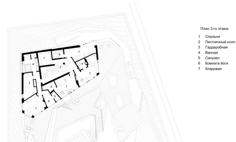
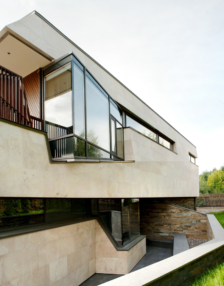
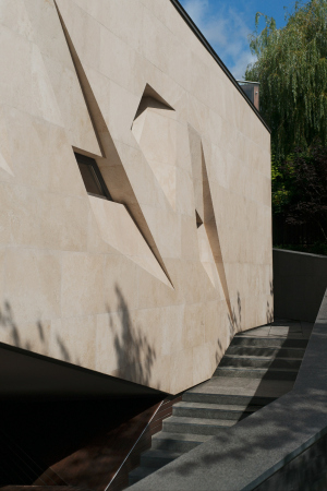
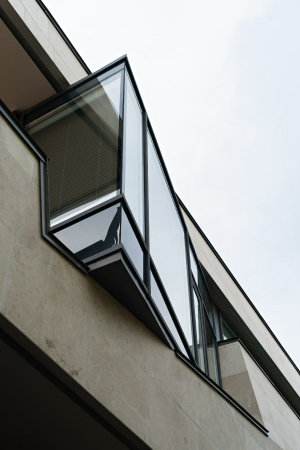
The third floor contains the family bedrooms, the parents and children sleeping on two different halves. In addition, the parents’ balcony with a flowerbed, which ensures extra privacy. The third children’s room, the bedroom of the youngest child, is turned north but is also equipped with a triangular bay window that catches the light and allows you to peek a little beyond the surface of the wall.

The “Spring” house: plan of the 3rd floor
Copyright: Photograph © Gleb Leonov | TOTEMENT/PAPER


The “Spring” house: view from the north
Copyright: Photograph © Gleb Leonov | TOTEMENT/PAPER


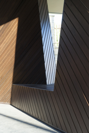
Anyway, the house, rather large, curved up in a ball within the confines of the land plot, propping up the slope with one of its sides, is subjected to the “from the inside out” principle: the architects formed conceptual and emotional “nuclei” and connected them together, tying them into a “spring”, also taking care about the energy outlets “to the world outside”: these are, for example, the side end stained glass of the library – the “head” or the “tail” of the fireplace chimney. True, there are right angles here but they do not play any significant part – everything is sophisticated; the space and the shapes are flowing, only slightly creaking at the bends, forming a giant volumetric origami.

The form not just plays here the main part, it is not just “unusual and cutting-edge” – it organizes the emotions inside and outside, showing through in accordance with its own logic. It must be precise without being excessive, and it cannot be too pristine because it has to be flamboyant at the same time. This task of making the form come alive, like an animal ready to leap, full of potential motion – is something that the architects have long since mastered, time after time honing and perfecting this idea. You need to learn to handle this form like a wild animal tamer learns to tame a wild animal, not to mention dragons – without stepping over the edge of what’s motivated, yet keeping the whole thing “alive and breathing” nonetheless. Which is, basically, what the architect’s work is all about, and it’s just great that in our days of efficient management there are still people out there who set such goals for themselves.

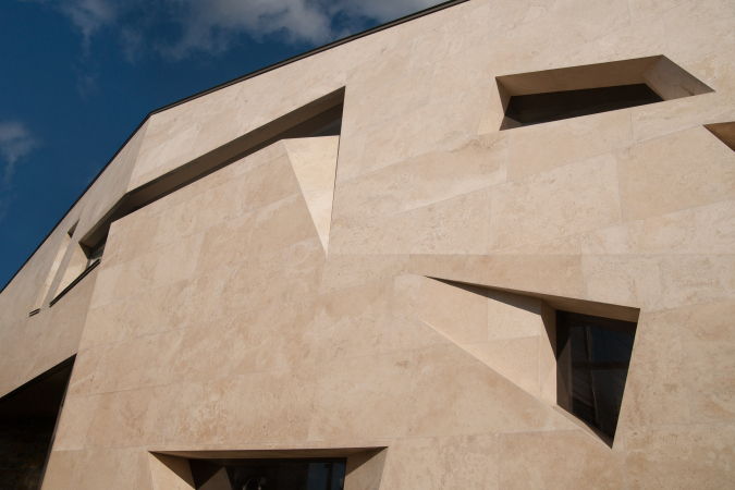
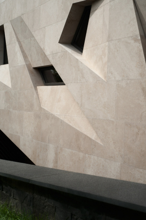
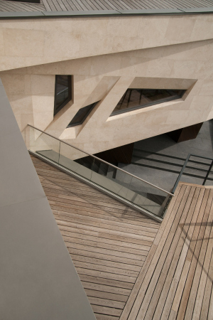
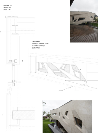
The implementation of such a project cannot be easy even in Europe, much less in Russia, and, strictly speaking, if you undertake to handle such a task, you need to be prepared to face difficulties, to redo something all over again, and to make on-the-spot corrections. For example, at the outset of the project, the architects were planning to cover the façades with white stucco but then they made a decision to coat it in Jurassic plaster, and on the subsystem, too, the façade being of the ventilated type, with ventilation outlets visible in the top and bottom ends of the walls. However, the house is basically meant to produce an effect of a sculptural monolith, and, in order to avoid the telltale joints, it was decided to glue the stone slabs upon aquapanels, installed, in turn, over the hear insulation material. The architects carefully selected the slabs in accordance with their color, making sure that the hints are as inconspicuous as possible. A lot of detailed drafts of the façades were made, including for the windows of the library.

  • zooming
    1 / 8
    The “Spring” house: the library windows
    Copyright: Photograph © Gleb Leonov | TOTEMENT/PAPER
  • zooming
    2 / 8
    The “Spring” house: the library windows
    Copyright: Photograph © Gleb Leonov | TOTEMENT/PAPER
  • zooming
    3 / 8
    The “Spring” house: the library windows
    Copyright: Photograph © Gleb Leonov | TOTEMENT/PAPER
  • zooming
    4 / 8
    The “Spring” house: the staircase. THe second floor
    Copyright: Photograph © Gleb Leonov | TOTEMENT/PAPER
  • zooming
    5 / 8
    The “Spring” house: the library windows
    Copyright: Photograph © Gleb Leonov | TOTEMENT/PAPER
  • zooming
    6 / 8
    The “Spring” house. View from the staircase
    Copyright: Photograph © Gleb Leonov | TOTEMENT/PAPER
  • zooming
    7 / 8
    The “Spring” house: the library windows
    Copyright: Photograph © Gleb Leonov | TOTEMENT/PAPER
  • zooming
    8 / 8
    The “Spring” house. Details of mounting of the wall coating
    Copyright: Photograph © Gleb Leonov | TOTEMENT/PAPER


In a word, a project like this requires a fair bit of painstaking work, both pragmatic, with the drafts and on the construction site, and conceptual, when you deal with such an agile form, you need to address lots of details, much more than in a “regular” house. What is also important is the fact that the architects work their ideas to perfection, ground their fantasy on real needs analysis and then implement it without any significant simplifications. Which, obviously, can also be considered to be a variety of Zen practice. What we’re ultimately getting is a cutting-adage version of the Ancient Roman domus. Well, or the Far East dragon who is reclining to contemplate the idyllic mid-Russian scenery.

23 May 2019

Headlines now
The Golden Crown
The concept for a dental clinic in Yekaterinburg, developed by CNTR Studio, revolves around the idea of a “mouth full of gold”: pristine white porcelain stoneware walls are complemented by matte brass details. To avoid an overly literal interpretation, the architects focused on the building’s proportions, skillfully navigating between sunlight requirements and fire safety regulations.
Flexibility and Integration
Not long ago, we covered the project for the fourth phase of the ÁLIA residential complex, designed by APEX. Now, we’ve been shown different fence concepts they developed to enclose the complex’s private courtyards, incorporating a variety of public functions. We believe that the sheer fact that the complex’s architects were involved in such a detail as fencing speaks volumes.
A Step Forward
The HIDE residential complex represents a major milestone for ADM architects and their leaders Andrey Romanov and Ekaterina Kuznetsova in their quest for a fresh high-rise aesthetic – one that is flexible and layered, capable of bringing vibrancy to mass and silhouette while shaping form. Over recent years, this approach has become ADM’s “signature style”, with the golden HIDE tower playing a pivotal role in its evolution. Here, we delve into the project’s story, explore the details of the complex’s design, and uncover its core essence.
Gold in the Sands
A new office for a transcontinental company specializing in resource extraction and processing has opened in Dubai. Designed by T+T Architects, masters of creating spaces that are contemporary, diverse, flexible, and original, this project exemplifies their expertise. On the executive floor, a massive brass-clad partition dominates, while layered textures of compressed earth create a contextually resonant backdrop.
Layers and Levels of Flight
This project goes way back – Reserve Union won this architectural competition at the end of 2011, and the building was completed in 2018, so it’s practically “archival”. However, despite being relatively unknown, the building can hardly be considered “dated” and remains a prime example of architectural expression, particularly in the headquarters genre. And it’s especially fitting for an aviation company office. In some ways, it resembles the Aeroflot headquarters at Sheremetyevo but with its own unique identity, following the signature style of Vladimir Plotkin. In this article, we take an in-depth look at the United Aircraft Corporation (UAC) headquarters in the Moscow agglomeration town of Zhukovsky, supplemented by recent photographs from Alexey Naroditsky – a shoot that became only recently possible due to the fact that improvements were finally made in the surrounding area.
Light and Shadow
In this article, we delve into the architectural design of the “Chaika” house by DNK ag architects, which was recently completed in 2023 as part of the collection of signature designs at ZILArt. As is well-known, all the buildings in this complex follow a design code, yet each one is distinct. This particular building stands out not only for its whiteness and minimalism but also for the refined use of a limited number of techniques that, together, create what can confidently be called synergy.
Casus Novae
A master plan was developed for a large residential area with a name of “DNS City”, but now that its implementation began, the plan has been arbitrarily reformatted and replaced with something that, while similar on the surface, is actually quite different. This is not the first time such a thing happens, but it’s always frustrating. With permission from the author, we are sharing Maria Elkina’s post.
Treasure Hunting
The GAFA bureau, in collaboration with Tegola and Arkhitail, organized an expedition to the island of Kilpola in Karelia as part of Moskomarkhitektura’s “Open City” festival. There, amidst moss and rocks, the students sought answers to questions like: what is the sacred, where does it dwell, and what sustains it? Assisting the participants in this quest were landscape engineer Evgeny Levin, artist Nicholas Roerich, a moose, and the lack of cellular connection. Here’s how the story unfolded.
Depths of the Earth, Streams of Water
In the Malaya Okhta district, the Akzent building, designed by Stepan Liphart, was constructed. It follows a classic tripartite structure, yet it’s what you might call “hand-drawn”: each façade is unique in its form and details, some of which aren’t immediately noticeable. In this article, we explore the context and, together with the architect, delve into how the form was developed.
Fir Tree Dynamics
The “Airports of Region” holding is planning to build an airport in Karachay-Cherkessia, aiming to make the Arkhyz and Dombay resorts more accessible to travelers. The project that won in an invitation-only competition, submitted by Sergey Nikeshkin’s KPLN, blends natural imagery inspired by the shape of a conifer seed, open-air waiting spaces, majestic large trees, and a green roof elevated on needle-like columns. The result is both nature-inspired and WOW.
​A Brick Shell
In the process of designing a clubhouse situated among pine trees in a prestigious suburban area near Moscow, the architectural firm “A.Len” did the façade design part. The combination of different types of brick and masonry correlates with the volumetric and plastique solutions, further enhanced by the inclusion of wood-painted fragments and metal “glazing”.
Word Forms
ATRIUM architects love ambitious challenges, and for the firm’s thirtieth anniversary, they boldly play a game of words with an exhibition that dives deep into a self-created vocabulary. They immerse their projects – especially art installations – into this glossary, as if plunging into a current of their own. You feel as if you’re flowing through the veins of pure art, immersed in a universe of vertical cities, educational spaces – of which the architects are true masters – and the cultural codes of various locations. But what truly captivates is the bold statement that Vera Butko and Anton Nadtochy make, both through their work and this exhibition: architecture, above all, is art – the art of working with form and space.
Flexibility and Acuteness of Modernity
Luxurious, fluid, large “kokoshniks” and spiral barrel columns, as if made from colorful chewing gum: there seem to be no other mansion like this in Moscow, designed in the “Neo-Russian-Modern” style. And the “Teremok” on Malaya Kaluzhskaya, previously somewhat obscure, has “come alive with new colors” and gained visibility after its restoration for the office of the “architectural ecosystem” as the architects love to call themselves. It’s evident that Julius Borisov and the architects at UNK put their hearts into finding this new office and bringing it up to date. Let’s delve into the paradoxes of this mansion’s history and its plasticity. Spoiler: two versions of modernity meet here, both balancing on the razor’s edge of “what’s current”.
Yuri Vissarionov: “A modular house does not belong to the land”
It belongs to space, or to the air... It turns out that 3D printing is more effective when combined with a modular approach: the house is built in a workshop and then adapted to the site, including on uneven terrain. Yuri Vissarionov shares his latest experience in designing tourist complexes, both in central Russia and in the south. These include houseboats, homes printed from lightweight concrete using a 3D printer, and, of course, frame houses.
​Moscow’s First
“The quality of education largely depends on the quality of the educational environment”. This principle of the last decade has been realized by Sergey Skuratov in the project for the First Moscow Gymnasium on Rostovskaya Embankment in the Khamovniki district. The building seamlessly integrates into the complex urban landscape, responding both to the pedestrian flow of the city and the quiet alleyways. It skillfully takes advantage of the height differences and aligns with modern trends in educational space design. Let’s take a closer look.
Looking at the Water
The site of Villa Sonata stretches from the road to the water’s edge, offering its own shoreline, pier, and a picturesque river panorama. To reveal these sweeping views, Roman Leonidov “cut” the façade diagonally parallel to the river, thus getting two main axes for the house and, consequently, “two heads”. The internal core – two double-height spaces, a living room and a conservatory, with a “bridge” above them – makes the house both “transparent” and filled with light.
The White Wing
Well, it’s not exactly white. It’s more of a beige, white-stone structure that plays with the color of limestone – smoother surfaces are lighter, while rougher ones are darker. This wing unites various elements: it absorbs and interprets the surrounding themes. It responds to everything, yet maintains a cohesive expression – a challenging task! – while also incorporating recognizable features of its own, such as the dynamic cuts at the bottom, top, and middle.
Urban Dunes
The XSA Ramps team designed and built a three-part sports hub for a park in Rostov-on-Don, welcoming people of all ages and fitness levels. The skate plaza, pump track, and playground are all meticulously crafted with details that attract a diverse range of visitors. The technical execution of the shapes and slopes transforms this space into a kind of sculptural composition.
Proportional Growth
The project for the fourth phase of the ÁLIA residential area has been announced. The buildings are situated on an elongated plot – almost a “ray” that shoots out from the center of the area towards the river. Their layout reflects both a response to Moscow’s architectural preferences over the past 15 years, shifting “from blocks to towers”, and an interpretation of the neighboring business park designed by SOM. Additionally, the best apartments here are not located at the very top but closer to the middle, forming a glowing “waistline”.
The “Staircase” Building
In designing the “Details” residential complex in New Moscow, Rais Baishev spiced up the now-popular Moscow theme of a “courtyard” building with an idea drawn from the surrealist drawings by Maurits Escher. He envisioned the stepped silhouettes and descending slopes as a metaphysical mega-staircase, creating a key void within the courtyard that gave the project an internal “spine”. This concept is felt both in the building’s silhouette and on its façades.
Projection of the Quarter
No one doubted that the building that Vladimir Plotkin designed as part of the “Garden Quarters” would be the most modernist of all. And it turned out just that way: while adhering to the common design code, the building successfully combines brick and white stone, rhythmically responding to the neighboring building designed by Ostozhenka, yet tactfully and persistently making a few statements of its own. This includes the projection of the ideal urban development composition “14–9–6”, which can be found right next door, mathematical calculations, including those for various types of terraces (and perhaps the only reminder of the Soviet past of the Kauchuk rubber factory!), and the white “cross-stitch” pattern of the façade grid.
Domus Aurea
In this issue, we examine the “Tessinsky-1” house, designed by Sergey Skuratov and completed in 2023. Located in the middle of the Serebryanicheskaya Embankment district, at the intersection of its main streets, this house assumes a sort of “nodal” role: it not only responds to everything around it and preserves many memories of the former EMA factory within itself, but it weaves all this into a newly directed pattern, reconciling bright “gold” and dark-colored brick, largely with the help of the new, modern-yet-archaic Columba brick, which, come to think about it, is the most precious element here.
The Chimney of Nikola-Lenivets
In this issue, we are examining the “Obelisk House” designed by KATARSIS and built for the Arkhstoyanie 2023 festival. However, it was only finished later on, and this is why we are examining it now. It seems to us that after the “Obelisk House” appeared in Nikola-Lenivets, a dialogue and a few inner connections appeared between the temporary structures built here. These houses no longer look like “accidental neighbors”, more of which below.
​Periscope by the Bay
The jury awarded the second place in the competition for a public and cultural center in Petropavlovsk-Kamchatsky to the companies GORA (“Mountain”) and M4. In the consortium’s proposal, the building resembles a sperm whale with a calf swimming next to it or a periscope, whose lenses capture the most spectacular views from the surrounding landscape.
From Arcs to Dolmens
While working on the competition project for Petropavlovsk-Kamchatsky, ASADOV Architects prioritized the value of the natural and urban environment, aiming to preserve the balance of the location while minimizing the resemblance of the volume that they designed to a “traditional building”. The task was challenging, and the architects created three versions, one of which having been developed after the competition, where their main proposal took third place. However, the point of interest here is not the competition result but the continuity of creative thinking.
Hide and Seek
The ID Moskovskiy house, designed by Stepan Liphart in St. Petersburg, in the courtyards near Moskovskiy Avenue beyond the Obvodny Canal and recently completed, is notable for several reasons. Firstly, it has been realized with considerable accuracy, which is particularly significant as this is the first building where the architect was responsible not only for the facades but also for the layouts, allowing for better integration between the two. On the other hand, this building is interesting as an example of the “germination” of new architecture in the city: it draws on the best examples from the neighborhood and becomes an improved and developed sum of ideas found by the architect in the surrounding context.
The Big Twelve
Yesterday, the winners of the Moscow Mayor’s Architecture Award were announced and honored. Let’s take a look at what was awarded and, in some cases, even critique this esteemed award. After all, there is always room for improvement, right?
Above the Golden Horn
The residential complex “Philosophy” designed by T+T architects in Vladivostok, is one of the new projects in the “Golubinaya Pad” area, changing its development philosophy (pun intended) from single houses to a comprehensive approach. The buildings are organized along public streets, varying in height and format, with one house even executed in gallery typology, featuring a cantilever leaning on an art object.
Nuanced Alternative
How can you rhyme a square and space? Easily! But to do so, you need to rhyme everything you can possibly think of: weave everything together, like in a tensegrity structure, and find your own optics too. The new exhibition at GES-2 does just that, offering its visitor a new perspective on the history of art spanning 150 years, infused with the hope for endless multiplicity of worlds and art histories. Read on to see how this is achieved and how the exhibition design by Evgeny Ace contributes to it.
Blinds for Ice
An ice arena has been constructed in Domodedovo based on a project by Yuri Vissarionov Architects. To prevent the long façade, a technical requirement for winter sports facilities, from appearing monotonous, the architects proposed the use of suspended structures with multidirectional slats. This design protects the ice from direct sunlight while giving the wall texture and detail.