По-русски

Along the Beach

In the city of Gelendzhik, “Ginsburg Architects” have designed a house over 250 meters long, making it at the same time visually discrete and putting an interesting spin on a few volumetric “resort” narratives connected with contemplation, sunbathing, and going for walks.

03 November 2017
Object
mainImg

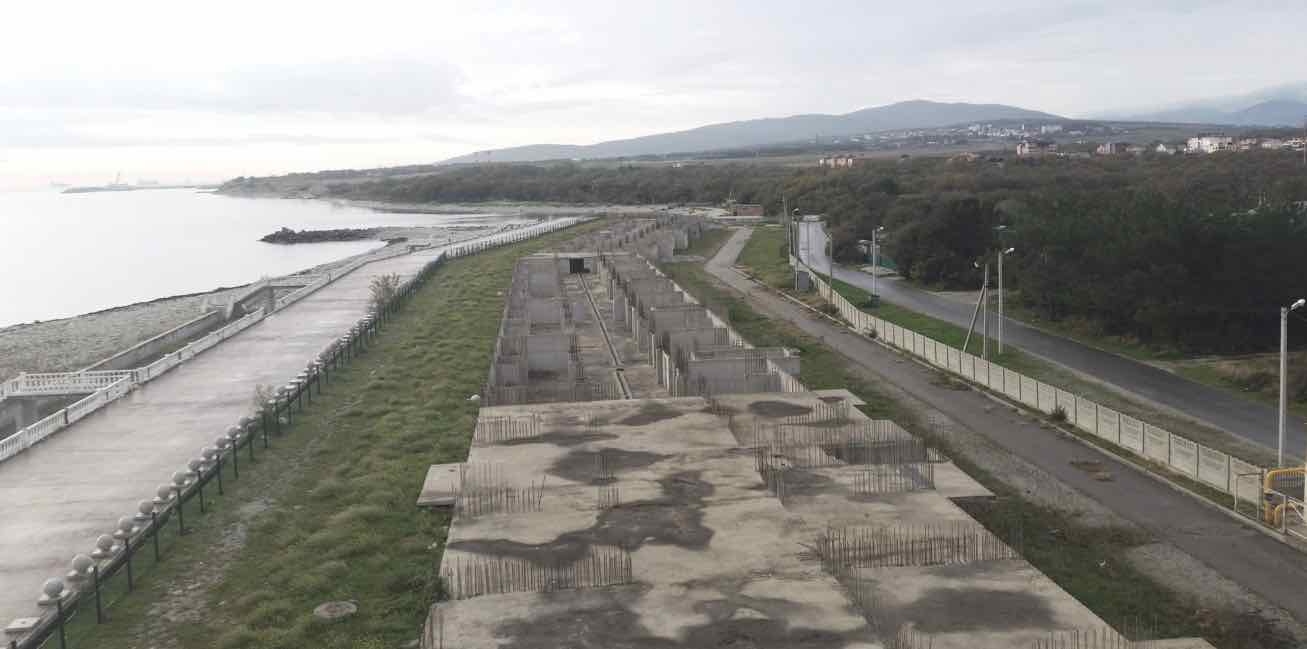
The bottom floor of the building of the western unit of the apartment hotel “Torik”, which is situated on the Tonky Cape in the city of Gelendzhik, is already cast in concrete and is essentially a very long – about 260 meters – foundation that stretches along the first line of a leveed beach which slightly encroaches on the sea with its promenade running along the very edge of water.

The project of an apratment hotel in Gelendzhik. Perspective view. The central south entrance © Ginsburg Architects
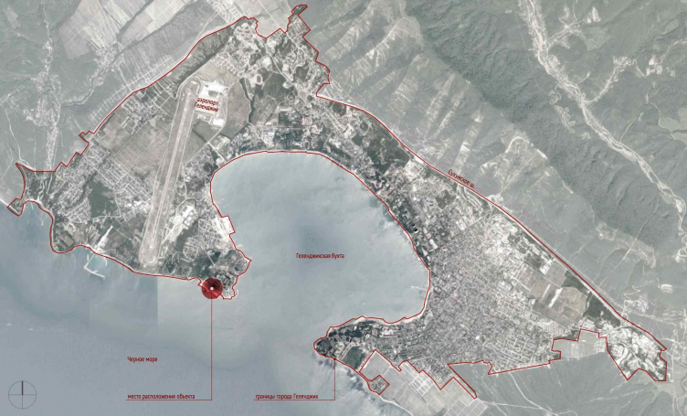
The project of an apratment hotel in Gelendzhik. Location plan © Ginsburg Architects


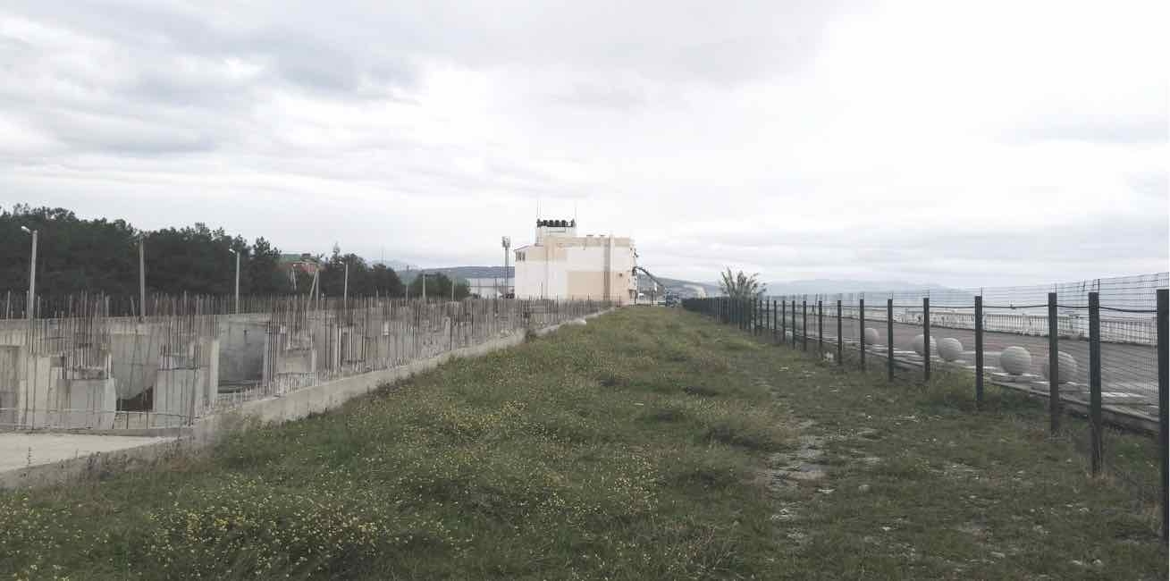
The house will command a great seaside view; the airport is relatively near; the place is surrounded by seaside resorts and privately owned cottages; the nearest settlement bears the same name of “Torik”, having been built by the owners of the apartment hotel slightly earlier. The place is quiet: the Naberezhnaya Street, which runs on the inner side of the apartment hotel, leads to a cedar forest. Next to the unfinished building, there is an orange three-story block of the hotel; it has been finished and already put into operation. The builders have yet to finish the eastern part that froze at the zero mark in concrete. While the east block consists of two sections, the west one, designed by Aleksey Ginsburg on the existing foundation, consists of five.

zooming
The project of an apratment hotel in Gelendzhik. The current situation © Ginsburg Architects


zooming
The project of an apratment hotel in Gelendzhik. The current situation © Ginsburg Architects


At this point, we will allow ourselves to suppose that if Aleksey Ginsburg had designed the west building of the apart-hotel from the very start, he would have probably proposed a different plan of the building, for example, one that would have been broken into several volumes. However, the architect was required to work with the pre-built foundation, which defined his main task of making the building visually lighter and discrete and taking away as much as possible of its likeness to “the Great Wall of China” – all the more so, because the west unit, unlike the three-story east one, has five stories in it.

The architects proposed a section-and-corridor type of floor planning. Small studio apartments are lined up in two rows on either side of a corridor which runs through the building from end to end. From the side of the sea, the architects placed 42-square meter “pencil-box” apartments, their structure being simple: a large 10.5 square meter stanza commands a sea view; behind it, there is a living room, a kitchen, and the entrance door. From the opposite (the city) side, the architects placed smaller apartments 33.9 square meters each, oriented not crosswise but lengthwise along the axis of the building. Among these, there are apartments (one in each section) with a rectangular ledge 2x3 meters, each of them boasting a large window the size of the wall. Such ledges (they are turned northward) might nicely house some sort of studies – there is little direct sunlight there but the ambient light will be enough.

zooming
The project of an apratment hotel in Gelendzhik. Plan of the typical floor © Ginsburg Architects


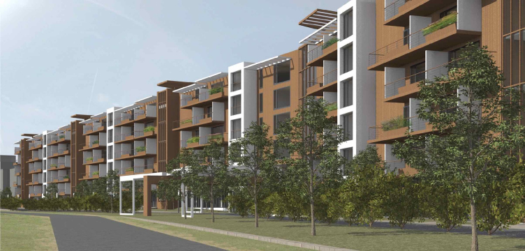
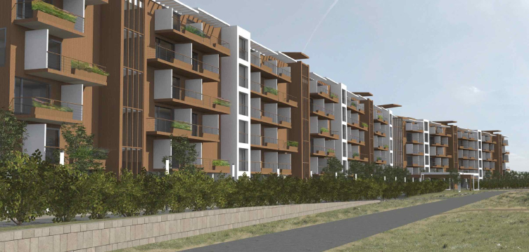
On the outside, the ledges form white tower-like verticals that break the “city façade” of each of the sections in two. This secondary fracturing is made by the staircases and elevators that are also brought slightly forward but are coated with wood and covered by the thin verticals of the grilles. This way, it turns out that from the city side the five sections are divided into 11 smaller fragments which makes one perceive the building not as a “beam” or a “slab” or a 260-meter snake but rather as a row of houses rhythmically similar to a street, which further enhances the “city” nature of the rear façade. At the same time, the main material of the north façade is brown wood; it is planned that it will be covered with natural veneer sheet.

The project of an apratment hotel in Gelendzhik. Perspective view. The central north entrance © Ginsburg Architects


The project of an apratment hotel in Gelendzhik. Perspective view. The north facade © Ginsburg Architects


The project of an apratment hotel in Gelendzhik. Perspective view. Overview of the north facade © Ginsburg Architects


zooming
The project of an apratment hotel in Gelendzhik. Development drawing of the facades along the Naberezhnaya Street © Ginsburg Architects


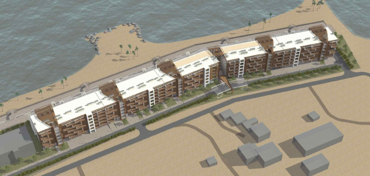
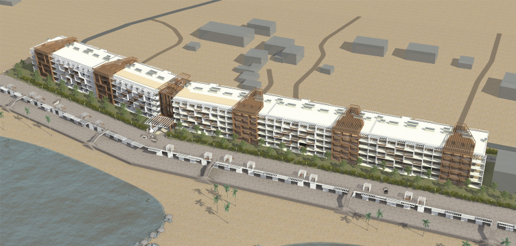
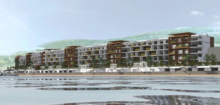
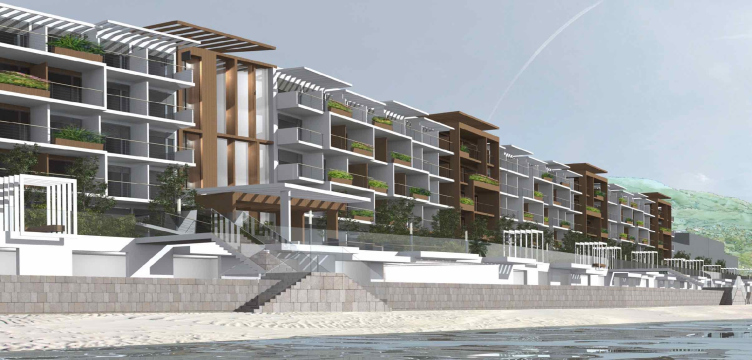
The seaside façade is designed in a different manner, in large masses: the continuous pattern of deep white stanzas is divided by six large wooden inserts matching the same number of section entrances, plus the main atrium. What is interesting is the fact that the wooden verticals of the entrances – and this is plainly visible from above – grow wider as they get closer to the sea; while on the north side the entrances only take up one module, their “shadows” on the “sea” side of the hotel correspond to three apartments, and at the same time on the beach side the wooden inserts no longer mark the entrances but only become their coloristic continuation. Thus, both south and north façades are essentially the inversions of each other to a certain degree. From the sea side, white, or, rather, a light shade of gray prevails: textured stucco with fragments of stone, and the ribs of the stanzas that make up the entire seaside façade will resemble a layered cut-off of calcareous rock – a stone wall that stretches almost the entire length of the Black Sea shore, if one is to walk along the water’s edge. From the floor side, on the other hand, the façade will put one in the mind of forests in which we will find ourselves when we climb up the limy slope. The two material constituent parts of the building – imitation stone and natural wood – put an interesting spin on the two main themes of the seaside nature, while the sea and the sand (in this case, leveed) also come with the package.

The project of an apratment hotel in Gelendzhik. Perspective view. Overview of the south facade © Ginsburg Architects


The project of an apratment hotel in Gelendzhik. Perspective view. The south facade © Ginsburg Architects


The project of an apratment hotel in Gelendzhik. Development drawing of the facades along the beach line © Ginsburg Architects


At about two thirds of its length, the “slab” building makes a slight bend, following the direction of the Naberezhnaya (“Waterfront”) Street – this is where the central lobby will be situated, which will be widening in the direction of the beach in a trumpet-shaped opening, literally “opening up” the sea view for those who will enter it.

It will also include the “main” elevator and staircase, a direct passage to the sea, and an atrium with inside balconies on the second floor: the balconies are strung upon the corridors of each floor, for which the point of crossing with the atrium will become some sort of a special climax – this place commands both sea and mountain views, upwards and downwards. The walls of the atriums on both sides are stained glass. The roofs of the two central sections on either side of the atrium will be usable – these landscaped roofs will support terraces with parasols for sunbathing; thus, here up in the roof, the surroundings of the atrium also play the climax role.

zooming
The project of an apratment hotel in Gelendzhik. Roof plan © Ginsburg Architects


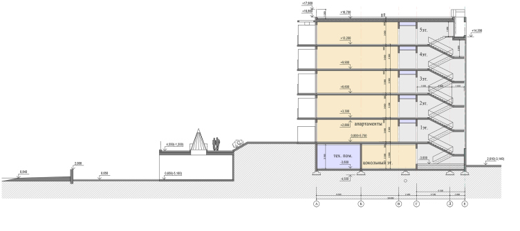
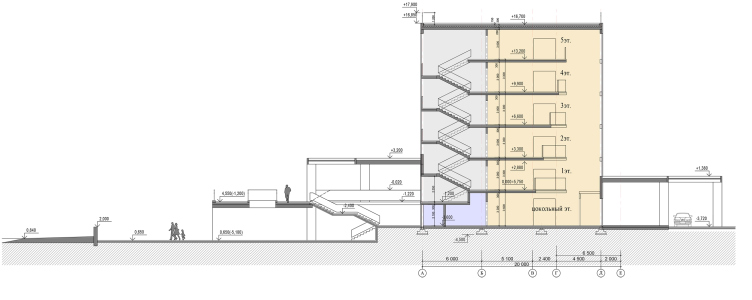
The main end-to-end passage to the sea, which runs through the atrium, is complemented by two others that run through the extreme left and right units (third and seventh) – this way, the building becomes permeable, and people will not need to find their way around it in order to get to the beach. From the side of the sea, there is a little green park stretching along the building on the ground floor level, and then, parallel to the greenery, there runs a two-tier promenade, its top terrace sunlit, and its bottom terrace in the shade; it is lit by a few skylights. What is interesting is the fact that the level of greenery and the sea-facing terrace is two meters higher than the level of the city side driveway – at this point, the terrain makes a peculiar zigzag, going up between the sea and the building, which is plain to see on the section view. The basement, whose floor lies but a meter and a half higher than the sea level – meaning, it can hardly be even called “basement” because of that – will house 32 car stalls and a rather large number of storage cells, one for each apartment, at the same time the basement of all the four central sections is essentially a public space.

zooming
The project of an apratment hotel in Gelendzhik. Plan of the first floor © Ginsburg Architects


The resulting space turned out to be of a double-tier kind thanks to the 4-meter height difference; from the top gallery, one can get to the sea by five evenly spaced staircases. The sixth staircase, which is situated in front of the main entrance, is more complex – this is the point where the earthen berm stops short, and the building gets yet another three-flight staircase that makes a turn. On the evening promenade, there are four latticed gazebos, and, above the edge, there are pergolas of the same kind that mark the boundary between the sunny and the shady part – this is a quite frequently used technique of resort architecture that puts one in the mind of the parterre terraces of the Arkhangelskoe and the Sochi health centers designed by Zholtovsky; in this particular case, it makes the entire composition more sophisticated, and the walks that people will take more eventful. If watched from the beach, the hotel grows up in distinct tiers: sand, then a strip of granite of the lower waterfront, the pergolas of the upper promenade, then the greenery, and, finally, the stanzas of the apartments. The whole thing looks consequent, spacious, and even ethereal; the building does not in the least distance itself from its surroundings but, rather, opens up to the sea like a sponge.

The project of an apratment hotel in Gelendzhik. Section 2-2 © Ginsburg Architects


The project of an apratment hotel in Gelendzhik. Section 1-1 © Ginsburg Architects


Thus, in spite of their being a lot of “givens”, including the pre-built foundation, Aleksey Ginsburg was still able to fill the house with a few meaningful nuances: from the space pivot of the atrium that forms in the center of each corridor a public nucleus that commands fine views on all cardinal points to a солярия on the roof and a two-tier promenade; at the same time, the architect did not for a second forget about the permeability of the inner space and its connection to the building’s outward appearance. All of this livens up the rather habitual task and endows the seaside resort with a highlight that it so desperately needed.
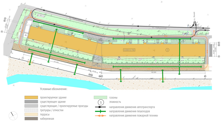
The project of an apratment hotel in Gelendzhik. Master plan layout © Ginsburg Architects
The project of an apratment hotel in Gelendzhik. Traffic flows © Ginsburg Architects


03 November 2017

Headlines now
The Golden Crown
The concept for a dental clinic in Yekaterinburg, developed by CNTR Studio, revolves around the idea of a “mouth full of gold”: pristine white porcelain stoneware walls are complemented by matte brass details. To avoid an overly literal interpretation, the architects focused on the building’s proportions, skillfully navigating between sunlight requirements and fire safety regulations.
Flexibility and Integration
Not long ago, we covered the project for the fourth phase of the ÁLIA residential complex, designed by APEX. Now, we’ve been shown different fence concepts they developed to enclose the complex’s private courtyards, incorporating a variety of public functions. We believe that the sheer fact that the complex’s architects were involved in such a detail as fencing speaks volumes.
A Step Forward
The HIDE residential complex represents a major milestone for ADM architects and their leaders Andrey Romanov and Ekaterina Kuznetsova in their quest for a fresh high-rise aesthetic – one that is flexible and layered, capable of bringing vibrancy to mass and silhouette while shaping form. Over recent years, this approach has become ADM’s “signature style”, with the golden HIDE tower playing a pivotal role in its evolution. Here, we delve into the project’s story, explore the details of the complex’s design, and uncover its core essence.
Gold in the Sands
A new office for a transcontinental company specializing in resource extraction and processing has opened in Dubai. Designed by T+T Architects, masters of creating spaces that are contemporary, diverse, flexible, and original, this project exemplifies their expertise. On the executive floor, a massive brass-clad partition dominates, while layered textures of compressed earth create a contextually resonant backdrop.
Layers and Levels of Flight
This project goes way back – Reserve Union won this architectural competition at the end of 2011, and the building was completed in 2018, so it’s practically “archival”. However, despite being relatively unknown, the building can hardly be considered “dated” and remains a prime example of architectural expression, particularly in the headquarters genre. And it’s especially fitting for an aviation company office. In some ways, it resembles the Aeroflot headquarters at Sheremetyevo but with its own unique identity, following the signature style of Vladimir Plotkin. In this article, we take an in-depth look at the United Aircraft Corporation (UAC) headquarters in the Moscow agglomeration town of Zhukovsky, supplemented by recent photographs from Alexey Naroditsky – a shoot that became only recently possible due to the fact that improvements were finally made in the surrounding area.
Light and Shadow
In this article, we delve into the architectural design of the “Chaika” house by DNK ag architects, which was recently completed in 2023 as part of the collection of signature designs at ZILArt. As is well-known, all the buildings in this complex follow a design code, yet each one is distinct. This particular building stands out not only for its whiteness and minimalism but also for the refined use of a limited number of techniques that, together, create what can confidently be called synergy.
Casus Novae
A master plan was developed for a large residential area with a name of “DNS City”, but now that its implementation began, the plan has been arbitrarily reformatted and replaced with something that, while similar on the surface, is actually quite different. This is not the first time such a thing happens, but it’s always frustrating. With permission from the author, we are sharing Maria Elkina’s post.
Treasure Hunting
The GAFA bureau, in collaboration with Tegola and Arkhitail, organized an expedition to the island of Kilpola in Karelia as part of Moskomarkhitektura’s “Open City” festival. There, amidst moss and rocks, the students sought answers to questions like: what is the sacred, where does it dwell, and what sustains it? Assisting the participants in this quest were landscape engineer Evgeny Levin, artist Nicholas Roerich, a moose, and the lack of cellular connection. Here’s how the story unfolded.
Depths of the Earth, Streams of Water
In the Malaya Okhta district, the Akzent building, designed by Stepan Liphart, was constructed. It follows a classic tripartite structure, yet it’s what you might call “hand-drawn”: each façade is unique in its form and details, some of which aren’t immediately noticeable. In this article, we explore the context and, together with the architect, delve into how the form was developed.
Fir Tree Dynamics
The “Airports of Region” holding is planning to build an airport in Karachay-Cherkessia, aiming to make the Arkhyz and Dombay resorts more accessible to travelers. The project that won in an invitation-only competition, submitted by Sergey Nikeshkin’s KPLN, blends natural imagery inspired by the shape of a conifer seed, open-air waiting spaces, majestic large trees, and a green roof elevated on needle-like columns. The result is both nature-inspired and WOW.
​A Brick Shell
In the process of designing a clubhouse situated among pine trees in a prestigious suburban area near Moscow, the architectural firm “A.Len” did the façade design part. The combination of different types of brick and masonry correlates with the volumetric and plastique solutions, further enhanced by the inclusion of wood-painted fragments and metal “glazing”.
Word Forms
ATRIUM architects love ambitious challenges, and for the firm’s thirtieth anniversary, they boldly play a game of words with an exhibition that dives deep into a self-created vocabulary. They immerse their projects – especially art installations – into this glossary, as if plunging into a current of their own. You feel as if you’re flowing through the veins of pure art, immersed in a universe of vertical cities, educational spaces – of which the architects are true masters – and the cultural codes of various locations. But what truly captivates is the bold statement that Vera Butko and Anton Nadtochy make, both through their work and this exhibition: architecture, above all, is art – the art of working with form and space.
Flexibility and Acuteness of Modernity
Luxurious, fluid, large “kokoshniks” and spiral barrel columns, as if made from colorful chewing gum: there seem to be no other mansion like this in Moscow, designed in the “Neo-Russian-Modern” style. And the “Teremok” on Malaya Kaluzhskaya, previously somewhat obscure, has “come alive with new colors” and gained visibility after its restoration for the office of the “architectural ecosystem” as the architects love to call themselves. It’s evident that Julius Borisov and the architects at UNK put their hearts into finding this new office and bringing it up to date. Let’s delve into the paradoxes of this mansion’s history and its plasticity. Spoiler: two versions of modernity meet here, both balancing on the razor’s edge of “what’s current”.
Yuri Vissarionov: “A modular house does not belong to the land”
It belongs to space, or to the air... It turns out that 3D printing is more effective when combined with a modular approach: the house is built in a workshop and then adapted to the site, including on uneven terrain. Yuri Vissarionov shares his latest experience in designing tourist complexes, both in central Russia and in the south. These include houseboats, homes printed from lightweight concrete using a 3D printer, and, of course, frame houses.
​Moscow’s First
“The quality of education largely depends on the quality of the educational environment”. This principle of the last decade has been realized by Sergey Skuratov in the project for the First Moscow Gymnasium on Rostovskaya Embankment in the Khamovniki district. The building seamlessly integrates into the complex urban landscape, responding both to the pedestrian flow of the city and the quiet alleyways. It skillfully takes advantage of the height differences and aligns with modern trends in educational space design. Let’s take a closer look.
Looking at the Water
The site of Villa Sonata stretches from the road to the water’s edge, offering its own shoreline, pier, and a picturesque river panorama. To reveal these sweeping views, Roman Leonidov “cut” the façade diagonally parallel to the river, thus getting two main axes for the house and, consequently, “two heads”. The internal core – two double-height spaces, a living room and a conservatory, with a “bridge” above them – makes the house both “transparent” and filled with light.
The White Wing
Well, it’s not exactly white. It’s more of a beige, white-stone structure that plays with the color of limestone – smoother surfaces are lighter, while rougher ones are darker. This wing unites various elements: it absorbs and interprets the surrounding themes. It responds to everything, yet maintains a cohesive expression – a challenging task! – while also incorporating recognizable features of its own, such as the dynamic cuts at the bottom, top, and middle.
Urban Dunes
The XSA Ramps team designed and built a three-part sports hub for a park in Rostov-on-Don, welcoming people of all ages and fitness levels. The skate plaza, pump track, and playground are all meticulously crafted with details that attract a diverse range of visitors. The technical execution of the shapes and slopes transforms this space into a kind of sculptural composition.
Proportional Growth
The project for the fourth phase of the ÁLIA residential area has been announced. The buildings are situated on an elongated plot – almost a “ray” that shoots out from the center of the area towards the river. Their layout reflects both a response to Moscow’s architectural preferences over the past 15 years, shifting “from blocks to towers”, and an interpretation of the neighboring business park designed by SOM. Additionally, the best apartments here are not located at the very top but closer to the middle, forming a glowing “waistline”.
The “Staircase” Building
In designing the “Details” residential complex in New Moscow, Rais Baishev spiced up the now-popular Moscow theme of a “courtyard” building with an idea drawn from the surrealist drawings by Maurits Escher. He envisioned the stepped silhouettes and descending slopes as a metaphysical mega-staircase, creating a key void within the courtyard that gave the project an internal “spine”. This concept is felt both in the building’s silhouette and on its façades.
Projection of the Quarter
No one doubted that the building that Vladimir Plotkin designed as part of the “Garden Quarters” would be the most modernist of all. And it turned out just that way: while adhering to the common design code, the building successfully combines brick and white stone, rhythmically responding to the neighboring building designed by Ostozhenka, yet tactfully and persistently making a few statements of its own. This includes the projection of the ideal urban development composition “14–9–6”, which can be found right next door, mathematical calculations, including those for various types of terraces (and perhaps the only reminder of the Soviet past of the Kauchuk rubber factory!), and the white “cross-stitch” pattern of the façade grid.
Domus Aurea
In this issue, we examine the “Tessinsky-1” house, designed by Sergey Skuratov and completed in 2023. Located in the middle of the Serebryanicheskaya Embankment district, at the intersection of its main streets, this house assumes a sort of “nodal” role: it not only responds to everything around it and preserves many memories of the former EMA factory within itself, but it weaves all this into a newly directed pattern, reconciling bright “gold” and dark-colored brick, largely with the help of the new, modern-yet-archaic Columba brick, which, come to think about it, is the most precious element here.
The Chimney of Nikola-Lenivets
In this issue, we are examining the “Obelisk House” designed by KATARSIS and built for the Arkhstoyanie 2023 festival. However, it was only finished later on, and this is why we are examining it now. It seems to us that after the “Obelisk House” appeared in Nikola-Lenivets, a dialogue and a few inner connections appeared between the temporary structures built here. These houses no longer look like “accidental neighbors”, more of which below.
​Periscope by the Bay
The jury awarded the second place in the competition for a public and cultural center in Petropavlovsk-Kamchatsky to the companies GORA (“Mountain”) and M4. In the consortium’s proposal, the building resembles a sperm whale with a calf swimming next to it or a periscope, whose lenses capture the most spectacular views from the surrounding landscape.
From Arcs to Dolmens
While working on the competition project for Petropavlovsk-Kamchatsky, ASADOV Architects prioritized the value of the natural and urban environment, aiming to preserve the balance of the location while minimizing the resemblance of the volume that they designed to a “traditional building”. The task was challenging, and the architects created three versions, one of which having been developed after the competition, where their main proposal took third place. However, the point of interest here is not the competition result but the continuity of creative thinking.
Hide and Seek
The ID Moskovskiy house, designed by Stepan Liphart in St. Petersburg, in the courtyards near Moskovskiy Avenue beyond the Obvodny Canal and recently completed, is notable for several reasons. Firstly, it has been realized with considerable accuracy, which is particularly significant as this is the first building where the architect was responsible not only for the facades but also for the layouts, allowing for better integration between the two. On the other hand, this building is interesting as an example of the “germination” of new architecture in the city: it draws on the best examples from the neighborhood and becomes an improved and developed sum of ideas found by the architect in the surrounding context.
The Big Twelve
Yesterday, the winners of the Moscow Mayor’s Architecture Award were announced and honored. Let’s take a look at what was awarded and, in some cases, even critique this esteemed award. After all, there is always room for improvement, right?
Above the Golden Horn
The residential complex “Philosophy” designed by T+T architects in Vladivostok, is one of the new projects in the “Golubinaya Pad” area, changing its development philosophy (pun intended) from single houses to a comprehensive approach. The buildings are organized along public streets, varying in height and format, with one house even executed in gallery typology, featuring a cantilever leaning on an art object.
Nuanced Alternative
How can you rhyme a square and space? Easily! But to do so, you need to rhyme everything you can possibly think of: weave everything together, like in a tensegrity structure, and find your own optics too. The new exhibition at GES-2 does just that, offering its visitor a new perspective on the history of art spanning 150 years, infused with the hope for endless multiplicity of worlds and art histories. Read on to see how this is achieved and how the exhibition design by Evgeny Ace contributes to it.
Blinds for Ice
An ice arena has been constructed in Domodedovo based on a project by Yuri Vissarionov Architects. To prevent the long façade, a technical requirement for winter sports facilities, from appearing monotonous, the architects proposed the use of suspended structures with multidirectional slats. This design protects the ice from direct sunlight while giving the wall texture and detail.