По-русски

Exploring the Topic

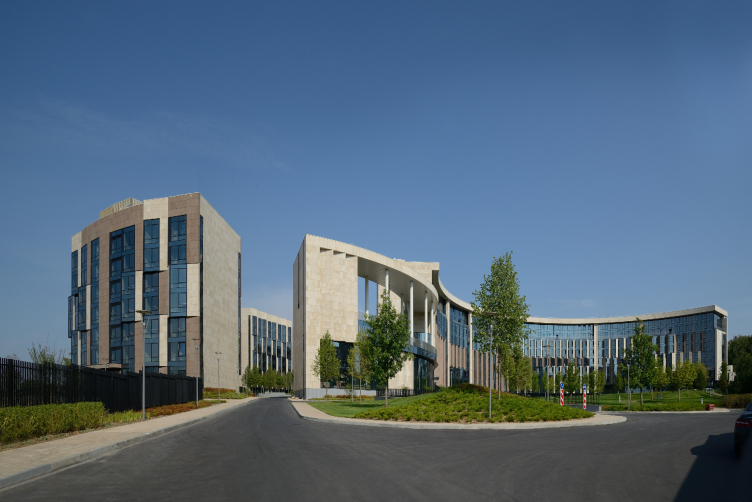
The almost theatrical scenography, mechanisms of modern architecture and nostalgia for mansions are combined in this house so unobtrusively and subtly that one even breathes more freely around it.

26 October 2015
Object
mainImg
Architect:
Vladimir Plotkin
Object:
Residential complex Skolkovo-park, Zarechie
Russia, Novoivanovsky s.o., raiyon r.p. Zarechie

Project Team:
authors-architects: Plotkin V.I. - the corporate authors’ leader. Gusarev S.A, Travkin.A.M., Denisova U.D., Diasheva T.A., Ilevskaya M.M., Butusov A.V., Turin I.N., Dudukin S.G.; authors-constructors: Andreev V.V., Scherbina S.K.; chief project engineer: Kaumov F.M.; Authors of engineer sections: Popova G.A., Nedbailo B.K., Dachkina M.A., Musatov A.L., Kochanova G.F.

2008 — 2009 / 2010 — 2014
The premium housing estate “Skolkovo Park” was built on the order of Millhouse development company not far from the innovation center “Skolkovo” – currently under construction – on Vesennaya Street in Estate Zarechie. Prime class and large apartments (from 60 to 130 m2), and Millhouse owns about 600 hectares of land here, including Park Meshersky improved by the developer and the largest golf club in Europe.

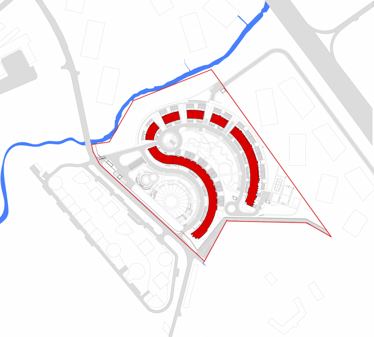
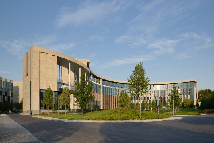
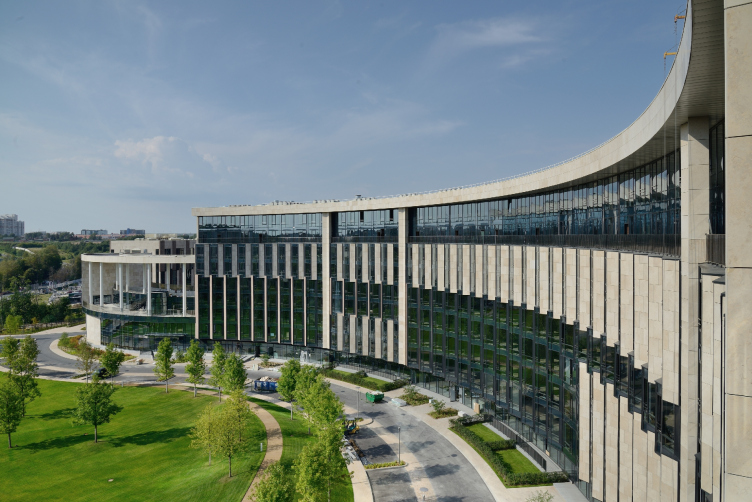
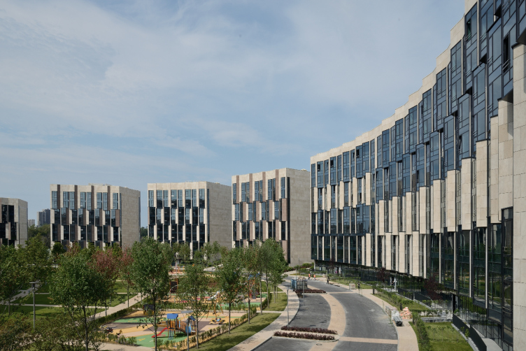
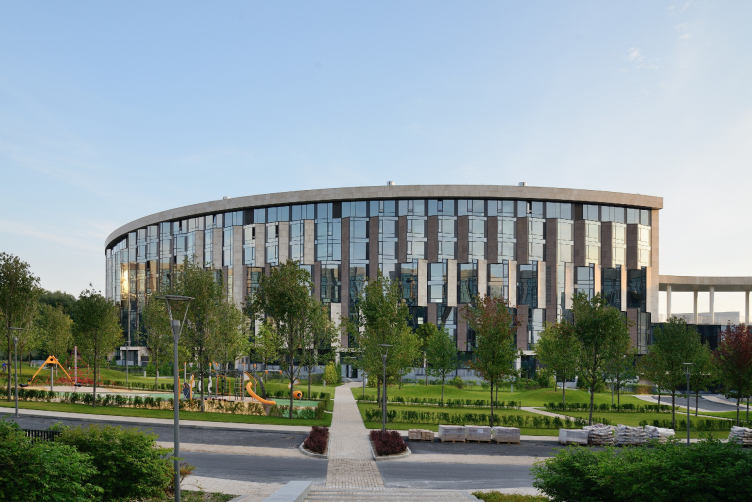
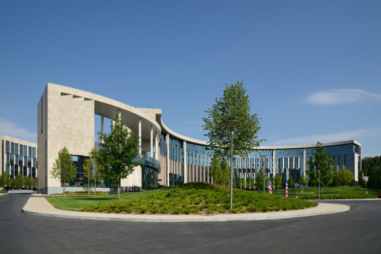
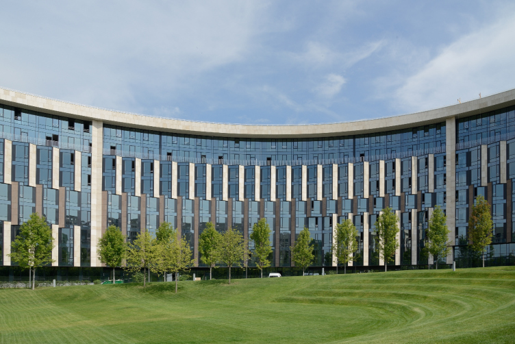
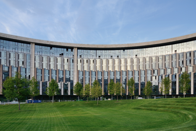
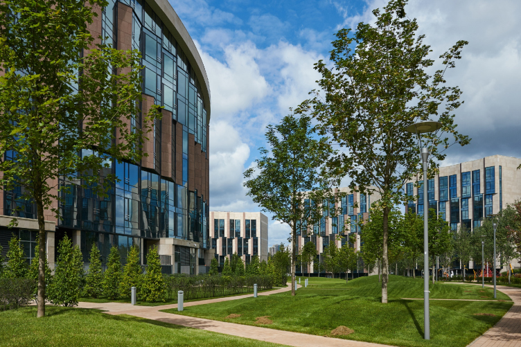
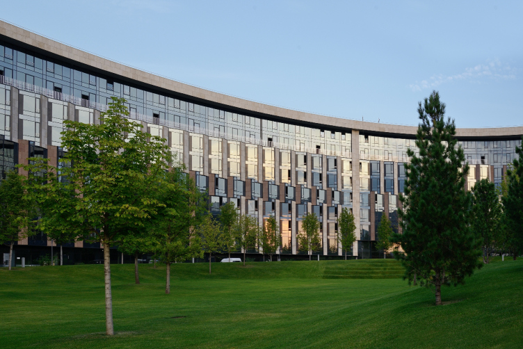
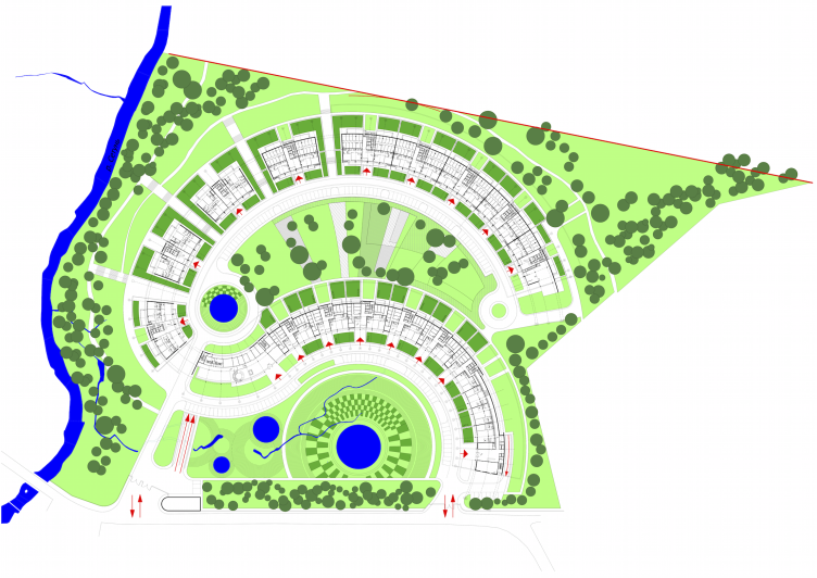
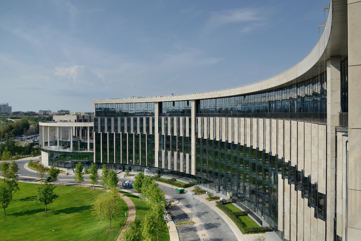
The arc-shaped form of the buildings in “Skolkovo Park” has – according to the words of architect Vladimir Plotkin – resulted from multiple restrictions. In short, the house had to bend in such a way, as to get the most of the sunlight for the dwellers. The case is that according to the rules of the surrounding territory, not a single window of the housing estate could face the south – the best side in terms of insolation. Eastward is the noisy Moscow Ring Road, and the most appealing part of the landscape – the river – is situated on the northern side. So, as the architect explained in the interview to “Project Russia” magazine (No. 77, 2015, p. 41-56), the arcs in the plan were at first part of a joke: a sum of thoughts about perspectives most convenient for insolation.   

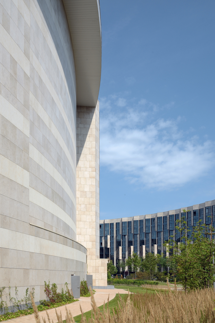
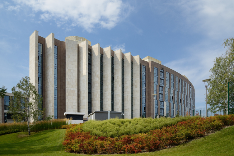
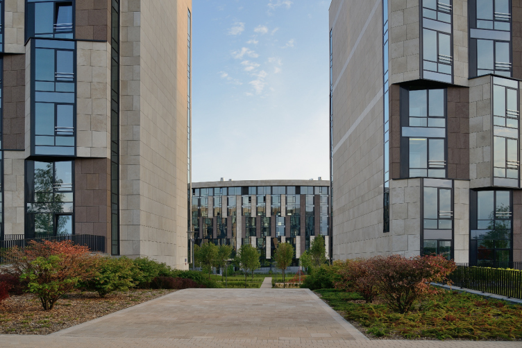
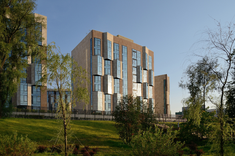
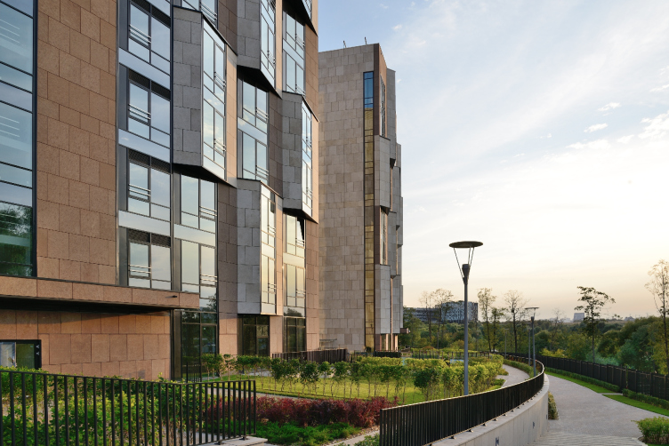
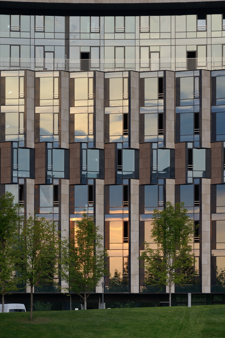
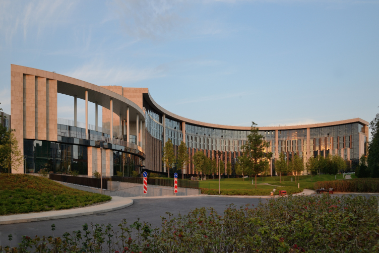
Which is why the “legs” of the building face the south with their blind ends, stone rounded wall and a line of “spurs”. This curve also restricts the windows from turning into the wrong direction, but at the same time allows parts of the embrasures to catch the rays of the south-west sun. A large part of the facades is covered with triangular bay windows – “the light traps”.    

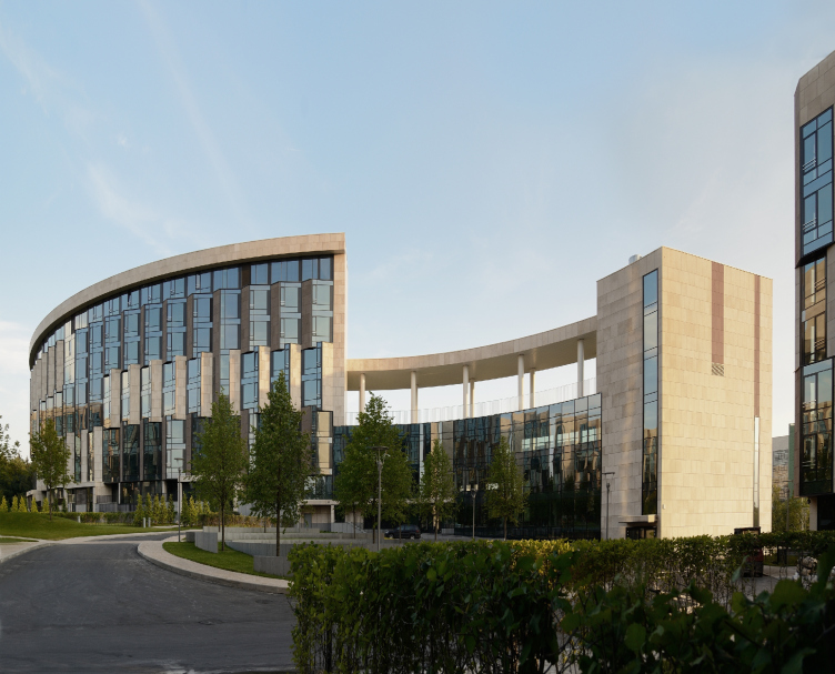
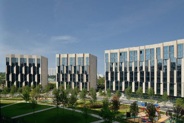
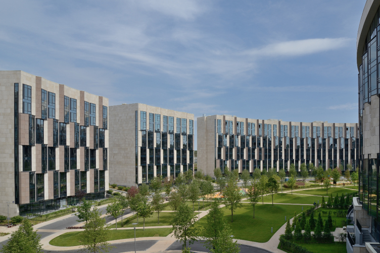
But the greatest advantage of this house is the lightness of its architecture. Thin lines, almost ephemeral, noble, reminding Modigliani… Nothing is inert; there are no crowded volumes or pressure of weight. This effect can hardly be seen even on very good photos, but you can easily feel it in presence, because it is all about movement and the constantly changing reflections of the sky and the perspectives. The architectural composition is emphatically dramatized – the building leads the spectator using the methods of baroque scenography: it embraces the forestage with the circumference of its inverted façade, plays with the beams of “visual outbreaks” slicing the curve of the north-east part into separate buildings giving a view of the river between them – just as if between the scenes.    
 
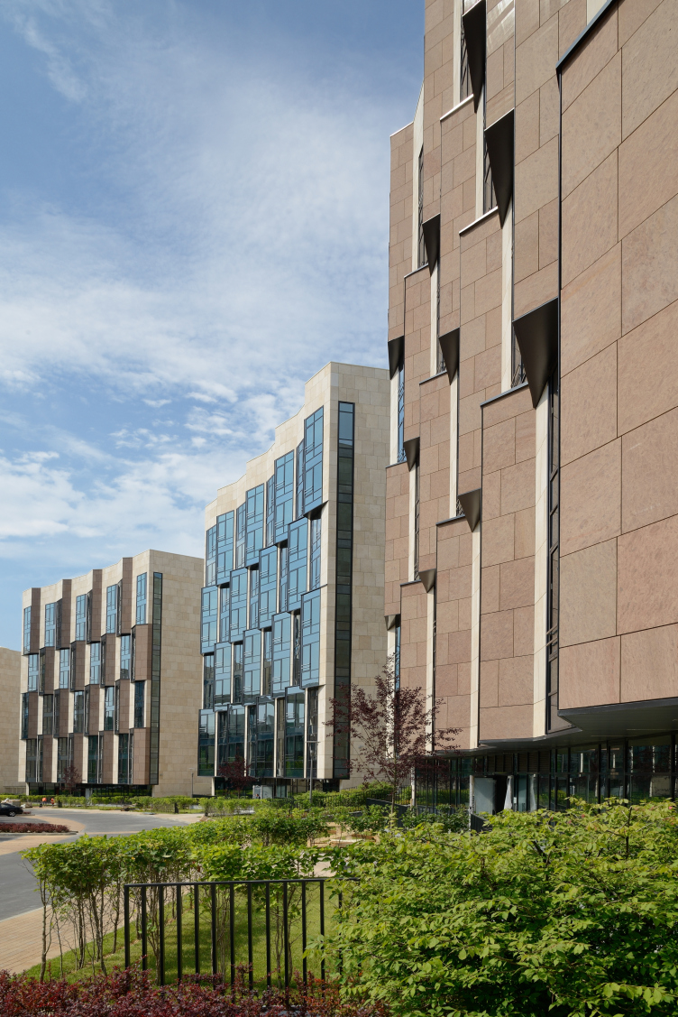
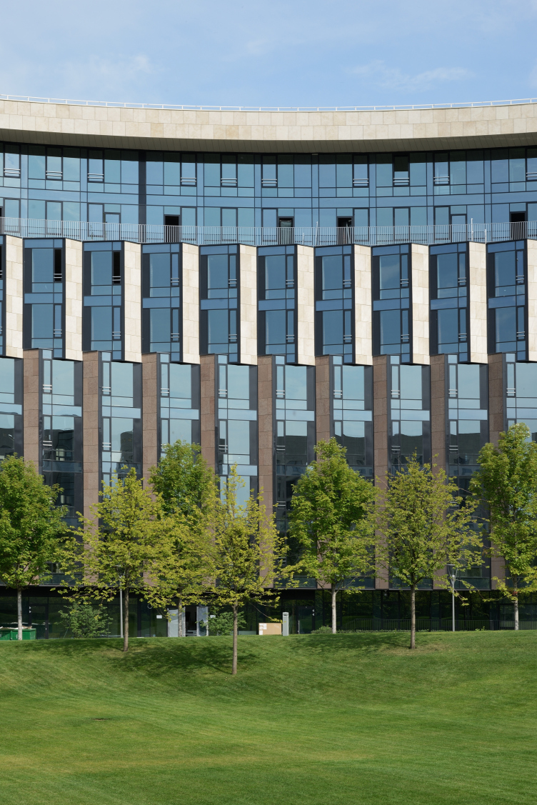
Besides, unlike houses with “well” courtyards and the snake-houses of “classical” modernism –in this case it is hard to figure out at once how the facades are organized, to make out the squares of windows. It is all because of the bay windows that connect either two or three floors confusing the perception of the tiers and sizes. In their meeting points they slightly “cling” lending to the façade resemblance with a mechanism: a conveyor or a bicycle chain. Edges and ribs break the curving surface making it lose the inherent sculpturesqueness. Needless to say, that it is one of the favorite author’s solutions of Vladimir Plotkin for rounded volumes. The ribbed cylinder method was first found in one of the projects of 2008 for an office complex on Valovaya Street. And just recently the same ribbed façade and the same combination of light and dark stone appeared in the project for Kul’neva Street.    

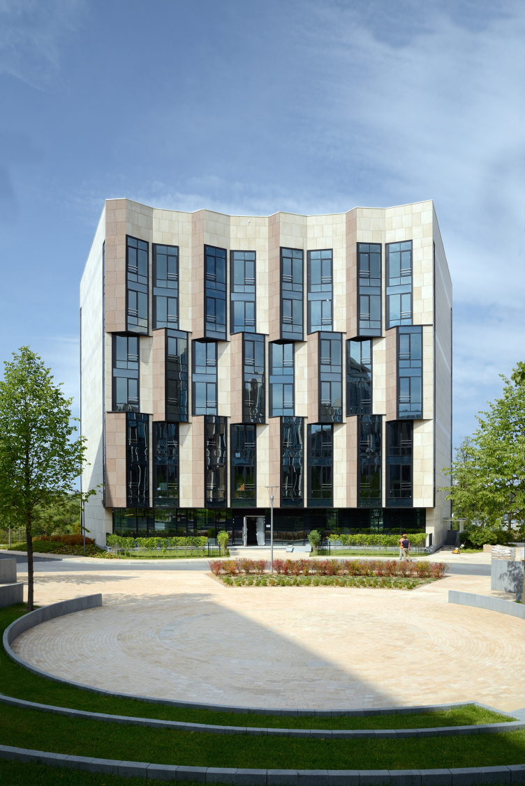
Another characteristic feature is the peculiar combination of glass and stone. They are almost half and half, and two types of limestone were used: light and dark – the latter accents the shades and compensating the lack of contrasting sun in our climate zone with the special architectural grisaille. The important thing is that grisaille is essentially a graphic, not a dimensional device. The stone goes on being graphical: bars of limestone “float” in the cold surface of glass like leaves upon water and create a single pattern with glass. So the difference between glass and stone goes down to nuances of transparency – and such approach is almost declaratively anticlassical.
 
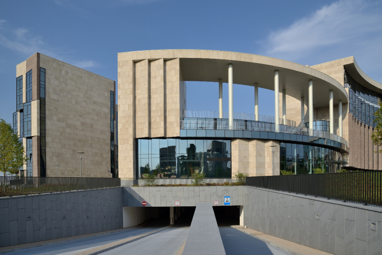
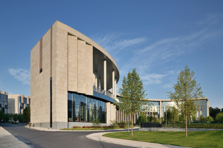
However, the familiar tectonic role of stone has not been completely ignored. It forms a large frame from the cornice and several vertical moldings similar to bolsters of a gigantic order but standing wide apart, thin and resembling an open book. However, this conventional “colonnade” arouses multiple associations – from antique to mansion-related. This theme is continued by another smaller colonnade on the roof of the glass community center. Its function will apparently be the restaurant terrace. But figuratively it is an anti-tower that accents the yard entrance and is simultaneously a belle vue garden house, the relative of the rotunda in the mansion parks reminding, for instance, of the Apollo Colonnade at Pavlovsk.        
 
It is as if a mansion palace with a park is transforming into a modern house right in front of us: one thing grows bigger, another smaller – and already the nostalgic fragments are fused into the new structure. It is the way you find antique reliefs in the walls of roman courtyards.
 
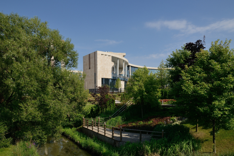
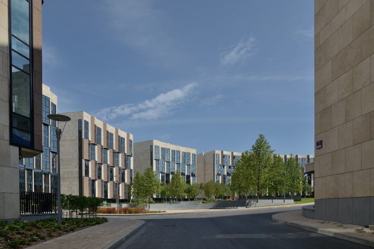
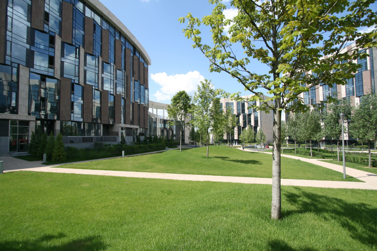
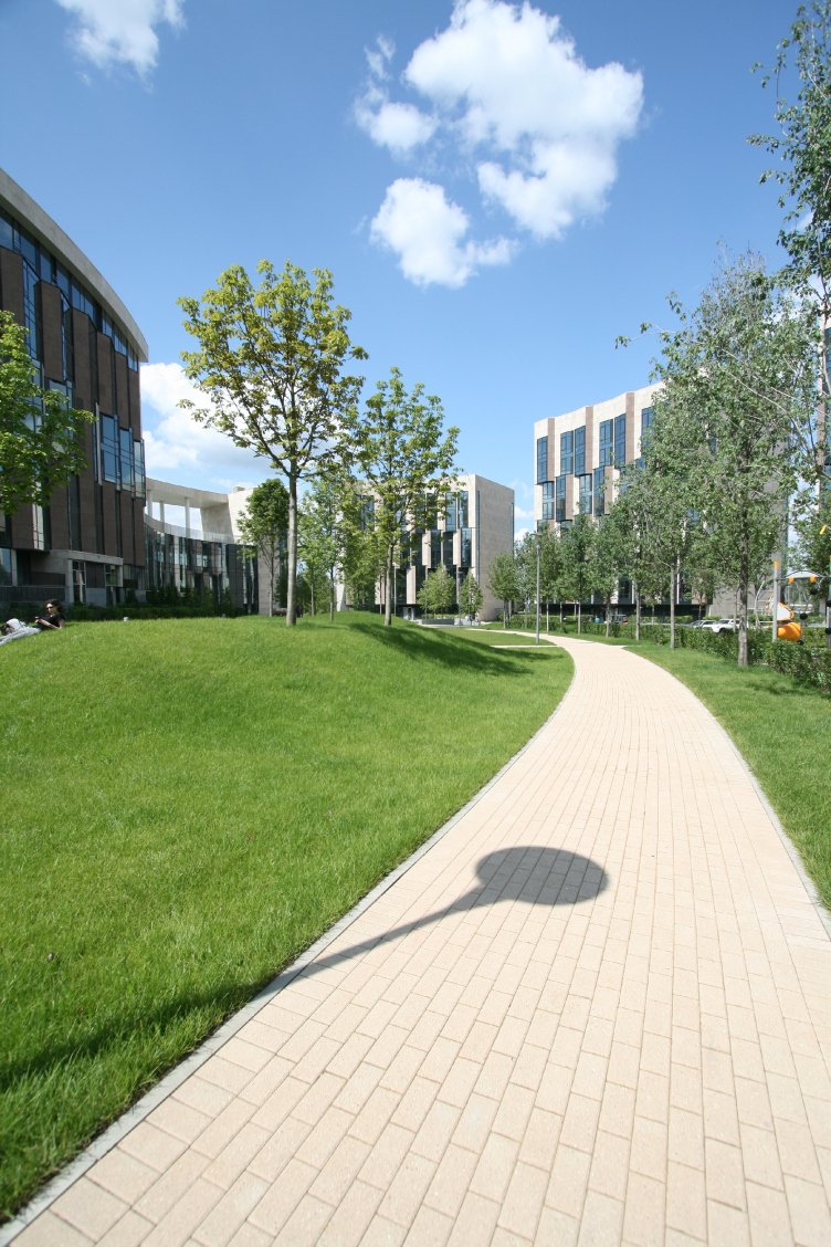
A tinge of nostalgia for the lost peacefulness of the Golden Age is resonated with by the improved territory. The first improvement project was proposed by TPO “Reserve”. Then the client organized a tender, won by an English bureau Hyland Edgar Driver. Vladimir Plotkin highly appreciated the improvement plan that was suggested and implemented by the British company – and in fact, it is a very accurately designed, beautiful and easily comprehendible landscape: comfortable and not overcrowded. The park is planted with flowers that bloom in turn and change the leaves colors regularly refreshing the view of the landscape; the lawns improved with soft geoplastics; everything is lit with soft, not blaring reflected light. The territory of the housing complex is rather big and is not densely developed, giving “air” to the residents. There are small front gardens before the ground floor apartments – personal pieces of ground for the residents.     
 
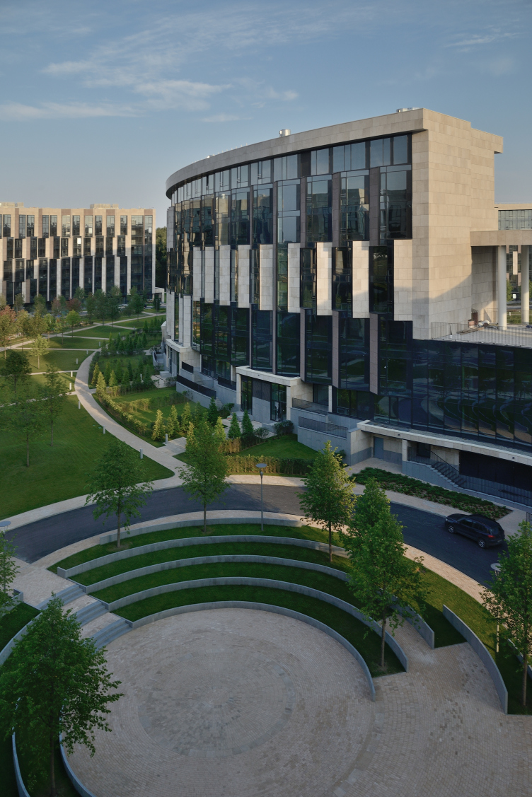
But the key parts of the park are the two amphitheaters placed by the English architects in the places where manmade ponds were planned according to “Reserve” project. Those are places predetermined by the architecture of the building, and first of all, the circle in the center of the compass that drew the curve of the façade. The English bureau has turned it into a charming green amphitheater: the steps covered with grass remind the theatres of ancient cities, not the restored ones, but the authentic earthquake-ruined, where the stone seats were shifted or gone altogether, and the steps remained. It resonates with the contour colonnade of the façade and awakens the mind of the stroller bringing more sense to an idle walk.  

But if we look around and see the big picture we will easily notice that the areas surrounding Skolkovo Highway are currently in the height of transformation. Earlier, just like along the neighboring Rublyovskoe Highway, there were only fences of country residences of influential people – even now, as soon as you turn aside a little, you appear in a gorge of fences. “Skolkovo Park” also has a fence, but it is different – it is transparent, aligned with the ideology of the project – light and natural. The house, as well as its “garden” do not hide inside a palace shell – but unwind upon the wide open space, breathe in the air as if saying in the morning: how wonderful! And what else does a person need?
"Skolkovo-Park". Photo © Aleksey Naroditsky, 2015
"Skolkovo-Park". On the foreground: the embankment of the Setun' River. Photo © Aleksey Naroditsky, 2015
"Skolkovo-Park". Location plan © Creative Union "Reserve"
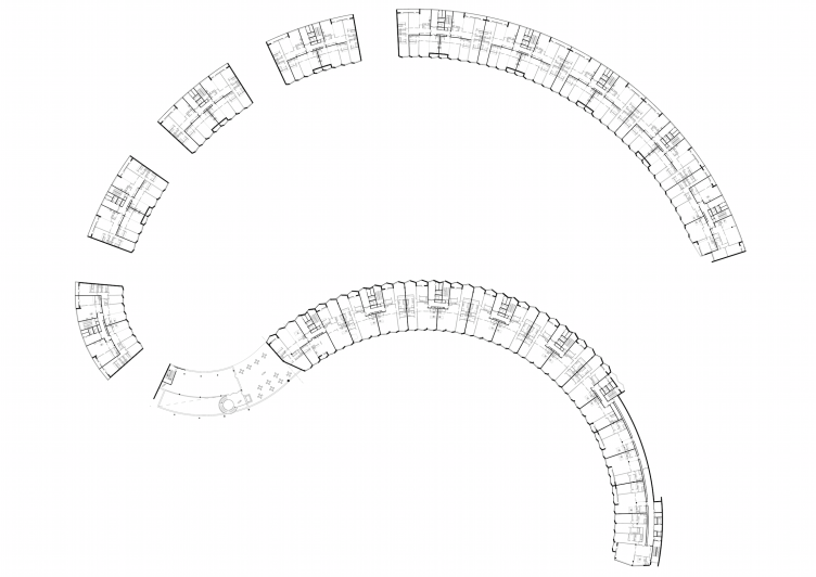
"Skolkovo-Park". Plan of the typical floor © Creative Union "Reserve"
"Skolkovo-Park". Photo © Aleksey Naroditsky, 2015
"Skolkovo-Park". The eastern facade is almost flat, the bay windows standing out only in its north part. Photo © Aleksey Naroditsky, 2015
"Skolkovo-Park". Photo © Aleksey Naroditsky, 2015
"Skolkovo-Park". Master Plan © Creative Union "Reserve"
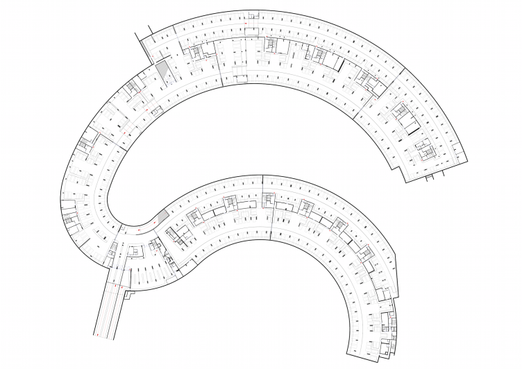
"Skolkovo-Park". Plan of the underground parking garage © Creative Union "Reserve"
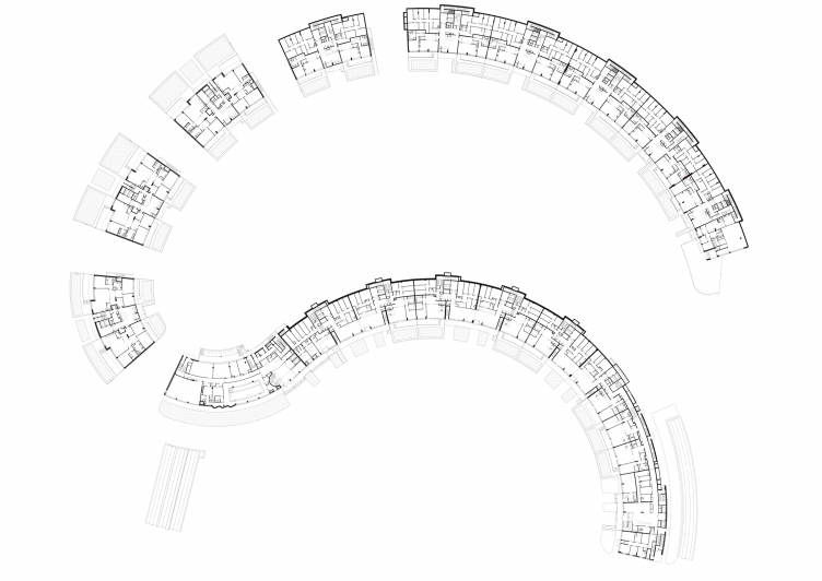
"Skolkovo-Park". Plan of the first floor © Creative Union "Reserve"
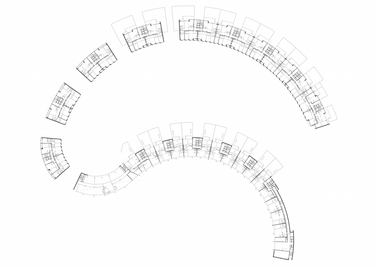
"Skolkovo-Park". Plan of the second floor © Creative Union "Reserve"
zooming
"Skolkovo-Park". Section view © Creative Union "Reserve"
zooming
"Skolkovo-Park". Section view © Creative Union "Reserve"
zooming
"Skolkovo-Park". Section view © Creative Union "Reserve"
"Skolkovo-Park". Section view, project © Creative Union "Reserve"

Architect:
Vladimir Plotkin
Object:
Residential complex Skolkovo-park, Zarechie
Russia, Novoivanovsky s.o., raiyon r.p. Zarechie

Project Team:
authors-architects: Plotkin V.I. - the corporate authors’ leader. Gusarev S.A, Travkin.A.M., Denisova U.D., Diasheva T.A., Ilevskaya M.M., Butusov A.V., Turin I.N., Dudukin S.G.; authors-constructors: Andreev V.V., Scherbina S.K.; chief project engineer: Kaumov F.M.; Authors of engineer sections: Popova G.A., Nedbailo B.K., Dachkina M.A., Musatov A.L., Kochanova G.F.

2008 — 2009 / 2010 — 2014

26 October 2015

Headlines now
A Step Forward
The HIDE residential complex represents a major milestone for ADM architects and their leaders Andrey Romanov and Ekaterina Kuznetsova in their quest for a fresh high-rise aesthetic – one that is flexible and layered, capable of bringing vibrancy to mass and silhouette while shaping form. Over recent years, this approach has become ADM’s “signature style”, with the golden HIDE tower playing a pivotal role in its evolution. Here, we delve into the project’s story, explore the details of the complex’s design, and uncover its core essence.
Gold in the Sands
A new office for a transcontinental company specializing in resource extraction and processing has opened in Dubai. Designed by T+T Architects, masters of creating spaces that are contemporary, diverse, flexible, and original, this project exemplifies their expertise. On the executive floor, a massive brass-clad partition dominates, while layered textures of compressed earth create a contextually resonant backdrop.
Layers and Levels of Flight
This project goes way back – Reserve Union won this architectural competition at the end of 2011, and the building was completed in 2018, so it’s practically “archival”. However, despite being relatively unknown, the building can hardly be considered “dated” and remains a prime example of architectural expression, particularly in the headquarters genre. And it’s especially fitting for an aviation company office. In some ways, it resembles the Aeroflot headquarters at Sheremetyevo but with its own unique identity, following the signature style of Vladimir Plotkin. In this article, we take an in-depth look at the United Aircraft Corporation (UAC) headquarters in the Moscow agglomeration town of Zhukovsky, supplemented by recent photographs from Alexey Naroditsky – a shoot that became only recently possible due to the fact that improvements were finally made in the surrounding area.
Light and Shadow
In this article, we delve into the architectural design of the “Chaika” house by DNK ag architects, which was recently completed in 2023 as part of the collection of signature designs at ZILArt. As is well-known, all the buildings in this complex follow a design code, yet each one is distinct. This particular building stands out not only for its whiteness and minimalism but also for the refined use of a limited number of techniques that, together, create what can confidently be called synergy.
Casus Novae
A master plan was developed for a large residential area with a name of “DNS City”, but now that its implementation began, the plan has been arbitrarily reformatted and replaced with something that, while similar on the surface, is actually quite different. This is not the first time such a thing happens, but it’s always frustrating. With permission from the author, we are sharing Maria Elkina’s post.
Treasure Hunting
The GAFA bureau, in collaboration with Tegola and Arkhitail, organized an expedition to the island of Kilpola in Karelia as part of Moskomarkhitektura’s “Open City” festival. There, amidst moss and rocks, the students sought answers to questions like: what is the sacred, where does it dwell, and what sustains it? Assisting the participants in this quest were landscape engineer Evgeny Levin, artist Nicholas Roerich, a moose, and the lack of cellular connection. Here’s how the story unfolded.
Depths of the Earth, Streams of Water
In the Malaya Okhta district, the Akzent building, designed by Stepan Liphart, was constructed. It follows a classic tripartite structure, yet it’s what you might call “hand-drawn”: each façade is unique in its form and details, some of which aren’t immediately noticeable. In this article, we explore the context and, together with the architect, delve into how the form was developed.
Fir Tree Dynamics
The “Airports of Region” holding is planning to build an airport in Karachay-Cherkessia, aiming to make the Arkhyz and Dombay resorts more accessible to travelers. The project that won in an invitation-only competition, submitted by Sergey Nikeshkin’s KPLN, blends natural imagery inspired by the shape of a conifer seed, open-air waiting spaces, majestic large trees, and a green roof elevated on needle-like columns. The result is both nature-inspired and WOW.
​A Brick Shell
In the process of designing a clubhouse situated among pine trees in a prestigious suburban area near Moscow, the architectural firm “A.Len” did the façade design part. The combination of different types of brick and masonry correlates with the volumetric and plastique solutions, further enhanced by the inclusion of wood-painted fragments and metal “glazing”.
Word Forms
ATRIUM architects love ambitious challenges, and for the firm’s thirtieth anniversary, they boldly play a game of words with an exhibition that dives deep into a self-created vocabulary. They immerse their projects – especially art installations – into this glossary, as if plunging into a current of their own. You feel as if you’re flowing through the veins of pure art, immersed in a universe of vertical cities, educational spaces – of which the architects are true masters – and the cultural codes of various locations. But what truly captivates is the bold statement that Vera Butko and Anton Nadtochy make, both through their work and this exhibition: architecture, above all, is art – the art of working with form and space.
Flexibility and Acuteness of Modernity
Luxurious, fluid, large “kokoshniks” and spiral barrel columns, as if made from colorful chewing gum: there seem to be no other mansion like this in Moscow, designed in the “Neo-Russian-Modern” style. And the “Teremok” on Malaya Kaluzhskaya, previously somewhat obscure, has “come alive with new colors” and gained visibility after its restoration for the office of the “architectural ecosystem” as the architects love to call themselves. It’s evident that Julius Borisov and the architects at UNK put their hearts into finding this new office and bringing it up to date. Let’s delve into the paradoxes of this mansion’s history and its plasticity. Spoiler: two versions of modernity meet here, both balancing on the razor’s edge of “what’s current”.
Yuri Vissarionov: “A modular house does not belong to the land”
It belongs to space, or to the air... It turns out that 3D printing is more effective when combined with a modular approach: the house is built in a workshop and then adapted to the site, including on uneven terrain. Yuri Vissarionov shares his latest experience in designing tourist complexes, both in central Russia and in the south. These include houseboats, homes printed from lightweight concrete using a 3D printer, and, of course, frame houses.
​Moscow’s First
“The quality of education largely depends on the quality of the educational environment”. This principle of the last decade has been realized by Sergey Skuratov in the project for the First Moscow Gymnasium on Rostovskaya Embankment in the Khamovniki district. The building seamlessly integrates into the complex urban landscape, responding both to the pedestrian flow of the city and the quiet alleyways. It skillfully takes advantage of the height differences and aligns with modern trends in educational space design. Let’s take a closer look.
Looking at the Water
The site of Villa Sonata stretches from the road to the water’s edge, offering its own shoreline, pier, and a picturesque river panorama. To reveal these sweeping views, Roman Leonidov “cut” the façade diagonally parallel to the river, thus getting two main axes for the house and, consequently, “two heads”. The internal core – two double-height spaces, a living room and a conservatory, with a “bridge” above them – makes the house both “transparent” and filled with light.
The White Wing
Well, it’s not exactly white. It’s more of a beige, white-stone structure that plays with the color of limestone – smoother surfaces are lighter, while rougher ones are darker. This wing unites various elements: it absorbs and interprets the surrounding themes. It responds to everything, yet maintains a cohesive expression – a challenging task! – while also incorporating recognizable features of its own, such as the dynamic cuts at the bottom, top, and middle.
Urban Dunes
The XSA Ramps team designed and built a three-part sports hub for a park in Rostov-on-Don, welcoming people of all ages and fitness levels. The skate plaza, pump track, and playground are all meticulously crafted with details that attract a diverse range of visitors. The technical execution of the shapes and slopes transforms this space into a kind of sculptural composition.
Proportional Growth
The project for the fourth phase of the ÁLIA residential area has been announced. The buildings are situated on an elongated plot – almost a “ray” that shoots out from the center of the area towards the river. Their layout reflects both a response to Moscow’s architectural preferences over the past 15 years, shifting “from blocks to towers”, and an interpretation of the neighboring business park designed by SOM. Additionally, the best apartments here are not located at the very top but closer to the middle, forming a glowing “waistline”.
The “Staircase” Building
In designing the “Details” residential complex in New Moscow, Rais Baishev spiced up the now-popular Moscow theme of a “courtyard” building with an idea drawn from the surrealist drawings by Maurits Escher. He envisioned the stepped silhouettes and descending slopes as a metaphysical mega-staircase, creating a key void within the courtyard that gave the project an internal “spine”. This concept is felt both in the building’s silhouette and on its façades.
Projection of the Quarter
No one doubted that the building that Vladimir Plotkin designed as part of the “Garden Quarters” would be the most modernist of all. And it turned out just that way: while adhering to the common design code, the building successfully combines brick and white stone, rhythmically responding to the neighboring building designed by Ostozhenka, yet tactfully and persistently making a few statements of its own. This includes the projection of the ideal urban development composition “14–9–6”, which can be found right next door, mathematical calculations, including those for various types of terraces (and perhaps the only reminder of the Soviet past of the Kauchuk rubber factory!), and the white “cross-stitch” pattern of the façade grid.
Domus Aurea
In this issue, we examine the “Tessinsky-1” house, designed by Sergey Skuratov and completed in 2023. Located in the middle of the Serebryanicheskaya Embankment district, at the intersection of its main streets, this house assumes a sort of “nodal” role: it not only responds to everything around it and preserves many memories of the former EMA factory within itself, but it weaves all this into a newly directed pattern, reconciling bright “gold” and dark-colored brick, largely with the help of the new, modern-yet-archaic Columba brick, which, come to think about it, is the most precious element here.
The Chimney of Nikola-Lenivets
In this issue, we are examining the “Obelisk House” designed by KATARSIS and built for the Arkhstoyanie 2023 festival. However, it was only finished later on, and this is why we are examining it now. It seems to us that after the “Obelisk House” appeared in Nikola-Lenivets, a dialogue and a few inner connections appeared between the temporary structures built here. These houses no longer look like “accidental neighbors”, more of which below.
​Periscope by the Bay
The jury awarded the second place in the competition for a public and cultural center in Petropavlovsk-Kamchatsky to the companies GORA (“Mountain”) and M4. In the consortium’s proposal, the building resembles a sperm whale with a calf swimming next to it or a periscope, whose lenses capture the most spectacular views from the surrounding landscape.
From Arcs to Dolmens
While working on the competition project for Petropavlovsk-Kamchatsky, ASADOV Architects prioritized the value of the natural and urban environment, aiming to preserve the balance of the location while minimizing the resemblance of the volume that they designed to a “traditional building”. The task was challenging, and the architects created three versions, one of which having been developed after the competition, where their main proposal took third place. However, the point of interest here is not the competition result but the continuity of creative thinking.
Hide and Seek
The ID Moskovskiy house, designed by Stepan Liphart in St. Petersburg, in the courtyards near Moskovskiy Avenue beyond the Obvodny Canal and recently completed, is notable for several reasons. Firstly, it has been realized with considerable accuracy, which is particularly significant as this is the first building where the architect was responsible not only for the facades but also for the layouts, allowing for better integration between the two. On the other hand, this building is interesting as an example of the “germination” of new architecture in the city: it draws on the best examples from the neighborhood and becomes an improved and developed sum of ideas found by the architect in the surrounding context.
The Big Twelve
Yesterday, the winners of the Moscow Mayor’s Architecture Award were announced and honored. Let’s take a look at what was awarded and, in some cases, even critique this esteemed award. After all, there is always room for improvement, right?
Above the Golden Horn
The residential complex “Philosophy” designed by T+T architects in Vladivostok, is one of the new projects in the “Golubinaya Pad” area, changing its development philosophy (pun intended) from single houses to a comprehensive approach. The buildings are organized along public streets, varying in height and format, with one house even executed in gallery typology, featuring a cantilever leaning on an art object.
Nuanced Alternative
How can you rhyme a square and space? Easily! But to do so, you need to rhyme everything you can possibly think of: weave everything together, like in a tensegrity structure, and find your own optics too. The new exhibition at GES-2 does just that, offering its visitor a new perspective on the history of art spanning 150 years, infused with the hope for endless multiplicity of worlds and art histories. Read on to see how this is achieved and how the exhibition design by Evgeny Ace contributes to it.
Blinds for Ice
An ice arena has been constructed in Domodedovo based on a project by Yuri Vissarionov Architects. To prevent the long façade, a technical requirement for winter sports facilities, from appearing monotonous, the architects proposed the use of suspended structures with multidirectional slats. This design protects the ice from direct sunlight while giving the wall texture and detail.
Frozen Magma
A competition for the creation of a public and cultural center was held in Petropavlovsk-Kamchatsky. Three architectural companies made it to the final, and we consider it important to share about the work of each. Let’s start with the winner – the consortium led by Wowhaus.
Campus within a Day
In this article, we talk about what the participants of Genplan Institute of Moscow’s hackathon were doing at the MosComArchitecture booth at the “ArchMoscow” exhibition. We also discuss who won the prize and why, and what can be done with the territory of a small university on the outskirts of Moscow.