По-русски

Mobility Zone

The architects of “A.Len” have not only fitted the multi-use complex in the Pulkovo Airport with a convenient arrangement of traffic and passenger flow, but also with a story-line that schematically encodes the past, present and future of the architecture.

22 October 2015
Object
mainImg

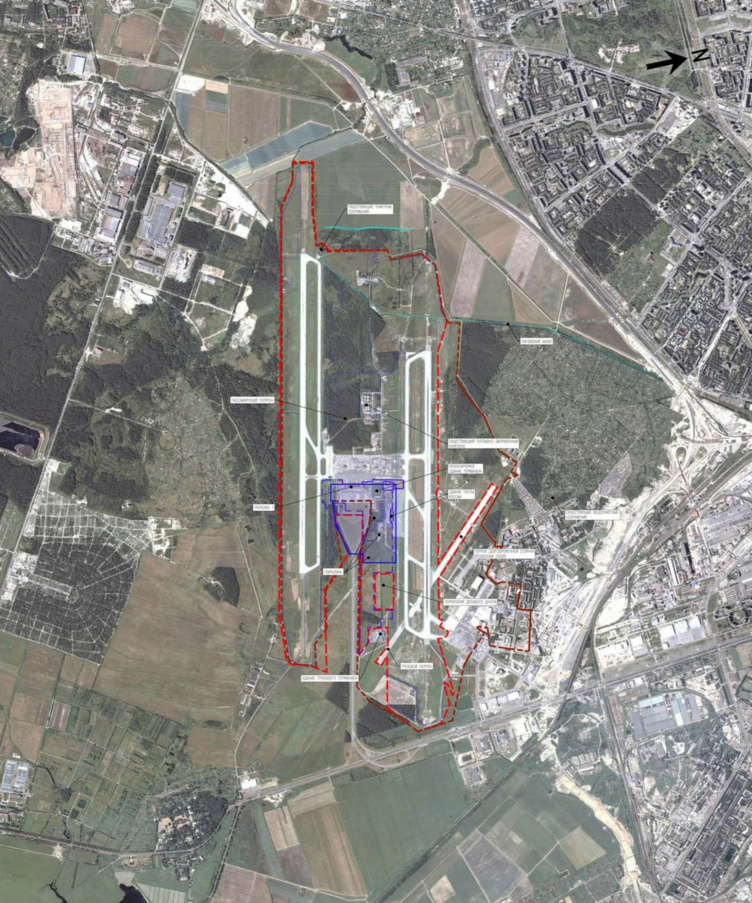
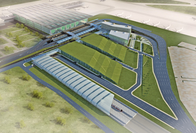
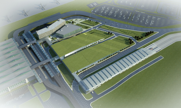
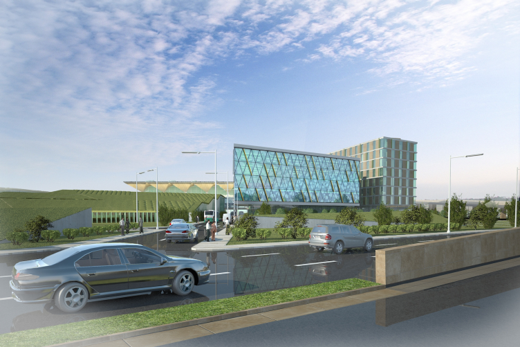
The multifunctional complex consisting of a hotel, business-center and multilayer parking lots is located right in front of the new passenger terminal of the Pulkovo Airport and surrounded with approach roadways on all sides. “Nadex” – the terminal station of aeroexpress– is built at the southern border of the multi-use complex, within the same project – the express train arrives at the meeting place of the old terminal Pulkovo-1 (constructed in early 70s to a design by Alexander Zhuk and known for its five light “glasses” placed in line on top of it) with the new one; after its reconstruction in 2014 the old terminal serves for domestic flights, and the new one – for international. To the north of the multi-use complex, there is an aircraft parking place; further to the east, along the highway, line up the business- and cargo Pulkovo terminals. This places the business-hotel-parking complex at the heart of a strained transportation hub of the only airport of St. Petersburg. That is why, one of the main and most challenging tasks in its design was to optimize the flows, find logical and convenient paths for motor- and passenger traffic both within the complex and at the borders with the external structures.

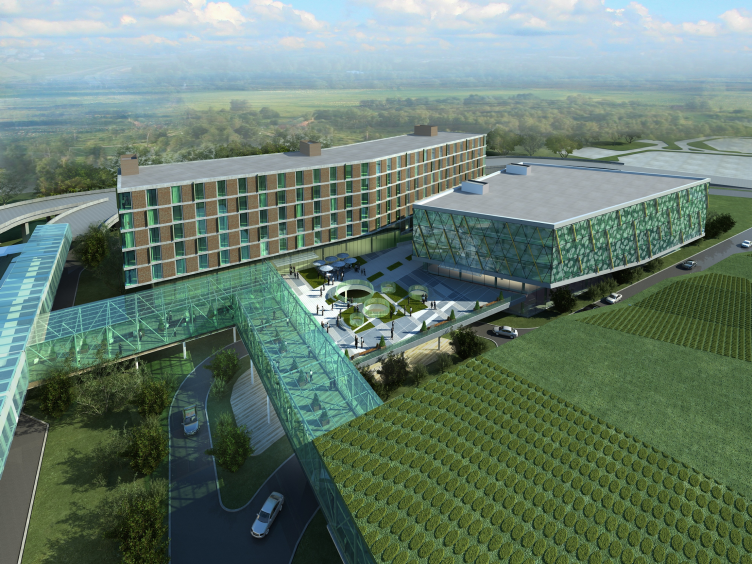
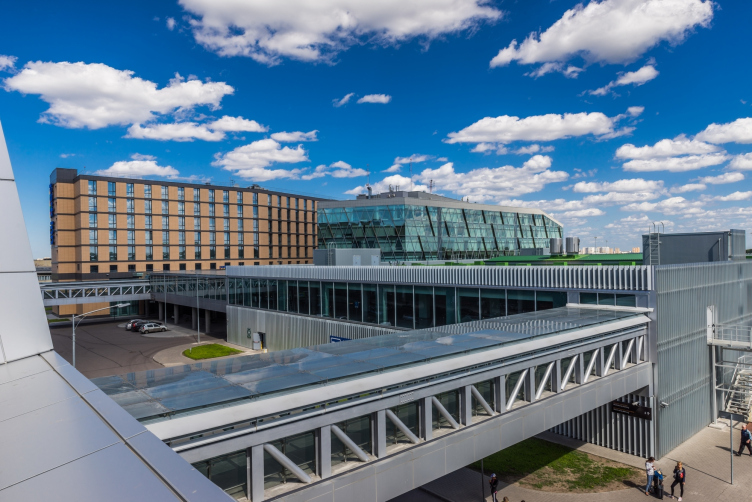
The business center and the hotel near "Pulkovo" airport © A.Len
The business center and the hotel near "Pulkovo" airport. Location plan © A.Len


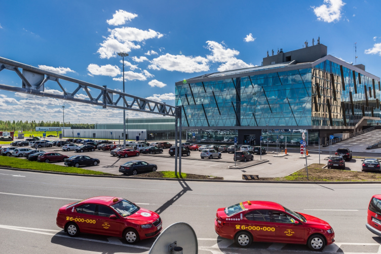
The business center and the hotel near "Pulkovo" airport © A.Len

               
As you know, the new Pulkovo Terminal was designed by the bureau of Nicholas Grimshaw that won the international tender of 2007. The same architects created the draft designs for the business-hotel complex situated next to the terminal. Afterwards, for the further elaboration of the project, Grimshaw architects hired a design company “Rambol” – an affiliate company of the largest Scandinavian enterprise “Ramboll Group” specializing in projects of industrial and public objects. For example, “Rambol” developed the building systems and distribution of traffic paths from the throughways to the hotel and business-center.  During the work he company made some unfortunate deviations from the Grimshaw’s draft design that were mentioned at several Urban Planning Councils. For example, the context of the terminal was left out, and the passengers were supposed to walk the transport flyover from the parking lot. At this point “A. Len” joined the project.                 
“Rambol” asked us to elaborate the project, –  says Sergey Oreshkin, head of  “A. Len”, – we gave our proposals in the form of a draft, the project was developed in close cooperation with the city authorities. In order to provide convenient traffic and lessen the load of the strained traffic junction, we suggested organizing movement of the aeroexpress passengers through a glazed gallery that – at the same time – gives a clear view of the airfield on its right side. Another glazed gallery connects the airport terminal with the complex site: the zone of the receiving terminal is situated merely 50 feet away from the hotel and the business-center, so we proposed the shortest path to it, which is extremely convenient, even for European standards.  

The business center and the hotel near "Pulkovo" airport © A.Len


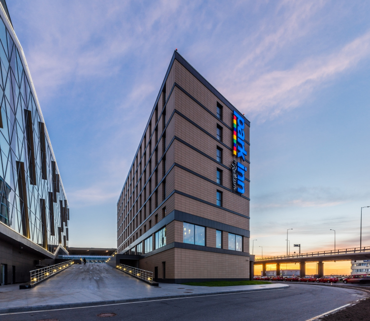
We went to London with our project to show the results to Sir Nicholas Grimshaw: our spatial solutions mainly coinsided with his opinions and ideas. The company’s employees were surprised that we duly appreciated their concept and that our vision of possible solutions was so close: it turned out that Grimshaw suggested arranging parking lots, the business zone and the aeroexpress stop in the same places. They also liked our interpretation of Melnikov’s rampants: the path from the parking lot smoothely turns round the hotel façade and rising through the gallery leads to the receiving terminal”.   

The business center and the hotel near "Pulkovo" airport © A.Len


The business center and the hotel near "Pulkovo" airport © A.Len


The business center and the hotel near "Pulkovo" airport © A.Len


Nevertheless, the spatial solutions of “A. Len” are fully independent. Unlike the original Grimshaw concept that tended towards an ordered, perpendicular network, the composition of Sergey Oreshnikov is based on the contrast of textures, lines and materials. The starting points were the original construction modules and the logic of the movement pattern.  
 
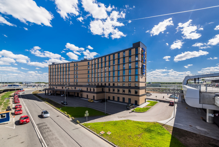
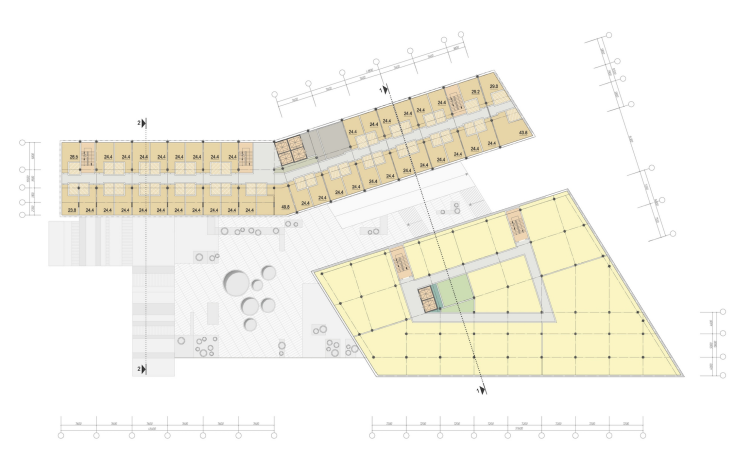
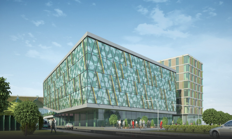
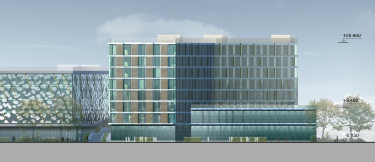
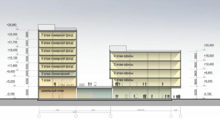
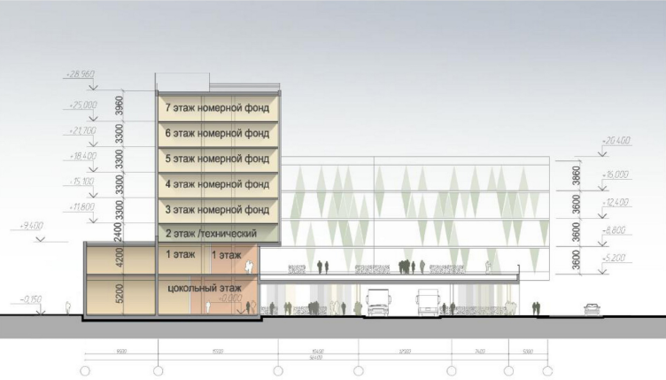
In the architectural part of the project all spatial solutions are based on the modules of construction and their sizes; the strict beauty of the geometry obeys the logic of the traffic pattern. The shape of the buildings is determined by the configuration of the lot and the distribution of communication flows. The plan of the business-center represents an irregular trapeze, the hotel is a strongly stretched building consisting of two parts, set in the form of a wide open book directed towards the airfield. The eight-storey hotel and the five-storey business-center are connected with a stylobate of the basement. The back façade of one of the hotel buildings is parallel to the façade of the business-center facing it and is reflected in its shiny surface. 

The business center and the hotel near "Pulkovo" airport © A.Len


The business center and the hotel near "Pulkovo" airport © A.Len


The business center and the hotel near "Pulkovo" airport. Plan of the typical floor © A.Len


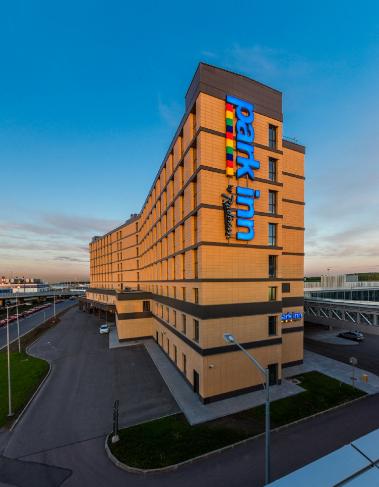
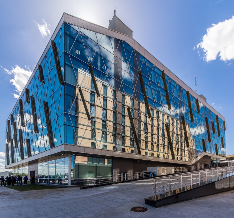
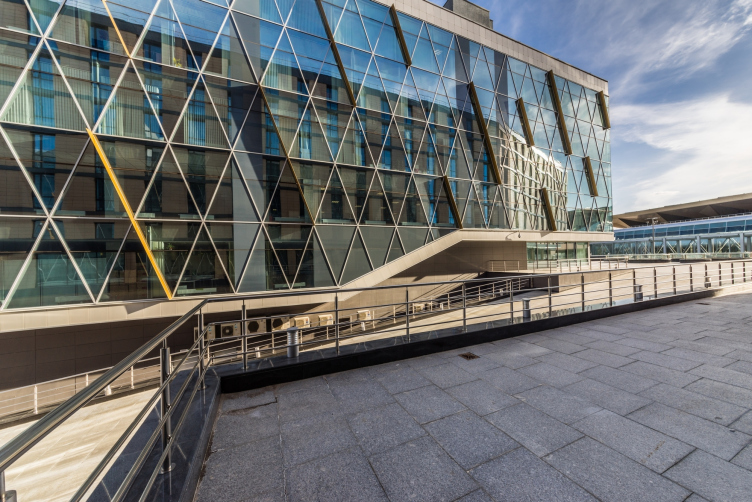
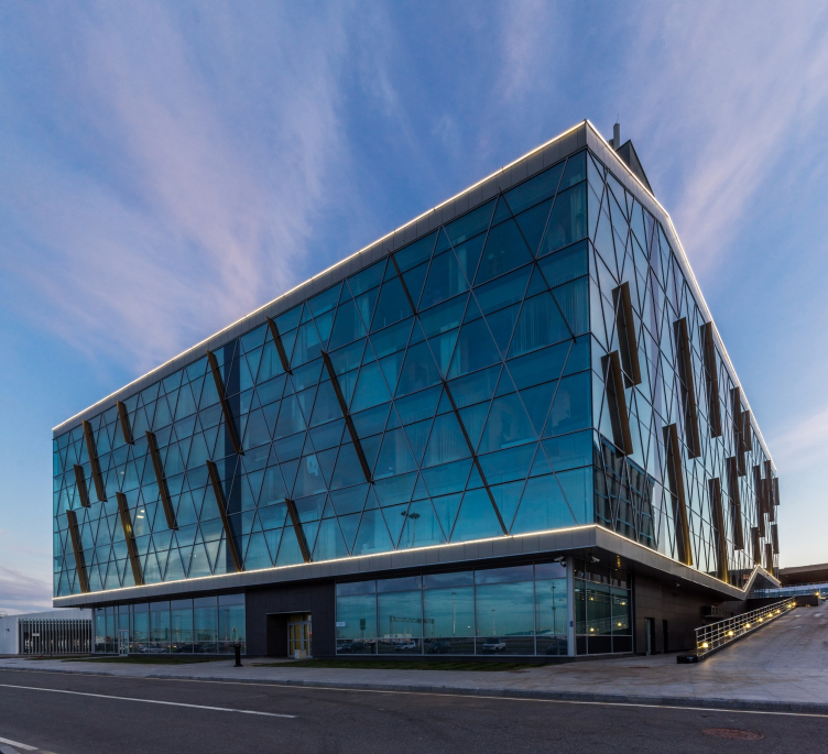
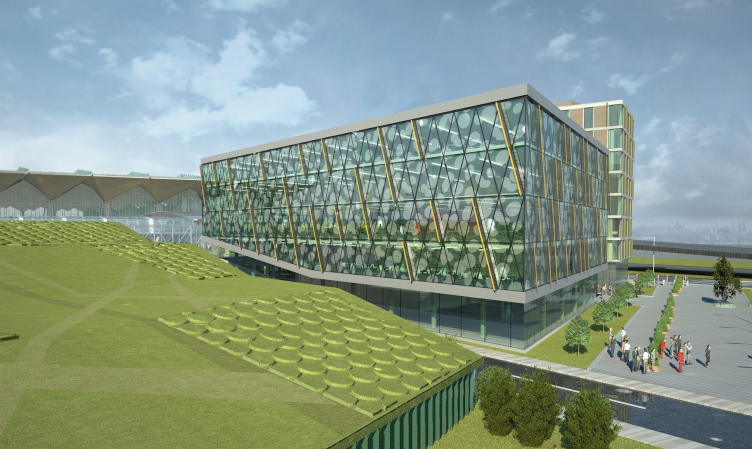
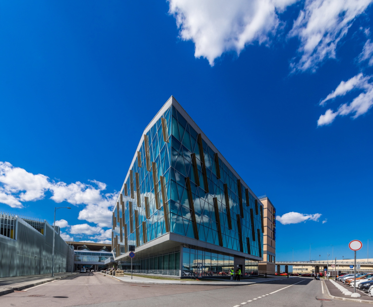
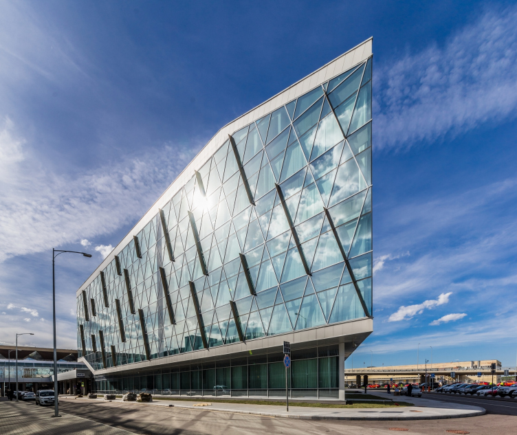
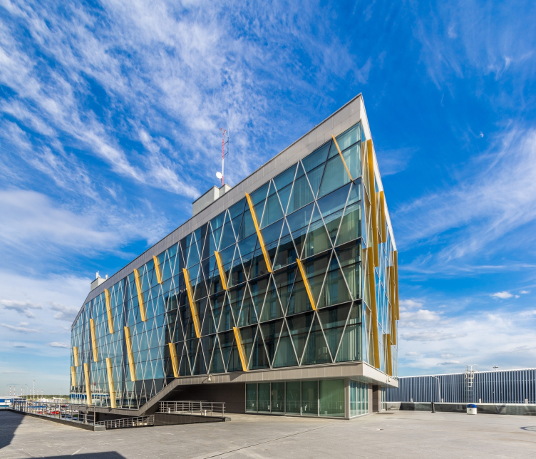
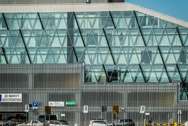
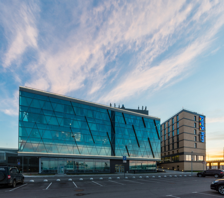
Unfortunately, the finishing was not done exactly according to the project of “A. Len”. The construction was carried out by a turkish company whose work was not controlled by the general contractor. As a result, the hotel facades are covered with pink-tinged ceramic panels and lined with rigid black horizontal contours, when, according to the project, it should have been finished with light-beige limestone and also light metal horizontal molding. The façade of the business-center remained as planned: the dynamic lines of the divided glazing diagonals coinside with the main traces suggested in the Grimshaw project. The image of flying is supported by the golden “wings” of the blinds. Inserted into the diamond-shaped network of the facades, they compose a decorative metaphor for flight – so appropriate for a building surrounded by planes. The glass of the façade has ecological properties and greenish toning. “A. Len” planned to apply thin contours of clouds onto the glass, but the edition of the turkish performing company turned these clouds into white circles, so it was decided to reject this idea altogether.

The business center and the hotel near "Pulkovo" airport © A.Len


The business center and the hotel near "Pulkovo" airport © A.Len

                
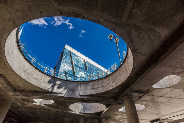
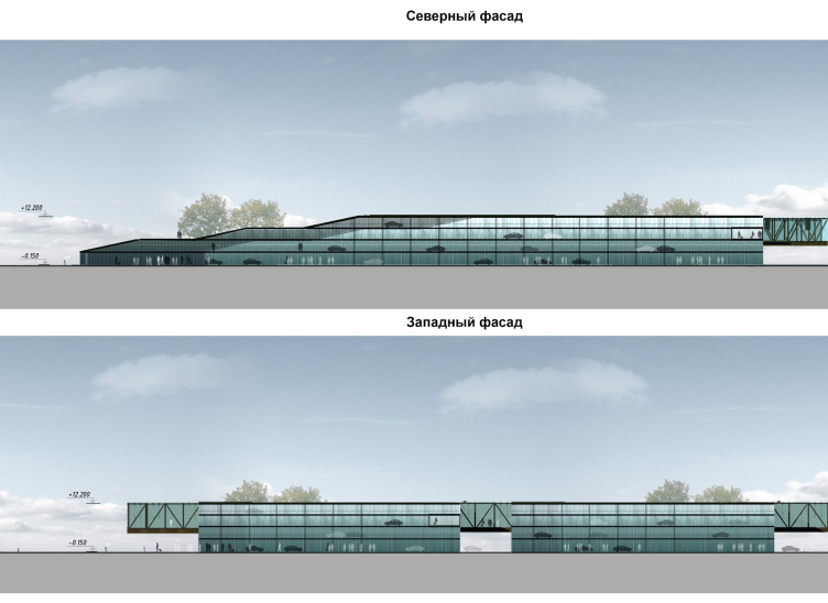
The open part of the stylobate roof near the end façade of the business-center has cut out round holes of different diameters: they bring daylight into the underground bus parking lot, and figuratively – they echo “glasses” of the old station of Alexander Zhuk.  

The business center and the hotel near "Pulkovo" airport © A.Len

 
Two more underground parking areas with roofed ground floors are located behind the building of the business center. The design of “A. Len” implied natural green areas on the roofs with land drainage and a park of modern urban sculpture. In a rather aggressive environment, this recreational zone would be a distraction for the passengers and guests of the hotel. However, due to the cost reasons, the roof has been covered with roll out lawns…  

The business center and the hotel near "Pulkovo" airport © A.Len
   

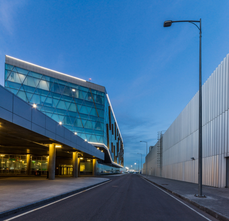
But, in the end, despite all of the not so much important (even though unfortunate) deviations from the project, the main idea of contrasting interaction has been successfully embodied. The ceramic (or, according to the draft – stone, as we remember) volumes of the hotel are graceful and almost classical, due to the rhythm of the wide verticals. The shine, the diagonals and the reflections of the glass business-center form the second pole. Stone – glass, verticals – rhombuses, everything is different, but everything agrees, mostly thanks to the lucky quality of modern glass architecture to reflect its neighbors. The third pole is henotic and absorbing: lines of lamellas fencing in contours of parking volumes look like a clotting of space that only marks the wall. Let us add the idea of a green roof: with the fence of lamellas bearing the park that was supposed to provide a completely antigravitational effect – a park that either rose from the ground (like a cut out piece of watermelon), or floats on air. So, the three volumes – even though with a significant share of conventionality, represent “three centuries” of architecture: the past with its order verticals; the dynamics, shining and variable geometry of the present, and finally, the transparency and rustic naturality of the future. Another crosspoint overlaps with the intense transportation hub – the imaginative one; an addition by no means useless in the center of a growing airport.                    
The business center and the hotel near "Pulkovo" airport © A.Len
The business center and the hotel near "Pulkovo" airport. Hotel, the eastern facade © A.Len
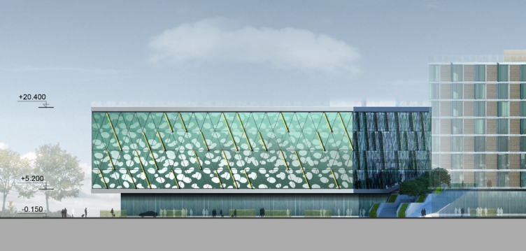
The business center and the hotel near "Pulkovo" airport. Facades of the parking lot © A.Len
The business center and the hotel near "Pulkovo" airport. Section view © A.Len


22 October 2015

Headlines now
The Golden Crown
The concept for a dental clinic in Yekaterinburg, developed by CNTR Studio, revolves around the idea of a “mouth full of gold”: pristine white porcelain stoneware walls are complemented by matte brass details. To avoid an overly literal interpretation, the architects focused on the building’s proportions, skillfully navigating between sunlight requirements and fire safety regulations.
Flexibility and Integration
Not long ago, we covered the project for the fourth phase of the ÁLIA residential complex, designed by APEX. Now, we’ve been shown different fence concepts they developed to enclose the complex’s private courtyards, incorporating a variety of public functions. We believe that the sheer fact that the complex’s architects were involved in such a detail as fencing speaks volumes.
A Step Forward
The HIDE residential complex represents a major milestone for ADM architects and their leaders Andrey Romanov and Ekaterina Kuznetsova in their quest for a fresh high-rise aesthetic – one that is flexible and layered, capable of bringing vibrancy to mass and silhouette while shaping form. Over recent years, this approach has become ADM’s “signature style”, with the golden HIDE tower playing a pivotal role in its evolution. Here, we delve into the project’s story, explore the details of the complex’s design, and uncover its core essence.
Gold in the Sands
A new office for a transcontinental company specializing in resource extraction and processing has opened in Dubai. Designed by T+T Architects, masters of creating spaces that are contemporary, diverse, flexible, and original, this project exemplifies their expertise. On the executive floor, a massive brass-clad partition dominates, while layered textures of compressed earth create a contextually resonant backdrop.
Layers and Levels of Flight
This project goes way back – Reserve Union won this architectural competition at the end of 2011, and the building was completed in 2018, so it’s practically “archival”. However, despite being relatively unknown, the building can hardly be considered “dated” and remains a prime example of architectural expression, particularly in the headquarters genre. And it’s especially fitting for an aviation company office. In some ways, it resembles the Aeroflot headquarters at Sheremetyevo but with its own unique identity, following the signature style of Vladimir Plotkin. In this article, we take an in-depth look at the United Aircraft Corporation (UAC) headquarters in the Moscow agglomeration town of Zhukovsky, supplemented by recent photographs from Alexey Naroditsky – a shoot that became only recently possible due to the fact that improvements were finally made in the surrounding area.
Light and Shadow
In this article, we delve into the architectural design of the “Chaika” house by DNK ag architects, which was recently completed in 2023 as part of the collection of signature designs at ZILArt. As is well-known, all the buildings in this complex follow a design code, yet each one is distinct. This particular building stands out not only for its whiteness and minimalism but also for the refined use of a limited number of techniques that, together, create what can confidently be called synergy.
Casus Novae
A master plan was developed for a large residential area with a name of “DNS City”, but now that its implementation began, the plan has been arbitrarily reformatted and replaced with something that, while similar on the surface, is actually quite different. This is not the first time such a thing happens, but it’s always frustrating. With permission from the author, we are sharing Maria Elkina’s post.
Treasure Hunting
The GAFA bureau, in collaboration with Tegola and Arkhitail, organized an expedition to the island of Kilpola in Karelia as part of Moskomarkhitektura’s “Open City” festival. There, amidst moss and rocks, the students sought answers to questions like: what is the sacred, where does it dwell, and what sustains it? Assisting the participants in this quest were landscape engineer Evgeny Levin, artist Nicholas Roerich, a moose, and the lack of cellular connection. Here’s how the story unfolded.
Depths of the Earth, Streams of Water
In the Malaya Okhta district, the Akzent building, designed by Stepan Liphart, was constructed. It follows a classic tripartite structure, yet it’s what you might call “hand-drawn”: each façade is unique in its form and details, some of which aren’t immediately noticeable. In this article, we explore the context and, together with the architect, delve into how the form was developed.
Fir Tree Dynamics
The “Airports of Region” holding is planning to build an airport in Karachay-Cherkessia, aiming to make the Arkhyz and Dombay resorts more accessible to travelers. The project that won in an invitation-only competition, submitted by Sergey Nikeshkin’s KPLN, blends natural imagery inspired by the shape of a conifer seed, open-air waiting spaces, majestic large trees, and a green roof elevated on needle-like columns. The result is both nature-inspired and WOW.
​A Brick Shell
In the process of designing a clubhouse situated among pine trees in a prestigious suburban area near Moscow, the architectural firm “A.Len” did the façade design part. The combination of different types of brick and masonry correlates with the volumetric and plastique solutions, further enhanced by the inclusion of wood-painted fragments and metal “glazing”.
Word Forms
ATRIUM architects love ambitious challenges, and for the firm’s thirtieth anniversary, they boldly play a game of words with an exhibition that dives deep into a self-created vocabulary. They immerse their projects – especially art installations – into this glossary, as if plunging into a current of their own. You feel as if you’re flowing through the veins of pure art, immersed in a universe of vertical cities, educational spaces – of which the architects are true masters – and the cultural codes of various locations. But what truly captivates is the bold statement that Vera Butko and Anton Nadtochy make, both through their work and this exhibition: architecture, above all, is art – the art of working with form and space.
Flexibility and Acuteness of Modernity
Luxurious, fluid, large “kokoshniks” and spiral barrel columns, as if made from colorful chewing gum: there seem to be no other mansion like this in Moscow, designed in the “Neo-Russian-Modern” style. And the “Teremok” on Malaya Kaluzhskaya, previously somewhat obscure, has “come alive with new colors” and gained visibility after its restoration for the office of the “architectural ecosystem” as the architects love to call themselves. It’s evident that Julius Borisov and the architects at UNK put their hearts into finding this new office and bringing it up to date. Let’s delve into the paradoxes of this mansion’s history and its plasticity. Spoiler: two versions of modernity meet here, both balancing on the razor’s edge of “what’s current”.
Yuri Vissarionov: “A modular house does not belong to the land”
It belongs to space, or to the air... It turns out that 3D printing is more effective when combined with a modular approach: the house is built in a workshop and then adapted to the site, including on uneven terrain. Yuri Vissarionov shares his latest experience in designing tourist complexes, both in central Russia and in the south. These include houseboats, homes printed from lightweight concrete using a 3D printer, and, of course, frame houses.
​Moscow’s First
“The quality of education largely depends on the quality of the educational environment”. This principle of the last decade has been realized by Sergey Skuratov in the project for the First Moscow Gymnasium on Rostovskaya Embankment in the Khamovniki district. The building seamlessly integrates into the complex urban landscape, responding both to the pedestrian flow of the city and the quiet alleyways. It skillfully takes advantage of the height differences and aligns with modern trends in educational space design. Let’s take a closer look.
Looking at the Water
The site of Villa Sonata stretches from the road to the water’s edge, offering its own shoreline, pier, and a picturesque river panorama. To reveal these sweeping views, Roman Leonidov “cut” the façade diagonally parallel to the river, thus getting two main axes for the house and, consequently, “two heads”. The internal core – two double-height spaces, a living room and a conservatory, with a “bridge” above them – makes the house both “transparent” and filled with light.
The White Wing
Well, it’s not exactly white. It’s more of a beige, white-stone structure that plays with the color of limestone – smoother surfaces are lighter, while rougher ones are darker. This wing unites various elements: it absorbs and interprets the surrounding themes. It responds to everything, yet maintains a cohesive expression – a challenging task! – while also incorporating recognizable features of its own, such as the dynamic cuts at the bottom, top, and middle.
Urban Dunes
The XSA Ramps team designed and built a three-part sports hub for a park in Rostov-on-Don, welcoming people of all ages and fitness levels. The skate plaza, pump track, and playground are all meticulously crafted with details that attract a diverse range of visitors. The technical execution of the shapes and slopes transforms this space into a kind of sculptural composition.
Proportional Growth
The project for the fourth phase of the ÁLIA residential area has been announced. The buildings are situated on an elongated plot – almost a “ray” that shoots out from the center of the area towards the river. Their layout reflects both a response to Moscow’s architectural preferences over the past 15 years, shifting “from blocks to towers”, and an interpretation of the neighboring business park designed by SOM. Additionally, the best apartments here are not located at the very top but closer to the middle, forming a glowing “waistline”.
The “Staircase” Building
In designing the “Details” residential complex in New Moscow, Rais Baishev spiced up the now-popular Moscow theme of a “courtyard” building with an idea drawn from the surrealist drawings by Maurits Escher. He envisioned the stepped silhouettes and descending slopes as a metaphysical mega-staircase, creating a key void within the courtyard that gave the project an internal “spine”. This concept is felt both in the building’s silhouette and on its façades.
Projection of the Quarter
No one doubted that the building that Vladimir Plotkin designed as part of the “Garden Quarters” would be the most modernist of all. And it turned out just that way: while adhering to the common design code, the building successfully combines brick and white stone, rhythmically responding to the neighboring building designed by Ostozhenka, yet tactfully and persistently making a few statements of its own. This includes the projection of the ideal urban development composition “14–9–6”, which can be found right next door, mathematical calculations, including those for various types of terraces (and perhaps the only reminder of the Soviet past of the Kauchuk rubber factory!), and the white “cross-stitch” pattern of the façade grid.
Domus Aurea
In this issue, we examine the “Tessinsky-1” house, designed by Sergey Skuratov and completed in 2023. Located in the middle of the Serebryanicheskaya Embankment district, at the intersection of its main streets, this house assumes a sort of “nodal” role: it not only responds to everything around it and preserves many memories of the former EMA factory within itself, but it weaves all this into a newly directed pattern, reconciling bright “gold” and dark-colored brick, largely with the help of the new, modern-yet-archaic Columba brick, which, come to think about it, is the most precious element here.
The Chimney of Nikola-Lenivets
In this issue, we are examining the “Obelisk House” designed by KATARSIS and built for the Arkhstoyanie 2023 festival. However, it was only finished later on, and this is why we are examining it now. It seems to us that after the “Obelisk House” appeared in Nikola-Lenivets, a dialogue and a few inner connections appeared between the temporary structures built here. These houses no longer look like “accidental neighbors”, more of which below.
​Periscope by the Bay
The jury awarded the second place in the competition for a public and cultural center in Petropavlovsk-Kamchatsky to the companies GORA (“Mountain”) and M4. In the consortium’s proposal, the building resembles a sperm whale with a calf swimming next to it or a periscope, whose lenses capture the most spectacular views from the surrounding landscape.
From Arcs to Dolmens
While working on the competition project for Petropavlovsk-Kamchatsky, ASADOV Architects prioritized the value of the natural and urban environment, aiming to preserve the balance of the location while minimizing the resemblance of the volume that they designed to a “traditional building”. The task was challenging, and the architects created three versions, one of which having been developed after the competition, where their main proposal took third place. However, the point of interest here is not the competition result but the continuity of creative thinking.
Hide and Seek
The ID Moskovskiy house, designed by Stepan Liphart in St. Petersburg, in the courtyards near Moskovskiy Avenue beyond the Obvodny Canal and recently completed, is notable for several reasons. Firstly, it has been realized with considerable accuracy, which is particularly significant as this is the first building where the architect was responsible not only for the facades but also for the layouts, allowing for better integration between the two. On the other hand, this building is interesting as an example of the “germination” of new architecture in the city: it draws on the best examples from the neighborhood and becomes an improved and developed sum of ideas found by the architect in the surrounding context.
The Big Twelve
Yesterday, the winners of the Moscow Mayor’s Architecture Award were announced and honored. Let’s take a look at what was awarded and, in some cases, even critique this esteemed award. After all, there is always room for improvement, right?
Above the Golden Horn
The residential complex “Philosophy” designed by T+T architects in Vladivostok, is one of the new projects in the “Golubinaya Pad” area, changing its development philosophy (pun intended) from single houses to a comprehensive approach. The buildings are organized along public streets, varying in height and format, with one house even executed in gallery typology, featuring a cantilever leaning on an art object.
Nuanced Alternative
How can you rhyme a square and space? Easily! But to do so, you need to rhyme everything you can possibly think of: weave everything together, like in a tensegrity structure, and find your own optics too. The new exhibition at GES-2 does just that, offering its visitor a new perspective on the history of art spanning 150 years, infused with the hope for endless multiplicity of worlds and art histories. Read on to see how this is achieved and how the exhibition design by Evgeny Ace contributes to it.
Blinds for Ice
An ice arena has been constructed in Domodedovo based on a project by Yuri Vissarionov Architects. To prevent the long façade, a technical requirement for winter sports facilities, from appearing monotonous, the architects proposed the use of suspended structures with multidirectional slats. This design protects the ice from direct sunlight while giving the wall texture and detail.