По-русски

A Rhombus Blitz

The contest project for a residential block situated on the site of Annenhof Grove by “4izmerenie” bureau is an example of combining striking futuristic towers with a humane solution of an urban environment and with evenly distributed functions.

29 April 2015
Object
mainImg
 
The project of "Annenhof Grove" residential complex at the Krasnokazarmennaya Street © 4izmerenie


The project of "Annenhof Grove" residential complex at the Krasnokazarmennaya Street © 4izmerenie


Today, the district of Lefortovo – one of the oldest in Moscow – is being actively transformed. While today its industrial enterprises take up more than half of its territory, in the near future the proportion is to shift to the benefit of the residential, cultural and public spaces. Not so long ago, the angst over the plans to build up the “Hammer and Sickle” plant’s territory has calmed down, and in August 2014 “Morton” group announced a blitz-contest on a development draft for the neighboring lot that refers to “Tenancy 14” on the Krasnokazarmennaya Street. Following the results of the contest, the winners were awarded the first and the second prizes, while another eight works were short-listed (which means, under the terms of the contest, that they “can be invited to further creative competitions and projects of Morton group and OOO “Regional Urban Planning Center”). One of this Eight was the bureau “4izmerenie” with its project “Annenhof Grove”.

Since the existing buildings of this territory – production halls, warehouses and other objects of neither cultural nor architectural value – are not planned to be preserved, the only thing that limited the participants’ imagination was the design assignment itself. But they did have an interesting historical background at hand – the difficult fate of the Annenhof grove that has been here since the 1730’s. It is generally thought that the grove back in the day was planted overnight by a pleasing courtier Biron to delight the eyes of the empress Anna Ioannovna, never to be liked by the city people, and in the beginning of the last century was altogether “shaven” (Gilyarovsky) away by a massive tornado in 1904. The project of “4izmerenie” in a way aims to repair the historical injustice by giving a new life to the grove and a comfortable urban area with an open parking to the Muscovites. The team of “4izmerenie” feels right at home in this challenging and often-disliked mode of a blitz-contest. “It is like building parti diagram at the university – only now we do it for real, like the grownups that we are – says one of the project’s authors, Vsevolod Medvedev. – It is a great test for your speed of creative thinking and ability to make decisions quickly”. In this case it was actually a super-blitz – the task of the competition was completed in only five days, and the authors are happy with their result.

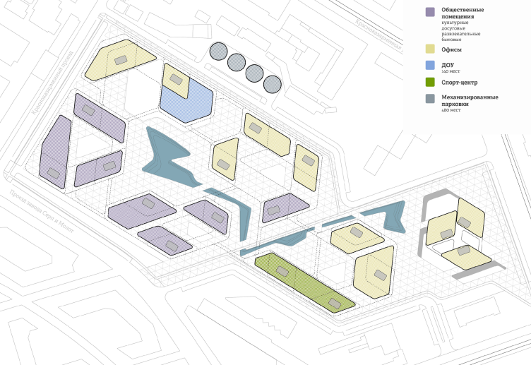
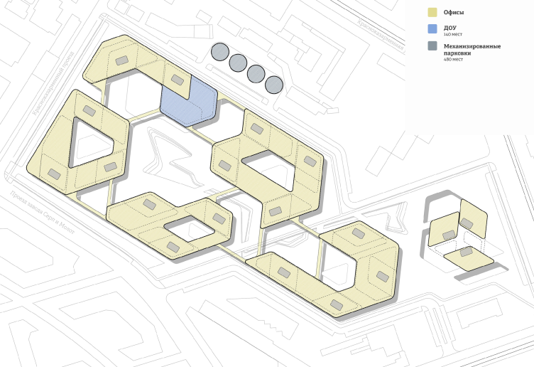
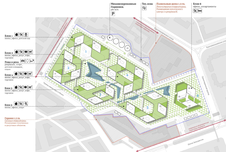
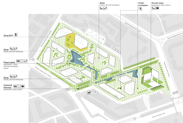
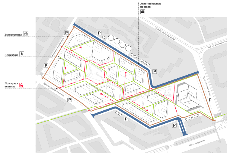
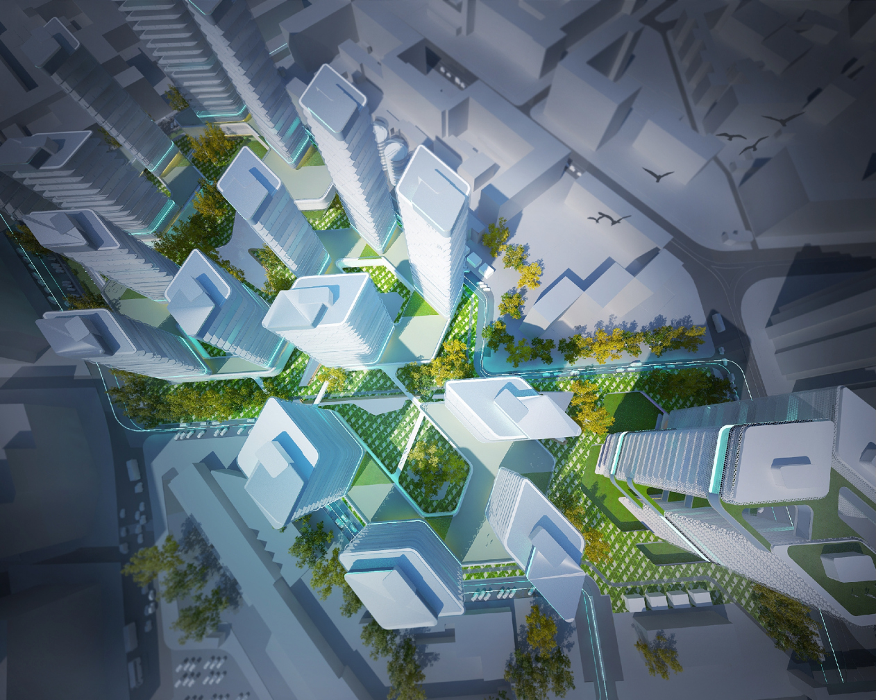
The project by “4izmerenie” fits into the spatial context as naturally as it does into the historical one. The master-plan of the development extends the main axes of the district. Their combination defined the rhomboidal cell structure of the plan divided into five mini-quarters plus the office-center, situated near the southern border. The architectures of “4izmerenie” consider this solution made entirely of advantages: it allowed them to create a fix and laconic composition with the residential, office and public volumes arranged along only three axes. The swiftly interchanging spaces, easy air-circulation, great insolation, the visual impression of constant movement (a definite advantage of this project, compared to some other short-listed participants, who consider building closed volumes with courtyards) – all of them are also functions of the multiply repeated rhombus, that represents a certain compromise between a canonical orthogonality a chaos of broken lines. The global practice actively uses this dynamic geometric figure in the area of façade decoration, however, it rarely puts it in a building plan – but if it does happen, it almost surely makes a powerful architectural expression: take, for instance, the centerpiece of Barcelona – “DiagonalZeroZero” upon the project of “EMBA” bureau, or Dominic Perro’s almost 1000 feet high “Blade” – that is now being built in Seoul.

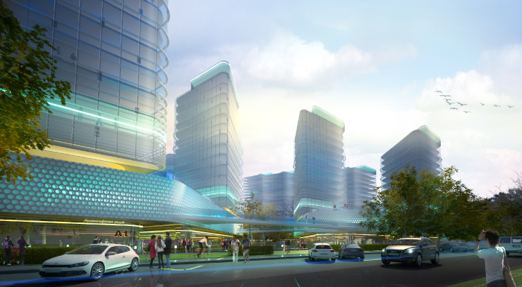
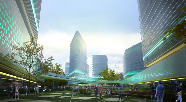
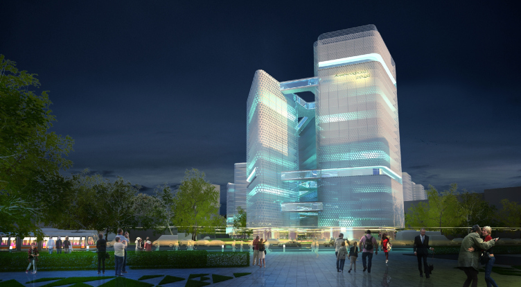
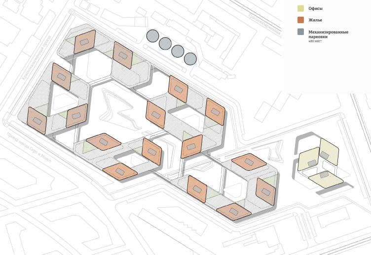
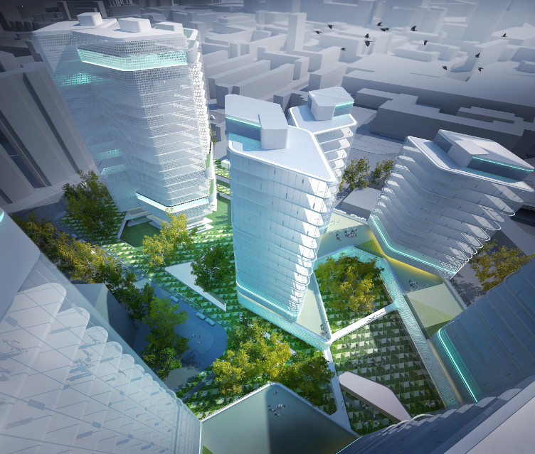
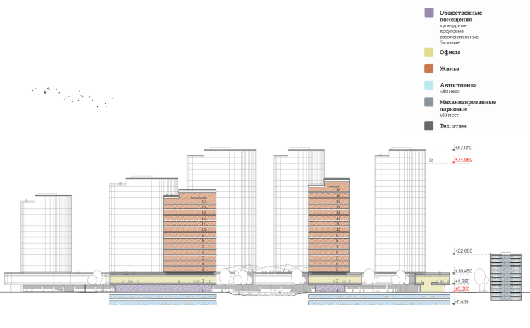
All the buildings in the project “Annenhof Grove” are rhombuses with rounded corners that are almost identical in plan but have different numbers of floors (from 13 to 22 with the number of floors decreasing towards south) and oriented towards different cardinal directions, which allows avoiding monotony. The dwelling buildings “grow through” the stylobate that in its turn, according to Le Corbusier’s principle, appears to be hung over the ground floor, on the level of the second storey protecting from the rain and uniting the towers with square closed and semi-closed lines surrounding the inner yards. Thus, there forms a hybrid space on the ground floor: basically modernistic but with a hint of the traditional urban structure – more closed up, secluded, subdued to the human scale but not wind-blown like the usual micro-district. And up above – rise the towers. It creates an elegant compromise between the modern Moscow tendency to residential quarters and the insolation requirements. The play of the overhung horizontal connections between the towers is supported by the mounted passages, suggested be the architects of “4izmerenie”. These passages are laid along the lines of the rhombus-like module on the level of the fifth, ninth and twenty-first floors – a method not only striking and changing the whole development into a complex spatial construction, but also bold and pricy. 

The project of "Annenhof Grove" residential complex at the Krasnokazarmennaya Street © 4izmerenie


The architects suggested making the most of the roofs of the stylobates operational: the planned recreational spaces are intended only for the dwellers of the district and local workers, unlike the lower level – available for everyone. The thing is, that unlike most participants of the contest that tended towards strict functional division of the corpuses into dwelling and office buildings, the architects of “4izmerenie” decided rather to approach this issue from two directions simultaneously. They suggested building the main office block on the crossroad of the Entuziastov highway and the future passway – first of all, it will create the architectural centerpiece from the direction of the main transport artery of the district, and secondly, it will provide an autonomous accessibility for the employees. Besides, the entire second level of the stylobate and partly the ground floors of the eastern towers are allocated for the offices (together with the commercial and public rooms).


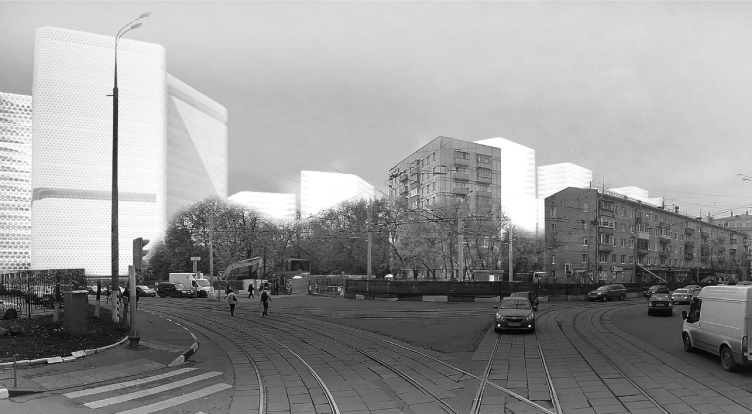
This project owes its charming futuristic air not least to the facades solution – laconic, even minimalist “splendid snow-white icebergs” (in the metaphoric expression of Vsevolod Medvedev). The authors suggested making them of glass with insertions of metal – just think of the visual characteristics of the apartments! By the way, the apartment layouts promise to be interesting and various: the floor spaces of the apartments vary from 600 to 1600 ft2, plus the two-storey penthouses. 

The project of "Annenhof Grove" residential complex at the Krasnokazarmennaya Street © 4izmerenie


The project of "Annenhof Grove" residential complex at the Krasnokazarmennaya Street © 4izmerenie


The project of "Annenhof Grove" residential complex at the Krasnokazarmennaya Street © 4izmerenie


The “not the most humane” building density, according to the architects, provided by the specifications (30 ha on a territory of 9 ha, aside from the underground space, with the height limitation of 240 ft) made the authors seek solutions of visual and dynamic lightening of the block. Since the ground floor development is not entire, but partial it allows for organizing a number of different well-equipped spaces, starting from little yards to squares that are to be open to all of the citizens according to the plan of the architects. And the central artery, extending the main axis of the neighboring site of the “Hammer and Sickle” (that is planned to be preserved after reconstruction) becomes the main planning accent of the block. This zone – practically a boulevard that organizes all the main fragments of the development – is planned to be completely pedestrian. More than that: the romantically-spirited architects have thought of an artificial little river as homage to Sinichka-river – that once flowed here, but now is only reminded of by several place-names. With a pinch of fantasy one can see the corpuses rising in different directions upon the stylobate not only as blocks of ice, but as some kind of a paraphrase of park trees. There should be plenty of real trees here, however: the architects want to make both the boulevard and the yards as green as possible. This is also a pendant of the “Hammer and Sickle” – its designer, “LPA Design” bureau, intends to make a city-park of it. A comfortable, ecological and simply good-looking recreational zone became one of the main advantages of this fascinating and promising project.

29 April 2015

Headlines now
The Golden Crown
The concept for a dental clinic in Yekaterinburg, developed by CNTR Studio, revolves around the idea of a “mouth full of gold”: pristine white porcelain stoneware walls are complemented by matte brass details. To avoid an overly literal interpretation, the architects focused on the building’s proportions, skillfully navigating between sunlight requirements and fire safety regulations.
Flexibility and Integration
Not long ago, we covered the project for the fourth phase of the ÁLIA residential complex, designed by APEX. Now, we’ve been shown different fence concepts they developed to enclose the complex’s private courtyards, incorporating a variety of public functions. We believe that the sheer fact that the complex’s architects were involved in such a detail as fencing speaks volumes.
A Step Forward
The HIDE residential complex represents a major milestone for ADM architects and their leaders Andrey Romanov and Ekaterina Kuznetsova in their quest for a fresh high-rise aesthetic – one that is flexible and layered, capable of bringing vibrancy to mass and silhouette while shaping form. Over recent years, this approach has become ADM’s “signature style”, with the golden HIDE tower playing a pivotal role in its evolution. Here, we delve into the project’s story, explore the details of the complex’s design, and uncover its core essence.
Gold in the Sands
A new office for a transcontinental company specializing in resource extraction and processing has opened in Dubai. Designed by T+T Architects, masters of creating spaces that are contemporary, diverse, flexible, and original, this project exemplifies their expertise. On the executive floor, a massive brass-clad partition dominates, while layered textures of compressed earth create a contextually resonant backdrop.
Layers and Levels of Flight
This project goes way back – Reserve Union won this architectural competition at the end of 2011, and the building was completed in 2018, so it’s practically “archival”. However, despite being relatively unknown, the building can hardly be considered “dated” and remains a prime example of architectural expression, particularly in the headquarters genre. And it’s especially fitting for an aviation company office. In some ways, it resembles the Aeroflot headquarters at Sheremetyevo but with its own unique identity, following the signature style of Vladimir Plotkin. In this article, we take an in-depth look at the United Aircraft Corporation (UAC) headquarters in the Moscow agglomeration town of Zhukovsky, supplemented by recent photographs from Alexey Naroditsky – a shoot that became only recently possible due to the fact that improvements were finally made in the surrounding area.
Light and Shadow
In this article, we delve into the architectural design of the “Chaika” house by DNK ag architects, which was recently completed in 2023 as part of the collection of signature designs at ZILArt. As is well-known, all the buildings in this complex follow a design code, yet each one is distinct. This particular building stands out not only for its whiteness and minimalism but also for the refined use of a limited number of techniques that, together, create what can confidently be called synergy.
Casus Novae
A master plan was developed for a large residential area with a name of “DNS City”, but now that its implementation began, the plan has been arbitrarily reformatted and replaced with something that, while similar on the surface, is actually quite different. This is not the first time such a thing happens, but it’s always frustrating. With permission from the author, we are sharing Maria Elkina’s post.
Treasure Hunting
The GAFA bureau, in collaboration with Tegola and Arkhitail, organized an expedition to the island of Kilpola in Karelia as part of Moskomarkhitektura’s “Open City” festival. There, amidst moss and rocks, the students sought answers to questions like: what is the sacred, where does it dwell, and what sustains it? Assisting the participants in this quest were landscape engineer Evgeny Levin, artist Nicholas Roerich, a moose, and the lack of cellular connection. Here’s how the story unfolded.
Depths of the Earth, Streams of Water
In the Malaya Okhta district, the Akzent building, designed by Stepan Liphart, was constructed. It follows a classic tripartite structure, yet it’s what you might call “hand-drawn”: each façade is unique in its form and details, some of which aren’t immediately noticeable. In this article, we explore the context and, together with the architect, delve into how the form was developed.
Fir Tree Dynamics
The “Airports of Region” holding is planning to build an airport in Karachay-Cherkessia, aiming to make the Arkhyz and Dombay resorts more accessible to travelers. The project that won in an invitation-only competition, submitted by Sergey Nikeshkin’s KPLN, blends natural imagery inspired by the shape of a conifer seed, open-air waiting spaces, majestic large trees, and a green roof elevated on needle-like columns. The result is both nature-inspired and WOW.
​A Brick Shell
In the process of designing a clubhouse situated among pine trees in a prestigious suburban area near Moscow, the architectural firm “A.Len” did the façade design part. The combination of different types of brick and masonry correlates with the volumetric and plastique solutions, further enhanced by the inclusion of wood-painted fragments and metal “glazing”.
Word Forms
ATRIUM architects love ambitious challenges, and for the firm’s thirtieth anniversary, they boldly play a game of words with an exhibition that dives deep into a self-created vocabulary. They immerse their projects – especially art installations – into this glossary, as if plunging into a current of their own. You feel as if you’re flowing through the veins of pure art, immersed in a universe of vertical cities, educational spaces – of which the architects are true masters – and the cultural codes of various locations. But what truly captivates is the bold statement that Vera Butko and Anton Nadtochy make, both through their work and this exhibition: architecture, above all, is art – the art of working with form and space.
Flexibility and Acuteness of Modernity
Luxurious, fluid, large “kokoshniks” and spiral barrel columns, as if made from colorful chewing gum: there seem to be no other mansion like this in Moscow, designed in the “Neo-Russian-Modern” style. And the “Teremok” on Malaya Kaluzhskaya, previously somewhat obscure, has “come alive with new colors” and gained visibility after its restoration for the office of the “architectural ecosystem” as the architects love to call themselves. It’s evident that Julius Borisov and the architects at UNK put their hearts into finding this new office and bringing it up to date. Let’s delve into the paradoxes of this mansion’s history and its plasticity. Spoiler: two versions of modernity meet here, both balancing on the razor’s edge of “what’s current”.
Yuri Vissarionov: “A modular house does not belong to the land”
It belongs to space, or to the air... It turns out that 3D printing is more effective when combined with a modular approach: the house is built in a workshop and then adapted to the site, including on uneven terrain. Yuri Vissarionov shares his latest experience in designing tourist complexes, both in central Russia and in the south. These include houseboats, homes printed from lightweight concrete using a 3D printer, and, of course, frame houses.
​Moscow’s First
“The quality of education largely depends on the quality of the educational environment”. This principle of the last decade has been realized by Sergey Skuratov in the project for the First Moscow Gymnasium on Rostovskaya Embankment in the Khamovniki district. The building seamlessly integrates into the complex urban landscape, responding both to the pedestrian flow of the city and the quiet alleyways. It skillfully takes advantage of the height differences and aligns with modern trends in educational space design. Let’s take a closer look.
Looking at the Water
The site of Villa Sonata stretches from the road to the water’s edge, offering its own shoreline, pier, and a picturesque river panorama. To reveal these sweeping views, Roman Leonidov “cut” the façade diagonally parallel to the river, thus getting two main axes for the house and, consequently, “two heads”. The internal core – two double-height spaces, a living room and a conservatory, with a “bridge” above them – makes the house both “transparent” and filled with light.
The White Wing
Well, it’s not exactly white. It’s more of a beige, white-stone structure that plays with the color of limestone – smoother surfaces are lighter, while rougher ones are darker. This wing unites various elements: it absorbs and interprets the surrounding themes. It responds to everything, yet maintains a cohesive expression – a challenging task! – while also incorporating recognizable features of its own, such as the dynamic cuts at the bottom, top, and middle.
Urban Dunes
The XSA Ramps team designed and built a three-part sports hub for a park in Rostov-on-Don, welcoming people of all ages and fitness levels. The skate plaza, pump track, and playground are all meticulously crafted with details that attract a diverse range of visitors. The technical execution of the shapes and slopes transforms this space into a kind of sculptural composition.
Proportional Growth
The project for the fourth phase of the ÁLIA residential area has been announced. The buildings are situated on an elongated plot – almost a “ray” that shoots out from the center of the area towards the river. Their layout reflects both a response to Moscow’s architectural preferences over the past 15 years, shifting “from blocks to towers”, and an interpretation of the neighboring business park designed by SOM. Additionally, the best apartments here are not located at the very top but closer to the middle, forming a glowing “waistline”.
The “Staircase” Building
In designing the “Details” residential complex in New Moscow, Rais Baishev spiced up the now-popular Moscow theme of a “courtyard” building with an idea drawn from the surrealist drawings by Maurits Escher. He envisioned the stepped silhouettes and descending slopes as a metaphysical mega-staircase, creating a key void within the courtyard that gave the project an internal “spine”. This concept is felt both in the building’s silhouette and on its façades.
Projection of the Quarter
No one doubted that the building that Vladimir Plotkin designed as part of the “Garden Quarters” would be the most modernist of all. And it turned out just that way: while adhering to the common design code, the building successfully combines brick and white stone, rhythmically responding to the neighboring building designed by Ostozhenka, yet tactfully and persistently making a few statements of its own. This includes the projection of the ideal urban development composition “14–9–6”, which can be found right next door, mathematical calculations, including those for various types of terraces (and perhaps the only reminder of the Soviet past of the Kauchuk rubber factory!), and the white “cross-stitch” pattern of the façade grid.
Domus Aurea
In this issue, we examine the “Tessinsky-1” house, designed by Sergey Skuratov and completed in 2023. Located in the middle of the Serebryanicheskaya Embankment district, at the intersection of its main streets, this house assumes a sort of “nodal” role: it not only responds to everything around it and preserves many memories of the former EMA factory within itself, but it weaves all this into a newly directed pattern, reconciling bright “gold” and dark-colored brick, largely with the help of the new, modern-yet-archaic Columba brick, which, come to think about it, is the most precious element here.
The Chimney of Nikola-Lenivets
In this issue, we are examining the “Obelisk House” designed by KATARSIS and built for the Arkhstoyanie 2023 festival. However, it was only finished later on, and this is why we are examining it now. It seems to us that after the “Obelisk House” appeared in Nikola-Lenivets, a dialogue and a few inner connections appeared between the temporary structures built here. These houses no longer look like “accidental neighbors”, more of which below.
​Periscope by the Bay
The jury awarded the second place in the competition for a public and cultural center in Petropavlovsk-Kamchatsky to the companies GORA (“Mountain”) and M4. In the consortium’s proposal, the building resembles a sperm whale with a calf swimming next to it or a periscope, whose lenses capture the most spectacular views from the surrounding landscape.
From Arcs to Dolmens
While working on the competition project for Petropavlovsk-Kamchatsky, ASADOV Architects prioritized the value of the natural and urban environment, aiming to preserve the balance of the location while minimizing the resemblance of the volume that they designed to a “traditional building”. The task was challenging, and the architects created three versions, one of which having been developed after the competition, where their main proposal took third place. However, the point of interest here is not the competition result but the continuity of creative thinking.
Hide and Seek
The ID Moskovskiy house, designed by Stepan Liphart in St. Petersburg, in the courtyards near Moskovskiy Avenue beyond the Obvodny Canal and recently completed, is notable for several reasons. Firstly, it has been realized with considerable accuracy, which is particularly significant as this is the first building where the architect was responsible not only for the facades but also for the layouts, allowing for better integration between the two. On the other hand, this building is interesting as an example of the “germination” of new architecture in the city: it draws on the best examples from the neighborhood and becomes an improved and developed sum of ideas found by the architect in the surrounding context.
The Big Twelve
Yesterday, the winners of the Moscow Mayor’s Architecture Award were announced and honored. Let’s take a look at what was awarded and, in some cases, even critique this esteemed award. After all, there is always room for improvement, right?
Above the Golden Horn
The residential complex “Philosophy” designed by T+T architects in Vladivostok, is one of the new projects in the “Golubinaya Pad” area, changing its development philosophy (pun intended) from single houses to a comprehensive approach. The buildings are organized along public streets, varying in height and format, with one house even executed in gallery typology, featuring a cantilever leaning on an art object.
Nuanced Alternative
How can you rhyme a square and space? Easily! But to do so, you need to rhyme everything you can possibly think of: weave everything together, like in a tensegrity structure, and find your own optics too. The new exhibition at GES-2 does just that, offering its visitor a new perspective on the history of art spanning 150 years, infused with the hope for endless multiplicity of worlds and art histories. Read on to see how this is achieved and how the exhibition design by Evgeny Ace contributes to it.
Blinds for Ice
An ice arena has been constructed in Domodedovo based on a project by Yuri Vissarionov Architects. To prevent the long façade, a technical requirement for winter sports facilities, from appearing monotonous, the architects proposed the use of suspended structures with multidirectional slats. This design protects the ice from direct sunlight while giving the wall texture and detail.