По-русски

Supermatism in Krasnokazarmennaya Street

The results of the competition for a design-concept of South-Eastern Administrative Okrug’s territory, Moscow. The competition was commissioned by the “MORTON” development center.

18 September 2014
Contest Results
mainImg
The one-phase creative blitz-contest for a design-concept of a district development came to a conclusion. The candidates were to suggest a rebuilding plan for a 9 hectare plot in Krasnokazarmennaya street to replace houses №14 behind Moscow Power Engineering Institute, on the eastern side of “Hammer and Sickle”, that is currently under reconstruction. By the way, it has recently come out, that the former giant-factory will be reconstructed by LDA design.


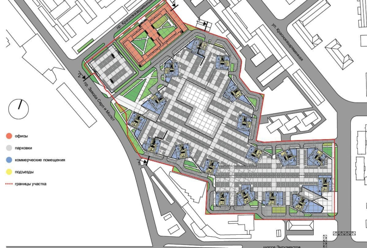
"Suprematism" project by "8D architects". Photo courtesy by the contest organizers

The land site that is now surrounded with fences and sheds, and overall looks semi-industrial, (although, according to Yandex Maps, not considered as an industrial area) is planned to be completely rebuilt. Nine hectares will be built over with 20 hectares of dwelling space for about 4570 people, a three-story kindergarten, 10 hectares of offices, and over a hectare of ground floor will be allocated for a number of cafes and shops. The maximum building height is 246 feet, the allowable number of floors ranging from 14 to 21. The competition was organized by the Union of Moscow Architects and the Regional Center of Urban Geography for “MORTON” development center. 31 projects took part in the contest, two of which shared the winning entries and eight more were shortlisted. All the ten finalists are published in this article. 

The Winner.
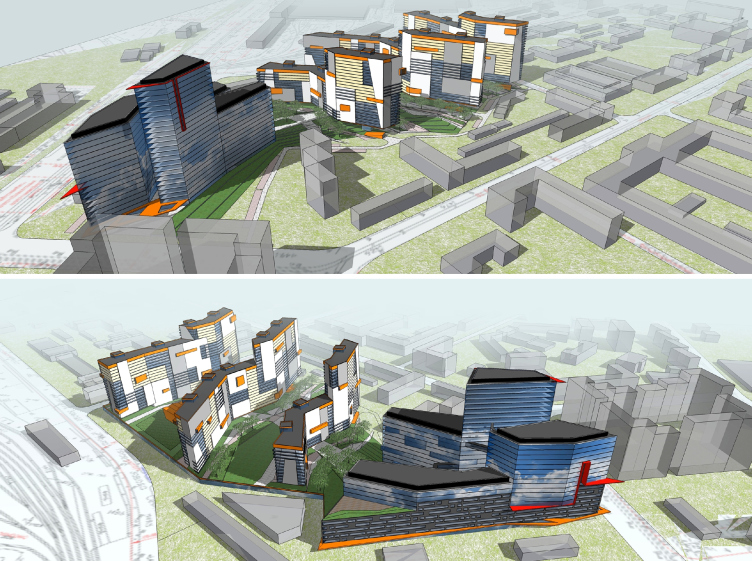
“Supermatism”/8D architects


"Suprematism" project by "8D architects". Photo courtesy by the contest organizers

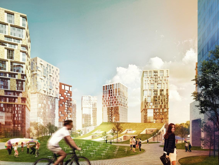
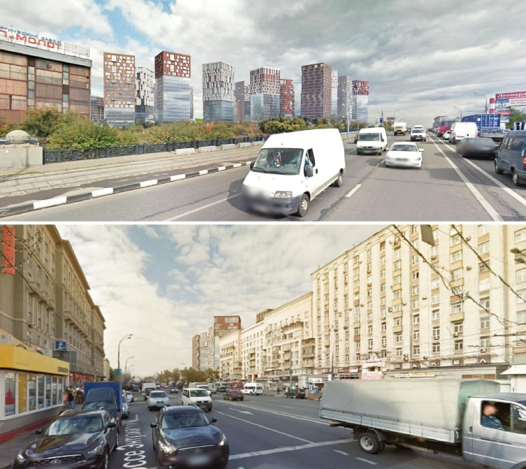
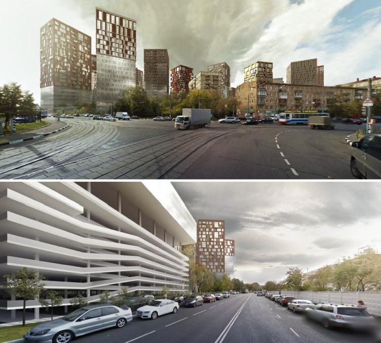
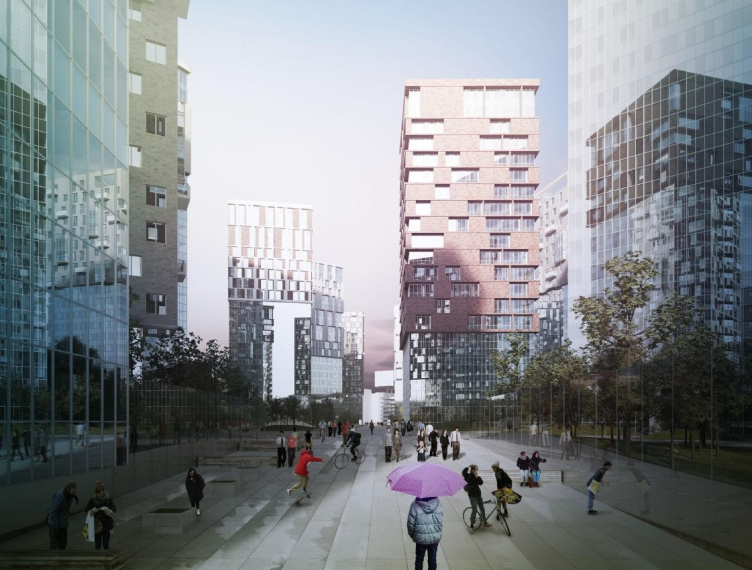
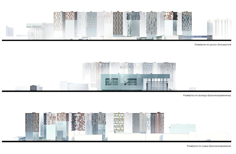
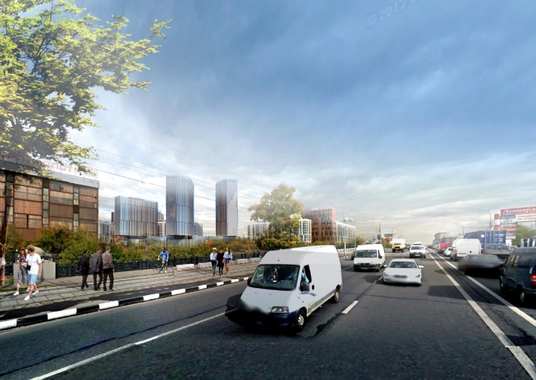
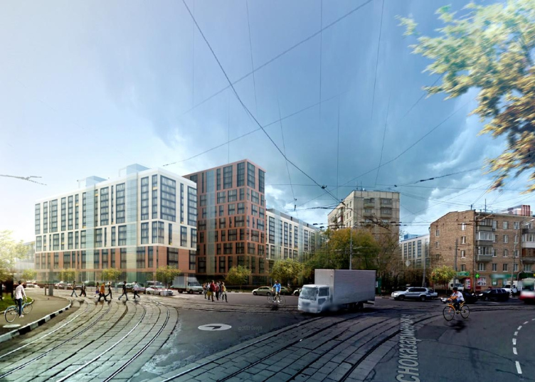
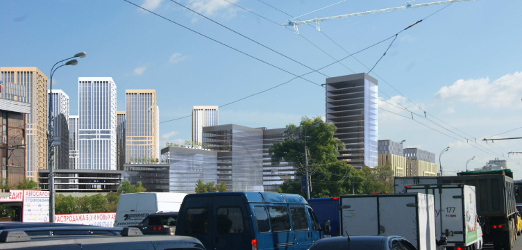
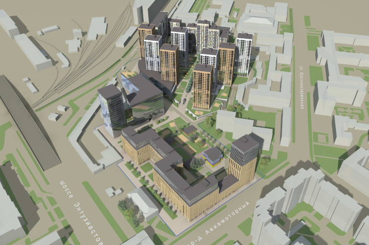
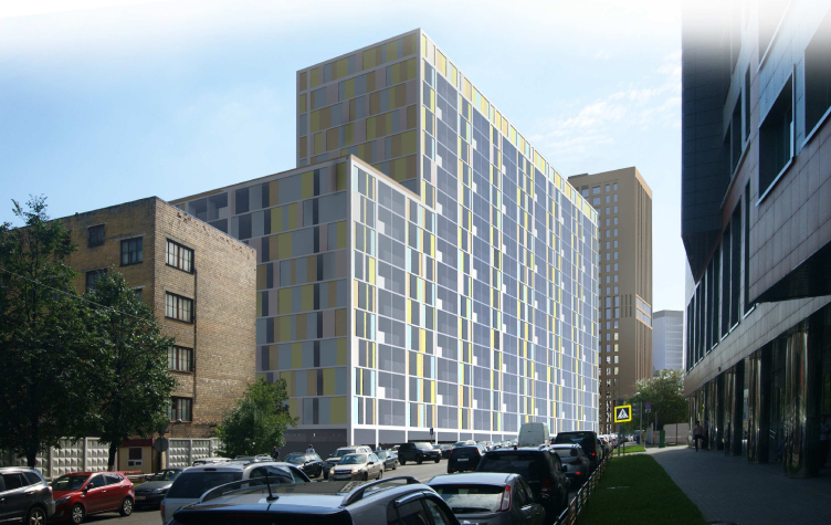
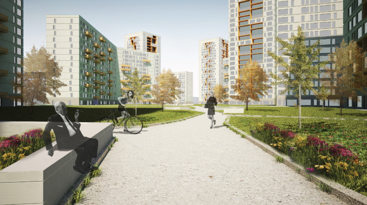
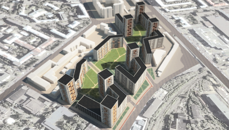
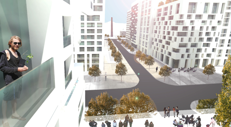
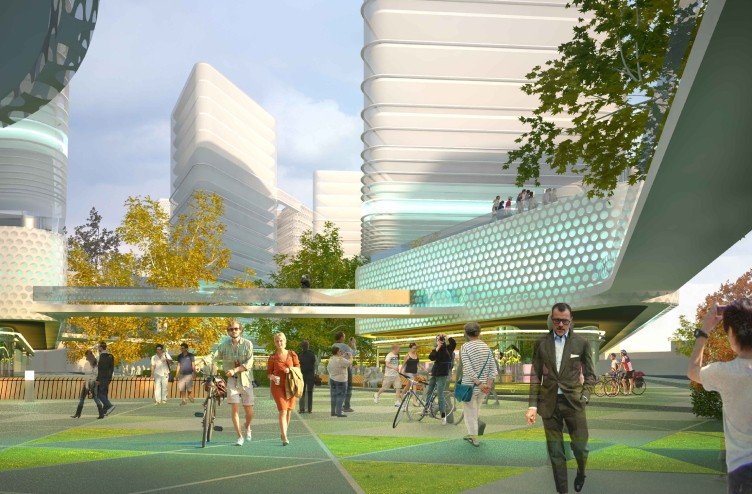
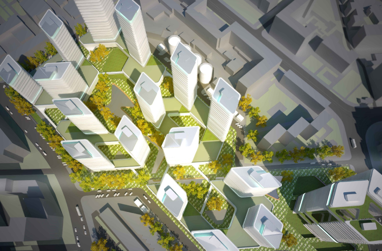
The base of the project is a pedestrian boulevard – a diagonal axis connecting “Hammer and Sickle” factory and Shosse Entuziastov metro station; from north-east to south-west. The architects placed 18 residential towers along the perimeter of the territory, square on plan and with varying facades. The lower parts of the houses, all of different height, are made of glass. The upper parts are covered with thicker matter. This creates an allusion to stone volumes, levitating on a different distance from the ground. Following the fanciful outline of the plot the towers are turned at different angles which makes an impression of a dance (it also somehow reminds Erick Egeraat’s residential complex “Avant-guard”). The apartments vary from one-room studios to penthouses with terraces. The office complex and the parking lot are stretched along the upper part of the site – Krasnokazarnenniy Drive. 


"Suprematism" project by "8D architects". Photo courtesy by the contest organizers

"Suprematism" project by "8D architects". Photo courtesy by the contest organizers


"Suprematism" project by "8D architects". Photo courtesy by the contest organizers
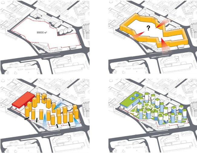

"Suprematism" project by "8D architects". Photo courtesy by the contest organizers
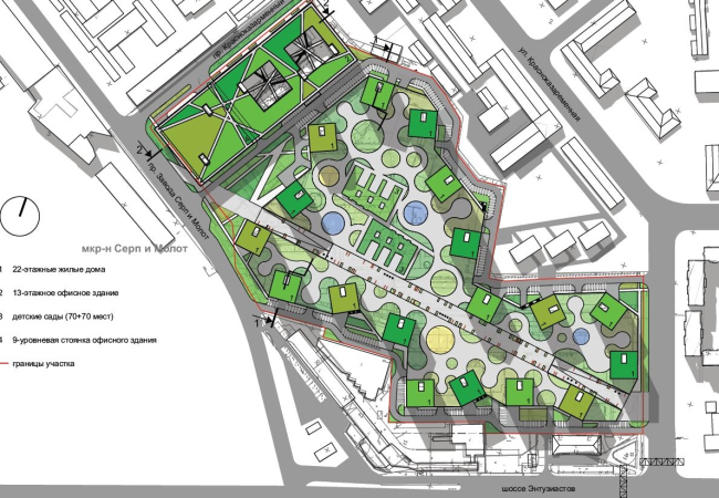

"Suprematism" project by "8D architects". Photo courtesy by the contest organizers
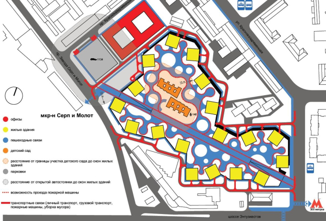

"Suprematism" project by "8D architects". Photo courtesy by the contest organizers


"Suprematism" project by "8D architects". Photo courtesy by the contest organizers
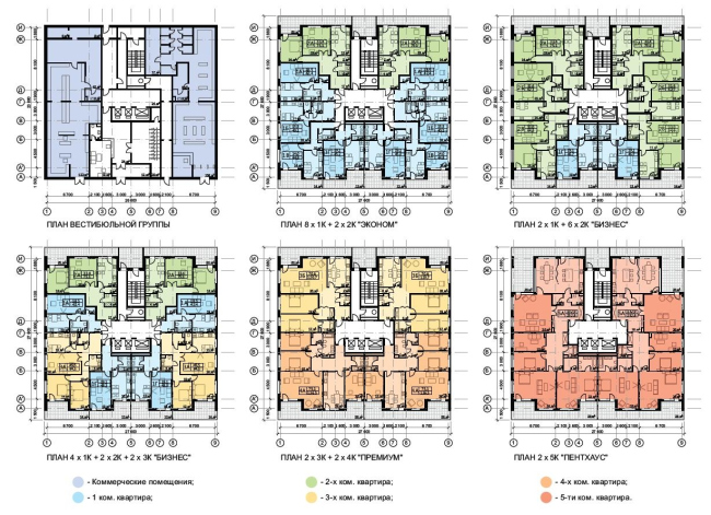

"Suprematism" project by "8D architects". Photo courtesy by the contest organizers
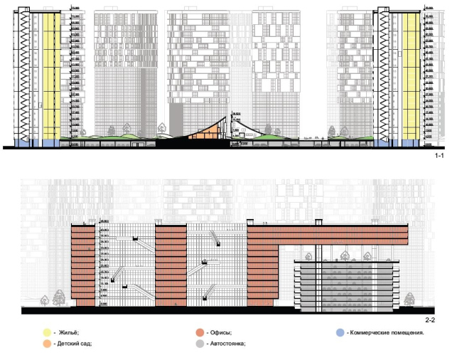

"Suprematism" project by "8D architects". Photo courtesy by the contest organizers
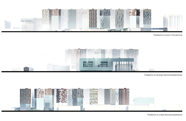

"Suprematism" project by "8D architects". Photo courtesy by the contest organizers

Second Prize
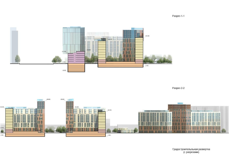
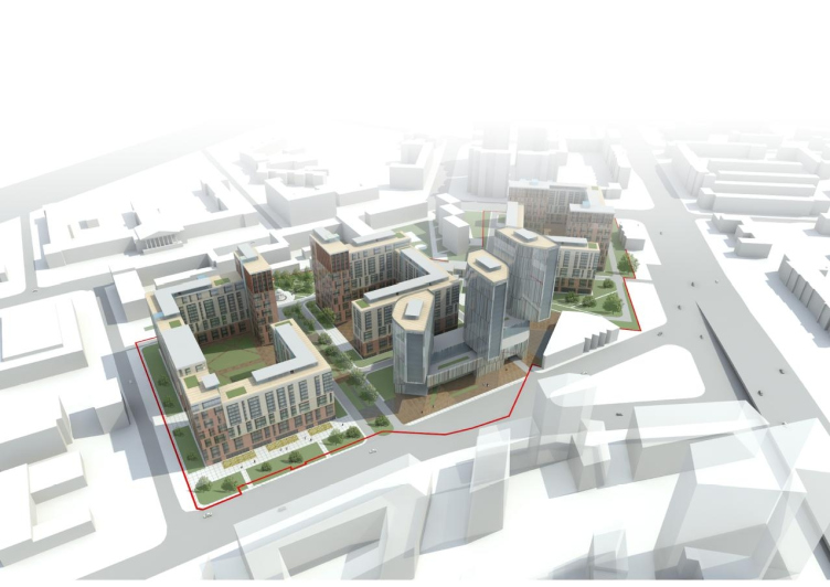
“Annenhof Park” / Asadov Architectural Bureau
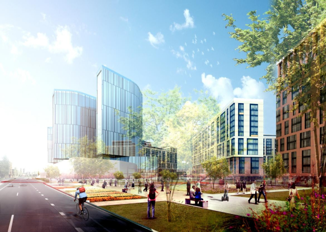


Annenhof Park. Asadov Architectural Bureau. Photo courtesy by the contest organizers

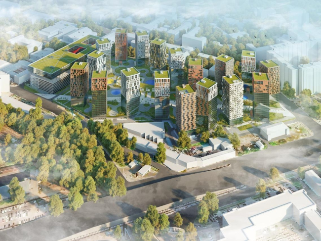
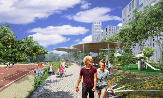
The suggested name of the architectural complex – “Annenhof Park” – reflects the history of the area. This territory neighbored upon the former Annenhof Grove back in the 18th century. And, even though hardly anything is left of it today, some fragments of the grove have been preserved as public gardens. The biggest of them is situated in front of the Military Armored Forces Academy (former Catherine’s Palace) which is about 0,6 miles away from the plot. Lefortovo Park, the remainder of Annenhof on the bank of the Yauza River (also the former park at Golovin Palace, later Catherine’s Palace), is 1,2 miles away from the residential complex. The architects see these green parks as recreational areas for the future dwellers. 

The building complex consists of four groups of buildings in this project: one allocated for the offices and three for dwelling. The office-building looks like a crystal: three polyhedral towers arranged at different angles are united by a single stylobate and are connected to the central spatial axis of the future territory of “Hammer and Sickle” complex. 

The three groups of apartment houses with different numbers of floors are built up as blocks around the perimeter of the yards. Two basements and a ground floor are allocated for parking lots. That’s why the surfaces of the yards are raised higher up than the adjacent territories, which restricts the access of transport.  The green parks and boulevards inside the dwelling complex, as well as the adjacent kindergarten and a number of shops, are separated from the traffic area. 


Annenhof Park. Asadov Architectural Bureau. Photo courtesy by the contest organizers


Annenhof Park. Asadov Architectural Bureau. Photo courtesy by the contest organizers
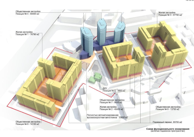

Annenhof Park. Asadov Architectural Bureau. Photo courtesy by the contest organizers
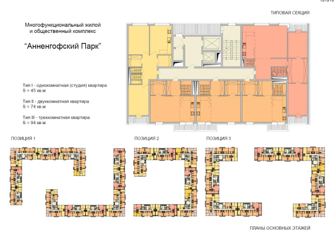

Annenhof Park. Asadov Architectural Bureau. Photo courtesy by the contest organizers
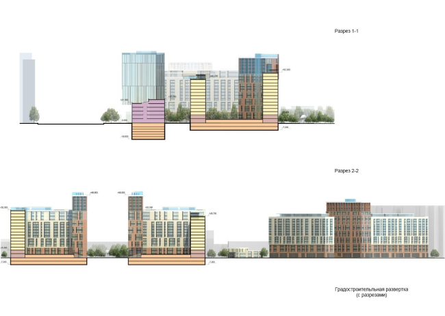

Annenhof Park. Asadov Architectural Bureau. Photo courtesy by the contest organizers
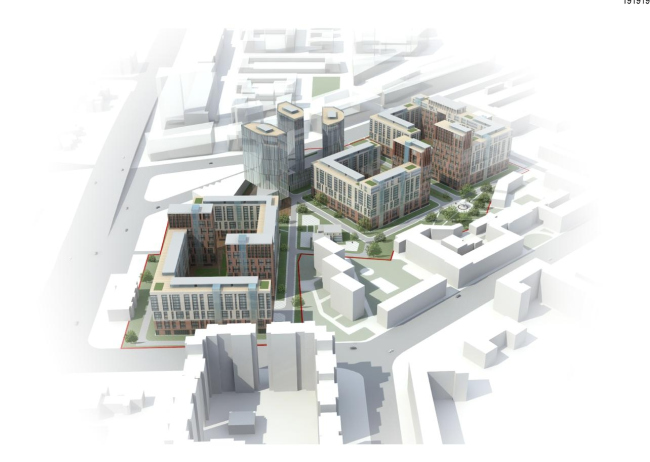

Annenhof Park. Asadov Architectural Bureau. Photo courtesy by the contest organizers


Annenhof Park. Asadov Architectural Bureau. Photo courtesy by the contest organizers

***
The Projects in the Shortlist

According to the terms of the competition, the eight candidates that have gotten into the shortlist may take part in the coming creative contests and projects of MORTON Group and the Regional Center of Urban Geography. 

Vladimir Kuzmin, Ekaterina Shornikova, Alisa Mamayeva.

Proposal for building over a land site in the South-East Administrative District of Moscow. Vladimir Kuzmin, Ekaterina Shornik, Alice Mamaeva. Photo courtesy by the contest organizers

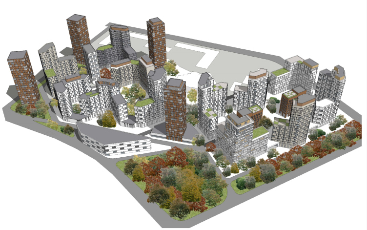
The residential houses are inserted into four secluded blocks of a rigid orthogonal layout, separated by green boulevards. The office-buildings of the same orthogonal planning are situated closer to Entuziastov Highway and are turned at 45 degrees to the residential quarter these are meant to block the noise of the highway. At the same time the offices are separated from the dwellings by a green area. Tall beacon-towers at the corners of the buildings visually unite them. 
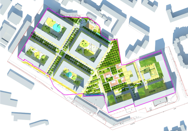

Proposal for building over a land site in the South-East Administrative District of Moscow. Vladimir Kuzmin, Ekaterina Shornik, Alice Mamaeva. Photo courtesy by the contest organizers


Proposal for building over a land site in the South-East Administrative District of Moscow. Vladimir Kuzmin, Ekaterina Shornik, Alice Mamaeva. Photo courtesy by the contest organizers
***
“Archimedes PLUS”


Proposal for building over a land site in the South-East Administrative District of Moscow. "Archimedes Plus". Photo courtesy by the contest organizers

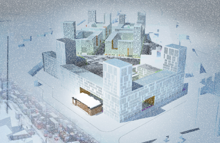
The project suggests three isolated areas. There are extensive sectional residential buildings on the sides of Krasnokazarmenniy drive and “Hammer and Sickle” drive. They hide the seemingly randomly arranged tower houses at the back of the district. An impressively large building adjoins Entuziastov highway and Aviamotorniy drive. Its layout and the facades remind the neighboring Moscow Power Engineering Institute. The third area is seven-, twelve- and twenty-storey Business Center of a rather reserved form and with pristene glazed façades. 


Proposal for building over a land site in the South-East Administrative District of Moscow. "Archimedes Plus". Photo courtesy by the contest organizers
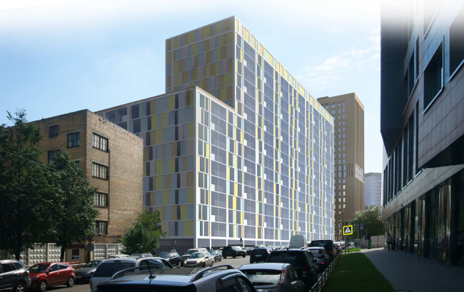

Proposal for building over a land site in the South-East Administrative District of Moscow. "Archimedes Plus". Photo courtesy by the contest organizers

***
Robert Podjapolsky, Alexander Shabanov


Proposal for building over a land site in the South-East Administrative District of Moscow. Robert Podjapolsky, Alexander Shabanov. Photo courtesy by the contest organizers

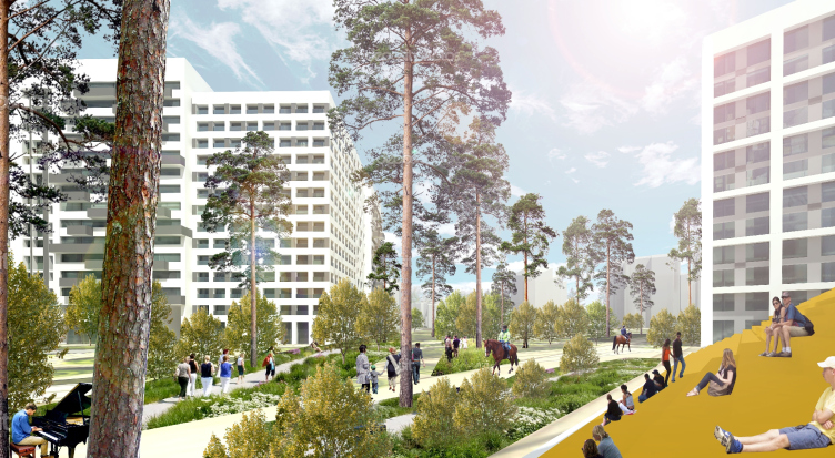
The district sooner reminds a natural park with its outlines formed by the surrounding houses in this project. The houses – several square towers, a zigzag, books and plates – protect the park between them. The authors suggest the dwellings and offices be mixed in order to stimulate the movement about the central green area and “integrate nature into the everyday life of the townspeople”. 
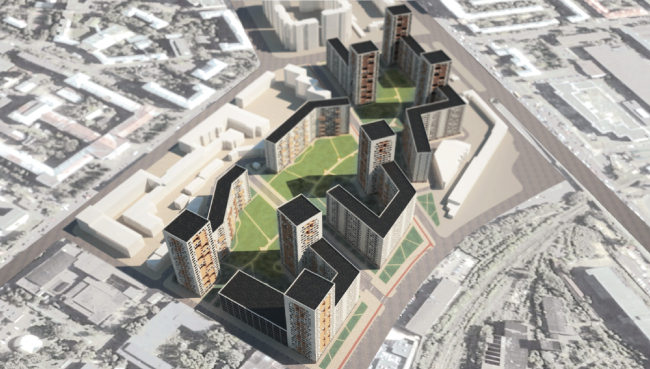

Proposal for building over a land site in the South-East Administrative District of Moscow. Robert Podjapolsky, Alexander Shabanov. Photo courtesy by the contest organizers
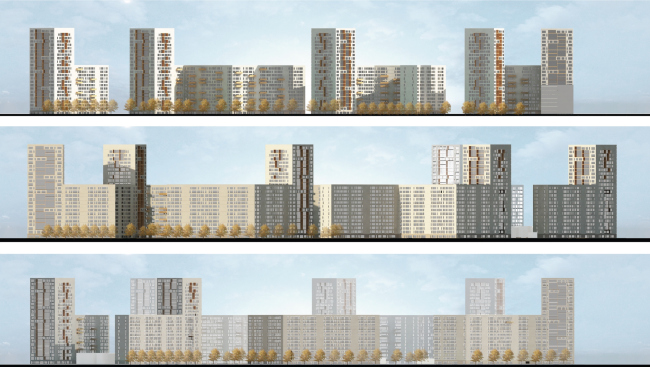

Proposal for building over a land site in the South-East Administrative District of Moscow. Robert Podjapolsky, Alexander Shabanov. Photo courtesy by the contest organizers

***
Vadim Lukin, Oleg Ryzhayev
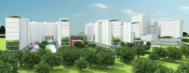

Proposal for building over a land site in the South-East Administrative District of Moscow. Vadim Lukin, Oleg Ryzhaev. Photo courtesy by the contest organizers

The authors propose a strict functional zoning but, at the same time, preserving the general stylistic concept. The buildings remind the slightly lifted houses of Le Corbusier with support-pillars and roof gardens. 
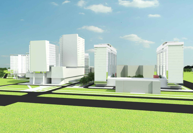

Proposal for building over a land site in the South-East Administrative District of Moscow. Vadim Lukin, Oleg Ryzhaev. Photo courtesy by the contest organizers
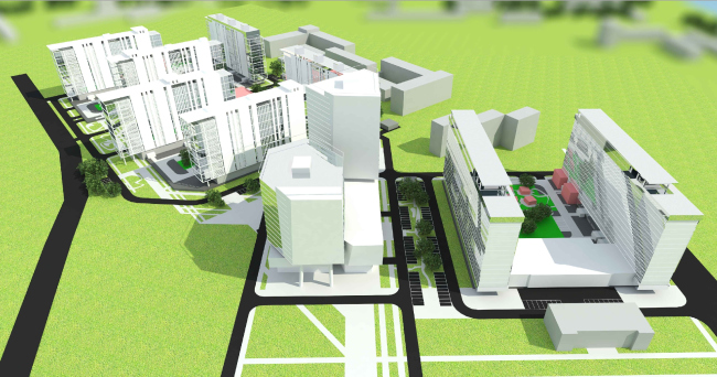

Proposal for building over a land site in the South-East Administrative District of Moscow. Vadim Lukin, Oleg Ryzhaev. Photo courtesy by the contest organizers

***
Konstantin Konovaltsev, Oleg Konovaltsev, Olga Tishenko
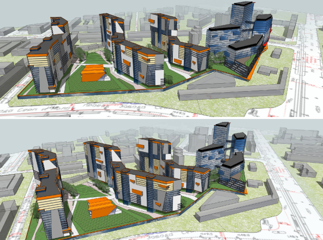

Proposal for building over a land site in the South-East Administrative District of Moscow. Konstantin Konovaltsev, Oleg Konovaltsev, Olga Tishenko. Photo courtesy by the contest organizers

The “main characters” in this project are angles. The architects bring out the visual perception of different combinations of acute and obtuse angles to the foreground, both in the plan and in the facades and geometrical outlines of the green areas. The coloring of the fronts makes an interesting contribution to the whole impression: the facades are as if composed of gigantic deformed Tetris pieces. 

The office-buildings stand aside from the dwelling houses and are supposed to keep the highway sounds from disturbing the dwellers. The apartment-houses, on the contrary, are planned at the back of the lot, and are arranged so that the yards and north-facades stay insolated.


Proposal for building over a land site in the South-East Administrative District of Moscow. Konstantin Konovaltsev, Oleg Konovaltsev, Olga Tishenko. Photo courtesy by the contest organizers
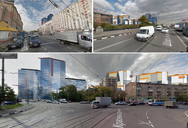

Proposal for building over a land site in the South-East Administrative District of Moscow. Konstantin Konovaltsev, Oleg Konovaltsev, Olga Tishenko. Photo courtesy by the contest organizers
 
***
Elena Popova, Vera Betretdinova, Olga Mranova


Proposal for building over a land site in the South-East Administrative District of Moscow. Elena Popova, Vera Betretdinova, Olga Mranova. Photo courtesy by the contest organizers

The concept proposes rather densely arranged houses of a different number of stories with several dominating towers.
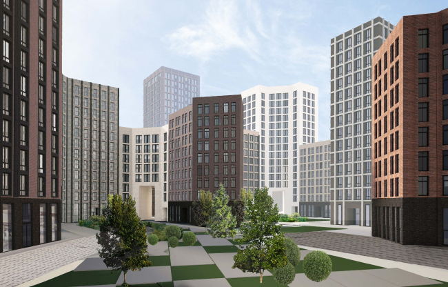

Proposal for building over a land site in the South-East Administrative District of Moscow. Elena Popova, Vera Betretdinova, Olga Mranova. Photo courtesy by the contest organizers
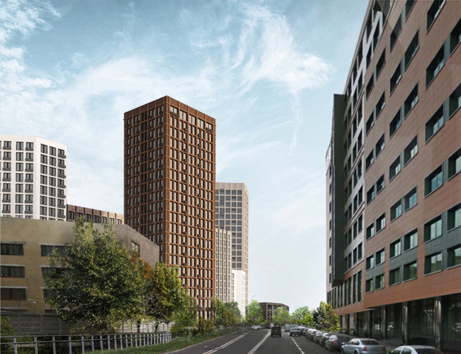

Proposal for building over a land site in the South-East Administrative District of Moscow. Elena Popova, Vera Betretdinova, Olga Mranova. Photo courtesy by the contest organizers

***
Yevgeniy  Didorenko, Alexander Shtanyuk


Proposal for building over a land site in the South-East Administrative District of Moscow. Yevgeniy  Didorenko, Alexander Shtanyuk. Photo courtesy by the contest organizers

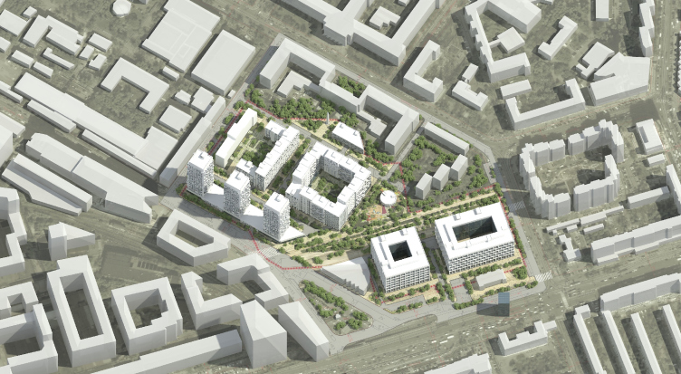
The dwelling and office territories stand separately in this project. The dwelling area is arranged on the side of Krasnokazarmenniy drive and consists of three towers and two blocks encircling yards. Two office buildings – a square one and a rectangular one – are drawn up to Entuziastov highway. Both of them surround a small courtyard.
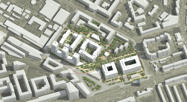

Proposal for building over a land site in the South-East Administrative District of Moscow. Yevgeniy  Didorenko, Alexander Shtanyuk. Photo courtesy by the contest organizers


Proposal for building over a land site in the South-East Administrative District of Moscow. Yevgeniy  Didorenko, Alexander Shtanyuk. Photo courtesy by the contest organizers

***
Architectural Bureau “4izmerenie”


Proposal for building over a land site in the South-East Administrative District of Moscow. “4izmerenie”. Photo courtesy by the contest organizers


The rhombus – a figure that gives countless possibilities at creating ornaments and patterns – is taken as the planning unit in this project. The complex consists of numerous towers with rhombus in plan and rounded corners. The front design develops a theme of simple geometrical figures as squares and circles.
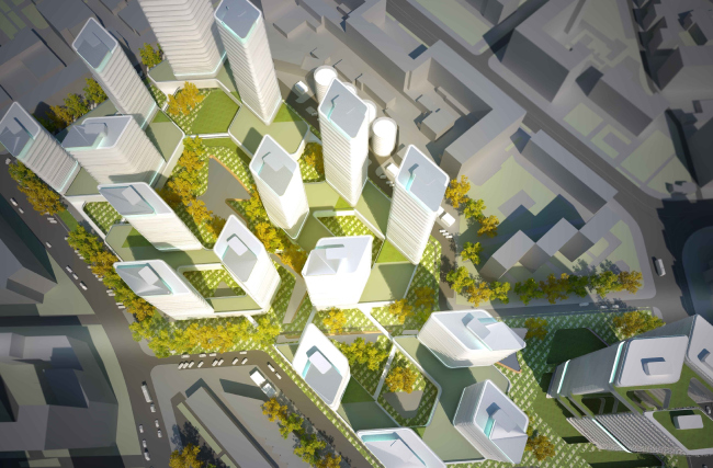

Proposal for building over a land site in the South-East Administrative District of Moscow. “4izmerenie”. Photo courtesy by the contest organizers
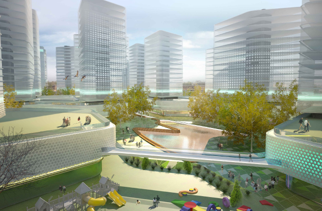

Proposal for building over a land site in the South-East Administrative District of Moscow. “4izmerenie”. Photo courtesy by the contest organizers

The Judging Panel of the Contest:

•    Nikolay Shumankov, Head of the Jury, the honored architect of Russia, member of the Russian Academy of Arts, the International Academy of Architecture (Moscow Branch), the president of the Union of Moscow Architects;
•    Oleg Kolchenko, Vice President of “MORTON” companies;
•    Dmitry Zotov, Director General of LLC “MORTON Development Center”;
•    Alexander Bogdanov, Director General of LLC “Regional Center of Urban Geography”;
•    Julia Korolyova, Director General of ZAO Control Strategy;
•    Andrey Yarushin, Chief of the Department of LLC “MORTON Development Center”;
•    Vladimir Yudintsev, laureate of the State Prize of the Russian Federation, professor of MArchI, head of “ARTE+” architectural studio;
•    Mikhail Khazanov, professor of MArchI, Vice President of International Academy of Architecture (Moscow Branch), full member of IAA;
•    Sergey Gnedovsky, Vice President the Union of Russian Architects, the honored architect of Russia, Corresponding Member of RAACS;
•    Mikhail Shubenkov, Vice Chancellor of vocational education development of MArchI.      


18 September 2014

Headlines now
The Golden Crown
The concept for a dental clinic in Yekaterinburg, developed by CNTR Studio, revolves around the idea of a “mouth full of gold”: pristine white porcelain stoneware walls are complemented by matte brass details. To avoid an overly literal interpretation, the architects focused on the building’s proportions, skillfully navigating between sunlight requirements and fire safety regulations.
Flexibility and Integration
Not long ago, we covered the project for the fourth phase of the ÁLIA residential complex, designed by APEX. Now, we’ve been shown different fence concepts they developed to enclose the complex’s private courtyards, incorporating a variety of public functions. We believe that the sheer fact that the complex’s architects were involved in such a detail as fencing speaks volumes.
A Step Forward
The HIDE residential complex represents a major milestone for ADM architects and their leaders Andrey Romanov and Ekaterina Kuznetsova in their quest for a fresh high-rise aesthetic – one that is flexible and layered, capable of bringing vibrancy to mass and silhouette while shaping form. Over recent years, this approach has become ADM’s “signature style”, with the golden HIDE tower playing a pivotal role in its evolution. Here, we delve into the project’s story, explore the details of the complex’s design, and uncover its core essence.
Gold in the Sands
A new office for a transcontinental company specializing in resource extraction and processing has opened in Dubai. Designed by T+T Architects, masters of creating spaces that are contemporary, diverse, flexible, and original, this project exemplifies their expertise. On the executive floor, a massive brass-clad partition dominates, while layered textures of compressed earth create a contextually resonant backdrop.
Layers and Levels of Flight
This project goes way back – Reserve Union won this architectural competition at the end of 2011, and the building was completed in 2018, so it’s practically “archival”. However, despite being relatively unknown, the building can hardly be considered “dated” and remains a prime example of architectural expression, particularly in the headquarters genre. And it’s especially fitting for an aviation company office. In some ways, it resembles the Aeroflot headquarters at Sheremetyevo but with its own unique identity, following the signature style of Vladimir Plotkin. In this article, we take an in-depth look at the United Aircraft Corporation (UAC) headquarters in the Moscow agglomeration town of Zhukovsky, supplemented by recent photographs from Alexey Naroditsky – a shoot that became only recently possible due to the fact that improvements were finally made in the surrounding area.
Light and Shadow
In this article, we delve into the architectural design of the “Chaika” house by DNK ag architects, which was recently completed in 2023 as part of the collection of signature designs at ZILArt. As is well-known, all the buildings in this complex follow a design code, yet each one is distinct. This particular building stands out not only for its whiteness and minimalism but also for the refined use of a limited number of techniques that, together, create what can confidently be called synergy.
Casus Novae
A master plan was developed for a large residential area with a name of “DNS City”, but now that its implementation began, the plan has been arbitrarily reformatted and replaced with something that, while similar on the surface, is actually quite different. This is not the first time such a thing happens, but it’s always frustrating. With permission from the author, we are sharing Maria Elkina’s post.
Treasure Hunting
The GAFA bureau, in collaboration with Tegola and Arkhitail, organized an expedition to the island of Kilpola in Karelia as part of Moskomarkhitektura’s “Open City” festival. There, amidst moss and rocks, the students sought answers to questions like: what is the sacred, where does it dwell, and what sustains it? Assisting the participants in this quest were landscape engineer Evgeny Levin, artist Nicholas Roerich, a moose, and the lack of cellular connection. Here’s how the story unfolded.
Depths of the Earth, Streams of Water
In the Malaya Okhta district, the Akzent building, designed by Stepan Liphart, was constructed. It follows a classic tripartite structure, yet it’s what you might call “hand-drawn”: each façade is unique in its form and details, some of which aren’t immediately noticeable. In this article, we explore the context and, together with the architect, delve into how the form was developed.
Fir Tree Dynamics
The “Airports of Region” holding is planning to build an airport in Karachay-Cherkessia, aiming to make the Arkhyz and Dombay resorts more accessible to travelers. The project that won in an invitation-only competition, submitted by Sergey Nikeshkin’s KPLN, blends natural imagery inspired by the shape of a conifer seed, open-air waiting spaces, majestic large trees, and a green roof elevated on needle-like columns. The result is both nature-inspired and WOW.
​A Brick Shell
In the process of designing a clubhouse situated among pine trees in a prestigious suburban area near Moscow, the architectural firm “A.Len” did the façade design part. The combination of different types of brick and masonry correlates with the volumetric and plastique solutions, further enhanced by the inclusion of wood-painted fragments and metal “glazing”.
Word Forms
ATRIUM architects love ambitious challenges, and for the firm’s thirtieth anniversary, they boldly play a game of words with an exhibition that dives deep into a self-created vocabulary. They immerse their projects – especially art installations – into this glossary, as if plunging into a current of their own. You feel as if you’re flowing through the veins of pure art, immersed in a universe of vertical cities, educational spaces – of which the architects are true masters – and the cultural codes of various locations. But what truly captivates is the bold statement that Vera Butko and Anton Nadtochy make, both through their work and this exhibition: architecture, above all, is art – the art of working with form and space.
Flexibility and Acuteness of Modernity
Luxurious, fluid, large “kokoshniks” and spiral barrel columns, as if made from colorful chewing gum: there seem to be no other mansion like this in Moscow, designed in the “Neo-Russian-Modern” style. And the “Teremok” on Malaya Kaluzhskaya, previously somewhat obscure, has “come alive with new colors” and gained visibility after its restoration for the office of the “architectural ecosystem” as the architects love to call themselves. It’s evident that Julius Borisov and the architects at UNK put their hearts into finding this new office and bringing it up to date. Let’s delve into the paradoxes of this mansion’s history and its plasticity. Spoiler: two versions of modernity meet here, both balancing on the razor’s edge of “what’s current”.
Yuri Vissarionov: “A modular house does not belong to the land”
It belongs to space, or to the air... It turns out that 3D printing is more effective when combined with a modular approach: the house is built in a workshop and then adapted to the site, including on uneven terrain. Yuri Vissarionov shares his latest experience in designing tourist complexes, both in central Russia and in the south. These include houseboats, homes printed from lightweight concrete using a 3D printer, and, of course, frame houses.
​Moscow’s First
“The quality of education largely depends on the quality of the educational environment”. This principle of the last decade has been realized by Sergey Skuratov in the project for the First Moscow Gymnasium on Rostovskaya Embankment in the Khamovniki district. The building seamlessly integrates into the complex urban landscape, responding both to the pedestrian flow of the city and the quiet alleyways. It skillfully takes advantage of the height differences and aligns with modern trends in educational space design. Let’s take a closer look.
Looking at the Water
The site of Villa Sonata stretches from the road to the water’s edge, offering its own shoreline, pier, and a picturesque river panorama. To reveal these sweeping views, Roman Leonidov “cut” the façade diagonally parallel to the river, thus getting two main axes for the house and, consequently, “two heads”. The internal core – two double-height spaces, a living room and a conservatory, with a “bridge” above them – makes the house both “transparent” and filled with light.
The White Wing
Well, it’s not exactly white. It’s more of a beige, white-stone structure that plays with the color of limestone – smoother surfaces are lighter, while rougher ones are darker. This wing unites various elements: it absorbs and interprets the surrounding themes. It responds to everything, yet maintains a cohesive expression – a challenging task! – while also incorporating recognizable features of its own, such as the dynamic cuts at the bottom, top, and middle.
Urban Dunes
The XSA Ramps team designed and built a three-part sports hub for a park in Rostov-on-Don, welcoming people of all ages and fitness levels. The skate plaza, pump track, and playground are all meticulously crafted with details that attract a diverse range of visitors. The technical execution of the shapes and slopes transforms this space into a kind of sculptural composition.
Proportional Growth
The project for the fourth phase of the ÁLIA residential area has been announced. The buildings are situated on an elongated plot – almost a “ray” that shoots out from the center of the area towards the river. Their layout reflects both a response to Moscow’s architectural preferences over the past 15 years, shifting “from blocks to towers”, and an interpretation of the neighboring business park designed by SOM. Additionally, the best apartments here are not located at the very top but closer to the middle, forming a glowing “waistline”.
The “Staircase” Building
In designing the “Details” residential complex in New Moscow, Rais Baishev spiced up the now-popular Moscow theme of a “courtyard” building with an idea drawn from the surrealist drawings by Maurits Escher. He envisioned the stepped silhouettes and descending slopes as a metaphysical mega-staircase, creating a key void within the courtyard that gave the project an internal “spine”. This concept is felt both in the building’s silhouette and on its façades.
Projection of the Quarter
No one doubted that the building that Vladimir Plotkin designed as part of the “Garden Quarters” would be the most modernist of all. And it turned out just that way: while adhering to the common design code, the building successfully combines brick and white stone, rhythmically responding to the neighboring building designed by Ostozhenka, yet tactfully and persistently making a few statements of its own. This includes the projection of the ideal urban development composition “14–9–6”, which can be found right next door, mathematical calculations, including those for various types of terraces (and perhaps the only reminder of the Soviet past of the Kauchuk rubber factory!), and the white “cross-stitch” pattern of the façade grid.
Domus Aurea
In this issue, we examine the “Tessinsky-1” house, designed by Sergey Skuratov and completed in 2023. Located in the middle of the Serebryanicheskaya Embankment district, at the intersection of its main streets, this house assumes a sort of “nodal” role: it not only responds to everything around it and preserves many memories of the former EMA factory within itself, but it weaves all this into a newly directed pattern, reconciling bright “gold” and dark-colored brick, largely with the help of the new, modern-yet-archaic Columba brick, which, come to think about it, is the most precious element here.
The Chimney of Nikola-Lenivets
In this issue, we are examining the “Obelisk House” designed by KATARSIS and built for the Arkhstoyanie 2023 festival. However, it was only finished later on, and this is why we are examining it now. It seems to us that after the “Obelisk House” appeared in Nikola-Lenivets, a dialogue and a few inner connections appeared between the temporary structures built here. These houses no longer look like “accidental neighbors”, more of which below.
​Periscope by the Bay
The jury awarded the second place in the competition for a public and cultural center in Petropavlovsk-Kamchatsky to the companies GORA (“Mountain”) and M4. In the consortium’s proposal, the building resembles a sperm whale with a calf swimming next to it or a periscope, whose lenses capture the most spectacular views from the surrounding landscape.
From Arcs to Dolmens
While working on the competition project for Petropavlovsk-Kamchatsky, ASADOV Architects prioritized the value of the natural and urban environment, aiming to preserve the balance of the location while minimizing the resemblance of the volume that they designed to a “traditional building”. The task was challenging, and the architects created three versions, one of which having been developed after the competition, where their main proposal took third place. However, the point of interest here is not the competition result but the continuity of creative thinking.
Hide and Seek
The ID Moskovskiy house, designed by Stepan Liphart in St. Petersburg, in the courtyards near Moskovskiy Avenue beyond the Obvodny Canal and recently completed, is notable for several reasons. Firstly, it has been realized with considerable accuracy, which is particularly significant as this is the first building where the architect was responsible not only for the facades but also for the layouts, allowing for better integration between the two. On the other hand, this building is interesting as an example of the “germination” of new architecture in the city: it draws on the best examples from the neighborhood and becomes an improved and developed sum of ideas found by the architect in the surrounding context.
The Big Twelve
Yesterday, the winners of the Moscow Mayor’s Architecture Award were announced and honored. Let’s take a look at what was awarded and, in some cases, even critique this esteemed award. After all, there is always room for improvement, right?
Above the Golden Horn
The residential complex “Philosophy” designed by T+T architects in Vladivostok, is one of the new projects in the “Golubinaya Pad” area, changing its development philosophy (pun intended) from single houses to a comprehensive approach. The buildings are organized along public streets, varying in height and format, with one house even executed in gallery typology, featuring a cantilever leaning on an art object.
Nuanced Alternative
How can you rhyme a square and space? Easily! But to do so, you need to rhyme everything you can possibly think of: weave everything together, like in a tensegrity structure, and find your own optics too. The new exhibition at GES-2 does just that, offering its visitor a new perspective on the history of art spanning 150 years, infused with the hope for endless multiplicity of worlds and art histories. Read on to see how this is achieved and how the exhibition design by Evgeny Ace contributes to it.
Blinds for Ice
An ice arena has been constructed in Domodedovo based on a project by Yuri Vissarionov Architects. To prevent the long façade, a technical requirement for winter sports facilities, from appearing monotonous, the architects proposed the use of suspended structures with multidirectional slats. This design protects the ice from direct sunlight while giving the wall texture and detail.