По-русски

​The Infinity Sign

In this issue, we are giving a more detailed coverage of the project that won in the “Gorizont” (“Horizon”) competition devoted to designing a campus situated on the roof of the most noticeable building of Saint Petersburg’s Sevkabel Factory overlooking the river. The landmark shape with a multitude of versions and interpretations is surrounded by a highly developed public space – what more can a modern man ask for?

01 July 2019
Object
mainImg

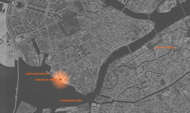
Founded back in 1879 by Carl Siemens, Russia’s oldest cable factory, renamed after the Great October Socialist Revolution into “Sevkabel” (“North Cable”), is situated in the west part of the Vasilyevsky Island in the Neva estuary, not far away from the brutalist building of the Morvokzal (“Sea Terminal”) designed by Vitaly Sokhin (not to be confused with the Sea Façade of Saint Petersburg). For years, the Sevkabel land has been undergoing postindustrial transformations: the production process was reorganized, it began to consume less space, and the vacated premises hosted creative studios, restaurants, and a farmers’ market; the waterfront was also renovated, and the place became popular. Meanwhile, it is planned that the nonhazardous production will be preserved here but now it will coexist with the city life. The master plan for the territory of the factory was designed by Khvoya Architects, and the same architects are working on renovating Building B, a large concrete building on the bank of Neva. This building must become something like a river façade of the renovated territory because it looks really great from the water, and, at the same time, it commands magnificent river views as well. For this reason, for “making a campus on the roof of Production Building B within the framework of the next stage of redevelopment of the territory”, the managing company Sevkabelport organized an open-door international competition named “Gorizont”. Technically, the operator of the competition was “Project Baltia” magazine. The results were announced at the end of May. The competition was won by the project developed by DNK ag, more of which we are covering below.

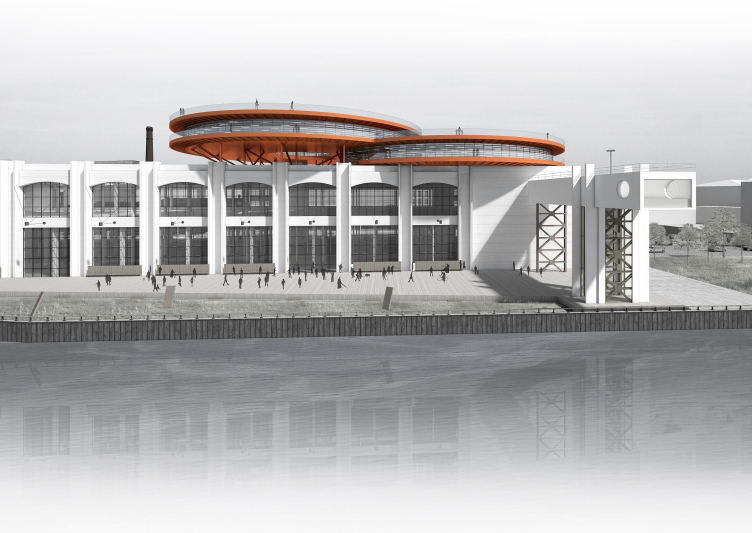
Concept of the public and office campus on the roof of Production Facility B on the territory of “Sevkabel Port”. View from the river
Copyright: © DNK ag
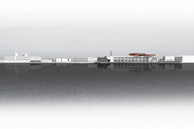
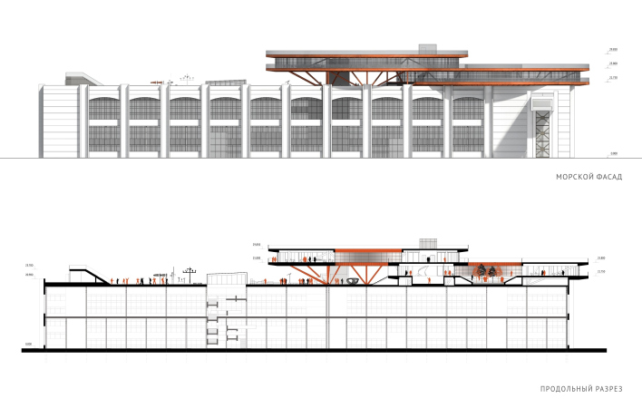
Concept of the public and office campus on the roof of Production Facility B on the territory of “Sevkabel Port”. The sea facade
Copyright: © DNK ag


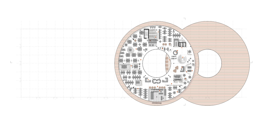
Concept of the public and office campus on the roof of Production Facility B on the territory of “Sevkabel Port”. Location plan
Copyright: © DNK ag


The contestants were to do the following tasks: to place on the roof of the Soviet concrete building an open-air public space overlooking the Neva River, whose estuary here is about a kilometer wide; to create a project that could claim a landmark status – not least because of the fact that this year they launched a regular tourist boat coming into the estuary, making it a part of the city’s representative “river façade”. And, finally, they had to find room for some office premises in the roof. The authors were issued with a scheme of approximate loads that, according to estimates, the framework of the building could bear – according to the provided data, it was clear that chiefly the building could be more loaded on the eastern, right-hand side (if watched from the river), and less loaded on the left-hand side.

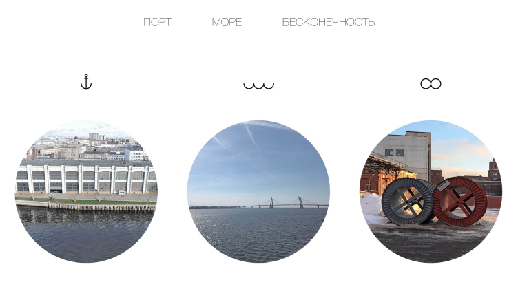
Concept of the public and office campus on the roof of Production Facility B on the territory of “Sevkabel Port”.
Copyright: © DNK ag


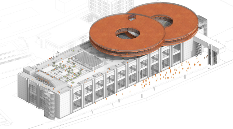
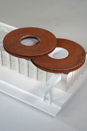
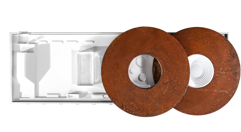
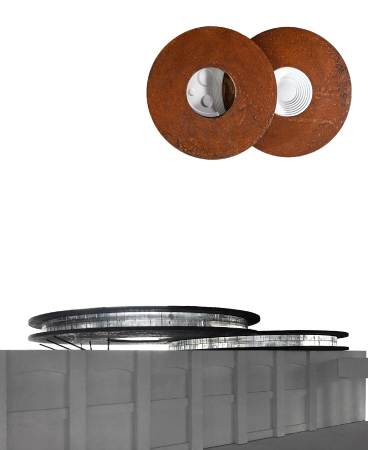
Which determined the composition of the buildup proposed by DNK ag. The bulk of the office part was positioned on the right; it got an iconic shape of two cable coils, looking similar to the ones that are exhibited on the territory of the cluster as a reminder of the factory’s profile, but, of course, not literally replicated – the ones that are on the roof are slender and thin, especially from the side. Still another association that this composition brings about – the infinity sign – was announced by the authors themselves, and, as the architects share, the organizers warmed up to the idea.

Concept of the public and office campus on the roof of Production Facility B on the territory of “Sevkabel Port”.
Copyright: © DNK ag


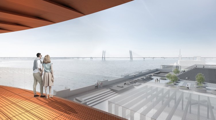
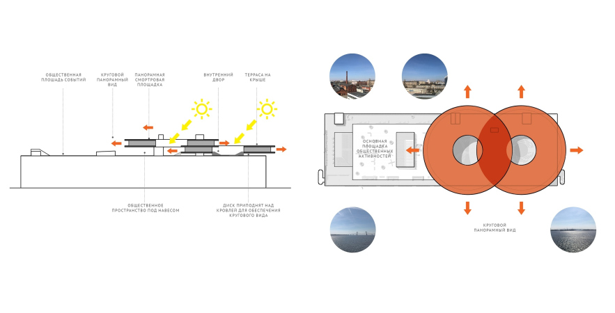
The disks turned out to be the perfectly ergonomic shape for placing the offices inside of them: two continuous contours of glass, the inner and the outer one, ensure an abundance of ambient light. On the outside, there is a string of breathtaking views of the city and the river, virtually a 360-degree panorama of the city skyline, also an infinity of sorts.

Concept of the public and office campus on the roof of Production Facility B on the territory of “Sevkabel Port”. View from the office
Copyright: © DNK ag


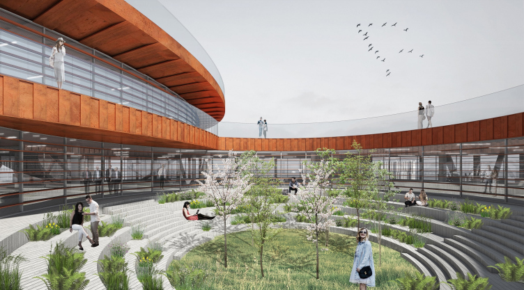
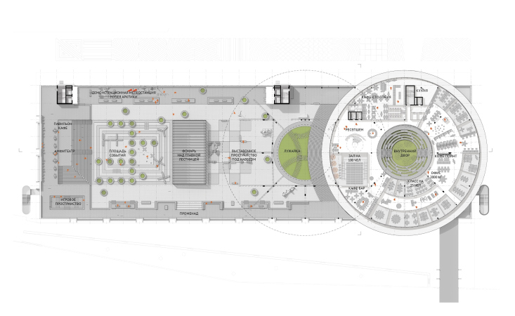
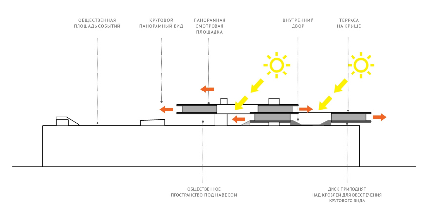
The width of the arc-shaped volumes allows for all kinds of floor plans, both of the “study” and “open space” type – the architects give examples of different options. The useful floor space is occupied by the staircase and elevators as little as possible, two of them being already there in the building (they only need to be extended), and still another one at the intersection of two disks, which ensures equal spacing of the premises, the authors of the project emphasize. On the same central axis, a spiral staircase may appear – if there is one key tenant, this staircase will help to link the two floors with an impressive-looking “swirl”. In the circular yard of the eastern “disc”, there is a yard for the employees’ recreation, invisible to the public eye, yet with an open sky overhead.

Concept of the public and office campus on the roof of Production Facility B on the territory of “Sevkabel Port”. The inner office yard
Copyright: © DNK ag


Underneath the same disk (the one that is situated closer to the side end of the building), the architects found room for ventilation chambers and mechanical rooms that, when arranged in this way, do not spoil the silhouette of the building, being modestly hidden underground.

  • zooming
    1 / 6
    Concept of the public and office campus on the roof of Production Facility B on the territory of “Sevkabel Port”. The buildup concept
    Copyright: © DNK ag
  • zooming
    2 / 6
    Concept of the public and office campus on the roof of Production Facility B on the territory of “Sevkabel Port”. Plan of the 2nd floor
    Copyright: © DNK ag
  • zooming
    3 / 6
    Concept of the public and office campus on the roof of Production Facility B on the territory of “Sevkabel Port”. Plan of the 1st floor
    Copyright: © DNK ag
  • zooming
    4 / 6
    Concept of the public and office campus on the roof of Production Facility B on the territory of “Sevkabel Port”. Section view
    Copyright: © DNK ag
  • zooming
    5 / 6
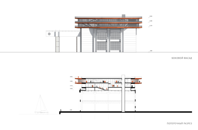
    Concept of the public and office campus on the roof of Production Facility B on the territory of “Sevkabel Port”. Section view
    Copyright: © DNK ag
  • zooming
    6 / 6
    Concept of the public and office campus on the roof of Production Facility B on the territory of “Sevkabel Port”. Schematic section view
    Copyright: © DNK ag


This solution is not just optimum buy it also looks like a peculiar study of the perfect office space: the quintessence raised to the level of landmark laconism. Because, what is an office, basically speaking? It is a box with glass walls and an atrium in the middle for extra light. And what we are seeing here is the composition of two slices of this typology, brought to the efficient circular shape, without the atrium glazing, and even without corners. It was still Konstantin Melnikov who back in the day was wont to say that the corners are always in the way – let’s remember his house now, shall we? Here is yet another association, this time from the classic avant-garde tradition.

The discs are placed with a shift one above the other, in a staircase fashion, as if flying saucers were landing on the roof one by one, on a tight cosmic port schedule. The building material that the authors are recommending – Corten, oxidized iron – makes the discs look even more like the gears of some gigantic mechanism arrested in mid-motion, which further enhances the industrial architecture theme and is read particularly clearly in the model, in which the architects did use Corten plates. The relief of the stripes on the edges of the discs strengthens their likeness with gears and coils – and generally enhances the industrial image.

  • zooming
    1 / 3
    Concept of the public and office campus on the roof of Production Facility B on the territory of “Sevkabel Port”. Model
    Copyright: © DNK ag
  • zooming
    2 / 3
    Concept of the public and office campus on the roof of Production Facility B on the territory of “Sevkabel Port”. Model
    Copyright: © DNK ag
  • zooming
    3 / 3
    Concept of the public and office campus on the roof of Production Facility B on the territory of “Sevkabel Port”. Model
    Copyright: © DNK ag


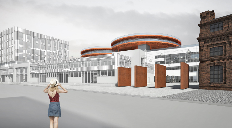
This retro technological image of “rusty” coils from the side of the Kozhevennaya Line also echoes the Corten “pylon” slabs, designed and made by Khvoya as the decoration of the main entrance to Building B.

Concept of the public and office campus on the roof of Production Facility B on the territory of “Sevkabel Port”. View from the Kozhevennaya Line
Copyright: © DNK ag


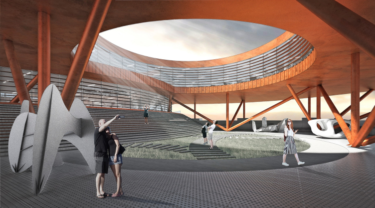
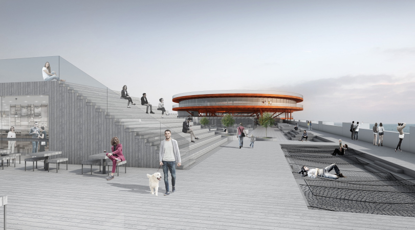
Back to the discs of the offices and the roof, though! More than a half of the open space is public. Two thirds of the upper disc, the bundles of whose pillars come together at the yard contour underneath the “skylight”, serve as the awning above the open yard. This is a transition zone that includes the entrance to the offices from the roof; its steps, replicating the arc of the other disc, are juxtaposed with the amphitheater. This cantilevered structure is very large; rather, it is not even a cantilever but a whole house on legs – it not only overhangs beautifully, but it is also large enough to give protection from the inevitable rain or rare sunshine of Saint Petersburg. The part covered by the awning is also interpreted by the architects as expo space that is protected from the rain.

Concept of the public and office campus on the roof of Production Facility B on the territory of “Sevkabel Port”. The yard, entrance
Copyright: © DNK ag


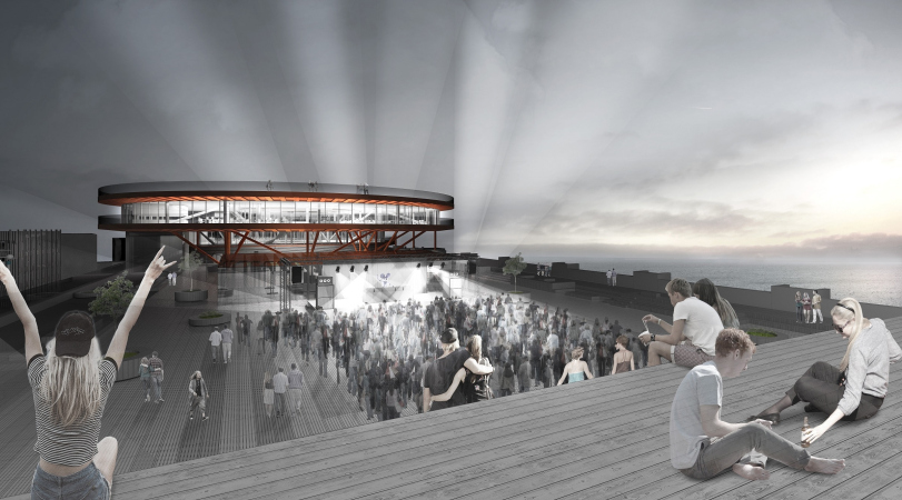
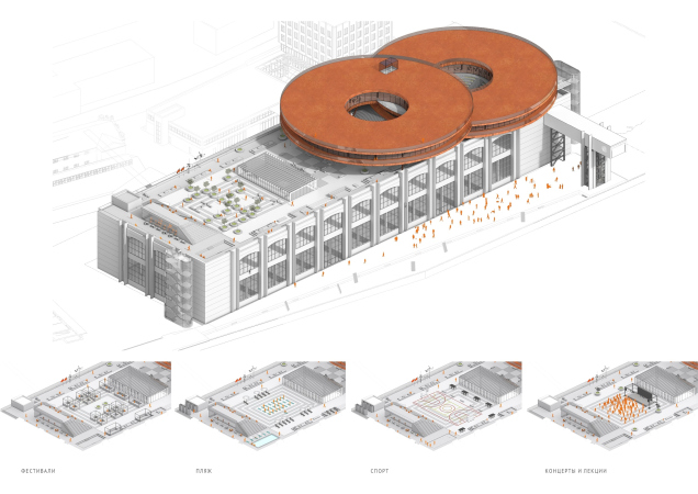
In the middle of the open part of the roof, there is a glass casing of the central stairway – part of the reconstruction of the building by the Khvoya project. Behind it, there is an open square for concerts and other public events; its main peculiarity consists in the fact that it is transformable: you can create here different compositions and partitions by means of moving the mobile benches and tubs with decorative trees. Further on, next to the open western edge, there is a cafe pavilion, whose two sides are turned into the stairs of the amphitheater. From here, just like from the roof of the café, one will be able to watch the shows.

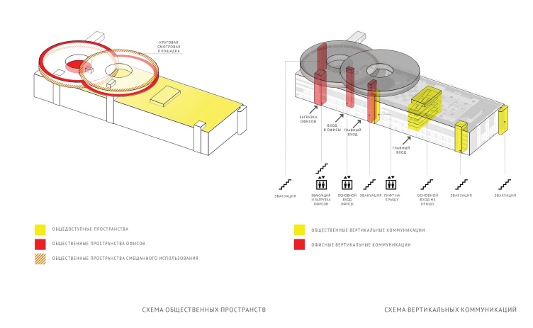
Concept of the public and office campus on the roof of Production Facility B on the territory of “Sevkabel Port”. Schemes
Copyright: © DNK ag


Generally speaking, the architects had their fill of playing with elevations and depressions: according to the project, the entire floor of the roof will be elevated in order to make sure that the existing concrete fence does not stop people from admiring the panorama. However, the pavement has in it dents for hammocks for meditative rest. Alongside the panorama, stretches a string of “bumps” of benches that sometimes spring up with two or three steps of a mini-amphitheater for contemplating the water and the city. In the north part of the open roof, DNK ag placed a small weather station for the Arctic Museum, which, according to the project, will be placed, among other things, in the main part of Building B.

  • zooming
    1 / 3
    Concept of the public and office campus on the roof of Production Facility B on the territory of “Sevkabel Port”. Night life
    Copyright: © DNK ag
  • zooming
    2 / 3
    Concept of the public and office campus on the roof of Production Facility B on the territory of “Sevkabel Port”. The roof with a bar
    Copyright: © DNK ag
  • zooming
    3 / 3
    Concept of the public and office campus on the roof of Production Facility B on the territory of “Sevkabel Port”. Axonometry
    Copyright: © DNK ag


In a word, the functions of the open space are flexible here and can support a whole number of various scenarios. And, to cap it all, one will also be able to take a walk on the roof – there will a looped route about 400 meters long. The details are to come up in the process of realization but so far there is an idea of making a loop of the second disc on the level of the roof, and a looped sightseeing platform on the roof of the first cantilevered disc.

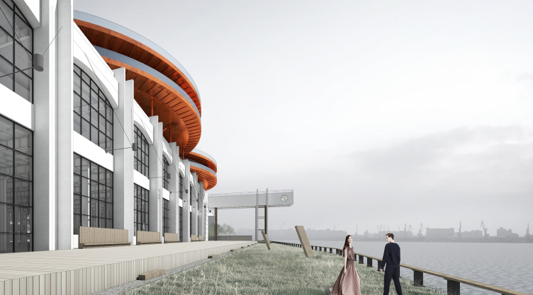
What they ultimately got here was a curious type of office – not exactly groundbreaking but still rare in these parts: on the one side, there is this part of the cluster of the former factory, and, on the other side, a completely new building in a very advantageous location, high up, and with great panoramas – the perfect place for some kind of headquarters, surrounded by a large number of public places, arranged in a sophisticated way in terms of their importance and accessibility, yet still flexible. This project is very postindustrial and at the same time this is a landmark building, a “sign on the wall”, essentially illustrating the peculiarities of Saint Petersburg: this city is horizontal, yet it likes an architectural highlight; in its best parts, your gaze wanders from one landmark to another. And – behold – you’ve got a horizontal here, and a telltale highlight, whose industrial imagery makes a perfect match for the “constructivist” lintel to the transport terminal that is placed closer to the river and at a distance from Building B: from here, the cables used to be loaded directly on ships. Which can be noticed from the river, but especially – from the waterfront.

Concept of the public and office campus on the roof of Production Facility B on the territory of “Sevkabel Port”. Waterfront
Copyright: © DNK ag


01 July 2019

Headlines now
The Golden Crown
The concept for a dental clinic in Yekaterinburg, developed by CNTR Studio, revolves around the idea of a “mouth full of gold”: pristine white porcelain stoneware walls are complemented by matte brass details. To avoid an overly literal interpretation, the architects focused on the building’s proportions, skillfully navigating between sunlight requirements and fire safety regulations.
Flexibility and Integration
Not long ago, we covered the project for the fourth phase of the ÁLIA residential complex, designed by APEX. Now, we’ve been shown different fence concepts they developed to enclose the complex’s private courtyards, incorporating a variety of public functions. We believe that the sheer fact that the complex’s architects were involved in such a detail as fencing speaks volumes.
A Step Forward
The HIDE residential complex represents a major milestone for ADM architects and their leaders Andrey Romanov and Ekaterina Kuznetsova in their quest for a fresh high-rise aesthetic – one that is flexible and layered, capable of bringing vibrancy to mass and silhouette while shaping form. Over recent years, this approach has become ADM’s “signature style”, with the golden HIDE tower playing a pivotal role in its evolution. Here, we delve into the project’s story, explore the details of the complex’s design, and uncover its core essence.
Gold in the Sands
A new office for a transcontinental company specializing in resource extraction and processing has opened in Dubai. Designed by T+T Architects, masters of creating spaces that are contemporary, diverse, flexible, and original, this project exemplifies their expertise. On the executive floor, a massive brass-clad partition dominates, while layered textures of compressed earth create a contextually resonant backdrop.
Layers and Levels of Flight
This project goes way back – Reserve Union won this architectural competition at the end of 2011, and the building was completed in 2018, so it’s practically “archival”. However, despite being relatively unknown, the building can hardly be considered “dated” and remains a prime example of architectural expression, particularly in the headquarters genre. And it’s especially fitting for an aviation company office. In some ways, it resembles the Aeroflot headquarters at Sheremetyevo but with its own unique identity, following the signature style of Vladimir Plotkin. In this article, we take an in-depth look at the United Aircraft Corporation (UAC) headquarters in the Moscow agglomeration town of Zhukovsky, supplemented by recent photographs from Alexey Naroditsky – a shoot that became only recently possible due to the fact that improvements were finally made in the surrounding area.
Light and Shadow
In this article, we delve into the architectural design of the “Chaika” house by DNK ag architects, which was recently completed in 2023 as part of the collection of signature designs at ZILArt. As is well-known, all the buildings in this complex follow a design code, yet each one is distinct. This particular building stands out not only for its whiteness and minimalism but also for the refined use of a limited number of techniques that, together, create what can confidently be called synergy.
Casus Novae
A master plan was developed for a large residential area with a name of “DNS City”, but now that its implementation began, the plan has been arbitrarily reformatted and replaced with something that, while similar on the surface, is actually quite different. This is not the first time such a thing happens, but it’s always frustrating. With permission from the author, we are sharing Maria Elkina’s post.
Treasure Hunting
The GAFA bureau, in collaboration with Tegola and Arkhitail, organized an expedition to the island of Kilpola in Karelia as part of Moskomarkhitektura’s “Open City” festival. There, amidst moss and rocks, the students sought answers to questions like: what is the sacred, where does it dwell, and what sustains it? Assisting the participants in this quest were landscape engineer Evgeny Levin, artist Nicholas Roerich, a moose, and the lack of cellular connection. Here’s how the story unfolded.
Depths of the Earth, Streams of Water
In the Malaya Okhta district, the Akzent building, designed by Stepan Liphart, was constructed. It follows a classic tripartite structure, yet it’s what you might call “hand-drawn”: each façade is unique in its form and details, some of which aren’t immediately noticeable. In this article, we explore the context and, together with the architect, delve into how the form was developed.
Fir Tree Dynamics
The “Airports of Region” holding is planning to build an airport in Karachay-Cherkessia, aiming to make the Arkhyz and Dombay resorts more accessible to travelers. The project that won in an invitation-only competition, submitted by Sergey Nikeshkin’s KPLN, blends natural imagery inspired by the shape of a conifer seed, open-air waiting spaces, majestic large trees, and a green roof elevated on needle-like columns. The result is both nature-inspired and WOW.
​A Brick Shell
In the process of designing a clubhouse situated among pine trees in a prestigious suburban area near Moscow, the architectural firm “A.Len” did the façade design part. The combination of different types of brick and masonry correlates with the volumetric and plastique solutions, further enhanced by the inclusion of wood-painted fragments and metal “glazing”.
Word Forms
ATRIUM architects love ambitious challenges, and for the firm’s thirtieth anniversary, they boldly play a game of words with an exhibition that dives deep into a self-created vocabulary. They immerse their projects – especially art installations – into this glossary, as if plunging into a current of their own. You feel as if you’re flowing through the veins of pure art, immersed in a universe of vertical cities, educational spaces – of which the architects are true masters – and the cultural codes of various locations. But what truly captivates is the bold statement that Vera Butko and Anton Nadtochy make, both through their work and this exhibition: architecture, above all, is art – the art of working with form and space.
Flexibility and Acuteness of Modernity
Luxurious, fluid, large “kokoshniks” and spiral barrel columns, as if made from colorful chewing gum: there seem to be no other mansion like this in Moscow, designed in the “Neo-Russian-Modern” style. And the “Teremok” on Malaya Kaluzhskaya, previously somewhat obscure, has “come alive with new colors” and gained visibility after its restoration for the office of the “architectural ecosystem” as the architects love to call themselves. It’s evident that Julius Borisov and the architects at UNK put their hearts into finding this new office and bringing it up to date. Let’s delve into the paradoxes of this mansion’s history and its plasticity. Spoiler: two versions of modernity meet here, both balancing on the razor’s edge of “what’s current”.
Yuri Vissarionov: “A modular house does not belong to the land”
It belongs to space, or to the air... It turns out that 3D printing is more effective when combined with a modular approach: the house is built in a workshop and then adapted to the site, including on uneven terrain. Yuri Vissarionov shares his latest experience in designing tourist complexes, both in central Russia and in the south. These include houseboats, homes printed from lightweight concrete using a 3D printer, and, of course, frame houses.
​Moscow’s First
“The quality of education largely depends on the quality of the educational environment”. This principle of the last decade has been realized by Sergey Skuratov in the project for the First Moscow Gymnasium on Rostovskaya Embankment in the Khamovniki district. The building seamlessly integrates into the complex urban landscape, responding both to the pedestrian flow of the city and the quiet alleyways. It skillfully takes advantage of the height differences and aligns with modern trends in educational space design. Let’s take a closer look.
Looking at the Water
The site of Villa Sonata stretches from the road to the water’s edge, offering its own shoreline, pier, and a picturesque river panorama. To reveal these sweeping views, Roman Leonidov “cut” the façade diagonally parallel to the river, thus getting two main axes for the house and, consequently, “two heads”. The internal core – two double-height spaces, a living room and a conservatory, with a “bridge” above them – makes the house both “transparent” and filled with light.
The White Wing
Well, it’s not exactly white. It’s more of a beige, white-stone structure that plays with the color of limestone – smoother surfaces are lighter, while rougher ones are darker. This wing unites various elements: it absorbs and interprets the surrounding themes. It responds to everything, yet maintains a cohesive expression – a challenging task! – while also incorporating recognizable features of its own, such as the dynamic cuts at the bottom, top, and middle.
Urban Dunes
The XSA Ramps team designed and built a three-part sports hub for a park in Rostov-on-Don, welcoming people of all ages and fitness levels. The skate plaza, pump track, and playground are all meticulously crafted with details that attract a diverse range of visitors. The technical execution of the shapes and slopes transforms this space into a kind of sculptural composition.
Proportional Growth
The project for the fourth phase of the ÁLIA residential area has been announced. The buildings are situated on an elongated plot – almost a “ray” that shoots out from the center of the area towards the river. Their layout reflects both a response to Moscow’s architectural preferences over the past 15 years, shifting “from blocks to towers”, and an interpretation of the neighboring business park designed by SOM. Additionally, the best apartments here are not located at the very top but closer to the middle, forming a glowing “waistline”.
The “Staircase” Building
In designing the “Details” residential complex in New Moscow, Rais Baishev spiced up the now-popular Moscow theme of a “courtyard” building with an idea drawn from the surrealist drawings by Maurits Escher. He envisioned the stepped silhouettes and descending slopes as a metaphysical mega-staircase, creating a key void within the courtyard that gave the project an internal “spine”. This concept is felt both in the building’s silhouette and on its façades.
Projection of the Quarter
No one doubted that the building that Vladimir Plotkin designed as part of the “Garden Quarters” would be the most modernist of all. And it turned out just that way: while adhering to the common design code, the building successfully combines brick and white stone, rhythmically responding to the neighboring building designed by Ostozhenka, yet tactfully and persistently making a few statements of its own. This includes the projection of the ideal urban development composition “14–9–6”, which can be found right next door, mathematical calculations, including those for various types of terraces (and perhaps the only reminder of the Soviet past of the Kauchuk rubber factory!), and the white “cross-stitch” pattern of the façade grid.
Domus Aurea
In this issue, we examine the “Tessinsky-1” house, designed by Sergey Skuratov and completed in 2023. Located in the middle of the Serebryanicheskaya Embankment district, at the intersection of its main streets, this house assumes a sort of “nodal” role: it not only responds to everything around it and preserves many memories of the former EMA factory within itself, but it weaves all this into a newly directed pattern, reconciling bright “gold” and dark-colored brick, largely with the help of the new, modern-yet-archaic Columba brick, which, come to think about it, is the most precious element here.
The Chimney of Nikola-Lenivets
In this issue, we are examining the “Obelisk House” designed by KATARSIS and built for the Arkhstoyanie 2023 festival. However, it was only finished later on, and this is why we are examining it now. It seems to us that after the “Obelisk House” appeared in Nikola-Lenivets, a dialogue and a few inner connections appeared between the temporary structures built here. These houses no longer look like “accidental neighbors”, more of which below.
​Periscope by the Bay
The jury awarded the second place in the competition for a public and cultural center in Petropavlovsk-Kamchatsky to the companies GORA (“Mountain”) and M4. In the consortium’s proposal, the building resembles a sperm whale with a calf swimming next to it or a periscope, whose lenses capture the most spectacular views from the surrounding landscape.
From Arcs to Dolmens
While working on the competition project for Petropavlovsk-Kamchatsky, ASADOV Architects prioritized the value of the natural and urban environment, aiming to preserve the balance of the location while minimizing the resemblance of the volume that they designed to a “traditional building”. The task was challenging, and the architects created three versions, one of which having been developed after the competition, where their main proposal took third place. However, the point of interest here is not the competition result but the continuity of creative thinking.
Hide and Seek
The ID Moskovskiy house, designed by Stepan Liphart in St. Petersburg, in the courtyards near Moskovskiy Avenue beyond the Obvodny Canal and recently completed, is notable for several reasons. Firstly, it has been realized with considerable accuracy, which is particularly significant as this is the first building where the architect was responsible not only for the facades but also for the layouts, allowing for better integration between the two. On the other hand, this building is interesting as an example of the “germination” of new architecture in the city: it draws on the best examples from the neighborhood and becomes an improved and developed sum of ideas found by the architect in the surrounding context.
The Big Twelve
Yesterday, the winners of the Moscow Mayor’s Architecture Award were announced and honored. Let’s take a look at what was awarded and, in some cases, even critique this esteemed award. After all, there is always room for improvement, right?
Above the Golden Horn
The residential complex “Philosophy” designed by T+T architects in Vladivostok, is one of the new projects in the “Golubinaya Pad” area, changing its development philosophy (pun intended) from single houses to a comprehensive approach. The buildings are organized along public streets, varying in height and format, with one house even executed in gallery typology, featuring a cantilever leaning on an art object.
Nuanced Alternative
How can you rhyme a square and space? Easily! But to do so, you need to rhyme everything you can possibly think of: weave everything together, like in a tensegrity structure, and find your own optics too. The new exhibition at GES-2 does just that, offering its visitor a new perspective on the history of art spanning 150 years, infused with the hope for endless multiplicity of worlds and art histories. Read on to see how this is achieved and how the exhibition design by Evgeny Ace contributes to it.
Blinds for Ice
An ice arena has been constructed in Domodedovo based on a project by Yuri Vissarionov Architects. To prevent the long façade, a technical requirement for winter sports facilities, from appearing monotonous, the architects proposed the use of suspended structures with multidirectional slats. This design protects the ice from direct sunlight while giving the wall texture and detail.