По-русски

​DNK ag: “Reconstruction is very much like coming up with a new life”.

In this article, we are speaking to the curators of the reconstruction intensive PRO conducted by the MARCH school of architecture about the relevance of this topic, successful cases of reconstruction, and about the benefits of the approach based on the preservation of the old buildings.

18 February 2019
Интервью Реконструкция Образование

Why has the topic of reconstruction been so popular recently?

Konstantin Khodnev: First of all, the value of the multilayered environment is becoming more and more apparent. Second, there is a growing trend for resource saving, sustainability, and cutting the overall costs of construction and deconstruction. If we avoid tearing down this or that building, this means that we made so much for the nature conservation. This also has to do with restrictions on new construction in historical centers. Sometimes it’s easier to slightly change the building on the outside and significantly on the inside than to bury yourself in the seemingly endless process of getting all the appropriate approvals from the municipality and other public authorities.

In the 1970-1980’s, it was the usual practice to build on new lands, without having to face the challenges posed by the city. However, now that the interest for the city center is back on the scene, a question arises about what we do with the buildings that are already there, and how we can transform them to meet our new needs. The next issue is what do you do with the suburban buildings that fell into disuse. In America, for example, hundreds of shopping malls are closing down and no one knows what to do with them.

Daniel Lorentz: Our culture experiences strengthening of individualization. In addition to custom-designed clothes, we as human beings are considering an opportunity to get ourselves a custom-designed living environment: an apartment or a workplace. Today’s fashion is created by people who don’t stay in one place, who are upwardly mobile, who work from home, and who work flexible schedules. They have a different cultural vision, other points of perception. This also affects the way that historical buildings are regarded – accordingly, there are developers and architects who are ready to reconstruct them and use them as projects with new unusual properties.

Natalia Sidorova: Time leaves its individual mark, even the building materials bear the stamp of time. In fact, this is a ready resource for creating an authentic and unique atmosphere. What is also important is the fact that this is a real value, not something that was artificially invented.

Konstantin Khodnev: Perhaps, reconstruction is so attractive for this specific reason – it allows you to create some quite unexpected things that you simply couldn’t have invented in advance because of the uncertainty of your circumstances.

Natalia Sidorova: Sometimes, reconstruction allows you to use even more interesting solutions; it creates a situation where the clients are ready for new unconventional approaches and typologies. And this is how a synergy of sorts appears: both people and buildings are “ready” to deliver unusual solutions.

And are the clients prepared for that?

Daniel Lorentz: Yes, they are, and this is exactly why it has become a phenomenon. The clients are not the same as they used to be, even though you cannot say that the tables have turned completely because this is a gradual process.

Natalia Sidorova: Some are ready, some are not; with some clients you have to explain things and demonstrate the benefits of the reconstruction approaches.

Do you have your own favorite examples of high-quality interesting reconstruction projects?

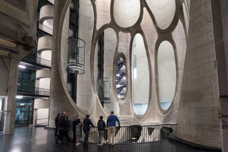
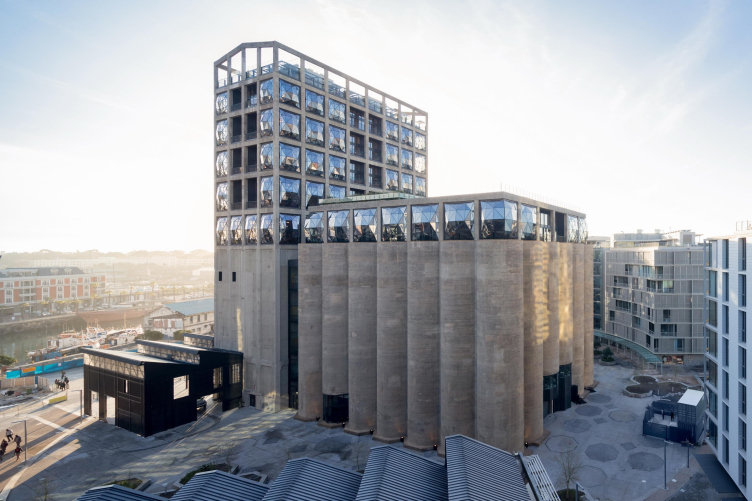
Konstantin Khodnev: Let’s take the Cape Town grain elevator reconstructed by Thomas Heatherwick, which now hosts a hotel and a center of modern art – this is just the right example of what Natalia is speaking about, the example of a totally unbelievable typology and forms. Just see how its beautiful context is used, and the unique features of the old structures – a really groovy thing!

zooming
Zeitz Museum of Contemporary Art Africa © Iwan Baan


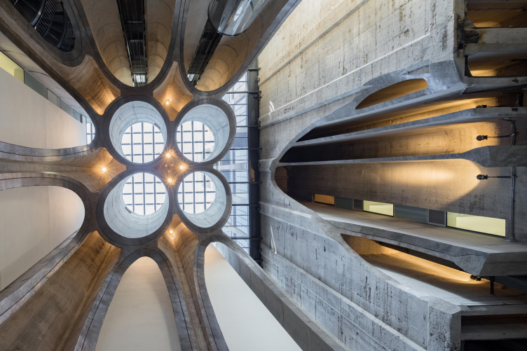
Natalia Sidorova: This cross-section of the structures allowed the architect to look at the space of the building from a totally different angle.This is not merely readjusting the building and making it perform new functions but transforming it with a modern vision that should be bold enough, and at the same time produce a stunning effect.

What we want is I think bolder, more original and more modern inclusions into the reconstructed environment.

Zeitz Museum of Contemporary Art Africa © Iwan Baan


Zeitz Museum of Contemporary Art Africa © Iwan Baan


Again, a recent example: a short while ago, we were able to visit the Kanaal by Axel Vervoordt, near Antwerpen, and it really impressed us. Unlike the acutely conceptual Heatherwick project, this one is all about creating a special atmosphere. Those concrete walls were just poured over the ground, and they became part of the landscape. The landscape design is done there by Michel Desvigne. The new construction was done by different architectural firms: so many buildings, so many authors. The buildings turned out to be different but they are still incorporated into the historical environment, and the entire complex reads like a single world with a unique atmosphere of its own. Every little detail has been taken care of.

Of course, the client played a major role here because essentially it was the client that came up with the whole concept. 

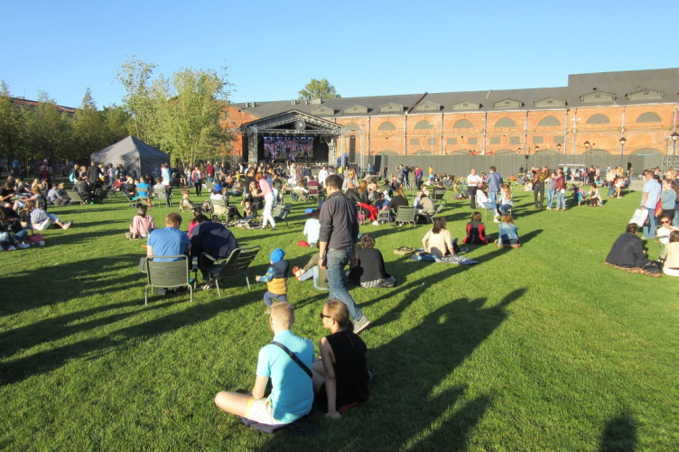
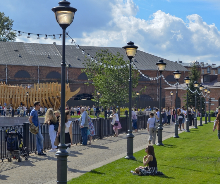
Konstantin Khodnev: Yes, I agree. Continuing the topic of the role of the client, I would note the two most important reconstruction projects in this country. First of all, this is the New Holland Island, which can serve as a model example of the architects’ commitment to excellence when it comes to the material quality of reconstruction.

The New Holland Island © West 8


The New Holland Island © West 8


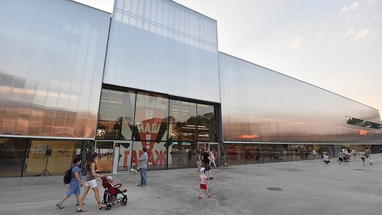
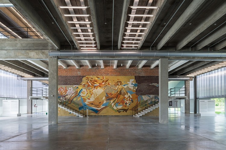
The second example is the Rem Koolhaas Garage, the first-ever project that reinterprets the Soviet modernist architecture. Here is the thing – when we speak reconstruction, the first thing that comes to mind is brick walls, cornices, and pitched roofs. And making a work of art from some seemingly rank-and-file buildings of modernist architecture is something that nobody did before. This was the first project of such kind. We must also note that projects like this are also few and far between in the rest of the world. And it’s also totally unique in term of the quality of execution.

Garage Museum in Gorky Park / photo courtesy by Garage


Garage Museum in Gorky Park / photo courtesy by Garage


Natalia Sidorova: And here we are speaking not just about the quality of the buildings themselves but about the quality of the atmosphere as well. When the atmosphere of the events and everything that goes on there is really connected with the building, you get the perfect environment. As a matter of fact, this is the task that we set four our educational course – teaching our students how to create such an environment.

Konstantin Khodnev: And we also want to motivate our students to think beyond the limits of squeezing a certain number of offices into a certain amount of square meters but always set for themselves a task of forming a new living environment, and making a positive difference to people’s lives. Because the meaning of any reconstruction project is for you to make it work. You need to launch a certain mechanism, every part of which matters – the architectural solutions, the program, and the ideas for further uses of this building. Essentially, a reconstruction project is about coming up with a new life.

And what kind of scenario did you come up with for “Rassvet”?

Konstantin Khodnev: There is a step-by-step process going on there; there is a fragment of environment that by degrees becomes less and less of a factory and more and more of a fragment of the city. The possibilities for development are virtually endless.

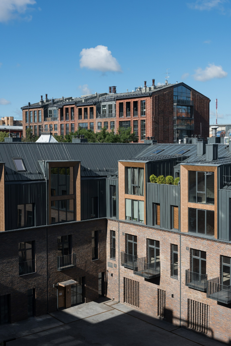
Natalia Sidorova: The two finished buildings (3.34 and 3.20) on the territory of the “Rassvet” factory became to us a very special experience of interacting with the city through deep immersion into the context. The status of redevelopment and the apartment building function allowed us to experiment with various typological solutions – the building has double-level apartments in it, including the ones that are situated on the bottom floors with individual entrances and little gardens of their own that can allow its residents to work and accept visitors on the first floor and live on the second. Today, Rassvet is full of people day and night, it functions 24/7. Cafés appeared, and new ones are being designed. The project of that territory is still developing, and we will continue working with it.

The housing complex Rassvet LOFT*Studio, Building 3.20. Photograph © DNK ag, Ilia Ivanov


What do you think are the omissions of the modern architectural education?

Natalia Sidorova: The interdisciplinary approach. It is missed by architecture in general, and by reconstruction in particular. Because of the inertia of the tradition, it is not practiced in our higher educational institutions. But here is the thing – the most interesting solutions always appear at the junction of disciplines. Hence the new program that add to the classical education. We will be trying to attract as many as possible different specialists who are proficient in architecture but who are at the same time capable of addressing non-architectural issues. There are subtleties of working with theoretical bases, and with surveying buildings, and with studying their history. There are also functional and budget issues to be addressed.

Daniel Lorentz: I would also say that when you interact not only with the terrain but also with cultural codes, this poses a challenge of a whole different level. And it’s a do-or-die battle. Either the building gets the best of you or the other was around but the happy ending is when you both survive and benefit from it.

Back to your MARCH architectural course! Was it easy for you to accept the offer and become its curators? Why was it interesting to you?

Konstantin Khodnev: I cannot say it was easy but we made a positive decision from the very start, somehow, we were quick to respond. Teaching students is hard work but it also teaches you a lot: you learn how to systematize things, how to develop your own teaching methods, how to make it all add up and form a single picture. Learn how to move on. This is all very interesting.

And, of course, it is exciting to get your knowledge and ideas that you think are important across to the maximum number of people. Because, after all, we are all looking to make a positive difference. A positive difference to the city and to people’s lives. And the more people share our values, the better.

Natalia Sidorova: I must also say that we were the residents of the first Artplay at “Red Rose”. And there was a wonderful and unique atmosphere over there back then. And now Sergey Dyatlov, the founder of Artplay, got us infected by the new venue named Pluton, where he gave us a green light in terms of working with our students. And we will be able, on the one hand, to address all the subtleties of the real redevelopment territory, and, on the other hand, maybe do some experimenting and look at things from a new angle. Try to find a few solutions that you would never have found within the framework of this or that specific client’s brief or commission. And we will have an exciting time doing this together with our students.

18 February 2019

Headlines now
The Golden Crown
The concept for a dental clinic in Yekaterinburg, developed by CNTR Studio, revolves around the idea of a “mouth full of gold”: pristine white porcelain stoneware walls are complemented by matte brass details. To avoid an overly literal interpretation, the architects focused on the building’s proportions, skillfully navigating between sunlight requirements and fire safety regulations.
Flexibility and Integration
Not long ago, we covered the project for the fourth phase of the ÁLIA residential complex, designed by APEX. Now, we’ve been shown different fence concepts they developed to enclose the complex’s private courtyards, incorporating a variety of public functions. We believe that the sheer fact that the complex’s architects were involved in such a detail as fencing speaks volumes.
A Step Forward
The HIDE residential complex represents a major milestone for ADM architects and their leaders Andrey Romanov and Ekaterina Kuznetsova in their quest for a fresh high-rise aesthetic – one that is flexible and layered, capable of bringing vibrancy to mass and silhouette while shaping form. Over recent years, this approach has become ADM’s “signature style”, with the golden HIDE tower playing a pivotal role in its evolution. Here, we delve into the project’s story, explore the details of the complex’s design, and uncover its core essence.
Gold in the Sands
A new office for a transcontinental company specializing in resource extraction and processing has opened in Dubai. Designed by T+T Architects, masters of creating spaces that are contemporary, diverse, flexible, and original, this project exemplifies their expertise. On the executive floor, a massive brass-clad partition dominates, while layered textures of compressed earth create a contextually resonant backdrop.
Layers and Levels of Flight
This project goes way back – Reserve Union won this architectural competition at the end of 2011, and the building was completed in 2018, so it’s practically “archival”. However, despite being relatively unknown, the building can hardly be considered “dated” and remains a prime example of architectural expression, particularly in the headquarters genre. And it’s especially fitting for an aviation company office. In some ways, it resembles the Aeroflot headquarters at Sheremetyevo but with its own unique identity, following the signature style of Vladimir Plotkin. In this article, we take an in-depth look at the United Aircraft Corporation (UAC) headquarters in the Moscow agglomeration town of Zhukovsky, supplemented by recent photographs from Alexey Naroditsky – a shoot that became only recently possible due to the fact that improvements were finally made in the surrounding area.
Light and Shadow
In this article, we delve into the architectural design of the “Chaika” house by DNK ag architects, which was recently completed in 2023 as part of the collection of signature designs at ZILArt. As is well-known, all the buildings in this complex follow a design code, yet each one is distinct. This particular building stands out not only for its whiteness and minimalism but also for the refined use of a limited number of techniques that, together, create what can confidently be called synergy.
Casus Novae
A master plan was developed for a large residential area with a name of “DNS City”, but now that its implementation began, the plan has been arbitrarily reformatted and replaced with something that, while similar on the surface, is actually quite different. This is not the first time such a thing happens, but it’s always frustrating. With permission from the author, we are sharing Maria Elkina’s post.
Treasure Hunting
The GAFA bureau, in collaboration with Tegola and Arkhitail, organized an expedition to the island of Kilpola in Karelia as part of Moskomarkhitektura’s “Open City” festival. There, amidst moss and rocks, the students sought answers to questions like: what is the sacred, where does it dwell, and what sustains it? Assisting the participants in this quest were landscape engineer Evgeny Levin, artist Nicholas Roerich, a moose, and the lack of cellular connection. Here’s how the story unfolded.
Depths of the Earth, Streams of Water
In the Malaya Okhta district, the Akzent building, designed by Stepan Liphart, was constructed. It follows a classic tripartite structure, yet it’s what you might call “hand-drawn”: each façade is unique in its form and details, some of which aren’t immediately noticeable. In this article, we explore the context and, together with the architect, delve into how the form was developed.
Fir Tree Dynamics
The “Airports of Region” holding is planning to build an airport in Karachay-Cherkessia, aiming to make the Arkhyz and Dombay resorts more accessible to travelers. The project that won in an invitation-only competition, submitted by Sergey Nikeshkin’s KPLN, blends natural imagery inspired by the shape of a conifer seed, open-air waiting spaces, majestic large trees, and a green roof elevated on needle-like columns. The result is both nature-inspired and WOW.
​A Brick Shell
In the process of designing a clubhouse situated among pine trees in a prestigious suburban area near Moscow, the architectural firm “A.Len” did the façade design part. The combination of different types of brick and masonry correlates with the volumetric and plastique solutions, further enhanced by the inclusion of wood-painted fragments and metal “glazing”.
Word Forms
ATRIUM architects love ambitious challenges, and for the firm’s thirtieth anniversary, they boldly play a game of words with an exhibition that dives deep into a self-created vocabulary. They immerse their projects – especially art installations – into this glossary, as if plunging into a current of their own. You feel as if you’re flowing through the veins of pure art, immersed in a universe of vertical cities, educational spaces – of which the architects are true masters – and the cultural codes of various locations. But what truly captivates is the bold statement that Vera Butko and Anton Nadtochy make, both through their work and this exhibition: architecture, above all, is art – the art of working with form and space.
Flexibility and Acuteness of Modernity
Luxurious, fluid, large “kokoshniks” and spiral barrel columns, as if made from colorful chewing gum: there seem to be no other mansion like this in Moscow, designed in the “Neo-Russian-Modern” style. And the “Teremok” on Malaya Kaluzhskaya, previously somewhat obscure, has “come alive with new colors” and gained visibility after its restoration for the office of the “architectural ecosystem” as the architects love to call themselves. It’s evident that Julius Borisov and the architects at UNK put their hearts into finding this new office and bringing it up to date. Let’s delve into the paradoxes of this mansion’s history and its plasticity. Spoiler: two versions of modernity meet here, both balancing on the razor’s edge of “what’s current”.
Yuri Vissarionov: “A modular house does not belong to the land”
It belongs to space, or to the air... It turns out that 3D printing is more effective when combined with a modular approach: the house is built in a workshop and then adapted to the site, including on uneven terrain. Yuri Vissarionov shares his latest experience in designing tourist complexes, both in central Russia and in the south. These include houseboats, homes printed from lightweight concrete using a 3D printer, and, of course, frame houses.
​Moscow’s First
“The quality of education largely depends on the quality of the educational environment”. This principle of the last decade has been realized by Sergey Skuratov in the project for the First Moscow Gymnasium on Rostovskaya Embankment in the Khamovniki district. The building seamlessly integrates into the complex urban landscape, responding both to the pedestrian flow of the city and the quiet alleyways. It skillfully takes advantage of the height differences and aligns with modern trends in educational space design. Let’s take a closer look.
Looking at the Water
The site of Villa Sonata stretches from the road to the water’s edge, offering its own shoreline, pier, and a picturesque river panorama. To reveal these sweeping views, Roman Leonidov “cut” the façade diagonally parallel to the river, thus getting two main axes for the house and, consequently, “two heads”. The internal core – two double-height spaces, a living room and a conservatory, with a “bridge” above them – makes the house both “transparent” and filled with light.
The White Wing
Well, it’s not exactly white. It’s more of a beige, white-stone structure that plays with the color of limestone – smoother surfaces are lighter, while rougher ones are darker. This wing unites various elements: it absorbs and interprets the surrounding themes. It responds to everything, yet maintains a cohesive expression – a challenging task! – while also incorporating recognizable features of its own, such as the dynamic cuts at the bottom, top, and middle.
Urban Dunes
The XSA Ramps team designed and built a three-part sports hub for a park in Rostov-on-Don, welcoming people of all ages and fitness levels. The skate plaza, pump track, and playground are all meticulously crafted with details that attract a diverse range of visitors. The technical execution of the shapes and slopes transforms this space into a kind of sculptural composition.
Proportional Growth
The project for the fourth phase of the ÁLIA residential area has been announced. The buildings are situated on an elongated plot – almost a “ray” that shoots out from the center of the area towards the river. Their layout reflects both a response to Moscow’s architectural preferences over the past 15 years, shifting “from blocks to towers”, and an interpretation of the neighboring business park designed by SOM. Additionally, the best apartments here are not located at the very top but closer to the middle, forming a glowing “waistline”.
The “Staircase” Building
In designing the “Details” residential complex in New Moscow, Rais Baishev spiced up the now-popular Moscow theme of a “courtyard” building with an idea drawn from the surrealist drawings by Maurits Escher. He envisioned the stepped silhouettes and descending slopes as a metaphysical mega-staircase, creating a key void within the courtyard that gave the project an internal “spine”. This concept is felt both in the building’s silhouette and on its façades.
Projection of the Quarter
No one doubted that the building that Vladimir Plotkin designed as part of the “Garden Quarters” would be the most modernist of all. And it turned out just that way: while adhering to the common design code, the building successfully combines brick and white stone, rhythmically responding to the neighboring building designed by Ostozhenka, yet tactfully and persistently making a few statements of its own. This includes the projection of the ideal urban development composition “14–9–6”, which can be found right next door, mathematical calculations, including those for various types of terraces (and perhaps the only reminder of the Soviet past of the Kauchuk rubber factory!), and the white “cross-stitch” pattern of the façade grid.
Domus Aurea
In this issue, we examine the “Tessinsky-1” house, designed by Sergey Skuratov and completed in 2023. Located in the middle of the Serebryanicheskaya Embankment district, at the intersection of its main streets, this house assumes a sort of “nodal” role: it not only responds to everything around it and preserves many memories of the former EMA factory within itself, but it weaves all this into a newly directed pattern, reconciling bright “gold” and dark-colored brick, largely with the help of the new, modern-yet-archaic Columba brick, which, come to think about it, is the most precious element here.
The Chimney of Nikola-Lenivets
In this issue, we are examining the “Obelisk House” designed by KATARSIS and built for the Arkhstoyanie 2023 festival. However, it was only finished later on, and this is why we are examining it now. It seems to us that after the “Obelisk House” appeared in Nikola-Lenivets, a dialogue and a few inner connections appeared between the temporary structures built here. These houses no longer look like “accidental neighbors”, more of which below.
​Periscope by the Bay
The jury awarded the second place in the competition for a public and cultural center in Petropavlovsk-Kamchatsky to the companies GORA (“Mountain”) and M4. In the consortium’s proposal, the building resembles a sperm whale with a calf swimming next to it or a periscope, whose lenses capture the most spectacular views from the surrounding landscape.
From Arcs to Dolmens
While working on the competition project for Petropavlovsk-Kamchatsky, ASADOV Architects prioritized the value of the natural and urban environment, aiming to preserve the balance of the location while minimizing the resemblance of the volume that they designed to a “traditional building”. The task was challenging, and the architects created three versions, one of which having been developed after the competition, where their main proposal took third place. However, the point of interest here is not the competition result but the continuity of creative thinking.
Hide and Seek
The ID Moskovskiy house, designed by Stepan Liphart in St. Petersburg, in the courtyards near Moskovskiy Avenue beyond the Obvodny Canal and recently completed, is notable for several reasons. Firstly, it has been realized with considerable accuracy, which is particularly significant as this is the first building where the architect was responsible not only for the facades but also for the layouts, allowing for better integration between the two. On the other hand, this building is interesting as an example of the “germination” of new architecture in the city: it draws on the best examples from the neighborhood and becomes an improved and developed sum of ideas found by the architect in the surrounding context.
The Big Twelve
Yesterday, the winners of the Moscow Mayor’s Architecture Award were announced and honored. Let’s take a look at what was awarded and, in some cases, even critique this esteemed award. After all, there is always room for improvement, right?
Above the Golden Horn
The residential complex “Philosophy” designed by T+T architects in Vladivostok, is one of the new projects in the “Golubinaya Pad” area, changing its development philosophy (pun intended) from single houses to a comprehensive approach. The buildings are organized along public streets, varying in height and format, with one house even executed in gallery typology, featuring a cantilever leaning on an art object.
Nuanced Alternative
How can you rhyme a square and space? Easily! But to do so, you need to rhyme everything you can possibly think of: weave everything together, like in a tensegrity structure, and find your own optics too. The new exhibition at GES-2 does just that, offering its visitor a new perspective on the history of art spanning 150 years, infused with the hope for endless multiplicity of worlds and art histories. Read on to see how this is achieved and how the exhibition design by Evgeny Ace contributes to it.
Blinds for Ice
An ice arena has been constructed in Domodedovo based on a project by Yuri Vissarionov Architects. To prevent the long façade, a technical requirement for winter sports facilities, from appearing monotonous, the architects proposed the use of suspended structures with multidirectional slats. This design protects the ice from direct sunlight while giving the wall texture and detail.