По-русски

The U-House

The Jois complex combines height with terraces, bringing the most expensive apartments from penthouses down to the bottom floors. The powerful iconic image of the U-shaped building is the result of the creative search for a new standard of living in high-rise buildings by the architects of “Genpro”.

11 March 2024
Overview
mainImg
Architect:
Andy Snow
Moscow has entered a new era of residential skyscraper construction, unprecedented in scale and height. It is not surprising that after the period of toggling between the Stalin-era high-rise style and the laconic “pencil” towers, the city has embarked on a search for an original form of high-rise buildings. But then again, come to think of it, this search has never ceased since it began in the 1920s, only slowing down from time to time. Some ideas remain hidden under the cover of closed-door competitions, but the “open” part is publicly known quite well.
 
In short, the process is ongoing, and against the backdrop of the nation’s capital’s high-rise boom, the goal of such exploration is not just coming up with some non-trivial forms but also testing some prejudices for strength.

Jois multifunctional complex
Copyright: © Genpro

 
Andy Snow, a British-born architect and creative director of Genpro, positions his project – as he said in an interview with Tatlin magazine, for example – precisely as a myth-buster.

We are really proud of this project. While conceptualizing Jois, we aimed to challenge prevailing myths surrounding skyscrapers, incorporating unique solutions that set a premium standard in Moscow. For instance, we debunked the belief in insufficient fresh air in tall buildings and the absence of small windows – our design features small windows above 75 meters, equipped with protective valves. We also addressed the misconception that skyscrapers lack social spaces and countered the idea that the best apartments with terraces should be reserved for the upper floors.

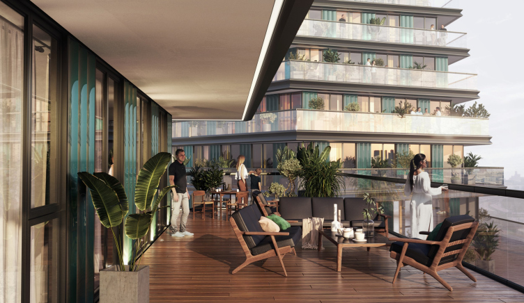
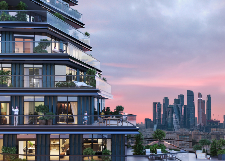
In our approach, premium apartments are situated in the lower tier, featuring expansive “balcony” terraces that extend across multiple facades and visually engage with the “park” courtyard, generously adorned with greenery. These apartments define the distinctive shape of the buildings, seamlessly emerging from the ground and connecting the tower bases. This form not only presents a recognizable silhouette from a distance but also offers breathtaking views. The process required meticulous effort; for the lower floors, standard layouts were impractical, prompting us to essentially start from scratch. Jois stands out as one of the most extensive and challenging projects in my career.

I express gratitude to the developer, MR-Group, for their understanding and cooperation. We successfully navigated the idea through various iterations of project development, maintaining its original design integrity. The role of Genpro as the general designer has been instrumental in ensuring the complex’s successful execution. In my view, Genpro stands as one of the most robust general design companies in the Russian market.


Jois multifunctional complex
Copyright: © Genpro

 
Jois is one of the new iconic projects of Moscow’s “skyscraper trend”; its construction began in August 2023. It continues the so-called “Big City” beyond the Zvenigorodskoe Highway, stretching towards Zorge Street, that is, it is part of the “protuberance”, a huge spot of urban territory that was previously almost entirely filled with industrial parks, and is now being intensively cleared and built upon. Nearby is the Moscow Central Ring line, with its “Khoroshevo” station just 300 meters away, making the transportation accessibility of this location excellent. Additionally, nearby is the business center “1Zhukov”, and there are ambitious plans for construction in the adjacent areas. The Jois complex itself will appear on the territory of the former concrete products plant No. 17.

  • zooming
    Jois multifunctional complex. First phase of construction. Photo montage
    Copyright: © Genpro
  • zooming
    Jois multifunctional complex. First phase of construction. Photo montage
    Copyright: © Genpro

 
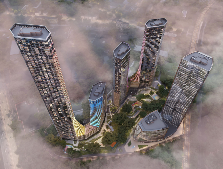
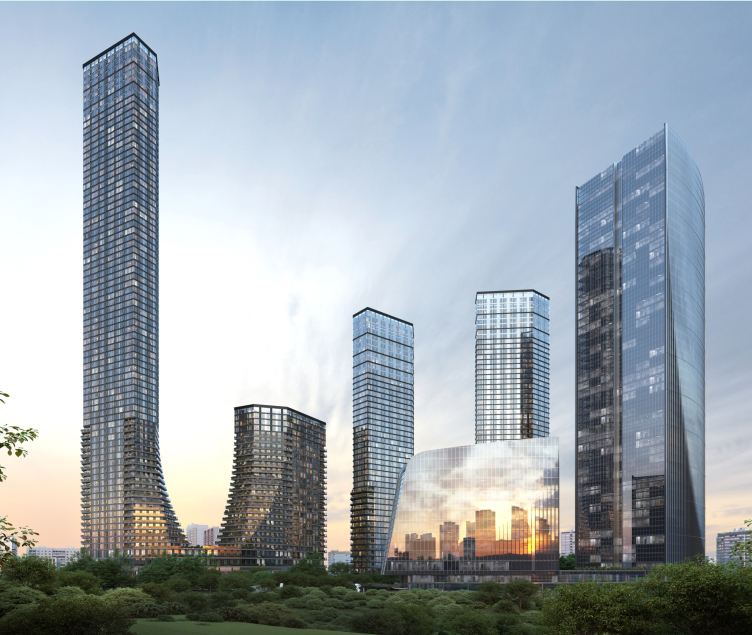
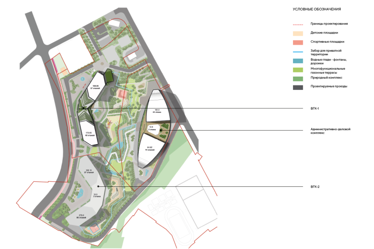
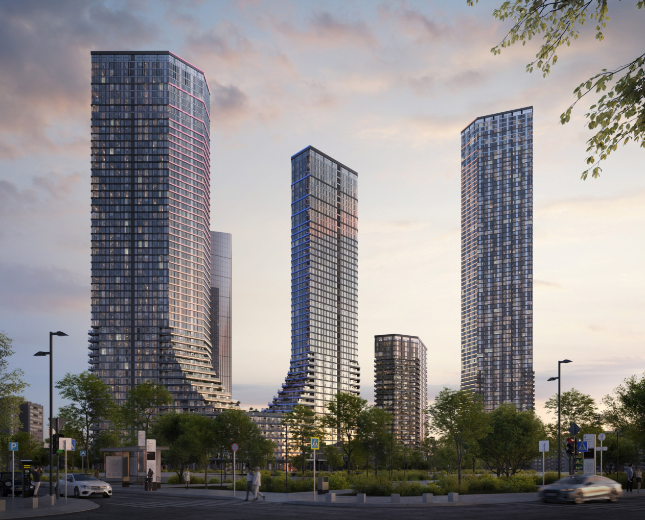
In fact, Jois consists of two high-rise residential complexes – from 48 to 57 floors, with the highest point at 338.5 meters – and an administrative/business center. The plan shape of each of the three objects resembles a boomerang: two two-section residential buildings are opened in different directions, one to the east, the other to the west, and the third one, the office building, being slightly wider, is located closer to the Moscow Central Ring, completing the composition.

Jois multifunctional residential complex, the master plan
Copyright: image provided by Genpro

 
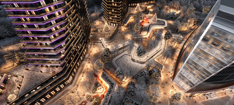
The two pairs of volumes are arranged on either side of the subway line passing beneath the site, over which a courtyard/park/boulevard is designed, with a tiered contour merging into the surrounding stylobates.

Jois multifunctional residential complex
Copyright: image provided by Genpro


  • zooming
    Project of the park courtyard. Jois multifunctional complex
    Copyright: image provided by Genpro
  • zooming
    Jois multifunctional complex
    Copyright: image provided by Genpro

 
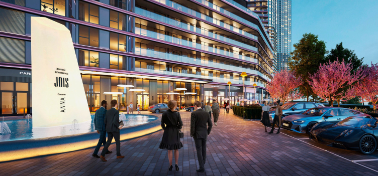
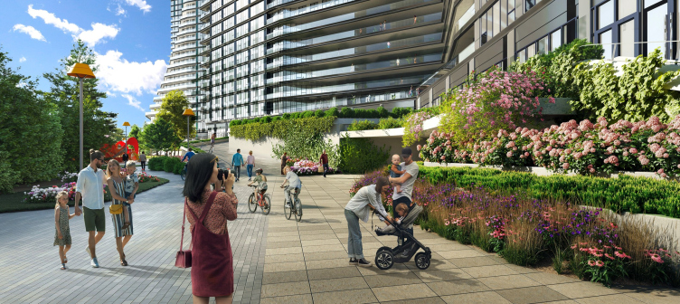
The courtyard/park is meant to compensate for the lack of greenery in the city for the residents and office workers while simultaneously creating a vibrant public space filled with cafes and shops, which is absolutely essential for a complex of this scale.

Jois multifunctional residential complex
Copyright: image provided by Genpro


Jois multifunctional residential complex
Copyright: image provided by Genpro

 
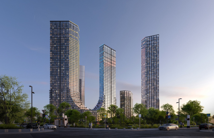
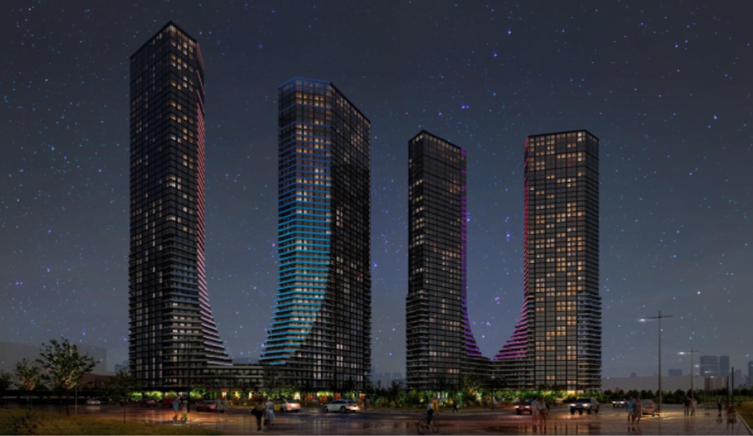
While the business center consists of two towers with a parabolic plan contour, placed on the “boomerang” stylobate with “bases of parabolas” slices facing each other, the pairs of residential buildings merge on their stylobates with terraces of the lower (premium) apartments to form two giant U-letters – a visually powerful and instantly recognizable form, which has all the grounds to claim an iconic status – a crucial quality for large modern buildings. They resemble horseshoes or magnets, with upward-pointing ends, different in height in one complex, and of an equal height in the other.

Jois multifunctional complex
Copyright: © Genpro


zooming
Jois multifunctional complex
Copyright: © Genpro

 
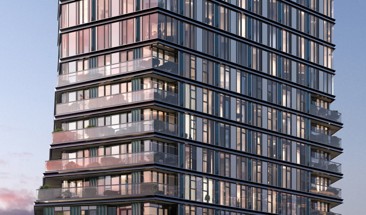
Terracing the lower floors becomes a successful way to give extra strength to the U-silhouette towers. Their form is not merely “put together”; it is composed of terraces, which, in turn, provide spacious apartments equipped with outdoor leisure space. The terraces are planned to be greened, as seen in the project visualizations, featuring numerous trees in containers, their steps rising from the courtyard and the roof of the stylobate like a kind of green mountain. Above, the live greenery finds its reflection in the form of “diamond rust” metal elements on the glass facades.
 
The decorative elements on the facades include fiber-concrete and concave terracotta displays of semi-circular shape in section. The terrace railings are made of tempered glass. Between the floors, projecting decorative elements made of “M”-shaped aluminum sheets are used.

  • zooming
    Jois multifunctional complex
    Copyright: © Genpro
  • zooming
    Jois multifunctional complex
    Copyright: © Genpro


Jois multifunctional complex
Copyright: © Genpro

 
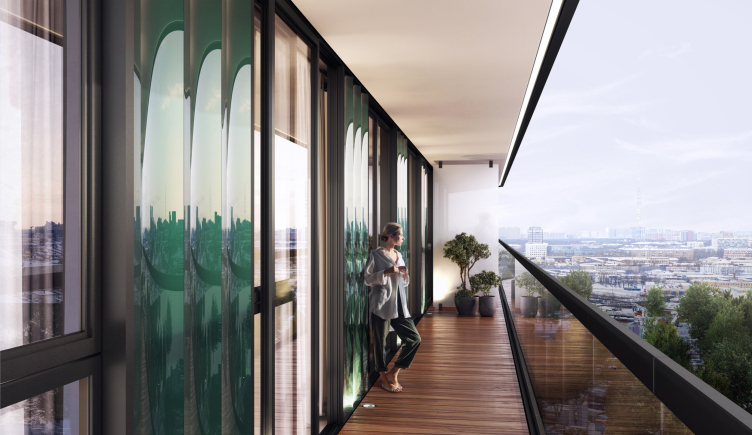
Each lower balcony protrudes further than the upper one, but the upper one also protrudes relative to the wall, creating a canopy over the open balcony-terrace space, providing protection from the sun and rain.

Jois multifunctional complex
Copyright: © Genpro


Jois multifunctional complex
Copyright: © Genpro

 
This approach simultaneously enriches the form, deconstructing the shape of the towers’ bases, and enhancing the resemblance of those bases to a layered mountain, which is then sculpted into smooth, almost entirely glass, surfaces at the top.

  • zooming
    Jois multifunctional complex
    Copyright: © Genpro
  • zooming
    Jois multifunctional complex
    Copyright: © Genpro


Jois multifunctional complex
Copyright: © Genpro

 
The volumes of the towers themselves are not rectangular in plan; their corners are cut in the search for optimal views, insolation, and, at the same time, they feature a streamlined, asymmetrically faceted shape. Meanwhile, on the pedestal, as we remember, they are also turned towards each other at an angle – as a result, the contours of the terraces also consistently rotate, forming, when viewed from above, a shape reminiscent of a fractal. It all looks as if the houses had a half-sun skirt and were gently dancing, with their folds moving.

  • zooming
    Jois multifunctional complex
    Copyright: © Genpro
  • zooming
    Jois multifunctional complex
    Copyright: © Genpro

 
The lower part of the towers seems to be wrapped in additional skin. Or, simply put, the building unfolds before our eyes “putting itself together” from horizontal plates.
 
It is worth noting that terraces in modern Moscow construction have proven themselves quite effective in recent years – it has become evident that they go a long way to solve the problem of snow removal, and the issue of bad weather is effectively addressed by awnings and, for example, gas lanterns. What is also important, apartments with terraces sell first and at higher prices in residential complexes. Plus, terraces and balconies, all these “inhabited projections”, make the building look more “inhabited” – it interacts better with the city space.
 
Andy Snow joins those buildings that have already contributed to debunking the myth of the inconvenience of terraces in Moscow's climate and proposes a new step – combining terraces with a skyscraper, merging them into a cohesive “city” where different characteristics of individual parts are fused within an integral volumetric composition.

Jois multifunctional complex
Copyright: © Genpro

 
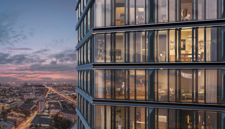
And, of course, this opens up beautiful views of the city, from a level comfortable for humans.

  • zooming
    1 / 4
    Jois multifunctional residential complex
    Copyright: image provided by Genpro
  • zooming
    2 / 4
    Jois multifunctional residential complex
    Copyright: image provided by Genpro
  • zooming
    3 / 4
    Jois multifunctional residential complex
    Copyright: image provided by Genpro
  • zooming
    4 / 4
    Jois multifunctional residential complex
    Copyright: image provided by Genpro

 
Regarding the windows, according to construction regulations, at a significant height, they do not open for ventilation. In Jois, ventilation flaps are applied above 75 meters, with inward-opening and protective screens made of perforated metal placed in front of them. Below 75 meters, apartment windows are made of aluminum profiles with double-glazed windows and noise-proof ventilation valves. Additionally, French balconies with glass panel railings are incorporated into the transparent structures on the residential floors.
 
In addition to apartments, the project includes children’s clubs, fitness centers, a health center, a spa, and well-designed open spaces for communal activities. Finally, there is the business center. Its task is to enrich the future environment functionally, which is absolutely necessary for 300-meter residential complexes. It is challenging to say how realistic it is to buy an apartment right next to your office or even within the same project, yet Moscow is increasingly recognizing the need for multifunctionality in large new developments.
 
The sculptural solution of the business center, as noted earlier, somewhat echoes the residential “pairs” while differing from them. Here, there is no U-shaped silhouette or terraces, but the plan contours take on a distinct parabolic outline, and the facades feature a thin, smoothly embedded vertical relief in glass. These details allow the architects to signify the affiliation of office buildings to the entire complex and at the same time indicate their functional distinction: if the residential buildings expand at the bottom, the offices efficiently “pull” their volumes “together”.

  • zooming
    1 / 4
    The administrative and business center
    Copyright: image provided by Genpro
  • zooming
    2 / 4
    The administrative and business complex
    Copyright: image provided by Genpro
  • zooming
    3 / 4
    Jois multifunctional complex
    Copyright: © Genpro
  • zooming
    4 / 4
    Jois multifunctional complex
    Copyright: © Genpro

 
In summary, a new tall structure, over 300 meters high, has emerged among Moscow’s new developments with a recognizable form determined by its content.
 
It wouldn’t be accurate to say that the stepped or gradual growth of a skyscraper from its stylobate, as well as the connection of towers with such bases, is an entirely groundbreaking solution; there are plenty of examples, such as here, here, here, here, and here. Or even here. For buildings of this scale, a transition from a wide bottom to a slender tower at the top – resembling the growth of a tree – is a technique that sort of suggests itself. There are U-shaped solutions, looking like a half-house with a “tail”, and structures more reminiscent of aquatic plants sprouting from calyxes. However, each such solution is usually associated with a large scale and an inclination towards a symbolic expression, easily recognizable from a distance. These U-shaped structures will be quite visible from the windows of the Moscow Central Diameter train. The chances of this project being executed are quite significant.
 
It is planned that this complex will be built in three phases, starting with the northern pair of residential buildings.

Architect:
Andy Snow

11 March 2024

Headlines now
The Golden Crown
The concept for a dental clinic in Yekaterinburg, developed by CNTR Studio, revolves around the idea of a “mouth full of gold”: pristine white porcelain stoneware walls are complemented by matte brass details. To avoid an overly literal interpretation, the architects focused on the building’s proportions, skillfully navigating between sunlight requirements and fire safety regulations.
Flexibility and Integration
Not long ago, we covered the project for the fourth phase of the ÁLIA residential complex, designed by APEX. Now, we’ve been shown different fence concepts they developed to enclose the complex’s private courtyards, incorporating a variety of public functions. We believe that the sheer fact that the complex’s architects were involved in such a detail as fencing speaks volumes.
A Step Forward
The HIDE residential complex represents a major milestone for ADM architects and their leaders Andrey Romanov and Ekaterina Kuznetsova in their quest for a fresh high-rise aesthetic – one that is flexible and layered, capable of bringing vibrancy to mass and silhouette while shaping form. Over recent years, this approach has become ADM’s “signature style”, with the golden HIDE tower playing a pivotal role in its evolution. Here, we delve into the project’s story, explore the details of the complex’s design, and uncover its core essence.
Gold in the Sands
A new office for a transcontinental company specializing in resource extraction and processing has opened in Dubai. Designed by T+T Architects, masters of creating spaces that are contemporary, diverse, flexible, and original, this project exemplifies their expertise. On the executive floor, a massive brass-clad partition dominates, while layered textures of compressed earth create a contextually resonant backdrop.
Layers and Levels of Flight
This project goes way back – Reserve Union won this architectural competition at the end of 2011, and the building was completed in 2018, so it’s practically “archival”. However, despite being relatively unknown, the building can hardly be considered “dated” and remains a prime example of architectural expression, particularly in the headquarters genre. And it’s especially fitting for an aviation company office. In some ways, it resembles the Aeroflot headquarters at Sheremetyevo but with its own unique identity, following the signature style of Vladimir Plotkin. In this article, we take an in-depth look at the United Aircraft Corporation (UAC) headquarters in the Moscow agglomeration town of Zhukovsky, supplemented by recent photographs from Alexey Naroditsky – a shoot that became only recently possible due to the fact that improvements were finally made in the surrounding area.
Light and Shadow
In this article, we delve into the architectural design of the “Chaika” house by DNK ag architects, which was recently completed in 2023 as part of the collection of signature designs at ZILArt. As is well-known, all the buildings in this complex follow a design code, yet each one is distinct. This particular building stands out not only for its whiteness and minimalism but also for the refined use of a limited number of techniques that, together, create what can confidently be called synergy.
Casus Novae
A master plan was developed for a large residential area with a name of “DNS City”, but now that its implementation began, the plan has been arbitrarily reformatted and replaced with something that, while similar on the surface, is actually quite different. This is not the first time such a thing happens, but it’s always frustrating. With permission from the author, we are sharing Maria Elkina’s post.
Treasure Hunting
The GAFA bureau, in collaboration with Tegola and Arkhitail, organized an expedition to the island of Kilpola in Karelia as part of Moskomarkhitektura’s “Open City” festival. There, amidst moss and rocks, the students sought answers to questions like: what is the sacred, where does it dwell, and what sustains it? Assisting the participants in this quest were landscape engineer Evgeny Levin, artist Nicholas Roerich, a moose, and the lack of cellular connection. Here’s how the story unfolded.
Depths of the Earth, Streams of Water
In the Malaya Okhta district, the Akzent building, designed by Stepan Liphart, was constructed. It follows a classic tripartite structure, yet it’s what you might call “hand-drawn”: each façade is unique in its form and details, some of which aren’t immediately noticeable. In this article, we explore the context and, together with the architect, delve into how the form was developed.
Fir Tree Dynamics
The “Airports of Region” holding is planning to build an airport in Karachay-Cherkessia, aiming to make the Arkhyz and Dombay resorts more accessible to travelers. The project that won in an invitation-only competition, submitted by Sergey Nikeshkin’s KPLN, blends natural imagery inspired by the shape of a conifer seed, open-air waiting spaces, majestic large trees, and a green roof elevated on needle-like columns. The result is both nature-inspired and WOW.
​A Brick Shell
In the process of designing a clubhouse situated among pine trees in a prestigious suburban area near Moscow, the architectural firm “A.Len” did the façade design part. The combination of different types of brick and masonry correlates with the volumetric and plastique solutions, further enhanced by the inclusion of wood-painted fragments and metal “glazing”.
Word Forms
ATRIUM architects love ambitious challenges, and for the firm’s thirtieth anniversary, they boldly play a game of words with an exhibition that dives deep into a self-created vocabulary. They immerse their projects – especially art installations – into this glossary, as if plunging into a current of their own. You feel as if you’re flowing through the veins of pure art, immersed in a universe of vertical cities, educational spaces – of which the architects are true masters – and the cultural codes of various locations. But what truly captivates is the bold statement that Vera Butko and Anton Nadtochy make, both through their work and this exhibition: architecture, above all, is art – the art of working with form and space.
Flexibility and Acuteness of Modernity
Luxurious, fluid, large “kokoshniks” and spiral barrel columns, as if made from colorful chewing gum: there seem to be no other mansion like this in Moscow, designed in the “Neo-Russian-Modern” style. And the “Teremok” on Malaya Kaluzhskaya, previously somewhat obscure, has “come alive with new colors” and gained visibility after its restoration for the office of the “architectural ecosystem” as the architects love to call themselves. It’s evident that Julius Borisov and the architects at UNK put their hearts into finding this new office and bringing it up to date. Let’s delve into the paradoxes of this mansion’s history and its plasticity. Spoiler: two versions of modernity meet here, both balancing on the razor’s edge of “what’s current”.
Yuri Vissarionov: “A modular house does not belong to the land”
It belongs to space, or to the air... It turns out that 3D printing is more effective when combined with a modular approach: the house is built in a workshop and then adapted to the site, including on uneven terrain. Yuri Vissarionov shares his latest experience in designing tourist complexes, both in central Russia and in the south. These include houseboats, homes printed from lightweight concrete using a 3D printer, and, of course, frame houses.
​Moscow’s First
“The quality of education largely depends on the quality of the educational environment”. This principle of the last decade has been realized by Sergey Skuratov in the project for the First Moscow Gymnasium on Rostovskaya Embankment in the Khamovniki district. The building seamlessly integrates into the complex urban landscape, responding both to the pedestrian flow of the city and the quiet alleyways. It skillfully takes advantage of the height differences and aligns with modern trends in educational space design. Let’s take a closer look.
Looking at the Water
The site of Villa Sonata stretches from the road to the water’s edge, offering its own shoreline, pier, and a picturesque river panorama. To reveal these sweeping views, Roman Leonidov “cut” the façade diagonally parallel to the river, thus getting two main axes for the house and, consequently, “two heads”. The internal core – two double-height spaces, a living room and a conservatory, with a “bridge” above them – makes the house both “transparent” and filled with light.
The White Wing
Well, it’s not exactly white. It’s more of a beige, white-stone structure that plays with the color of limestone – smoother surfaces are lighter, while rougher ones are darker. This wing unites various elements: it absorbs and interprets the surrounding themes. It responds to everything, yet maintains a cohesive expression – a challenging task! – while also incorporating recognizable features of its own, such as the dynamic cuts at the bottom, top, and middle.
Urban Dunes
The XSA Ramps team designed and built a three-part sports hub for a park in Rostov-on-Don, welcoming people of all ages and fitness levels. The skate plaza, pump track, and playground are all meticulously crafted with details that attract a diverse range of visitors. The technical execution of the shapes and slopes transforms this space into a kind of sculptural composition.
Proportional Growth
The project for the fourth phase of the ÁLIA residential area has been announced. The buildings are situated on an elongated plot – almost a “ray” that shoots out from the center of the area towards the river. Their layout reflects both a response to Moscow’s architectural preferences over the past 15 years, shifting “from blocks to towers”, and an interpretation of the neighboring business park designed by SOM. Additionally, the best apartments here are not located at the very top but closer to the middle, forming a glowing “waistline”.
The “Staircase” Building
In designing the “Details” residential complex in New Moscow, Rais Baishev spiced up the now-popular Moscow theme of a “courtyard” building with an idea drawn from the surrealist drawings by Maurits Escher. He envisioned the stepped silhouettes and descending slopes as a metaphysical mega-staircase, creating a key void within the courtyard that gave the project an internal “spine”. This concept is felt both in the building’s silhouette and on its façades.
Projection of the Quarter
No one doubted that the building that Vladimir Plotkin designed as part of the “Garden Quarters” would be the most modernist of all. And it turned out just that way: while adhering to the common design code, the building successfully combines brick and white stone, rhythmically responding to the neighboring building designed by Ostozhenka, yet tactfully and persistently making a few statements of its own. This includes the projection of the ideal urban development composition “14–9–6”, which can be found right next door, mathematical calculations, including those for various types of terraces (and perhaps the only reminder of the Soviet past of the Kauchuk rubber factory!), and the white “cross-stitch” pattern of the façade grid.
Domus Aurea
In this issue, we examine the “Tessinsky-1” house, designed by Sergey Skuratov and completed in 2023. Located in the middle of the Serebryanicheskaya Embankment district, at the intersection of its main streets, this house assumes a sort of “nodal” role: it not only responds to everything around it and preserves many memories of the former EMA factory within itself, but it weaves all this into a newly directed pattern, reconciling bright “gold” and dark-colored brick, largely with the help of the new, modern-yet-archaic Columba brick, which, come to think about it, is the most precious element here.
The Chimney of Nikola-Lenivets
In this issue, we are examining the “Obelisk House” designed by KATARSIS and built for the Arkhstoyanie 2023 festival. However, it was only finished later on, and this is why we are examining it now. It seems to us that after the “Obelisk House” appeared in Nikola-Lenivets, a dialogue and a few inner connections appeared between the temporary structures built here. These houses no longer look like “accidental neighbors”, more of which below.
​Periscope by the Bay
The jury awarded the second place in the competition for a public and cultural center in Petropavlovsk-Kamchatsky to the companies GORA (“Mountain”) and M4. In the consortium’s proposal, the building resembles a sperm whale with a calf swimming next to it or a periscope, whose lenses capture the most spectacular views from the surrounding landscape.
From Arcs to Dolmens
While working on the competition project for Petropavlovsk-Kamchatsky, ASADOV Architects prioritized the value of the natural and urban environment, aiming to preserve the balance of the location while minimizing the resemblance of the volume that they designed to a “traditional building”. The task was challenging, and the architects created three versions, one of which having been developed after the competition, where their main proposal took third place. However, the point of interest here is not the competition result but the continuity of creative thinking.
Hide and Seek
The ID Moskovskiy house, designed by Stepan Liphart in St. Petersburg, in the courtyards near Moskovskiy Avenue beyond the Obvodny Canal and recently completed, is notable for several reasons. Firstly, it has been realized with considerable accuracy, which is particularly significant as this is the first building where the architect was responsible not only for the facades but also for the layouts, allowing for better integration between the two. On the other hand, this building is interesting as an example of the “germination” of new architecture in the city: it draws on the best examples from the neighborhood and becomes an improved and developed sum of ideas found by the architect in the surrounding context.
The Big Twelve
Yesterday, the winners of the Moscow Mayor’s Architecture Award were announced and honored. Let’s take a look at what was awarded and, in some cases, even critique this esteemed award. After all, there is always room for improvement, right?
Above the Golden Horn
The residential complex “Philosophy” designed by T+T architects in Vladivostok, is one of the new projects in the “Golubinaya Pad” area, changing its development philosophy (pun intended) from single houses to a comprehensive approach. The buildings are organized along public streets, varying in height and format, with one house even executed in gallery typology, featuring a cantilever leaning on an art object.
Nuanced Alternative
How can you rhyme a square and space? Easily! But to do so, you need to rhyme everything you can possibly think of: weave everything together, like in a tensegrity structure, and find your own optics too. The new exhibition at GES-2 does just that, offering its visitor a new perspective on the history of art spanning 150 years, infused with the hope for endless multiplicity of worlds and art histories. Read on to see how this is achieved and how the exhibition design by Evgeny Ace contributes to it.
Blinds for Ice
An ice arena has been constructed in Domodedovo based on a project by Yuri Vissarionov Architects. To prevent the long façade, a technical requirement for winter sports facilities, from appearing monotonous, the architects proposed the use of suspended structures with multidirectional slats. This design protects the ice from direct sunlight while giving the wall texture and detail.