По-русски

​The Breath of the East

Designing a residential complex for Tashkent, GENPRO is turning to traditional architecture and modern trends, aiming at emotionality and efficiency: the panjar window lattices and mishrabias are neighboring on vertical greenery and parametric ornaments, while the theme buildings do on a cotton alley and an oriental bazaar.

30 October 2021
Object
mainImg
Over the recent years, Uzbekistan has been becoming an ever more open country interesting to the world: in 2019, The Economist pronounced it to be the country of the year, and this year Uzbekistan made the top five most interesting tourist destinations according to The Times, opened its own pavilion at the world Expo-2020 in Dubai, and for the first time around took part in the Venice Architecture Biennale – with an exposition that shared about the local social and cultural phenomenon known a “makhalla”. The project of the residential complex Orient City is Genpro’s to the changes in the country’s image, and a search for balance between the European know-how and preserving the national flavor.

Orient City
Copyright: © GENPRO


The rich heritage of Uzbekistan and the traditions of the Islamic culture were reflected even in the architecture of the Soviet period, which some experts describe as “oriental” or even “earthquake-proof” modernism. The contemporary architecture still uses traditional forms, such as panjar lattices, vaulted arches, maiolica, and the carpet ornaments, but more often you see faceless average “Euro-samples”. Sometimes, the former and the latter form rather strange combinations, but then again, lucky exceptions are also there. For all intents and purposes, Genpro, acting within the limits of its typology, is offering Tashkent something completely new, yet at the same time not devoid of national flavor, just like the big restaurant complex “Zarafshan” that was built back in the day.

Orient City
Copyright: © GENPRO


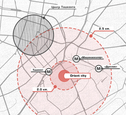
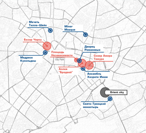
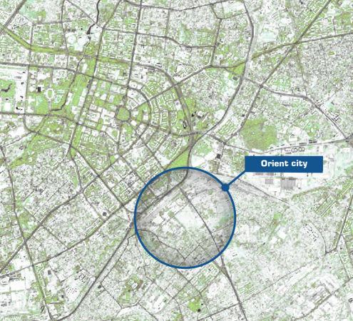
The land site that Genpro is working upon is situated in Tashkent’s southeast, outside the minor ring, equally distanced both from the center of the city and the airport, and almost next to the railway station, from where you can get to Samarkand within a couple of hours by bullet train. Hitherto, nobody actively built housing projects here – if you take a look at this interactive map, for example, you will see that it seems as though the developers were deliberately avoiding the Miradab district. However, most likely, this semi-industrial area of this growing city will soon change. For example, next to the future housing complex a new-format retail complex Alfragmus is being built, quite capable of becoming the local point of attraction and launching, together with Orient City, a new string of positive changes.

  • zooming
    1 / 6
    Orient City. Transport accessibility
    Copyright: © GENPRO
  • zooming
    2 / 6
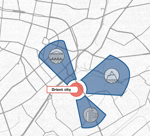
    Orient City. The map of viewing points
    Copyright: © GENPRO
  • zooming
    3 / 6
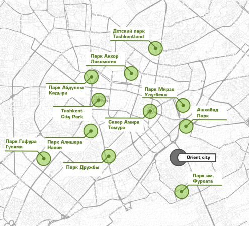
    Orient City. The parks
    Copyright: © GENPRO
  • zooming
    4 / 6
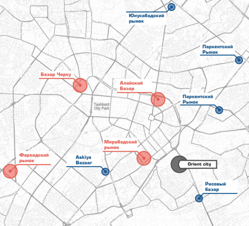
    Orient City. The map of marketplaces
    Copyright: © GENPRO
  • zooming
    5 / 6
    Orient City. The map of landmarks
    Copyright: © GENPRO
  • zooming
    6 / 6
    Orient City. The greenery
    Copyright: © GENPRO


One of Genpro’s tasks is offering to the city a new type of public space embedded in a commercial project. The analysis of the content on social networks revealed that the townspeople have little interest in the existing locations of Tashkent. According to the architects’ plan, Orient City must become a new landmark, a place where people will like to spend their time and share this online with photos and hashtags. Curiosity enough, people’s desire to photograph an object more and more becomes the chief criterion for its success, and you can easily visualize “emotional response” as one of the mandatory positions of the architectural (and not only architectural) briefs of the future. In accordance with the task, the architects paid special attention not only to the diversity of facades and skylines, but also to the environment – the heart of the complex is a park straddling a river that crosses the entire site diagonally.

Orient City. The concept
Copyright: © GENPRO


Just as important for the Genpro architects was getting involved in a dialogue with the local tradition, combining it with modern realities, technologies, and solutions. This is why the complex also includes symbols and shapes, characteristic for Uzbekistan; some of the local phenomena were also revised.

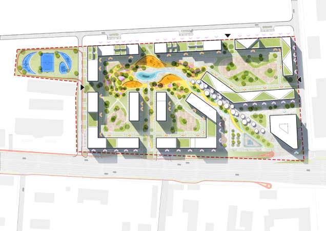
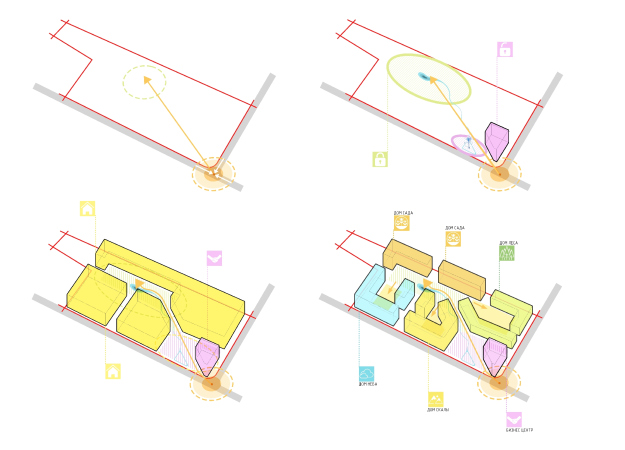
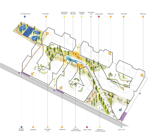
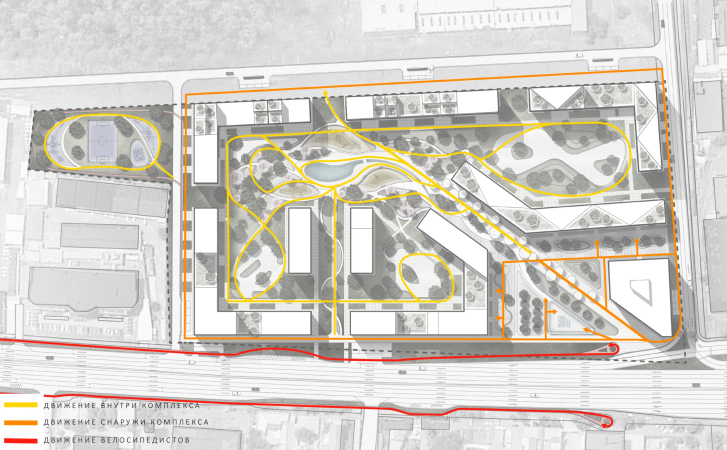
For example, on the “banks” of the park, there are residential buildings of varying height, grouped into four theme quarters – “rock house”, “sky house”, “garden house”, and “forest house”. Such names, it should be noted, correlate quite well with the local toponymy, in which names that translate as “a thousand apricot trees” or “forty girls” are quite the usual thing. The quarters meet the park with their private inner yards, forming a rectangular outline of the complex on the outside. The entrance to the park is marked by a square with a business center, tents, and a basin, which can be seen as a reference to the traditional ablution fountain. Across the complex, past the cafes, shops and gardens, the park leads to a large sports field that is placed outside the complex and expands the daily scenarios of the residents.

  • zooming
    1 / 5
    Orient City. The masterplan
    Copyright: © GENPRO
  • zooming
    2 / 5
    Orient City. The overall composition
    Copyright: © GENPRO
  • zooming
    3 / 5
    Orient City. The functional content
    Copyright: © GENPRO
  • zooming
    4 / 5
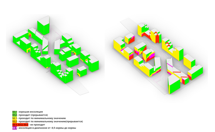
    Orient City. The insolation
    Copyright: © GENPRO
  • zooming
    5 / 5
    Orient City. The pedestrian streams
    Copyright: © GENPRO


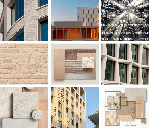
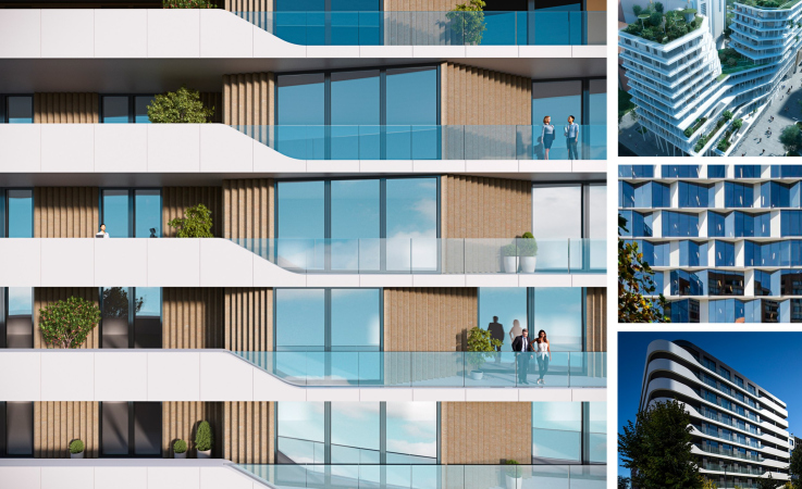
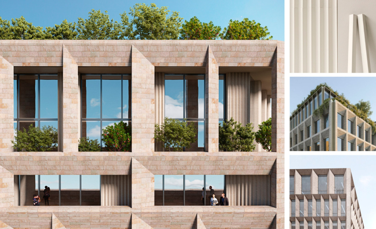
The facade design also changes in accordance with the names of the quarters: the “sky house” has more glass surfaces, the “rock house” has jagged contours and is clad in natural stone, the “garden house” and “forest house” receive liberal vertical greenery, which also plays the part of an ornament covering the walls and tying different parts of the complex into a single whole, bringing variety into the colors of the desert. The architects also make use of the traditional ornaments, highlighting the horizontal molds with it.

  • zooming
    1 / 4
    Orient City. The colors of the details
    Copyright: © GENPRO
  • zooming
    2 / 4
    Orient City. The facade solutions
    Copyright: © GENPRO
  • zooming
    3 / 4
    Orient City. The facade solutions
    Copyright: © GENPRO
  • zooming
    4 / 4
    Orient City. The facade solutions
    Copyright: © GENPRO


However, although the materials and plastique techniques are different, in general the buildings are constructed according to similar principles: a rectangular base, a terraced top, an abundance of terraces and balconies, and various solutions that help to cool the premises – pergolas, mashrabies, and recessed windows.

Orient City
Copyright: © GENPRO


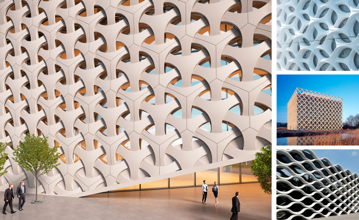
The complex’s most “oriental” building is the business center, fully wrapped in sun protection lattices, which makes it look integral and as monolith as a rock, at the foot of which a path to mountain riches begins. Its brutalist form simultaneously brings to mind both the Kaaba and the objects modeled for futuristic films about space. The ornament is no longer a master's cutter, but parametric modeling or, possibly, 3D printing. This combination of ancient craft and technology of the future was the ultimate goal of Genpro.

The business center “holds” the corner at the crossing of the Fargona Yuli Highway and the Kushkuprik Street, and, together with the residential sections going into the depth of the complex, sets the axis of the river park.

Orient City
Copyright: © GENPRO


The relatively reserved character of the facade design is compensated by the improvement of the park and the yards, where it feels like the architects indulged in the charms of the local flavor. The main square turns into a modern version of the oriental bazaar, in the center of which there is an amphitheater with a dry fountain, surrounded by shops and restaurants. The tents, which give a continuous shadow and islands of rest, are stylized like huge cotton buds – the “white gold” of Uzbekistan. Through the “propylaea” of the residential sections, the cotton “alley” and the artificial stream lead the walkers into the inner spaces. In the central part of the park there is a reservoir, playgrounds and sports fields, as well as a garden with fruit trees and greenhouses.

Orient City
Copyright: © GENPRO


It should be noted that in the hot climate conditions the most expensive apartments are in the bottom floors, cooler and shadier, which influenced the floor plans. The lower floors turn the space of the complex into an active part of the city: the architects designed premises for a kindergarten, coworking spaces, workshops, and a fitness center.
Orient City. Vross section views
Copyright: © GENPRO


30 October 2021

Headlines now
The Golden Crown
The concept for a dental clinic in Yekaterinburg, developed by CNTR Studio, revolves around the idea of a “mouth full of gold”: pristine white porcelain stoneware walls are complemented by matte brass details. To avoid an overly literal interpretation, the architects focused on the building’s proportions, skillfully navigating between sunlight requirements and fire safety regulations.
Flexibility and Integration
Not long ago, we covered the project for the fourth phase of the ÁLIA residential complex, designed by APEX. Now, we’ve been shown different fence concepts they developed to enclose the complex’s private courtyards, incorporating a variety of public functions. We believe that the sheer fact that the complex’s architects were involved in such a detail as fencing speaks volumes.
A Step Forward
The HIDE residential complex represents a major milestone for ADM architects and their leaders Andrey Romanov and Ekaterina Kuznetsova in their quest for a fresh high-rise aesthetic – one that is flexible and layered, capable of bringing vibrancy to mass and silhouette while shaping form. Over recent years, this approach has become ADM’s “signature style”, with the golden HIDE tower playing a pivotal role in its evolution. Here, we delve into the project’s story, explore the details of the complex’s design, and uncover its core essence.
Gold in the Sands
A new office for a transcontinental company specializing in resource extraction and processing has opened in Dubai. Designed by T+T Architects, masters of creating spaces that are contemporary, diverse, flexible, and original, this project exemplifies their expertise. On the executive floor, a massive brass-clad partition dominates, while layered textures of compressed earth create a contextually resonant backdrop.
Layers and Levels of Flight
This project goes way back – Reserve Union won this architectural competition at the end of 2011, and the building was completed in 2018, so it’s practically “archival”. However, despite being relatively unknown, the building can hardly be considered “dated” and remains a prime example of architectural expression, particularly in the headquarters genre. And it’s especially fitting for an aviation company office. In some ways, it resembles the Aeroflot headquarters at Sheremetyevo but with its own unique identity, following the signature style of Vladimir Plotkin. In this article, we take an in-depth look at the United Aircraft Corporation (UAC) headquarters in the Moscow agglomeration town of Zhukovsky, supplemented by recent photographs from Alexey Naroditsky – a shoot that became only recently possible due to the fact that improvements were finally made in the surrounding area.
Light and Shadow
In this article, we delve into the architectural design of the “Chaika” house by DNK ag architects, which was recently completed in 2023 as part of the collection of signature designs at ZILArt. As is well-known, all the buildings in this complex follow a design code, yet each one is distinct. This particular building stands out not only for its whiteness and minimalism but also for the refined use of a limited number of techniques that, together, create what can confidently be called synergy.
Casus Novae
A master plan was developed for a large residential area with a name of “DNS City”, but now that its implementation began, the plan has been arbitrarily reformatted and replaced with something that, while similar on the surface, is actually quite different. This is not the first time such a thing happens, but it’s always frustrating. With permission from the author, we are sharing Maria Elkina’s post.
Treasure Hunting
The GAFA bureau, in collaboration with Tegola and Arkhitail, organized an expedition to the island of Kilpola in Karelia as part of Moskomarkhitektura’s “Open City” festival. There, amidst moss and rocks, the students sought answers to questions like: what is the sacred, where does it dwell, and what sustains it? Assisting the participants in this quest were landscape engineer Evgeny Levin, artist Nicholas Roerich, a moose, and the lack of cellular connection. Here’s how the story unfolded.
Depths of the Earth, Streams of Water
In the Malaya Okhta district, the Akzent building, designed by Stepan Liphart, was constructed. It follows a classic tripartite structure, yet it’s what you might call “hand-drawn”: each façade is unique in its form and details, some of which aren’t immediately noticeable. In this article, we explore the context and, together with the architect, delve into how the form was developed.
Fir Tree Dynamics
The “Airports of Region” holding is planning to build an airport in Karachay-Cherkessia, aiming to make the Arkhyz and Dombay resorts more accessible to travelers. The project that won in an invitation-only competition, submitted by Sergey Nikeshkin’s KPLN, blends natural imagery inspired by the shape of a conifer seed, open-air waiting spaces, majestic large trees, and a green roof elevated on needle-like columns. The result is both nature-inspired and WOW.
​A Brick Shell
In the process of designing a clubhouse situated among pine trees in a prestigious suburban area near Moscow, the architectural firm “A.Len” did the façade design part. The combination of different types of brick and masonry correlates with the volumetric and plastique solutions, further enhanced by the inclusion of wood-painted fragments and metal “glazing”.
Word Forms
ATRIUM architects love ambitious challenges, and for the firm’s thirtieth anniversary, they boldly play a game of words with an exhibition that dives deep into a self-created vocabulary. They immerse their projects – especially art installations – into this glossary, as if plunging into a current of their own. You feel as if you’re flowing through the veins of pure art, immersed in a universe of vertical cities, educational spaces – of which the architects are true masters – and the cultural codes of various locations. But what truly captivates is the bold statement that Vera Butko and Anton Nadtochy make, both through their work and this exhibition: architecture, above all, is art – the art of working with form and space.
Flexibility and Acuteness of Modernity
Luxurious, fluid, large “kokoshniks” and spiral barrel columns, as if made from colorful chewing gum: there seem to be no other mansion like this in Moscow, designed in the “Neo-Russian-Modern” style. And the “Teremok” on Malaya Kaluzhskaya, previously somewhat obscure, has “come alive with new colors” and gained visibility after its restoration for the office of the “architectural ecosystem” as the architects love to call themselves. It’s evident that Julius Borisov and the architects at UNK put their hearts into finding this new office and bringing it up to date. Let’s delve into the paradoxes of this mansion’s history and its plasticity. Spoiler: two versions of modernity meet here, both balancing on the razor’s edge of “what’s current”.
Yuri Vissarionov: “A modular house does not belong to the land”
It belongs to space, or to the air... It turns out that 3D printing is more effective when combined with a modular approach: the house is built in a workshop and then adapted to the site, including on uneven terrain. Yuri Vissarionov shares his latest experience in designing tourist complexes, both in central Russia and in the south. These include houseboats, homes printed from lightweight concrete using a 3D printer, and, of course, frame houses.
​Moscow’s First
“The quality of education largely depends on the quality of the educational environment”. This principle of the last decade has been realized by Sergey Skuratov in the project for the First Moscow Gymnasium on Rostovskaya Embankment in the Khamovniki district. The building seamlessly integrates into the complex urban landscape, responding both to the pedestrian flow of the city and the quiet alleyways. It skillfully takes advantage of the height differences and aligns with modern trends in educational space design. Let’s take a closer look.
Looking at the Water
The site of Villa Sonata stretches from the road to the water’s edge, offering its own shoreline, pier, and a picturesque river panorama. To reveal these sweeping views, Roman Leonidov “cut” the façade diagonally parallel to the river, thus getting two main axes for the house and, consequently, “two heads”. The internal core – two double-height spaces, a living room and a conservatory, with a “bridge” above them – makes the house both “transparent” and filled with light.
The White Wing
Well, it’s not exactly white. It’s more of a beige, white-stone structure that plays with the color of limestone – smoother surfaces are lighter, while rougher ones are darker. This wing unites various elements: it absorbs and interprets the surrounding themes. It responds to everything, yet maintains a cohesive expression – a challenging task! – while also incorporating recognizable features of its own, such as the dynamic cuts at the bottom, top, and middle.
Urban Dunes
The XSA Ramps team designed and built a three-part sports hub for a park in Rostov-on-Don, welcoming people of all ages and fitness levels. The skate plaza, pump track, and playground are all meticulously crafted with details that attract a diverse range of visitors. The technical execution of the shapes and slopes transforms this space into a kind of sculptural composition.
Proportional Growth
The project for the fourth phase of the ÁLIA residential area has been announced. The buildings are situated on an elongated plot – almost a “ray” that shoots out from the center of the area towards the river. Their layout reflects both a response to Moscow’s architectural preferences over the past 15 years, shifting “from blocks to towers”, and an interpretation of the neighboring business park designed by SOM. Additionally, the best apartments here are not located at the very top but closer to the middle, forming a glowing “waistline”.
The “Staircase” Building
In designing the “Details” residential complex in New Moscow, Rais Baishev spiced up the now-popular Moscow theme of a “courtyard” building with an idea drawn from the surrealist drawings by Maurits Escher. He envisioned the stepped silhouettes and descending slopes as a metaphysical mega-staircase, creating a key void within the courtyard that gave the project an internal “spine”. This concept is felt both in the building’s silhouette and on its façades.
Projection of the Quarter
No one doubted that the building that Vladimir Plotkin designed as part of the “Garden Quarters” would be the most modernist of all. And it turned out just that way: while adhering to the common design code, the building successfully combines brick and white stone, rhythmically responding to the neighboring building designed by Ostozhenka, yet tactfully and persistently making a few statements of its own. This includes the projection of the ideal urban development composition “14–9–6”, which can be found right next door, mathematical calculations, including those for various types of terraces (and perhaps the only reminder of the Soviet past of the Kauchuk rubber factory!), and the white “cross-stitch” pattern of the façade grid.
Domus Aurea
In this issue, we examine the “Tessinsky-1” house, designed by Sergey Skuratov and completed in 2023. Located in the middle of the Serebryanicheskaya Embankment district, at the intersection of its main streets, this house assumes a sort of “nodal” role: it not only responds to everything around it and preserves many memories of the former EMA factory within itself, but it weaves all this into a newly directed pattern, reconciling bright “gold” and dark-colored brick, largely with the help of the new, modern-yet-archaic Columba brick, which, come to think about it, is the most precious element here.
The Chimney of Nikola-Lenivets
In this issue, we are examining the “Obelisk House” designed by KATARSIS and built for the Arkhstoyanie 2023 festival. However, it was only finished later on, and this is why we are examining it now. It seems to us that after the “Obelisk House” appeared in Nikola-Lenivets, a dialogue and a few inner connections appeared between the temporary structures built here. These houses no longer look like “accidental neighbors”, more of which below.
​Periscope by the Bay
The jury awarded the second place in the competition for a public and cultural center in Petropavlovsk-Kamchatsky to the companies GORA (“Mountain”) and M4. In the consortium’s proposal, the building resembles a sperm whale with a calf swimming next to it or a periscope, whose lenses capture the most spectacular views from the surrounding landscape.
From Arcs to Dolmens
While working on the competition project for Petropavlovsk-Kamchatsky, ASADOV Architects prioritized the value of the natural and urban environment, aiming to preserve the balance of the location while minimizing the resemblance of the volume that they designed to a “traditional building”. The task was challenging, and the architects created three versions, one of which having been developed after the competition, where their main proposal took third place. However, the point of interest here is not the competition result but the continuity of creative thinking.
Hide and Seek
The ID Moskovskiy house, designed by Stepan Liphart in St. Petersburg, in the courtyards near Moskovskiy Avenue beyond the Obvodny Canal and recently completed, is notable for several reasons. Firstly, it has been realized with considerable accuracy, which is particularly significant as this is the first building where the architect was responsible not only for the facades but also for the layouts, allowing for better integration between the two. On the other hand, this building is interesting as an example of the “germination” of new architecture in the city: it draws on the best examples from the neighborhood and becomes an improved and developed sum of ideas found by the architect in the surrounding context.
The Big Twelve
Yesterday, the winners of the Moscow Mayor’s Architecture Award were announced and honored. Let’s take a look at what was awarded and, in some cases, even critique this esteemed award. After all, there is always room for improvement, right?
Above the Golden Horn
The residential complex “Philosophy” designed by T+T architects in Vladivostok, is one of the new projects in the “Golubinaya Pad” area, changing its development philosophy (pun intended) from single houses to a comprehensive approach. The buildings are organized along public streets, varying in height and format, with one house even executed in gallery typology, featuring a cantilever leaning on an art object.
Nuanced Alternative
How can you rhyme a square and space? Easily! But to do so, you need to rhyme everything you can possibly think of: weave everything together, like in a tensegrity structure, and find your own optics too. The new exhibition at GES-2 does just that, offering its visitor a new perspective on the history of art spanning 150 years, infused with the hope for endless multiplicity of worlds and art histories. Read on to see how this is achieved and how the exhibition design by Evgeny Ace contributes to it.
Blinds for Ice
An ice arena has been constructed in Domodedovo based on a project by Yuri Vissarionov Architects. To prevent the long façade, a technical requirement for winter sports facilities, from appearing monotonous, the architects proposed the use of suspended structures with multidirectional slats. This design protects the ice from direct sunlight while giving the wall texture and detail.