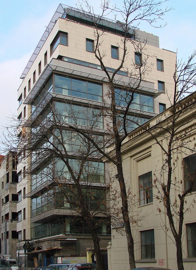
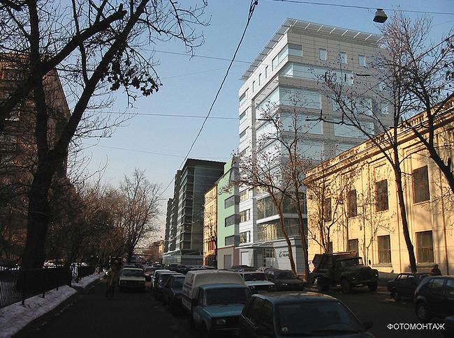
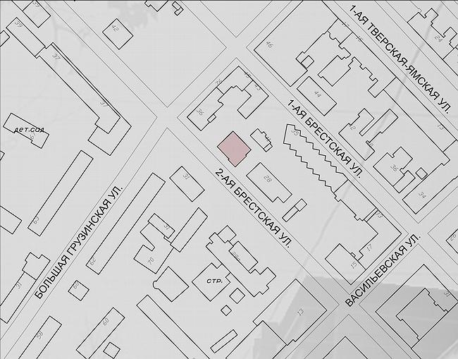
The building of “Alta-Bank” occupies the whole given site that is not large – 20 m along the street and 18 m deep to the block, and surely takes as many square meters as possible out of the restrictions heavy territory: 9 levels with an attic up, and 4 underground ones. Remarkably, doing its commercial duty and despite the extending oriel windows, the building fits very delicately into the street’s tune.
To the right there is a modest light-gray building of Stalin period with stepped verticals and thin almost neo-classical rustication common in 1930’s. To the left from the building, from B.Gruzinskaya street, there are two new buildings that are just a little smaller than the Alta-Bank.
Altogether they combine into a line, and the bank is the main there now. This is remarkable because the façade is emphatically modest. It combines the three common features: firstly, this is a true hi-tech modernism, secondly, this modernism is contextually ‘calm’ and attentive – nothing aggressive. Third, - a paradox: this modest one contains an emotional charge spreading it on its small – within the sight - sphere of influence. There some special approach to urban environment common to commercial apartment buildings (banks as well) of 19th and 20th century. It is not hard to imagine this building as one of modernistic insertions into housebuilding in Paris. Like it has been transferred from there (or Berlin) – and now is improving Moscow atmosphere.
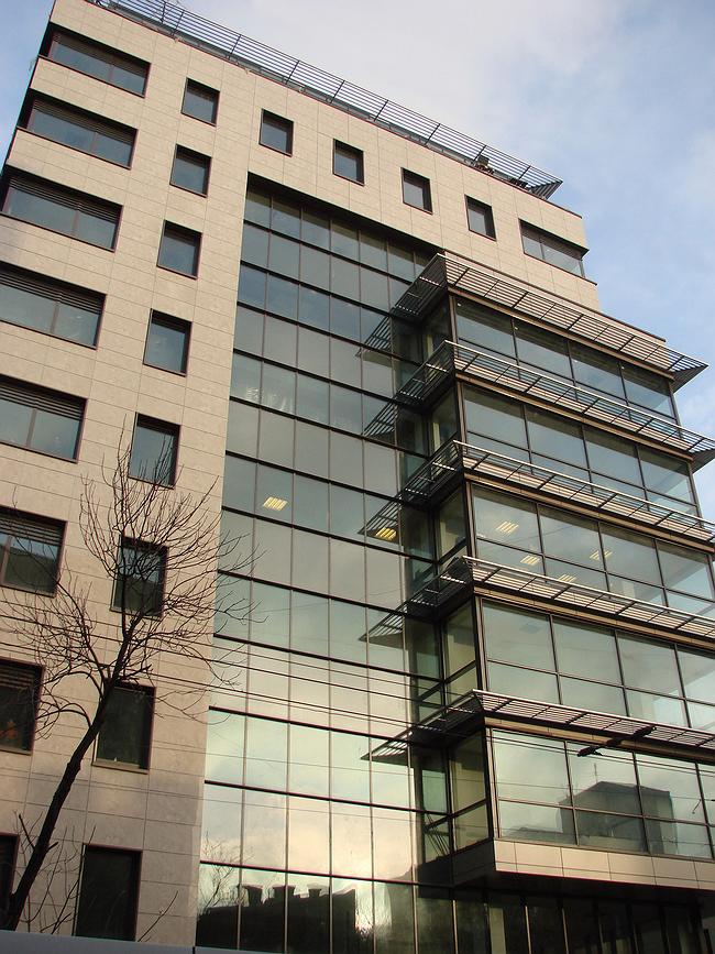
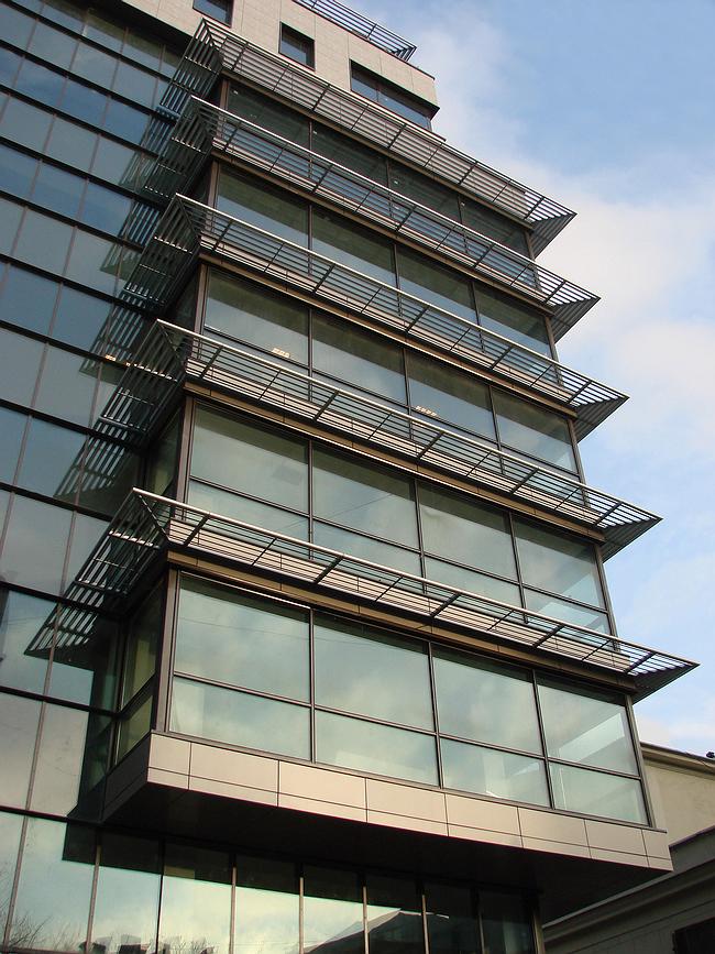
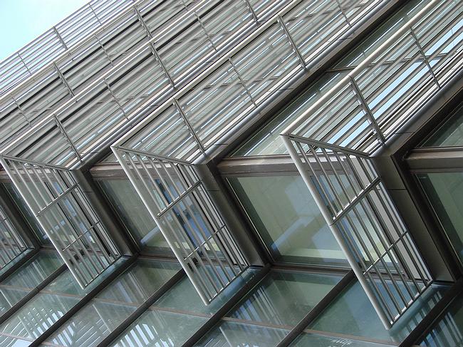
The facades of the construction are made of glass, metal and ceramic granite are of soft yellowy coloring. Glass is focused on the one ‘front’ corner that views Mayakovskogo Square and Moskomarhitectura. Everything that is non-transparent forms a kind of a shell: it covers the walls facing the yard and from up and side it shapes a picture frame that is surrounding the main theme. One may imagine that this frame guards the fragile and loose glass-metal substance, within which a story is developing. From the shiny surface of the tinted glass, embracing the corner and hanging over the ground, there extends the glass oriel window bristled up with horizontal boards of metal louvres. Actually, the frame systems by Reynaers are sun-protective, but they are rather for decorative purpose. Indeed, this is the central piece of the building. Mat grayish stripes are alternating with different hues of the sky color and spots of lams light and create in a way cold geometrical but painterly composition that crowning the impression reflects in the background glass. Sometimes, it seems they are inside also.
Ceramic granite slabs look too material by this play of metallic glitter and images. At corners they are cut by neo-constructivist corner-windows, which have sunbreak grill that echoes to the main theme of thin horizontal boards. The colour and the proportions of the boards are quite like the pattern of the rustication of the nearby building of Stalin period – the buildings resonate in a way. At same time horizontal prevails on the facades of the new bank, but not vertical – taking us back into 1920’s. The image of the constructivism period every now and again comes out.
Yet, all these themes are only hints – they are not obvious, so hi-tech, neo-constructivism and context approach are live peacefully side by side, creating ingressive and attractive image – a germ of a nice city.


