По-русски

Rock House

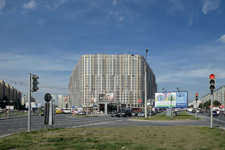
The "YE'S" house, recently built by Eugene Gerasimov, is the outpost of "quarter" ideology in the block environment of Saint Petersburg's Primorsky District.

08 September 2014
Object
mainImg
Architect:
Evgeny Gerasimov
Object:
Mixed-use complex on Hoshimina Square (St.Petersburg)
Russia, St. Petersburg, Vyborgsky district, Hoshimina street, 14, liter A (site 1)

Project Team:
head of the project: Gerasimov E.L.; chief project architect: Petrova Z.V.; chief constructor: Reznichenko M.Y.; head of the AR group: Komaldinova T.A.; head of the KZh group: Harinskaya T.S., architects: Kuznetsova T.V., Orlova-Sheiner M.E., Priporov I.V., Serebryakova Y.E.

2009 — 2013

OOO "Centr Ipotechnyh Kreditov" [Real Estate Loan Centre]
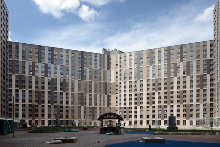
This location was covered by us twice already: up until 2009, located on the trapeze-shaped plot at the crossing of the Ho Chi Minh Street and the Prosvescheniya Avenue, the multi-function complex was designed by Sergey Kiselev, the number of offices situated in it, though initially planned to be larger, gradually shrinking and the share of residential premises gradually expanding. Then, when the plot got into the hands of Eugene Gerasimov, the task also changed: the main area was taken up by the comfort-class housing, about a quarter - by the apart-hotel, and the offices were but a few left, like some decorative topping to the entire structure. The construction of the complex designed by Eugene Gerasimov in 2010, was completed half a year ago almost in full accordance with the design project. 


Residential complex “YE′S” © Eugene Gerasimov and Partners

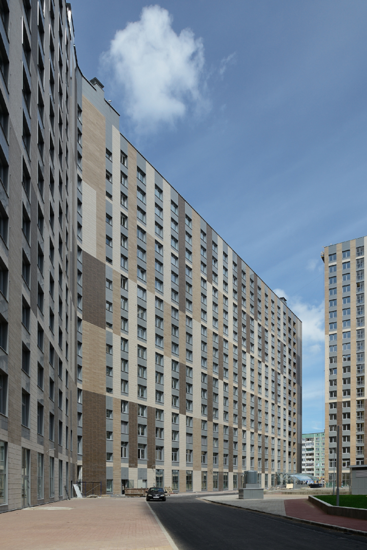
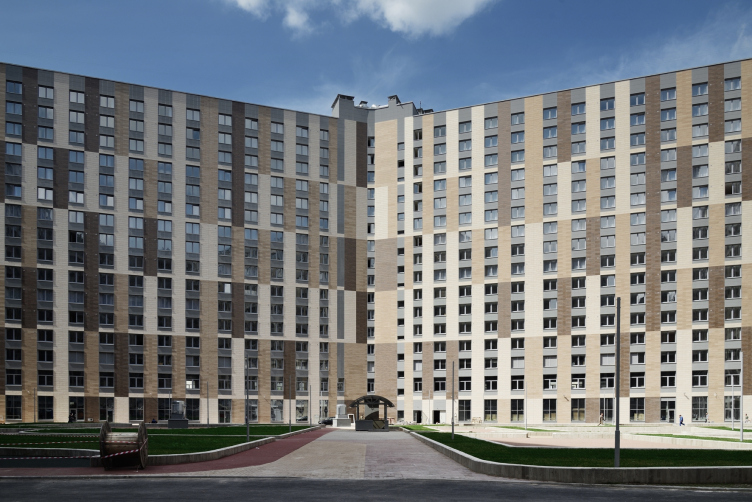
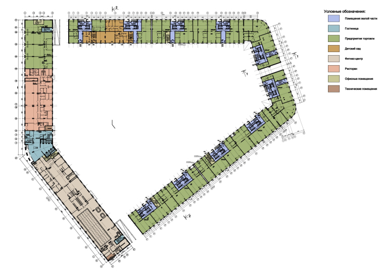
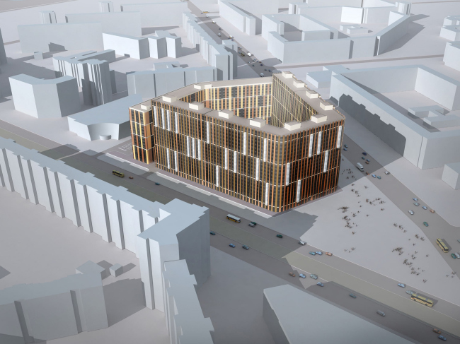
"In my opinion, the image of a "wicker basket" or a "lath fence" that was intended here, came out quite convincing" - says Eugene Gerasimov. One must recognize this definition as a pretty accurate one, as the meaning of this house was, first of all, protecting from the city noise and grime a rather large (the total area of the plot is about two and a half hectares) territory inside the courtyard. The two buildings embrace the courtyard in a symmetric pentagon that bears a remote resemblance... to the soviet "quality sign": the horseshoe-shaped trapeze of the twelve-story house is turned to the Prosvescheniya Avenue and the sharp "arrow" of the merging streets, and the broad sixteen-story "book" of the apart-hotel closes the perimeter from the rear side of the complex. The courtyard has but three passages to it: two of them are situated at the spots where the side walls of the house and the wings of the apart-hotel meet, plus an arch in the "nose" part, through which one will be able to get inside the courtyard from the park at the arrow between the streets - in other words, the perimeter has a really "closed" nature, and it is the direct opposite of the windswept "stitches" of the neighborhood blocks. 

Residential complex “YE′S” © Eugene Gerasimov and Partners

The result looks a lot like "Stalin-style quarters", only larger. However, upon a closer examination of the surrounding neighborhoods, one will discover that the idea of a "super-quarter" was born here as early back as in the eighties: the panel "slab" houses, not as tall but sometimes of an even greater length, oftentimes make a turn, getting sometimes an L-shaped or even a П-shaped plan, and sometimes even form spacious squares, as if "dreaming of the old city" or protecting themselves against the wind. One way or another, looking at the plan, one may think that the idea of a giant quarter was there in it even earlier, only back then it was not taken to its logical conclusion. The Eugene Gerasimov house definitely explores the topic to the fullest: amidst the sloppy, and, in spite of all the previous efforts, very disjointed surroundings of the panel houses with an odd fraction of a later built shopping mall, this house is a fortress, a Norman castle that completes the busy road junction with its sheer self-sufficient mass. This house is means business; it makes its presence known in the space, organizing it with its reserved magnificence. 

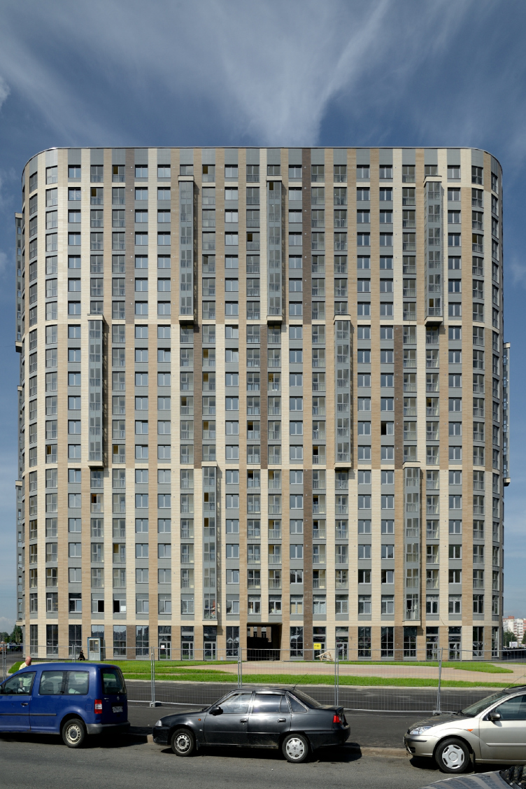
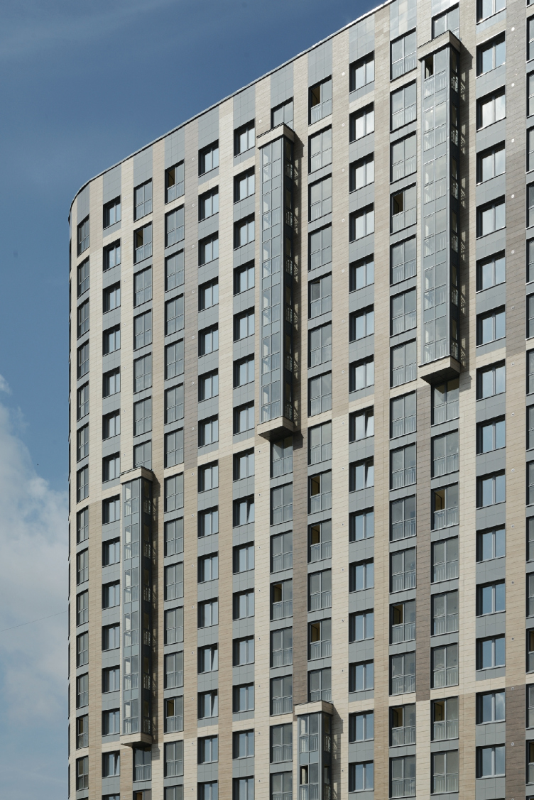
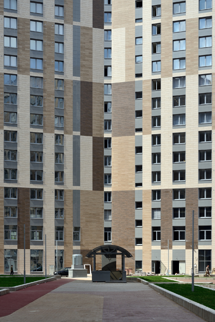
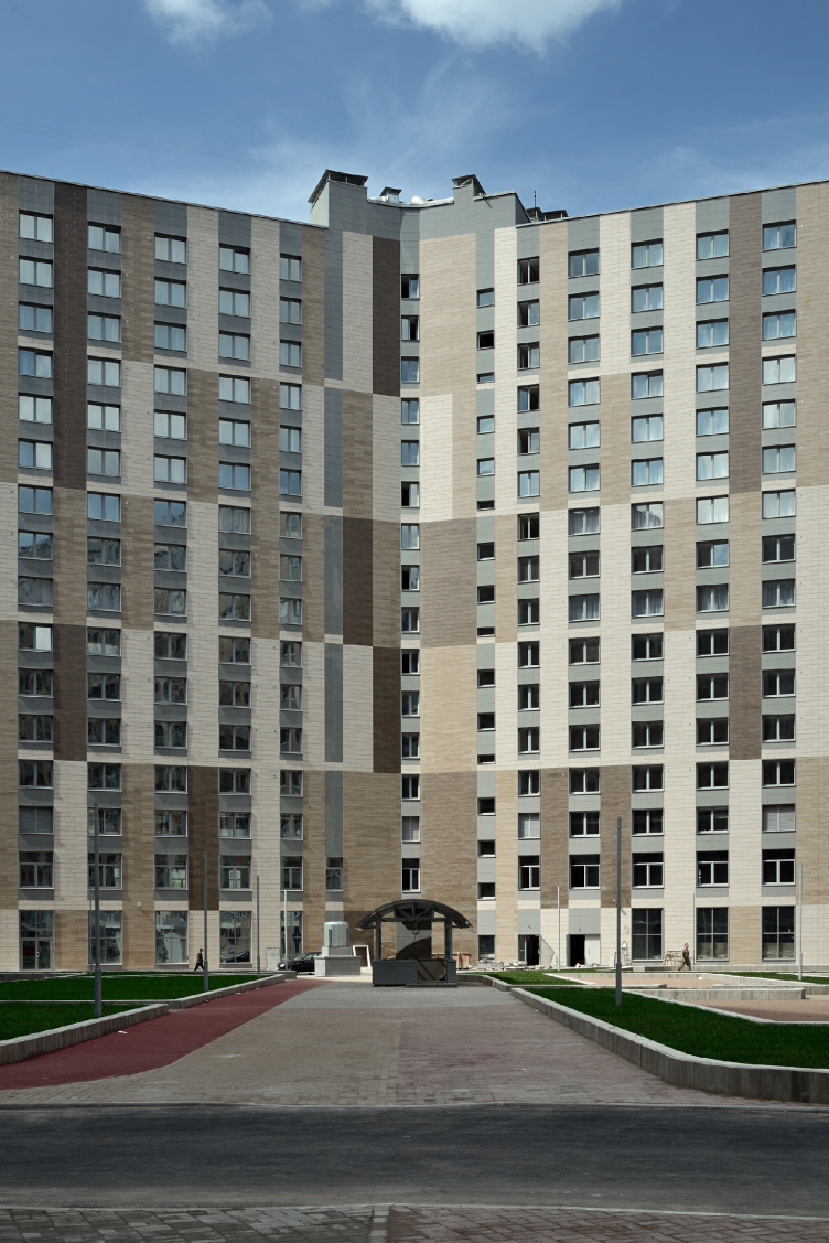
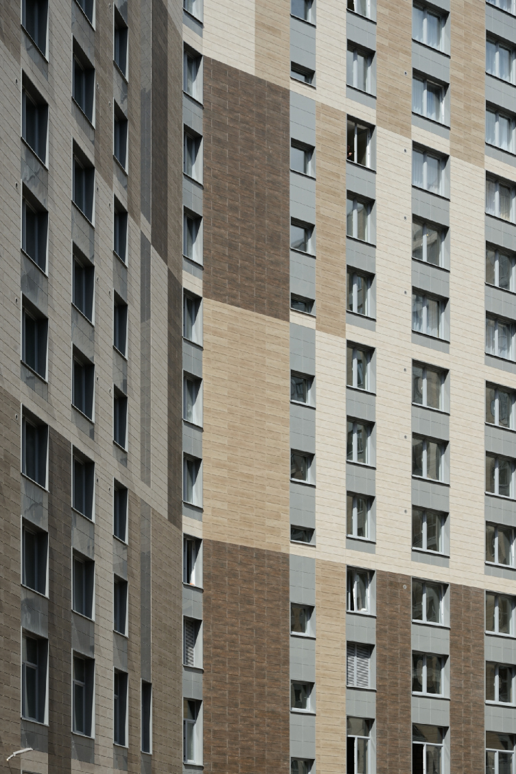
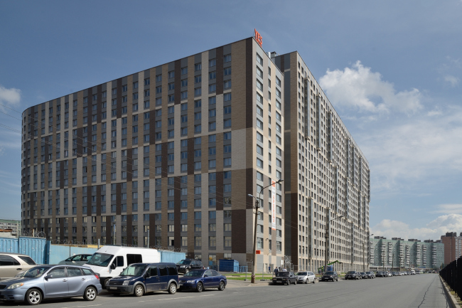
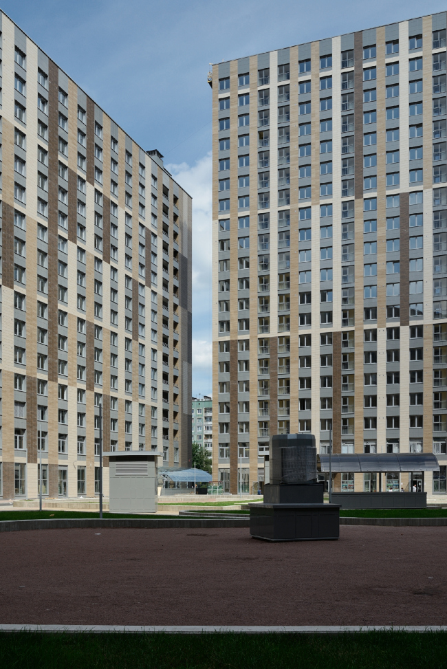
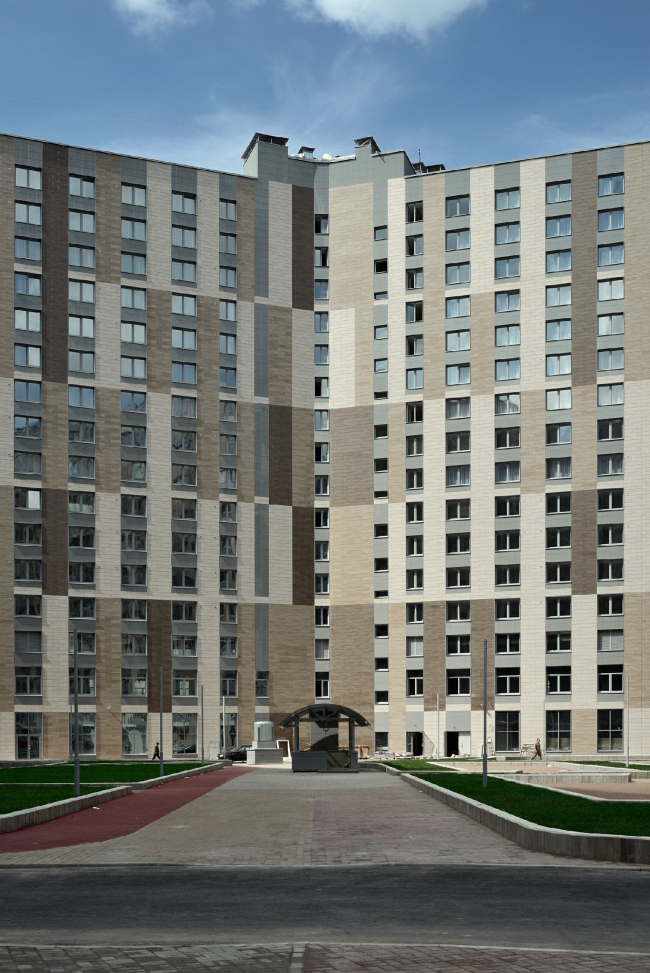
The facade pattern: the large grid of the verticals, like an aptly selected lady's blouse, helps to structure and unload, to a certain degree, visually the imposing volume of the complex that from many viewpoints (except for the main one) looks as if it was larger broadways than in its height. Mostly regular, and at times of the "French" type, the windows line up to form vertical arrays, alternating with the inter-floor inserts of a neutrally gray color, and at some places stand out as asymmetrically placed bay windows. As for the vertical bands of the walls between the windows, it is actually these bands that produce the "lath fence" effect, or, rather a pale fence with a large pixel pattern (partly imitating the play of light and shade) superimposed upon it, a pattern of brown, beige, and white (almost ivory) bands. Their ornament is interrupted by slim light horizontals that "bind" the "lath fence" of the house each six (and in the apart-hotel building each three) floors (thus in the former case the rhythm is made more relaxed, and in the latter case is made busier, which goes some way to conceal the height difference between the two buildings). At some points, the color of the vertical bands remains intact and it runs through the horizontal, enhancing its illusory quality and the ornamental quality of the pattern in general. In the places where the breadth of the bands is greater (for example, in the hotel's niche where the staircases are situated), the pattern takes on a truly pixel-like view, breaking up part of the surface. The play of these bands on the facades is all about trying to optically correct the volume but it also has a meaningful play to it: the massive volume of the "castle" in conjunction with "graphic" pattern of the "pale fence", just like one plus one, add up to give a Russian ostrog, a memory of the Russian north the way it was before Peter the Great (but then again, we have reasons to think that this allusion did not come about by chance). 


Residential complex “YE′S” © Eugene Gerasimov and Partners

Up above, over the two top floors, there is no horizontal binding (either a conditional entablature or a cornice), the pixel ornament is opened up into the sky, which enhances its likeness to, though very conditional, "polls" or, even though the image of the fence is not at all literal, this is rather an occasion for a geometric play that, by adding to the facades some slenderness and agility, turns this mass of square meters into an author's work - which was not so easy in the conditions of working with a comfort-class housing project (which, as we know is the top segment of the economy class; the house has in it an underground parking garage for 511 car stalls (for 1062 apartments), the whole ground floor is taken up by shops, cafés, and a spa center; also by a kindergarten; the apartments are sold turn-key). 


Residential complex “YE′S” © Eugene Gerasimov and Partners


Residential complex “YE′S” © Eugene Gerasimov and Partners

Residential complex “YE′S” © Eugene Gerasimov and Partners

Residential complex “YE′S” © Eugene Gerasimov and Partners


Residential complex “YE′S” © Eugene Gerasimov and Partners

For Eugene Gerasimov, the YE’S house is one of his first projects in the genre of "comfort class". "This is a pretty rigid segment of the affordable housing that incurs a lot of limiting regulations to it, ones that we had not really run into before - Eugene Gerasimov shares - But then again, the architect always has to work within the boundaries of some regulations, this is natural, or we would have lived in the environment of masterpieces, among Louvres and Eiffel Towers - which would not have been quite normal. There are no "bad" genres, and this one is no exception, one can also find here interesting things to do - especially, as in this particular case, when there is a developer that is ready to look for solutions together with us and is willing to be engaged in a dialogue with the architects". 

The houses of comfort class, not too expensive, but still giving the architects an opportunity to go beyond the standard panel construction, became a common practice after the crisis of 2008, and now some of them, as we can see, are being completed. The genre that requires from the architect a strict observance of its rules, and, as a consequence, careful attention in connection with, probably, more effort (in this particular case, the architects developed about a dozen versions before the final one was approved) - one should recognize as useful and productive because, in spite of the limits that it sets, it still leaves the room for experiment. And, as a result, for example, for the advent of such a gigantic closed living area that hides from the city grime inside its very self. 

Residential complex “YE′S” © Eugene Gerasimov and Partners


Residential complex “YE′S” © Eugene Gerasimov and Partners


Residential complex “YE′S” © Eugene Gerasimov and Partners


Residential complex “YE′S” © Eugene Gerasimov and Partners
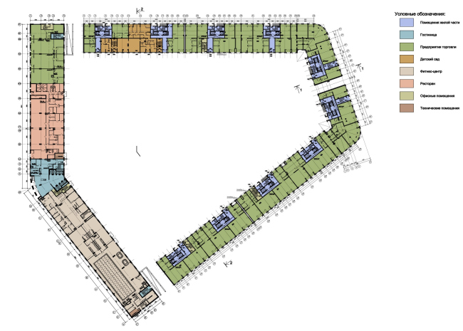

Residential complex “YE′S”. Plan of the ground floor © Eugene Gerasimov and Partners
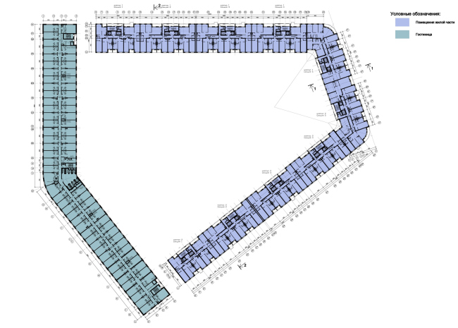

Residential complex “YE′S”. Plan of the typical floor © Eugene Gerasimov and Partners
Residential complex “YE′S” © Eugene Gerasimov and Partners
Residential complex “YE′S”. Plan of the ground floor © Eugene Gerasimov and Partners
Residential complex “YE′S”. Plan of the typical floor © Eugene Gerasimov and Partners


Architect:
Evgeny Gerasimov
Object:
Mixed-use complex on Hoshimina Square (St.Petersburg)
Russia, St. Petersburg, Vyborgsky district, Hoshimina street, 14, liter A (site 1)

Project Team:
head of the project: Gerasimov E.L.; chief project architect: Petrova Z.V.; chief constructor: Reznichenko M.Y.; head of the AR group: Komaldinova T.A.; head of the KZh group: Harinskaya T.S., architects: Kuznetsova T.V., Orlova-Sheiner M.E., Priporov I.V., Serebryakova Y.E.

2009 — 2013

OOO "Centr Ipotechnyh Kreditov" [Real Estate Loan Centre]

08 September 2014

Headlines now
The Golden Crown
The concept for a dental clinic in Yekaterinburg, developed by CNTR Studio, revolves around the idea of a “mouth full of gold”: pristine white porcelain stoneware walls are complemented by matte brass details. To avoid an overly literal interpretation, the architects focused on the building’s proportions, skillfully navigating between sunlight requirements and fire safety regulations.
Flexibility and Integration
Not long ago, we covered the project for the fourth phase of the ÁLIA residential complex, designed by APEX. Now, we’ve been shown different fence concepts they developed to enclose the complex’s private courtyards, incorporating a variety of public functions. We believe that the sheer fact that the complex’s architects were involved in such a detail as fencing speaks volumes.
A Step Forward
The HIDE residential complex represents a major milestone for ADM architects and their leaders Andrey Romanov and Ekaterina Kuznetsova in their quest for a fresh high-rise aesthetic – one that is flexible and layered, capable of bringing vibrancy to mass and silhouette while shaping form. Over recent years, this approach has become ADM’s “signature style”, with the golden HIDE tower playing a pivotal role in its evolution. Here, we delve into the project’s story, explore the details of the complex’s design, and uncover its core essence.
Gold in the Sands
A new office for a transcontinental company specializing in resource extraction and processing has opened in Dubai. Designed by T+T Architects, masters of creating spaces that are contemporary, diverse, flexible, and original, this project exemplifies their expertise. On the executive floor, a massive brass-clad partition dominates, while layered textures of compressed earth create a contextually resonant backdrop.
Layers and Levels of Flight
This project goes way back – Reserve Union won this architectural competition at the end of 2011, and the building was completed in 2018, so it’s practically “archival”. However, despite being relatively unknown, the building can hardly be considered “dated” and remains a prime example of architectural expression, particularly in the headquarters genre. And it’s especially fitting for an aviation company office. In some ways, it resembles the Aeroflot headquarters at Sheremetyevo but with its own unique identity, following the signature style of Vladimir Plotkin. In this article, we take an in-depth look at the United Aircraft Corporation (UAC) headquarters in the Moscow agglomeration town of Zhukovsky, supplemented by recent photographs from Alexey Naroditsky – a shoot that became only recently possible due to the fact that improvements were finally made in the surrounding area.
Light and Shadow
In this article, we delve into the architectural design of the “Chaika” house by DNK ag architects, which was recently completed in 2023 as part of the collection of signature designs at ZILArt. As is well-known, all the buildings in this complex follow a design code, yet each one is distinct. This particular building stands out not only for its whiteness and minimalism but also for the refined use of a limited number of techniques that, together, create what can confidently be called synergy.
Casus Novae
A master plan was developed for a large residential area with a name of “DNS City”, but now that its implementation began, the plan has been arbitrarily reformatted and replaced with something that, while similar on the surface, is actually quite different. This is not the first time such a thing happens, but it’s always frustrating. With permission from the author, we are sharing Maria Elkina’s post.
Treasure Hunting
The GAFA bureau, in collaboration with Tegola and Arkhitail, organized an expedition to the island of Kilpola in Karelia as part of Moskomarkhitektura’s “Open City” festival. There, amidst moss and rocks, the students sought answers to questions like: what is the sacred, where does it dwell, and what sustains it? Assisting the participants in this quest were landscape engineer Evgeny Levin, artist Nicholas Roerich, a moose, and the lack of cellular connection. Here’s how the story unfolded.
Depths of the Earth, Streams of Water
In the Malaya Okhta district, the Akzent building, designed by Stepan Liphart, was constructed. It follows a classic tripartite structure, yet it’s what you might call “hand-drawn”: each façade is unique in its form and details, some of which aren’t immediately noticeable. In this article, we explore the context and, together with the architect, delve into how the form was developed.
Fir Tree Dynamics
The “Airports of Region” holding is planning to build an airport in Karachay-Cherkessia, aiming to make the Arkhyz and Dombay resorts more accessible to travelers. The project that won in an invitation-only competition, submitted by Sergey Nikeshkin’s KPLN, blends natural imagery inspired by the shape of a conifer seed, open-air waiting spaces, majestic large trees, and a green roof elevated on needle-like columns. The result is both nature-inspired and WOW.
​A Brick Shell
In the process of designing a clubhouse situated among pine trees in a prestigious suburban area near Moscow, the architectural firm “A.Len” did the façade design part. The combination of different types of brick and masonry correlates with the volumetric and plastique solutions, further enhanced by the inclusion of wood-painted fragments and metal “glazing”.
Word Forms
ATRIUM architects love ambitious challenges, and for the firm’s thirtieth anniversary, they boldly play a game of words with an exhibition that dives deep into a self-created vocabulary. They immerse their projects – especially art installations – into this glossary, as if plunging into a current of their own. You feel as if you’re flowing through the veins of pure art, immersed in a universe of vertical cities, educational spaces – of which the architects are true masters – and the cultural codes of various locations. But what truly captivates is the bold statement that Vera Butko and Anton Nadtochy make, both through their work and this exhibition: architecture, above all, is art – the art of working with form and space.
Flexibility and Acuteness of Modernity
Luxurious, fluid, large “kokoshniks” and spiral barrel columns, as if made from colorful chewing gum: there seem to be no other mansion like this in Moscow, designed in the “Neo-Russian-Modern” style. And the “Teremok” on Malaya Kaluzhskaya, previously somewhat obscure, has “come alive with new colors” and gained visibility after its restoration for the office of the “architectural ecosystem” as the architects love to call themselves. It’s evident that Julius Borisov and the architects at UNK put their hearts into finding this new office and bringing it up to date. Let’s delve into the paradoxes of this mansion’s history and its plasticity. Spoiler: two versions of modernity meet here, both balancing on the razor’s edge of “what’s current”.
Yuri Vissarionov: “A modular house does not belong to the land”
It belongs to space, or to the air... It turns out that 3D printing is more effective when combined with a modular approach: the house is built in a workshop and then adapted to the site, including on uneven terrain. Yuri Vissarionov shares his latest experience in designing tourist complexes, both in central Russia and in the south. These include houseboats, homes printed from lightweight concrete using a 3D printer, and, of course, frame houses.
​Moscow’s First
“The quality of education largely depends on the quality of the educational environment”. This principle of the last decade has been realized by Sergey Skuratov in the project for the First Moscow Gymnasium on Rostovskaya Embankment in the Khamovniki district. The building seamlessly integrates into the complex urban landscape, responding both to the pedestrian flow of the city and the quiet alleyways. It skillfully takes advantage of the height differences and aligns with modern trends in educational space design. Let’s take a closer look.
Looking at the Water
The site of Villa Sonata stretches from the road to the water’s edge, offering its own shoreline, pier, and a picturesque river panorama. To reveal these sweeping views, Roman Leonidov “cut” the façade diagonally parallel to the river, thus getting two main axes for the house and, consequently, “two heads”. The internal core – two double-height spaces, a living room and a conservatory, with a “bridge” above them – makes the house both “transparent” and filled with light.
The White Wing
Well, it’s not exactly white. It’s more of a beige, white-stone structure that plays with the color of limestone – smoother surfaces are lighter, while rougher ones are darker. This wing unites various elements: it absorbs and interprets the surrounding themes. It responds to everything, yet maintains a cohesive expression – a challenging task! – while also incorporating recognizable features of its own, such as the dynamic cuts at the bottom, top, and middle.
Urban Dunes
The XSA Ramps team designed and built a three-part sports hub for a park in Rostov-on-Don, welcoming people of all ages and fitness levels. The skate plaza, pump track, and playground are all meticulously crafted with details that attract a diverse range of visitors. The technical execution of the shapes and slopes transforms this space into a kind of sculptural composition.
Proportional Growth
The project for the fourth phase of the ÁLIA residential area has been announced. The buildings are situated on an elongated plot – almost a “ray” that shoots out from the center of the area towards the river. Their layout reflects both a response to Moscow’s architectural preferences over the past 15 years, shifting “from blocks to towers”, and an interpretation of the neighboring business park designed by SOM. Additionally, the best apartments here are not located at the very top but closer to the middle, forming a glowing “waistline”.
The “Staircase” Building
In designing the “Details” residential complex in New Moscow, Rais Baishev spiced up the now-popular Moscow theme of a “courtyard” building with an idea drawn from the surrealist drawings by Maurits Escher. He envisioned the stepped silhouettes and descending slopes as a metaphysical mega-staircase, creating a key void within the courtyard that gave the project an internal “spine”. This concept is felt both in the building’s silhouette and on its façades.
Projection of the Quarter
No one doubted that the building that Vladimir Plotkin designed as part of the “Garden Quarters” would be the most modernist of all. And it turned out just that way: while adhering to the common design code, the building successfully combines brick and white stone, rhythmically responding to the neighboring building designed by Ostozhenka, yet tactfully and persistently making a few statements of its own. This includes the projection of the ideal urban development composition “14–9–6”, which can be found right next door, mathematical calculations, including those for various types of terraces (and perhaps the only reminder of the Soviet past of the Kauchuk rubber factory!), and the white “cross-stitch” pattern of the façade grid.
Domus Aurea
In this issue, we examine the “Tessinsky-1” house, designed by Sergey Skuratov and completed in 2023. Located in the middle of the Serebryanicheskaya Embankment district, at the intersection of its main streets, this house assumes a sort of “nodal” role: it not only responds to everything around it and preserves many memories of the former EMA factory within itself, but it weaves all this into a newly directed pattern, reconciling bright “gold” and dark-colored brick, largely with the help of the new, modern-yet-archaic Columba brick, which, come to think about it, is the most precious element here.
The Chimney of Nikola-Lenivets
In this issue, we are examining the “Obelisk House” designed by KATARSIS and built for the Arkhstoyanie 2023 festival. However, it was only finished later on, and this is why we are examining it now. It seems to us that after the “Obelisk House” appeared in Nikola-Lenivets, a dialogue and a few inner connections appeared between the temporary structures built here. These houses no longer look like “accidental neighbors”, more of which below.
​Periscope by the Bay
The jury awarded the second place in the competition for a public and cultural center in Petropavlovsk-Kamchatsky to the companies GORA (“Mountain”) and M4. In the consortium’s proposal, the building resembles a sperm whale with a calf swimming next to it or a periscope, whose lenses capture the most spectacular views from the surrounding landscape.
From Arcs to Dolmens
While working on the competition project for Petropavlovsk-Kamchatsky, ASADOV Architects prioritized the value of the natural and urban environment, aiming to preserve the balance of the location while minimizing the resemblance of the volume that they designed to a “traditional building”. The task was challenging, and the architects created three versions, one of which having been developed after the competition, where their main proposal took third place. However, the point of interest here is not the competition result but the continuity of creative thinking.
Hide and Seek
The ID Moskovskiy house, designed by Stepan Liphart in St. Petersburg, in the courtyards near Moskovskiy Avenue beyond the Obvodny Canal and recently completed, is notable for several reasons. Firstly, it has been realized with considerable accuracy, which is particularly significant as this is the first building where the architect was responsible not only for the facades but also for the layouts, allowing for better integration between the two. On the other hand, this building is interesting as an example of the “germination” of new architecture in the city: it draws on the best examples from the neighborhood and becomes an improved and developed sum of ideas found by the architect in the surrounding context.
The Big Twelve
Yesterday, the winners of the Moscow Mayor’s Architecture Award were announced and honored. Let’s take a look at what was awarded and, in some cases, even critique this esteemed award. After all, there is always room for improvement, right?
Above the Golden Horn
The residential complex “Philosophy” designed by T+T architects in Vladivostok, is one of the new projects in the “Golubinaya Pad” area, changing its development philosophy (pun intended) from single houses to a comprehensive approach. The buildings are organized along public streets, varying in height and format, with one house even executed in gallery typology, featuring a cantilever leaning on an art object.
Nuanced Alternative
How can you rhyme a square and space? Easily! But to do so, you need to rhyme everything you can possibly think of: weave everything together, like in a tensegrity structure, and find your own optics too. The new exhibition at GES-2 does just that, offering its visitor a new perspective on the history of art spanning 150 years, infused with the hope for endless multiplicity of worlds and art histories. Read on to see how this is achieved and how the exhibition design by Evgeny Ace contributes to it.
Blinds for Ice
An ice arena has been constructed in Domodedovo based on a project by Yuri Vissarionov Architects. To prevent the long façade, a technical requirement for winter sports facilities, from appearing monotonous, the architects proposed the use of suspended structures with multidirectional slats. This design protects the ice from direct sunlight while giving the wall texture and detail.