The exhibition of design of an interior is done by the EXPO-PARK since 1997. For this time the concept of an exhibition some times changed: in the beginning there was a Russian variant of world famous exhibition Obenta, or the consumer goods; then - cooperation with the magazine The Attic. Today, organizers of an exhibition consider, « the understanding of the internal filling of buildings, roles of the designer in creation of an inhabitancy and division of a role of the set dresser, the designer and the architect is important ».
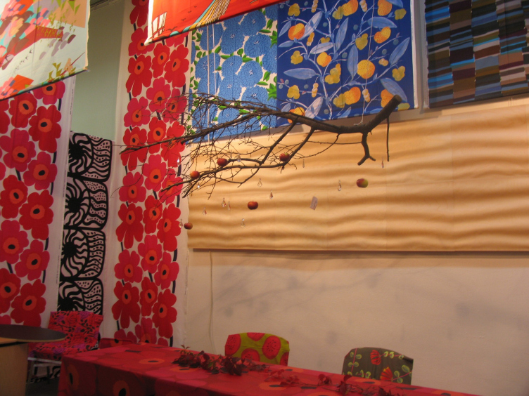
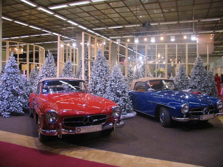
This year stands are transformed into mini-boutiques, and should, on a plan of organizers, show fragments of high-grade, staged down to details, interiors of different style directions. There are for about a hundred stands in total, they show almost all components of modern luxury: furniture from vanguard up to elaborate, house textiles, porcelain and other.
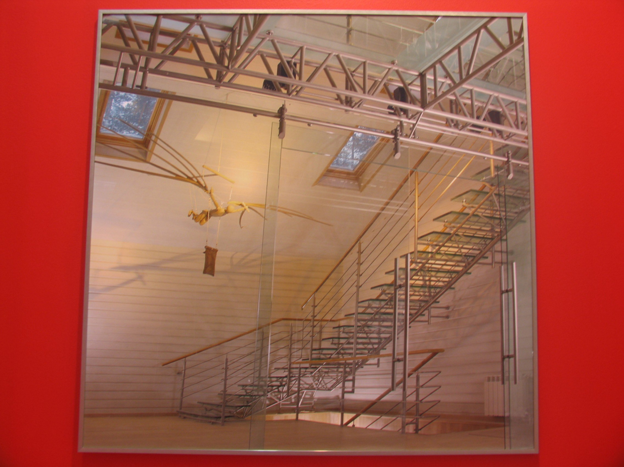
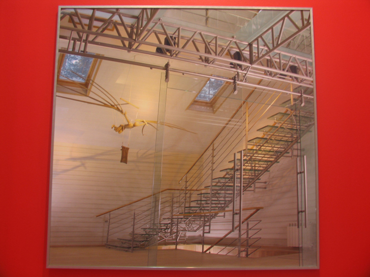
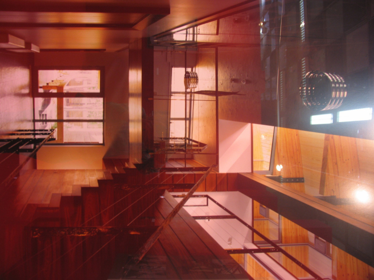
Among the special projects the main allocates - "Gallery ADD", created by curators architects Vlad Savinkin and Vladimir Kuzmin at support of French furniture firm Roche Bobois. The gallery is located in front of the entrance in the basic hall and it is the red labyrinth filled by photos of good interiors - country houses, workshops, night clubs and the offices designed by Anton Nadtochiem, Michael Filippovym, by the workshop « Vitruvii and sons », studio «Three A design » and others. As a matter of fact, it is a variant "Аrchcatalogue", arranged at ArchMoscow, but smaller one, and it is better incorporated by a curator plan. As it is known, a labyrinth – is also an interior, one of the trickiest variants of an interior, some kind of no antagonistic contrast to the cozy and smart corners exposed at other stands. The impossibility to live in it is compensated by that it is a convenient variant of exhibition space because it allows to find room for the maximal number of running meters on rather small area, having hanged out along them an exposition. The cramped space answers the chamber of the interior genre, and its complexity comes across with the market variety of a surrounding exhibition. The hint on mythological history which is hardly guessed from a combination a labyrinth - architects - red color, whether wishes to tell instead of a signboard: « … and here - interiors of good architects », whether reminds of a coming nearer distribution of « crystal Dedals » …
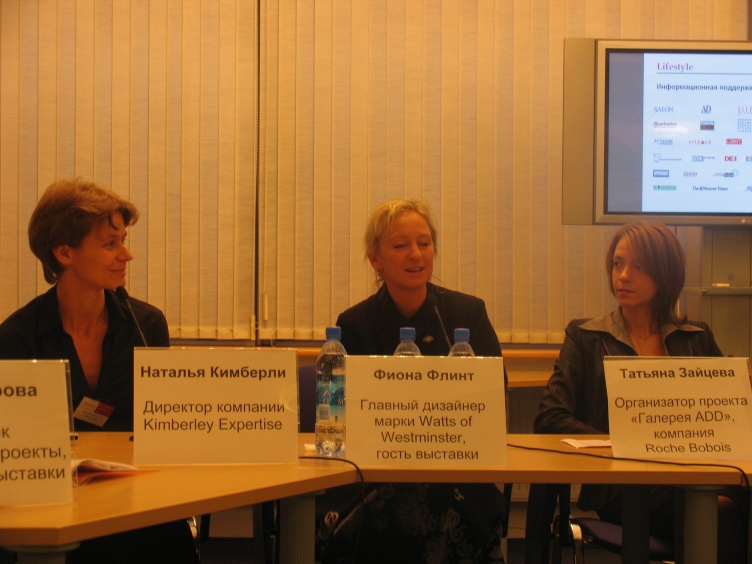
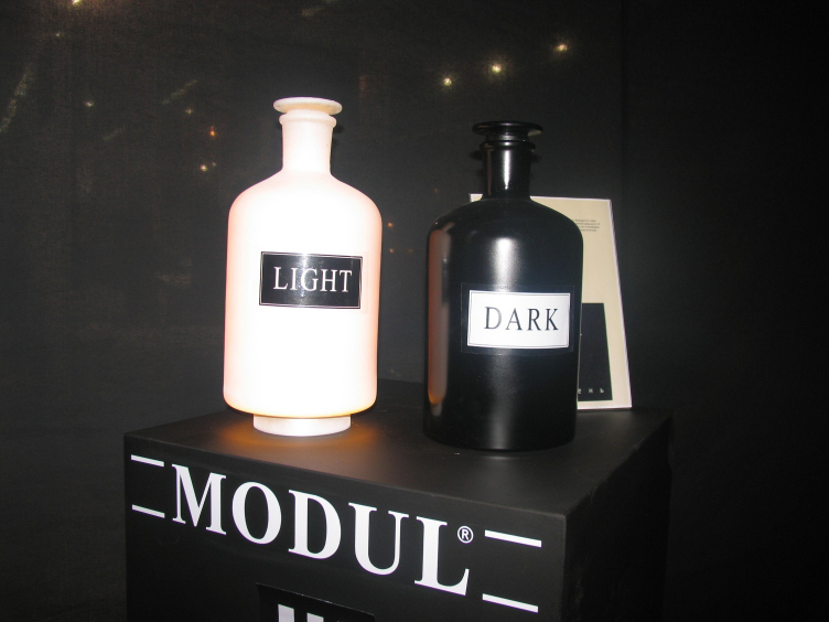
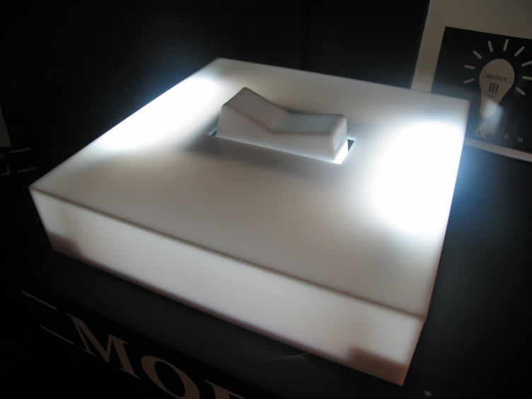
Besides all these the group MODUL and the magazine "Headquarters" show the project of the author's lamps « The Light and the Shadow ». Having taken « … beside not laying … » subjects and having connected them with direct instructions on light sources, the Moscow designers have built a conceptual collection of the light equipment. Besides bench projects, within the limits of an exhibition the master-class of the main designer of company Watts and Westminster Fiona Flint is planned, and also « Moscow at your home » where on an example of an under construction multipurpose complex « City of Capitals » it will be told about the features of the interiors including panoramic glassing.
