По-русски

​Heaven Gets Closer

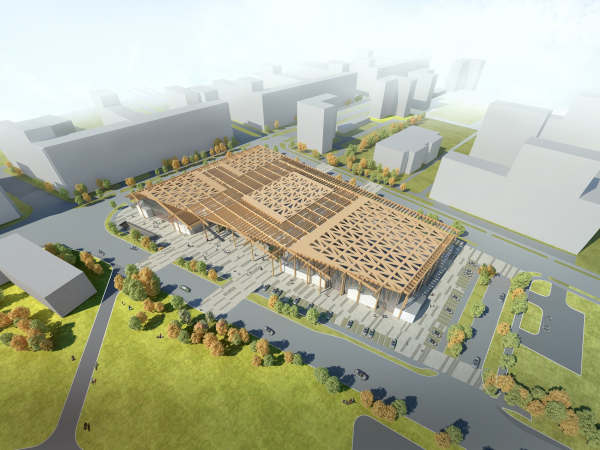
In their “Sportpark” project in Moscow’s Tushino, ASADOV architects joined together swimming pools, a skating rink, gyms, and tennis courts under a single “sky” of a giant pergola made from glued wooden structures, creating a convincing image of eco architecture.

09 December 2019
News
mainImg

The “Sportpark” project was created by ASADOV architects for “Gorod na Reke Tushino – 2018” (“Town on the Tushino River”), a grand-scale residential complex built in the stead of the former Tushino Airfield, inscribed into the peninsula between the Moskva River, the Moscow Channel, and the Skhodnya River. This residential area was formed around “Otkrytie Arena” – the home base of Spartak football club, built in 2014 by its owner, Leonid Fedun. The city authorities originally gave their approvals not only for the residential but also for the sports nature of the complex. The developer of “Tushino-2018” was to build here and hand over to the city a few sports facilities, for which he conducted a closed-door competition, to which the Asadov team was invited. The project by the ASADOV architects did not win eventually, yet it did bring about a beautiful and universal idea for the future architecture.

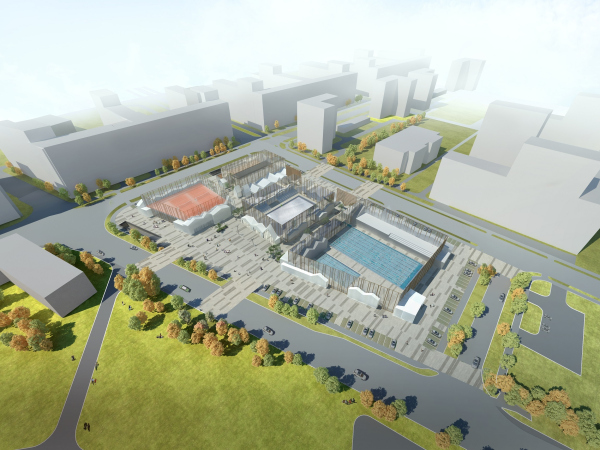
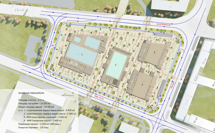
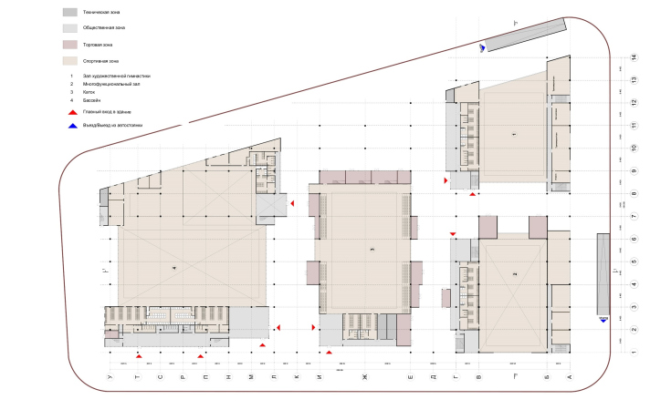
The land site – a rectangle of irregular features – is situated between the park zone and future residential buildings. On this venue, the architects were to place an aquatic center, tennis courts, an ice arena, and a multifunctional gym. The architects designed four glass volumes, and then decided to unite them with a single pergola roof – a glued-wood mega-structure situated on the height of the playing field. There are several entrances to this megastructure. From the chamfered side before the entrance, there is a partially open plaza.

The multifunctional complex “Sportpark”
Copyright: © ASADOV architects
  • zooming
    1 / 4
    The multifunctional complex “Sportpark”
  • zooming
    2 / 4
    The multifunctional complex “Sportpark”
  • zooming
    3 / 4
    The multifunctional complex “Sportpark”
    Copyright: © ASADOV architects
  • zooming
    4 / 4
    The multifunctional complex “Sportpark”
    Copyright: © ASADOV architects


In the center, there is a skating rink, flanked by pedestrian galleries; on the right, there are swimming pools, on the left tennis courts and a youth sports school. The wooden pergola can be both open, and covered with glass. Underneath this “sky”, as Andrey Asadov calls it, one can not only do sports but also go walking around the inner streets, formed by low-rise pavilions, whose silhouette looks a little bit like that of an old north-European city – this archetype of a traditional street is still going strong, and, as it turned out, is not at all at odds with the modern sports futurism.

The multifunctional complex “Sportpark”
Copyright: © ASADOV architects


On the human level, this looks like a small town of little houses with pitched roofs, these roofs being of various heights, steeper or gently sloping ones, the silhouette can be of any kind because all of the houses share the same sky. The facades of the little houses are either completely transparent, including the fronton, or dull, or with a stained glass window showcase – in all of the cases, the plastique is modernist, and not the traditional grid with windows. On the inside, there are locker rooms, mechanical rooms, and the commercial infrastructure. Similar “little houses” with gable roofs, yet without one of the walls, also cover the spectator areas around the skating rink.

The multifunctional complex “Sportpark”
Copyright: © ASADOV architects


The tall glass partitions with vertical wooden sashes are cut into the little houses, and this creates an impression as if this is a little town amidst a pine forest, the pergola casting shadows like from tree branches. The glass and the slim “pines” grow up to the “sky” and separate the inner premises from the outside world, at the same time connecting them: the little town is perceived as its continuation, the streets ending directly under the pergola.

The multifunctional complex “Sportpark”
Copyright: © ASADOV architects


The multifunctional complex “Sportpark”
Copyright: © ASADOV architects


Glass is essentially a boundary that is not there. This little town is maybe an inside or an outside ambivalent space. It was expected that in the evening the Sportpark would glow with a warm light. Being inside, one would be able to see the city behind the glass, at the same time being protected from the wind and the rain.

The multifunctional complex “Sportpark”
Copyright: © ASADOV architects


It’s not that such techniques were not used before in shopping malls, railway stations, and food markets (which all are essentially a combination of small volumes and megastructures covering them), yet here they met with wood and gable roofs. Furthermore, the wooden pergola – an openwork thing with ostentatiously jagged edges – became in this case a structure of a city magnitude.

The multifunctional complex “Sportpark”
Copyright: © ASADOV architects


The ASADOV architects did wooden architecture projects before (“we love wooden things” – Andrey Asadov says). In the tennis center in Moscow’s Kuntsevo, for example, the entrance zone was also made of glued wood. After that, there was a sports complex in Zhukovka-XXI with “flying” triangular wooden roofs. When asked about the fire safety issue of the wooden construction, Andrey Asadov emphasized that wood, if treated correctly, keeps up its bearing capacity many hours after the start of the fire, whilst metal loses it within about an hour and a half. As for the price, the wooden construction is oftentimes is not more expensive than a metal one. “All of our elements are as functional as they can be – Andrey Asadov stresses – It’s just that the construction of the main roof, which was going to be there in any case, was ultimately made of wood, while the inner premises, which also were to be there in any case, we decided to design not as simple boxes but as little houses with a dramatic silhouette. Probably, economy-wise, our client thought of our solution as a unique one. Our project did not ultimately win but we still like it very much because we now have a powerful universal idea in our arsenal. It will sure come handy in the future”.

Usually, all sports facilities in this country, unless they are built for the Olympics or for the World Soccer Championship, are doomed to be hangars. The mere fact that the architects were able to break away from the “box” design is a great achievement in itself and a stepping stone for a better future. The image became softer and more environmentally friendly. Accordingly, the wooden pergola became a universal “sky” for the little town or whatever it is there underneath it. In our climate, the very opportunity for moving around from one house to another without getting your shoes dirty already sounds like an achievement in itself. The pergola must be plain to see from the top floors and become the fifth facade. The weaving pattern of the pergola is diverse, and changed not unlike the pattern on a sweater: there are laconic planks above the pedestrian galleries, while above the sports facilities the ornaments become thicker and more intricate. This was done not just for the sake of decor, but also for functional purposes: at the client’s request, the architects diminished the glazing area at the expense of skylights, giving them a triangular shape.

The multifunctional complex “Sportpark”
Copyright: © ASADOV architects


Now about the formal context of Sportpark! The megastructure that hides the inner streets inside of it is actually a town within a building. A town within a building is a modern architectural form that is different from the traditional palace or a classical architectural ensemble with their inherent symmetry. This is a form that is freer; like a real town, it contains a kaleidoscope or different shapes, yet it still demonstrates a clear “fabric” with streets and buildings united by a common “sky” or some other large figure, it has a beginning and an ending. Such megastructures are to be encountered, for example, in Skolkovo (or in the Herzog and de Meuron project of the University building, and in the Valod and Pistre project in Technopark); in expo architecture, for example, in the Milan Fair designed by Fucsas. And as for the wooden grids, these pop up now and then in the park and garden architecture, for example, in the glass-and-wood “parthenon” in the Citroen Park in Paris. The Tushino Sportpark miraculously combines all of these features: large technological elements, sophisticated city infrastructure, and the subtle wooden architecture.

The wood-and-glass grid and, essentially, the pergola too, are exactly of this kind, quite a nature-friendly image. And, if we are to speak about being inspired by environmental elements, glass in architecture is likened to water or to air. And wood is quite natural as it is. The plants in the tubs add to the likeness with a greenhouse. The image of eco architecture can be expressed with different ways: in vertical gardens on the facade or in burying the building in a green hill. This little town underneath the elegant wooden pergola is yet another convincing image of green architecture. Conservation is on the world’s most prevalent ideologies of today. Some think tanks, like Noah Harry, for example, even believe that nature is ousting the humans, becoming the center of creation, the world becoming more nature-centric, and not anthropocentric, the way it has been since the time of Renaissance. The revenge that nature is taking out on us for the violence that it was subjected to in the course of the previous centuries leads to a situation that is reversely lopsided, some “eco-nazi” thing. In this sense, it is very important that the archetypal little houses with gable roofs in the Sportpark project become the humanity’s agents, reflecting it scale of thinking and perception, which ultimately will lead to overall harmony, will it not?

09 December 2019

Headlines now
Four Different Surveys
The “Explore the City” competition, organized this year by the Genplan Institute of Moscow, stands out as a pretty unconventional one for the architectural field but aligns perfectly well with the character of urban planning work. The winning project analyzed contemporary residential complexes, combining urban planning insights with a realtor’s perspective to propose a hybrid approach. Other entries explored public centers, motivations for car ownership, and housing vacancy rates. A fifth participant withdrew. Here’s a closer look at the four completed works.
Scheduled Evolution
ASADOV Architects unveiled the EvyCenter pavilion, a microcultural hub for fostering personal growth, organizing workshops, and doing gymnastics. Additionally, this pavilion serves as a prototype for a scalable country house, drawing inspiration from the “Loskutok” project, and constructed from CLT panels in a factory. This marks the beginning of a developer project initiated by the architectural firm (sic!), which is seeking partners to expand both small Evy settlements and even larger Evy cities, which are, according to Andrey Asadov, aimed at fostering the “evolutionary” development of the people who will inhabit them.
The Golden Crown
The concept for a dental clinic in Yekaterinburg, developed by CNTR Studio, revolves around the idea of a “mouth full of gold”: pristine white porcelain stoneware walls are complemented by matte brass details. To avoid an overly literal interpretation, the architects focused on the building’s proportions, skillfully navigating between sunlight requirements and fire safety regulations.
Flexibility and Integration
Not long ago, we covered the project for the fourth phase of the ÁLIA residential complex, designed by APEX. Now, we’ve been shown different fence concepts they developed to enclose the complex’s private courtyards, incorporating a variety of public functions. We believe that the sheer fact that the complex’s architects were involved in such a detail as fencing speaks volumes.
A Step Forward
The HIDE residential complex represents a major milestone for ADM architects and their leaders Andrey Romanov and Ekaterina Kuznetsova in their quest for a fresh high-rise aesthetic – one that is flexible and layered, capable of bringing vibrancy to mass and silhouette while shaping form. Over recent years, this approach has become ADM’s “signature style”, with the golden HIDE tower playing a pivotal role in its evolution. Here, we delve into the project’s story, explore the details of the complex’s design, and uncover its core essence.
Gold in the Sands
A new office for a transcontinental company specializing in resource extraction and processing has opened in Dubai. Designed by T+T Architects, masters of creating spaces that are contemporary, diverse, flexible, and original, this project exemplifies their expertise. On the executive floor, a massive brass-clad partition dominates, while layered textures of compressed earth create a contextually resonant backdrop.
Layers and Levels of Flight
This project goes way back – Reserve Union won this architectural competition at the end of 2011, and the building was completed in 2018, so it’s practically “archival”. However, despite being relatively unknown, the building can hardly be considered “dated” and remains a prime example of architectural expression, particularly in the headquarters genre. And it’s especially fitting for an aviation company office. In some ways, it resembles the Aeroflot headquarters at Sheremetyevo but with its own unique identity, following the signature style of Vladimir Plotkin. In this article, we take an in-depth look at the United Aircraft Corporation (UAC) headquarters in the Moscow agglomeration town of Zhukovsky, supplemented by recent photographs from Alexey Naroditsky – a shoot that became only recently possible due to the fact that improvements were finally made in the surrounding area.
Light and Shadow
In this article, we delve into the architectural design of the “Chaika” house by DNK ag architects, which was recently completed in 2023 as part of the collection of signature designs at ZILArt. As is well-known, all the buildings in this complex follow a design code, yet each one is distinct. This particular building stands out not only for its whiteness and minimalism but also for the refined use of a limited number of techniques that, together, create what can confidently be called synergy.
Casus Novae
A master plan was developed for a large residential area with a name of “DNS City”, but now that its implementation began, the plan has been arbitrarily reformatted and replaced with something that, while similar on the surface, is actually quite different. This is not the first time such a thing happens, but it’s always frustrating. With permission from the author, we are sharing Maria Elkina’s post.
Treasure Hunting
The GAFA bureau, in collaboration with Tegola and Arkhitail, organized an expedition to the island of Kilpola in Karelia as part of Moskomarkhitektura’s “Open City” festival. There, amidst moss and rocks, the students sought answers to questions like: what is the sacred, where does it dwell, and what sustains it? Assisting the participants in this quest were landscape engineer Evgeny Levin, artist Nicholas Roerich, a moose, and the lack of cellular connection. Here’s how the story unfolded.
Depths of the Earth, Streams of Water
In the Malaya Okhta district, the Akzent building, designed by Stepan Liphart, was constructed. It follows a classic tripartite structure, yet it’s what you might call “hand-drawn”: each façade is unique in its form and details, some of which aren’t immediately noticeable. In this article, we explore the context and, together with the architect, delve into how the form was developed.
Fir Tree Dynamics
The “Airports of Region” holding is planning to build an airport in Karachay-Cherkessia, aiming to make the Arkhyz and Dombay resorts more accessible to travelers. The project that won in an invitation-only competition, submitted by Sergey Nikeshkin’s KPLN, blends natural imagery inspired by the shape of a conifer seed, open-air waiting spaces, majestic large trees, and a green roof elevated on needle-like columns. The result is both nature-inspired and WOW.
​A Brick Shell
In the process of designing a clubhouse situated among pine trees in a prestigious suburban area near Moscow, the architectural firm “A.Len” did the façade design part. The combination of different types of brick and masonry correlates with the volumetric and plastique solutions, further enhanced by the inclusion of wood-painted fragments and metal “glazing”.
Word Forms
ATRIUM architects love ambitious challenges, and for the firm’s thirtieth anniversary, they boldly play a game of words with an exhibition that dives deep into a self-created vocabulary. They immerse their projects – especially art installations – into this glossary, as if plunging into a current of their own. You feel as if you’re flowing through the veins of pure art, immersed in a universe of vertical cities, educational spaces – of which the architects are true masters – and the cultural codes of various locations. But what truly captivates is the bold statement that Vera Butko and Anton Nadtochy make, both through their work and this exhibition: architecture, above all, is art – the art of working with form and space.
Flexibility and Acuteness of Modernity
Luxurious, fluid, large “kokoshniks” and spiral barrel columns, as if made from colorful chewing gum: there seem to be no other mansion like this in Moscow, designed in the “Neo-Russian-Modern” style. And the “Teremok” on Malaya Kaluzhskaya, previously somewhat obscure, has “come alive with new colors” and gained visibility after its restoration for the office of the “architectural ecosystem” as the architects love to call themselves. It’s evident that Julius Borisov and the architects at UNK put their hearts into finding this new office and bringing it up to date. Let’s delve into the paradoxes of this mansion’s history and its plasticity. Spoiler: two versions of modernity meet here, both balancing on the razor’s edge of “what’s current”.
Yuri Vissarionov: “A modular house does not belong to the land”
It belongs to space, or to the air... It turns out that 3D printing is more effective when combined with a modular approach: the house is built in a workshop and then adapted to the site, including on uneven terrain. Yuri Vissarionov shares his latest experience in designing tourist complexes, both in central Russia and in the south. These include houseboats, homes printed from lightweight concrete using a 3D printer, and, of course, frame houses.
​Moscow’s First
“The quality of education largely depends on the quality of the educational environment”. This principle of the last decade has been realized by Sergey Skuratov in the project for the First Moscow Gymnasium on Rostovskaya Embankment in the Khamovniki district. The building seamlessly integrates into the complex urban landscape, responding both to the pedestrian flow of the city and the quiet alleyways. It skillfully takes advantage of the height differences and aligns with modern trends in educational space design. Let’s take a closer look.
Looking at the Water
The site of Villa Sonata stretches from the road to the water’s edge, offering its own shoreline, pier, and a picturesque river panorama. To reveal these sweeping views, Roman Leonidov “cut” the façade diagonally parallel to the river, thus getting two main axes for the house and, consequently, “two heads”. The internal core – two double-height spaces, a living room and a conservatory, with a “bridge” above them – makes the house both “transparent” and filled with light.
The White Wing
Well, it’s not exactly white. It’s more of a beige, white-stone structure that plays with the color of limestone – smoother surfaces are lighter, while rougher ones are darker. This wing unites various elements: it absorbs and interprets the surrounding themes. It responds to everything, yet maintains a cohesive expression – a challenging task! – while also incorporating recognizable features of its own, such as the dynamic cuts at the bottom, top, and middle.
Urban Dunes
The XSA Ramps team designed and built a three-part sports hub for a park in Rostov-on-Don, welcoming people of all ages and fitness levels. The skate plaza, pump track, and playground are all meticulously crafted with details that attract a diverse range of visitors. The technical execution of the shapes and slopes transforms this space into a kind of sculptural composition.
Proportional Growth
The project for the fourth phase of the ÁLIA residential area has been announced. The buildings are situated on an elongated plot – almost a “ray” that shoots out from the center of the area towards the river. Their layout reflects both a response to Moscow’s architectural preferences over the past 15 years, shifting “from blocks to towers”, and an interpretation of the neighboring business park designed by SOM. Additionally, the best apartments here are not located at the very top but closer to the middle, forming a glowing “waistline”.
The “Staircase” Building
In designing the “Details” residential complex in New Moscow, Rais Baishev spiced up the now-popular Moscow theme of a “courtyard” building with an idea drawn from the surrealist drawings by Maurits Escher. He envisioned the stepped silhouettes and descending slopes as a metaphysical mega-staircase, creating a key void within the courtyard that gave the project an internal “spine”. This concept is felt both in the building’s silhouette and on its façades.
Projection of the Quarter
No one doubted that the building that Vladimir Plotkin designed as part of the “Garden Quarters” would be the most modernist of all. And it turned out just that way: while adhering to the common design code, the building successfully combines brick and white stone, rhythmically responding to the neighboring building designed by Ostozhenka, yet tactfully and persistently making a few statements of its own. This includes the projection of the ideal urban development composition “14–9–6”, which can be found right next door, mathematical calculations, including those for various types of terraces (and perhaps the only reminder of the Soviet past of the Kauchuk rubber factory!), and the white “cross-stitch” pattern of the façade grid.
Domus Aurea
In this issue, we examine the “Tessinsky-1” house, designed by Sergey Skuratov and completed in 2023. Located in the middle of the Serebryanicheskaya Embankment district, at the intersection of its main streets, this house assumes a sort of “nodal” role: it not only responds to everything around it and preserves many memories of the former EMA factory within itself, but it weaves all this into a newly directed pattern, reconciling bright “gold” and dark-colored brick, largely with the help of the new, modern-yet-archaic Columba brick, which, come to think about it, is the most precious element here.
The Chimney of Nikola-Lenivets
In this issue, we are examining the “Obelisk House” designed by KATARSIS and built for the Arkhstoyanie 2023 festival. However, it was only finished later on, and this is why we are examining it now. It seems to us that after the “Obelisk House” appeared in Nikola-Lenivets, a dialogue and a few inner connections appeared between the temporary structures built here. These houses no longer look like “accidental neighbors”, more of which below.
​Periscope by the Bay
The jury awarded the second place in the competition for a public and cultural center in Petropavlovsk-Kamchatsky to the companies GORA (“Mountain”) and M4. In the consortium’s proposal, the building resembles a sperm whale with a calf swimming next to it or a periscope, whose lenses capture the most spectacular views from the surrounding landscape.
From Arcs to Dolmens
While working on the competition project for Petropavlovsk-Kamchatsky, ASADOV Architects prioritized the value of the natural and urban environment, aiming to preserve the balance of the location while minimizing the resemblance of the volume that they designed to a “traditional building”. The task was challenging, and the architects created three versions, one of which having been developed after the competition, where their main proposal took third place. However, the point of interest here is not the competition result but the continuity of creative thinking.
Hide and Seek
The ID Moskovskiy house, designed by Stepan Liphart in St. Petersburg, in the courtyards near Moskovskiy Avenue beyond the Obvodny Canal and recently completed, is notable for several reasons. Firstly, it has been realized with considerable accuracy, which is particularly significant as this is the first building where the architect was responsible not only for the facades but also for the layouts, allowing for better integration between the two. On the other hand, this building is interesting as an example of the “germination” of new architecture in the city: it draws on the best examples from the neighborhood and becomes an improved and developed sum of ideas found by the architect in the surrounding context.
The Big Twelve
Yesterday, the winners of the Moscow Mayor’s Architecture Award were announced and honored. Let’s take a look at what was awarded and, in some cases, even critique this esteemed award. After all, there is always room for improvement, right?
Above the Golden Horn
The residential complex “Philosophy” designed by T+T architects in Vladivostok, is one of the new projects in the “Golubinaya Pad” area, changing its development philosophy (pun intended) from single houses to a comprehensive approach. The buildings are organized along public streets, varying in height and format, with one house even executed in gallery typology, featuring a cantilever leaning on an art object.