По-русски

Circles on the Walls

In this issue, we showcase one of the most widely discussed interior designs of the year - the restaurant of the famous Central House of Writers, renovation of which was done by the famous architectural bureau WOWHAUS.

19 June 2014
Object
mainImg

Reconstruction of the restaurant of the Central House of Writers © WOWHAUS

The restaurant of the Central House of Writers appeared in the 1930's as a cafe of the Writers' Union that was then occupying the Olsufievs Mansion built back in 1886–1887. This place gained an almost instant popularity: the famous writers not only dined here but also read their manuscripts, celebrated their birthdays, and had heated discussions as well. The walls of the CHW remember Tvardovsky, Zoschenko, Sholokhov, Okudzhava, as well as Nils Bor, Marlene Dietrich, Indira Gandi, and many other celebrities. After the fall of socialism, the restaurant for years retained the heavyweight aura of the stagnation era: it was quite an expensive place to eat in, and the interior "supported" the sky-high prices with the brazen luxury of the velvet curtains and oak panels. When the restaurant changed its owner last year, the issue of renewing its "face" was instantly raised. Developing a new groundbreaking gastronomic concept for the CHW, the restaurant owner Aleksey Zimin turned to WOWHAUS Bureau with a request to design a bright and dramatic but at the same time easily replaceable interior that would be oriented for the new clientele of the restaurant - workers of the creative industries aged from 25 to 45. 

Reconstruction of the restaurant of the Central House of Writers © WOWHAUS

Reconstruction of the restaurant of the Central House of Writers © WOWHAUS

The challenge of this task consisted in the fact that the new design was not supposed to "cross out", let alone oust, the historical adornment. The monument architecture and just a milestone place of the nation's culture were to be kept completely intact, this is why all the authentic elements of the neogothic interior - the oak panels, the fireplaces, and the chandeliers (including the one that was originally going to become the jewel of "Komsomolskaya" Hotel) - were all in one bunch transferred into the project of its renovation, in fact, even before the moment that the architects actually got down to work. "The solution just what to do with all these things came to us rather soon - shares Dmitry Likin, partner of WOWHAUS. Due to the fact that nobody performed a fully-fledged historic and restoration inspection of the building's interior, any serious intervention could have possibly led to damages. It was decided to act in accordance with the logic of art-intervention - meaning, to put a new layer upon the old interior. It will switch the guest's attention onto itself, it will create a different atmosphere but, should this be necessary, it can be easily changed or even removed". 

Reconstruction of the restaurant of the Central House of Writers © WOWHAUS

In other words, the choice was at once made in favor of several quick-mount materials - namely, gypsum plasterboard and MDF that, if needed, could be dismantled literally overnight. It is these materials that create in the historical interior the contemporary "layer" treating the originally set neogothic theme through the ornament and light-and-color effects. "The new image of the restaurant is based on the contrast of the interior's historical details executed from wood and the technologies that create a composition that is resonant of today" - Oleg Shapiro adds. 


Reconstruction of the restaurant of the Central House of Writers © WOWHAUS

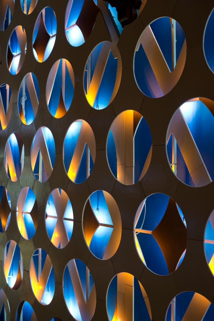
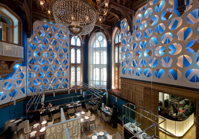
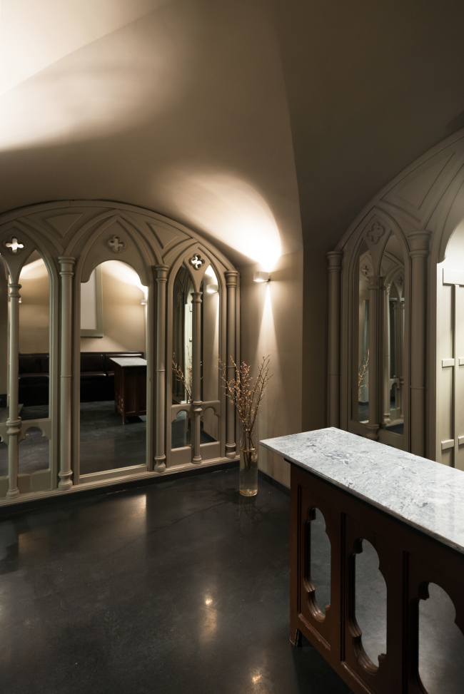
For example, the walls of the foyer that is the first to greet the guests if the restaurant - the architects re-painted them gray-blue, applying to this background a lot of circles with light-reflecting properties. Appearing here for the first time, the circle becomes the theme that runs through all the premises of the restaurant - this is generally one of the favorite techniques of WOWHAUS, and, one must say that it in the interior it sounds a lot more intimately than it does in the decoration of public outdoor areas.

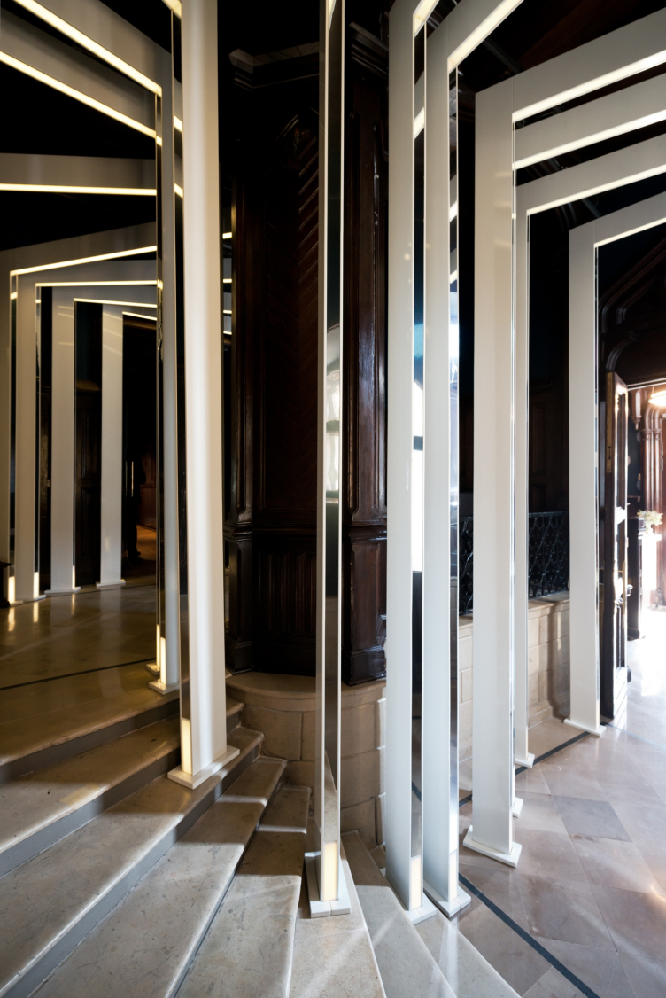
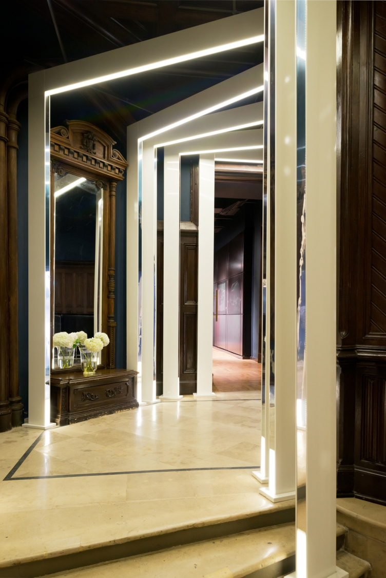
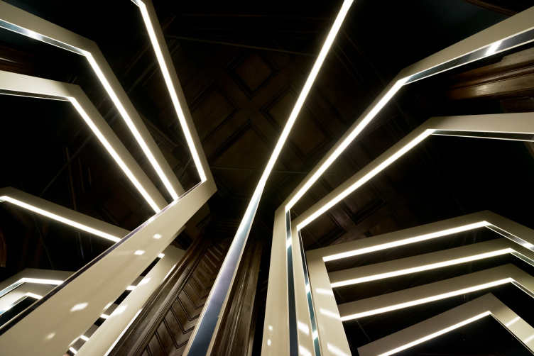
The stairway that leads from the foyer to the restaurant, also underwent complete transformation. In order to give this structure a less massive look, the architects installed on each stair snow-white triangular frames with a backlight. Following the shift of the steps, these structures form an imposing-looking perspective portal: leading into the main premises of the restaurant, it unambiguously warns the guests not only about the drastic change of image of the place but also about the very nature of the transformation that occurred.


Reconstruction of the restaurant of the Central House of Writers © WOWHAUS


Reconstruction of the restaurant of the Central House of Writers © WOWHAUS


Reconstruction of the restaurant of the Central House of Writers © WOWHAUS

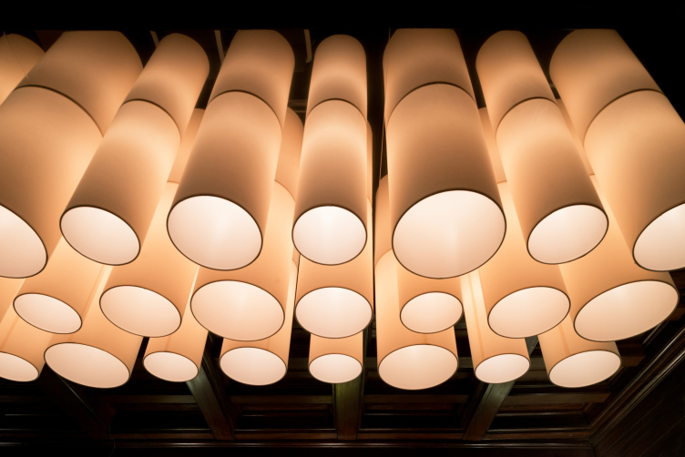
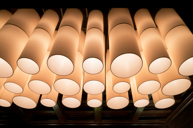
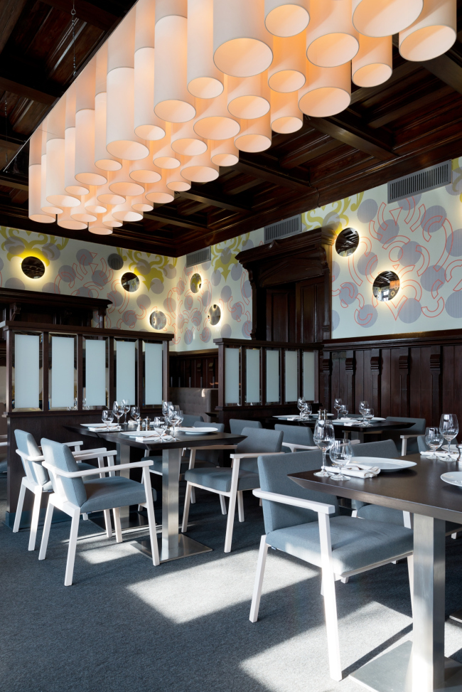
In thus sense, the corridors of the restaurant look particularly expressive. Their ceilings conceal the air chutes and ventilation ducts, while below them there are there is a layer of cylinder-shaped lights. They not only conceal the chutes but also make the ceiling look lower, giving extra intrigue to the passes from one hall to another.

Reconstruction of the restaurant of the Central House of Writers © WOWHAUS

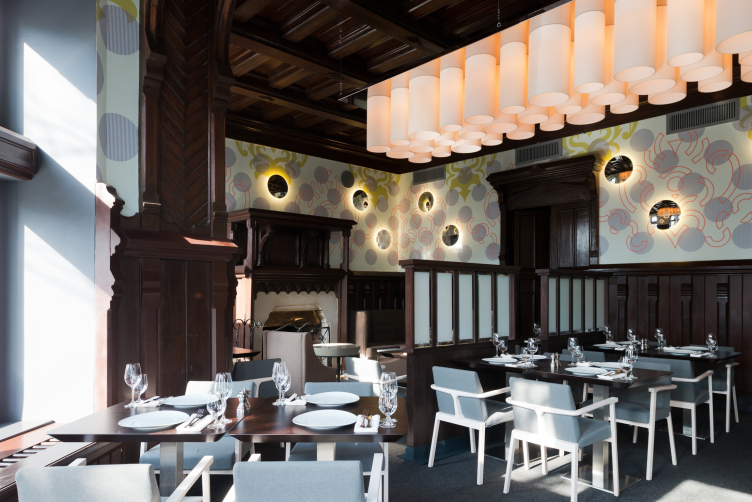
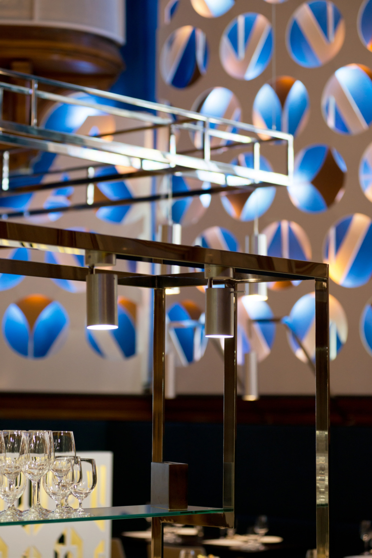
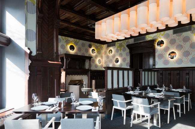
The mantel rooms of the CHW, although situated on different floors, are still designed in the similar fashion. Their design uses multiple repeating elements: the same circles and the repeating damask pattern. At the same time, in the lower room, the latter - yet another "genre classic" for neogothic - serves as the background, upon which panels with perforation in the form of circles are applied. Also interesting is the fact that the architects also backlight their multilayer plastic panels with blue light, thus attracting all the visitors' attention to them and making a diversion from the heavyweight decoration if the premises. In the upper hall, these same elements become flat, repeating themselves in the pattern of the wallpaper. The wall lights continue to develop the "circle" theme as the leitmotif of the restaurant's decoration, while the main lighting is provided by the suspended chandelier that consists of a multitude of cylinders. 

Reconstruction of the restaurant of the Central House of Writers © WOWHAUS

Reconstruction of the restaurant of the Central House of Writers © WOWHAUS

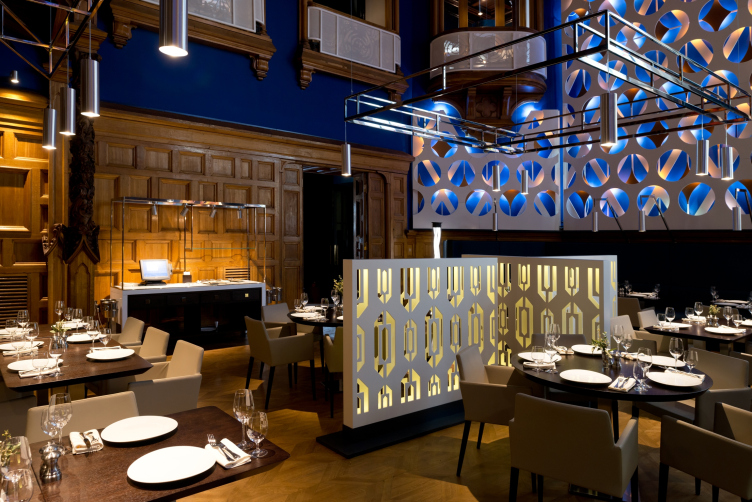
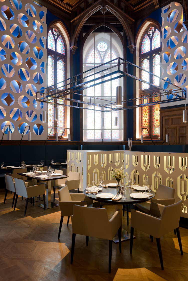
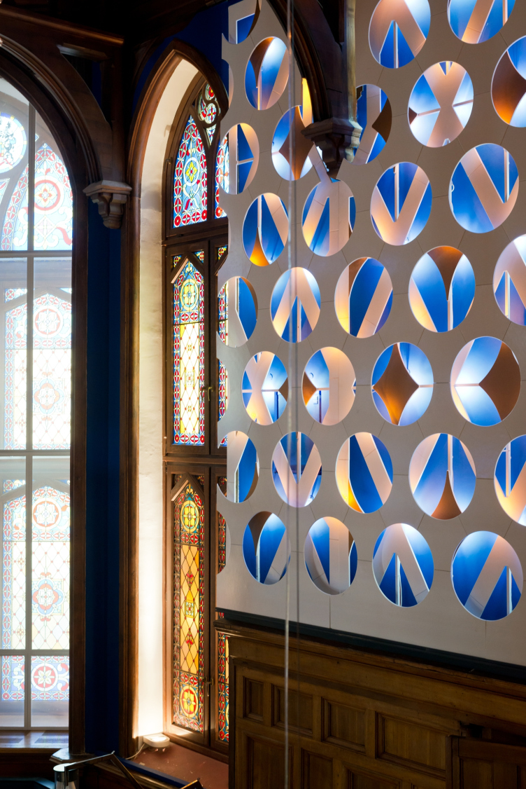
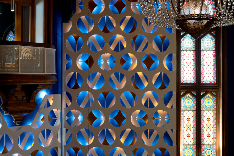
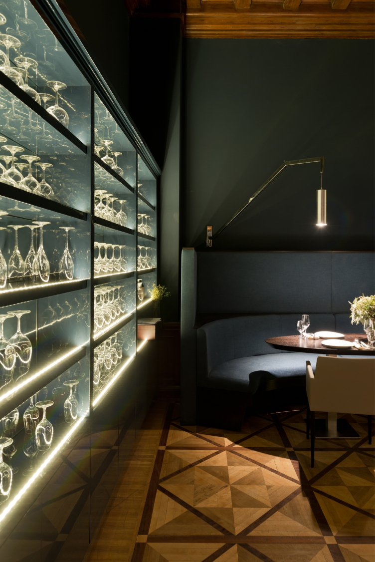
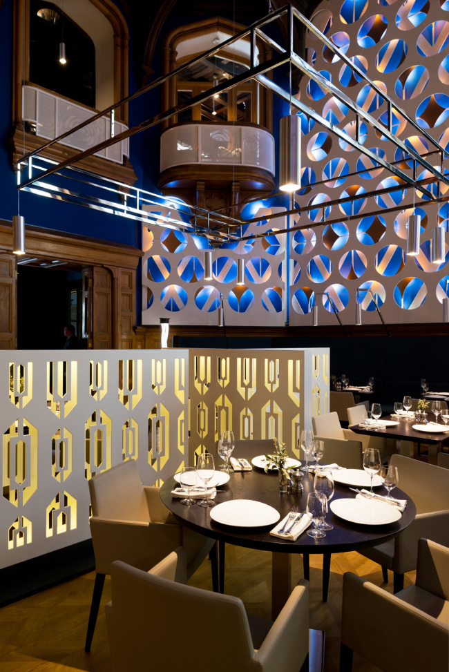
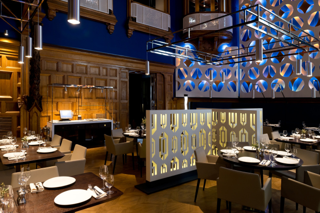
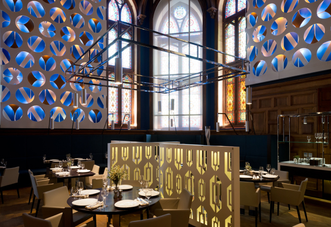
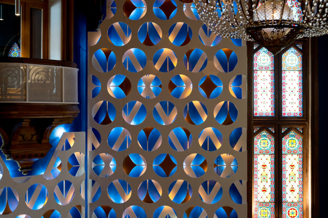
Probably, the place where the concept of a modern layer freely laid over the historical one manifests itself the most is the Oak Hall. Here, again, the task was to distract the guests from the all-too-high-brow interior, and the architects decorate the oak panels with a glittering pattern. Interesting is the fact that these screens run along the perimeter of the hall on a level with the faces of the people sitting behind the tables, which all the more enhances the independence and conditional status of the new "layer". The two-layer perforated false walls from MDF are decorated with a pattern that repeats, in an exaggerated way, the patterns of this hall's main pride - the immense stained-glass window. The outer layer is cut through with circles, and the outer layer - with diamonds, and they are backlit by a warm yellow glow that creates a peculiar play of geometric shapes that echoes the play of light in the stained glass. 


Reconstruction of the restaurant of the Central House of Writers © WOWHAUS

Reconstruction of the restaurant of the Central House of Writers © WOWHAUS


Reconstruction of the restaurant of the Central House of Writers © WOWHAUS

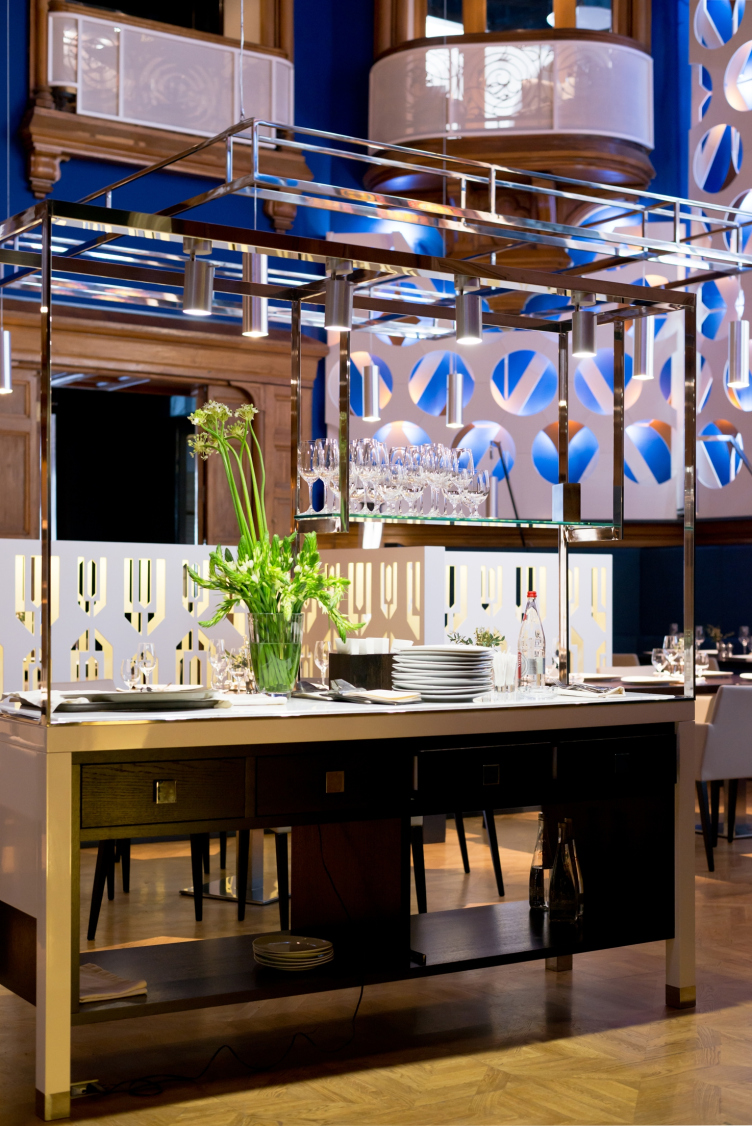
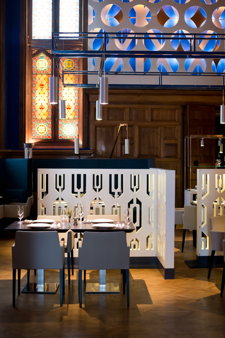
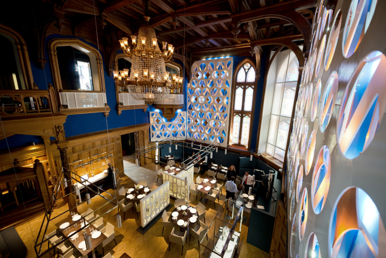
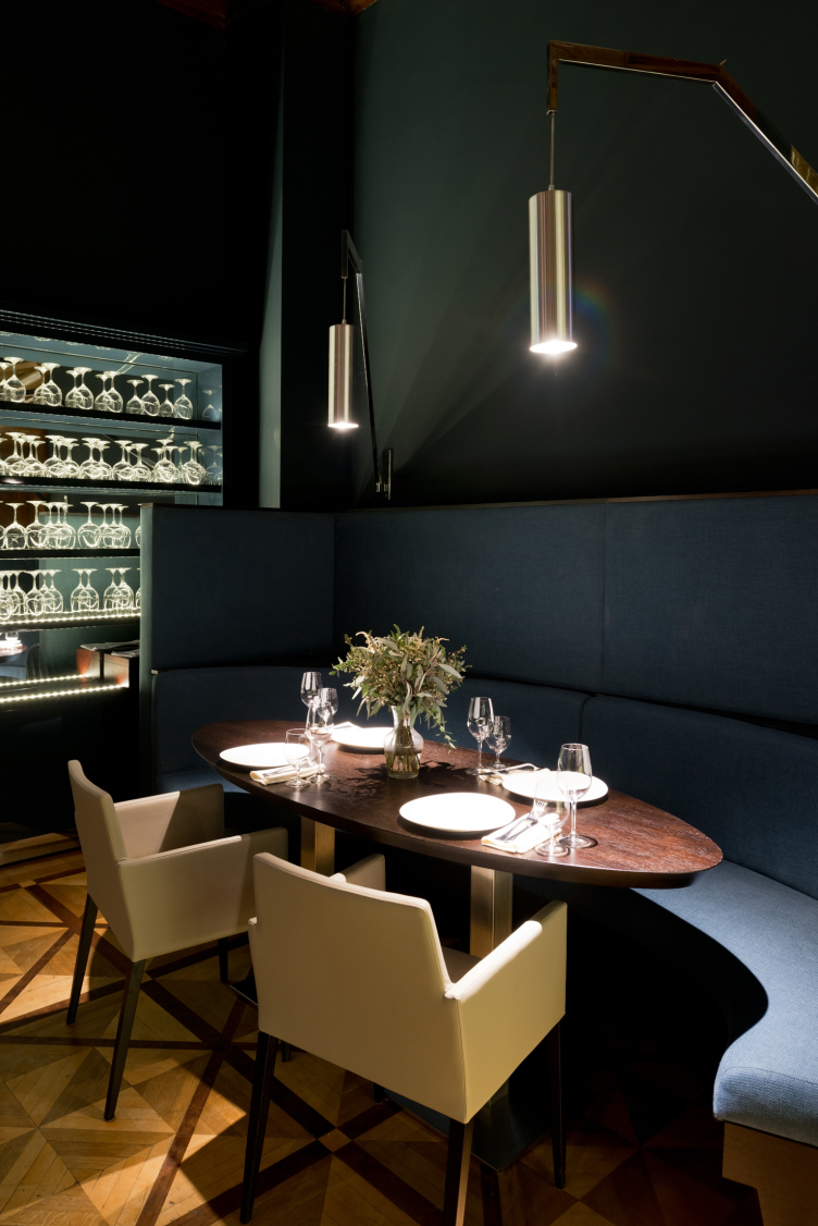
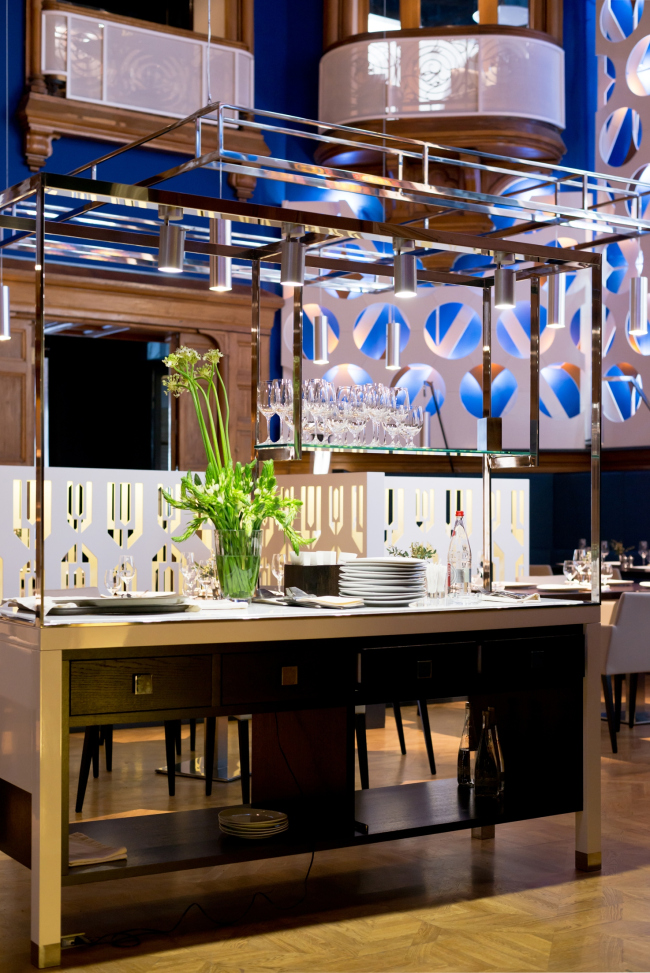
Besides, the hall has in it white separation screens - white backlit partitions, also made from MDF and perforated with a pattern that freely interprets the neogothic language. In order to visually shrink a little the double-height hall and create here a more intimate atmosphere, the architects used, for lighting the tables, bulb lights suspended in a metal framework. In the central zone they are mounted onto the ceiling, while in the couch area they are fastened on the tall couch backs. As was already said, the architects were also able to preserve the CHW's special pride - the immense crystal chandelier: on the level of the second tier, the architects installed a huge panel picture dedicated to good, the very magnitude of which rhymes with the glory of the chandelier. 


Reconstruction of the restaurant of the Central House of Writers © WOWHAUS

Developed by WOWHAUS, the concept of renovating the interior of the famous restaurant did not get universal critical acclaim: some people, to be sure, shudder at the very idea of marrying the "sturdy" wood and the plastic that does not even make an attempt to pay a lip service to this noble material. Probably, if one takes transformation seriously, such complaints would have made sense - but the key to understanding this interior lies in the very fact that one needs to realize that this renovation was not done "for ages to come". "The pattern was based on the "golden shields against the azure field" - almost childish interpretation of the chivalrous heraldry - Dmitry Likin explains - applied to the decorative panels, it starts to play with the pseudo-gothic historical interior, destroying its grandeur and thus performing its main task of creating a light and sharp-witted space". 

Reconstruction of the restaurant of the Central House of Writers © WOWHAUS


Reconstruction of the restaurant of the Central House of Writers © WOWHAUS


Reconstruction of the restaurant of the Central House of Writers © WOWHAUS


Reconstruction of the restaurant of the Central House of Writers © WOWHAUS


Reconstruction of the restaurant of the Central House of Writers © WOWHAUS


Reconstruction of the restaurant of the Central House of Writers © WOWHAUS

Reconstruction of the restaurant of the Central House of Writers © WOWHAUS


Reconstruction of the restaurant of the Central House of Writers © WOWHAUS


19 June 2014

Headlines now
The Golden Crown
The concept for a dental clinic in Yekaterinburg, developed by CNTR Studio, revolves around the idea of a “mouth full of gold”: pristine white porcelain stoneware walls are complemented by matte brass details. To avoid an overly literal interpretation, the architects focused on the building’s proportions, skillfully navigating between sunlight requirements and fire safety regulations.
Flexibility and Integration
Not long ago, we covered the project for the fourth phase of the ÁLIA residential complex, designed by APEX. Now, we’ve been shown different fence concepts they developed to enclose the complex’s private courtyards, incorporating a variety of public functions. We believe that the sheer fact that the complex’s architects were involved in such a detail as fencing speaks volumes.
A Step Forward
The HIDE residential complex represents a major milestone for ADM architects and their leaders Andrey Romanov and Ekaterina Kuznetsova in their quest for a fresh high-rise aesthetic – one that is flexible and layered, capable of bringing vibrancy to mass and silhouette while shaping form. Over recent years, this approach has become ADM’s “signature style”, with the golden HIDE tower playing a pivotal role in its evolution. Here, we delve into the project’s story, explore the details of the complex’s design, and uncover its core essence.
Gold in the Sands
A new office for a transcontinental company specializing in resource extraction and processing has opened in Dubai. Designed by T+T Architects, masters of creating spaces that are contemporary, diverse, flexible, and original, this project exemplifies their expertise. On the executive floor, a massive brass-clad partition dominates, while layered textures of compressed earth create a contextually resonant backdrop.
Layers and Levels of Flight
This project goes way back – Reserve Union won this architectural competition at the end of 2011, and the building was completed in 2018, so it’s practically “archival”. However, despite being relatively unknown, the building can hardly be considered “dated” and remains a prime example of architectural expression, particularly in the headquarters genre. And it’s especially fitting for an aviation company office. In some ways, it resembles the Aeroflot headquarters at Sheremetyevo but with its own unique identity, following the signature style of Vladimir Plotkin. In this article, we take an in-depth look at the United Aircraft Corporation (UAC) headquarters in the Moscow agglomeration town of Zhukovsky, supplemented by recent photographs from Alexey Naroditsky – a shoot that became only recently possible due to the fact that improvements were finally made in the surrounding area.
Light and Shadow
In this article, we delve into the architectural design of the “Chaika” house by DNK ag architects, which was recently completed in 2023 as part of the collection of signature designs at ZILArt. As is well-known, all the buildings in this complex follow a design code, yet each one is distinct. This particular building stands out not only for its whiteness and minimalism but also for the refined use of a limited number of techniques that, together, create what can confidently be called synergy.
Casus Novae
A master plan was developed for a large residential area with a name of “DNS City”, but now that its implementation began, the plan has been arbitrarily reformatted and replaced with something that, while similar on the surface, is actually quite different. This is not the first time such a thing happens, but it’s always frustrating. With permission from the author, we are sharing Maria Elkina’s post.
Treasure Hunting
The GAFA bureau, in collaboration with Tegola and Arkhitail, organized an expedition to the island of Kilpola in Karelia as part of Moskomarkhitektura’s “Open City” festival. There, amidst moss and rocks, the students sought answers to questions like: what is the sacred, where does it dwell, and what sustains it? Assisting the participants in this quest were landscape engineer Evgeny Levin, artist Nicholas Roerich, a moose, and the lack of cellular connection. Here’s how the story unfolded.
Depths of the Earth, Streams of Water
In the Malaya Okhta district, the Akzent building, designed by Stepan Liphart, was constructed. It follows a classic tripartite structure, yet it’s what you might call “hand-drawn”: each façade is unique in its form and details, some of which aren’t immediately noticeable. In this article, we explore the context and, together with the architect, delve into how the form was developed.
Fir Tree Dynamics
The “Airports of Region” holding is planning to build an airport in Karachay-Cherkessia, aiming to make the Arkhyz and Dombay resorts more accessible to travelers. The project that won in an invitation-only competition, submitted by Sergey Nikeshkin’s KPLN, blends natural imagery inspired by the shape of a conifer seed, open-air waiting spaces, majestic large trees, and a green roof elevated on needle-like columns. The result is both nature-inspired and WOW.
​A Brick Shell
In the process of designing a clubhouse situated among pine trees in a prestigious suburban area near Moscow, the architectural firm “A.Len” did the façade design part. The combination of different types of brick and masonry correlates with the volumetric and plastique solutions, further enhanced by the inclusion of wood-painted fragments and metal “glazing”.
Word Forms
ATRIUM architects love ambitious challenges, and for the firm’s thirtieth anniversary, they boldly play a game of words with an exhibition that dives deep into a self-created vocabulary. They immerse their projects – especially art installations – into this glossary, as if plunging into a current of their own. You feel as if you’re flowing through the veins of pure art, immersed in a universe of vertical cities, educational spaces – of which the architects are true masters – and the cultural codes of various locations. But what truly captivates is the bold statement that Vera Butko and Anton Nadtochy make, both through their work and this exhibition: architecture, above all, is art – the art of working with form and space.
Flexibility and Acuteness of Modernity
Luxurious, fluid, large “kokoshniks” and spiral barrel columns, as if made from colorful chewing gum: there seem to be no other mansion like this in Moscow, designed in the “Neo-Russian-Modern” style. And the “Teremok” on Malaya Kaluzhskaya, previously somewhat obscure, has “come alive with new colors” and gained visibility after its restoration for the office of the “architectural ecosystem” as the architects love to call themselves. It’s evident that Julius Borisov and the architects at UNK put their hearts into finding this new office and bringing it up to date. Let’s delve into the paradoxes of this mansion’s history and its plasticity. Spoiler: two versions of modernity meet here, both balancing on the razor’s edge of “what’s current”.
Yuri Vissarionov: “A modular house does not belong to the land”
It belongs to space, or to the air... It turns out that 3D printing is more effective when combined with a modular approach: the house is built in a workshop and then adapted to the site, including on uneven terrain. Yuri Vissarionov shares his latest experience in designing tourist complexes, both in central Russia and in the south. These include houseboats, homes printed from lightweight concrete using a 3D printer, and, of course, frame houses.
​Moscow’s First
“The quality of education largely depends on the quality of the educational environment”. This principle of the last decade has been realized by Sergey Skuratov in the project for the First Moscow Gymnasium on Rostovskaya Embankment in the Khamovniki district. The building seamlessly integrates into the complex urban landscape, responding both to the pedestrian flow of the city and the quiet alleyways. It skillfully takes advantage of the height differences and aligns with modern trends in educational space design. Let’s take a closer look.
Looking at the Water
The site of Villa Sonata stretches from the road to the water’s edge, offering its own shoreline, pier, and a picturesque river panorama. To reveal these sweeping views, Roman Leonidov “cut” the façade diagonally parallel to the river, thus getting two main axes for the house and, consequently, “two heads”. The internal core – two double-height spaces, a living room and a conservatory, with a “bridge” above them – makes the house both “transparent” and filled with light.
The White Wing
Well, it’s not exactly white. It’s more of a beige, white-stone structure that plays with the color of limestone – smoother surfaces are lighter, while rougher ones are darker. This wing unites various elements: it absorbs and interprets the surrounding themes. It responds to everything, yet maintains a cohesive expression – a challenging task! – while also incorporating recognizable features of its own, such as the dynamic cuts at the bottom, top, and middle.
Urban Dunes
The XSA Ramps team designed and built a three-part sports hub for a park in Rostov-on-Don, welcoming people of all ages and fitness levels. The skate plaza, pump track, and playground are all meticulously crafted with details that attract a diverse range of visitors. The technical execution of the shapes and slopes transforms this space into a kind of sculptural composition.
Proportional Growth
The project for the fourth phase of the ÁLIA residential area has been announced. The buildings are situated on an elongated plot – almost a “ray” that shoots out from the center of the area towards the river. Their layout reflects both a response to Moscow’s architectural preferences over the past 15 years, shifting “from blocks to towers”, and an interpretation of the neighboring business park designed by SOM. Additionally, the best apartments here are not located at the very top but closer to the middle, forming a glowing “waistline”.
The “Staircase” Building
In designing the “Details” residential complex in New Moscow, Rais Baishev spiced up the now-popular Moscow theme of a “courtyard” building with an idea drawn from the surrealist drawings by Maurits Escher. He envisioned the stepped silhouettes and descending slopes as a metaphysical mega-staircase, creating a key void within the courtyard that gave the project an internal “spine”. This concept is felt both in the building’s silhouette and on its façades.
Projection of the Quarter
No one doubted that the building that Vladimir Plotkin designed as part of the “Garden Quarters” would be the most modernist of all. And it turned out just that way: while adhering to the common design code, the building successfully combines brick and white stone, rhythmically responding to the neighboring building designed by Ostozhenka, yet tactfully and persistently making a few statements of its own. This includes the projection of the ideal urban development composition “14–9–6”, which can be found right next door, mathematical calculations, including those for various types of terraces (and perhaps the only reminder of the Soviet past of the Kauchuk rubber factory!), and the white “cross-stitch” pattern of the façade grid.
Domus Aurea
In this issue, we examine the “Tessinsky-1” house, designed by Sergey Skuratov and completed in 2023. Located in the middle of the Serebryanicheskaya Embankment district, at the intersection of its main streets, this house assumes a sort of “nodal” role: it not only responds to everything around it and preserves many memories of the former EMA factory within itself, but it weaves all this into a newly directed pattern, reconciling bright “gold” and dark-colored brick, largely with the help of the new, modern-yet-archaic Columba brick, which, come to think about it, is the most precious element here.
The Chimney of Nikola-Lenivets
In this issue, we are examining the “Obelisk House” designed by KATARSIS and built for the Arkhstoyanie 2023 festival. However, it was only finished later on, and this is why we are examining it now. It seems to us that after the “Obelisk House” appeared in Nikola-Lenivets, a dialogue and a few inner connections appeared between the temporary structures built here. These houses no longer look like “accidental neighbors”, more of which below.
​Periscope by the Bay
The jury awarded the second place in the competition for a public and cultural center in Petropavlovsk-Kamchatsky to the companies GORA (“Mountain”) and M4. In the consortium’s proposal, the building resembles a sperm whale with a calf swimming next to it or a periscope, whose lenses capture the most spectacular views from the surrounding landscape.
From Arcs to Dolmens
While working on the competition project for Petropavlovsk-Kamchatsky, ASADOV Architects prioritized the value of the natural and urban environment, aiming to preserve the balance of the location while minimizing the resemblance of the volume that they designed to a “traditional building”. The task was challenging, and the architects created three versions, one of which having been developed after the competition, where their main proposal took third place. However, the point of interest here is not the competition result but the continuity of creative thinking.
Hide and Seek
The ID Moskovskiy house, designed by Stepan Liphart in St. Petersburg, in the courtyards near Moskovskiy Avenue beyond the Obvodny Canal and recently completed, is notable for several reasons. Firstly, it has been realized with considerable accuracy, which is particularly significant as this is the first building where the architect was responsible not only for the facades but also for the layouts, allowing for better integration between the two. On the other hand, this building is interesting as an example of the “germination” of new architecture in the city: it draws on the best examples from the neighborhood and becomes an improved and developed sum of ideas found by the architect in the surrounding context.
The Big Twelve
Yesterday, the winners of the Moscow Mayor’s Architecture Award were announced and honored. Let’s take a look at what was awarded and, in some cases, even critique this esteemed award. After all, there is always room for improvement, right?
Above the Golden Horn
The residential complex “Philosophy” designed by T+T architects in Vladivostok, is one of the new projects in the “Golubinaya Pad” area, changing its development philosophy (pun intended) from single houses to a comprehensive approach. The buildings are organized along public streets, varying in height and format, with one house even executed in gallery typology, featuring a cantilever leaning on an art object.
Nuanced Alternative
How can you rhyme a square and space? Easily! But to do so, you need to rhyme everything you can possibly think of: weave everything together, like in a tensegrity structure, and find your own optics too. The new exhibition at GES-2 does just that, offering its visitor a new perspective on the history of art spanning 150 years, infused with the hope for endless multiplicity of worlds and art histories. Read on to see how this is achieved and how the exhibition design by Evgeny Ace contributes to it.
Blinds for Ice
An ice arena has been constructed in Domodedovo based on a project by Yuri Vissarionov Architects. To prevent the long façade, a technical requirement for winter sports facilities, from appearing monotonous, the architects proposed the use of suspended structures with multidirectional slats. This design protects the ice from direct sunlight while giving the wall texture and detail.