По-русски

On the Hills

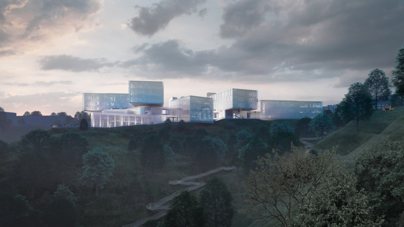
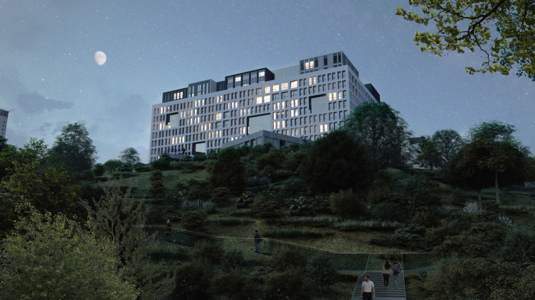
In the project by Studio 44, the “distributed” IT campus of Nizhny Novgorod is based on well-balanced contracts. Sometimes it is hovering, sometimes undulating, sometimes towering over a rock. For every task, the architects found appropriate form and logic: the hotels are based on a square module, the academic buildings are based on a “flying” one, and so on. Modernist prototypes, specifically, Convent Sainte-Marie de La Tourette, stand next to references to the antique Forum and the tower of a medieval university – as well as next to contextual allusions that help inscribe the buildings of the future campus into the landscape of the city hills with their dominants, high slopes, breathtaking river views, the historical city center, and the Nizhny Novgorod University.

09 August 2023
Object
mainImg
The Nizhny Novgorod IT campus, named after mathematician Yuri Neimark, is the mega project among the series of Russian IT campuses, meant to develop the branch on an international level. A total of eight campuses are planned in different cities across the country. The Nizhny Novgorod campus is currently the most famous one: there are reasons to believe that it will be built first – the work started in April 2023 and is expected to be completed in 2025. The campus is designed for 7000 students, the total area of the new buildings is 216.4 thousand m2.

In 2021, Nizhny Novgorod won the competition and became one of the eight cities where IT campuses are planned to be built, with a sketchy pre-concept by Eric Valeev. The sites and tasks were defined in it, but only roughly. The concept became part of the technical brief that was later on offered to the architects of Nikita Yavein’s Studio 44; they’ve been designing the campus – as they almost always do, at a brisk pace – since 2022. This comes as no surprise: Studio 44 has extensive experience working with large training complexes, including IT. First of all, the project of the ITMO High Park campus comes to mind – flashy-looking on the outside and designed as a complex space of a “city for studying” on the inside. There are indeed similarities between the two projects – they relate to the task, typology, and even the fact that the architects worked on the terms of reference together with the client – says Anton Yar-Skryabin, head of the company’s division that designed both campuses.

Yes, the ITMO High Park was the first time we were able to work on a project in close cooperation with the client – and we were lucky to have mutual understanding, or I would even say synergy. We used the same principles of interaction and experience in Nizhny Novgorod, and also quite successfully. An important principle is simultaneous separation of functions and merging of complexes. This is especially true for the educational space, where it is necessary for everyone to communicate with everyone else, so that the learning process is as integral as possible: sometimes you can “catch” a teacher on the way to class and ask them a question, somewhere you can organize a quick meeting to discuss joint work; and at the same time there is a possibility to find a quiet place for secluded work for any student or group. Maximum scenarios for work and interaction – this is the essence of our approach; colleagues from the IT sphere really appreciate it, because it is modern and creates conditions for rapid development and adaptation to constant changes.

However, in Nizhny Novgorod, unlike in the ITMO High Park, the campus is located in an urban context – so here interaction with the city was a very important part of the project for us; in fact, we treated the campus as a city, built it into the city at different levels. The research of our team member Elizaveta Korovina helped us a lot in this part: she studied the structure of the city and formulated its specifics – Nizhny Novgorod stands on hills, and at the top of each hill there are some remarkable buildings. They echo each other; there is a connection between them. We tried to integrate our buildings into this historical structure, found a connection with the Kremlin and with the monasteries, although, of course, we also took into account the immediate context.


Indeed, the context and site specifics are very strong in Nizhny Novgorod; we can even say that to a large extent they were “co-creators” of this architectural project – the urban landscape is very active here.

Let’s start with the fact that unlike St. Petersburg’s ITMO campus, the Nizhny Novgorod campus, does not belong to one single university. The concept of “distributed” in its name means that its buildings, classrooms, equipment and dormitories are planned to be used by different universities of the region as needed. Any of the several universities will be able to rent space and educational facilities here. If we talk about the architectural and town-planning specifics of the future complex, it means, on the one hand, great flexibility and potential freedom of layout, and, on the other hand, significant multifunctionality of its content: the architects were required to accommodate here a significant modern “base” of such a rapidly developing area as IT.

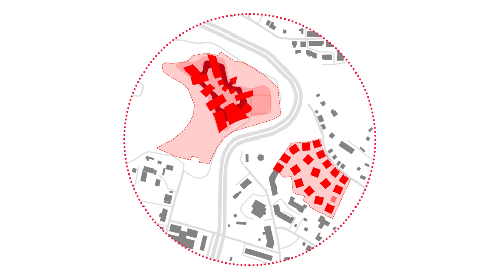
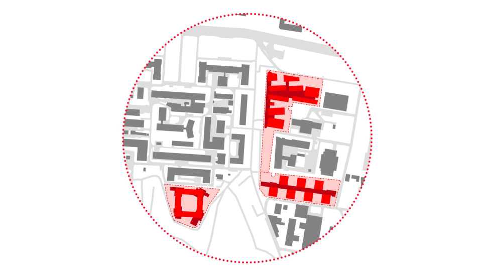
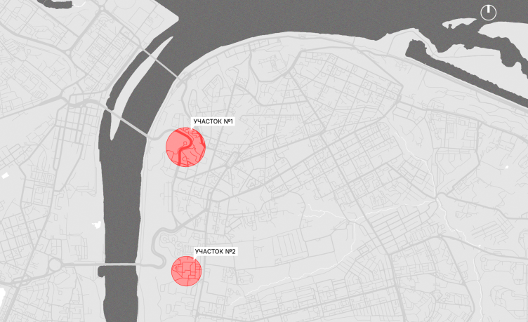
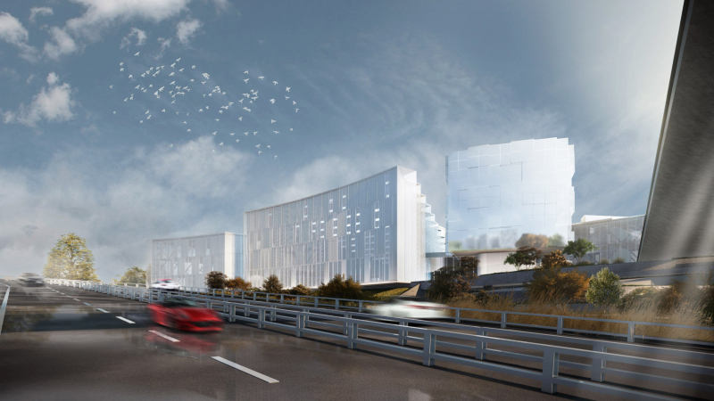
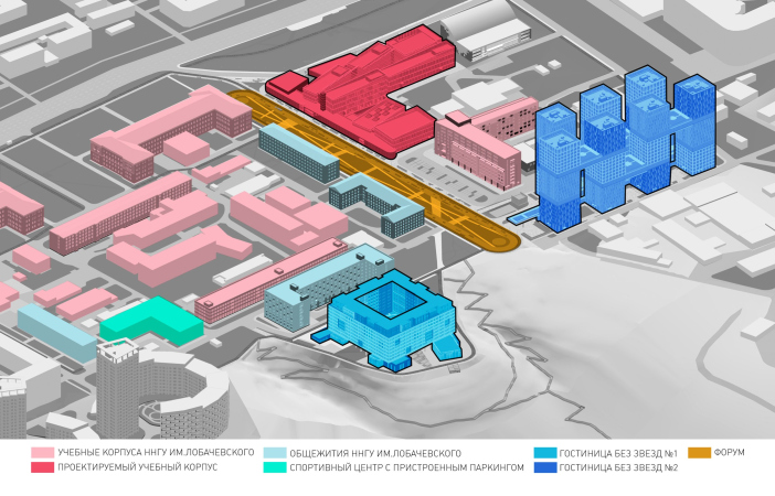
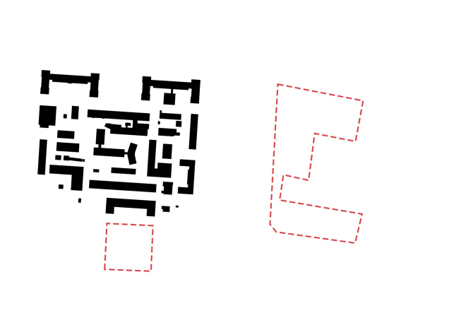
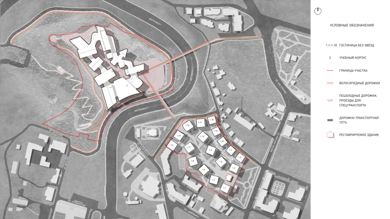
The campus is also spread out in space, otherwise it would be impossible to place it in the center of the city. As was originally planned, it is located on two sites, at a distance of 1.5 kilometers one from the other, at two bridges over the Oka River: Molitovsky and Metromost. Both sites include academic buildings and hotels mixed in different proportions. The first site is closer to the city center; there is a large academic building and a residential area next to the Metromost. The second site is situated on the border of the territory of Nizhny Novgorod university.

  • zooming
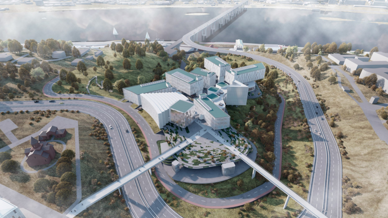
    IT campus Neimark in Nizhny Novgorod, Site 1
    Copyright: © Studio 44
  • zooming
    IT campus Neimark in Nizhny Novgorod, Site 2
    Copyright: © Studio 44


  • zooming
    IT campus Neimark in Nizhny Novgorod, Site 1 next to the Metrobridge
    Copyright: © Studio 44
  • zooming
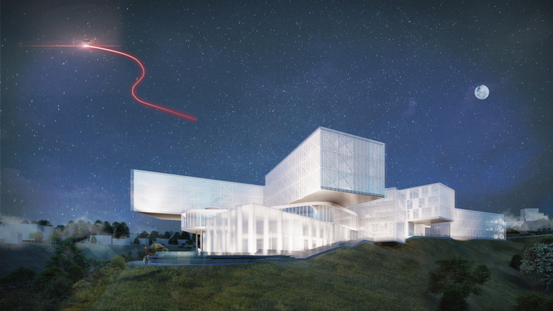
    Neimark IT Campus in Nizhny Novgorod, Site 2, next to the territory of the Nizhny Novgorod University, near Molitovsky Bridge
    Copyright: © Studio 44


IT campus Neimark in Nizhny Novgorod, the sites on the city plan
Copyright: © Studio 44


It is noteworthy that both sites are located on the slopes of the left bank of the Oka River, and before the Oka flows into the Volga River, it complies with all the rules of “steep and flat banks”, even with a “surplus”: the height of the river bank near the Kremlin and the Chkalov Stairs is 70-80 meters, and here on the Oka as much as 100 meters. Nizhny Novgorod residents are very proud of the fact that their banks are the highest and the steepest. The steepness of the slopes can be felt even when you look at the map: the lines of automobile tracks curve like a mountain slalom; the bank indeed commands beautiful views.

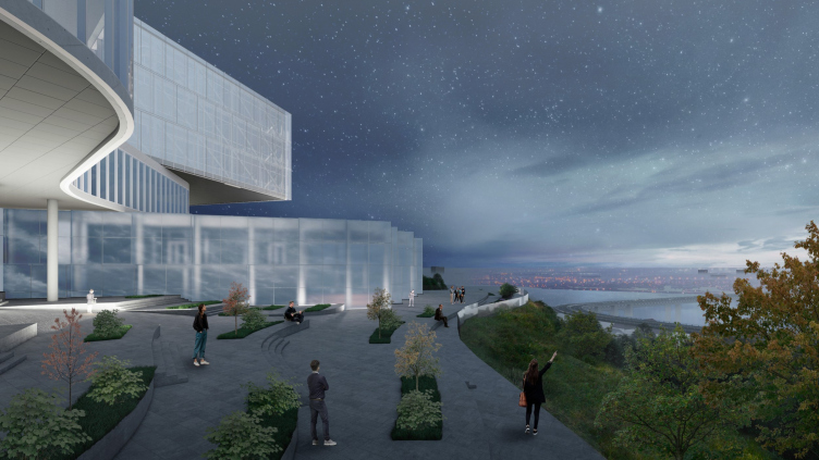
The IT campus received not only the sites before the slopes, but the slope edge areas as well. On the one hand, this is inconvenient – for example, the very street name “Bolshie Ovragi” (“Big Ravines”) speaks for itself. On the other hand, however, it yields sweeping river views and views of the opposite bank.

The Flight Over the Slope

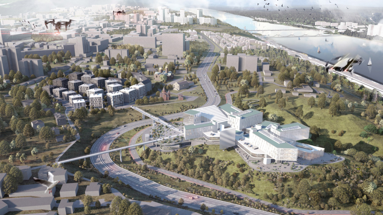
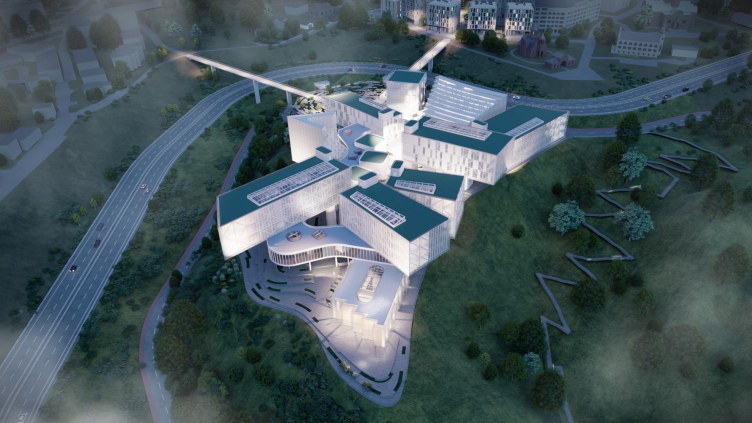
According to the plan, the construction is divided into 5 phases, and starts with the dormitories, which are now called “hotels for students”. But the brightest building is definitely the academic building near the Metromost, and if you look at the Yandex map, you can see that the territory there is already prepared for work.

The academic building. IT campus Neimark in Nizhny Novgorod, Site 1
Copyright: © Studio 44


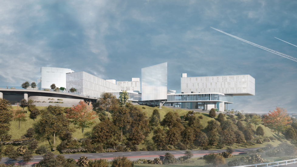
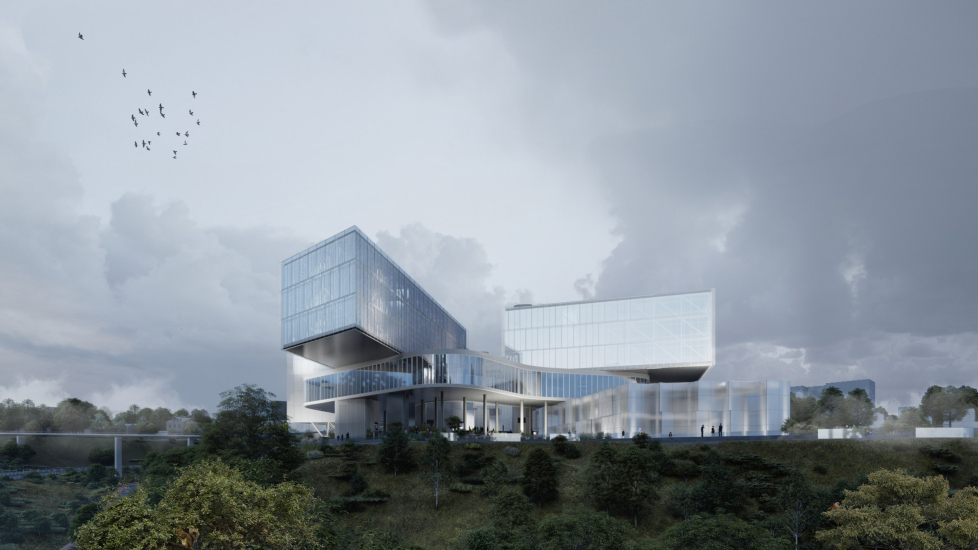
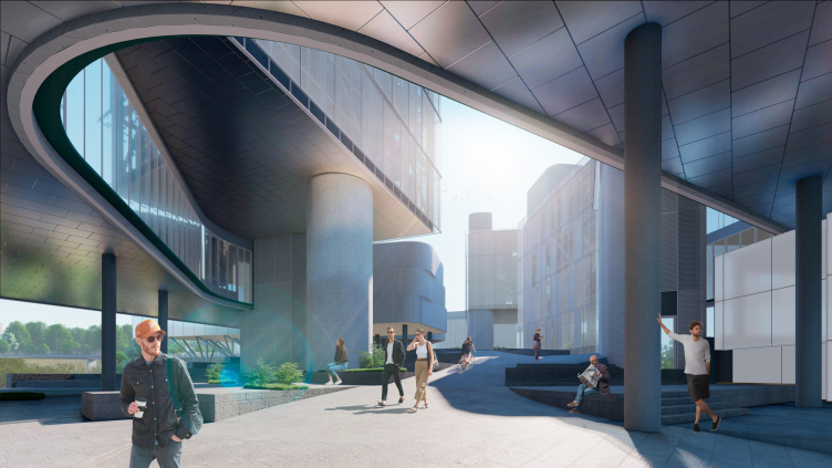
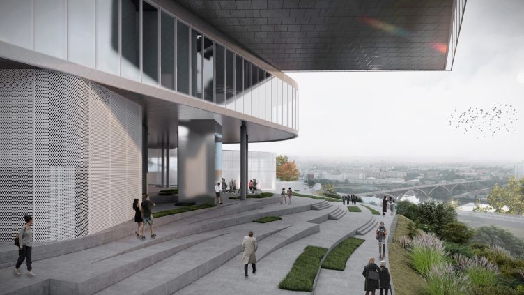
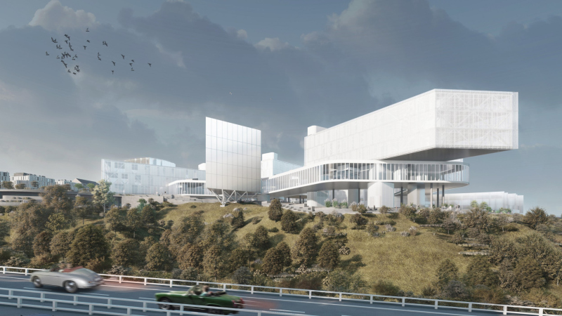
The building features ideas that have already been expressed more than once in Studio 44 projects – I would even say that it contains some of the architects’ favorite “techniques”: cantilevered structures with a long outreach, a layout of volumes with multidirectional beams, transparent galleries resting on tall thin columns – everything is based on levitation and aspiration, not just fighting gravity, but easily overcoming it. “Shots” of beams are well read in ITMO, although there they have more of Malevich in them, while the soaring motion of cantilevers over the slope can be seen, for example, in the competition project of the Museum of Modern Art prepared for Ufa. In other words, the image is immersed in the context of Studio 44’s creative search – but it is also more than appropriate on the top of a spur of the river slope between two ravines. Either a fortress tower should stand here, or something similar to it, something of the “soaring” type. The place seems to be a launching pad, and the building looks as if it was trying to make sense of its numerous “wings”, trying to assemble some kind of copter.

  • zooming
    The academic building. IT campus Neimark in Nizhny Novgorod, Site 1
    Copyright: © Studio 44
  • zooming
    The academic building. IT campus Neimark in Nizhny Novgorod, Site 1
    Copyright: © Studio 44


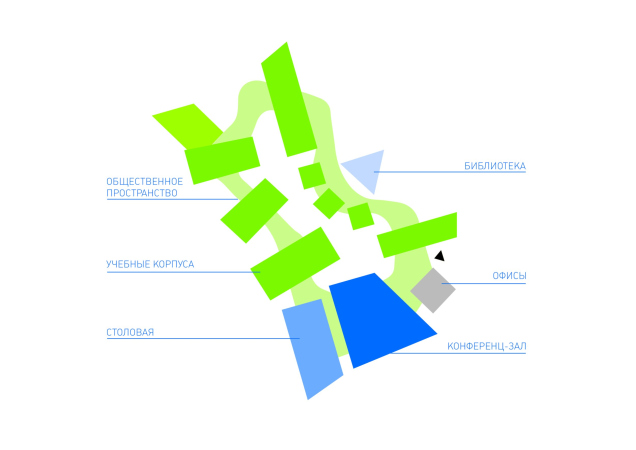
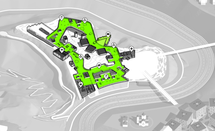
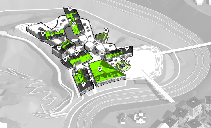
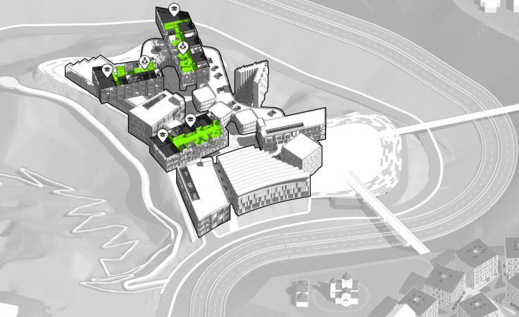
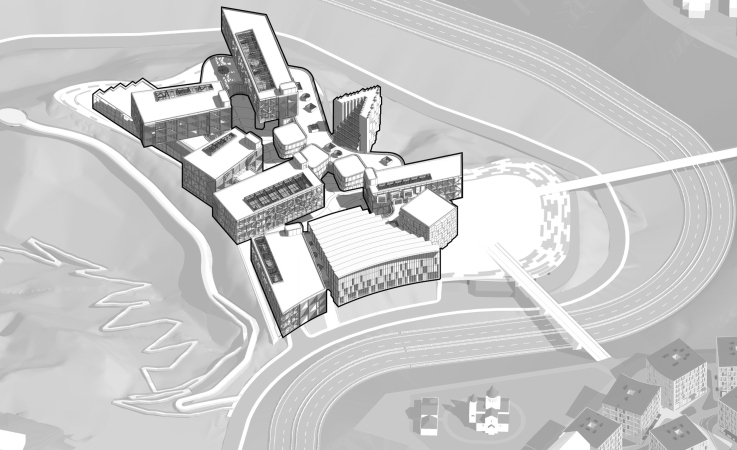
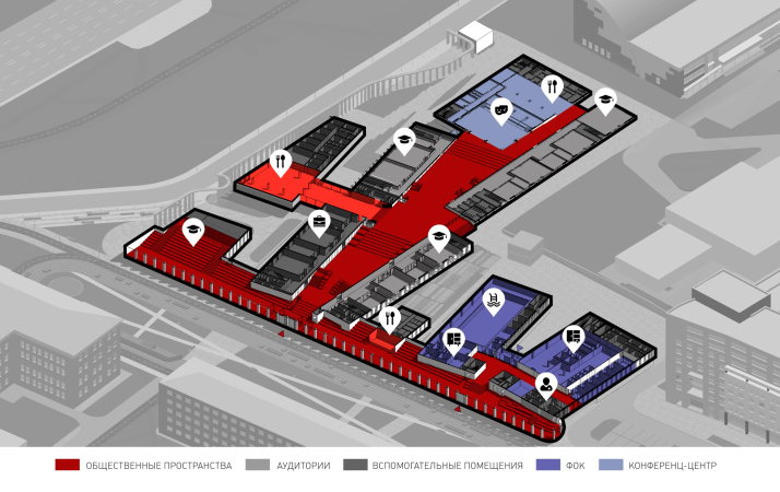
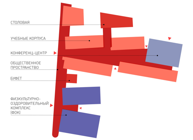
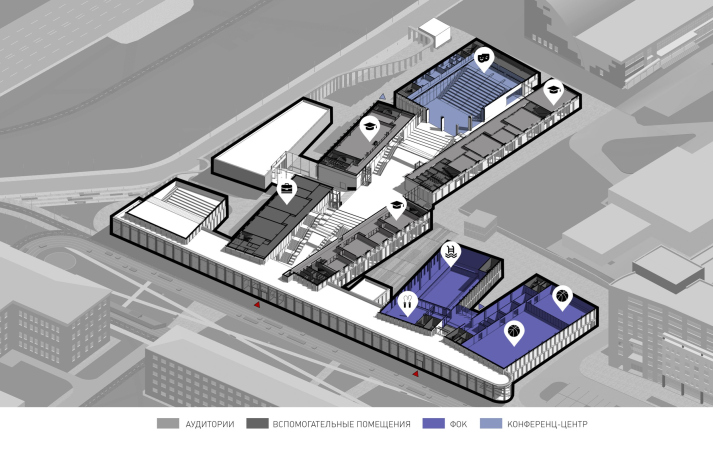
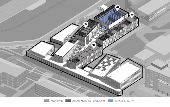
But the essence of the project, of course, is not so much in the metaphor of a takeoff, as in the approach to arranging volumes. Academic buildings, a large auditorium, a canteen, a library, and a small office for the administration are strung on a wide glass gallery of public space. On the plan, it resembles an irregular figure eight; on the one hand, it is a covered passage between the buildings – but much wider and more spacious, more like a “river”, illuminated both by floor-to-ceiling stained glass windows with panoramic views and by skylights wherever possible. The public space will penetrate the enclosures, it is designed to be able to pass freely through everything, but each volume can be isolated if necessary – the architects explain.

  • zooming
    1 / 8
    IT campus Neimark in Nizhny Novgorod, Site 1
    Copyright: © Studio 44
  • zooming
    2 / 8
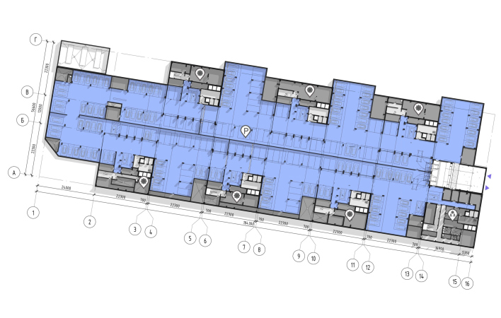
    IT campus Neimark in Nizhny Novgorod, Site 2. The hotel. Plan of the -2nd floor
    Copyright: © Studio 44
  • zooming
    3 / 8
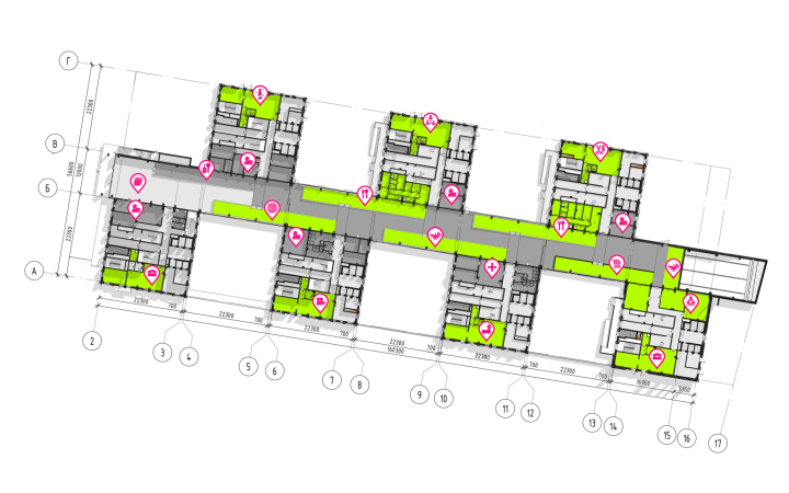
    IT campus Neimark in Nizhny Novgorod, Site 2. The hotel. Plan of the -1st floor
    Copyright: © Studio 44
  • zooming
    4 / 8
    IT campus Neimark in Nizhny Novgorod, Site 1. Plan of the 2nd floor
    Copyright: © Studio 44
  • zooming
    5 / 8
    IT campus Neimark in Nizhny Novgorod, Site 1. Plan of the 2nd floor
    Copyright: © Studio 44
  • zooming
    6 / 8
    IT campus Neimark in Nizhny Novgorod, Site 1. Plan of the 4th floor
    Copyright: © Studio 44
  • zooming
    7 / 8
    IT campus Neimark in Nizhny Novgorod, Site 1
    Copyright: © Studio 44
  • zooming
    8 / 8
    IT campus Neimark in Nizhny Novgorod, Site 1. Cross-section views
    Copyright: © Studio 44


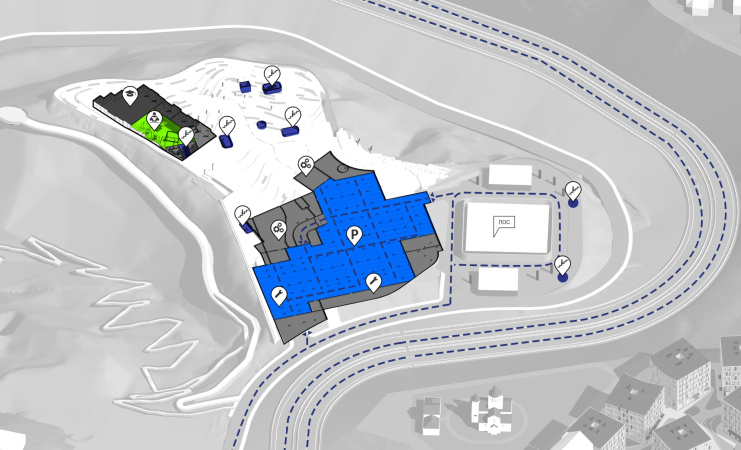
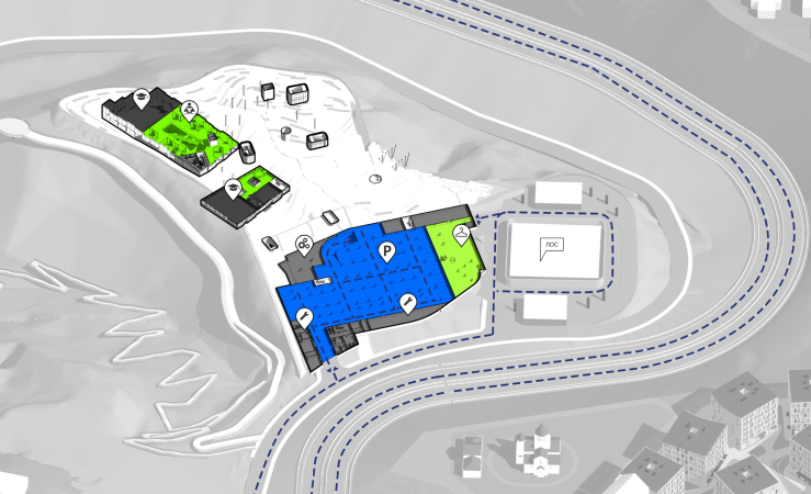
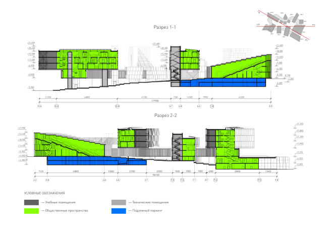
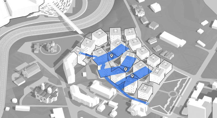
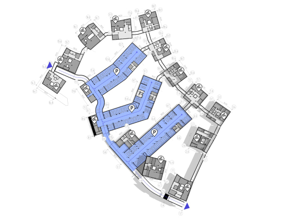
The height difference on the site itself is relatively small, but there is still 4 meters, so that the “figure eight” of public space from the city side sits on the ground – here 2 tiers of underground parking lots are formed under it, and from the river side it hangs above the slope. The architects used the location on the mountain to the fullest extent, both to get additional underground spaces and to create a “hovering” effect.

The frosted-glass volume of the cafeteria is the only one that is entirely built into the slope below the level of the public gallery; the rest of the buildings grow upwards, reminiscent of another Studio 44 competition project – the reconstruction of the Krasnoyarsk theater.

Where the gallery is “hovering”, it opens the passage to the courtyard, resting both on slender supports and voluminous cylinders of communication cores.

The academic building, the yard. IT campus Neimark in Nizhny Novgorod, Site 1
Copyright: © Studio 44


The Nizhny Novgorod campus is located in the city, and in a historical city at that. The first part of the campus is even situated on the site of a 16th century settlement – there were excavations and archaeologists worked here.
Therefore, our associations, in addition to those structural things that are necessary for an IT-campus, are also connected with medieval prototypes and their reinterpretation in the XX century. In some ways, it is a monastery cloister – we were reminded, in particular, of Le Corbusier’s Convent Sainte-Marie de La Tourette: there, too, there is a large slope, about 10 meters high, and a rectangle of a courtyard with residential galleries and thin supports raised above it.


The academic building. IT campus Neimark in Nizhny Novgorod, Site 1
Copyright: © Studio 44


The academic building. IT campus Neimark in Nizhny Novgorod, Site 1
Copyright: © Studio 44


It must be said that since 2022 the project has changed significantly: originally, it had more “tell-tale” shapes in it – a golden egg, and a Shukhov-esque tower, to name but two. Later on, the egg was replaced with the triangle of the library, the tower disappeared, and the outlines of the volumes became more austere.

  • zooming
    1 / 4
    The academic building. IT campus Neimark in Nizhny Novgorod, Site 1
    Copyright: © Studio 44
  • zooming
    2 / 4
    The academic building. IT campus Neimark in Nizhny Novgorod, Site 1
    Copyright: © Studio 44
  • zooming
    3 / 4
    The academic building. IT campus Neimark in Nizhny Novgorod, Site 1
    Copyright: © Studio 44
  • zooming
    4 / 4
    The academic building. IT campus Neimark in Nizhny Novgorod, Site 1
    Copyright: © Studio 44


However, the basic principle has not changed – the buildings are strung on a gallery, and the external form manifests and emphasizes the internal structure – both the multicomponent nature of the building as a whole and the character of each building: for example, the volume of the conference hall received a stepped roof, echoing the amphitheater inside of it. Similar steps can be seen in the triangle of the library, only there they are glass and serve for overhead lighting. Strictly speaking, the very approach taken here makes each facade optional and subject to change: the essence of the concept does not change because of the changes in the imagery of the components, since the basic idea is embedded in the very structure of the complex.

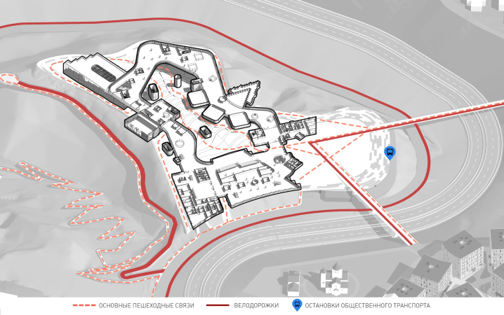
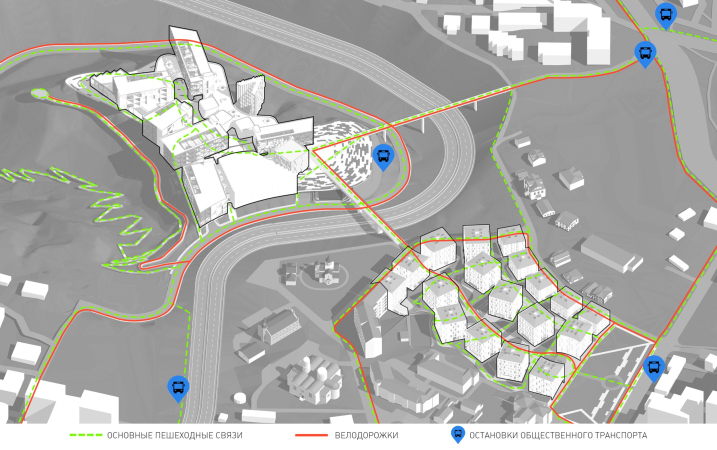
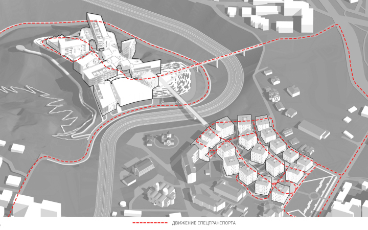
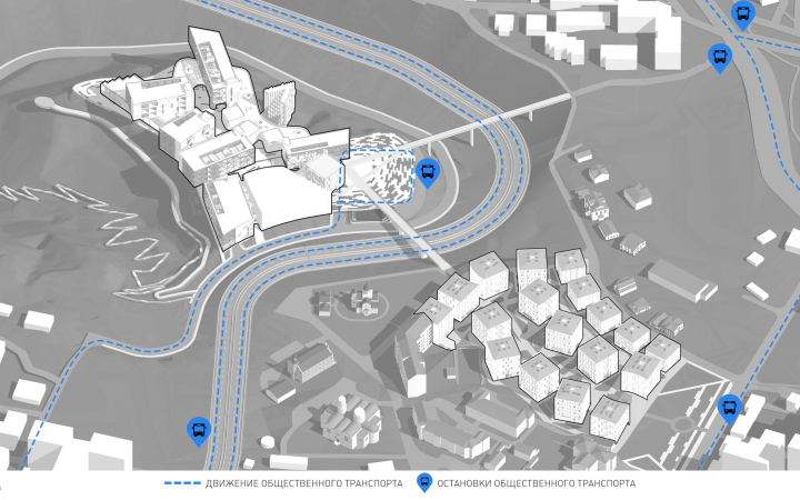
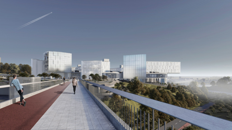
Toward the dormitory hotels, whose site is situated beyond the highway and slightly above, the conglomeration of academic buildings directs 2 more beams – pedestrian bridges thrown over the road.

  • zooming
    1 / 8
    The academic building, the pedestrian bridges above the highway. IT campus Neimark in Nizhny Novgorod, Site 1
    Copyright: © Studio 44
  • zooming
    2 / 8
    IT campus Neimark in Nizhny Novgorod, Site 1. The pedestrian flows
    Copyright: © Studio 44
  • zooming
    3 / 8
    IT campus Neimark in Nizhny Novgorod, Site 1
    Copyright: © Studio 44
  • zooming
    4 / 8
    IT campus Neimark in Nizhny Novgorod, Site 1
    Copyright: © Studio 44
  • zooming
    5 / 8
    IT campus Neimark in Nizhny Novgorod, Site 1
    Copyright: © Studio 44
  • zooming
    6 / 8
    IT campus Neimark in Nizhny Novgorod, Site 1
    Copyright: © Studio 44
  • zooming
    7 / 8
    IT campus Neimark in Nizhny Novgorod, Site 1. The master plan
    Copyright: © Studio 44
  • zooming
    8 / 8
    The academic building, the pedestrian bridge over the rosd. IT campus Neimark in Nizhny Novgorod, Site 1
    Copyright: © Studio 44


The Urban Routine

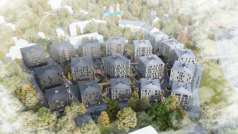
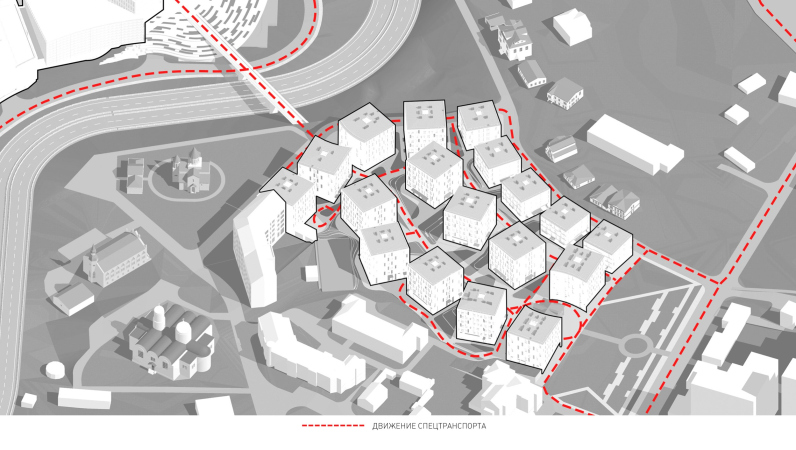
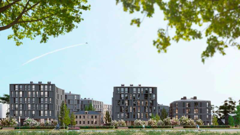
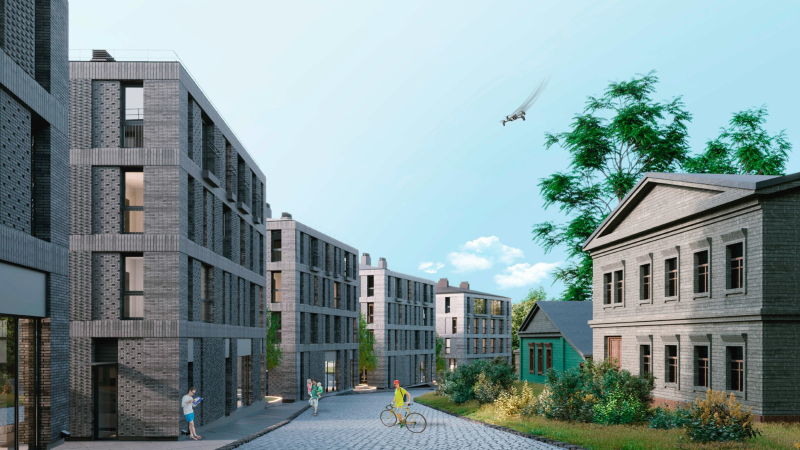
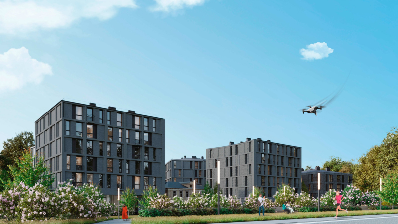
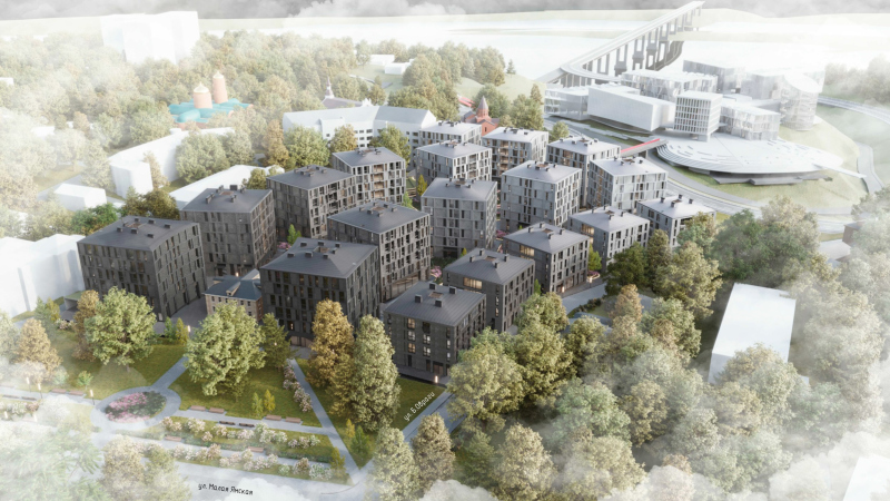
The hotels for students beyond the highway look totally different: life is quite peaceful here, and nobody is hurrying anywhere.

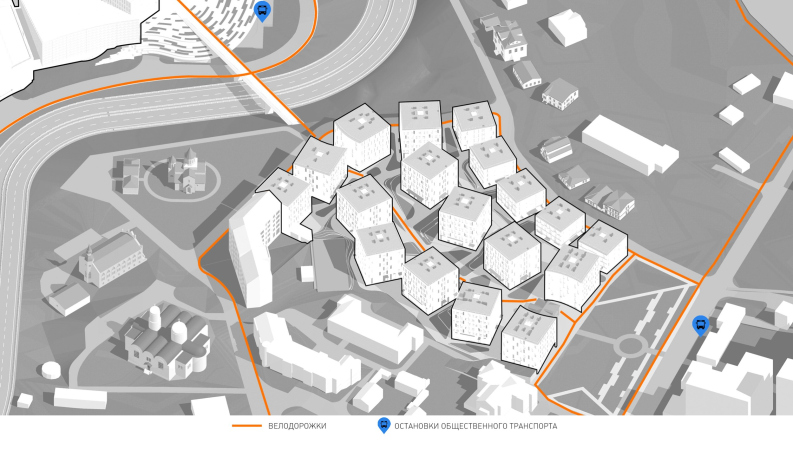
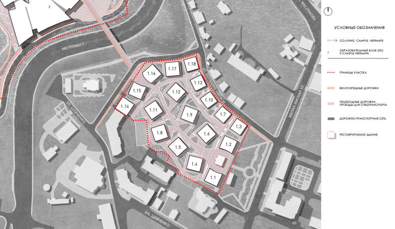
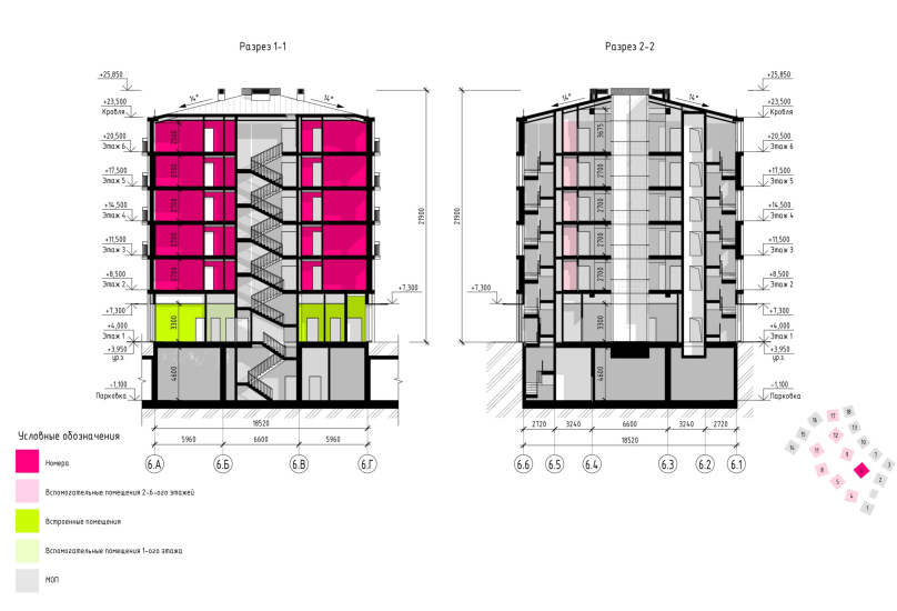
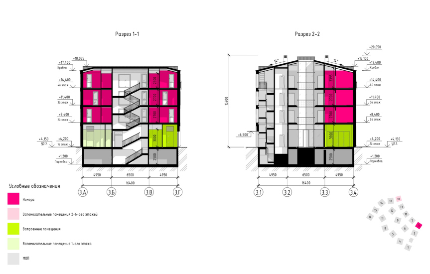
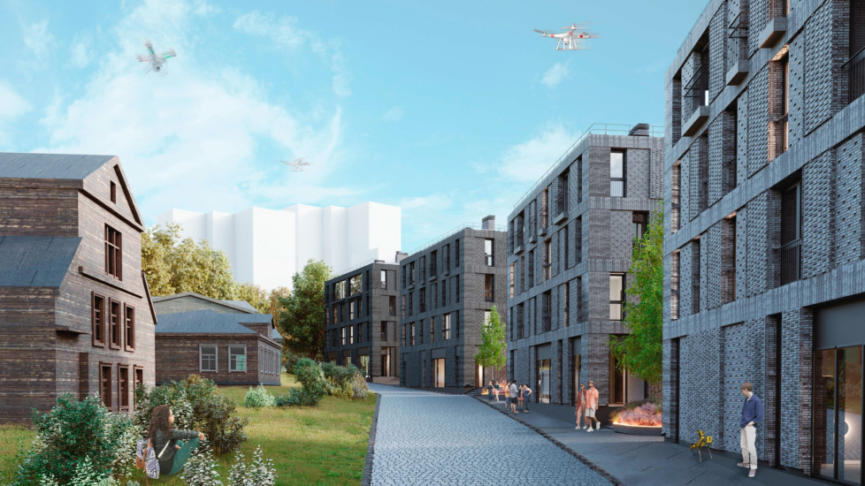
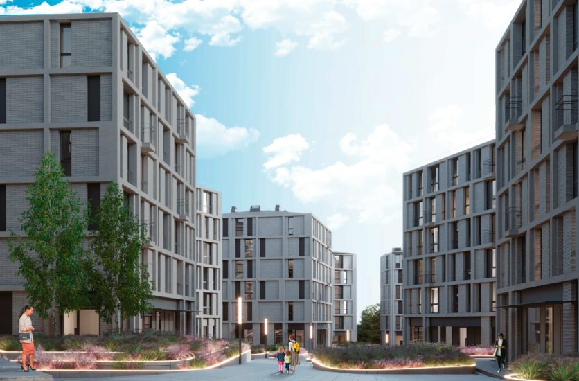
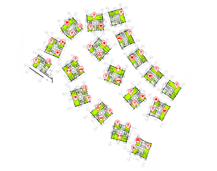
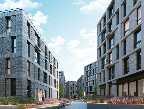
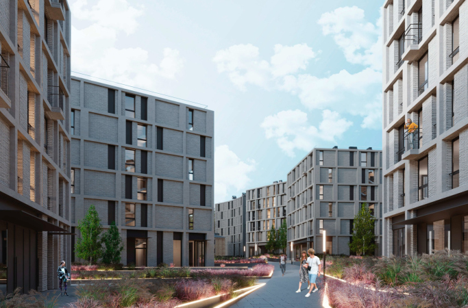
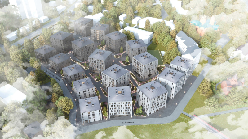
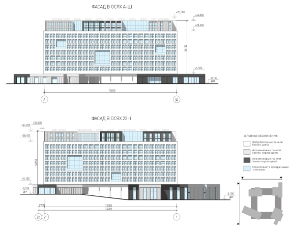
The houses, square on the plan, are positioned at a slight angle to each other: the ones that stand next to the historical 19th century houses have four floors in them, the other ones have six.

  • zooming
    1 / 8
    The academic building. IT campus Neimark in Nizhny Novgorod, Site 1
    Copyright: © Studio 44 & abmayak
  • zooming
    2 / 8
    IT campus Neimark in Nizhny Novgorod, Site 1. The hotels
    Copyright: © Studio 44 & abmayak
  • zooming
    3 / 8
    IT campus Neimark in Nizhny Novgorod, Site 1. The hotels
    Copyright: © Studio 44 & abmayak
  • zooming
    4 / 8
    IT campus Neimark in Nizhny Novgorod, Site 1. The hotels
    Copyright: © Studio 44 & abmayak
  • zooming
    5 / 8
    IT campus Neimark in Nizhny Novgorod, Site 1. The hotels
    Copyright: © Studio 44 & abmayak
  • zooming
    6 / 8
    IT campus Neimark in Nizhny Novgorod, Site 1. The hotels
    Copyright: © Studio 44 & abmayak
  • zooming
    7 / 8
    IT campus Neimark in Nizhny Novgorod, Site 1. The hotels
    Copyright: © Studio 44 & abmayak
  • zooming
    8 / 8
    IT campus Neimark in Nizhny Novgorod, Site 1. The hotels
    Copyright: © Studio 44 & abmayak


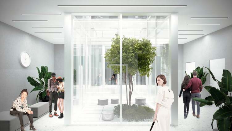
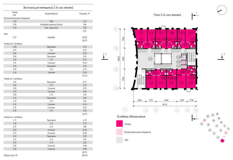
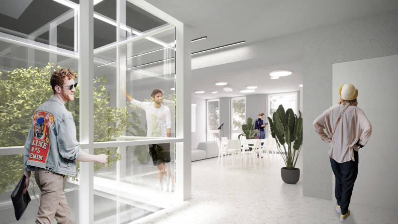
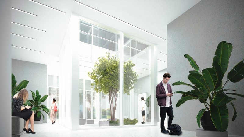
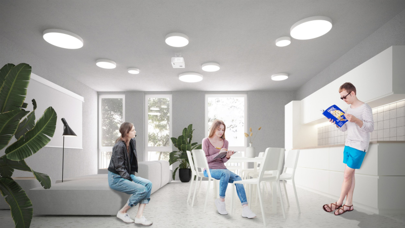
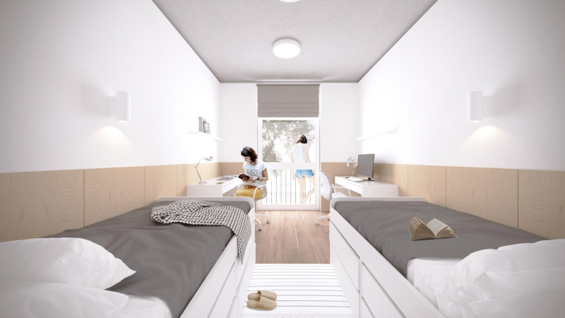
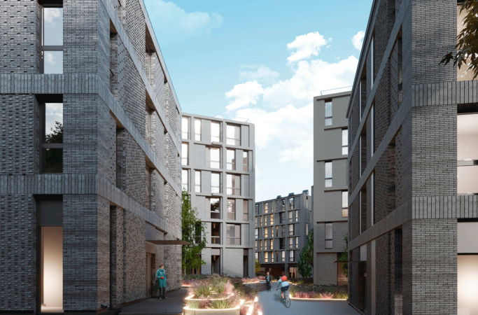
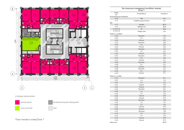
Each of the six-story houses has a capacity for about 120 people, 20 per floor. The houses are wide, almost cubic, with brick facades, looking like hobbits. The width is due to the fact that inside between the rooms there is a hallway, a place for socializing plus a co-working space for the micro-community on each floor. The halls are mostly T-shaped, sometimes longitudinal – leaving the rooms with corners, they face the facade with three or two ends, so the public spaces are well lit. In addition – while the ITMO dormitories were built around a full-fledged atrium in the center – here instead of an atrium there is a small “light well” running from top to bottom, with a skylight placed on the symmetry axis. On the first floor, you will be able to enter it, while for the rest it will serve as an additional light and compositional “rod”; it will be possible to look up and down from any point of the well.

  • zooming
    The academic building. IT campus Neimark in Nizhny Novgorod, Site 1. THe hotels
    Copyright: © Studio 44 & abmayak
  • zooming
    IT campus Neimark in Nizhny Novgorod, Site 1. The hotels
    Copyright: © Studio 44 & abmayak


The 20-person public area on a standard floor. IT campus Neimark in Nizhny Novgorod, Site 1
Copyright: © Studio 44 & abmayak


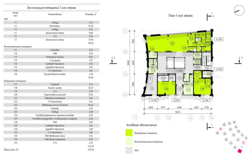
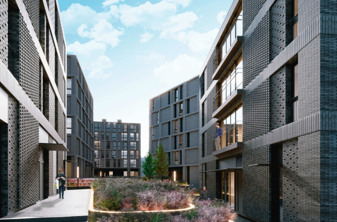
There are no residential rooms on the first floors – instead, there are cafes and stores. The historic city is very close by and the small new district inherits its principles. Here, winding narrow streets appear – curiously enough, the block layout is not used here: all the space arising between the houses is both pedestrian/urban and courtyard-like – something like the arithmetic mean between the two. The ever-present idea of soaring upwards is great and fine, but you need to have a place to rest somewhere.

  • zooming
    The hostels. IT campus Neimark in Nizhny Novgorod, Site 1
    Copyright: © Studio 44 & abmayak
  • zooming
    The hostels. IT campus Neimark in Nizhny Novgorod, Site 1
    Copyright: © Studio 44 & abmayak


  • zooming
    IT campus Neimark in Nizhny Novgorod, Site 1. THe hotels, the corner house, the standard floor
    Copyright: © Studio 44 & abmayak
  • zooming
    IT campus Neimark in Nizhny Novgorod, Site 1. The hotels, corner house, 1st floor, public spaces, and commercial areas
    Copyright: © Studio 44 & abmayak


IT campus Neimark in Nizhny Novgorod, Site 1. The hotels
Copyright: © Studio 44 & abmayak


The facades are rich in textured masonry and are delineated in a regular grid. The dark tone of the bricks echoes the color of the old wood of the old houses, and sometimes the new buildings respectfully retreat from their historical neighbors with a slight deflection of the facade. Everything is uniform and even typical, but spiced up with nuances and subtleties.

  • zooming
    1 / 14
    The hostels. IT campus Neimark in Nizhny Novgorod, Site 1
    Copyright: © Studio 44 & abmayak
  • zooming
    2 / 14
    The hostels. IT campus Neimark in Nizhny Novgorod, Site 1
    Copyright: © Studio 44 & abmayak
  • zooming
    3 / 14
    The hostels. IT campus Neimark in Nizhny Novgorod, Site 1
    Copyright: © Studio 44
  • zooming
    4 / 14
    The hostels. IT campus Neimark in Nizhny Novgorod, Site 1
    Copyright: © Studio 44 & abmayak
  • zooming
    5 / 14
    The hostels. IT campus Neimark in Nizhny Novgorod, Site 1
    Copyright: © Studio 44 & abmayak
  • zooming
    6 / 14
    The hostels. IT campus Neimark in Nizhny Novgorod, Site 1
    Copyright: © Studio 44 & abmayak
  • zooming
    7 / 14
    The hostels. IT campus Neimark in Nizhny Novgorod, Site 1
    Copyright: © Studio 44 & abmayak
  • zooming
    8 / 14
    IT campus Neimark in Nizhny Novgorod, Site 1
    Copyright: © Studio 44 & abmayak
  • zooming
    9 / 14
    The hostels. IT campus Neimark in Nizhny Novgorod, Site 1
    Copyright: © Studio 44 & abmayak
  • zooming
    10 / 14
    IT campus Neimark in Nizhny Novgorod, Site 1
    Copyright: © Studio 44 & abmayak
  • zooming
    11 / 14
    The hostels. IT campus Neimark in Nizhny Novgorod, Site 1
    Copyright: © Studio 44 & abmayak
  • zooming
    12 / 14
    IT campus Neimark in Nizhny Novgorod, Site 1
    Copyright: © Studio 44 & abmayak
  • zooming
    13 / 14
    The hostels. IT campus Neimark in Nizhny Novgorod, Site 1
    Copyright: © Studio 44 & abmayak
  • zooming
    14 / 14
    The hostels. IT campus Neimark in Nizhny Novgorod, Site 1
    Copyright: © Studio 44 & abmayak


The design process – Anton Yar-Skryabin explains – also involved architects from Elena Brilliantova’s Mayak studio. Together with Studio 44, they worked on the concept, then on the “Project” stage, and now they are getting down to the “Working Documentation” stage.

The Forum, Portico Gallery, and Tower

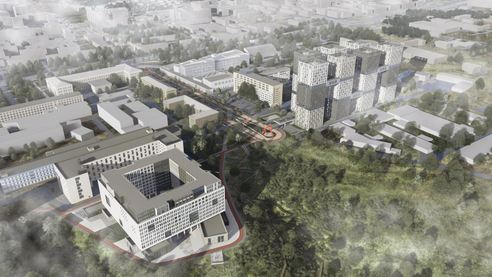
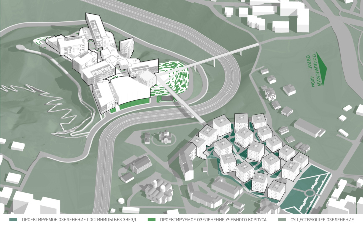
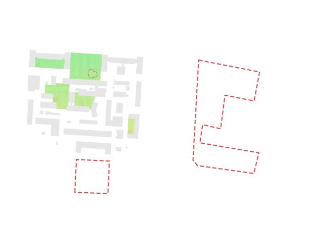
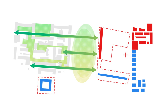
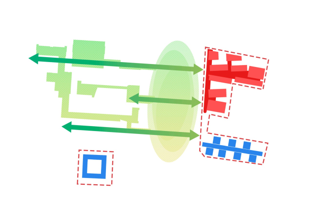
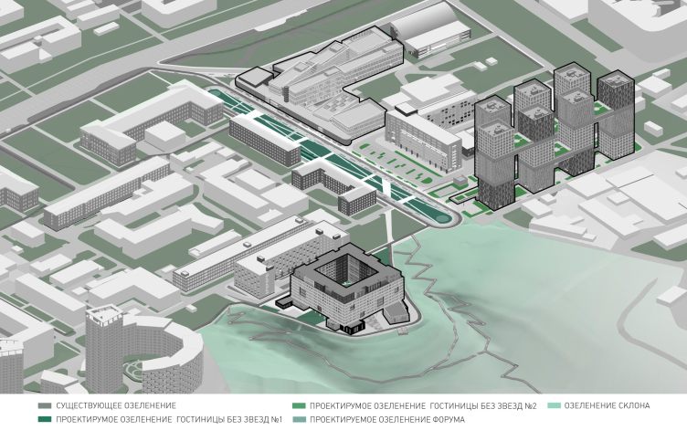
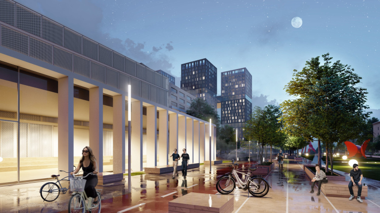
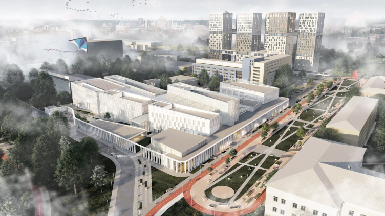
The second site, we would like to remind you, which is located to the south, adjoins the Nizhny Novgorod University, and becomes a continuation and development of its territory. Although the campus does not formally belong to it, Nizhny Novgorod University has one of the strongest IT schools in the country, and most likely, it will need the new buildings. Moreover, they will neighbor the university campus, continuing it from the west and from the south. So the architects have thought through pedestrian connections and “green prominences”, approaching the old and new territories holistically, and even “stitching” them with a new center – a pedestrian boulevard. It runs perpendicular to the city’s Gagarin Avenue, and then runs away from it towards the Oka River. In the project, it bears the telling name of Forum.

  • zooming
    1 / 7
    IT campus Neimark in Nizhny Novgorod, Site 2. The functional layout
    Copyright: © Studio 44
  • zooming
    2 / 7
    IT campus Neimark in Nizhny Novgorod, Site 1. Formation of the blocks
    Copyright: © Studio 44
  • zooming
    3 / 7
    IT campus Neimark in Nizhny Novgorod, Site 1. Formation of the blocks
    Copyright: © Studio 44
  • zooming
    4 / 7
    IT campus Neimark in Nizhny Novgorod, Site 2. Formation of the blocks
    Copyright: © Studio 44
  • zooming
    5 / 7
    IT campus Neimark in Nizhny Novgorod, Site 2. Formation of the blocks
    Copyright: © Studio 44
  • zooming
    6 / 7
    IT campus Neimark in Nizhny Novgorod, Site 2. Formation of the blocks
    Copyright: © Studio 44 & abmayak
  • zooming
    7 / 7
    IT campus Neimark in Nizhny Novgorod, Site 2. Formation of the blocks
    Copyright: © Studio 44 & abmayak


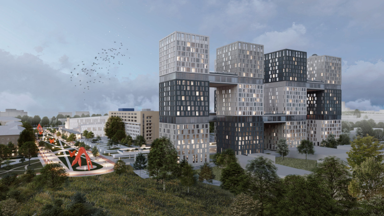
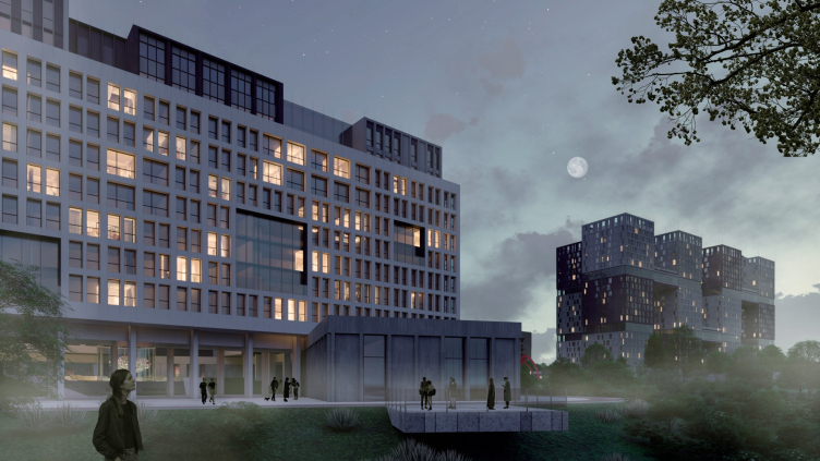
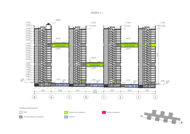
The geographical situation here is the same – two thirds of the sites face the edge of the slope – but the composition is reversed: two buildings of hotels for students rise above the mountain, while the academic part is set back into the depths. This is how a kind of castling appears: the academic building is integrated into the most “urban” part of the campus, and, while on the first site it soared over the slope “in full sale”, here it only slightly waves its “wings”, which one would like to compare to boats rocking on the waves. Meanwhile, the hotels, towers, and walls are “holding the defense” over the slope.

IT campus Neimark in Nizhny Novgorod, Site 2. The green layout
Copyright: © Studio 44


Traces of Antiquity and Middle Ages

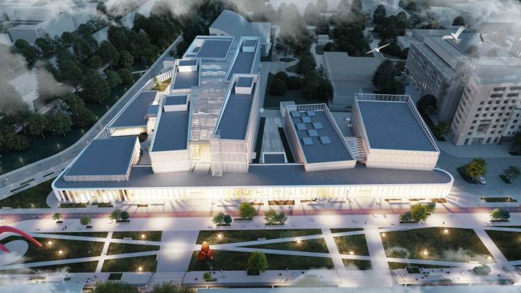
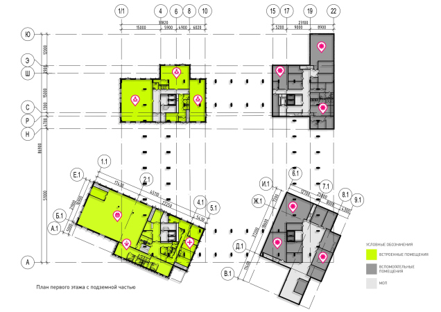
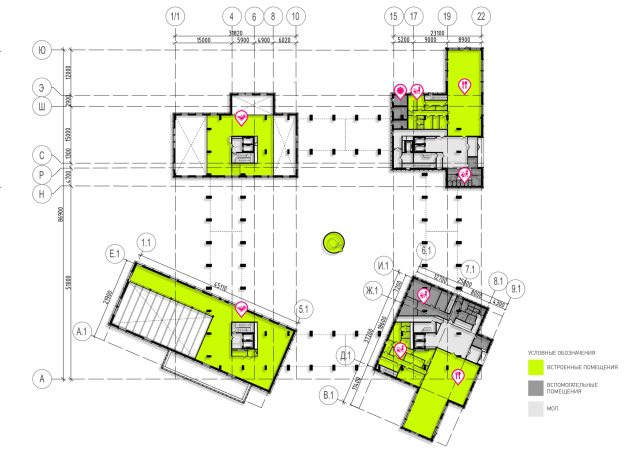
Academic building #2 includes auditoriums, offices, a large conference hall, a gym, and a swimming pool. The latter correlates with the vicinity of the already existing sports infrastructure of the Nizhny Novgorod University.

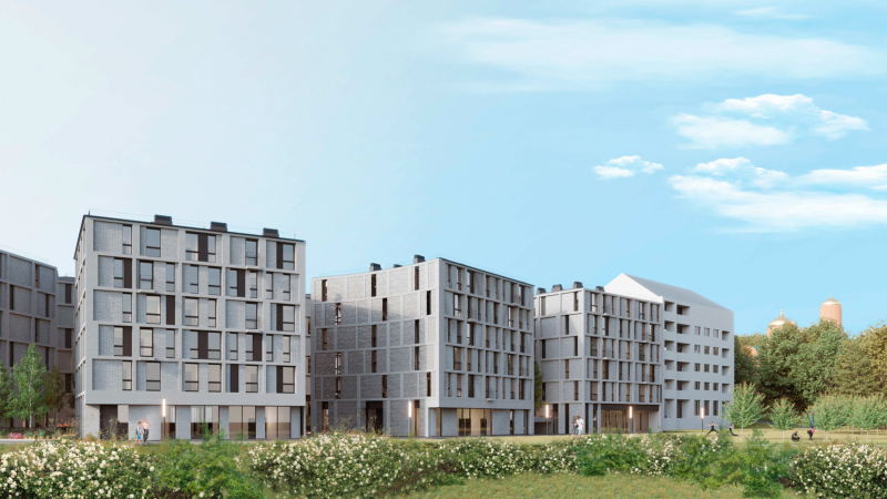
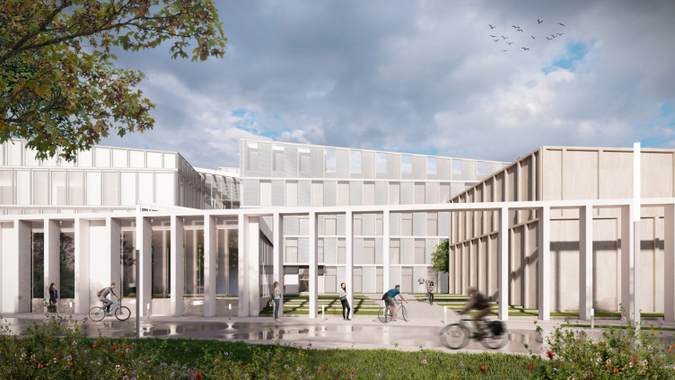
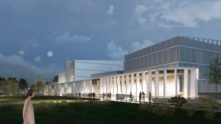
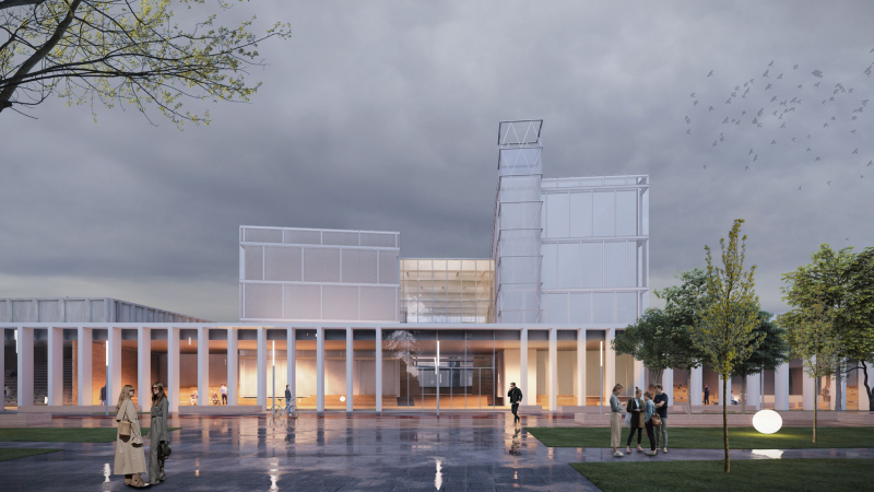
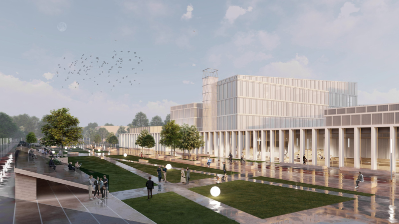
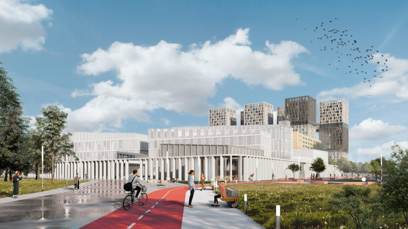
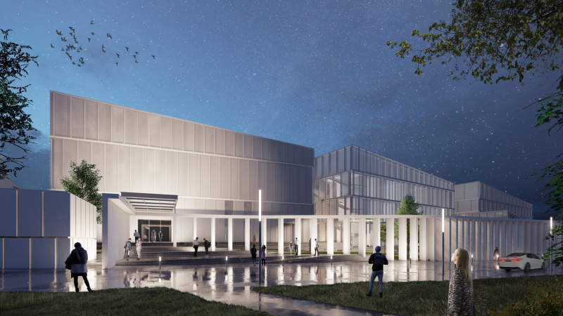
The separation and combination of buildings that perform different functions is performed in this part of the campus as consistently as in the big academic building, but the public atriums, which join the volumes, are grouped in this case not as a ring, like on the former site, but in a T-shaped way: the gallery that stretches along the “forum” boulevard, unites the “indoor” glass part and the “outdoor” white colonnade. The latter looks like an antique portico gallery, and marks the eastern border of the boulevard, justifying its image parallels to the forum of some antique city. The gallery also turns north, running along the avenue, and demonstrating to the city its stretched horizontal proportions and disciplined vertical faceting.

IT campus Neimark in Nizhny Novgorod, Site 2
Copyright: © Studio 44


All the spaces near the gallery feel regular, developed and safe. It looks as if the building, “hidden” behind the backs of the imposing, fortress-like, hotels standing on the edge of the slope, has been given the right to relax, to build around itself a kind of urban center. Or, to put it more precisely, the center of the campus. Here you would like to stroll leisurely, being engaged in a casual conversation, and, say, trying to remember where the term Peripatetics came from.

IT campus Neimark in Nizhny Novgorod, Site 2
Copyright: © Studio 44


IT campus Neimark in Nizhny Novgorod, Site 2
Copyright: © Studio 44


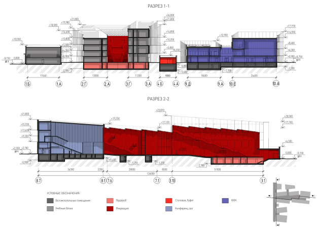
The second main public space – the “amphitheater” atrium extends inside the building transversely to the boulevard and gallery. The amphitheater is wider; it rises up in steps towards the congress center, echoing the rise of its auditorium, and it also expands in depth, creating a spatial attraction: the perspective is enhanced for looking towards the boulevard and, on the contrary, from the colonnade side the atrium seems wide and spacious – like a square.

  • zooming
    1 / 6
    IT campus Neimark in Nizhny Novgorod, Site 2. Axonometry, 1st floor
    Copyright: © Studio 44
  • zooming
    2 / 6
    IT campus Neimark in Nizhny Novgorod, Site 2. The main blocks
    Copyright: © Studio 44
  • zooming
    3 / 6
    IT campus Neimark in Nizhny Novgorod, Site 2. Axonometric drawing of the standard floor
    Copyright: © Studio 44
  • zooming
    4 / 6
    IT campus Neimark in Nizhny Novgorod, Site 2. Axonometric drawing of the 4th floor
    Copyright: © Studio 44
  • zooming
    5 / 6
    IT campus Neimark in Nizhny Novgorod, Site 2. Axonometric drawing
    Copyright: © Studio 44
  • zooming
    6 / 6
    IT campus Neimark in Nizhny Novgorod, Site 2. The administrative and academic building. Cross-section views
    Copyright: © Studio 44


A similar baroque technique of playing with perspective was used in the main atrium of ITMO, where it was also oriented towards the boulevard – not transversely, but longitudinally.
 
The plan of the academic building quite noticeably resembles a comb with a handle along the boulevard and the buildings “stuck” into it. This is one of the convenient variants of the plan, allowing the architects to rationally organize logistics, and to divide and unite functions.

IT campus Neimark in Nizhny Novgorod, Site 2
Copyright: © Studio 44


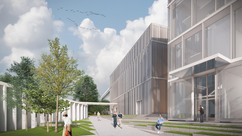
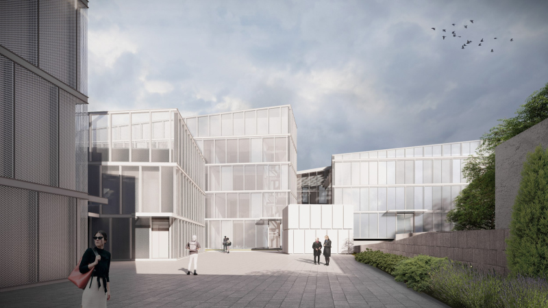
The facades of the buildings are generalized and also, as in the large educational building, light. Mesh and perforated metal prevail here, everything that glows in the evenings from within. The volumes seem to be “wrapped” in something light or even translucent and ghostly. At the same time, one can read another recognizable sign in the silhouette – the silhouette of a clock tower without a clock, which instantly, albeit fleetingly, reminds you of a medieval university.

IT campus Neimark in Nizhny Novgorod, Site 2
Copyright: © Studio 44


Towers Above the City

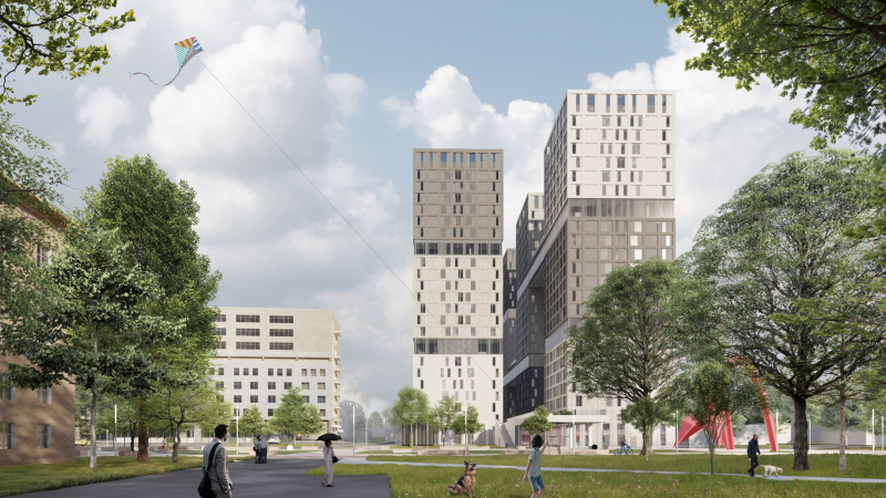
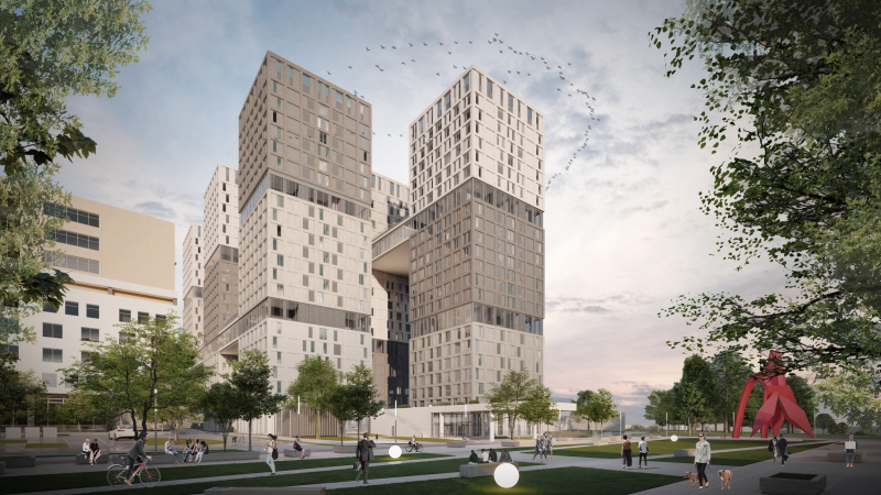
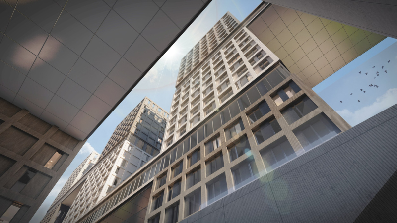
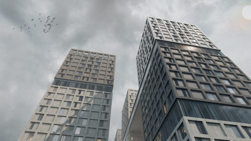
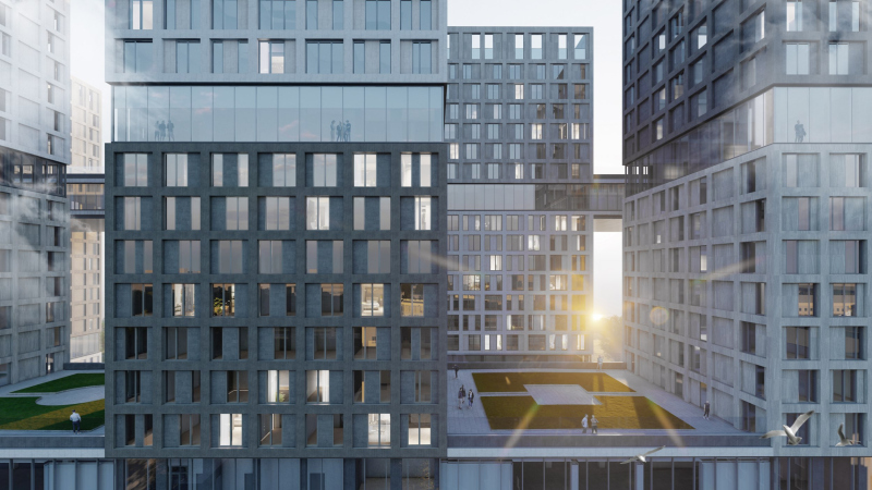
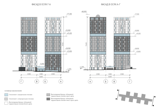
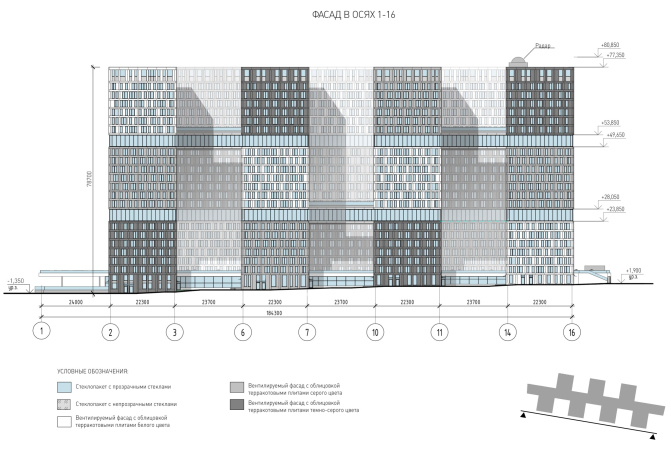
While on the first land site the architects used the hill for a takeoff and hovering, here they took a different path, and put a wall of towers at the edge of the slope. Or, rather, even two rows: en face, the towers align themselves in a continuous row, but, when viewed from an angle, they display gaps.

  • zooming
    1 / 6
    IT campus Neimark in Nizhny Novgorod, Site 2
    Copyright: © Studio 44
  • zooming
    2 / 6
    IT campus Neimark in Nizhny Novgorod, Site 2
    Copyright: © Studio 44
  • zooming
    3 / 6
    IT campus Neimark in Nizhny Novgorod, Site 2
    Copyright: © Studio 44
  • zooming
    4 / 6
    IT campus Neimark in Nizhny Novgorod, Site 2
    Copyright: © Studio 44
  • zooming
    5 / 6
    IT campus Neimark in Nizhny Novgorod, Site 2
    Copyright: © Studio 44 & abmayak
  • zooming
    6 / 6
    IT campus Neimark in Nizhny Novgorod, Site 2
    Copyright: © Studio 44 & abmayak


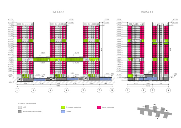
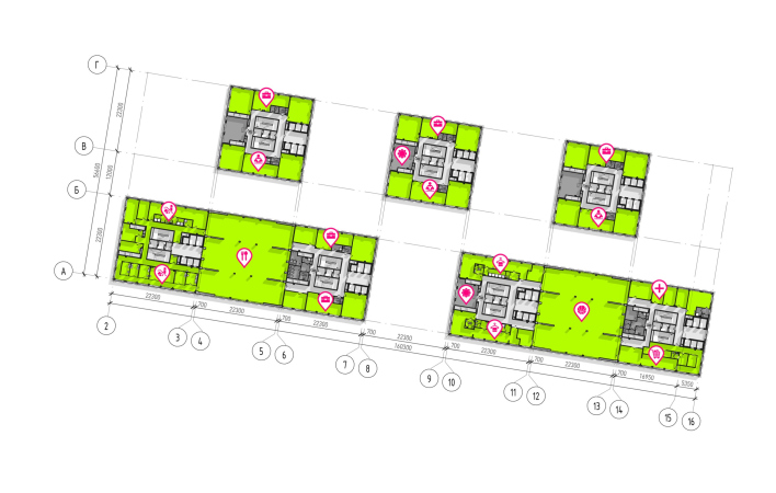
Each tower comprises three six or seven-story modular houses, whose structure is akin to that of the student hotels from the first land site, with a public space on each floor. The initial compositional module was a single floor combining rooms, a public lounge and a co-working space; assembled in cubes of several floors they created a nucleus, and now these are “put on top of each other”.

IT campus Neimark in Nizhny Novgorod, Site 2
Copyright: © Studio 44


Here, on the other hand, there are no top-to-bottom light wells, the way you would see in the mid-rise houses of the first land site. Instead, between the “block” cubes, there are inclusions of public floors, which bleed into overpasses with operated roofs, connecting the towers sometimes from the first row and sometimes from the second. It all comes together to form a mega structure – not flying but confidently presenting itself to the cityscape of Nizhny Novgorod.

  • zooming
    1 / 5
    IT campus Neimark in Nizhny Novgorod, Site 2
    Copyright: © Studio 44
  • zooming
    2 / 5
    IT campus Neimark in Nizhny Novgorod, Site 2
    Copyright: © Studio 44
  • zooming
    3 / 5
    IT campus Neimark in Nizhny Novgorod, Site 2
    Copyright: © Studio 44
  • zooming
    4 / 5
    The hostels. IT campus Neimark in Nizhny Novgorod, Site 2
    Copyright: © Studio 44
  • zooming
    5 / 5
    IT campus Neimark in Nizhny Novgorod, Site 2
    Copyright: © Studio 44


This megastructure also has its prototypes, from the Fortress of Basil the 3rd (we are on the Kremlin side of the city, after all!) to the brick “Brezhnev-era” houses that appeared over the Oka in the 1980’s. But then again, there is an even closer example, the campus’s neighbor on the slope – the “Marshal Grad” housing complex, which consists of circular houses and towers of approximately the same height.

The Cloister

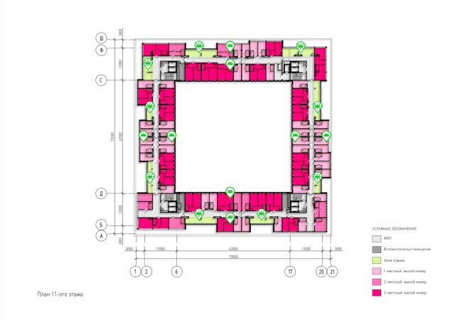
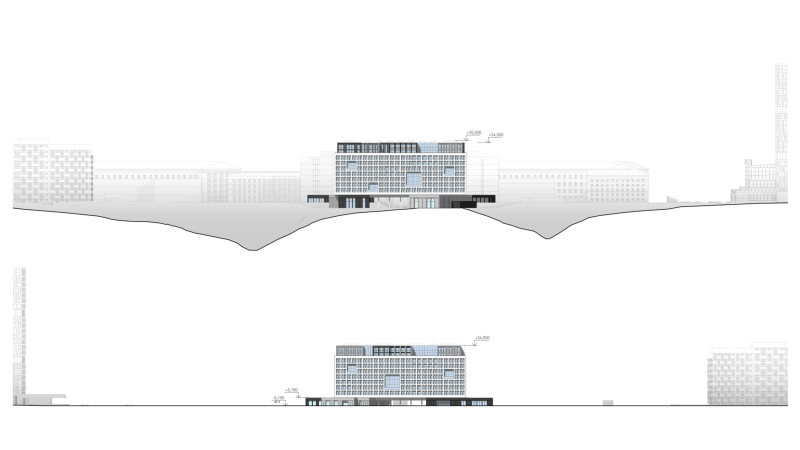
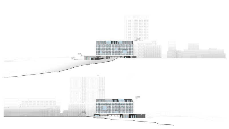
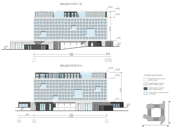
The third format of the student hotel is a house with a square courtyard – also on the edge of the slope – is situated closer to the north side and next to the University’s already existing dormitories.

You get a feeling that in the IT campus project the architects set for themselves a task to clearly mark a few different typologies of residential buildings: on the first site, the cubic modules are distributed over the site like a mini-city, on the second site they are assembled to form “tower” walls, and the third version of student hotel presents, as it seems to me, a hybrid of the academic building from Site 1 and Convent Sainte-Marie de La Tourette that Nikita Yavein mentioned.

  • zooming
    1 / 10
    IT campus Neimark in Nizhny Novgorod, Site 2. THe hotel. Section view 2-2
    Copyright: © Studio 44
  • zooming
    2 / 10
    IT campus Neimark in Nizhny Novgorod, Site 2. The hotel. Cross-section view 1-1
    Copyright: © Studio 44
  • zooming
    3 / 10
    IT campus Neimark in Nizhny Novgorod, Site 2. The hotel and the parking lot
    Copyright: © Studio 44 & abmayak
  • zooming
    4 / 10
    IT campus Neimark in Nizhny Novgorod, Site 2. The hotel. Plan of the 1st floor
    Copyright: © Studio 44 & abmayak
  • zooming
    5 / 10
    IT campus Neimark in Nizhny Novgorod, Site 2. The hotel
    Copyright: © Studio 44
  • zooming
    6 / 10
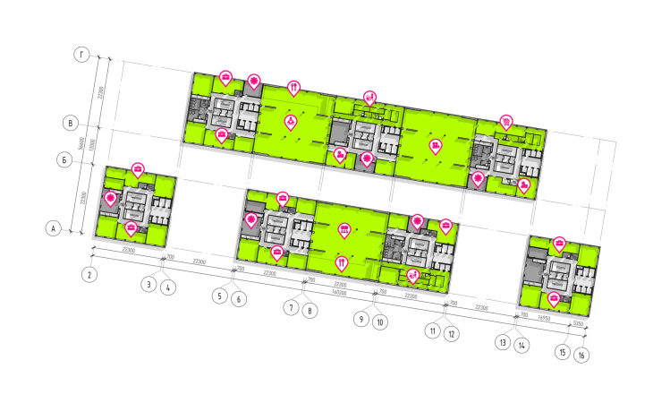
    IT campus Neimark in Nizhny Novgorod, Site 2. The hotel. Plan of the 8th floor
    Copyright: © Studio 44 & abmayak
  • zooming
    7 / 10
    IT campus Neimark in Nizhny Novgorod, Site 2. The hotel. Plan of the 16th floor
    Copyright: © Studio 44 & abmayak
  • zooming
    8 / 10
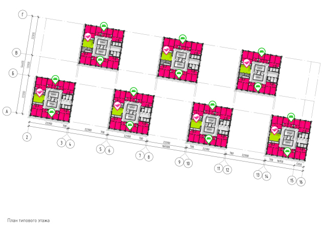
    IT campus Neimark in Nizhny Novgorod, Site 2. The hotel. Plan of the standard floor
    Copyright: © Studio 44
  • zooming
    9 / 10
    IT campus Neimark in Nizhny Novgorod, Site 2. The hotel
    Copyright: © Studio 44
  • zooming
    10 / 10
    IT campus Neimark in Nizhny Novgorod, Site 2. The hotel
    Copyright: © Studio 44


IT campus Neimark in Nizhny Novgorod, Site 2
Copyright: © Studio 44


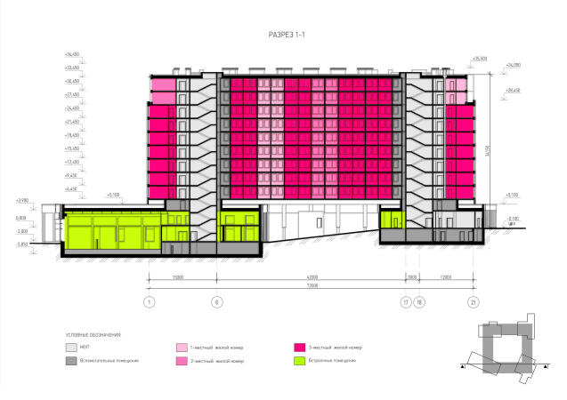
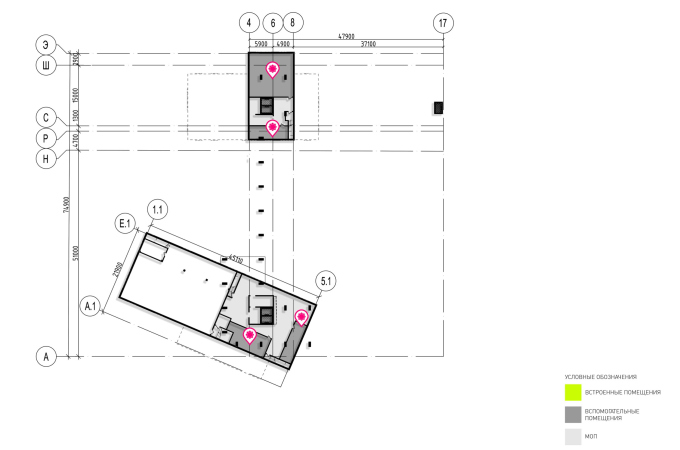
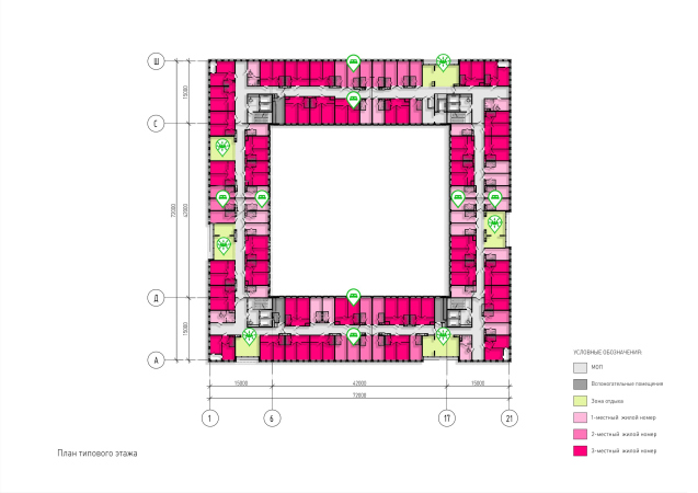
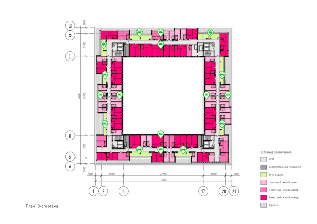
Strictly square on the plan, the 11-story building is elevated one tier above the ground – it rests on asymmetrical volumes of public premises that are tucked underneath it like children’s blocks, with a certain share of liberty. The entrances to the yard are designed as spacious colonnades – the yard must be well-aired – yet at the same time it is as closed as a cloister, and as grand and geometric as the Corbusier convent. The system inside is strictly of the corridor type, but each corridor, as was often done in modernist hotels, has a window at one end, which gives daylight and provides city and river views, allowing to avoid a feeling of a contained space. In addition, public “living rooms” and coworking spaces are integrated into each floor; they also adjoin the light front and are equipped with terraces, especially wide on the upper floors, where the attic recedes into the depths.

IT campus Neimark in Nizhny Novgorod, Site 2
Copyright: © Studio 44
***

Thus, it is likely that the left bank of the Oka River in Nizhny Novgorod will soon be transformed and will receive several completely different, but masterfully arranged accents: I wonder how the two parts of the “distributed” or “spread-out” campus will be perceived in the perspective – after all, there is a straight line a kilometer and a half long between them – but it is obvious that there will be some kind of interaction between them because the proposed statements are very accentuated. However, as is always the case with Studio 44, it’s hard to remember a time when their architecture made a statement that went unnoticed.

In the IT campus project, apart from the obvious mega-task and complex structure, it is interesting how the architects’ considerable experience in designing large educational complexes is transformed based on the task and peculiarities of the city. Buildings with different functions, situated at a considerable distance from each other, nevertheless form an ensemble – sometimes this happens thanks to the proposed module: “cubes” or “blocks” of hotels and dormitories are put together in one way, then in another way, and an internal connection emerges between them; sometimes it is achieved through compositional “castling”. In one case, the academic building is brought forward as a kind of forward figure, like Nika of Samothrace, in another case it is hidden behind the “walls” of megalithic hotels and is calm and floating in an urban way. In short, there’s plenty to observe and admire. The campus has adapted well to both its university and the city.
  • zooming
    1 / 11
    IT campus Neimark in Nizhny Novgorod, Site 2. THe hotel. Section view
  • zooming
    2 / 11
    IT campus Neimark in Nizhny Novgorod, Site 2. The hotel. Plan of the -2nd floor
    Copyright: © Studio 44
  • zooming
    3 / 11
    IT campus Neimark in Nizhny Novgorod, Site 2. The hotel. Plan of the -1st floor
    Copyright: © Studio 44 & abmayak
  • zooming
    4 / 11
    IT campus Neimark in Nizhny Novgorod, Site 2. The hotel. Plan of the 1st floor
    Copyright: © Studio 44
  • zooming
    5 / 11
    IT campus Neimark in Nizhny Novgorod, Site 2. The hotel. Plan of the standard floor
    Copyright: © Studio 44
  • zooming
    6 / 11
    IT campus Neimark in Nizhny Novgorod, Site 2. The hotel. Plan of the 11th floor
    Copyright: © Studio 44 & abmayak
  • zooming
    7 / 11
    IT campus Neimark in Nizhny Novgorod, Site 2. The hotel. Plan of the 11th floor
    Copyright: © Studio 44 & abmayak
  • zooming
    8 / 11
    IT campus Neimark in Nizhny Novgorod, Site 2. The hotel
    Copyright: © Studio 44 & abmayak
  • zooming
    9 / 11
    IT campus Neimark in Nizhny Novgorod, Site 2. The hotel
    Copyright: © Studio 44 & abmayak
  • zooming
    10 / 11
    IT campus Neimark in Nizhny Novgorod, Site 2. The hotel
    Copyright: © Studio 44
  • zooming
    11 / 11
    IT campus Neimark in Nizhny Novgorod, Site 2. The hotel
    Copyright: © Studio 44


09 August 2023

Headlines now
Gold in the Sands
A new office for a transcontinental company specializing in resource extraction and processing has opened in Dubai. Designed by T+T Architects, masters of creating spaces that are contemporary, diverse, flexible, and original, this project exemplifies their expertise. On the executive floor, a massive brass-clad partition dominates, while layered textures of compressed earth create a contextually resonant backdrop.
Layers and Levels of Flight
This project goes way back – Reserve Union won this architectural competition at the end of 2011, and the building was completed in 2018, so it’s practically “archival”. However, despite being relatively unknown, the building can hardly be considered “dated” and remains a prime example of architectural expression, particularly in the headquarters genre. And it’s especially fitting for an aviation company office. In some ways, it resembles the Aeroflot headquarters at Sheremetyevo but with its own unique identity, following the signature style of Vladimir Plotkin. In this article, we take an in-depth look at the United Aircraft Corporation (UAC) headquarters in the Moscow agglomeration town of Zhukovsky, supplemented by recent photographs from Alexey Naroditsky – a shoot that became only recently possible due to the fact that improvements were finally made in the surrounding area.
Light and Shadow
In this article, we delve into the architectural design of the “Chaika” house by DNK ag architects, which was recently completed in 2023 as part of the collection of signature designs at ZILArt. As is well-known, all the buildings in this complex follow a design code, yet each one is distinct. This particular building stands out not only for its whiteness and minimalism but also for the refined use of a limited number of techniques that, together, create what can confidently be called synergy.
Casus Novae
A master plan was developed for a large residential area with a name of “DNS City”, but now that its implementation began, the plan has been arbitrarily reformatted and replaced with something that, while similar on the surface, is actually quite different. This is not the first time such a thing happens, but it’s always frustrating. With permission from the author, we are sharing Maria Elkina’s post.
Treasure Hunting
The GAFA bureau, in collaboration with Tegola and Arkhitail, organized an expedition to the island of Kilpola in Karelia as part of Moskomarkhitektura’s “Open City” festival. There, amidst moss and rocks, the students sought answers to questions like: what is the sacred, where does it dwell, and what sustains it? Assisting the participants in this quest were landscape engineer Evgeny Levin, artist Nicholas Roerich, a moose, and the lack of cellular connection. Here’s how the story unfolded.
Depths of the Earth, Streams of Water
In the Malaya Okhta district, the Akzent building, designed by Stepan Liphart, was constructed. It follows a classic tripartite structure, yet it’s what you might call “hand-drawn”: each façade is unique in its form and details, some of which aren’t immediately noticeable. In this article, we explore the context and, together with the architect, delve into how the form was developed.
Fir Tree Dynamics
The “Airports of Region” holding is planning to build an airport in Karachay-Cherkessia, aiming to make the Arkhyz and Dombay resorts more accessible to travelers. The project that won in an invitation-only competition, submitted by Sergey Nikeshkin’s KPLN, blends natural imagery inspired by the shape of a conifer seed, open-air waiting spaces, majestic large trees, and a green roof elevated on needle-like columns. The result is both nature-inspired and WOW.
​A Brick Shell
In the process of designing a clubhouse situated among pine trees in a prestigious suburban area near Moscow, the architectural firm “A.Len” did the façade design part. The combination of different types of brick and masonry correlates with the volumetric and plastique solutions, further enhanced by the inclusion of wood-painted fragments and metal “glazing”.
Word Forms
ATRIUM architects love ambitious challenges, and for the firm’s thirtieth anniversary, they boldly play a game of words with an exhibition that dives deep into a self-created vocabulary. They immerse their projects – especially art installations – into this glossary, as if plunging into a current of their own. You feel as if you’re flowing through the veins of pure art, immersed in a universe of vertical cities, educational spaces – of which the architects are true masters – and the cultural codes of various locations. But what truly captivates is the bold statement that Vera Butko and Anton Nadtochy make, both through their work and this exhibition: architecture, above all, is art – the art of working with form and space.
Flexibility and Acuteness of Modernity
Luxurious, fluid, large “kokoshniks” and spiral barrel columns, as if made from colorful chewing gum: there seem to be no other mansion like this in Moscow, designed in the “Neo-Russian-Modern” style. And the “Teremok” on Malaya Kaluzhskaya, previously somewhat obscure, has “come alive with new colors” and gained visibility after its restoration for the office of the “architectural ecosystem” as the architects love to call themselves. It’s evident that Julius Borisov and the architects at UNK put their hearts into finding this new office and bringing it up to date. Let’s delve into the paradoxes of this mansion’s history and its plasticity. Spoiler: two versions of modernity meet here, both balancing on the razor’s edge of “what’s current”.
Yuri Vissarionov: “A modular house does not belong to the land”
It belongs to space, or to the air... It turns out that 3D printing is more effective when combined with a modular approach: the house is built in a workshop and then adapted to the site, including on uneven terrain. Yuri Vissarionov shares his latest experience in designing tourist complexes, both in central Russia and in the south. These include houseboats, homes printed from lightweight concrete using a 3D printer, and, of course, frame houses.
​Moscow’s First
“The quality of education largely depends on the quality of the educational environment”. This principle of the last decade has been realized by Sergey Skuratov in the project for the First Moscow Gymnasium on Rostovskaya Embankment in the Khamovniki district. The building seamlessly integrates into the complex urban landscape, responding both to the pedestrian flow of the city and the quiet alleyways. It skillfully takes advantage of the height differences and aligns with modern trends in educational space design. Let’s take a closer look.
Looking at the Water
The site of Villa Sonata stretches from the road to the water’s edge, offering its own shoreline, pier, and a picturesque river panorama. To reveal these sweeping views, Roman Leonidov “cut” the façade diagonally parallel to the river, thus getting two main axes for the house and, consequently, “two heads”. The internal core – two double-height spaces, a living room and a conservatory, with a “bridge” above them – makes the house both “transparent” and filled with light.
The White Wing
Well, it’s not exactly white. It’s more of a beige, white-stone structure that plays with the color of limestone – smoother surfaces are lighter, while rougher ones are darker. This wing unites various elements: it absorbs and interprets the surrounding themes. It responds to everything, yet maintains a cohesive expression – a challenging task! – while also incorporating recognizable features of its own, such as the dynamic cuts at the bottom, top, and middle.
Urban Dunes
The XSA Ramps team designed and built a three-part sports hub for a park in Rostov-on-Don, welcoming people of all ages and fitness levels. The skate plaza, pump track, and playground are all meticulously crafted with details that attract a diverse range of visitors. The technical execution of the shapes and slopes transforms this space into a kind of sculptural composition.
Proportional Growth
The project for the fourth phase of the ÁLIA residential area has been announced. The buildings are situated on an elongated plot – almost a “ray” that shoots out from the center of the area towards the river. Their layout reflects both a response to Moscow’s architectural preferences over the past 15 years, shifting “from blocks to towers”, and an interpretation of the neighboring business park designed by SOM. Additionally, the best apartments here are not located at the very top but closer to the middle, forming a glowing “waistline”.
The “Staircase” Building
In designing the “Details” residential complex in New Moscow, Rais Baishev spiced up the now-popular Moscow theme of a “courtyard” building with an idea drawn from the surrealist drawings by Maurits Escher. He envisioned the stepped silhouettes and descending slopes as a metaphysical mega-staircase, creating a key void within the courtyard that gave the project an internal “spine”. This concept is felt both in the building’s silhouette and on its façades.
Projection of the Quarter
No one doubted that the building that Vladimir Plotkin designed as part of the “Garden Quarters” would be the most modernist of all. And it turned out just that way: while adhering to the common design code, the building successfully combines brick and white stone, rhythmically responding to the neighboring building designed by Ostozhenka, yet tactfully and persistently making a few statements of its own. This includes the projection of the ideal urban development composition “14–9–6”, which can be found right next door, mathematical calculations, including those for various types of terraces (and perhaps the only reminder of the Soviet past of the Kauchuk rubber factory!), and the white “cross-stitch” pattern of the façade grid.
Domus Aurea
In this issue, we examine the “Tessinsky-1” house, designed by Sergey Skuratov and completed in 2023. Located in the middle of the Serebryanicheskaya Embankment district, at the intersection of its main streets, this house assumes a sort of “nodal” role: it not only responds to everything around it and preserves many memories of the former EMA factory within itself, but it weaves all this into a newly directed pattern, reconciling bright “gold” and dark-colored brick, largely with the help of the new, modern-yet-archaic Columba brick, which, come to think about it, is the most precious element here.
The Chimney of Nikola-Lenivets
In this issue, we are examining the “Obelisk House” designed by KATARSIS and built for the Arkhstoyanie 2023 festival. However, it was only finished later on, and this is why we are examining it now. It seems to us that after the “Obelisk House” appeared in Nikola-Lenivets, a dialogue and a few inner connections appeared between the temporary structures built here. These houses no longer look like “accidental neighbors”, more of which below.
​Periscope by the Bay
The jury awarded the second place in the competition for a public and cultural center in Petropavlovsk-Kamchatsky to the companies GORA (“Mountain”) and M4. In the consortium’s proposal, the building resembles a sperm whale with a calf swimming next to it or a periscope, whose lenses capture the most spectacular views from the surrounding landscape.
From Arcs to Dolmens
While working on the competition project for Petropavlovsk-Kamchatsky, ASADOV Architects prioritized the value of the natural and urban environment, aiming to preserve the balance of the location while minimizing the resemblance of the volume that they designed to a “traditional building”. The task was challenging, and the architects created three versions, one of which having been developed after the competition, where their main proposal took third place. However, the point of interest here is not the competition result but the continuity of creative thinking.
Hide and Seek
The ID Moskovskiy house, designed by Stepan Liphart in St. Petersburg, in the courtyards near Moskovskiy Avenue beyond the Obvodny Canal and recently completed, is notable for several reasons. Firstly, it has been realized with considerable accuracy, which is particularly significant as this is the first building where the architect was responsible not only for the facades but also for the layouts, allowing for better integration between the two. On the other hand, this building is interesting as an example of the “germination” of new architecture in the city: it draws on the best examples from the neighborhood and becomes an improved and developed sum of ideas found by the architect in the surrounding context.
The Big Twelve
Yesterday, the winners of the Moscow Mayor’s Architecture Award were announced and honored. Let’s take a look at what was awarded and, in some cases, even critique this esteemed award. After all, there is always room for improvement, right?
Above the Golden Horn
The residential complex “Philosophy” designed by T+T architects in Vladivostok, is one of the new projects in the “Golubinaya Pad” area, changing its development philosophy (pun intended) from single houses to a comprehensive approach. The buildings are organized along public streets, varying in height and format, with one house even executed in gallery typology, featuring a cantilever leaning on an art object.
Nuanced Alternative
How can you rhyme a square and space? Easily! But to do so, you need to rhyme everything you can possibly think of: weave everything together, like in a tensegrity structure, and find your own optics too. The new exhibition at GES-2 does just that, offering its visitor a new perspective on the history of art spanning 150 years, infused with the hope for endless multiplicity of worlds and art histories. Read on to see how this is achieved and how the exhibition design by Evgeny Ace contributes to it.
Blinds for Ice
An ice arena has been constructed in Domodedovo based on a project by Yuri Vissarionov Architects. To prevent the long façade, a technical requirement for winter sports facilities, from appearing monotonous, the architects proposed the use of suspended structures with multidirectional slats. This design protects the ice from direct sunlight while giving the wall texture and detail.
Frozen Magma
A competition for the creation of a public and cultural center was held in Petropavlovsk-Kamchatsky. Three architectural companies made it to the final, and we consider it important to share about the work of each. Let’s start with the winner – the consortium led by Wowhaus.
Campus within a Day
In this article, we talk about what the participants of Genplan Institute of Moscow’s hackathon were doing at the MosComArchitecture booth at the “ArchMoscow” exhibition. We also discuss who won the prize and why, and what can be done with the territory of a small university on the outskirts of Moscow.
Vertical Civilization
Genpro considered the development of the vertical city concept and made it the theme of their pavilion at the “ArchMoscow” exhibition.