По-русски

A Ringlet Bridge

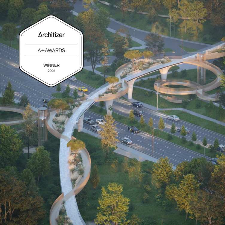
The project of a pedestrian bridge, proposed by the architectural company ATRIUM, headed by Vera Butko and Anton Nadtochiy, for the city of Almaty, Kazakhstan, became the winner of the A+A Awards organized by the Architizer portal in the “Unbuilt Transportation” nomination. The bridge is indeed a stunner: a “hanging garden” in concrete tubs of columns, suspended over a city highway, is fitted with ringlets of wooden ramps, which in the bridge’s key point form an element of national ornament.

24 June 2022
News
mainImg
Firm:
ATRIUM
Object:
Pedestrian green bridge in Almaty
Kazakhstan, Almaty

Project Team:
Anton Nadtochiy, Vera Butko, Petr Alimov, Polina Yavna, Roman Khorev, Anna Vorobieva, Rashid Gilfanov, Olga Kozak,Adel Khakimullin, Ivan Khripkov, Natalya Khlopenkova

2021 — 12.2021

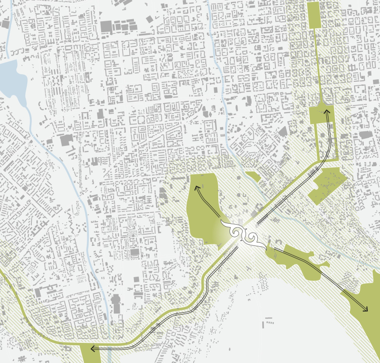
The city of Almaty occupies a large territory; its southwest part is essentially foothills, and, hence, is only partially developed – mostly with clusters of country homes and getaways. One of them is called “Kurortnoe” (“Resort”), and is situated next to the Sunkar skiing area. The actual city territory is separated from these leisure and sports grounds by the Al-Farabi Avenue that is part of the ring road of the southeast part of Almaty: this is a rather busy highway with three lanes of traffic on each side. Making overland pedestrian crossings on such highways is not the best idea. On the opposite side of the avenue, inside the central part of the city, there is the Botanical Garden, one of Almaty’s biggest parks.

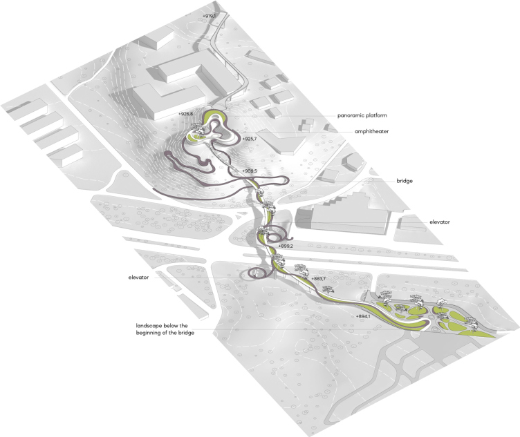
The location plan. The green pedestrian bridge in Almaty
Copyright: © ATRIUM


In order to connect the two recreational zones, the ATRIUM architects were commissioned in the past 2021 with a project of a flyover pedestrian bridge. Currently, it is still on paper, but the probability of it being built in the future does exist. 

The typology of such bridges, as a rule, is rather well-known and habitual: these are metal-and-plastic things, rarely livened up by the fantasy of a designer, much less an architect.

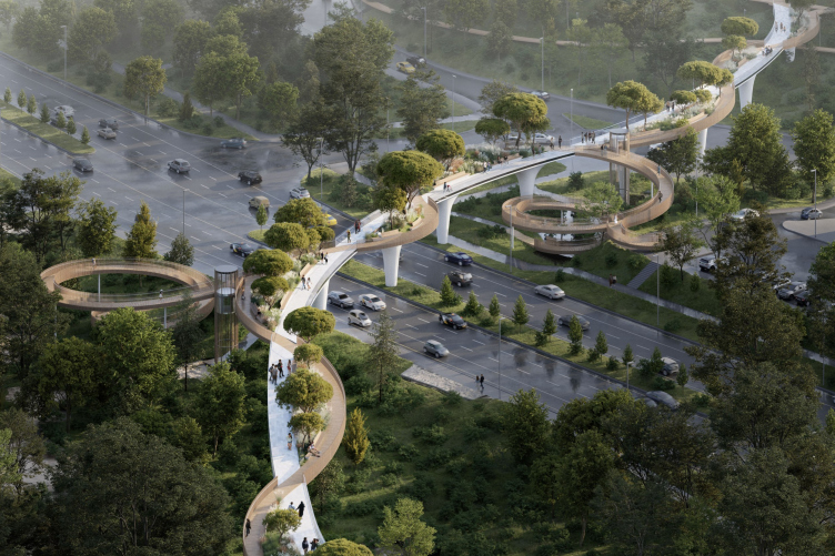
The bridge designed by ATRIUM is quite a different matter, however, and more than just a technical facility built over a highway. First, it is roofless, and it has trees and grass growing upon it; second, it is large, elongated, and integrated into the landscape – essentially, these are two bridges, interwoven with one another: one is almost straight, and the other is very winding and consists of ramps with a 5-degree tilt.

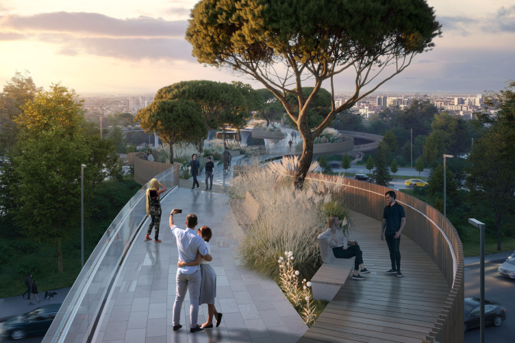
Rather, it is not even a bridge but a park tourist attraction or even a mini-park. The well-known High Line Park and other famous modern artificial city parks come to mind, which allow the pedestrians to enjoy more green views than on average. In this specific case, however, one will be able to walk over a hanging park, admiring both the greenery and the stream of cars speeding by.

The green pedestrian bridge in Almaty
Copyright: © ATRIUM


The green pedestrian bridge in Almaty
Copyright: © ATRIUM


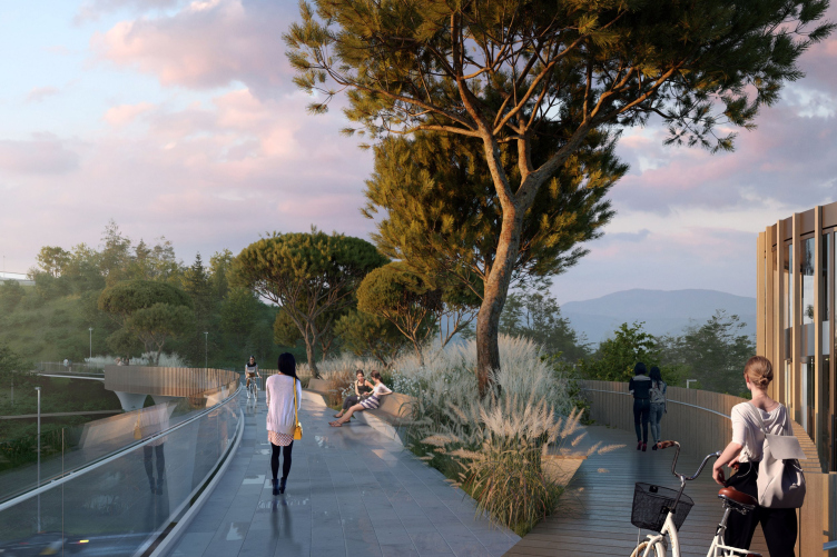
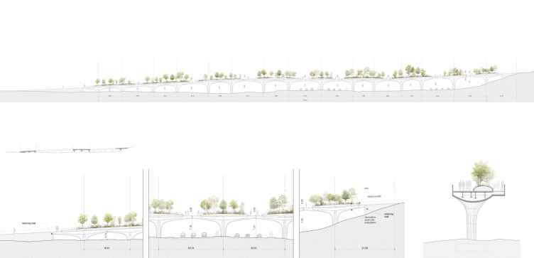
And, third, this sculpture of a bridge is simply beautiful. It is obvious enough that this project develops the ideas that can be seen in the project of the bridge running over the “Green River” park in the “Symbol” housing complex that the architects have been designing and building for years now, since 2011. It is just as obvious that this project is very much in the vein of modern trends – you cannot help but recall the Little Island Park next to Pier 55 designed by Thomas Heatherwick. The concrete “trees” that carry real trees are a very appropriate idea for a modern city: it is brave, paradoxical, and doable at the same time because the giant cachepots can contain a volume of soil sufficient for a root system of any (or almost any) tree. The drivers, cruising down the ring road, will have particularly many things to be amazed at, should the project ever come to fruition.

The green pedestrian bridge in Almaty
Copyright: © ATRIUM


The green pedestrian bridge in Almaty
Copyright: © ATRIUM


Section views. The green pedestrian bridge in Almaty
Copyright: © ATRIUM


The two main points of entrance to the bridge are also designed as mini-parks. In the Botanical Garden from the “city” side, the bridge leads to a “Fish Pond”, a flat and rather large plaza. On the opposite “mountain resort” side, in the fork between the Remizovka and Kapparova streets, there is a hill, its topmost point being 130 higher, but with a “saddle” depression in the middle. Here, in the depression, the architects place an amphitheater and a plaza with an exit in the direction of the slopes, as well as an overpass and a viewing platform on top of the hill. On the outer side of the hill, there is a winding path for those who prefer to walk on foot. This way, the architects emphasize, all the solutions are inscribed into the landscape; they are based on its features, and, hence, do not require any considerable excavation work, and are cost-effective.

Axonometric view. The green pedestrian bridge in Almaty
Copyright: © ATRIUM


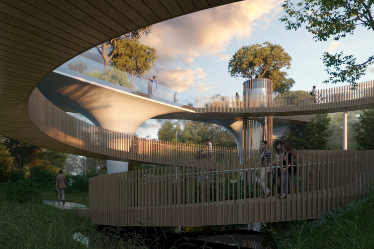
The two paths – the concrete bridge itself and the wooden ramp that accompanies it throughout its entire length – are superimposed like the stem and ringlets of a floral ornament. They are complemented by verticals of the circular elevator chutes, and the differences between the two paths are deliberately accentuated: the “straight” concrete part is equipped with glass barriers, and the winding part is fully wooden; the intertwining of the two structures can be both felt and traced from different vantage points.

The green pedestrian bridge in Almaty
Copyright: © ATRIUM


The green pedestrian bridge in Almaty
Copyright: © ATRIUM


The green pedestrian bridge in Almaty
Copyright: © ATRIUM


The green pedestrian bridge in Almaty
Copyright: © ATRIUM


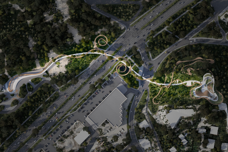
If you look at the winding plan of the bridge – particularly its central part hanging above the highway, where the ringlets of the ramps take a distinctly spiral shape – you can easily see the prototypes of the national decoration ornament, some sort of a meander. “The national ornaments are also used in the parametric patterns of the columns, backlit at night” – the architects specify. Meanwhile, we will emphasize that the traditional motifs are not just superimposed or used as a sign of the presence of the theme but are interpreted in a very modern way, inscribed into some flowing pattern and are functionally justified: the ringlets appear only in the spots where they are necessary for ascending. And the pattern of the columns is not just based upon national ornaments – it is parametric.

The green pedestrian bridge in Almaty
Copyright: © ATRIUM


And, last but not least – the project became the only Russian project that won (this being the judging panel’s choice) in the “Unbuilt Transportation” nomination of the A+A Awards by Architizer. This event is worthy of attention not just because that this competition involves hundreds of projects, including such world stars as David Adjaye, Thomas Heatherwick, Kengo Kuma, and others, but also because of the fact that Russian projects do not get a lot of awards this year, and many Russ – possibly, expecting a loss in advance – opt out of submitting their projects for international awards. However, it turns out that everything is possible for a really interesting project. The project is also examined in more detail by our colleagues from “Project Russia”.

The green pedestrian bridge in Almaty
Copyright: © ATRIUM


Firm:
ATRIUM
Object:
Pedestrian green bridge in Almaty
Kazakhstan, Almaty

Project Team:
Anton Nadtochiy, Vera Butko, Petr Alimov, Polina Yavna, Roman Khorev, Anna Vorobieva, Rashid Gilfanov, Olga Kozak,Adel Khakimullin, Ivan Khripkov, Natalya Khlopenkova

2021 — 12.2021

24 June 2022

Headlines now
The Golden Crown
The concept for a dental clinic in Yekaterinburg, developed by CNTR Studio, revolves around the idea of a “mouth full of gold”: pristine white porcelain stoneware walls are complemented by matte brass details. To avoid an overly literal interpretation, the architects focused on the building’s proportions, skillfully navigating between sunlight requirements and fire safety regulations.
Flexibility and Integration
Not long ago, we covered the project for the fourth phase of the ÁLIA residential complex, designed by APEX. Now, we’ve been shown different fence concepts they developed to enclose the complex’s private courtyards, incorporating a variety of public functions. We believe that the sheer fact that the complex’s architects were involved in such a detail as fencing speaks volumes.
A Step Forward
The HIDE residential complex represents a major milestone for ADM architects and their leaders Andrey Romanov and Ekaterina Kuznetsova in their quest for a fresh high-rise aesthetic – one that is flexible and layered, capable of bringing vibrancy to mass and silhouette while shaping form. Over recent years, this approach has become ADM’s “signature style”, with the golden HIDE tower playing a pivotal role in its evolution. Here, we delve into the project’s story, explore the details of the complex’s design, and uncover its core essence.
Gold in the Sands
A new office for a transcontinental company specializing in resource extraction and processing has opened in Dubai. Designed by T+T Architects, masters of creating spaces that are contemporary, diverse, flexible, and original, this project exemplifies their expertise. On the executive floor, a massive brass-clad partition dominates, while layered textures of compressed earth create a contextually resonant backdrop.
Layers and Levels of Flight
This project goes way back – Reserve Union won this architectural competition at the end of 2011, and the building was completed in 2018, so it’s practically “archival”. However, despite being relatively unknown, the building can hardly be considered “dated” and remains a prime example of architectural expression, particularly in the headquarters genre. And it’s especially fitting for an aviation company office. In some ways, it resembles the Aeroflot headquarters at Sheremetyevo but with its own unique identity, following the signature style of Vladimir Plotkin. In this article, we take an in-depth look at the United Aircraft Corporation (UAC) headquarters in the Moscow agglomeration town of Zhukovsky, supplemented by recent photographs from Alexey Naroditsky – a shoot that became only recently possible due to the fact that improvements were finally made in the surrounding area.
Light and Shadow
In this article, we delve into the architectural design of the “Chaika” house by DNK ag architects, which was recently completed in 2023 as part of the collection of signature designs at ZILArt. As is well-known, all the buildings in this complex follow a design code, yet each one is distinct. This particular building stands out not only for its whiteness and minimalism but also for the refined use of a limited number of techniques that, together, create what can confidently be called synergy.
Casus Novae
A master plan was developed for a large residential area with a name of “DNS City”, but now that its implementation began, the plan has been arbitrarily reformatted and replaced with something that, while similar on the surface, is actually quite different. This is not the first time such a thing happens, but it’s always frustrating. With permission from the author, we are sharing Maria Elkina’s post.
Treasure Hunting
The GAFA bureau, in collaboration with Tegola and Arkhitail, organized an expedition to the island of Kilpola in Karelia as part of Moskomarkhitektura’s “Open City” festival. There, amidst moss and rocks, the students sought answers to questions like: what is the sacred, where does it dwell, and what sustains it? Assisting the participants in this quest were landscape engineer Evgeny Levin, artist Nicholas Roerich, a moose, and the lack of cellular connection. Here’s how the story unfolded.
Depths of the Earth, Streams of Water
In the Malaya Okhta district, the Akzent building, designed by Stepan Liphart, was constructed. It follows a classic tripartite structure, yet it’s what you might call “hand-drawn”: each façade is unique in its form and details, some of which aren’t immediately noticeable. In this article, we explore the context and, together with the architect, delve into how the form was developed.
Fir Tree Dynamics
The “Airports of Region” holding is planning to build an airport in Karachay-Cherkessia, aiming to make the Arkhyz and Dombay resorts more accessible to travelers. The project that won in an invitation-only competition, submitted by Sergey Nikeshkin’s KPLN, blends natural imagery inspired by the shape of a conifer seed, open-air waiting spaces, majestic large trees, and a green roof elevated on needle-like columns. The result is both nature-inspired and WOW.
​A Brick Shell
In the process of designing a clubhouse situated among pine trees in a prestigious suburban area near Moscow, the architectural firm “A.Len” did the façade design part. The combination of different types of brick and masonry correlates with the volumetric and plastique solutions, further enhanced by the inclusion of wood-painted fragments and metal “glazing”.
Word Forms
ATRIUM architects love ambitious challenges, and for the firm’s thirtieth anniversary, they boldly play a game of words with an exhibition that dives deep into a self-created vocabulary. They immerse their projects – especially art installations – into this glossary, as if plunging into a current of their own. You feel as if you’re flowing through the veins of pure art, immersed in a universe of vertical cities, educational spaces – of which the architects are true masters – and the cultural codes of various locations. But what truly captivates is the bold statement that Vera Butko and Anton Nadtochy make, both through their work and this exhibition: architecture, above all, is art – the art of working with form and space.
Flexibility and Acuteness of Modernity
Luxurious, fluid, large “kokoshniks” and spiral barrel columns, as if made from colorful chewing gum: there seem to be no other mansion like this in Moscow, designed in the “Neo-Russian-Modern” style. And the “Teremok” on Malaya Kaluzhskaya, previously somewhat obscure, has “come alive with new colors” and gained visibility after its restoration for the office of the “architectural ecosystem” as the architects love to call themselves. It’s evident that Julius Borisov and the architects at UNK put their hearts into finding this new office and bringing it up to date. Let’s delve into the paradoxes of this mansion’s history and its plasticity. Spoiler: two versions of modernity meet here, both balancing on the razor’s edge of “what’s current”.
Yuri Vissarionov: “A modular house does not belong to the land”
It belongs to space, or to the air... It turns out that 3D printing is more effective when combined with a modular approach: the house is built in a workshop and then adapted to the site, including on uneven terrain. Yuri Vissarionov shares his latest experience in designing tourist complexes, both in central Russia and in the south. These include houseboats, homes printed from lightweight concrete using a 3D printer, and, of course, frame houses.
​Moscow’s First
“The quality of education largely depends on the quality of the educational environment”. This principle of the last decade has been realized by Sergey Skuratov in the project for the First Moscow Gymnasium on Rostovskaya Embankment in the Khamovniki district. The building seamlessly integrates into the complex urban landscape, responding both to the pedestrian flow of the city and the quiet alleyways. It skillfully takes advantage of the height differences and aligns with modern trends in educational space design. Let’s take a closer look.
Looking at the Water
The site of Villa Sonata stretches from the road to the water’s edge, offering its own shoreline, pier, and a picturesque river panorama. To reveal these sweeping views, Roman Leonidov “cut” the façade diagonally parallel to the river, thus getting two main axes for the house and, consequently, “two heads”. The internal core – two double-height spaces, a living room and a conservatory, with a “bridge” above them – makes the house both “transparent” and filled with light.
The White Wing
Well, it’s not exactly white. It’s more of a beige, white-stone structure that plays with the color of limestone – smoother surfaces are lighter, while rougher ones are darker. This wing unites various elements: it absorbs and interprets the surrounding themes. It responds to everything, yet maintains a cohesive expression – a challenging task! – while also incorporating recognizable features of its own, such as the dynamic cuts at the bottom, top, and middle.
Urban Dunes
The XSA Ramps team designed and built a three-part sports hub for a park in Rostov-on-Don, welcoming people of all ages and fitness levels. The skate plaza, pump track, and playground are all meticulously crafted with details that attract a diverse range of visitors. The technical execution of the shapes and slopes transforms this space into a kind of sculptural composition.
Proportional Growth
The project for the fourth phase of the ÁLIA residential area has been announced. The buildings are situated on an elongated plot – almost a “ray” that shoots out from the center of the area towards the river. Their layout reflects both a response to Moscow’s architectural preferences over the past 15 years, shifting “from blocks to towers”, and an interpretation of the neighboring business park designed by SOM. Additionally, the best apartments here are not located at the very top but closer to the middle, forming a glowing “waistline”.
The “Staircase” Building
In designing the “Details” residential complex in New Moscow, Rais Baishev spiced up the now-popular Moscow theme of a “courtyard” building with an idea drawn from the surrealist drawings by Maurits Escher. He envisioned the stepped silhouettes and descending slopes as a metaphysical mega-staircase, creating a key void within the courtyard that gave the project an internal “spine”. This concept is felt both in the building’s silhouette and on its façades.
Projection of the Quarter
No one doubted that the building that Vladimir Plotkin designed as part of the “Garden Quarters” would be the most modernist of all. And it turned out just that way: while adhering to the common design code, the building successfully combines brick and white stone, rhythmically responding to the neighboring building designed by Ostozhenka, yet tactfully and persistently making a few statements of its own. This includes the projection of the ideal urban development composition “14–9–6”, which can be found right next door, mathematical calculations, including those for various types of terraces (and perhaps the only reminder of the Soviet past of the Kauchuk rubber factory!), and the white “cross-stitch” pattern of the façade grid.
Domus Aurea
In this issue, we examine the “Tessinsky-1” house, designed by Sergey Skuratov and completed in 2023. Located in the middle of the Serebryanicheskaya Embankment district, at the intersection of its main streets, this house assumes a sort of “nodal” role: it not only responds to everything around it and preserves many memories of the former EMA factory within itself, but it weaves all this into a newly directed pattern, reconciling bright “gold” and dark-colored brick, largely with the help of the new, modern-yet-archaic Columba brick, which, come to think about it, is the most precious element here.
The Chimney of Nikola-Lenivets
In this issue, we are examining the “Obelisk House” designed by KATARSIS and built for the Arkhstoyanie 2023 festival. However, it was only finished later on, and this is why we are examining it now. It seems to us that after the “Obelisk House” appeared in Nikola-Lenivets, a dialogue and a few inner connections appeared between the temporary structures built here. These houses no longer look like “accidental neighbors”, more of which below.
​Periscope by the Bay
The jury awarded the second place in the competition for a public and cultural center in Petropavlovsk-Kamchatsky to the companies GORA (“Mountain”) and M4. In the consortium’s proposal, the building resembles a sperm whale with a calf swimming next to it or a periscope, whose lenses capture the most spectacular views from the surrounding landscape.
From Arcs to Dolmens
While working on the competition project for Petropavlovsk-Kamchatsky, ASADOV Architects prioritized the value of the natural and urban environment, aiming to preserve the balance of the location while minimizing the resemblance of the volume that they designed to a “traditional building”. The task was challenging, and the architects created three versions, one of which having been developed after the competition, where their main proposal took third place. However, the point of interest here is not the competition result but the continuity of creative thinking.
Hide and Seek
The ID Moskovskiy house, designed by Stepan Liphart in St. Petersburg, in the courtyards near Moskovskiy Avenue beyond the Obvodny Canal and recently completed, is notable for several reasons. Firstly, it has been realized with considerable accuracy, which is particularly significant as this is the first building where the architect was responsible not only for the facades but also for the layouts, allowing for better integration between the two. On the other hand, this building is interesting as an example of the “germination” of new architecture in the city: it draws on the best examples from the neighborhood and becomes an improved and developed sum of ideas found by the architect in the surrounding context.
The Big Twelve
Yesterday, the winners of the Moscow Mayor’s Architecture Award were announced and honored. Let’s take a look at what was awarded and, in some cases, even critique this esteemed award. After all, there is always room for improvement, right?
Above the Golden Horn
The residential complex “Philosophy” designed by T+T architects in Vladivostok, is one of the new projects in the “Golubinaya Pad” area, changing its development philosophy (pun intended) from single houses to a comprehensive approach. The buildings are organized along public streets, varying in height and format, with one house even executed in gallery typology, featuring a cantilever leaning on an art object.
Nuanced Alternative
How can you rhyme a square and space? Easily! But to do so, you need to rhyme everything you can possibly think of: weave everything together, like in a tensegrity structure, and find your own optics too. The new exhibition at GES-2 does just that, offering its visitor a new perspective on the history of art spanning 150 years, infused with the hope for endless multiplicity of worlds and art histories. Read on to see how this is achieved and how the exhibition design by Evgeny Ace contributes to it.
Blinds for Ice
An ice arena has been constructed in Domodedovo based on a project by Yuri Vissarionov Architects. To prevent the long façade, a technical requirement for winter sports facilities, from appearing monotonous, the architects proposed the use of suspended structures with multidirectional slats. This design protects the ice from direct sunlight while giving the wall texture and detail.