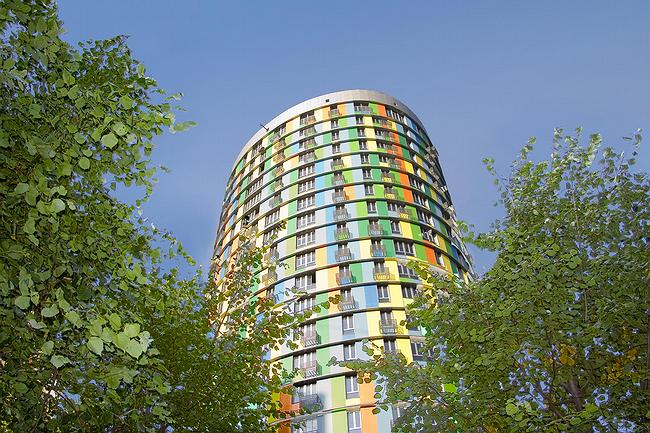
Last autumn ARX Awards announced ‘Avangard’ the best in the nomination Architectural Realization in Regard of Development. In other words, its architecture was considered increasing the cost per square meter – the topic of the recent years in Moscow. Just a glance at the house is enough to admit the fairness of the appraisal.
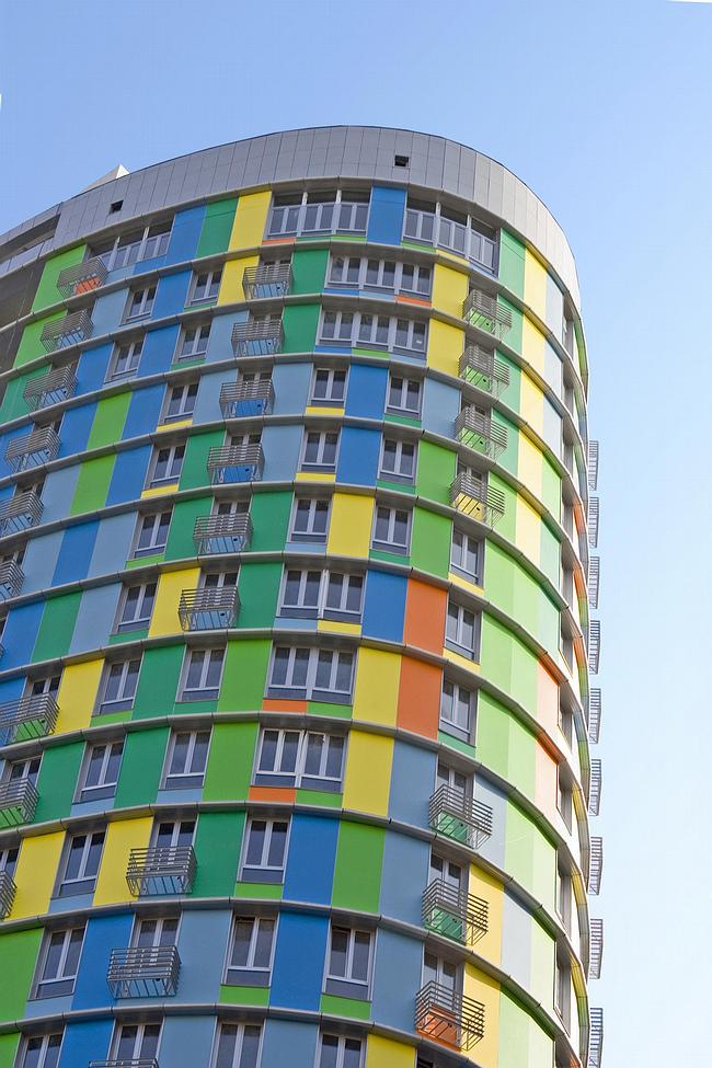
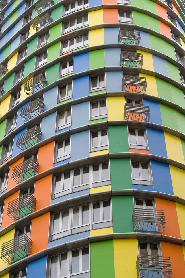
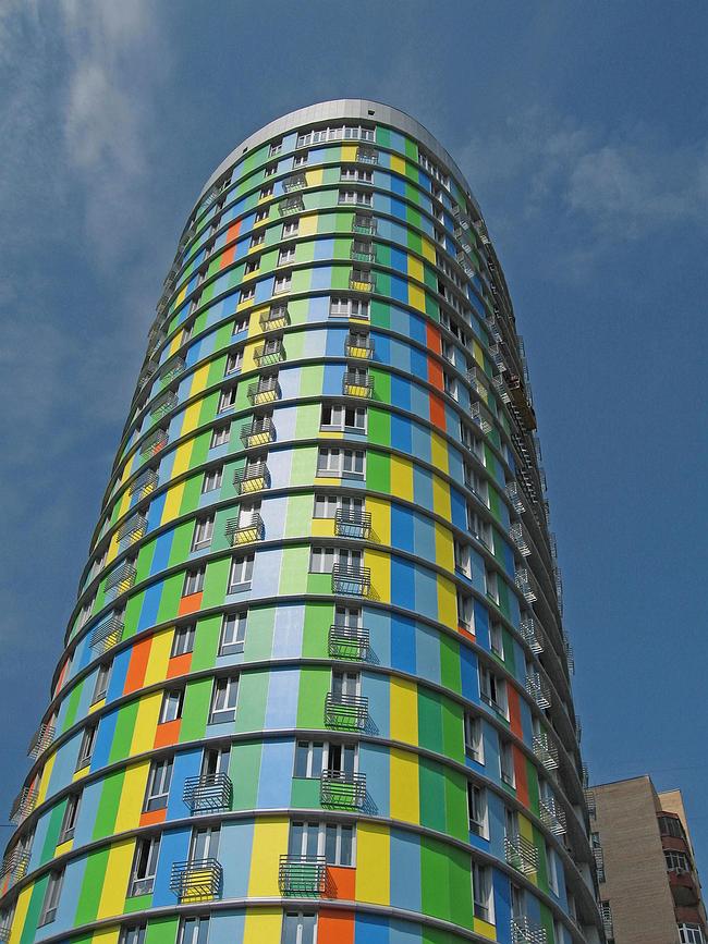
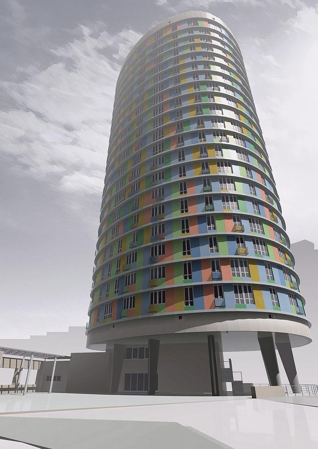
It has the two main features - color and shape. The 20 storeys are fronted with bright wallboards, each one is of window-size, creating asymmetrical pattern. In some parts they are fusing into one-color stripes or spots, in another - 2-3 windows unite, as if changing places with color rectangles. A strain of order unpredictability turns the façades into a continuous carpet-like surface. There remain only the consecutive aluminium rims dividing the horizontals of storeys.
The colorful ‘tower’ claims to became a new mark of ‘Cheremushki’. It is well seen from afar. Besides, the bright coloring keeps another few ‘secrets’: for example, there more blue and green colors, and this lets the building fit the scenery in a beautiful summer weather, visually dissolving a part of its volume against the sky. And in winter it will remind of the warm season.
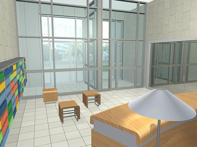
Bright facades are not like most designed by Sergey Kiselev’s studio, famous for it’s fondness of very quiet colors. Moreover, self-cleaning wallboards have been used in Moscow for the first time – the building will not ever fade, but will remain as vivid as it is nowadays. However, the house meets its tenants with a noble modesty of aluminium gloss of the lower level. The entrance foyer is as much modest, only the colorful mailboxes’ small doors remind of the place we’ve entered.
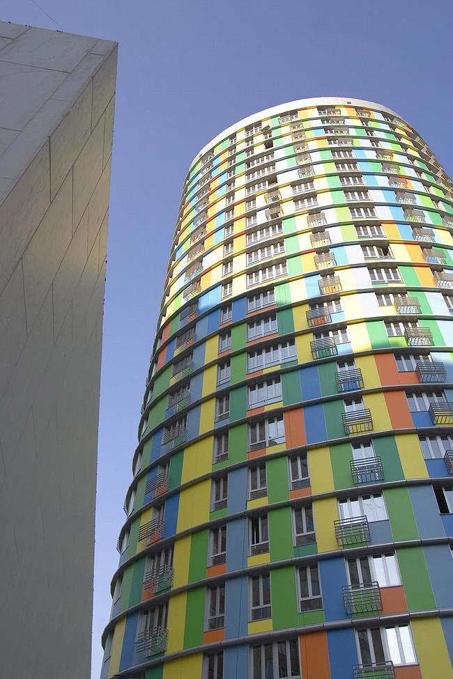
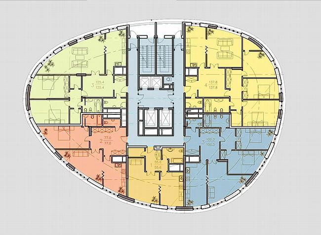
The house is a tower-like one, the shape is close to an ellipse, but is much more complex. Cergey Kiselev has said it takes much after a coffee table of the beginning of the century. The shape, thought, wasn’t designed only for appearance, but had come out as a result of complex estimations in order to get all the extra-space (that is the clue to the ‘development’ award – the architects have increased the amount of usable area in 2,5 times) and at the same time not to obscure the light to the neighboring buildings. One of those buildings is the one of former Central Committee workers, so, having beaten ‘all the records on the number of contacts with the neighbors’, “Sergey Kiselev and partners” Ltd have designed the house, which is hard it be faulted.
There are two advantages of the ellipse form for the tenants. A little hooped walls provide more windows, daylight and scenery. The ‘core‘ of the tower offers large entrance halls – a dream of anyone who have ever lived in a bearing-wall house…
On the whole, the building is the result of enormous number of estimates. Asymmetry of color spots on the façade seems to be matched by some algorithm on a computer. The plan is drawn very thoroughly considering all the appendage circumstances, at that, design is just fine. To save more of the yard space, the lower level was placed onto six corbusian legs; there is a small park and children's playground on the roof of the underground garage. Remarkably, for all that the building succeeds to retain originality of the architectural concept, ease of play, which makes it a decoration of the Cheremushki residence area.


