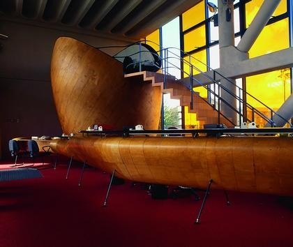
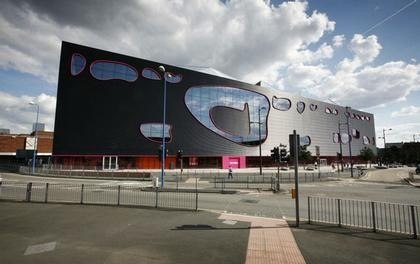
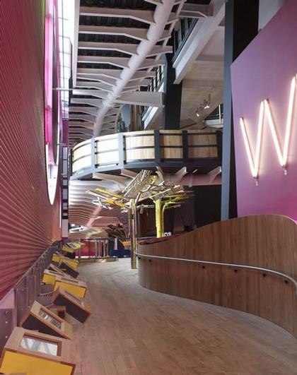
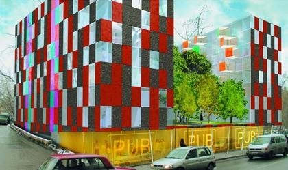
sketches have been exhibited alongside his architectural projects in galleries and museums. Alsop’s buildings feature colorful, organic forms – “blobs and daubs” as he calls them. The architect was born in 1947 in Northampton in central England. He studied at the London’s Architectural Association in the late 1960s. Since 1981, Alsop worked in partnerships – first with his classmate John Lyall and then with Jan Störmer. In 2000 he formed Alsop Architects. In early 2006, he sold his office to the British design conglomerate SMC Group which owns a dozen independent architectural practices.
Creatively, SMC Alsop remains fully independent and maintains offices in London, Beijing, Shanghai, Singapore and Toronto, employing 120 people worldwide.
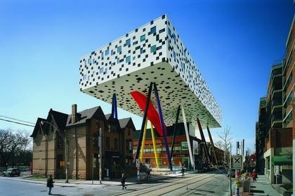
His projects never fail to attract attention and controversy. The most wellknown and adventurous are: the Hotel du Departement (a regional government complex) in Marseilles; the Sharp Centre for Design (a box thrown into the sky on
thin multistory stilts) at Ontario College of Art & Design in Toronto; and Peckham Library in South London (which won the
prestigious Stirling Prize in 2000). Alsop refers to his buildings as “objects of curiosity” – structures that are meant to
inspire people, animate the landscape and encourage dreams of what could be, as well as ask questions like “what if...”
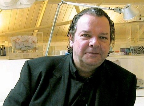
I met with Will Alsop in his studio in London’s Battersea. We sat in the architect’s mezzanine office, overlooking
a large open design studio, converted from a former warehouse. There are about fifty people working here on buildings that
feature legs, beaks, wings and are dressed in skirts and hats. My first question was about Will’s extensive and hands-on
experience working in Russia.
You used to have an office in Moscow from 1993 to 2000. Can you talk about your Russian adventure and why you left?
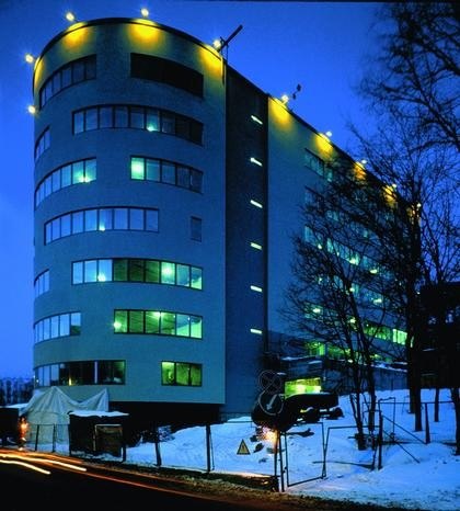
First, let me tell you why I came. I first went there in 1990 to do a workshop with students at the Moscow Architecture School, MArchI. For me it was interesting to be in a big city, undergoing dramatic political, economic and even religious changes. Then I started to visit more often to observe these changes. Over time I set up an office with an Englishman
named James McAdam who spoke some Russian and a Russian lady Tanya Kalinina who spoke very good English. Now they have their own practice, McAdam Architects in both Moscow and London. The first project was to find a project, which we soon did. Subsequently we made a lot of friends and built a few buildings there. The first project was the Deutsche Bank building on Shepkina Street and the second major commission was the Millennium House on Trubnaya Street.
Did you collaborate on the Millennium House with a local architect?
A French investor with whom we had worked for many years commissioned the Millennium House. The concept stage
was developed solely by our office. We selected AB Ostozhenka, directed by Alexander Skokan, to assist us with the
approval process. It was a very productive collaboration and Ostozhenka participated fully in the design process. In 2000 because of the shaky economy I pulled out. By then we had about 20 people, mostly Russians and I was coming once every two months. Maybe I should have downsized the office and stayed. It was a very interesting and creative time when young people especially had many original ideas about how to survive in such an economy. It was very exciting. It was also very corrupt, of course, not that I had anything to do with corruption but I was aware of it. That was a major challenge. For me these years in Moscow were to experience the city. I knew before I came that to create architecture would be very difficult. If at that time we could use Austrian or Finnish contractors… but none of my clients could afford it. The next choice was Irish or Turkish contractors – their work was of reasonable quality but it would limit the choice of materials. And then of course, there were Russian contractors. I’m sure it is very different now but at that time you never knew when the job would be finished and what the final price would be. Hence, any experimental architecture was very risky. Now, when looking at the magazines and sometimes visiting Moscow, I wonder about the quality of some of the latest projects there. Moscow needs to decide what it wants to be. It is a great city and it deserves great architecture.
What kind of architecture do you imagine being built in Moscow today and how different should it be, let’s say from London?
Well, obviously, there is climatic difference, which has a dramatic effect on what you do. For example, Moscow is much hotter than London in summer and this has a very definite effect. But that is not really what you mean with your question. Ideally, I don’t think the approach is any different whether you are in Moscow or some place in Africa. There will be differences imposed on you and you have to listen to them. What I really like to work with is expectations and aspirations.
I like to think that I don’t have a particular style. I do very different things and in different ways. Some people say – there is
an Alsop style. It is an insult to me because I like to avoid it. I have gone away from the idea of what architecture “should be”. My job is to discover what architecture could be and that voyage of discovery involves other people. I like working with people who live or work in the area of my projects and handing them the pencil or the paintbrush. Then you
can have real fun trying to make sense of these engagements. My idea is not to change people’s view but to allow them to express their view. And that’s why I like working with people. I find it very strange when some architects make very grotesque and imposed forms. You can make a very good honest building with just materials alone.
What is a good honest building?
When it has good quality of construction, good lighting and particularly, when it pays attention to what is happening at the
bottom because that is what most people experience. If I were a politician I would make a law in every city that everything
from the ground to 10m and higher should float and not touch the ground. You could still eat and drink at the ground level but there would be no buildings. The ground should be given to people and gardens, not buildings. It would make our cities much happier, particularly in Moscow in winter when the sun angle is low. Think of Le Corbusier’s Unite d’Habitation in Marseilles, which is where I built my first elevated building Hotel du Departement. It was a big influence on my architecture.
You knew you wanted to be an architect very early on. Who introduced you to architecture and art?
Yes, I knew I wanted to be an architect before I knew what architects did and that might have something to do with the house next-door to where my family lived in Northampton. This was the house designed by Peter Behrens in 1926, which was one of the first modern rational houses in Britain. My mother always commented that it was an ugly house, but I found it very interesting because it did not look like any other house around. An older couple lived there and they often invited my sister and me for delicious ice cream so it always felt good to be there. There was furniture by Charles Rennie Mackintosh. It was a very design oriented atmosphere. Everything there was different and interesting and that was all that mattered. Then when I got older, I met an uncle of one of my friends, an eccentric stage designer who essentially taught me the history of the stage design – from the Greeks to the Constructivists and beyond. By then I knew how to draw, but he wanted to teach me anyhow. He started to teach me how to draw a brick. This was going on for three months. I tried to do it with shadows but he wanted just a line drawing and then we progressed to the tin can and so on. At the age of 16, I started working at a local architect’s office, while attending evening classes at school. So I learned about how to put traditional buildings together
on a domestic scale. I was also aware of many progressive projects, such as by Archigram. So I decided to go away for
a while and instead of going to architecture school, I first went to study art for a couple of years. Today I don’t really make any distinction between art and architecture.
Your architectural heroes are Le Corbusier, Sir John Soane, Mies van der Rohe and John Vanbrugh. How do these very different architects relate to your work?
I think there is no right way to make architecture and I think that is good. Our cities should have diversity. Uniformity
makes life less interesting. There is a lot of that around Moscow or in the north of England. It makes people bored.
Architecture is not about just having a roof over your head but about a feeling of belonging and a feeling of comfort.
Sometimes it is very difficult to explain how to do that but I had people who told me that my buildings are very comfortable. They would come to me and ask – how do you do that? I don’t know and I don’t want to know because if I did all the fun and exploration about making architecture would be destroyed. You have to have faith. So all of these architects you mentioned, they are all very different but they all have qualities that we can all learn from.
What kind of architecture do you like today?
I like different projects. For example, I like the Hearst Building in New York by Norman Foster. When you drive north of Seventh Avenue there is a sensation of an optical illusion. Somehow, the general form is very pleasing to the eye. It is quite arresting and it is not like any other building. Its design suggests vertical growth and continuation, yet it has a good height and proportions and it gives a sense of presence. On the other hand, Foster’s projects in Moscow are very grotesque. Here in Britain we have a lot of very interesting engineers and our architects tend to celebrate structure more than others. I suppose Richard Rogers is the most notable example of that. It is very exciting and this idea of a clear floor plate and taking everything else to the edges or outside of the edges commercially makes a lot of sense, but at the end, it is almost denial of the proportions and the architecture. I don’t mind exposing structure but not for functional reasons alone. Otherwise, architecture is reduced to being High-Tech or a style. Once High- Tech becomes a style that is the end of architecture. What I like about architecture is that anything is possible as long as it is done with a real intent. For example, take the architects called FAT. I think they do very interesting work. I would never do what they do, but I enjoy it.
They have done some very sarcastic projects.
Oh yes, and I love them for that and I want to help them. I am working on a master plan of 1,500 homes in East Manchester and for some of the first houses there I introduced FAT to the clients and now they are building their homes. I think one of the roles of older architects is to help generations below them if they can.
You went to Architectural Association. What kind of work did you do there and who were your professors at that time?
I think at the time I went to the AA it was the most interesting school, so it was the only place I applied to. And by the time
I graduated, which was in 1972, I had been taught by every single architect of the Archigram. To me their work was like
science fiction. It was about social aspects of architecture and more about imagining how people could live and work. Therefore, for my final year project I wrote a science fiction novel. I used the novel as a vehicle to illustrate things about the decentralization of cities. I invented different scenarios of how the cities would empty out and how we could occupy the landscape in the country.
After Architectural Association, you worked for Cedric Price. What was that experience like and what did you learn from him?
That experience was very important. I was the project architect on the last building he built. One may argue that architecturally it was not an interesting building. But that was his style—which was absolutely no style at all. It gave me good practical experience. I’m not sure I really understood Cedric, but it didn’t matter. It was good for me. He was my second course in architecture. Now I tell my students in Vienna, “after you finish your school, if possible, try to work for someone
you really admire for three to four years. Then you don’t have to think beyond that. It will become evident what you want to do.”
Do you have any of your former students in this studio?
Yes, a couple of women.
Could you describe your art?
I like to draw and paint on canvas and spend time looking around. I don’t know if my work can be called art. Some people like it. Some people don’t like it. It doesn’t matter. In more recent years I began doing art for its own sake. I enjoy working together with various community groups. It is very stimulating and educational.
On your website it says, “Schools and academic buildings must be expansive, stimulating environments, allowing exchange between students and mentors”.
I am interested in how buildings affect communities. Originally, the Peckham library was meant to attract 12 thousand readers a month and now it attracts 40 thousand. And there are many people who go there for other reasons other than to read. You know, young men might go there to look at girls, but they might pick up a book or they might fall in love. That is also fine. Or, take the college in Toronto. Two months after the building was inished the number of applying students
increased 300 percent. The mayor of Toronto told me that this modestly scaled building helped to increase the level of tourism in the city. So it seems that people respond very positively to our buildings and this response goes beyond these buildings’ original functions. I’m not interested in making monuments or icons. It is actually quite easy to build a building. But there is something else that turns it into architecture. The main question is – how does a new building contribute to the town or city it is in?
Could you talk about the Peckham Library design process?
For the Peckham Library design process, we engaged the local community and developed the project based on what people wanted. The building became more than just a library. It is a place where people meet, hang out, get married, take breastfeeding classes and so many other things. And when you come in you lift yourself out of everyday life. We also discovered that to solve financial or other social problems people would rather go to a library than a town hall, which is a lot more institutional.
You initiated a dialogue with different community groups and invited them to participate in design workshops to discover what sort of building Peckham’s inhabitants wanted.
Yes. These workshops didn’t inform me as far as the form, but they helped to make the project successful in many other respects. There is a row of shops on the other side of the road, which were barely hanging on to their business and people were concerned about them. By lifting the building up, you get a direct view of these shops from the public space. These are not great shops but they are still there today and they are doing better than they ever did. The other fascinating thing about its elevated form is that the library can generate a lot of different events in the summer. You never know when it is going to rain in this country, but if you lift a building it becomes like an umbrella. So it doesn’t matter if it rains or not because you already have your big umbrella. Furthermore, even though there are a lot of bus stops around I observed that many people prefer to wait for their buses under the building. In addition to all of this, I also discovered that by lifting the library over the street, at the north side of the building you can see St. Paul’s Cathedral and it looks quite close despite the fact that the building is not that tall. This single aspect of the building, I think, did a lot for the people at Peckham and they suddenly
realized that they are not lost in that huge part of South London. They are actually in the middle of London and that is something very important for people to know and identify themselves with.
What are your points of reference and inspirations?
I’m not sure if inspiration is important. You know the famous saying by Thomas Edison that ideas are one percent inspiration and 99 percent perspiration. You discover ideas by working and not dreaming. You only see things when you are moving the pencil. But beyond that I think travel is quite good because it broadens your expectations and brings attention to various qualities and spaces and it is not only about what you see but also what you feel.
Let’s go back to what kind of architecture is being built in Russia. Do you think inviting so many foreign architects to build there is a good idea?
I think the Russian architects should think that if Russia becomes more open then they would have more opportunities to
do their work there or somewhere else. I think a good city is about diversity. For example, since the late 1970s we saw a lot of American architects coming to London, which they were interested in using as a stepping stone into mainland Europe.
I guess they picked London because we speak almost the same language. Many American companies are well established
here and they designed and built a lot of key projects, such as Canary Wharf and many others. For a long time it was not
fair because it was very difficult for British architects to go work in America. Now the US is a lot more open and we share a lot of ideas and resources. Therefore, I think Russian architects should observe, learn from each other, build their reputation and surely they will be asked to do projects in other places. Architecture is a slow profession, but the fashion industry is a good indicator and already there is a big interest in what Russian fashion designers are doing. So the same will
happen in architecture. But, I also think it is fair to expect from foreign architects a real commitment and not just the
recycling of their ideas—what they used in Portland, Oregon or other places. That is why wherever we go we try to have a real presence and work with local people. For example, we work on our projects in China from our Shanghai office where we have about 25 people, many of whom are local, and we work with local contractors and produce our own working drawings. For us being there is also about experiencing culture and learning from it.
Sometimes architects fail to produce original and critical work because their clients want them to design what they have seen in the West – iconic glass-clad towers that are associated with power and success, even if such models do not fit into a particular context.
Well, I have a drawer full of failed projects elsewhere that would do well in China or Russia. I can sell them to those clients. But of course, I’m just kidding. I would never do that.
What kind of architecture do you envision in the future and what kind of project would you like to realize?
I don’t think you can talk about the future because if I knew it I would be doing it. We are locked into the age we live in. For example, many architects are preoccupied now with climate change and issues of sustainability and ecology, but that is
just general awareness. It doesn’t make architecture. Some architects market themselves as green architects. Well, we are too, but I want my clients to pick us for other reasons. You never pick an architect because he is good at plumbing. When pluming was first invented maybe there were architects who would say, “we understand plumbing”. In the future, I would
like to see more sharing of ideas and on occasions, I would like the idea of working with other architects. It would be fun to do it in Moscow. As far as a project, I would like to do a hospital. I think most hospitals that are done in Britain today are done by architects who have done hospitals before – by a lot of American architects. But they are too much like a machine. I have visited a number of hospitals that actually make you ill. I think hospitals should be beautiful so when you come out you would fall in love again – that’s how spaces should make people feel.
Will Alsop Architects office in London
41 Parkgate Road, Battersea
April 21, 2008


