По-русски

​The Red Park

Wowhaus turned a park in the center of Moscow into a great space for recreation and outdoor activities where everyone will find a place for himself by following red guiding marks.

03 May 2018
Object
mainImg

The story of reorganizing the “Kransogvardeiskie Prudy” park is typical for the practice of Wowhaus, which has been into improving city spaces and recreational areas for about ten years now. There is meticulous work and there is deadline pressure, there is struggling with the harsh realities of the Russian construction industry and overcoming the challenges of the climatic cataclysms. However, this work also leaves plenty of room for creativity, which makes it all worth it.
 
Three Ponds of Memories
 
Located west of the Moscow City business center, this cluster of a few green areas is definitely not on the top of Moscow parks list. Nevertheless, the new trends have finally reached this place as well: the park “Krasnaya Presnya”, which the city inherited from the Studenets-Gagarins estate, has already been reformed and landscaped. Historically, the “Krasnogvardeiskie Prudy” park is one of its parts, even though today it looks more like a green boulevard – as a matter of fact, the street running along the western border of the park is called “Krasnogvardeiskiy Boulevard”.
 
The three ponds that once gave the name to the park, were dug out in the early XVIII century. The biggest one (called “Nizhny”, meaning “the lower”) is squeezed between the 1st Krasnogvardeiskiy and the Shmitovsky drives. The two other ponds are located to the north of this one – their green zone, averaging 70 meters, stops at the Zvenigorod Highway. During the soviet time, the ponds were clad in concrete casing, which was rather convenient for the ducks and the anglers. The park was intended for the local use: it had neither amusement rides nor heritage sites in it that would draw crowds from the outside. One could compare it to a slightly hyperbolic yard that was spilling over its boundaries – it was a haunt of moms going for walks with go carts and toddlers, pensioners from the surrounding houses, and the local youngsters who would periodically raise a racket here.
 
Vox Populi
 
In 2015, the Department of Culture and the management of “Krasnaya Presnya” decided to include the “Kransogvardeiskie Ponds” into the sphere of influence of the new park policy and invited for developing the project Wowhaus architects, known for their ability to not only uncover the potential of various venues but also involve the future users to the creation of the program, using the methodology of social and cultural programming.

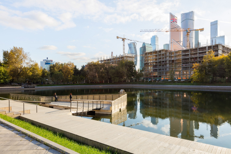
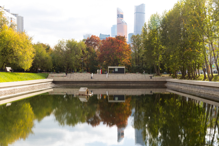
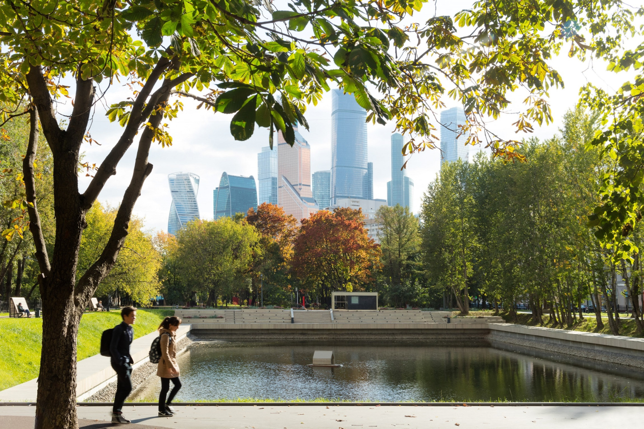
Reorganization of the Krasnogvardeiskie Ponds. View of the Moscow City through the Upper Pond © WOWHAUS
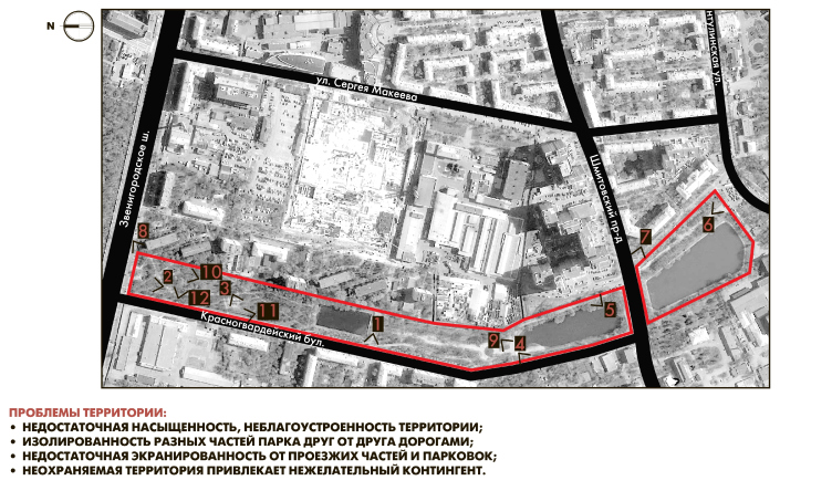
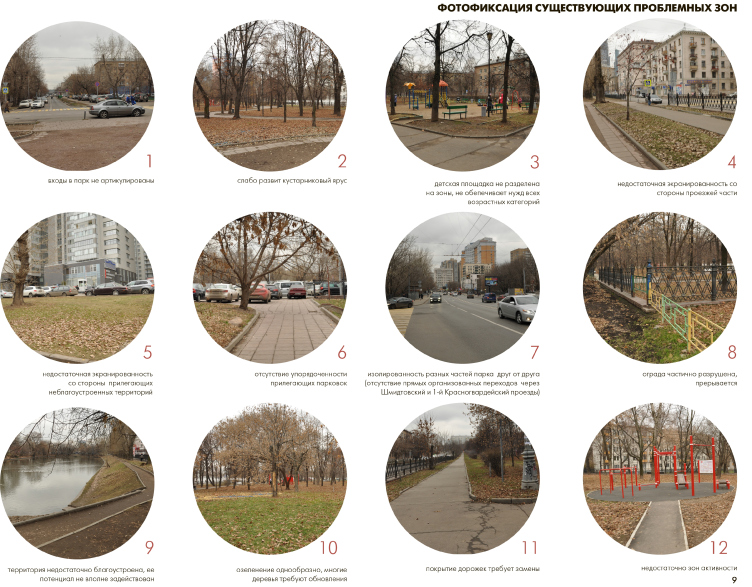
Reorganization of the Krasnogvardeiskie Ponds. Analysis of the original situation © WOWHAUS


Reorganization of the Krasnogvardeiskie Ponds. Analysis of the problem spots © WOWHAUS

 
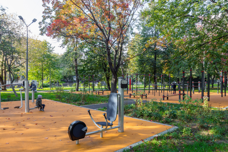
To collect and analyze the design information, the architects invited their steady partners in that field – KB23. The sociological survey proved the desire of the local residents to keep the intimate character of the park. “The poll data made us us reconsider some of our preliminary solutions – shares the chief architect of Wowhaus, Daria Ionova (Melnik), who curated the project of reconstructing the “Krasnogvardeiskie Ponds” – Parents and their little kids, and the senior citizens that usually go for walks here, were not so much in need of some spectacular amusement rides or other noisy activities as children’s playgrounds, sports fields, and places for quiet rest and recreation”.
 
The Red Entrance

Reorganization of the Krasnogvardeiskie Ponds © WOWHAUS

 
As far as the starting point was concerned, the architects used the main entrance from the side of the Zvenigorod Highway: at this point, the width of the park reaches its minimum – about 62 meters, so, from the side of the highway this place looked just like a rather unkempt piece of parkland. 
 
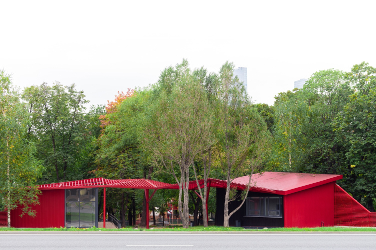
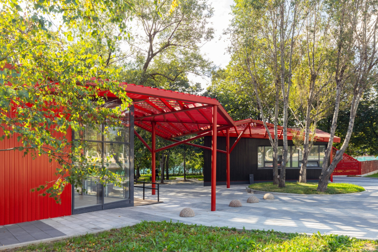
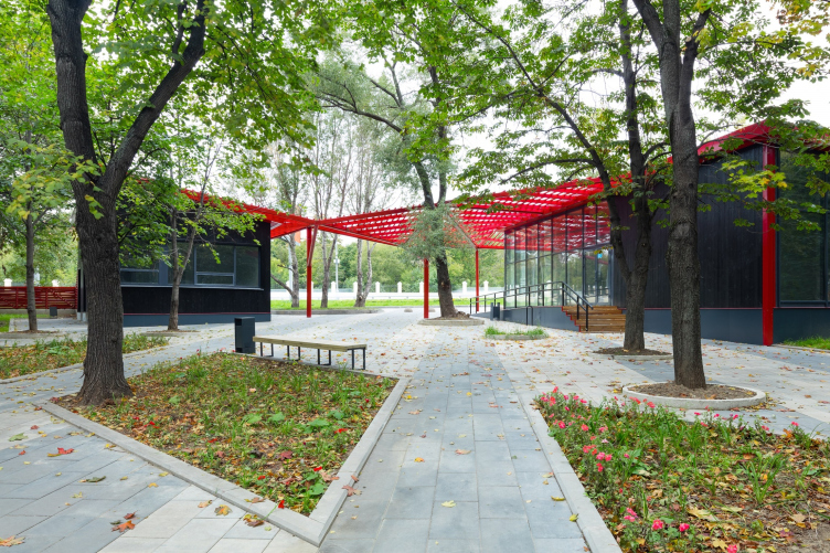
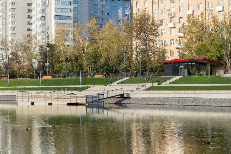
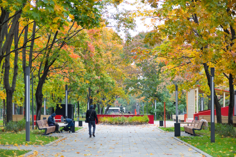
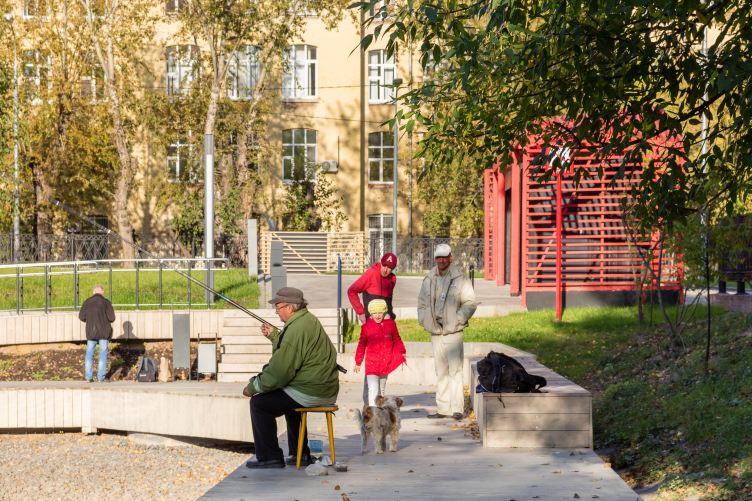
It was also necessary to accentuate the entrance, and the architects of Wowhaus flanked it with two black-and-red pavilions connected by an openwork pergola that encompasses a cluster of preserved trees. The resulting structure is strikingly different from the stylized decorative portals that have recently adorned the entrances to the numerous Moscow parks – these pavilions are not meant to imitate some sort of holiday, their function being much more honest and utilitarian: one can have here a cup of coffee, rent a scooter or buy a book to read in the park. They signify an entrance to a territory that was designed and built for people.

Reorganization of the Krasnogvardeiskie Ponds © WOWHAUS


Reorganization of the Krasnogvardeiskie Ponds © WOWHAUS

 
Five Parks Instead of Just One
 
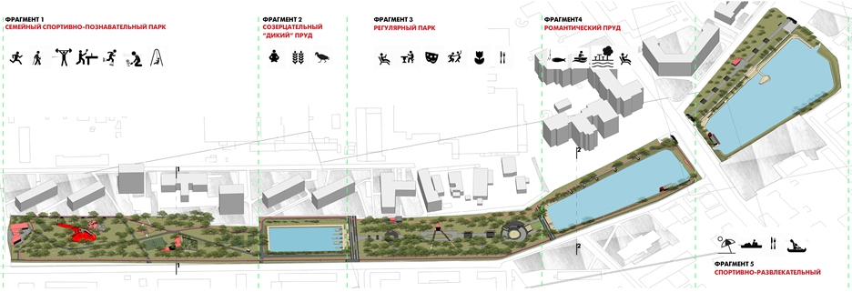
The information about the life of the park, specifically, its terrain, ponds, and greenery, as well as the surrounding buildings, prompted an unconventional solution: the authors decided to refrain from the idea of working with this territory “from beginning to end” and fractured it into several fragments with different functions and different approaches to infrastructure and landscape design.

zooming
Reorganization of the Krasnogvardeiskie Ponds. Plan of the functional and stylistic organization of the territory © WOWHAUS


zooming
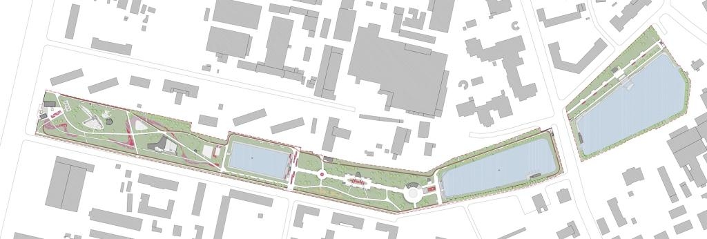
Reorganization of the Krasnogvardeiskie Ponds. Masterplan © WOWHAUS

 
Children’s Paradise
 
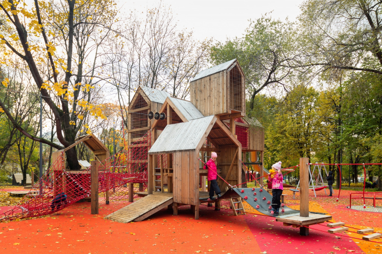
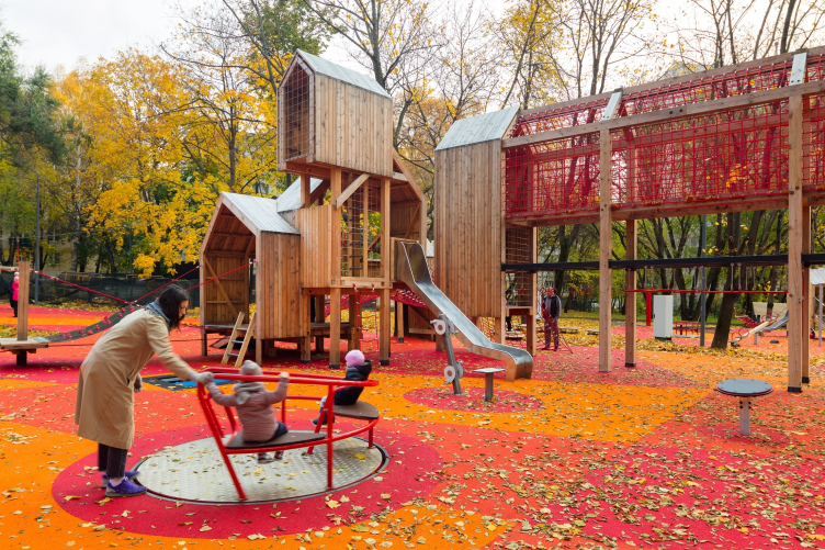
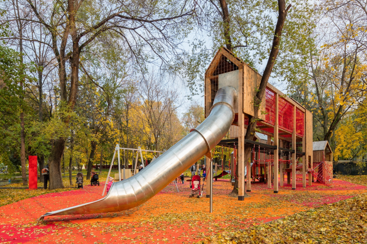
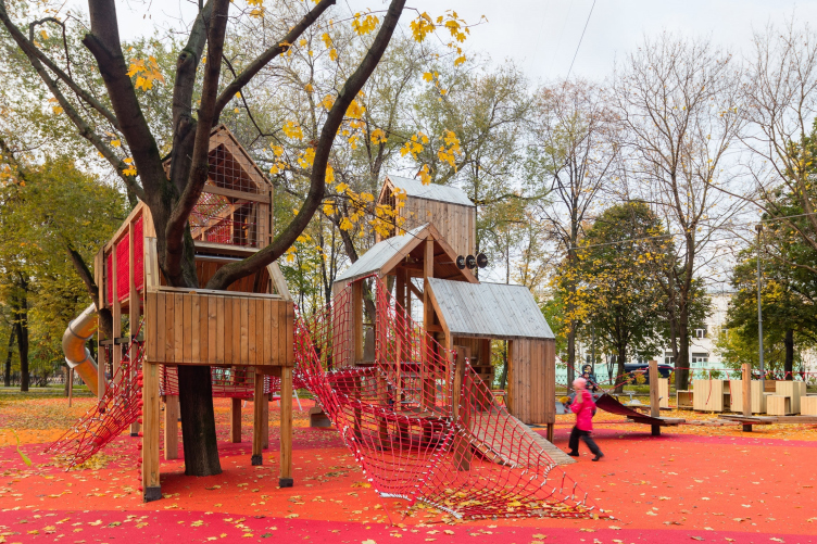
The zone situated immediately behind the entrance is occupied by sports fields and family recreation venues; the architects preserved the natural character of the park as much as possible here. The gem of this zone is the already-famous “playground in the trees”, something like a cross between a fairy tale castle and a rope park. A few differently sized little houses connected by boardwalks and ladders are mounted on tree trunks and special columns. The project got into the spotlight of all the architectural and city media long before it was implemented, which comes as no surprise – this sci-fi playground was created with the input from the architects who had previously designed the children’s club “Koni na Balkone” (“Horses on the Balcony”), and these architects used their own experience in involving children in the creative process of designing the exciting game environment. There are no preset scenarios here, the children themselves deciding what games to play, and how. Some families specifically come from far away specially for this playground.

Reorganization of the Krasnogvardeiskie Ponds © WOWHAUS


Reorganization of the Krasnogvardeiskie Ponds © WOWHAUS


Reorganization of the Krasnogvardeiskie Ponds © WOWHAUS


Reorganization of the Krasnogvardeiskie Ponds © WOWHAUS

 
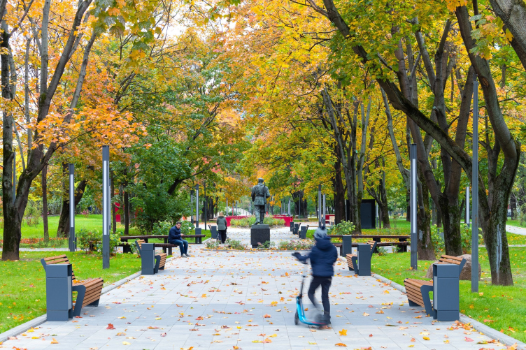
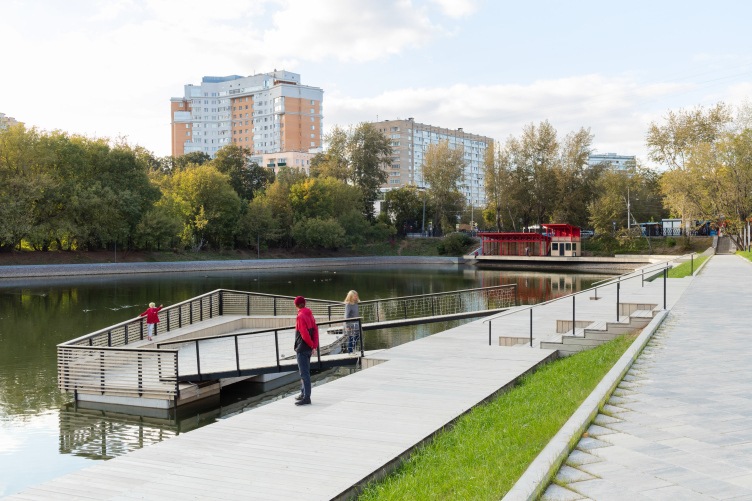
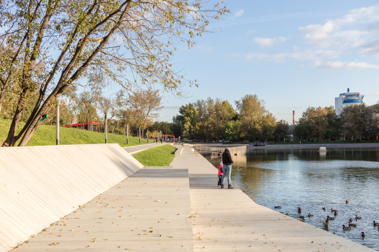
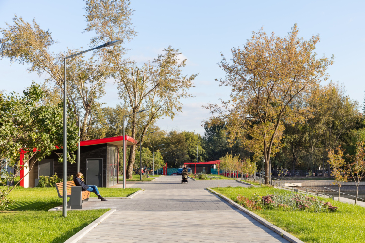
The next zone is the territory around the Upper Pond, also treated in the natural key, with a boardwalk. The third fragment – located between the Upper and the Middle ponds – is designed as a regular park with a central promenade, flowerbeds, a few pavilions, an amphitheater around the dance floor, and also a small square, the center of which, according to the architects’ proposal, is the local curiosity – the “October Days” monument.

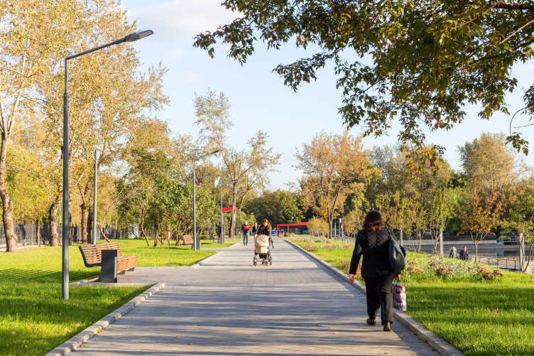
Reorganization of the Krasnogvardeiskie Ponds. The central promenade © WOWHAUS

 
The next zone, which spreads around the second pond, is designed in a romantic spirit: a few gazebos with benches, and a boat renting point.
 
...and Circuses 
 
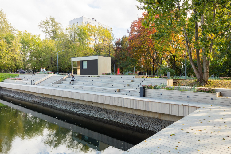
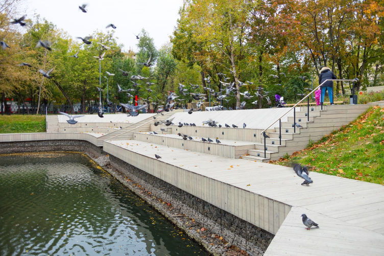
The last fifth fragment with the “Lower Pond”, separated from the mainland by the Shmitovsky Driveway and having no nearby houses, became the center of the noisy pastime, which, as the sociological survey showed, the other zones rejected. There is a floating stage in the middle of the huge pond, and its banks have been turned into an amphitheater for 150 spectators and a large flooring sun bed. On the City Day 2017, there was an orchestra playing on that stage; in the upcoming season, the program is promising to be more diverse.
 
In order to ensure a better connection between the two major parts of the park, the architects planned to remove the pedestrian stoplight on the Shmitovsky Drive but, regretfully, this plan was not to come to pass.

Reorganization of the Krasnogvardeiskie Ponds. The floating stage © WOWHAUS


Reorganization of the Krasnogvardeiskie Ponds. The floating stage © WOWHAUS


Reorganization of the Krasnogvardeiskie Ponds © WOWHAUS


Reorganization of the Krasnogvardeiskie Ponds © WOWHAUS


Reorganization of the Krasnogvardeiskie Ponds © WOWHAUS

 
The Connecting Red Line
 
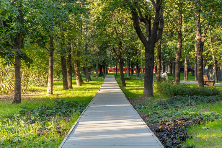
The entire length of the park is pierced by a “secret trail” – a pedestrian route with sightseeing platforms and “surprise” objects that the visitors run into as if by accident.

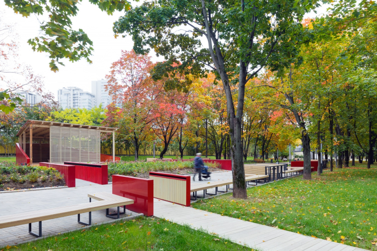
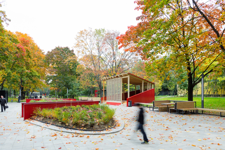
In addition, the authors of the project decided not to argue with history and converted the name of the park into an obvious color code. For “Krasnogvardeiskie Prudy” (“Red Guard Ponds”) that are part of the “Krasnaya Presnya” (“Red Presnya”) park, they proposed to use the red color. It is complemented by gray and beige-ochre color of wood.

Reorganization of the Krasnogvardeiskie Ponds © WOWHAUS

 
Red Greenery and Other Curious Dendrology
 
In addition to the objects and guiding arrow signs, the red color is also present in vegetation here: the dendrologists have put together a collection of plants with red leaves or branches – or at least the kind that turns red in autumn.

Reorganization of the Krasnogvardeiskie Ponds © WOWHAUS

 
The reconstruction of the park required a major revision of its greenery. There were a lot of trees in the park but not all of them were healthy; over the long years of “wild” growth, many cultured trees and shrubs died, junk underwood grew up, and the flowerbeds practically disappeared. Because of the strong winds of the winters of 2016-2017, many trees fell down – in a word, there arose a necessity for planting new trees: these include the now-popular kinds of trees, shrubs and perennials that grow well in the city.

Reorganization of the Krasnogvardeiskie Ponds. Pavilions next to the Lower Pond © WOWHAUS


Reorganization of the Krasnogvardeiskie Ponds © WOWHAUS


Reorganization of the Krasnogvardeiskie Ponds © WOWHAUS


Reorganization of the Krasnogvardeiskie Ponds © WOWHAUS


Reorganization of the Krasnogvardeiskie Ponds © WOWHAUS


Reorganization of the Krasnogvardeiskie Ponds © WOWHAUS


Reorganization of the Krasnogvardeiskie Ponds © WOWHAUS


Reorganization of the Krasnogvardeiskie Ponds © WOWHAUS

 
The flowerbeds were individually developed for each of the segments of the park, with regard to its function and style – regular or, conversely, landscaping kind. At some places, the architects would choose to use simple forest plants, at some places – more flashy-looking but still fuss-free garden flowers and herbs. The boundaries of the zones are highlighted – and at the same time smoothed out – with a mix of herbs.
 
Realization: Express and Improvised
 
The project was finished in the middle of 2016 but the construction work in the park did not begin until October. The management of the park was to organize a tender to choose the contractor, and, as it often happens, the process took quite a long time – until the advent of the unexpectedly early winter. Practically the whole work was suspended until the next year. The only thing that could be done was preparing the foundations for the pavilions, but then again, some changes were introduced because a different technology was used.
 
As a result, from April to October 2017, the construction was done by express and improvisation method; some of the solutions had to be simplified in order to meet the construction schedule.
 
Before the start of the landscaping work, the park launched the process of reconstructing and clearing the ponds that included reinforcing their banks with gabions. Due to the fact that the ponds are in the books of Mosvodostok (the Moscow water disposal service), and not the park itself, their reconstruction was handled by another contractor – the result of his efforts was strikingly different from the solutions proposed in the project, and the architects had to make revisions to the structure of the boardwalks and amphitheaters to put things in order.
 
Just Add Water
 
The not-so-long list of project losses has one position in it that stands out with its objectively insurmountable character, though temporary, as the authors of the project hope. The ponds did survive the years of dilapidation, with losses in terms of purity but still with water. After the reconstruction, the ponds grew shallow – which was the reason the architects had to abandon the idea of a boat renting point on the Middle Pond, and the twin-hull boat renting point at the Lower Pond had to be turned into a changing room for the sunbed. But then again, the architects hope that this situation is only temporary and the ponds will get filled with water soon.
 
Reorganization of the Krasnogvardeiskie Ponds © WOWHAUS


Luckily, almost all the other solutions got realized to a letter, just as the architects were able to achieve the integrity of the landscape and architectural inclusions, so characteristic of Wowhaus projects. Some of the solutions even turned out to be more effective and efficient than the authors anticipated.
 
Bench Reversal
 
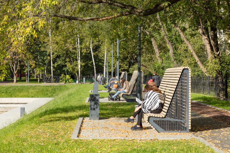
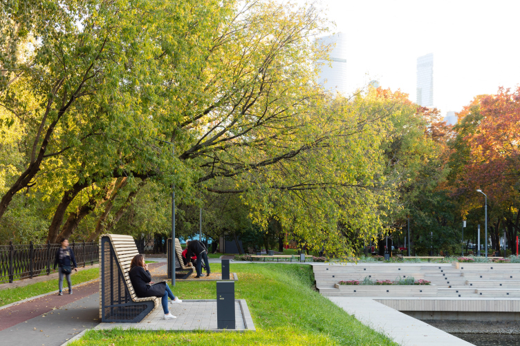
In the conditions of time and budget constraints, the architects had to combine new minor forms with author creations. One of the most popular ones is the “high back bench”.

Reorganization of the Krasnogvardeiskie Ponds © WOWHAUS

 
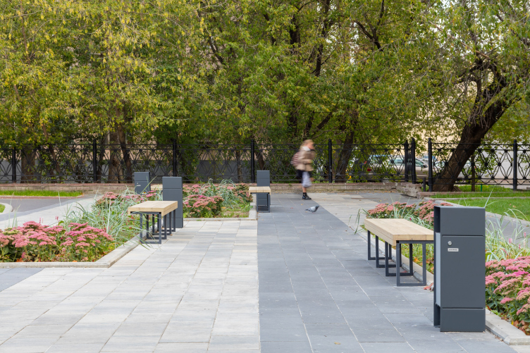
The beauty of descriptive names is in their self-explanatory vividness. The size of the back of the bench is outstanding indeed but what is more important is the fact that it is the key to solving the longstanding problem of all parks: the necessity to choose between the comfort of sitting and the opportunity to admire the surrounding scenery. Usually, benches are placed along the trails, facing the promenade – and the person who sits down on them automatically finds himself with his back to all the beauty of the park, through which the trail runs. The solution that Wowhaus proposed is revolutionary in its radical simplicity: they turned the bench with its back to the passageway, and, in order to make sure that the person who is sitting on it does not get a creepy feeling because of what is going on behind his back, covered the rear with a high back. The idea went straight home. Once they were installed, these benches became an instant hit with lovebirds and introverts.

Reorganization of the Krasnogvardeiskie Ponds © WOWHAUS

 
A Park Study
 
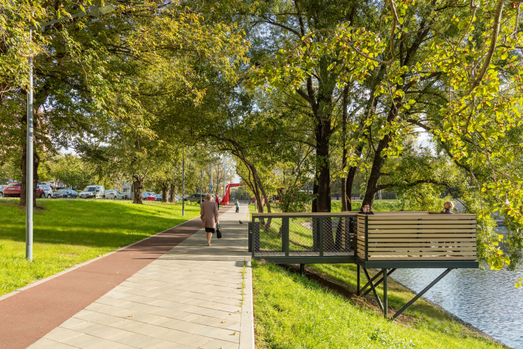
Yet another successful solution is the format of the “bank pavilions”. Because of the steep banks of the middle pond, you could not place regular benches alongside it, while building an amphitheater here would be prohibitively expensive. A compromise was found in small “balcony” or “veranda” gazebos, which were placed above the water and connected to the bridge by a boardwalk. Such boxes can comfortably host a company of four to six people. Being formally detached from the outside world will let one feel more comfortable but, being of the open-air type, the verandas are vandal-proof.

Reorganization of the Krasnogvardeiskie Ponds © WOWHAUS

 
And, while a couple of years back Wowhaus came up with an urban open-air “living room”, now the list of innovations proposed by this company has been augmented with an urban “open-air” study.

03 May 2018

Headlines now
Layers and Levels of Flight
This project goes way back – Reserve Union won this architectural competition at the end of 2011, and the building was completed in 2018, so it’s practically “archival”. However, despite being relatively unknown, the building can hardly be considered “dated” and remains a prime example of architectural expression, particularly in the headquarters genre. And it’s especially fitting for an aviation company office. In some ways, it resembles the Aeroflot headquarters at Sheremetyevo but with its own unique identity, following the signature style of Vladimir Plotkin. In this article, we take an in-depth look at the United Aircraft Corporation (UAC) headquarters in the Moscow agglomeration town of Zhukovsky, supplemented by recent photographs from Alexey Naroditsky – a shoot that became only recently possible due to the fact that improvements were finally made in the surrounding area.
Light and Shadow
In this article, we delve into the architectural design of the “Chaika” house by DNK ag architects, which was recently completed in 2023 as part of the collection of signature designs at ZILArt. As is well-known, all the buildings in this complex follow a design code, yet each one is distinct. This particular building stands out not only for its whiteness and minimalism but also for the refined use of a limited number of techniques that, together, create what can confidently be called synergy.
Casus Novae
A master plan was developed for a large residential area with a name of “DNS City”, but now that its implementation began, the plan has been arbitrarily reformatted and replaced with something that, while similar on the surface, is actually quite different. This is not the first time such a thing happens, but it’s always frustrating. With permission from the author, we are sharing Maria Elkina’s post.
Treasure Hunting
The GAFA bureau, in collaboration with Tegola and Arkhitail, organized an expedition to the island of Kilpola in Karelia as part of Moskomarkhitektura’s “Open City” festival. There, amidst moss and rocks, the students sought answers to questions like: what is the sacred, where does it dwell, and what sustains it? Assisting the participants in this quest were landscape engineer Evgeny Levin, artist Nicholas Roerich, a moose, and the lack of cellular connection. Here’s how the story unfolded.
Depths of the Earth, Streams of Water
In the Malaya Okhta district, the Akzent building, designed by Stepan Liphart, was constructed. It follows a classic tripartite structure, yet it’s what you might call “hand-drawn”: each façade is unique in its form and details, some of which aren’t immediately noticeable. In this article, we explore the context and, together with the architect, delve into how the form was developed.
Fir Tree Dynamics
The “Airports of Region” holding is planning to build an airport in Karachay-Cherkessia, aiming to make the Arkhyz and Dombay resorts more accessible to travelers. The project that won in an invitation-only competition, submitted by Sergey Nikeshkin’s KPLN, blends natural imagery inspired by the shape of a conifer seed, open-air waiting spaces, majestic large trees, and a green roof elevated on needle-like columns. The result is both nature-inspired and WOW.
​A Brick Shell
In the process of designing a clubhouse situated among pine trees in a prestigious suburban area near Moscow, the architectural firm “A.Len” did the façade design part. The combination of different types of brick and masonry correlates with the volumetric and plastique solutions, further enhanced by the inclusion of wood-painted fragments and metal “glazing”.
Word Forms
ATRIUM architects love ambitious challenges, and for the firm’s thirtieth anniversary, they boldly play a game of words with an exhibition that dives deep into a self-created vocabulary. They immerse their projects – especially art installations – into this glossary, as if plunging into a current of their own. You feel as if you’re flowing through the veins of pure art, immersed in a universe of vertical cities, educational spaces – of which the architects are true masters – and the cultural codes of various locations. But what truly captivates is the bold statement that Vera Butko and Anton Nadtochy make, both through their work and this exhibition: architecture, above all, is art – the art of working with form and space.
Flexibility and Acuteness of Modernity
Luxurious, fluid, large “kokoshniks” and spiral barrel columns, as if made from colorful chewing gum: there seem to be no other mansion like this in Moscow, designed in the “Neo-Russian-Modern” style. And the “Teremok” on Malaya Kaluzhskaya, previously somewhat obscure, has “come alive with new colors” and gained visibility after its restoration for the office of the “architectural ecosystem” as the architects love to call themselves. It’s evident that Julius Borisov and the architects at UNK put their hearts into finding this new office and bringing it up to date. Let’s delve into the paradoxes of this mansion’s history and its plasticity. Spoiler: two versions of modernity meet here, both balancing on the razor’s edge of “what’s current”.
Yuri Vissarionov: “A modular house does not belong to the land”
It belongs to space, or to the air... It turns out that 3D printing is more effective when combined with a modular approach: the house is built in a workshop and then adapted to the site, including on uneven terrain. Yuri Vissarionov shares his latest experience in designing tourist complexes, both in central Russia and in the south. These include houseboats, homes printed from lightweight concrete using a 3D printer, and, of course, frame houses.
​Moscow’s First
“The quality of education largely depends on the quality of the educational environment”. This principle of the last decade has been realized by Sergey Skuratov in the project for the First Moscow Gymnasium on Rostovskaya Embankment in the Khamovniki district. The building seamlessly integrates into the complex urban landscape, responding both to the pedestrian flow of the city and the quiet alleyways. It skillfully takes advantage of the height differences and aligns with modern trends in educational space design. Let’s take a closer look.
Looking at the Water
The site of Villa Sonata stretches from the road to the water’s edge, offering its own shoreline, pier, and a picturesque river panorama. To reveal these sweeping views, Roman Leonidov “cut” the façade diagonally parallel to the river, thus getting two main axes for the house and, consequently, “two heads”. The internal core – two double-height spaces, a living room and a conservatory, with a “bridge” above them – makes the house both “transparent” and filled with light.
The White Wing
Well, it’s not exactly white. It’s more of a beige, white-stone structure that plays with the color of limestone – smoother surfaces are lighter, while rougher ones are darker. This wing unites various elements: it absorbs and interprets the surrounding themes. It responds to everything, yet maintains a cohesive expression – a challenging task! – while also incorporating recognizable features of its own, such as the dynamic cuts at the bottom, top, and middle.
Urban Dunes
The XSA Ramps team designed and built a three-part sports hub for a park in Rostov-on-Don, welcoming people of all ages and fitness levels. The skate plaza, pump track, and playground are all meticulously crafted with details that attract a diverse range of visitors. The technical execution of the shapes and slopes transforms this space into a kind of sculptural composition.
Proportional Growth
The project for the fourth phase of the ÁLIA residential area has been announced. The buildings are situated on an elongated plot – almost a “ray” that shoots out from the center of the area towards the river. Their layout reflects both a response to Moscow’s architectural preferences over the past 15 years, shifting “from blocks to towers”, and an interpretation of the neighboring business park designed by SOM. Additionally, the best apartments here are not located at the very top but closer to the middle, forming a glowing “waistline”.
The “Staircase” Building
In designing the “Details” residential complex in New Moscow, Rais Baishev spiced up the now-popular Moscow theme of a “courtyard” building with an idea drawn from the surrealist drawings by Maurits Escher. He envisioned the stepped silhouettes and descending slopes as a metaphysical mega-staircase, creating a key void within the courtyard that gave the project an internal “spine”. This concept is felt both in the building’s silhouette and on its façades.
Projection of the Quarter
No one doubted that the building that Vladimir Plotkin designed as part of the “Garden Quarters” would be the most modernist of all. And it turned out just that way: while adhering to the common design code, the building successfully combines brick and white stone, rhythmically responding to the neighboring building designed by Ostozhenka, yet tactfully and persistently making a few statements of its own. This includes the projection of the ideal urban development composition “14–9–6”, which can be found right next door, mathematical calculations, including those for various types of terraces (and perhaps the only reminder of the Soviet past of the Kauchuk rubber factory!), and the white “cross-stitch” pattern of the façade grid.
Domus Aurea
In this issue, we examine the “Tessinsky-1” house, designed by Sergey Skuratov and completed in 2023. Located in the middle of the Serebryanicheskaya Embankment district, at the intersection of its main streets, this house assumes a sort of “nodal” role: it not only responds to everything around it and preserves many memories of the former EMA factory within itself, but it weaves all this into a newly directed pattern, reconciling bright “gold” and dark-colored brick, largely with the help of the new, modern-yet-archaic Columba brick, which, come to think about it, is the most precious element here.
The Chimney of Nikola-Lenivets
In this issue, we are examining the “Obelisk House” designed by KATARSIS and built for the Arkhstoyanie 2023 festival. However, it was only finished later on, and this is why we are examining it now. It seems to us that after the “Obelisk House” appeared in Nikola-Lenivets, a dialogue and a few inner connections appeared between the temporary structures built here. These houses no longer look like “accidental neighbors”, more of which below.
​Periscope by the Bay
The jury awarded the second place in the competition for a public and cultural center in Petropavlovsk-Kamchatsky to the companies GORA (“Mountain”) and M4. In the consortium’s proposal, the building resembles a sperm whale with a calf swimming next to it or a periscope, whose lenses capture the most spectacular views from the surrounding landscape.
From Arcs to Dolmens
While working on the competition project for Petropavlovsk-Kamchatsky, ASADOV Architects prioritized the value of the natural and urban environment, aiming to preserve the balance of the location while minimizing the resemblance of the volume that they designed to a “traditional building”. The task was challenging, and the architects created three versions, one of which having been developed after the competition, where their main proposal took third place. However, the point of interest here is not the competition result but the continuity of creative thinking.
Hide and Seek
The ID Moskovskiy house, designed by Stepan Liphart in St. Petersburg, in the courtyards near Moskovskiy Avenue beyond the Obvodny Canal and recently completed, is notable for several reasons. Firstly, it has been realized with considerable accuracy, which is particularly significant as this is the first building where the architect was responsible not only for the facades but also for the layouts, allowing for better integration between the two. On the other hand, this building is interesting as an example of the “germination” of new architecture in the city: it draws on the best examples from the neighborhood and becomes an improved and developed sum of ideas found by the architect in the surrounding context.
The Big Twelve
Yesterday, the winners of the Moscow Mayor’s Architecture Award were announced and honored. Let’s take a look at what was awarded and, in some cases, even critique this esteemed award. After all, there is always room for improvement, right?
Above the Golden Horn
The residential complex “Philosophy” designed by T+T architects in Vladivostok, is one of the new projects in the “Golubinaya Pad” area, changing its development philosophy (pun intended) from single houses to a comprehensive approach. The buildings are organized along public streets, varying in height and format, with one house even executed in gallery typology, featuring a cantilever leaning on an art object.
Nuanced Alternative
How can you rhyme a square and space? Easily! But to do so, you need to rhyme everything you can possibly think of: weave everything together, like in a tensegrity structure, and find your own optics too. The new exhibition at GES-2 does just that, offering its visitor a new perspective on the history of art spanning 150 years, infused with the hope for endless multiplicity of worlds and art histories. Read on to see how this is achieved and how the exhibition design by Evgeny Ace contributes to it.
Blinds for Ice
An ice arena has been constructed in Domodedovo based on a project by Yuri Vissarionov Architects. To prevent the long façade, a technical requirement for winter sports facilities, from appearing monotonous, the architects proposed the use of suspended structures with multidirectional slats. This design protects the ice from direct sunlight while giving the wall texture and detail.
Frozen Magma
A competition for the creation of a public and cultural center was held in Petropavlovsk-Kamchatsky. Three architectural companies made it to the final, and we consider it important to share about the work of each. Let’s start with the winner – the consortium led by Wowhaus.
Campus within a Day
In this article, we talk about what the participants of Genplan Institute of Moscow’s hackathon were doing at the MosComArchitecture booth at the “ArchMoscow” exhibition. We also discuss who won the prize and why, and what can be done with the territory of a small university on the outskirts of Moscow.
Vertical Civilization
Genpro considered the development of the vertical city concept and made it the theme of their pavilion at the “ArchMoscow” exhibition.
Marina Yegorova: “We think in terms of hectares, not square meters”
The career path of architect Marina Yegorova is quite impressive: MARHI, SPEECH, MosComArchitectura, the Genplan Institute of Moscow, and then her own architectural company. Its name Empate, which refers to the words “to draw” in Portuguese and “to empathize” in English, should not be misleading with its softness, as the firm freely works on different scales, including Integrated Territorial Development projects. We talked with Marina about various topics: urban planning experience, female leadership style, and even the love of architects for yachting.