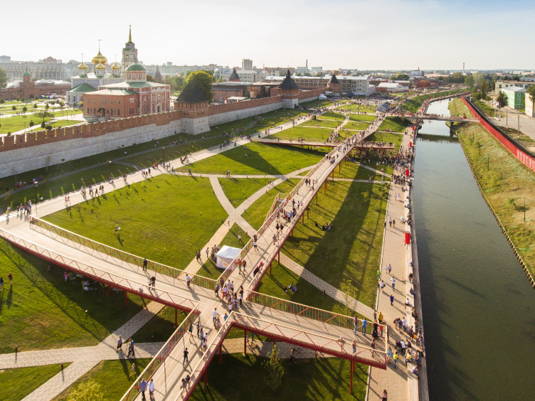
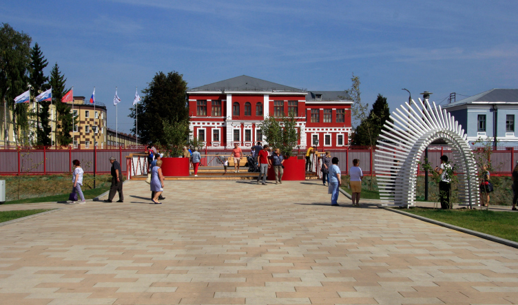
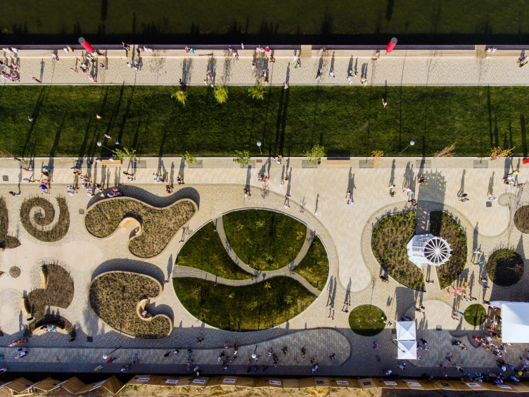
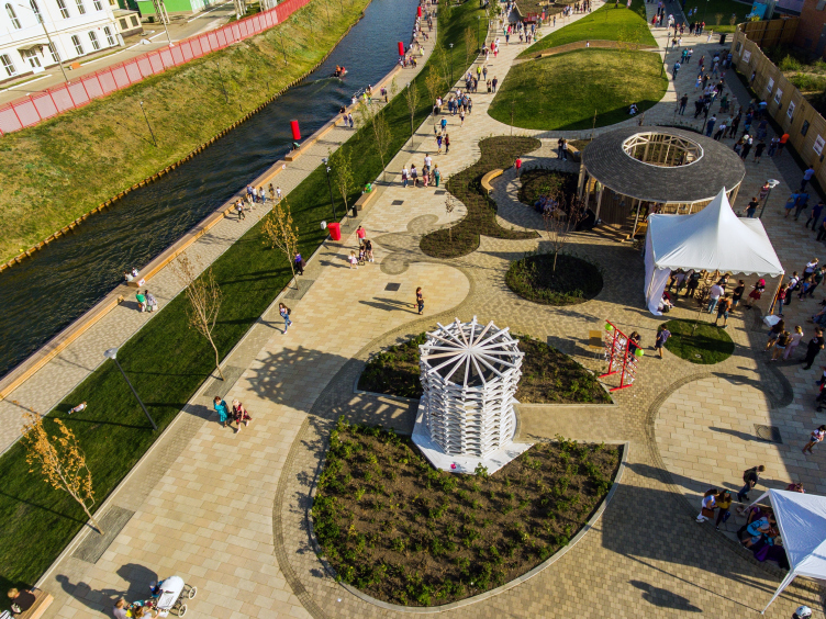
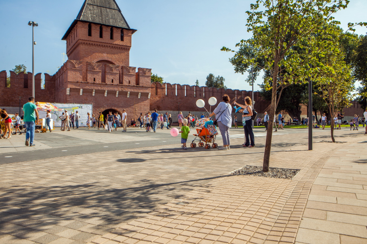
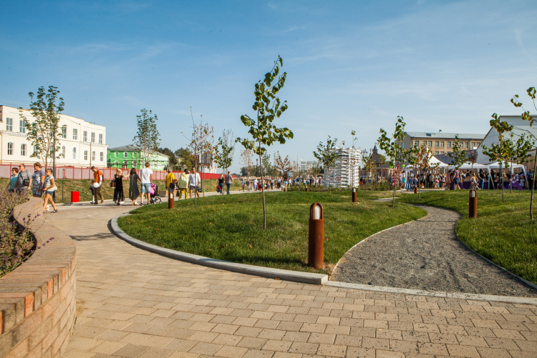
The project of the embankment of the Upa River, which flows past the Tula Kremlin, was announced in July of 2017, and now, a year later, it has already been implemented. The embankment was inaugurated on the city’s day September 8, in the presence of the governor Aleksey Dyumin, who actively supported the project. We already gave a detailed coverage of the project, and now we are examining the end result.
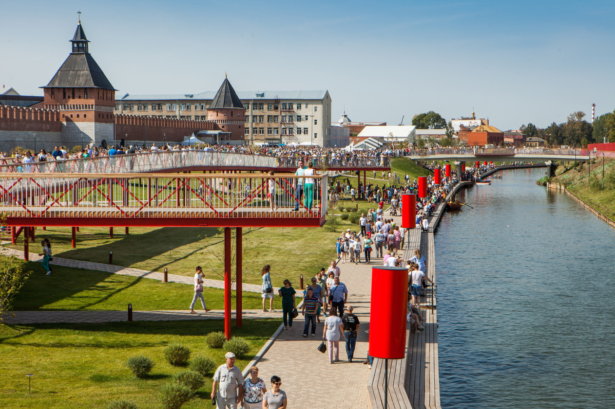
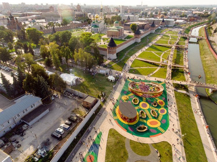
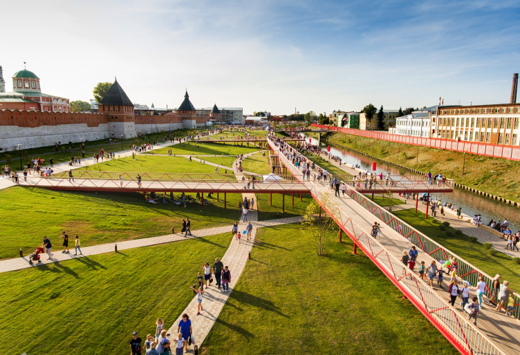
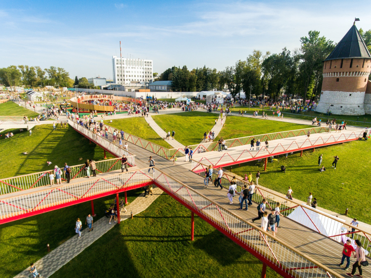
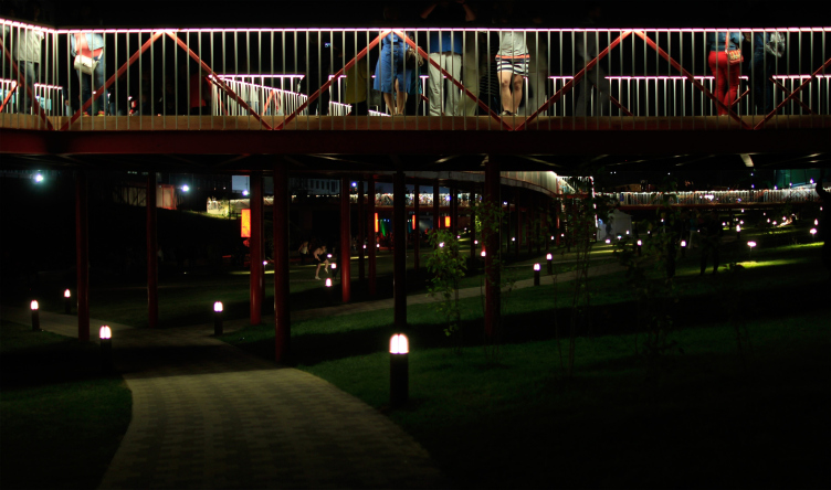
Reconstruction of the Upa River embankment, Tula. 2017-2018 © WOWHAUS, Photograph © Oleg Leonov, Overhaul Department of Moscow
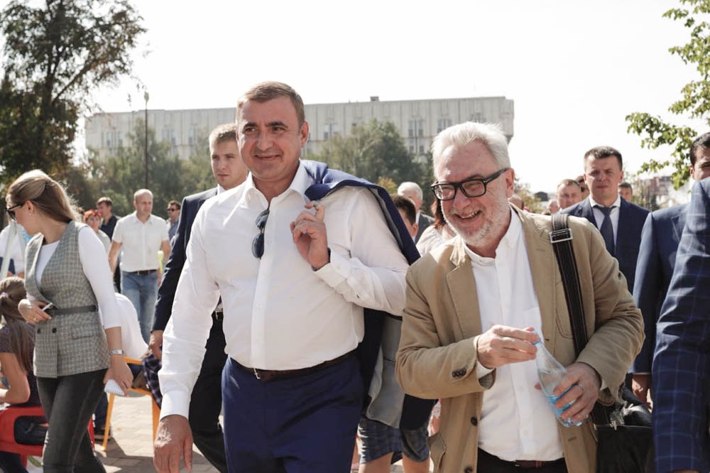
Aleksey Duming (left) Oleg Shapiro (right) at the inauguration of the embankment, 09.09.2018, Tula. Photo courtesy by WOWHAUS
This project has a lot of layers to it, which is characteristic of landscaping projects in general and the ones developed by Wowhaus in particular. In addition, the leader of the company Oleg Shapiro lays special stress on the fact that the architects worked with the project on all levels, from the macro-tasks, such as th master plan or the transport scheme, down to micro-tasks, such as designing some specific elements. Therefore, it makes sense to examine this project layer by layer, gradually going down from the basic solutions that the architects came up with to some little pleasant details.
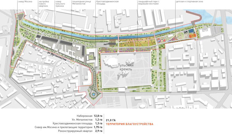
The project of renovating the Tula embankment. The landscaping plan © WOWHAUS
The land in question straddles the pristine rectangle of the low-rise Tula Kremlin from northwest and northeast. Until recently, this land lay completely abandoned because for most of the XX century the territory between the river and the Kremlin belonged to the legendary Tula small-arms factory located in fact on this same island, the location of which resembles that of the Parisian Cite, the difference being that the city center (which was indeed located here in the early XVI century) was later on transferred to the south bank of the Upa, and ever since the city would keep on developing south of the river within the framework of the battlements, while the north side stretching along the Tulitsa hosted the factories that created reservoirs for the metalwork along its riverbed. Russia’s main small-arms factory was built on this island by Peter the Great, and it stands here to this day.
- In the XIX century, this embankment was called “Kazanskaya”; there was a string of ponds on the Upa River, and a boat-renting station. Because of the factory’s needs, the boat station was shut down and the ponds were drained down in 1906;
- During the Second World War, there was a railroad running along the bank of the Upa, which supplied the power grid with coal. It was dismantled after the war;
- Decisions on landscaping the park on the Kazanskaya Embankment, the Metallistov Street, and the Soviet Street were taken in 1948 and 1956 but were never implemented.
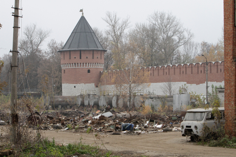
The walls of the Tula Kremlin before the reconstruction, 2017. Photo courtesy by WOWHAUS
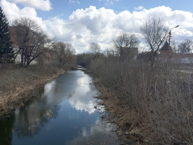
The riverbed of the Upa before the reconstruction, 2017. Photo courtesy by WOWHAUS
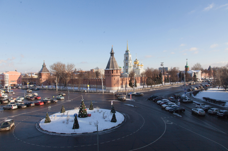
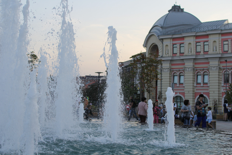
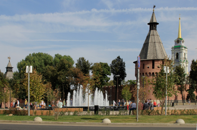
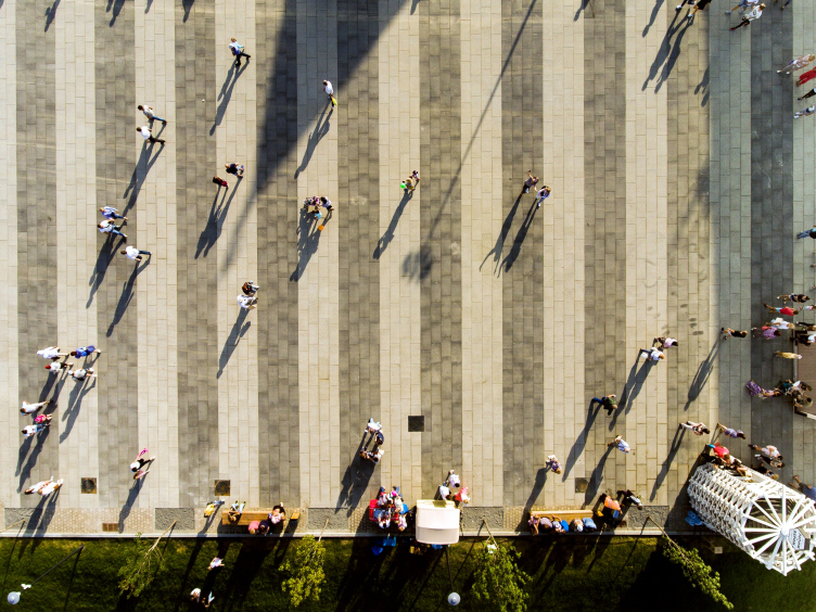
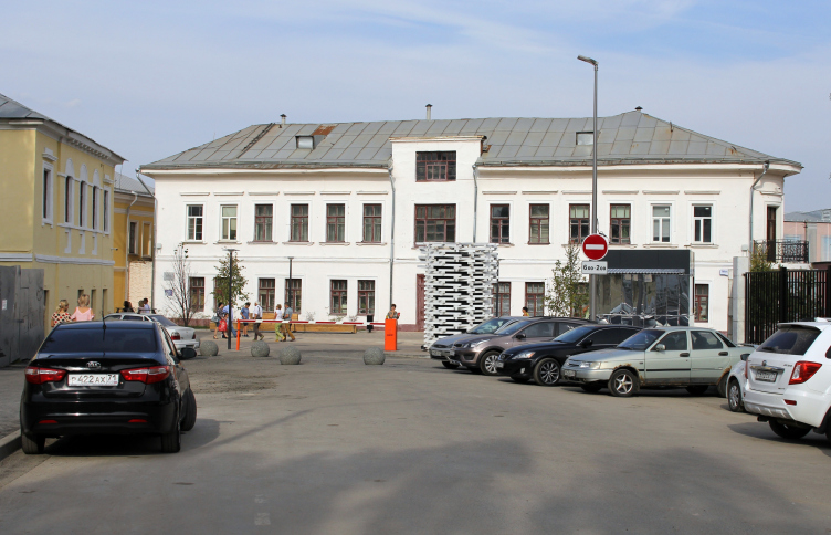
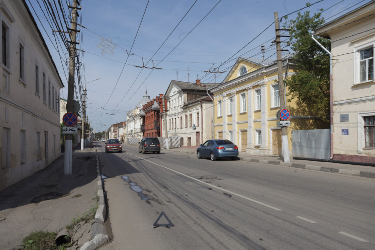
In short, still in 2017 one could drive around the Tula Kremlin on three sides, the fourth side being hidden behind the factory fence. There are two main narratives of the project, which was developed by Wowhaus and implemented on the governor’s initiative: number one – the factory handed the territory of the old riverbed of the Upa over to the city, carrying the notorious fence over to the island; the silted-up channel was cleaned and fortified with wooden piles. Number two – the Metallistov Street, which starts from the Zarechensky Bridge and leads over to the corner Spasskaya Tower of the Kremlin, was made completely vehicle-free, just as the Krestovozdvizhenskaya Square between the tower and the massive building of Sberbank, which used to serve as the roundabout.
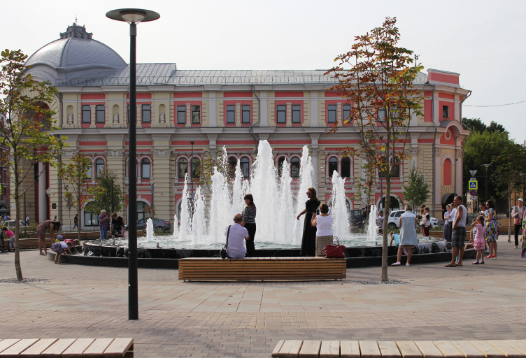
The fountain at the Krestovozdvizhenskaya Square. Reconstruction of the Upa River embankment, Tula. 2017-2018 © WOWHAUS, Photograph: Julia Tarabarina, Archi.ru
The fountain at the Krestovozdvizhenskaya Square. Reconstruction of the Upa River embankment, Tula. 2017-2018 © WOWHAUS, Photograph: Julia Tarabarina, Archi.ru
The fountain at the Krestovozdvizhenskaya Square. Reconstruction of the Upa River embankment, Tula. 2017-2018 © WOWHAUS, Photograph: Julia Tarabarina, Archi.ru
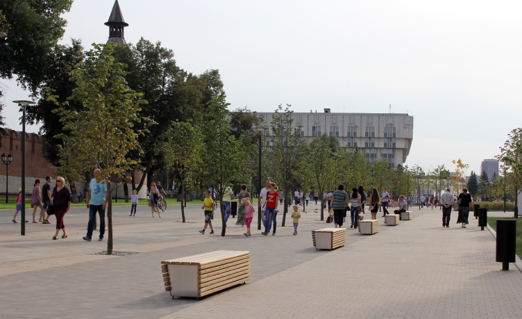
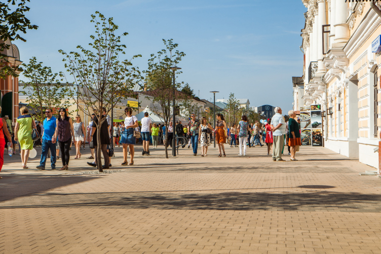
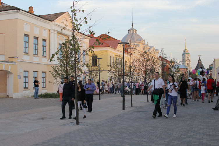
The square became the last “stop” of the new walking route around the Kremlin: from here, one can get both to the quietest historical part of the city, rich in houses built in the XVIII century and inspiring a feeling of blissful peace, and to the busy (in fact, maybe even too busy) middle of the Sovietskaya Street. The square became a pivot between the two worlds – one bustling and busy, the other peaceful and quiet, almost of a museum-like nature. The latter is in for a fair share of reconstruction, while it is planned that the nucleus of the museum part of the city center will be the reformed and vehicle-free Metallistov Street that almost solely consists of mansions of the XIX century: currently, most its façades have been restored, a couple of restaurants have opened, and the signs inform people about the past and the future of this area. Soon, according to the plans, the houses and their yards must turn into a museum city block, most of which will be occupied by the Russian Military Historical Society, which is now already supporting the Tula Kremlin museum.
The museum block on the Metallistov Street will also include branches of the following museums:
the “Kulikovo Field” museum, the Tula state museum of firearms, the history and local lore museum, the museum of fine arms, the Leo Tolstoy museum “Yasnaya Polyana”, and the museum of the headquarters of the Cossack army.
Reconstruction of the Upa River embankment, Tula. 2017-2018 © WOWHAUS, Photograph: Julia Tarabarina, Archi.ru
Reconstruction of the Upa River embankment, Tula. 2017-2018 © WOWHAUS, Photograph: Julia Tarabarina, Archi.ru
Reconstruction of the Upa River embankment, Tula. 2017-2018 © WOWHAUS
Let’s get back, however, to the part which has already been implemented, i.e. the landscaping project. The project is a large one; the length of the entire route (which forms on the plan something like the figure “1” with a long stroke of the street and a short stroke of the embankment) is a little over a kilometer and a half, its area being 21 hectares (just to compare, the length of the park on the Krymskaya Embankment in Moscow, the signature work done by Wowhaus in the same genre is but half of it – about 850 meters).
The length of the wooden embankment running along the Upa River in Tula is 670 meters
The length of the boardwalks is 270 meters
There are 385 lampposts,
19 gazebos and pavilions
Over 40 000 cubic meters of silt were removed from the Upa River,
More than 70 000 cubic meters of waste and soil were removed
More than 1 000 lime wood piles were driven into the bank
More than 41 000 square meters of pavements were laid
More than 30 000 meters of cables were routed
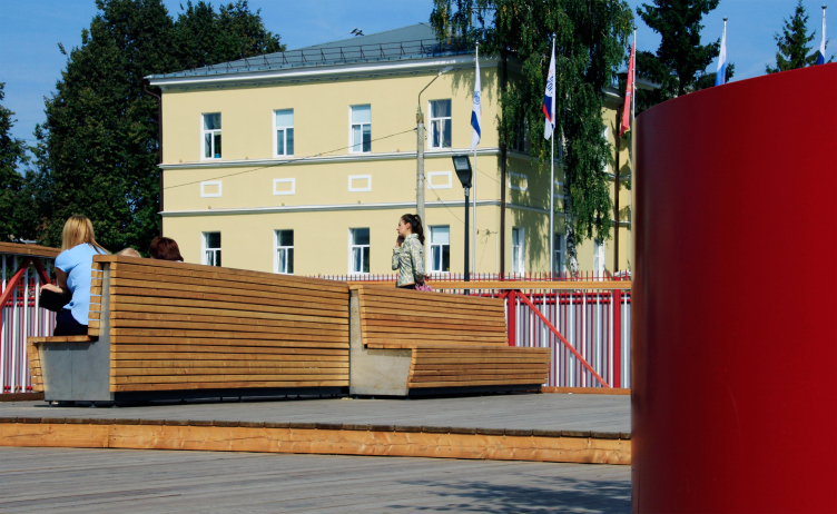
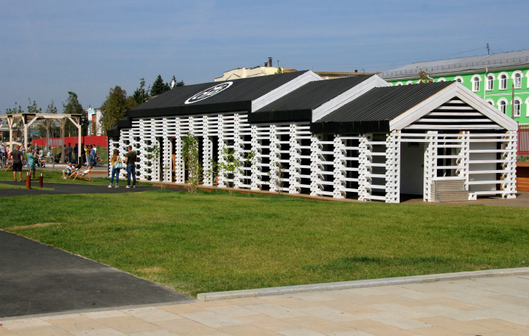
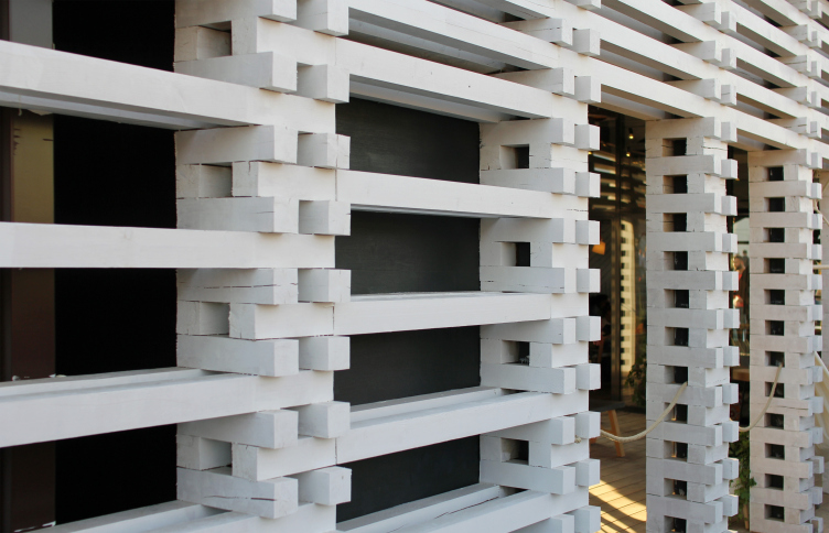
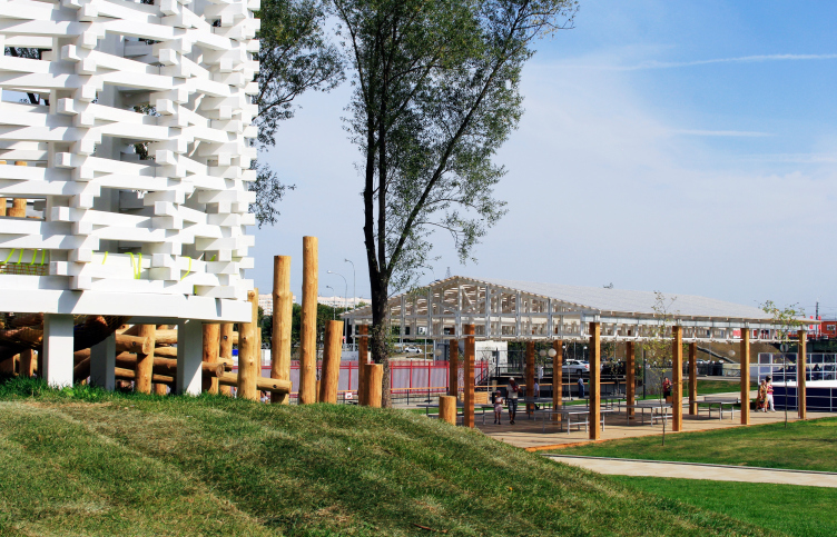
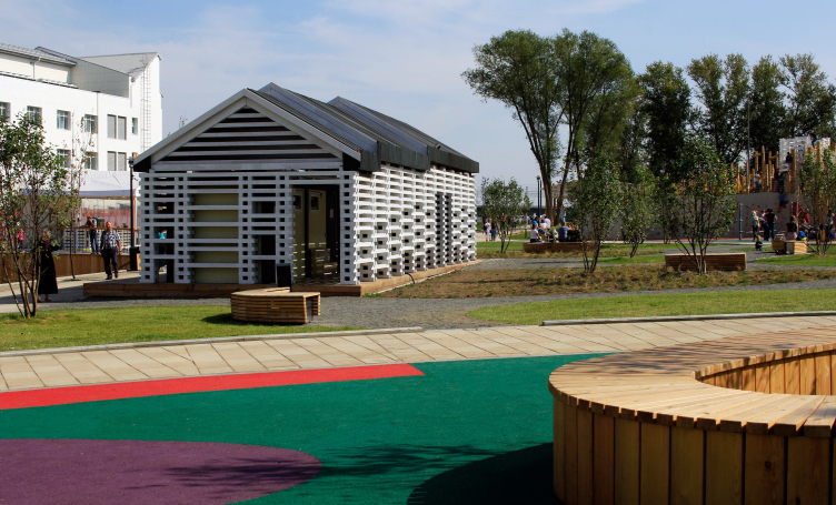
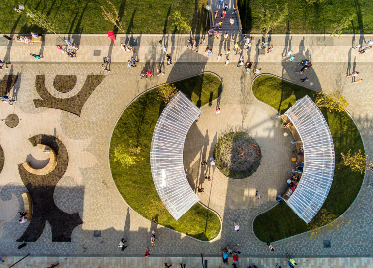
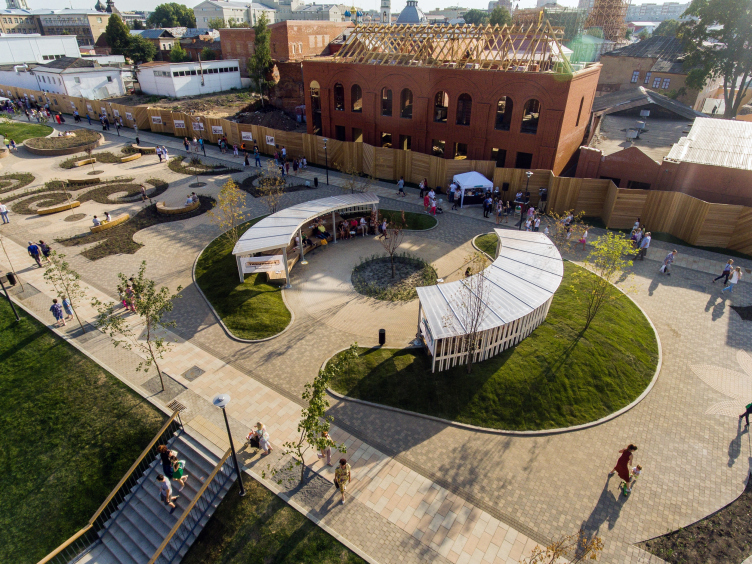
The route, on the one hand, is filled with basic “chain” elements, such as cylindrical “wood stack” food kiosks, made of white timber, or cafés with a similar lath structure of their wooden timber walls (and with ledgy gable roofs) – these repeating elements support the design code and help the walking person to easier get their bearings, and one soon understands what the food is for. I will note in passing here that all of the kiosks were rented and open on the day of inauguration. Another repeating element is the benches made of wooden planks, curved and straight ones, with or without backs, oftentimes turned with their backs to the main promenade – for people to sit down and look in contemplation in the direction of the river. This technique was already used by Wowhaus in the Krasnogvardeiskie Prudy Park, and here it also present, although it is less prominent here.
Reconstruction of the Upa River embankment, Tula. 2017-2018 © WOWHAUS, Photograph: Julia Tarabarina, Archi.ru
Reconstruction of the Upa River embankment, Tula. 2017-2018 © WOWHAUS, Photograph: Julia Tarabarina, Archi.ru
Reconstruction of the Upa River embankment, Tula. 2017-2018 © WOWHAUS, Photograph: Julia Tarabarina, Archi.ru
Reconstruction of the Upa River embankment, Tula. 2017-2018 © WOWHAUS, Photograph: Julia Tarabarina, Archi.ru
Reconstruction of the Upa River embankment, Tula. 2017-2018 © WOWHAUS, Photograph: Julia Tarabarina, Archi.ru
Reconstruction of the Upa River embankment, Tula. 2017-2018 © WOWHAUS, Photograph: Julia Tarabarina, Archi.ru
A kiosk at the beginning of the Metallistov Street. Reconstruction of the Upa River embankment, Tula. 2017-2018 © WOWHAUS, Photograph: Julia Tarabarina, Archi.ru
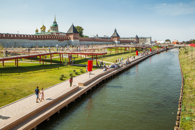
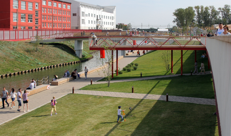
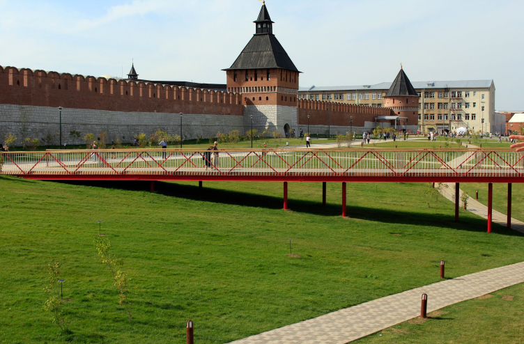
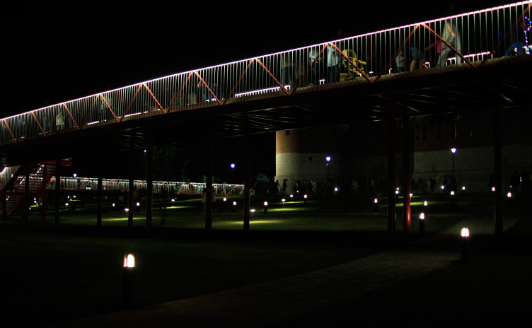
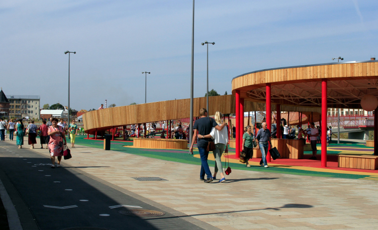
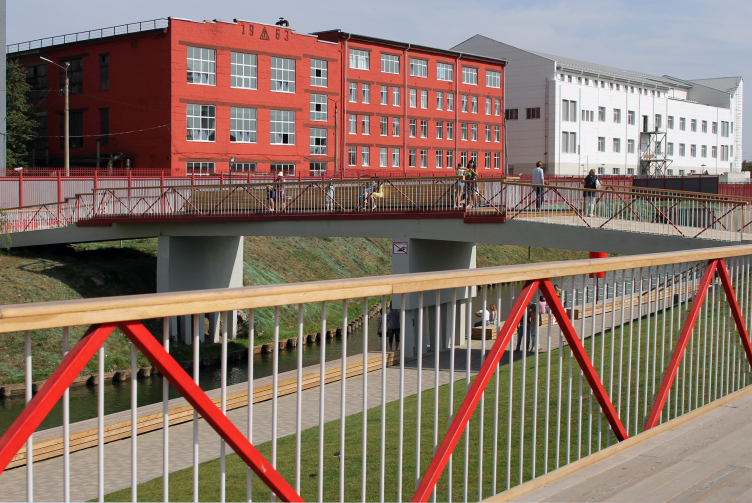
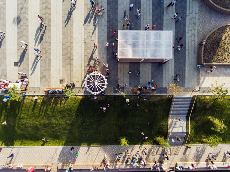
The repeating pavilions and benches, just like the paving, although consisting of cast stones but still diverse, create a peculiar framework that holds together different scenarios – such a big territory had to be divided into thematic zones to avoid monotony. And in my opinion, the most interesting of these unique narratives is the little bridges at the slope of the river. Resting on slender red legs, with red-and-white railings, they cover the intersection of two main streams: the one that exits from the Kremlin through the “Vodyanye Vorota” (which translates as “Water Gate”, nothing more nor less) opened as part of the project, and the one that moves in both directions along the river. This pedestrian crossing is designed in an upbeat manner, it has plenty of air in it but it still looks very bright. Walking down the waterfront, you initially are oblivious of the fact that you are actually walking up high above the slope, and the moment of revelation – wow, we are on the bridge already! – makes it all worth it. On your left and right, there are kids of different ages running (and sometimes rolling) around on the grass.
Reconstruction of the Upa River embankment, Tula. 2017-2018 © WOWHAUS
Reconstruction of the Upa River embankment, Tula. 2017-2018 © WOWHAUS, Photograph: Julia Tarabarina, Archi.ru
Reconstruction of the Upa River embankment, Tula. 2017-2018 © WOWHAUS, Photograph: Julia Tarabarina, Archi.ru
Reconstruction of the Upa River embankment, Tula. 2017-2018 © WOWHAUS, Photograph: Julia Tarabarina, Archi.ru
Reconstruction of the Upa River embankment, Tula. 2017-2018 © WOWHAUS, Photograph © Oleg Leonov, Overhaul Department of Moscow
Reconstruction of the Upa River embankment, Tula. 2017-2018 © WOWHAUS, Photograph © Oleg Leonov, Overhaul Department of Moscow
Reconstruction of the Upa River embankment, Tula. 2017-2018 © WOWHAUS, Photograph © Oleg Leonov, Overhaul Department of Moscow
At night, the frameworks of the bridges hang as white grilles over the multitude of lights: some of them are spotlights, and some cast circles of light on the grass, and it feels like you are in some magic place, some toy elf camp under the walls of a small fortress.
Reconstruction of the Upa River embankment, Tula. 2017-2018 © WOWHAUS, Photograph: Julia Tarabarina, Archi.ru
Reconstruction of the Upa River embankment, Tula. 2017-2018 © WOWHAUS, Photograph: Julia Tarabarina, Archi.ru
There are also crosswise boardwalks that connect this entire hanging promenade with the mainland on the one side and with the river on the other. There are also appendixes of balconies stretching out in the direction of the river that are great vantage points for admiring the surrounding scenery; these are echoed by two sturdier concrete bridges that, concrete as they are, nonetheless also “lead nowhere” – or, to be more exact, towards the factory fence, which, having turned into a red canvas behind the red grille, looks quite friendly. What is remarkable is the fact that one can step up directly to the fence – meaning, there are landings for the walking people not only on the city, but also on the factory side. The bridges are wide, there are benches and pots with decorative trees standing on them, so you could call them “balcony bridges”. All of this, when put together, does bring certain associations with the hovering bridge in Zaryadye, which can arguably claim the status of the nation’s main “bridge to nowhere”, but there are considerable differences from Zaryadye as well: what we see here is a structure that is not so high and mighty but a lot more diverse and upbeat. The boardwalks are not at all scary to walk upon, they are friendly and not really strained from the engineering standpoint either; the balance between the absence of feeling of being torn away from the ground and the feeling of being in a multi-tiered space goes a long way to liven up one’s emotions without trying to overwhelm the pedestrians with some grand-scale edifice.
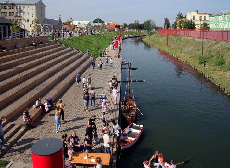
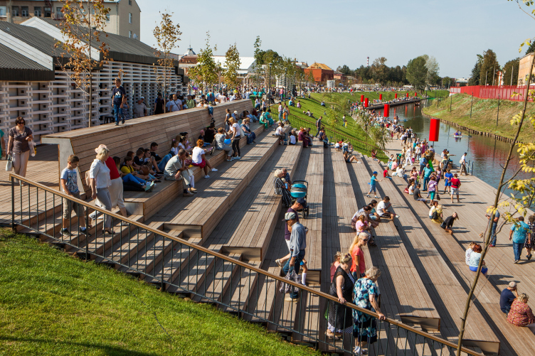
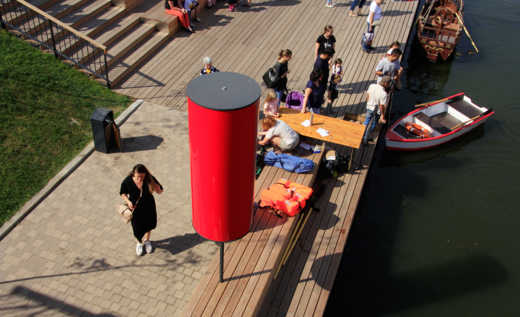
What is interesting is the fact that the boardwalks adorn not the whole of the terrain but at some point descend down to the amphitheater, the signature-style point of importance in many Wowhaus projects – it seems that, thanks to this firm’s outstanding ability to design them, amphitheaters became so prolific in the Russian reality of today. This one is rather large – it is situated next to the main axis leading from the Water Gate, i.e. from the city center, to the bridge over the river. Near the amphitheater, there is also a quay (it reminds us of the trading quay that existed here still in the XIX century), so, sitting here one can watch families sailing away in boats, which is an amusing sight in itself. There is yet another interesting and practically useful design solution: the wooden bench in the upper side of the amphitheater – it serves as a railing for the passersby, it is something like a bar counter for the guests of the nearby café, and it also gives protection from the sunlight falling from the south to those sitting on the upper stair of the amphitheater.
Reconstruction of the Upa River embankment, Tula. 2017-2018 © WOWHAUS
Reconstruction of the Upa River embankment, Tula. 2017-2018 © WOWHAUS, Photograph: Julia Tarabarina, Archi.ru
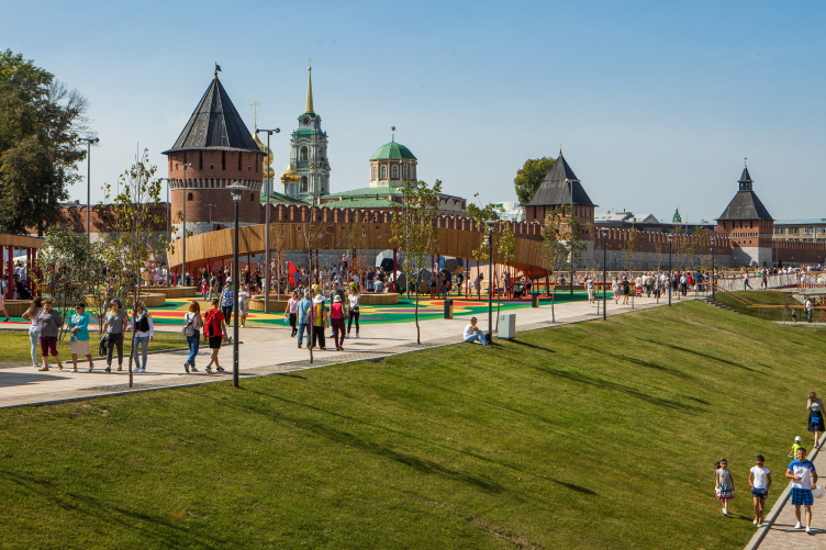
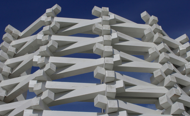
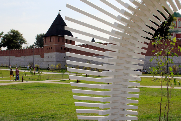
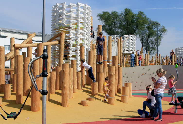
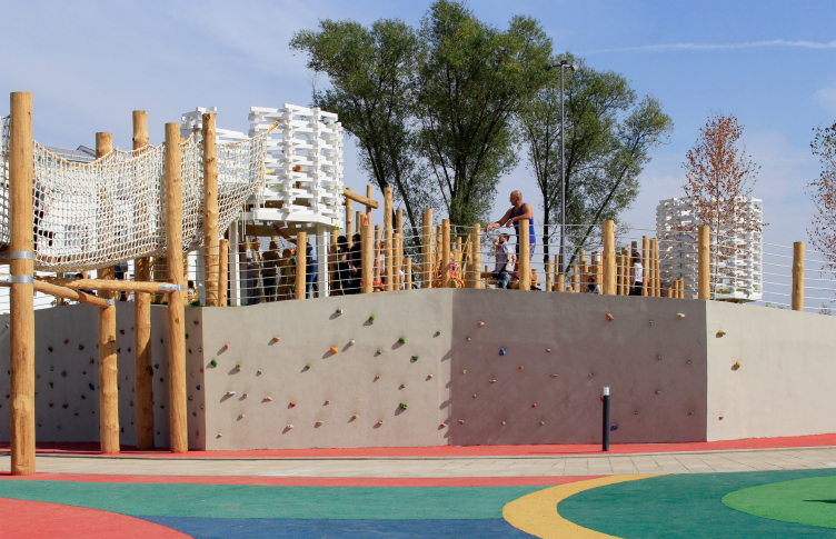
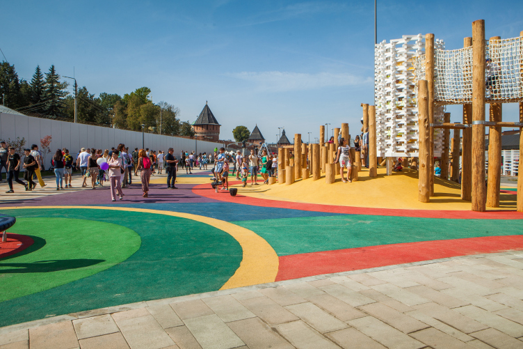
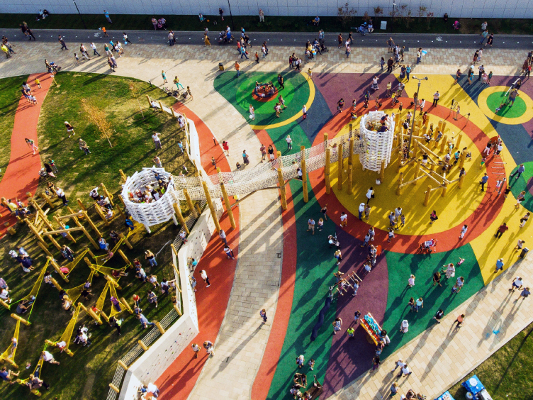
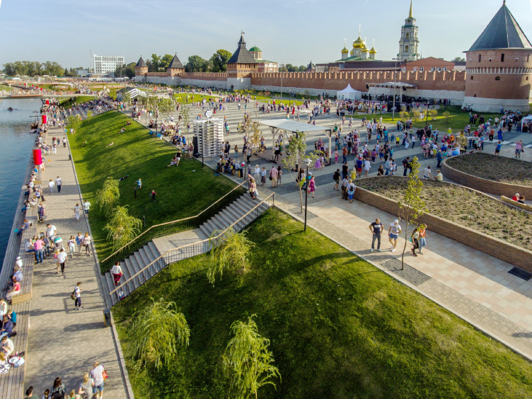
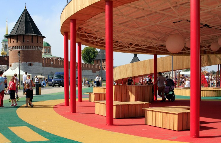
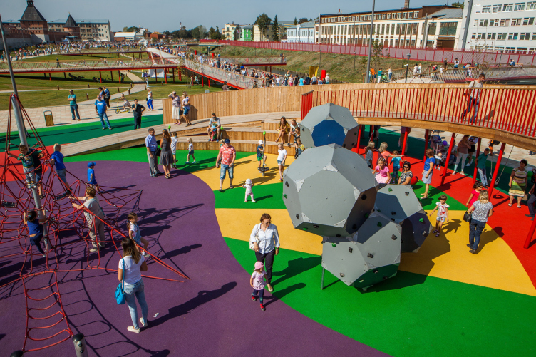
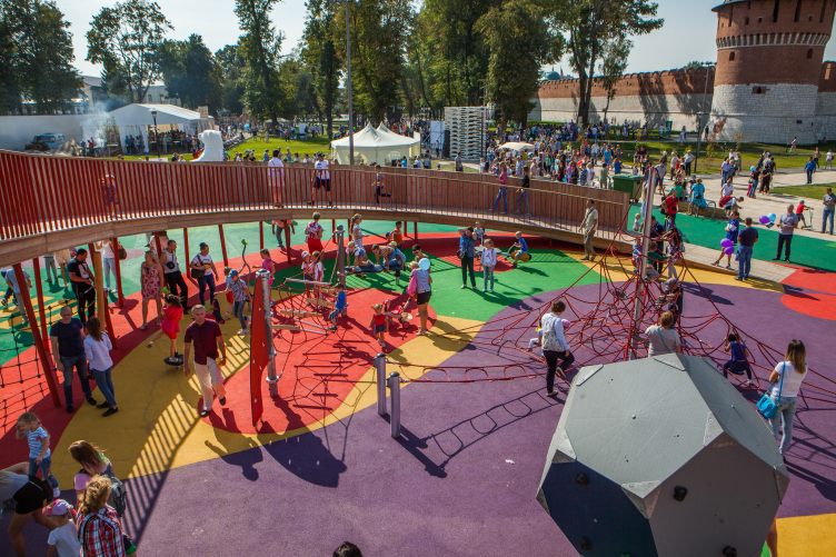
One must say at this point that the embankment is very closely connected to the Kremlin, both in terms of space and symbolically. The Kremlin is to be seen pretty much from everywhere, it becomes part of the view from playgrounds, while the teenager playground, built on a framework of whittled, yet not cylindrical, logs, can remind a knowledgeable person about the wooden walls, which, still before the time of Catherine the Great, would run along the lines of today’s Sovetskaya streets, and the stone-and-wood Kremlin, which, built by Basil III, came still before the red-brick Kremlin, which stands in Tula now. Meaning, this place can bring associations with both night army camp under the Kremlin walls and with the old wooden walls of the city – but all of these associations are really playful, which is also enhanced by the relatively small height of the Kremlin walls, and which is also a great thing because one’s architectural palate gets really tired of “serious” architectural structures meant to evoke associations with the Ancient Russ, and it’s not every day that you meet the old traditions presented in such a playful manner, and it is this way of presentation that makes it look welcoming and friendly.
Reconstruction of the Upa River embankment, Tula. 2017-2018 © WOWHAUS, Photograph: Julia Tarabarina, Archi.ru
Reconstruction of the Upa River embankment, Tula. 2017-2018 © WOWHAUS, Photograph: Julia Tarabarina, Archi.ru
Reconstruction of the Upa River embankment, Tula. 2017-2018 © WOWHAUS
Reconstruction of the Upa River embankment, Tula. 2017-2018 © WOWHAUS, Photograph © Oleg Leonov, Overhaul Department of Moscow
Reconstruction of the Upa River embankment, Tula. 2017-2018 © WOWHAUS, Photograph © Oleg Leonov, Overhaul Department of Moscow
Reconstruction of the Upa River embankment, Tula. 2017-2018 © WOWHAUS, Photograph © Oleg Leonov, Overhaul Department of Moscow
Reconstruction of the Upa River embankment, Tula. 2017-2018 © WOWHAUS, Photograph © Oleg Leonov, Overhaul Department of Moscow
Reconstruction of the Upa River embankment, Tula. 2017-2018 © WOWHAUS, Photograph: Julia Tarabarina, Archi.ru
Reconstruction of the Upa River embankment, Tula. 2017-2018 © WOWHAUS, Photograph © Oleg Leonov, Overhaul Department of Moscow
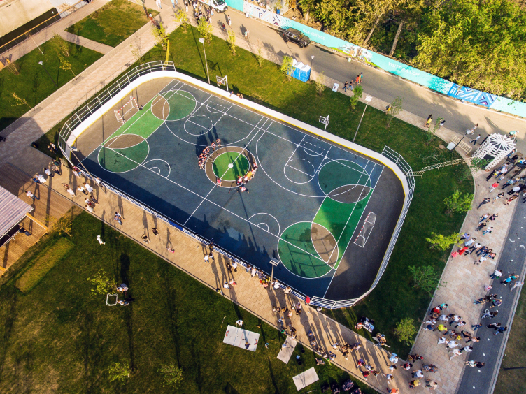
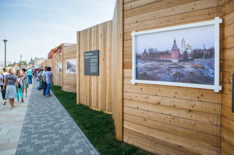
The Tula Kremlin has completely become the center of relaxed multicultural recreation – generally speaking, due of the fact that the fortress was built by the Italians, it is very clearly organized: a rectangle, four corners, and four gates. Now that all of the entrances and exits have been restored, one can indeed take a walk here in any direction, and there are lots of recreation options to choose from: you can play ping-pong, sail a boat, climb the rope park (not mentioning the multifunctional sports “box” located close to the further right end of the territory), and organize concerts not just in one but in two places: in the amphitheater, originally proposed by Wowhaus and on the stage, which is situated a little on the left and a little closer to the city wall, and which was proposed in the course of the design process by the mayor’s office and the city people (this resulted in their being two stages, one at the bottom, with a “river” background, and the other, more traditional, at the top, but it has more room for sound equipment). The wooden wall, which separates the embankment from the yet-to-be-reconstructed backyards of the Metallistov Street, proudly displays the history of the embankment for the curious to read. All of this hinges on the Kremlin as the central figure, and people can be exposed to all of this in an arbitrary order.
Reconstruction of the Upa River embankment, Tula. 2017-2018 © WOWHAUS
Reconstruction of the Upa River embankment, Tula. 2017-2018 © WOWHAUS, Photograph: Julia Tarabarina, Archi.ru
Reconstruction of the Upa River embankment, Tula. 2017-2018 © WOWHAUS, Photograph: Julia Tarabarina, Archi.ru
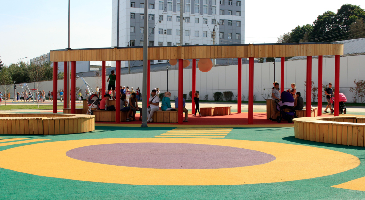
Yet another way of grasping the concept of the monument of architecture neighboring so luckily on a place designed in the signature style of the architects is through color. The Kremlin is red-and-white, about a third of its walls built from white stone, the rest – from brick. The landscaping elements are also red and white, the difference being that both colors are brighter. The “red thread” is formed by the pillars of the boardwalks, red circular tubs, and bright cylindrical lampposts, the white one – by the painted wood of the kiosks and the lath of the boardwalks. At this point one can also remember that the red leitmotif was recently tested by Wowhaus at Moscow’s Krasnogvardeiskie Ponds in Gorky Park, and can now also claim the role of the architects’ signature technique. The wood has also been spoken about already, one can see in it a reminder of the old Kremlin, at the same time, wood is a typical material of modern landscaping, and, like was already said, it can put one in the mind of the old city walls. These three colors are also complemented by black, which brings remote associations with metal, perfectly normal for the city of gunsmiths, but let’s also note that black here looks nothing like cast iron (which is pretty much the case on many other streets of this city) but is deep, stylish, and contrasted by white.
Reconstruction of the Upa River embankment, Tula. 2017-2018 © WOWHAUS, Photograph: Julia Tarabarina, Archi.ru
Reconstruction of the Upa River embankment, Tula. 2017-2018 © WOWHAUS, Photograph: Julia Tarabarina, Archi.ru
One of the brightest spots of the Upa’s new embankment is a string of the façades of the factory buildings on the opposite bank (as we remember, the factory works still to this day). When they were announcing their project, the architects did speak about the façades but at that point it seemed that these façades were just a formal necessity to be dealt with. However, it turned out that the city got more than it bargained for: the alternation of the façade colors – red and a light shade of gray – is not just festive but it also boosts the associations with constructivism, the art of the industrialization epoch, leaving at the same time some room for a note of “palace-and-castle” eclectics. Peculiarly, the fact that we cannot actually cross over to the other side and find ourselves on the island seems but a minor consideration – the factory came alive, presenting itself to the public in all living glory, its fence looking just as lively because its red color makes it look similar to the embankment, and, in addition, the architects raised it pretty high, almost to the crest of the slope. It would look even more beautiful if there were willows growing on the slope – but, alas, the factory is a regulation facility, and only grass can grow on this slope.
Reconstruction of the Upa River embankment, Tula. 2017-2018 © WOWHAUS, Photograph: Julia Tarabarina, Archi.ru
Reconstruction of the Upa River embankment, Tula. 2017-2018 © WOWHAUS, Photograph: Julia Tarabarina, Archi.ru
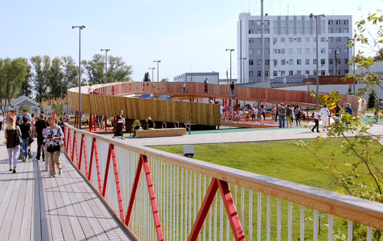
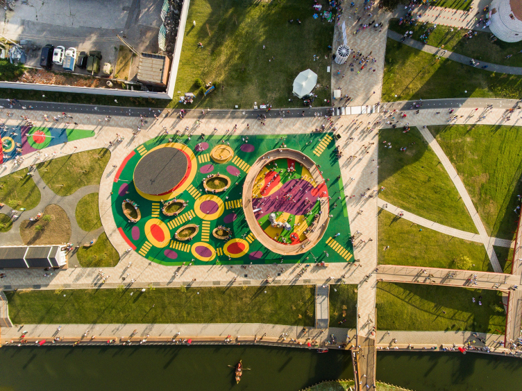
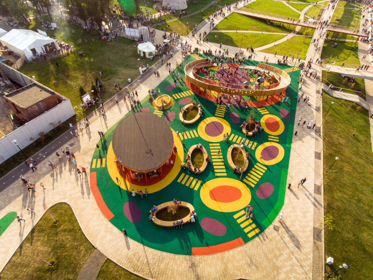
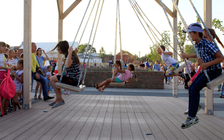
Otherwise, the zones of the “park” embankment constantly change their genre and structure: starting from sports on the east end to the “lightweight” ping-pong to the “wooden fortress” of the teen playground to the children’s “bagel” playground (which looks similar to the “bagel” that one can see in Moscow’s Bauman Park and City Farm in Moscow’s All-Russia Exhibition Center), and so on, with a break that presents itself in the form of a lilac garden and the geoplastics, again, the kind that one can see on Moscow’s Krymskaya Embankment (the swing and the box with chains were in fact the initiative of the city; originally, they were not there in the project). A keen observer may notice how the architects are accumulating experience and sets of techniques, leaning on their earlier projects, and the same time enriching them – for instance, the boardwalks and the balconies popped up in this specific project.
Reconstruction of the Upa River embankment, Tula. 2017-2018 © WOWHAUS
Reconstruction of the Upa River embankment, Tula. 2017-2018 © WOWHAUS
Reconstruction of the Upa River embankment, Tula. 2017-2018 © WOWHAUS, Photograph © Oleg Leonov, Overhaul Department of Moscow
Reconstruction of the Upa River embankment, Tula. 2017-2018 © WOWHAUS, Photograph © Oleg Leonov, Overhaul Department of Moscow
Reconstruction of the Upa River embankment, Tula. 2017-2018 © WOWHAUS, Photograph © Oleg Leonov, Overhaul Department of Moscow
Reconstruction of the Upa River embankment, Tula. 2017-2018 © WOWHAUS, Photograph © Oleg Leonov, Overhaul Department of Moscow
Reconstruction of the Upa River embankment, Tula. 2017-2018 © WOWHAUS, Photograph © Oleg Leonov, Overhaul Department of Moscow
Reconstruction of the Upa River embankment, Tula. 2017-2018 © WOWHAUS
Reconstruction of the Upa River embankment, Tula. 2017-2018 © WOWHAUS
Reconstruction of the Upa River embankment, Tula. 2017-2018 © WOWHAUS, Photograph: Julia Tarabarina, Archi.ru
As far as the greenery is concerned, it will be planted here during the next year, until the spring of 2019. But then again, the lilac garden next to the Water Gate has already been planted, although the bushes are pretty small, much smaller than the lime and maple trees on Moscow’s Garden Ring, but the lilac are yet to grow, which is not a bad thing – this way, you can make absolutely sure that they take root here. Today, apart from the young lilacs and the birch trees, what vegetation the place has is only the close-cropped grass – it is planned that in the future the flowerbeds scattered around the place will boast field flowers and herbs.
More than 58 000 square meters of lawns and flowerbeds have been made
More than 20 000 trees and shrubs have been planted
By the spring of 2019 it is planned to plant over 500 trees, 11 000 shrubs, 2 170 square meters of flowerbeds of perennial and gramineous plants on the river bank
The coppices that the architects designed in the west part of the park, are quite low so far, and are also waiting to be renewed. As a rule, the park component is the most fragile part of any landscaping project. Moscow has many times witnessed a situation when once planted fashionable vegetation lived for about a year, and then, once the contractor was changed, it would fade away, giving way to the “municipal happiness” presented by nicotiana alata and tagétes. Let us hope that something like this will not happen in Tula, abs next summer we will see the embankment flourish in all living glory. Incidentally, the greenery work on the Metallistov Street looks now quite complete, the street essentially being a vehicle-free boulevard, where the lime trees with their trunks buried in pebbles form a rather narrow – 3.5 meters – promenade in the middle, and always twice as wide – 5.5 lanes on the sides. These lanes can be used, should such need arise, by emergency vehicles, while the pedestrians obviously have the central promenade all to themselves.
Reconstruction of the Upa River embankment, Tula. 2017-2018 © WOWHAUS
Reconstruction of the Upa River embankment, Tula. 2017-2018 © WOWHAUS
None
Tula, just many other region centers situated around Moscow, is a city, the development layers of which are easily readable: for example, the former area of privately owned cottages (which is ironically called in Russian “the private sector”) starts here almost immediately beyond the border of the walls – the Soviet streets – with an odd inclusion of Soviet-era buildings and Stalin-era avenues. Fragments of the historical city are clearly readable, just as the modernist inclusions, such as the building of the city administration. A keen observer will notice spots of “Luzhkov” modernism and the “high-profile” treatment of the history of gunsmiths – if you enter the city from the Moscow side, you are met by the weaponry museum in the form of a giant helmet (built in 2011), and you will have a hard time trying to make up your mind as to whether you like it or not: on the one hand, the message is quite clear, on the other hand – isn’t it too much? The museum, as was already said, was built in 2011; in 2014, the cathedral was restored, the belfry was built anew, and the patriotic museum Russian Military Historical Society was opened in the Kremlin. As for the most recent days, they have seen a new wave of renovation sweeping over Tula: two multifunctional clusters appeared: “Iskra” (“Spark”) in the building of the former parochial secondary school for girls and around it (a great quiet place with great restaurants in it), and “Oktava”, located on the territory of the microphone factory with the telltale name – a loom museum with a multimedia exposition, a constantly functioning large lecture hall, a coworking space, and the like; also “Likerka Loft” and “Tipografia Place”. The new embankment of the Upa definitively belongs to this list of novelties – postindustrial, meant, among other things, to attract people to the city not only with firearm pride but also with the diversity of the city environment and opportunity that it presents.
* “civitas ludens” literally translates as “a playing city”, which is a reference to the “Homo ludens” book by Johan Huizinga. “Homo ludens” can be roughly translated as “a playing man” because Ludus has no direct equivalent in English, as it simultaneously refers to sport, play, school, and practice.

