По-русски

Roman Leonidov: "Half-timbering technology is, in my view, the upcoming trend of today".

A conversation about NEWOOD - the company that Roman Leonidov created two years ago for working with standard houses that are built with the use of the "half-timbering" technology.

11 December 2014
Interview
mainImg
Роман Леонидов © компания NEWOOD
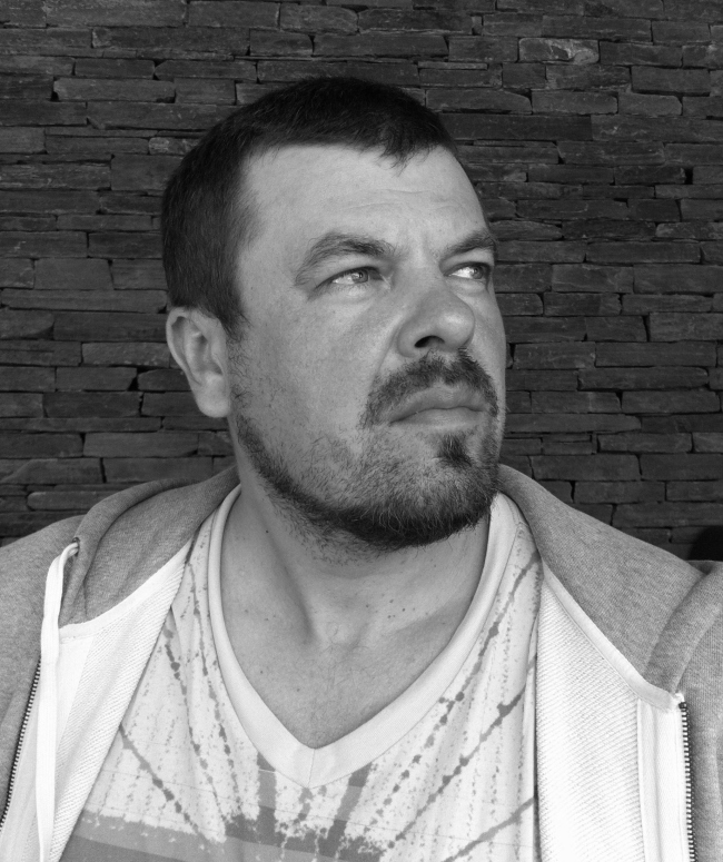
Roman Leonidov © NEWOOD Company открыть большое изображение

Archi.ru:
- When did NEWOOD project appear and what is it all about?

Roman Leonidov:
- The brand NEWOOD appeared but two years ago but over this comparatively short time it has gained a fair amount of recognition. It all started with us doing a few projects using the half-timbering technology that has a lot of advantages and benefits, and attempted to reconstruct the technology that was very popular in Moscow still in the late XIX century, when in the two-story construction, the second wooden floor was in fact of the framework type, with bearing corner columns. At the same time, the filling can be absolutely of any kind. Essentially, it is the same good old half-timbering technology, only some slight different version of it, different from the standard French or German samples.

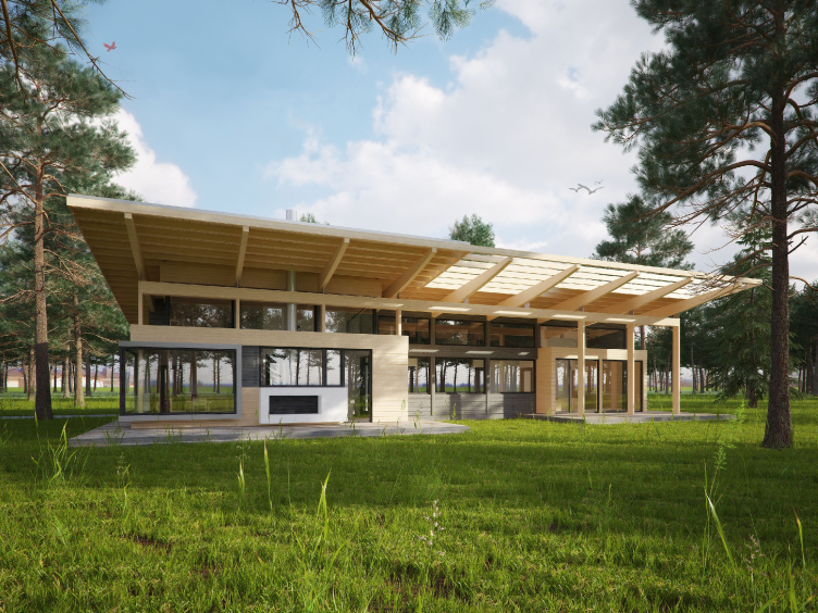
At some moment, we decided to use this knowledge, and, based on such technology, made a project of a guest house belonging to a Moscow manor. It became the prototype of a whole series of residential houses, a series that we named "Scandinavia". Besides, this project was to play the key part of the seed from which the company has grown: it was at that point that we had an idea to create a special studio that would specialize in timber construction. The idea was really simple: the very material gives here, in the Russian latitudes, a lot more creative freedom to the architect. 

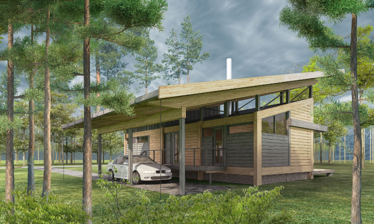
Типовой дом «Скандинавия-100» © компания NEWOOD
The standard house "Scandinavia-100" © NEWOOD Company открыть большое изображение

- And how is the work of your studios wired? What are your priorities? 

- For me, the division of our activity among the three independent companies - "Shabolovka" that mostly does the interior design projects, NEWOOD, and "Roman Leonidov Architectural Bureau" is nothing more but a business maneuver. Having satisfied my ego with the creation of a studio named after myself, I realized that by doing so I was limiting the number of possible customers and the creative growth of my employees. The thing is that when the customer comes to "Roman Leonidov Architectural Bureau", they, of course, want to work with Roman Leonidov and nobody else. Having "Shabolovka" and NEWOOD that are not tied to any specific name, it is a lot easier to help your young architects to grow and excel. And I am sure that it us the fresh blood that helps the company grow and develop. Besides, shifting part of the responsibility to my employees, I get a little bit more free time as an architect. 

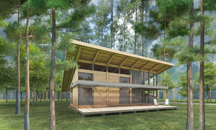
Типовой дом «Скандинавия-100» © компания NEWOOD
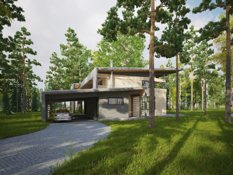
The standard house "Scandinavia-100" © NEWOOD Company открыть большое изображение

Yet another plus is the clear-cut division of my companies according to their types of activity. To me, it is perfectly obvious that designing the interiors and designing buildings simply cannot be done by one and the same person: these are two different professions. However, to keep my company afloat, I think it right to cover all the spheres: there are times when there is more demand for the interiors, there are times when type houses are in demand, and sometimes its the unique architecture that's on top. Thus, we get a certain share of financial security and stability. 

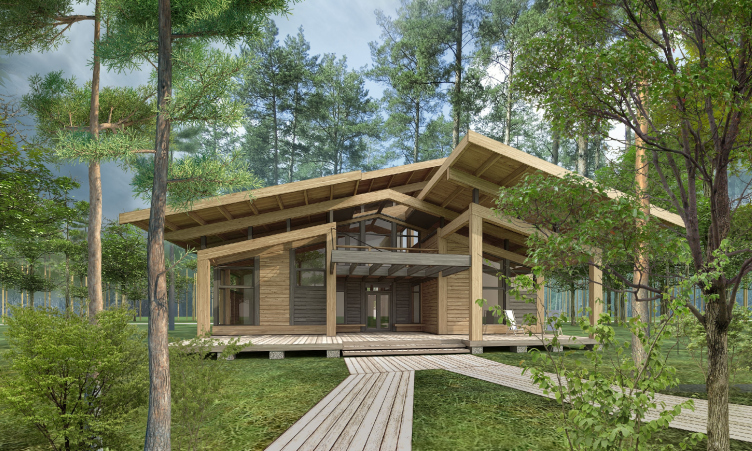
Типовой дом «Скандинавия-250» © компания NEWOOD
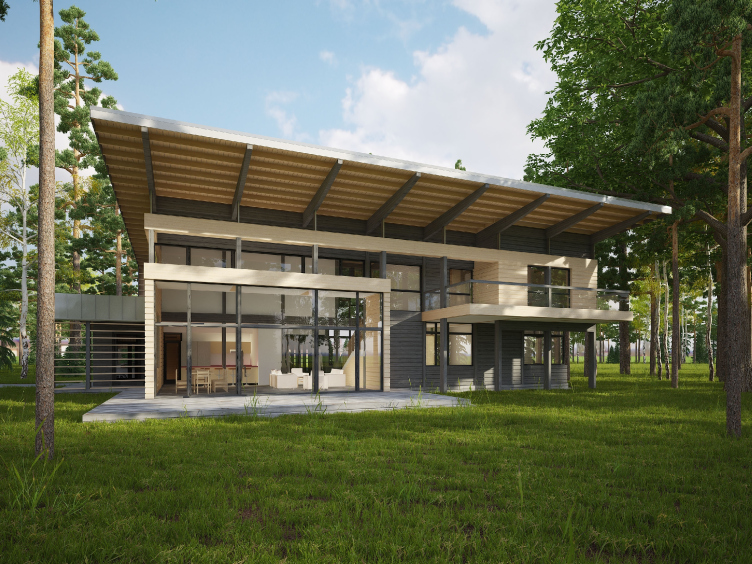
The standard house "Scandinavia-250" © NEWOOD Company открыть большое изображение

- Why did you decide to specialize in the laminated veneer lumber, refraining from using, for example, the regularized round timber and other technologies of working with wood? What are the advantages of the half-timbering technology before the traditional one? 

- Initially, we made opted for LVL because it shrinks a lot less than the regularized round timber. As the main benefit of this, the main problem of any wooden house that scared the customers off is solved once and for all. The crucial factor in the buying decision is now the consumer properties of the house in question. Besides, an LVL house does not need any extra warming or decorating: the wooden construction perform both the bearing and the decorative functions. This material gives more plastic advantages and opens up new opportunities of working with the shape. 

- To what degree do you "fine-tune" each standard project adapting it to the specific terrain and the customer's requirements? Perhaps, after this, the project stops being "standard"?

- Of course, standardized projects can be fine-tuned and readjusted: we always consider our customer's requirements but, yes, it all depends on the degree of readjustment. If it is necessary to move the door a bit in the partition or slightly adjust the parameters of the premises, then, yes, we can consider this house as built on a standardized project. If we are asked to make considerable changes, as a rule, we offer the customer to make an individual project that will exactly meet his needs and expectations. 

There was a case, however, when in the end version of the standardized project it was planned to build a single-story house with a loft over a double-height living room. Our customer asked us to substitute the loft with a second floor, placing the bedroom there. I am not sure if the project stopped being standardized after that. Probably not. It's just that we got two versions within one series for our customers to choose from. 
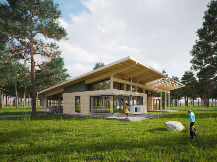
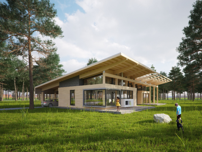
Типовой дом «Скандинавия-250» © компания NEWOOD
The standard house "Scandinavia-250" © NEWOOD Company открыть большое изображение

- Which individual projects stand a chance of living on as "standard" ones, and which don't? Were there any cases of such transformation in your career? 

- Even if there are such cases, they are few and far between. Making a custom-designed project is the same as sewing a custom-designed suit for your customer. Offering not just similar but exactly the same project to another person would be a difficult thing to do. A house is always the owner's portrait. And here it is always more simple to work with your average type project designed for an average family. The first thing that comes to mind is the guest house that I already mentioned - it was designed as an individual one but ultimately it became the standard type. 

- How quickly is the half-timbering house built? And - still more interesting - how much more or less expensive is it in comparison to the concrete one? What is the price ratio if you compare not the specific projects but technologies per se?

- The cost of such houses is almost the same as the LVL. And if we are to compare these houses to the stone ones, then the half-timbering house will turn out about 10–15% less expensive - in view of the fact that stone construction requires more operations: stucco job, paint job, and so on. In the case of the wooden wall, these stages can be simply left out. As far as the implementation terms are concerned, full assembly, regardless of the degree of complexity of the project, takes up no more than two or three months. 
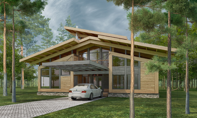
Типовой дом
The standard house "Delta-100" © NEWOOD Company открыть большое изображение

- In which market segment do you think NEWOOD operates? Do you plan to expand your range into the cheap segment or, the other way around, to focus on the luxury houses? 

The company NEWOOD was devised as an independent dedicated brand. However, this year I started to think about developing it and broadening its range of activity. It became clear to me that using but one technology narrows the possibilities of developing both your architecture and your business. This is why we decide to focus not only on manufacturing and selling ready-made houses according to the rehearsed plan but also upon designing for our large-scale partners - large companies that build with various technologies: from the traditional logs to the LVL and half-timbering. I personally hope that it will be not the end consumers but the architectural companies that will order our projects - this is my primary objective. 

Half-timbering is, in my view, the upcoming trend of today. I am convinced that in a couple of decades 80% of Russia's housing stock will be of the half-timbering kind. Today, this phenomenon can be observed in the USA, Finland, Canada, Denmark, and Norway... I am counting on the fact that in the near future will be able to design a series of even more cost-efficient houses. As a result, we will develop not only expensive projects but also quite affordable ones that at the same time will not look cheap at all. It is very important for me to have an opportunity to let my customers know that the wooden house can be different: modern, cozy, practical, expensive, affordable - of any kind, really. 

Типовой дом
The standard house "Delta-100" © NEWOOD Company открыть большое изображение

- Your frameworks are pretty much the same in all of your projects. And how do you work with the decoration materials? 

- If we are to speak about the half-timbering technology, then there are no limits here all: you can use any decoration materials you could possibly think of. As far as regularized round timber is concerned, then very few options are available - this is the peculiarity of the material. When you use the LVL, there are fewer restrictions, and they mostly have to do with the two-story houses where the pressure on the foundation is greater, and, consequently, the shrinking or the contracting of the material is greater. At the end of the day, it all comes down to the creativity and professionalism of the architect. The framework of the buildings allows for using either wood or stone walls, fiber-cement panels or tiles imitating bricks or stones. 

Типовой дом
The standard house "Delta-250" © NEWOOD Company открыть большое изображение

- Share with us, please, about the already implemented projects and their series. Which of them would you showcase as your "model" projects? 

- First of all, this is the good old "Scandinavia" - the wooden LVL house. This house is what it all started with, and, today, this is the project that gets implemented most often and this is the project that is in great demand. I think that the secret of its success is the fact that visually this house does not look "standard" at all, it keeps a special feel of a quiet modern country house on the bank of a creek. There are no obvious technological advantages about it, except for the fact that if you have a certain bearing framework, you have a really wide room for maneuver when it comes to glazing. 

Типовой дом
The standard house "Delta-250" © NEWOOD Company открыть большое изображение

- Do you use NEWOOD's best architectonic practices in the projects done by "Roman Leonidov Architectural Bureau"?

- Of course, we do! All the three of my companies are inextricably intertwined. However, it would be more appropriate to say that we actively use the experience of the Bureau in the work of NEWOOD Company because in the work on individual projects you have a lot more room for experiment. NEWOOD is more conservative in the sense because we always have to think how to make the project technology-friendly. In the work of our architectural studio, we use wood and timber wherever possible - if only our customer is not vocally against it. Just by going through the portfolio of our bureau, one can see that about half of our houses are built with timber that can also be used for the long span structures from glued wood and as the main decorative material as well.


11 December 2014

Headlines now
The Golden Crown
The concept for a dental clinic in Yekaterinburg, developed by CNTR Studio, revolves around the idea of a “mouth full of gold”: pristine white porcelain stoneware walls are complemented by matte brass details. To avoid an overly literal interpretation, the architects focused on the building’s proportions, skillfully navigating between sunlight requirements and fire safety regulations.
Flexibility and Integration
Not long ago, we covered the project for the fourth phase of the ÁLIA residential complex, designed by APEX. Now, we’ve been shown different fence concepts they developed to enclose the complex’s private courtyards, incorporating a variety of public functions. We believe that the sheer fact that the complex’s architects were involved in such a detail as fencing speaks volumes.
A Step Forward
The HIDE residential complex represents a major milestone for ADM architects and their leaders Andrey Romanov and Ekaterina Kuznetsova in their quest for a fresh high-rise aesthetic – one that is flexible and layered, capable of bringing vibrancy to mass and silhouette while shaping form. Over recent years, this approach has become ADM’s “signature style”, with the golden HIDE tower playing a pivotal role in its evolution. Here, we delve into the project’s story, explore the details of the complex’s design, and uncover its core essence.
Gold in the Sands
A new office for a transcontinental company specializing in resource extraction and processing has opened in Dubai. Designed by T+T Architects, masters of creating spaces that are contemporary, diverse, flexible, and original, this project exemplifies their expertise. On the executive floor, a massive brass-clad partition dominates, while layered textures of compressed earth create a contextually resonant backdrop.
Layers and Levels of Flight
This project goes way back – Reserve Union won this architectural competition at the end of 2011, and the building was completed in 2018, so it’s practically “archival”. However, despite being relatively unknown, the building can hardly be considered “dated” and remains a prime example of architectural expression, particularly in the headquarters genre. And it’s especially fitting for an aviation company office. In some ways, it resembles the Aeroflot headquarters at Sheremetyevo but with its own unique identity, following the signature style of Vladimir Plotkin. In this article, we take an in-depth look at the United Aircraft Corporation (UAC) headquarters in the Moscow agglomeration town of Zhukovsky, supplemented by recent photographs from Alexey Naroditsky – a shoot that became only recently possible due to the fact that improvements were finally made in the surrounding area.
Light and Shadow
In this article, we delve into the architectural design of the “Chaika” house by DNK ag architects, which was recently completed in 2023 as part of the collection of signature designs at ZILArt. As is well-known, all the buildings in this complex follow a design code, yet each one is distinct. This particular building stands out not only for its whiteness and minimalism but also for the refined use of a limited number of techniques that, together, create what can confidently be called synergy.
Casus Novae
A master plan was developed for a large residential area with a name of “DNS City”, but now that its implementation began, the plan has been arbitrarily reformatted and replaced with something that, while similar on the surface, is actually quite different. This is not the first time such a thing happens, but it’s always frustrating. With permission from the author, we are sharing Maria Elkina’s post.
Treasure Hunting
The GAFA bureau, in collaboration with Tegola and Arkhitail, organized an expedition to the island of Kilpola in Karelia as part of Moskomarkhitektura’s “Open City” festival. There, amidst moss and rocks, the students sought answers to questions like: what is the sacred, where does it dwell, and what sustains it? Assisting the participants in this quest were landscape engineer Evgeny Levin, artist Nicholas Roerich, a moose, and the lack of cellular connection. Here’s how the story unfolded.
Depths of the Earth, Streams of Water
In the Malaya Okhta district, the Akzent building, designed by Stepan Liphart, was constructed. It follows a classic tripartite structure, yet it’s what you might call “hand-drawn”: each façade is unique in its form and details, some of which aren’t immediately noticeable. In this article, we explore the context and, together with the architect, delve into how the form was developed.
Fir Tree Dynamics
The “Airports of Region” holding is planning to build an airport in Karachay-Cherkessia, aiming to make the Arkhyz and Dombay resorts more accessible to travelers. The project that won in an invitation-only competition, submitted by Sergey Nikeshkin’s KPLN, blends natural imagery inspired by the shape of a conifer seed, open-air waiting spaces, majestic large trees, and a green roof elevated on needle-like columns. The result is both nature-inspired and WOW.
​A Brick Shell
In the process of designing a clubhouse situated among pine trees in a prestigious suburban area near Moscow, the architectural firm “A.Len” did the façade design part. The combination of different types of brick and masonry correlates with the volumetric and plastique solutions, further enhanced by the inclusion of wood-painted fragments and metal “glazing”.
Word Forms
ATRIUM architects love ambitious challenges, and for the firm’s thirtieth anniversary, they boldly play a game of words with an exhibition that dives deep into a self-created vocabulary. They immerse their projects – especially art installations – into this glossary, as if plunging into a current of their own. You feel as if you’re flowing through the veins of pure art, immersed in a universe of vertical cities, educational spaces – of which the architects are true masters – and the cultural codes of various locations. But what truly captivates is the bold statement that Vera Butko and Anton Nadtochy make, both through their work and this exhibition: architecture, above all, is art – the art of working with form and space.
Flexibility and Acuteness of Modernity
Luxurious, fluid, large “kokoshniks” and spiral barrel columns, as if made from colorful chewing gum: there seem to be no other mansion like this in Moscow, designed in the “Neo-Russian-Modern” style. And the “Teremok” on Malaya Kaluzhskaya, previously somewhat obscure, has “come alive with new colors” and gained visibility after its restoration for the office of the “architectural ecosystem” as the architects love to call themselves. It’s evident that Julius Borisov and the architects at UNK put their hearts into finding this new office and bringing it up to date. Let’s delve into the paradoxes of this mansion’s history and its plasticity. Spoiler: two versions of modernity meet here, both balancing on the razor’s edge of “what’s current”.
Yuri Vissarionov: “A modular house does not belong to the land”
It belongs to space, or to the air... It turns out that 3D printing is more effective when combined with a modular approach: the house is built in a workshop and then adapted to the site, including on uneven terrain. Yuri Vissarionov shares his latest experience in designing tourist complexes, both in central Russia and in the south. These include houseboats, homes printed from lightweight concrete using a 3D printer, and, of course, frame houses.
​Moscow’s First
“The quality of education largely depends on the quality of the educational environment”. This principle of the last decade has been realized by Sergey Skuratov in the project for the First Moscow Gymnasium on Rostovskaya Embankment in the Khamovniki district. The building seamlessly integrates into the complex urban landscape, responding both to the pedestrian flow of the city and the quiet alleyways. It skillfully takes advantage of the height differences and aligns with modern trends in educational space design. Let’s take a closer look.
Looking at the Water
The site of Villa Sonata stretches from the road to the water’s edge, offering its own shoreline, pier, and a picturesque river panorama. To reveal these sweeping views, Roman Leonidov “cut” the façade diagonally parallel to the river, thus getting two main axes for the house and, consequently, “two heads”. The internal core – two double-height spaces, a living room and a conservatory, with a “bridge” above them – makes the house both “transparent” and filled with light.
The White Wing
Well, it’s not exactly white. It’s more of a beige, white-stone structure that plays with the color of limestone – smoother surfaces are lighter, while rougher ones are darker. This wing unites various elements: it absorbs and interprets the surrounding themes. It responds to everything, yet maintains a cohesive expression – a challenging task! – while also incorporating recognizable features of its own, such as the dynamic cuts at the bottom, top, and middle.
Urban Dunes
The XSA Ramps team designed and built a three-part sports hub for a park in Rostov-on-Don, welcoming people of all ages and fitness levels. The skate plaza, pump track, and playground are all meticulously crafted with details that attract a diverse range of visitors. The technical execution of the shapes and slopes transforms this space into a kind of sculptural composition.
Proportional Growth
The project for the fourth phase of the ÁLIA residential area has been announced. The buildings are situated on an elongated plot – almost a “ray” that shoots out from the center of the area towards the river. Their layout reflects both a response to Moscow’s architectural preferences over the past 15 years, shifting “from blocks to towers”, and an interpretation of the neighboring business park designed by SOM. Additionally, the best apartments here are not located at the very top but closer to the middle, forming a glowing “waistline”.
The “Staircase” Building
In designing the “Details” residential complex in New Moscow, Rais Baishev spiced up the now-popular Moscow theme of a “courtyard” building with an idea drawn from the surrealist drawings by Maurits Escher. He envisioned the stepped silhouettes and descending slopes as a metaphysical mega-staircase, creating a key void within the courtyard that gave the project an internal “spine”. This concept is felt both in the building’s silhouette and on its façades.
Projection of the Quarter
No one doubted that the building that Vladimir Plotkin designed as part of the “Garden Quarters” would be the most modernist of all. And it turned out just that way: while adhering to the common design code, the building successfully combines brick and white stone, rhythmically responding to the neighboring building designed by Ostozhenka, yet tactfully and persistently making a few statements of its own. This includes the projection of the ideal urban development composition “14–9–6”, which can be found right next door, mathematical calculations, including those for various types of terraces (and perhaps the only reminder of the Soviet past of the Kauchuk rubber factory!), and the white “cross-stitch” pattern of the façade grid.
Domus Aurea
In this issue, we examine the “Tessinsky-1” house, designed by Sergey Skuratov and completed in 2023. Located in the middle of the Serebryanicheskaya Embankment district, at the intersection of its main streets, this house assumes a sort of “nodal” role: it not only responds to everything around it and preserves many memories of the former EMA factory within itself, but it weaves all this into a newly directed pattern, reconciling bright “gold” and dark-colored brick, largely with the help of the new, modern-yet-archaic Columba brick, which, come to think about it, is the most precious element here.
The Chimney of Nikola-Lenivets
In this issue, we are examining the “Obelisk House” designed by KATARSIS and built for the Arkhstoyanie 2023 festival. However, it was only finished later on, and this is why we are examining it now. It seems to us that after the “Obelisk House” appeared in Nikola-Lenivets, a dialogue and a few inner connections appeared between the temporary structures built here. These houses no longer look like “accidental neighbors”, more of which below.
​Periscope by the Bay
The jury awarded the second place in the competition for a public and cultural center in Petropavlovsk-Kamchatsky to the companies GORA (“Mountain”) and M4. In the consortium’s proposal, the building resembles a sperm whale with a calf swimming next to it or a periscope, whose lenses capture the most spectacular views from the surrounding landscape.
From Arcs to Dolmens
While working on the competition project for Petropavlovsk-Kamchatsky, ASADOV Architects prioritized the value of the natural and urban environment, aiming to preserve the balance of the location while minimizing the resemblance of the volume that they designed to a “traditional building”. The task was challenging, and the architects created three versions, one of which having been developed after the competition, where their main proposal took third place. However, the point of interest here is not the competition result but the continuity of creative thinking.
Hide and Seek
The ID Moskovskiy house, designed by Stepan Liphart in St. Petersburg, in the courtyards near Moskovskiy Avenue beyond the Obvodny Canal and recently completed, is notable for several reasons. Firstly, it has been realized with considerable accuracy, which is particularly significant as this is the first building where the architect was responsible not only for the facades but also for the layouts, allowing for better integration between the two. On the other hand, this building is interesting as an example of the “germination” of new architecture in the city: it draws on the best examples from the neighborhood and becomes an improved and developed sum of ideas found by the architect in the surrounding context.
The Big Twelve
Yesterday, the winners of the Moscow Mayor’s Architecture Award were announced and honored. Let’s take a look at what was awarded and, in some cases, even critique this esteemed award. After all, there is always room for improvement, right?
Above the Golden Horn
The residential complex “Philosophy” designed by T+T architects in Vladivostok, is one of the new projects in the “Golubinaya Pad” area, changing its development philosophy (pun intended) from single houses to a comprehensive approach. The buildings are organized along public streets, varying in height and format, with one house even executed in gallery typology, featuring a cantilever leaning on an art object.
Nuanced Alternative
How can you rhyme a square and space? Easily! But to do so, you need to rhyme everything you can possibly think of: weave everything together, like in a tensegrity structure, and find your own optics too. The new exhibition at GES-2 does just that, offering its visitor a new perspective on the history of art spanning 150 years, infused with the hope for endless multiplicity of worlds and art histories. Read on to see how this is achieved and how the exhibition design by Evgeny Ace contributes to it.
Blinds for Ice
An ice arena has been constructed in Domodedovo based on a project by Yuri Vissarionov Architects. To prevent the long façade, a technical requirement for winter sports facilities, from appearing monotonous, the architects proposed the use of suspended structures with multidirectional slats. This design protects the ice from direct sunlight while giving the wall texture and detail.