|
Published on Archi.ru (https://archi.ru) |
|
| 08.04.2020 | |
|
The Flowing Lines |
|
|
Julia Tarabarina |
|
| Architect: | |
| Vera Butko | |
| Anton Nadtochiy | |
| Studio: | |
| ATRIUM | |
|
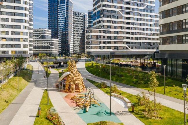
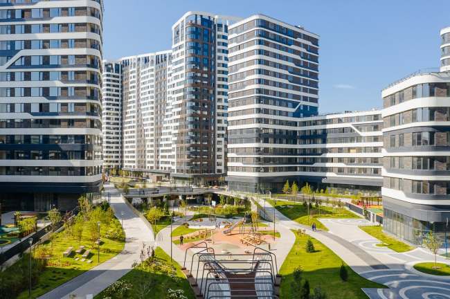
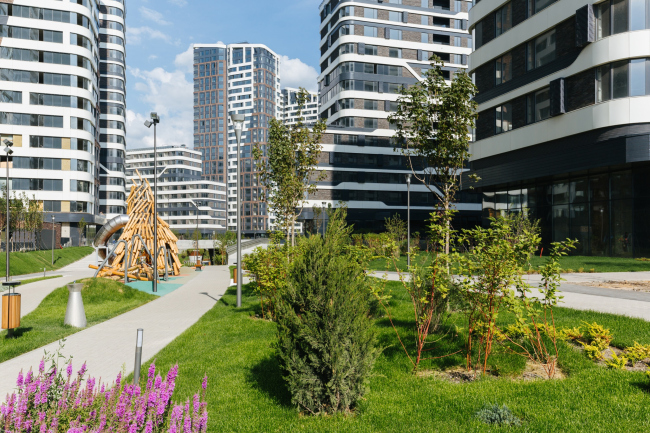
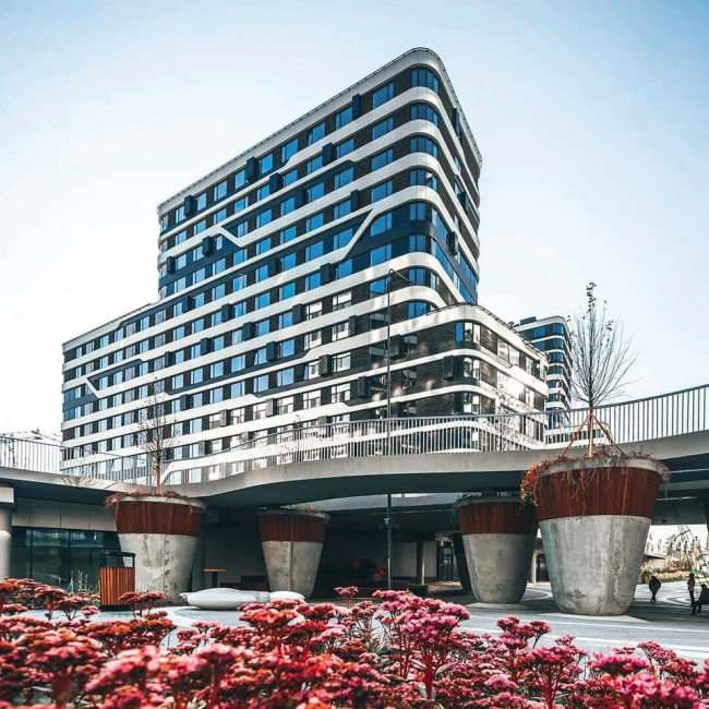
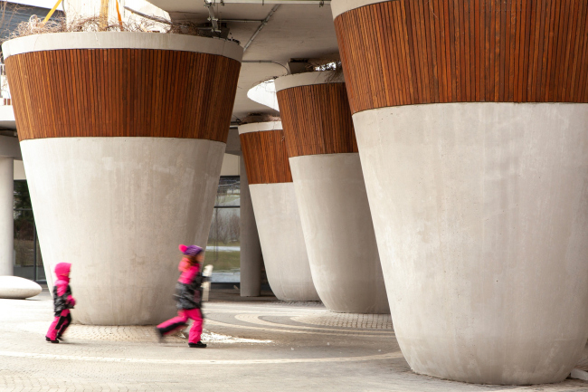
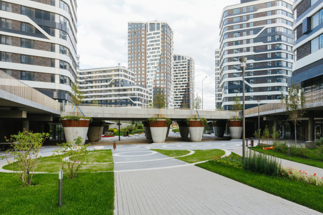
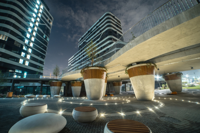
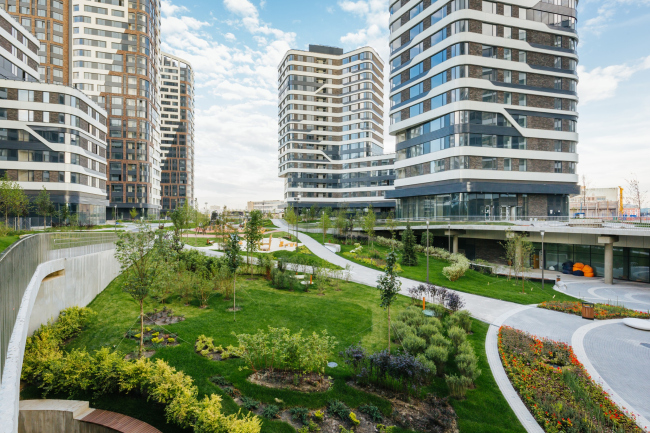
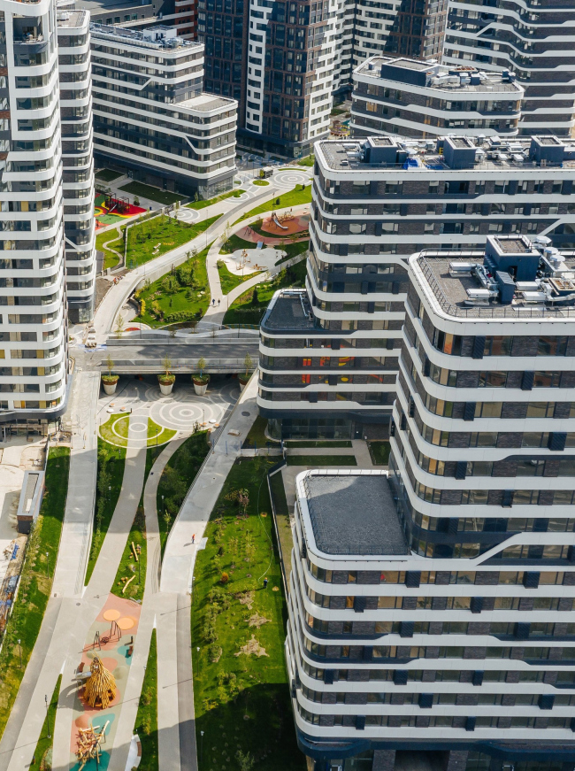
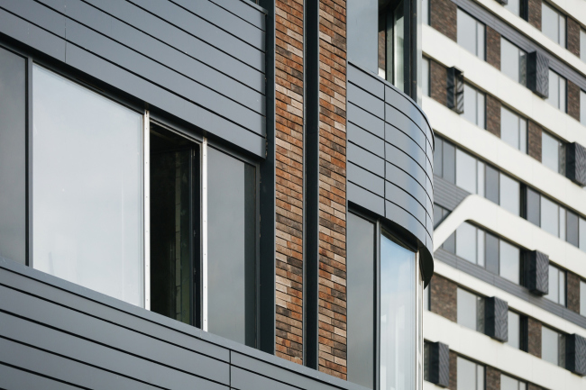
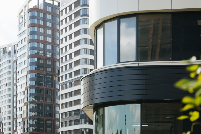
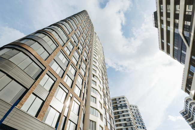
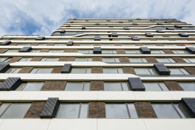
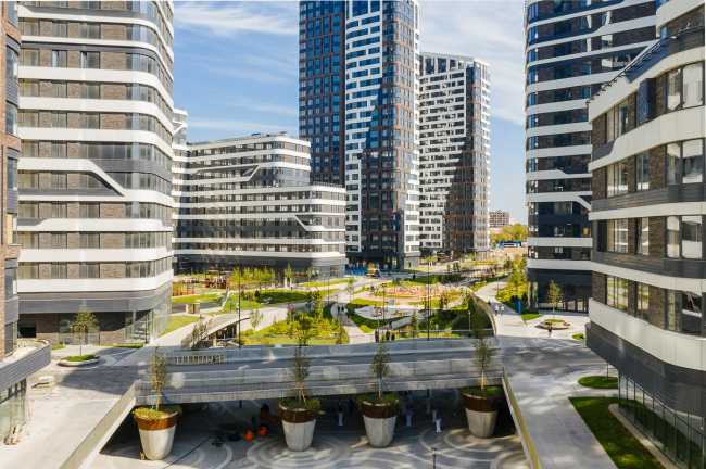
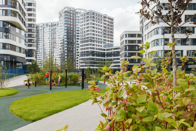
The five houses of the “Svoboda” block belonging to the “Simvol” residential complex present a vivid example of all-rounded work performed by the architects on an integral fragment of the city, which became the embodiment of the approach to architecture that hitherto was not to be seen anywhere in Moscow: everything is subjected to the flow of lines – something like a stream, enhanced by the powerful pattern of the facades akin to “super-graphics”. Probably, for more than a year now the drivers of the cars entering the south end of the Lefortovo Tunnel underneath the Yauza River have been able to see a string of contrastive-colored striped houses that tangibly livened up the cityscape with their rather unusual visual appearance. These are the houses of Stage 1B of the “Simvol” residential complex that DONSTROY development company is building on the territory of the former “Serp i Molot” factory. The houses are finished, and the residents are moving in; last summer, in the center of the landscaped section of the territory, with the participation of the Moscow Mayor, the first fragment of the “Green River” was inaugurated – a promenade designed by the architects of the first stage, the ATRIUM studio. “Simvol” residential complex (Stage 1B)Copyright: © DONSTROYWe already covered this project some time ago. It has an extensive history: in 2014, a competition was organized for the redevelopment of 58 hectares – most of the giant territory of the former factory. At that time, the judging panel opted for the idea proposed by MVRDV but the client ultimately preferred the concept proposed by the British consortium headed by LDA. The concept, very green and bionic – manmade hills alternating with towers and little corners of “semi-blocks” of streamlined shapes – was further developed by the British (again) UHA London, which brought it closer to reality, refraining from the highest centerpieces, but maintaining the “green” component as a focus on landscaping, as well as the preference for flowing and supple plastique. And it comes as no surprise at all that for on-site design within the framework of the design code, Moscow-based ATRIUM was invited – a team of architects known for their adherence to the sculptural plastique of the form. Which ultimately made it possible to get these houses that now attract the attention of the motorists driving down the Third Transport Ring – the most unconventional ones that stand out against the background of the metropolitan construction industry. “Simvol” residential complex (Stage 1B)Copyright: © DONSTROY“Simvol” residential complex (Stage 1B)Copyright: © DONSTROYThe group of buildings of Stage 1B, designed and built by Vera Butko and Anton Nadtochiy, is situated in the eastern part of the factory’s territory and consists of five U-shaped “frames” of different degree of asymmetry; all of them are opened on the promenade and grouped around it. Let us start with the boulevard: ultimately, DONSTROY is promising to make it a public pedestrian artery. About 30 meters wide and slightly bent, in the future it will traverse the whole triangular territory of the residential complex from east to west, parallel to the Entuziastov Highway. The total length of the boulevard is about 2 km; it was originally designed as the recreational and “green” axis of the complex still in the concept stage. Currently, the fragment belonging to Stage 1B has been finished, about a fifth of its length. Besides green lawns, trails, and landscaping elements, it includes state-of-the-art playgrounds and sports fields designed by “Chekharda” company: steel slides, constructions of natural logs, pergolas, and trampolines. The project of expanding the park will also be done by ATRIUM. 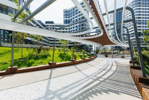 “Simvol” residential complex (Stage 1B)Copyright: © DONSTROY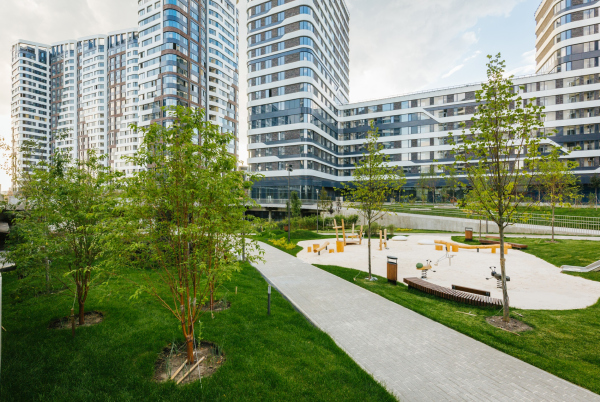 “Simvol” residential complex (Stage 1B)Copyright: © DONSTROY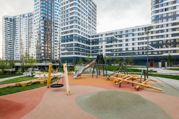 “Simvol” residential complex (Stage 1B)Copyright: © DONSTROY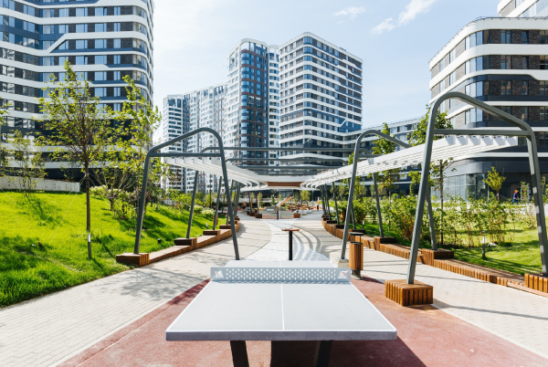 “Simvol” residential complex (Stage 1B)Copyright: Photograph © ATRIUMThe most amazing and attractive element, however, is the bridge. It is situated approximately in the middle of the finished district at the crossing of the promenade and the only inner driving street in the eastern part of the complex, the Nevelskogo Drive. The LDA concept and UHA elaboration did not have the bridge in them – the promenade and the drive simply crossed – and the bridge, which made it possible, on the one hand, to separate the flows and make the promenade more peaceful and self-sufficient, and, on the other hand, to make it more sophisticated and double-tiered, was proposed by the ATRIUM architects and designed in collaboration with Vladimir Garanin architectural studio. 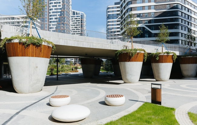 “Simvol” residential complex (Stage 1B)Copyright: © DONSTROYThe bridge is divided into a driveway and a pedestrian bridge, wavy and running parallel to the main one. The promenade, on the other hand, which, as we remember, is completely pedestrian, “ducks” under the bridge. Probably, this is how the name of “Green River” came around: the elongated pedestrian space is situated lower than the private yards of the residential buildings, and, because of height difference, it does look like a river that flows between two sloping green banks. Underneath the bridge, it gets deeper still, ever so smoothly – walking here, we suddenly find ourselves on the minus-first level. The play with the levels was made possible due to the fact that the relief here is chiefly man-made. First of all, according to the architects, the ground here was re-cultivated after the metallurgical plant, and, second, all of the houses feature underground parking garages, the private yards resting on their roofs, while here, on the central axis of the complex, where there are no underground parking garages, the solution to “sink” the whole green river, routing it underneath the bridge, literally suggested itself. The end effect looks curious in itself: it not just separates the flows at the crossing, relieving the pedestrians of the necessity to “cross the street” – it also creates a few emotional types of city space, not just different, but suggesting comparison, and experiencing the differences between the neighboring sites: one can look up from below and look down from above, one can hide underneath the bridge from the sun or the rain, or, conversely, walk from beneath it, feeling the space and the enticing perspective of intertwining trails. In addition, walking down the promenade towards the bridge, we are objectively going down, but subjectively we are “raising” the railings for ourselves, getting an opportunity to interact with the bottom floors of the buildings, as if gaining a permit to access the city part of the stylobate, which essentially forms the key role of the bridge as an important local hub – whose set of functional features will, of course, be determined by the functional content of the bottom floors. However, the premises adjoining the bridge are already booked not for a parking lot but for cafes, with a possibility to use the gently sloping squares of the banks as the summer terraces. Together with the open-air wooden amphitheater and the pebble-like circular seats scattered around, a certain nucleus of the public life of the district is being formed here – or even a small city plaza akin to those that we love in the historical centers of European cities, the difference being that it is made car-free not by the traffic signs but by the height drop. Various groups of youth culture choose bridges as their favorite hangouts – the architects explain. And here they created such a hangout, yet more glamorous than just a space underneath the bridge. “Simvol” residential complex (Stage 1B)Copyright: © DONSTROYAnother bright detail is the “cachepot” columns that support trees and climbing plants. “Usually, bridges are devoid of any verdure; they become blind spots in the city’s green framework. And we decided to change this and elevate the trees above the ground, making our bridge green” – the architects say. The plinths of the columns are smoothly rounded, like a tilting doll’s; the concrete surface is perfectly smooth: its high quality, as the architects say, was ensured by the general contractor, FODD Company. “Simvol” residential complex (Stage 1B)Copyright: © DONSTROYEverything here works towards creating the effect of these volumes looking more like vases and less like the bridge supports. The constructive supports are treated in a non-tectonic way, thanks to which the bridges, both automobile and pedestrian, visually rather hover above the ground, surrounded by hyper-cachepots, than rest on them. The paving pattern reacts to the columns’ standing points in concentric circles, which in a conditional and general way are symbolic of circles on the water – this, on the one hand, enhances the “river” associations, and, on the other hand, marks the difference between the promenade and an actual river because the lines of the trails on the promenade stretch like the flow of the river, whilst the circles also cover all the other non-promenade streets and yards of the complex, i.e. the whole conditional “terra firma”; after all, we mostly see such circles in the puddles on the city streets, and they can be, to a certain degree, a symbol of city space in general. “Simvol” residential complex (Stage 1B)Copyright: © DONSTROY“Simvol” residential complex (Stage 1B)Copyright: © DONSTROY“Simvol” residential complex (Stage 1B)Copyright: © DONSTROYAnyway, the smooth lines of the trails, looking like a half-undone braid, water streams in the river, or water weed – everything symbolically highlights the status of the promenade as the “Green River”. One can really appreciate the whole idea when looking from above: the effect is mostly designed for the look from the top floors, when the landscaping project takes on a role of the “fifth facade”. 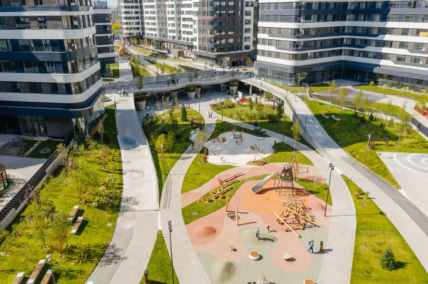 None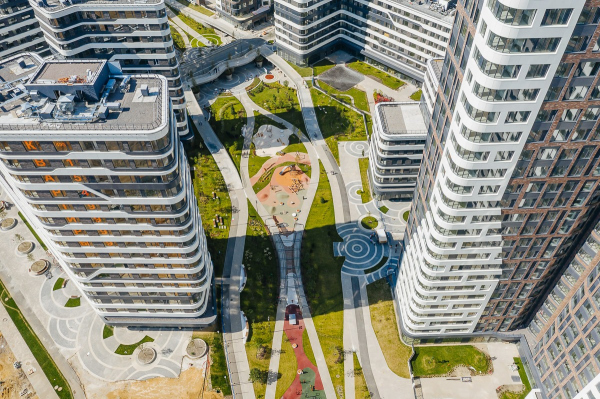 “Simvol” residential complex (Stage 1B)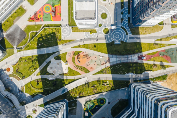 “Simvol” residential complex (Stage 1B)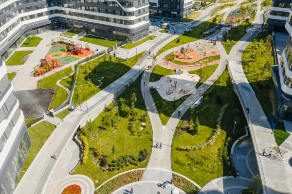 “Simvol” residential complex (Stage 1B)The graphic completeness of the landscaping part, its “clarity of statement” both for the gaze of pedestrians and people looking from above, creates an impression of space that is carefully looked after, an impression of a space that is coherent and well thought out in terms of all of manifestations of the complex, both inward and outward, subjected to a single concept. Needless to say, these ideas are continued in the entrance groups: flowing lines of the floors and walls, natural colors, white pointed reception desk; in addition, three will be a small winter garden inside – a “green wall”. The intertwining of the lines of the promenade resonates with the moderately flowing lines of the facades. Or, rather, it is the other way around: the contrastive and willful, “wired” graphics of the houses got reflected in the promenade; ultimately it was the primary structure-forming factor. “Simvol” residential complex (Stage 1B)Copyright: © DONSTROYAs for the outlines of the houses, they are subjected to the architecture of the apartments, and are therefore more on the rectangular side (even though it must be said that the parameters of the houses are really good: the ceiling height is 3.5 meters, the window height is 2.1 meters, the skewed “crowns” of the top floors host penthouses). However, let us admit that perfect bionics is nearly impossible and really hard to implement in housing projects; the architects, limiting themselves to rounded corners and asymmetric arrangement of two houses out of five, left the rest to the large-scale pattern of the lines. These are visually active, they arrest one’s gaze, and they pierce the space of the complex — by using these lines, the architects were able to enhance the effect of bionic agility, maybe even impose on the houses this modern statement as a reasonable compromise between the marketing requirements and the project’s imagery. As a result, these two do not contradict each other at all, as is often the case, between the creative impulse and the harsh marketing realities, but rather boost each other: the financial part of the project did not have to make any significant concessions for the sake of the form, yet, at the same time, the architecture provides a recognizable and, hopefully, “sales-friendly” image of the houses. The architects say that they are specifically grateful to DONSTROY for its readiness to build by a nonlinear project with rounded corners of the concrete framework and curvilinear panels of the metallic coating. “Simvol” residential complex (Stage 1B)Copyright: © DONSTROY“Simvol” residential complex (Stage 1B)Copyright: © DONSTROYThe buildings are subdivided into two types: three smaller ones, from 5 to 17 stories high, in the middle — these are dominated by horizontal motion, their silhouette being formed by large ledges (for the adjoining apartments, terraces are designed). The two other buildings are situated at the edges; they are 21 and 27 stories respectively, about 100 meters high, and are vertically designed: each of the sections, has rounded corners, and on the plan (or if viewed from above) each of the buildings looks like a multiply bound toy balloon. The form makes it possible to highlight their structure as a group of tall sections, like several towers sticking together. However, what the architects do is they disrupt the pristine array of verticals with a diagonal at the joint between the facades and dark brick or white surfaces. All of the towers, like yin and yang, are composed of such halves, the diagonal contour echoing the branching lines on the “horizontal” buildings. “Simvol” residential complex (Stage 1B)Copyright: © DONSTROYThe “halves” on the facades of the tall buildings are endowed with an easily readable contrastive look: the fine grid of the brick lintels is treated vertically, the windows are grouped height-wise, the white part is horizontal by nature, and then the bands of windows come into play – they also step a little bit forward, taking on the role of the “skin” or the “bark” of the houses. Which makes the facades look as if they consist of three or even four layers: white substance – brick – dark metal –glass windows. They have a relief, distinct and imbued with a “telltale” plot — for example, curvilinear dark metal with thin grooves is to be seen pretty much everywhere here, like a reminder of the metallurgical past of this territory. Just like the metallic casings for the air conditioning units, which support the texture and the rhythm on some of the facades. The brick is definitely responsible for the modern trends and the respectability of the complex, while its “relevant” differently-toned surface is set in metallic frames everywhere. Four textures and two directions of motion in the long run turn out to be quite enough to create an image that is as integral as it is agile – at times it looks as if the buildings were arrested in midair, getting frozen in some strange dance, moving sometimes rhythmically and sometimes smoothly, and this is what their megalithic charm is all about. “Simvol” residential complex (Stage 1B)Copyright: © DONSTROYThe “dance” effect is further supported by numerous different vantage points: using the bend of the promenade and placing just a few of the sections at an angle on the pivot of this bend, the architects ended up with a multitude of vantage points, as well as a constant shift of the picture as one walks the promenade. “The perspective in motion is something that is particularly intriguing because new angles of vision open up” – Anton Nadtochiy says. “Simvol” residential complex (Stage 1B)Copyright: © DONSTROYIt must also be said that, even though Stage 1B currently does look like an oasis amidst a giant construction site, already now, on the inside – on the promenade – this is hardly ever felt: from here, the city looks quite self-realized and self-sufficient, like an element that is deadly to be included into a larger system, yet at the same time quite capable of functioning on its own, first of all due to the inner axis of the promenade and the nucleus of the “bridge” crossroads. Its town planning structure is open to development, yet at the same time it is ready to take in new residents, while the integrity of the “genetic code” is to a large degree ensured by the above-mentioned super-graphics that unites all the volumes, together with the “fifth facade”, with a single structure of large lines and spots, agile and supercharged with modern dynamics. “Simvol” residential complex (Stage 1B)Copyright: © DONSTROYCurrently, the ATRIUM architects are involved in designing the eastern half of the “Simvol” promenade, its fragments situated left and right of the finished one, along with the school and kindergarten buildings. The eastern part of the boulevard is to get an oval cafe building, an artificial pond, and a “dry fountain”; the theme of “circles on the water” – the large graphic pavement elements – is also further distributed all around. South of the finished houses, there will appear yet another “inner” pedestrian promenade of a smaller size. Another four houses will be built in the south corner of the territory, west of the school building; these were jointly designed by WALL and ATRIUM (they proposed facades that inherit some elements of the finished buildings, specifically, the white balconies with a curved outline, these can be seen on the complex’s ). Then it is planned to build yet another house east of Stage 1B, by the project developed by Timur Bashkaev’s ABTB, and then still another house on the sharp eastern corner that opens up to the Entuziastov Highway, by Julius Borisov’s UNK Project. Totally, the “Simvol” residential complex will include six construction stages. 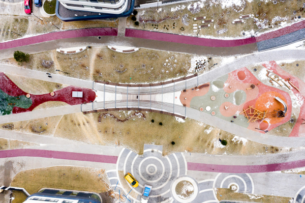 “Simvol” residential complex (Stage 1B)Copyright: © DONSTROY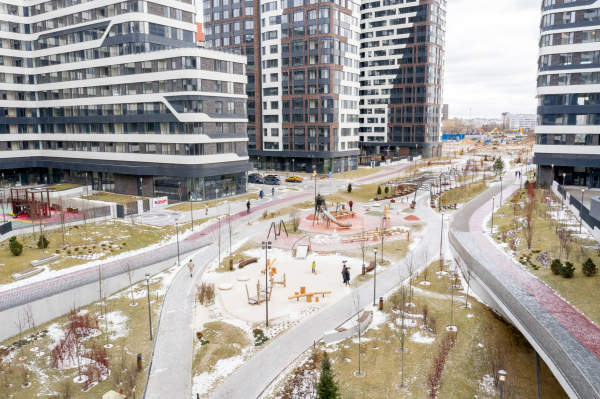 “Simvol” residential complex (Stage 1B)Copyright: © DONSTROY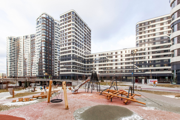 “Simvol” residential complex (Stage 1B)Copyright: © DONSTROY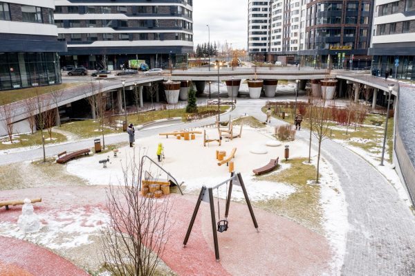 “Simvol” residential complex (Stage 1B)Copyright: © DONSTROY |
|
