|
Published on Archi.ru (https://archi.ru) |
|
| 07.06.2019 | |
|
Tower in a City |
|
|
Seraphima Lvovskaya |
|
| Studio: | |
| Bavykin architects | |
|
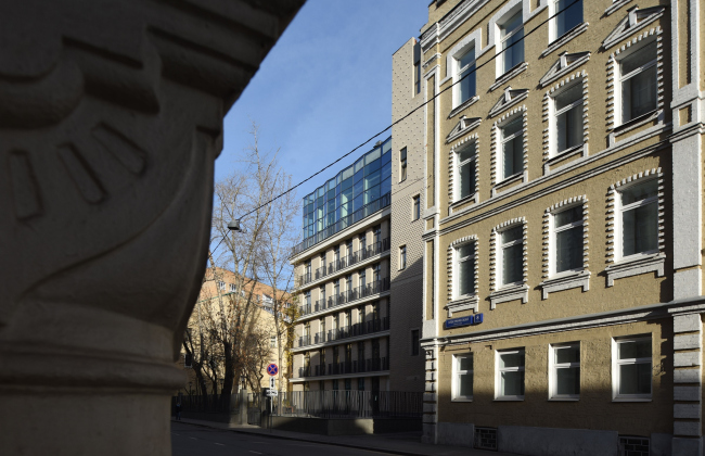
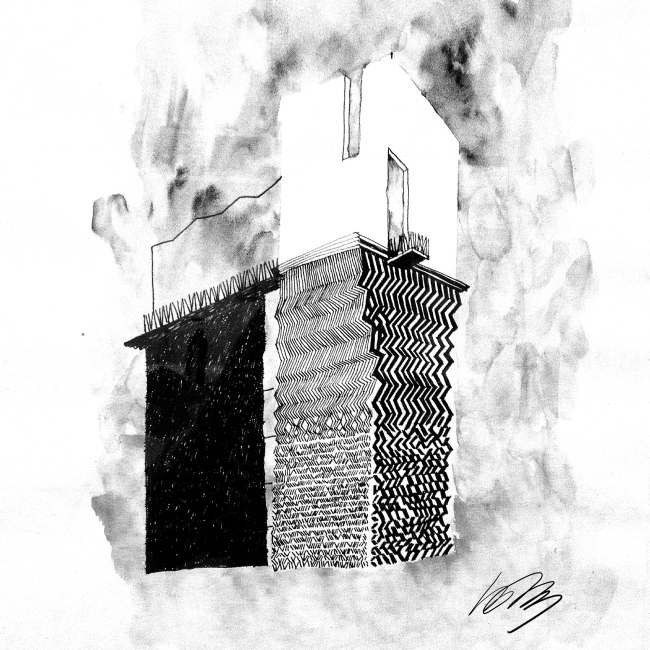
The high-end residential complex in the Elektrichesky Lane: historical background and details. Edison House. PhotographCopyright: © Ilia IvanovThe high-end residential complex “Edisson House”, designed and built by Aleksey Bavykin Architects in the Elektrichesky Lane, is notably compact, has a sophisticated plan that responds to the specifics of the land site, and sports a relatively laconic decor, in which, unlike in many Moscow houses of such kind, instead of “orderly” decorations and gilding, we are seeing a “signature” feature – a narrative “hidden” within the architecture that makes this house totally unique. For some reason, a tower has sprung up in the heart of Moscow, the kind this city may have never seen before. The house steps back from the red line, it is not excessively tall, no taller than its neighbors, and it does everything to fit in with the nearby buildings of the XIX century (even though one must note that those were actually painted an unstable beige color), at the same time looking completely different: small, slender, brittle, and crystalline. In addition, it has a rather long history of concept formation, in the course of which the building’s “narrative” got changed and the main accent also became different. Historical background Designed by Aleksey Bavykin Architects, the project of the house in the Elektrichesky Lane underwent several major revisions. In 2010, it looked pretty much like the house in the Brusov Lane – a slightly more “geometric” version of the “wild order” of tree trunks open into the sky. The house in the Elektrichesky Lane – approximately of the same scale, similarly situated in the historical city center, although slightly farther away from the Kremlin, and of the same high-end format – inherited and developed the original idea. At the same time, it seemed that Moscow could get more than one “tree-trunk” house like this. Still, later one it turned out that the house in the Brusov Lane was to remain unique because the Elektrichesky Lane project was revised. 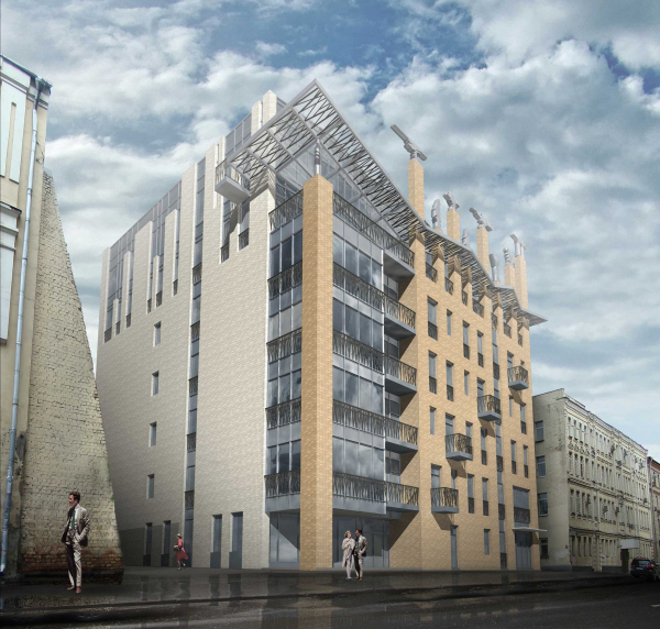 House in the Elektrichesky Lane, 201. View form the Elektrichesky LaneCopyright: © Aleksey Bavykin and Partners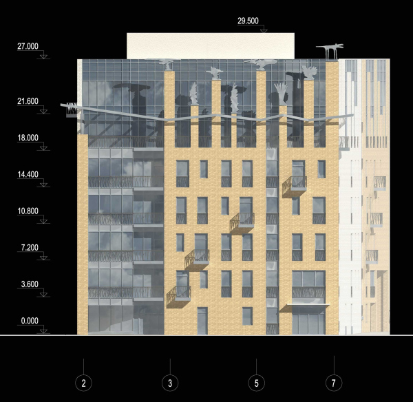 The house in the Elektrichesky Lane, 2010. West facade (the main one)Copyright: © Aleksey Bavykin and Partners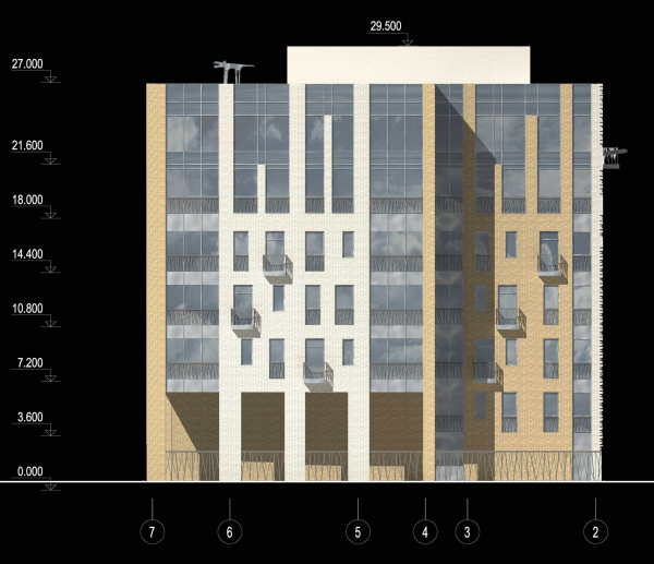 The house in the Elektrichesky Lane, 2010. The east facadeCopyright: © Aleksey Bavykin and Partners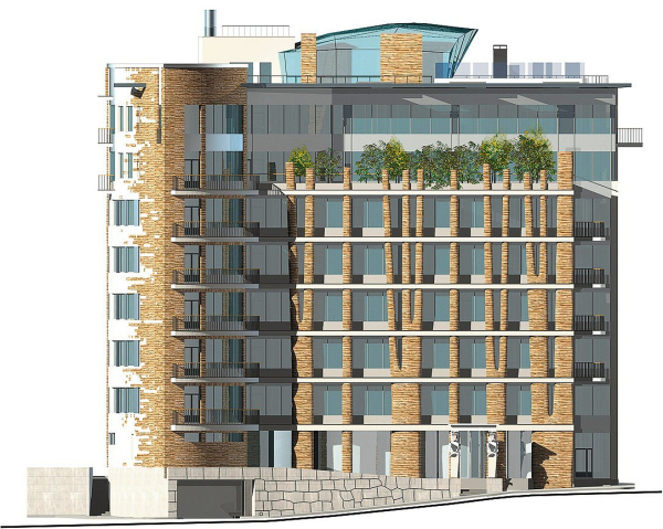 House in the Brusov LaneCopyright: © Aleksey Bavykin and Partners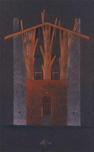 The project of a country residence in Moscow AreaCopyright: © Aleksey Bavykin and PartnersBy 2013, the right corner of the façade, the one which is closer to the Malaya Gruzinskaya Street, started growing a tower that initially still looked like a half-chopped tree. A little later, the house pulled itself together and became more compact: prominent horizontal lines of the interfloor braces appeared, together with glass “bellows” of the penthouse. The grand façade stepped a little back into the yard, the tower came forward, grew up a little, and stopped branching, also getting a more laconic outline, although a hint at an open castellated top remained. 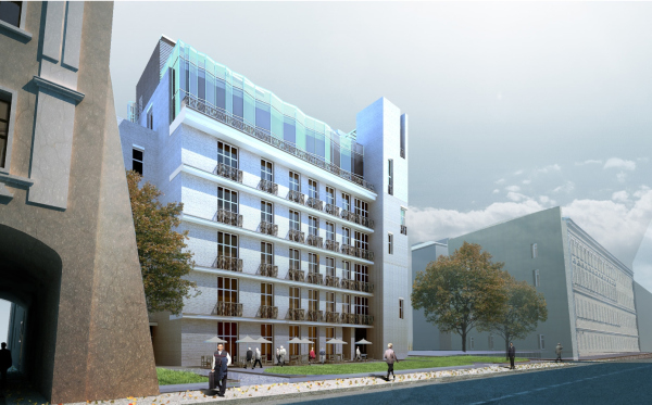 The hotel with apartments and an underground parking garage in the Elektrichesky lane. Project, 2014Copyright: © Aleksey Bavykin Architects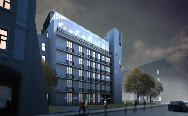 The hotel with apartments and an underground parking garage in the Elektrichesky lane. Project, 2014Copyright: © Aleksey Bavykin Architects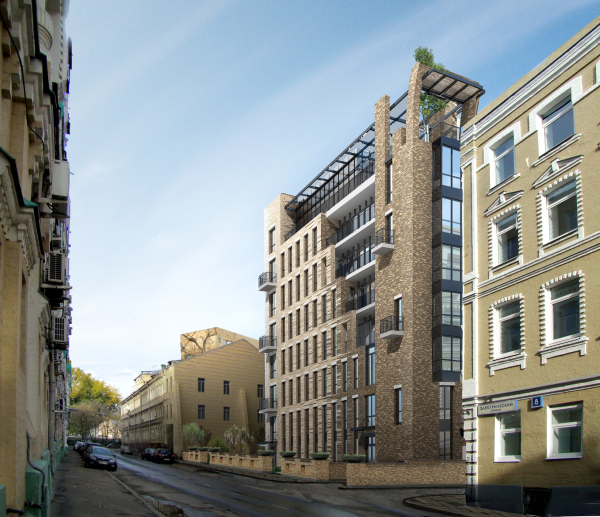 The hotel with apartments and an underground parking garage in the Elektrichesky lane. Project, 2013Copyright: © Aleksey Bavykin Architects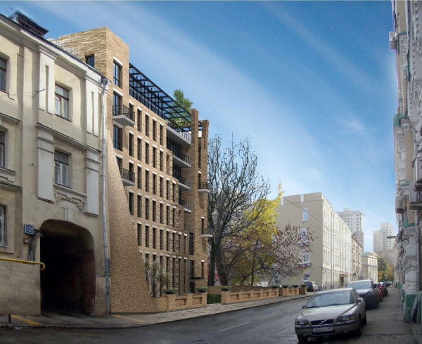 The hotel with apartments and an underground parking garage in the Elektrichesky lane.Copyright: © Aleksey Bavykin ArchitectsUltimately, from a “forest” or maybe “poplar”, the house turned into a stone one, much more urban-looking. The highlight, if we are to compare it with the original version of the project, got shifted from the left corner to the right one. 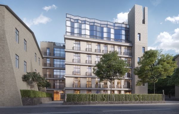 Edison HouseCopyright: © Aleksey Bavykin and Partners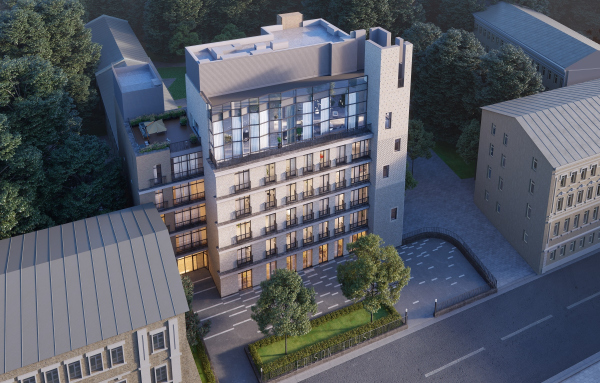 Edison HouseCopyright: © Rostislav Nikolaev Archirost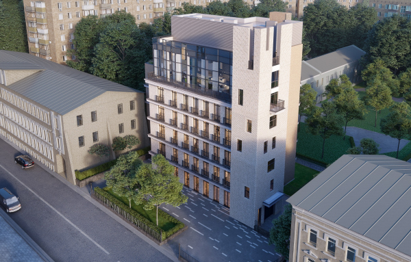 Edison HouseCopyright: © Rostislav Nikolaev Archirost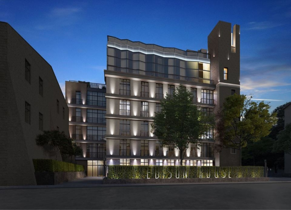 Edison HouseCopyright: © Aleksey Bavykin and Partners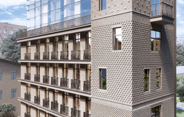 Edison HouseCopyright: © Aleksey Bavykin and Partners Edison HouseCopyright: © Aleksey Bavykin and PartnersThe corner tower, which now became the key “telltale” element of the building, now displays quite a different prototype – it can be traced back to the “noble family” of towers that are to be seen in medieval Mediterranean towns. These towers were known in many places around the world but in Florence by the XIV century these towers were dismantled, although in , for example, quite a lot of them survived into the present. Such towers are quite an interesting sight when they stand on a square like lonesome columns but most of the time they had other houses built up to them, like, for example, the Renaissance house at piazza d’Erbe in Mantua. To a certain extent, the house in the Elektrichesky Lane looks like such an ensemble consisting of a tower belonging to one of the town’s famous family and their new house, added to it later on. 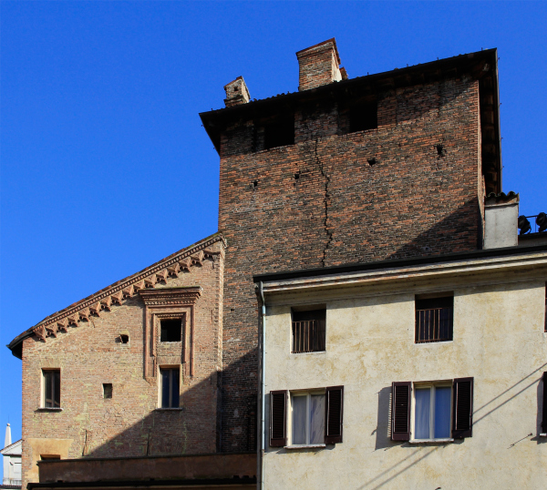 House of the tradesman, MantuaCopyright: Photograph: Julia Tarabarina, Archi.ru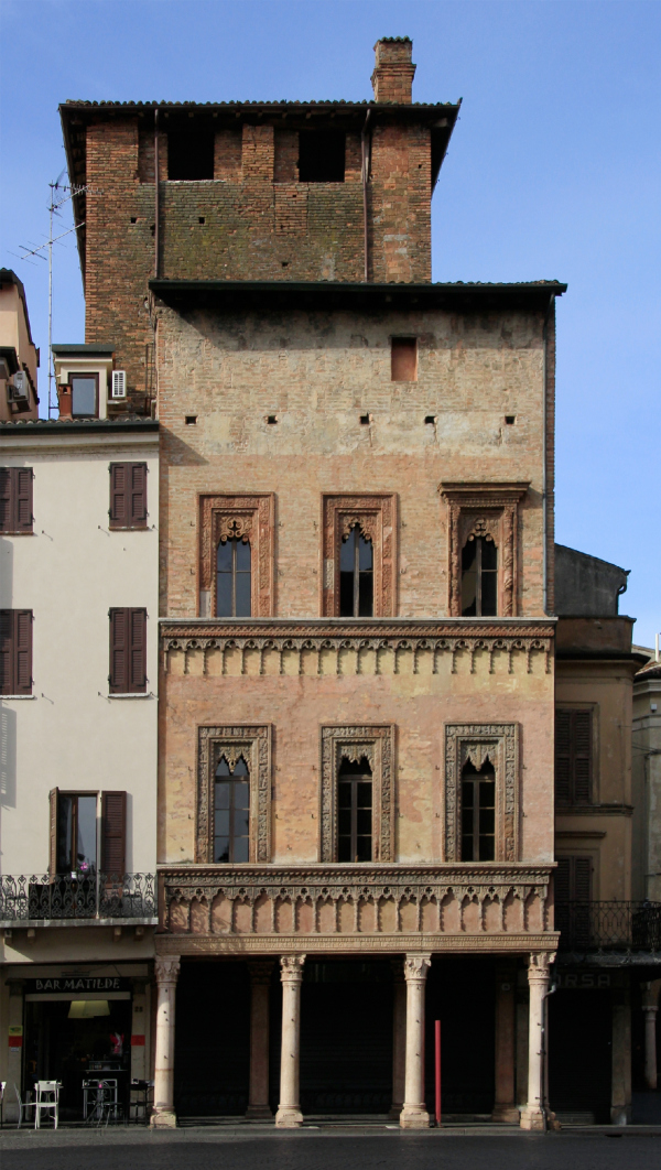 The tradesman′s houseCopyright: Photograph: Julia Tarabarina, Archi.ru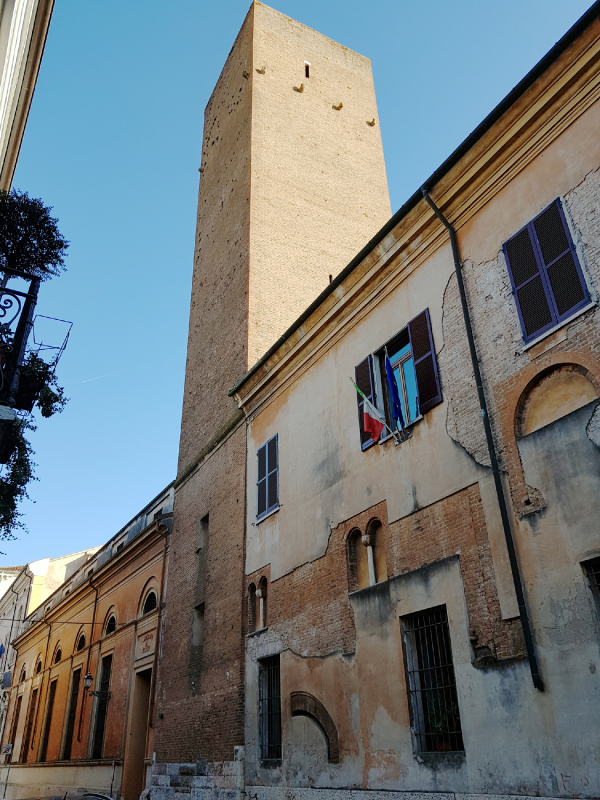 The building of the archives and the library, MantuaCopyright: Photograph: Julia Tarabarina, Archi.ru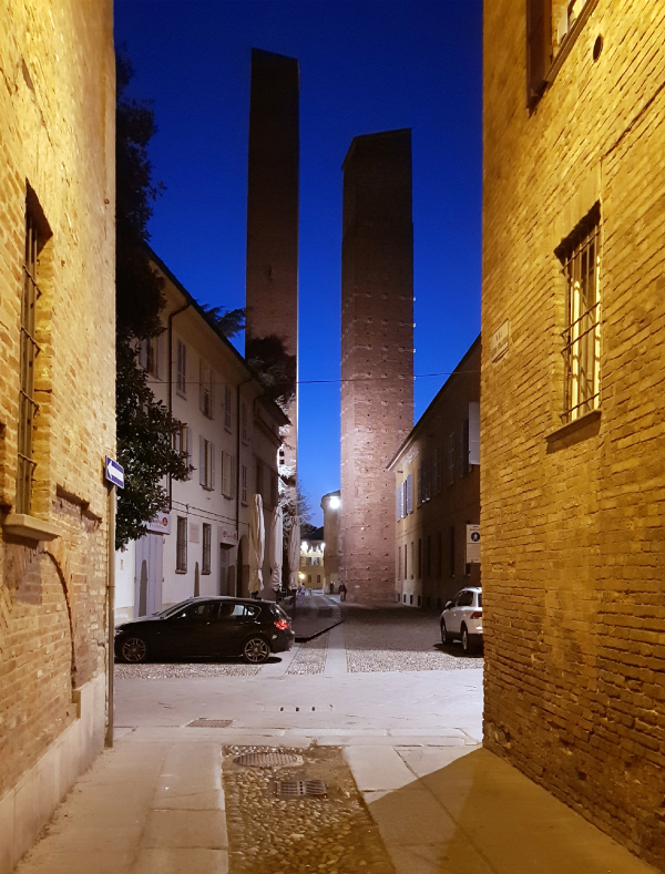 Towers of the noble families. PaviaCopyright: Photograph: Julia Tarabarina, Archi.ruOf course, this house is not a not a replica of any Renaissance heritage site, the mentioned city towers rather being an analogy or a starting point for inspiration. In addition, let’s remember that this building is a high-end residential complex type, an example of expensive housing in the city center, only having twelve apartments on six floors – such housing is in fact the home of a high-placed and distinguished townsman when adjusted for the modern multi-apartment nature of modern housing stock, so the dream, so to speak, was prophetic. The first floor includes a café and a lounge; directly beneath the tower there is an entrance to the double-tier automated parking garage: the house is not very large but it is obvious that the number of cars here will be larger than just one per family. The apartments from the second to the fifth floor boast floor-to-ceiling windows with French balconies in front of them – the kind that you technically can step upon but which will only be capable of hosting half of your foot. One of the apartments on the fifth floor, placed in the volume that turns into the yard, is double-level – this was the marketing department’s decision. The penthouse occupies the top sixth floor, its area being 257 square meters – essentially, it is a town villa built into a house – in this specific case, in the classic manner, i.e. in its top part. The glass “bellows” steps back from the façade line, leaving room for an open gallery and giving as much as possible ambient light to the tall – 6.7 meters – living room. Yet another terrace of the penthouse, large and almost square, 7x7 meters, like a room of average size, is situated farther to the north, on the roof of the volume, moved slightly backwards because of the complex configuration of the land site. To the right of it, there is a wall of the double-level apartment of the fifth floor, so, responding to the complex construction blueprint, the house space becomes just as sophisticated. What is more important, however, is the fact that from the height of the 5th floor (and here it is about 20 meters) you can contemplate a quiet alley; probably, a curious feeling. 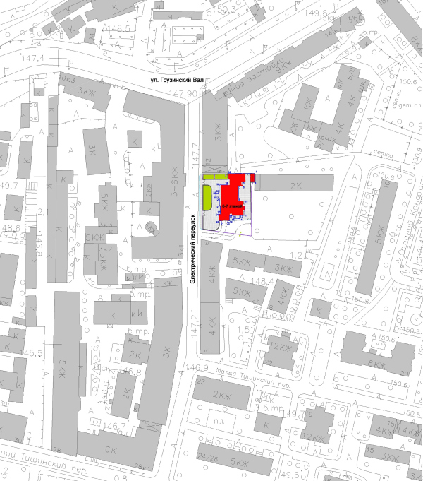 Edison House. Location planCopyright: © Aleksey Bavykin and Partners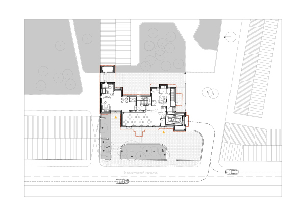 Edison House. Plan of the 1st floorCopyright: © Aleksey Bavykin and Partners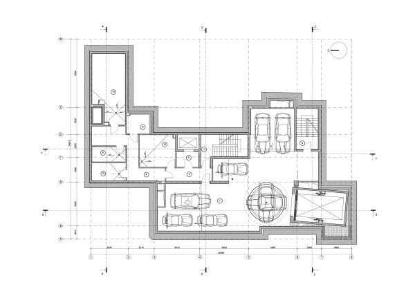 Edison House. Plan of the -1st level of the parking garageCopyright: © Aleksey Bavykin and Partners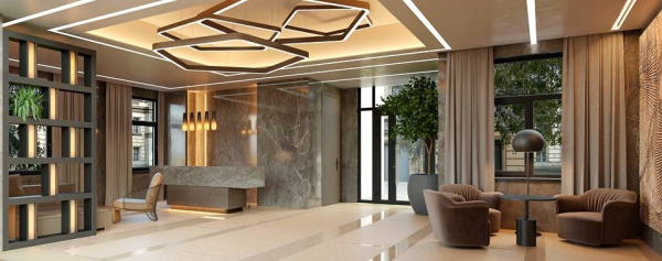 Edison HouseCopyright: © Aleksey Bavykin and Partners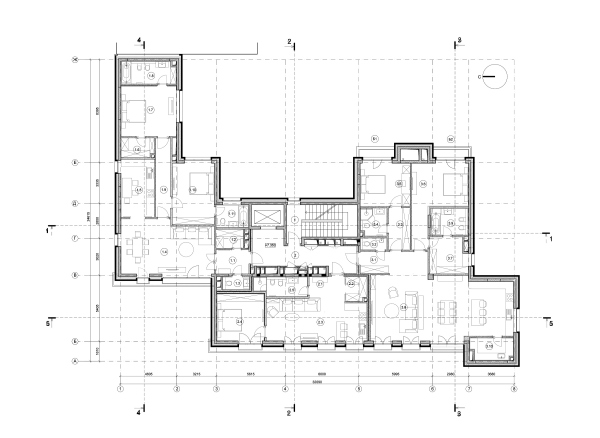 Edison House. Plan of floors 2-3Copyright: © Aleksey Bavykin and Partners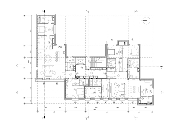 Edison House. Plan of the 5th floorCopyright: © Aleksey Bavykin and Partners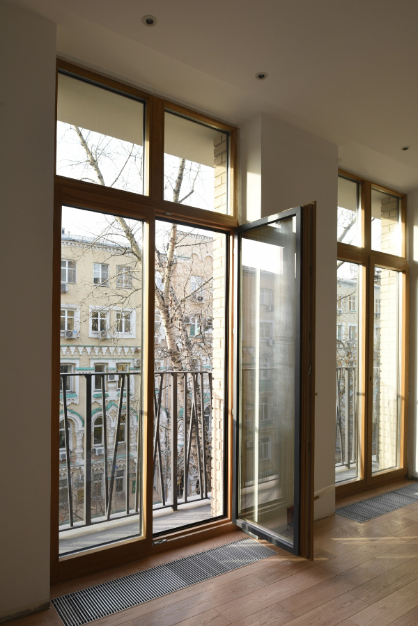 Edison House. PhotographCopyright: © Ilia Ivanov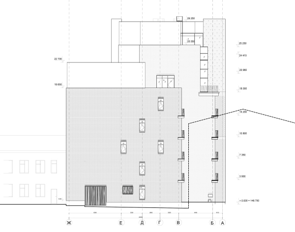 Edison House. The north facadeCopyright: © Aleksey Bavykin and Partners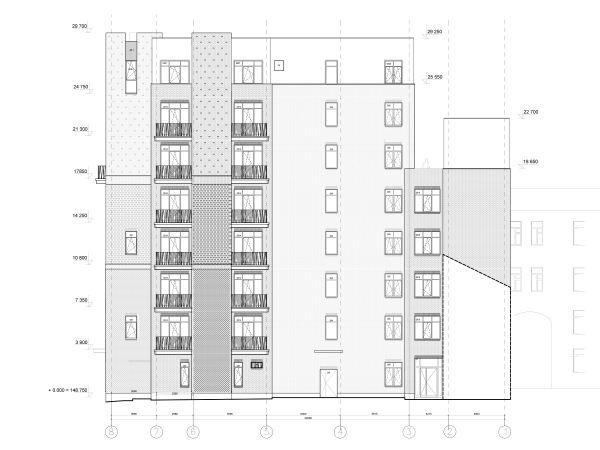 Edison House. The east facadeCopyright: © Aleksey Bavykin and Partners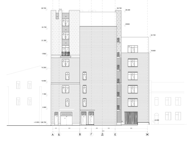 Edison House. The south facadeCopyright: © Aleksey Bavykin and Partners Edison House. Development drawing along the Elektrichesky LaneCopyright: © Aleksey Bavykin and Partners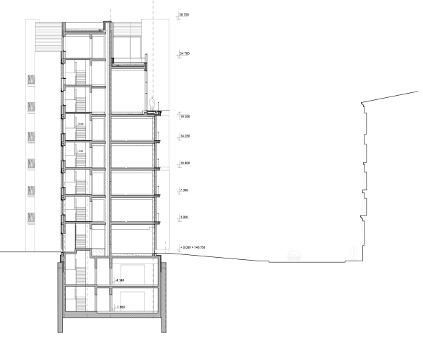 Edison House. Section 1-1Copyright: © Aleksey Bavykin and Partners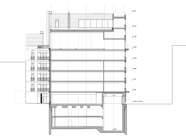 Edison House. PhotographCopyright: © Ilia IvanovAs for the tower, there is a bathroom in it, on a level with the penthouse – the architects explain that this was also the marketing department’s decision. Further on inside, there is a bedroom. In the apartments from the second to the fifth floor, next to the wall of the tower there is a utility room, and in the main volume that faces the side wall of the neighboring building, there is a kitchen. In other words, planning-wise, its volumes have quite a utilitarian function, not only because there is no watchman of the Tarly family sitting in the tower but mostly because the viewing properties remain unused even on the top floors. 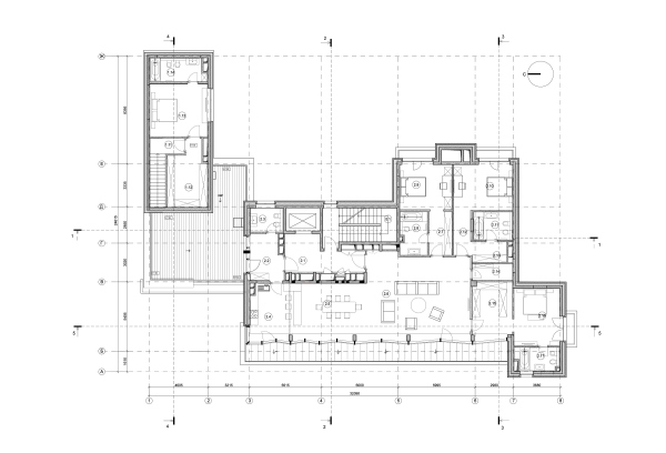 Edison House. Plan of the penthouse on the 6th floorCopyright: © Aleksey Bavykin and Partners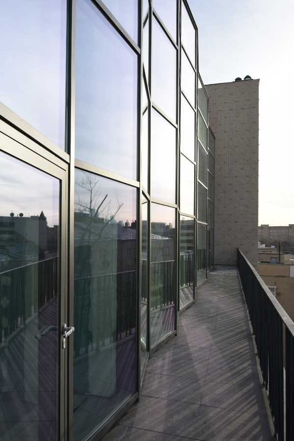 Edison House. PhotographCopyright: © Ilia IvanovMeanwhile, both image and decoration-wise, the tower, of course, prevails. In addition to the fact that it “holds” the corner, makes the house look more slender, and attracts maximum attention, the tower is decorated in accordance with the “brick gothic” principle, with various types of volumetric brickwork. By the way, this idea was there in the project from the very beginning but initially it was represented by a striped surface imitating a wall, prepared for being coated with marble, as the case might be. Now the texture took on a different quality. The tower is divided into three tiers in accordance with the principle of superposition of three orders. Everyone who knows anything at all about the order theory knows that even if you take the columns away from the building, the proportions will remain, and, if the proportions are still there, the building remains orderly. And in this specific instance this theme is expressed by the density of the brickwork’s play of light and shade. The lower tier (let’s call it conditionally “Dorian”, because it’s the heaviest one by default; if it had a rock-face façade it would have been of the roughest kind) – anyway, the lower tier uses the brickwork with the bricks’ corners sticking out, which is characteristic of the domes of Italian belfries. Seemingly, it is a paradox: the belfry dome must be on top, and here we are speaking about the lower tier. But this “finding fault” would be out of place. In actuality, these densely packed corners are a treat for one’s eye, and this is why they were placed at the bottom, as the most valuable part from the decoration standpoint. The play of light and shade, it must be noted, looks really wonderful. One must admit that this is a rather widely spread and favorite technique of modern brick architecture – in Moscow, specifically, it was used in the “Literateur” housing complex designed by Sergey Kisselev and Partners. 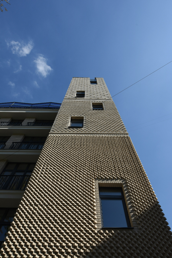 Edison House. PhotographCopyright: © Ilia Ivanov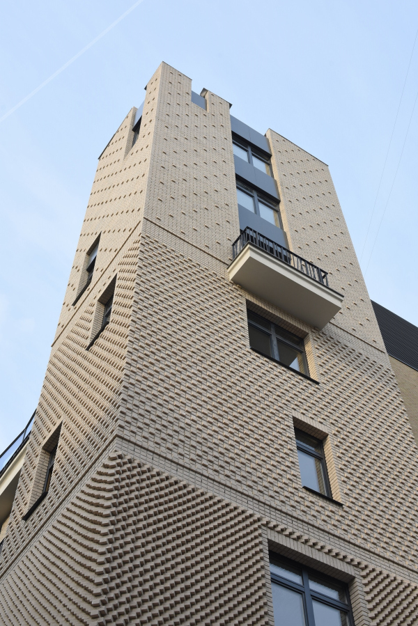 Edison House. PhotographCopyright: © Ilia Ivanov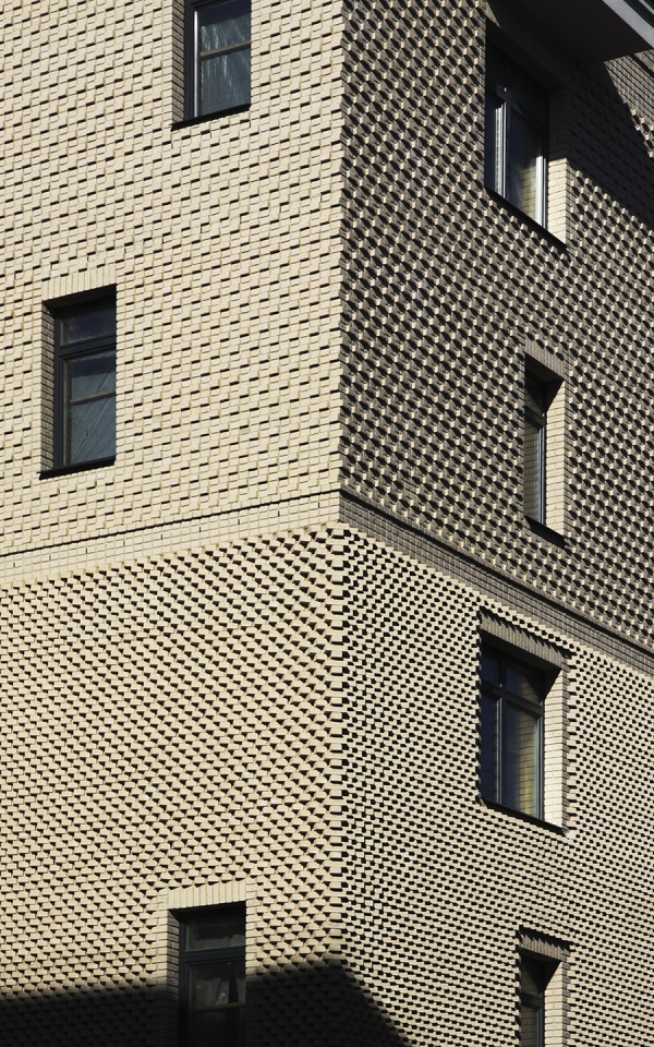 Edison House. PhotographCopyright: © Ilia Ivanov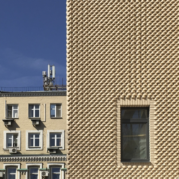 Edison House. PhotographCopyright: © Ilia Ivanov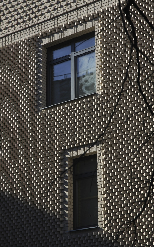 Edison House. PhotographCopyright: © Ilia Ivanov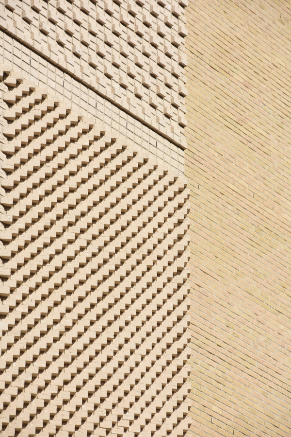 Edison House. PhotographCopyright: © Ilia Ivanov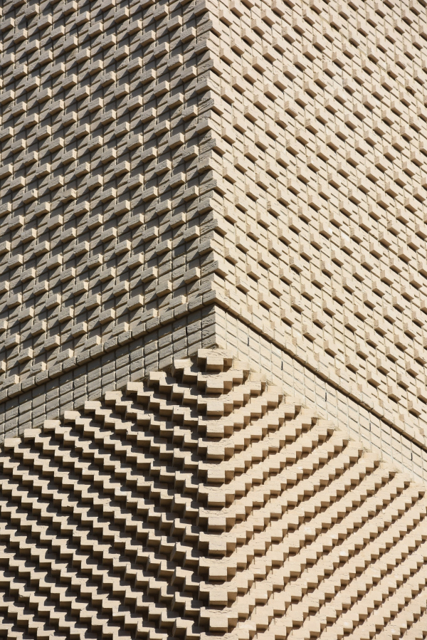 Edison House. PhotographCopyright: © Ilia Ivanov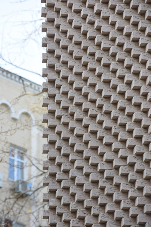 Edison House. PhotographCopyright: © Ilia Ivanov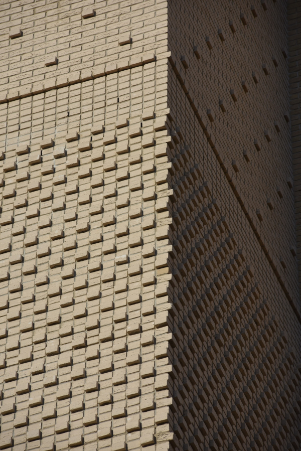 Edison House. PhotographCopyright: © Ilia Ivanov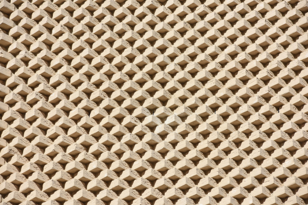 Edison House. PhotographCopyright: © Ilia Ivanov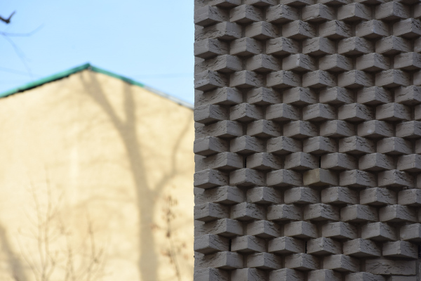 Edison House. PhotographCopyright: © Ilia Ivanov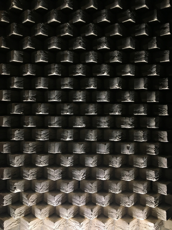 Edison House. PhotographCopyright: © Ilia Ivanov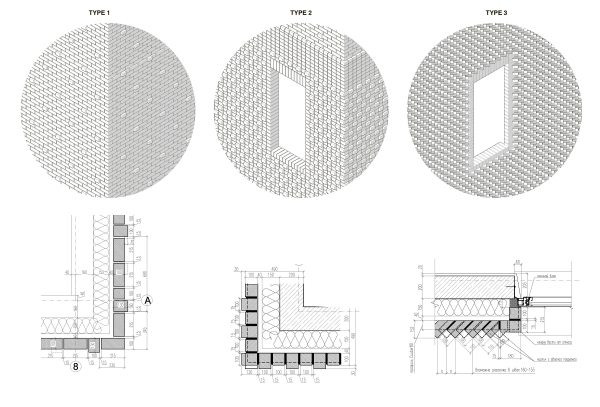 Edison House. Details of the brickworkCopyright: © Aleksey Bavykin and Partners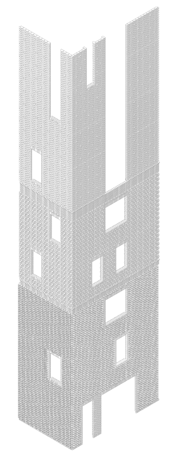 Edison House. Axonometric drawing of the brickworkCopyright: © Aleksey Bavykin and Partners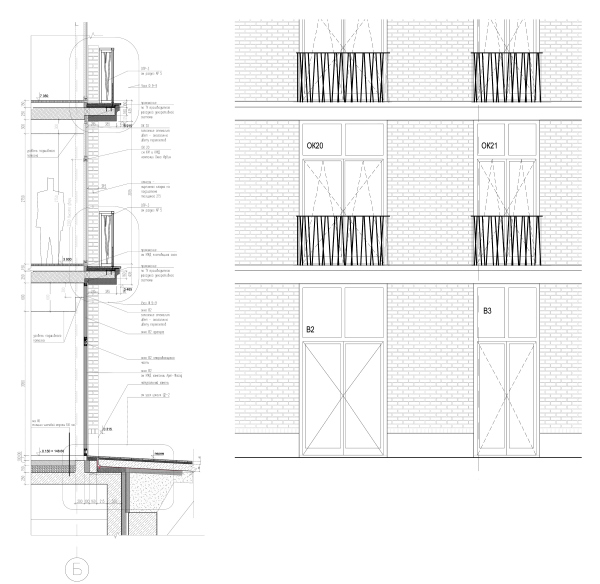 Edison House. Details of the facadeCopyright: © Aleksey Bavykin and PartnersThe middle tier is decorated with ledges placed in a staggered order; on top, ledges of the same kind are scattered three times less densely, the façade being lighter and flatter. Basically, the most correct analogue is the palazzo Medici Ricardi, because it is that specific building that demonstrates the gradient transition from rock-face façade at the bottom to the almost flat façade of the upper tier so vividly, the only difference being that in our case this idea is executed in brick. And, which is also noteworthy, in the recent years this project and its implementation were headed by the daughter of Aleksey Bavykin’s, Natalia, the chief architect of the project of the house in the Elektrichesky Lane. Edison House. SketchCopyright: © Natalia BavykinaThe other façades are less filled up semantically and rather can be traced back to the very typology of a high-end housing development, or, maybe, to the Haussmann’s renovation of Paris: what also fits in is the light tone, even though not exactly gray, and the little balconies, which, by the way, just as the lattice on the street side, inherit the idea of tree branches that first appeared in the Brusov Lane – but make it more general. This form, incidentally, became rather popular – now it trickled down into the projects of various Moscow architects. 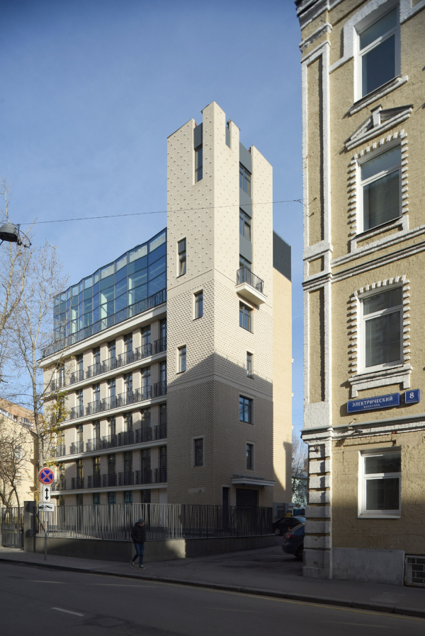 Edison House. PhotographCopyright: © Ilia Ivanov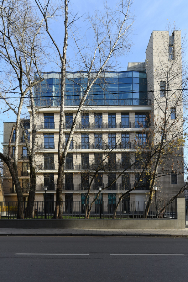 Edison House. PhotographCopyright: © Ilia Ivanov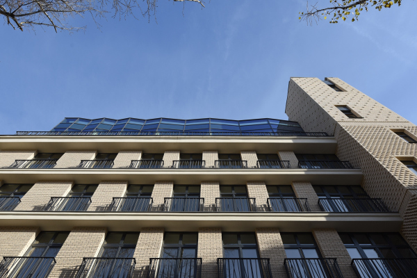 Edison House. PhotographCopyright: © Ilia Ivanov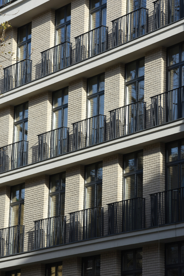 Edison House. PhotographCopyright: © Ilia IvanovAlthough almost a landmark in its own way, this project passed virtually unnoticed – apart from scoring gold at the “Golden Section” festival. Meanwhile, there are lots of interesting things about it: the meticulousness of work (I assume, many people saw the reports about the long and complex implementation process on Facebook), and the new narrative, and the typology of a low-rise housing development in the center of the city. Probably, what I am going to say now is my personal judgement, and it may not be accepted by the professional community but still, it looks better than its neighbors – adorned but still average house of the eclectic period. It would be just great if projects of such kind appeared not only in the high-end segment (whose prices make your hair stand up on end) but also in the more affordable bracket, well, at least affordable for the upper middle class. Then our city will probably be a little more beautiful. |
|
