|
Published on Archi.ru (https://archi.ru) |
|
| 02.07.2020 | |
|
The Union of Art and Technology |
|
|
Lara Kopylova |
|
| Architect: | |
| Stepan Liphart | |
| Studio: | |
| A-Architects | |
|
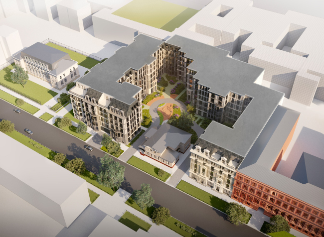
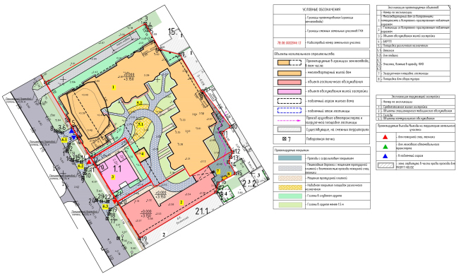
His interest for architecture of the 1930’s is pretty much the guiding star for Stepan Liphart. In his project of the “Amo” house on St. Petersburg’s Vasilyevsky Island, the architect based himself on Moscow Art Deco - aesthetically intricate and decorated in scratch-work technique. As a bonus, he developed the city block typology as an organic structure. This is already the second house that Stepan Liphart designed on the Vasilyevsky Island and the third that he designed in St. Petersburg (the “Renaissance” residential complex is already complete), all them designed for the AAG development company. “Little France”, the house that is currently being built on the 20th line, is an attempt to revive the beauty of the Kamennostrovsky Avenue, and revisit the tenement of the Silver Age as the ideal of modern housing. The hotel-and-housing complex “Amo” on the 12th line continues and develops this idea. The birds-eye view from the south. “Amo” residential complexCopyright: © Liphart ArchitectsThe master plan of the plot. “Amo” residential complexCopyright: © Liphart ArchitectsInfrastructure of happiness The second difference from the project on the 20th line is the fact that the southern unit of “Amo” is a hotel. The land owner already has a “Nash Otel” (“Our Hotel”) property nearby, on the 11th line, and this same operator will run the new hotel. The hotel is also allotted a portion of the yard; it will have a restaurant on the first floor and a fitness club on the top floor, which will also be accessible to the permanent residents. This way, in addition to the unique mansion, the residents will get the “infrastructure of happiness” - sports, food, and a place for rendezvous (not mentioning the French windows reaching to the floors and such “New York” housing formats as two-floor city-houses with individual entrances; patios and mansards - in a word, this is a great place to live in). The hotel adjoins the existing building of the hospital with its southern wall, its windows facing the western and northern sides. On the other side of the complex, there is a green yard with a separately standing two-story Stalin building that once used to be a kindergarten. 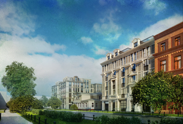 The perspective view on the 12th line form the south. The hotel is in the foreground. “Amo” residential complexCopyright: © Liphart Architects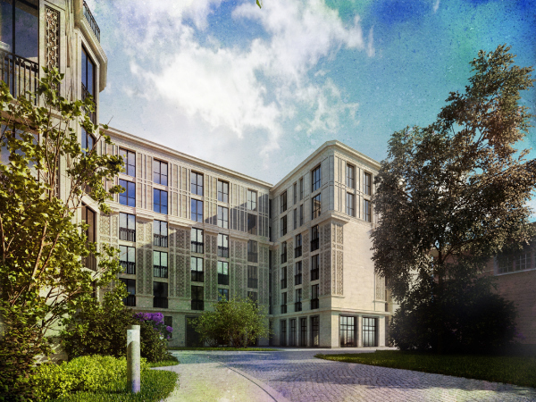 The overview of the yard facade of the hotel. “Amo” residential complexCopyright: © Liphart Architects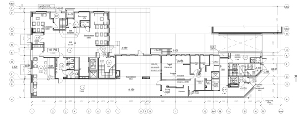 The first floor of the hotel. “Amo” residential complexCopyright: © Liphart Architects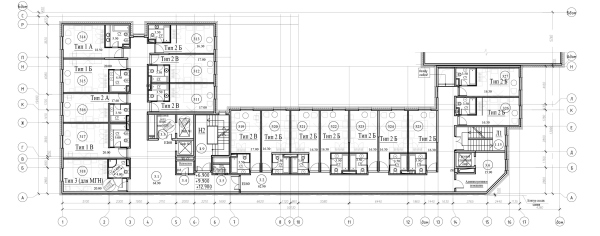 The standard floor of the hotel. “Amo” residential complexCopyright: © Liphart Architects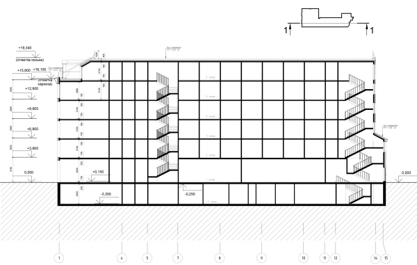 The section view of the hotel. “Amo” residential complexCopyright: © Liphart ArchitectsThe style of the new building can be defined as Art Deco, the street-side five-story facades being closer to the scale of the historical surroundings - they are meticulously drawn, decorated with cornices above the hotel entrance and above the pilastered frontons above the restaurant entrance, the line of the cornices continuing the cornices of the existing hospital building. The organic St. Petersburg: a combination of natural and man-made  The "Organic St. Petersburg" concept, proposed by Aleksey Levchuk and Stepan Liphart within the framework of their curator project for the "Ottepel« (»Thaw") workshop, organized by the “Project Baltia” magazine, supported by the Committee for CiCopyright: © Stepan Liphart, Aleksey Levchuk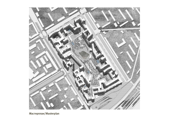 The "Organic St. Petersburg" concept, proposed by Aleksey Levchuk and Stepan Liphart within the framework of their curator project for the "Ottepel« (»Thaw") workshop, organized by the “Project Baltia” magazine, supported by the Committee for CiCopyright: © Stepan Liphart, Aleksey Levchuk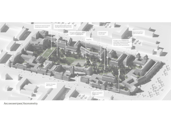 The "Organic St. Petersburg" concept, proposed by Aleksey Levchuk and Stepan Liphart within the framework of their curator project for the "Ottepel« (»Thaw") workshop, organized by the “Project Baltia” magazine, supported by the Committee for CiCopyright: © Stepan Liphart, Aleksey LevchukHouses on the medieval square The yards of St. Petersburg have rather wayward shapes. Although a part of the city’s mythology, the famous well courtyards are not particularly beautiful, for the rare exception of some of them, such as the Lidval Tauria House on the Rubinsheina Street. The “Amo” house is by no means of the “well courtyard” type - it is rather spacious, but the inside walls stand in a zigzag pattern. Which, among other things, makes it possible to better expose the southern wall to the sunlight, providing sufficient insolation. On the other hand, the jagged contour of the yard-side facades serves to diversify the rhythm and the composition: each fragment is subjected to the common concept, yet has a face of its own - as if what we are seeing is a group of small houses with narrow facades, structured by moldings and cornices, bay windows, and tiers with shifted axes. In addition, each of the volumes has its painting pattern, which makes navigation easier, making the perception of the housing anything but trivial: instead of the number of the hallway entrance, one will be able to speak about the facade with a floral or maritime pattern. It’s hard for a person to perceive a monotonous facade with a length of one hundred meters, the ideal length being 20-30 m, as in a historical city. This, specifically, was mentioned by Allan Jacobs in his book “Great Streets”. Back in his time, Mikhail Filippov used in his “Italian Quarter” the technique of designing the composition of a big house as consisting of several constructions of various epochs, with facades of three to five axes, thus recreating the humanistic principle of historical construction. In the case of “Amo”, however, a slightly different principle is proposed: placing a few several houses around a small square, yet the purpose is, by and large, the same. 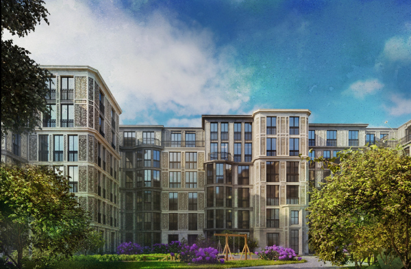 The overview of the south yard facade of the residential section. “Amo” residential complex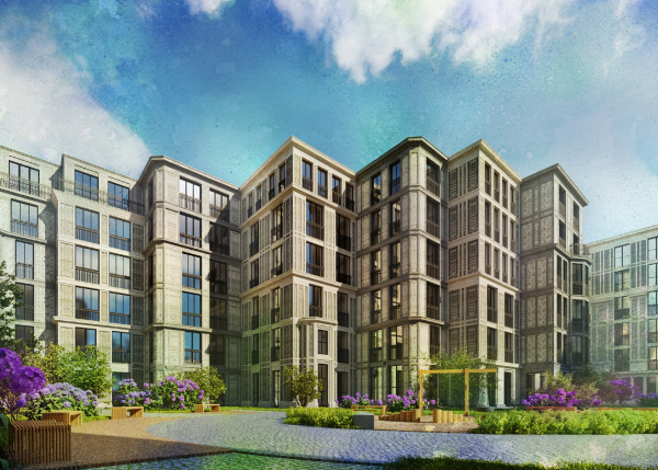 The perspective of the west yard facade of the residentil section. “Amo” residential complexCopyright: © Liphart ArchitectsUnlike the grand courtyard of “Little France”, the in-block square of “Amo” has an irregular shape. Generally speaking, landscaping the yard is a virtue nowadays. Therefore, the type of the yard is important. The Moscow yards, in which the Russian village can still be discerned, no longer satisfy us because they tend to eventually turn into a wasteland. Neither do the well courtyards of St. Petersburg - dramatic, yet pretty somber. As for the yard as a medieval square, however, which makes it possible to single out private, semi-private, and public spaces - this is quite a different matter. In his book “City Planning According to Artistic Principles”, Camillo Sitte claims that the irregular character of medieval squares makes them look all the more picturesque, and full of harmony. However irregular, they still look very tidy because of the main “hero” - the cathedral. And in the complex on the Vasilyevsky Island, the role of the “cathedral” is played by the Bremme mansion. The ornamental style: a union of art and technology The ornamental facades - a few types of patterns for panels with paradise flowers and trees, drawn by the graduate of the St. Petersburg Academy or Fine Arts, Anastasia Direktorenko - are essentially a reference to the “Openwork” house designed by Andrey Burov on the Leningrad Avenue and another house of his, Tverskaya, 25, with scratch-work decor executed by Favorsky’s design. He had an ability to combine technology and art, and was actually going to mass-produce his “Openwork House”, which we are now considering to be unique. 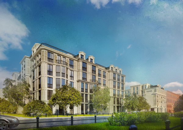 The perspective view on the 12th line form the north. “Amo” residential complexCopyright: © Liphart Architects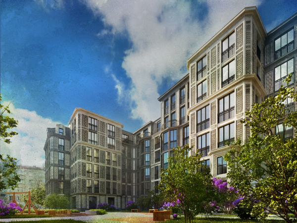 Fragment of the southwest part of the residential section, view from the yard. “Amo” residential complexCopyright: © Liphart Architects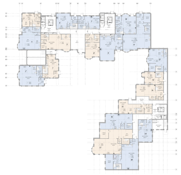 The first floor of the residential section. “Amo” residential complexCopyright: © Liphart Architects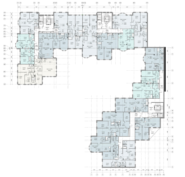 The third floor of the residential section. “Amo” residential complexCopyright: © Liphart Architects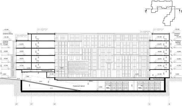 The section view of the resdidential section. “Amo” residential complexCopyright: © Liphart ArchitectsAs for the colors, Stepan Liphart proposed the reserved and modern kind, suitable for a house that is already rich in decor: emerald, ashen, chocolate, and milk-and-coffee. Yet another task was implementing the scratch-work technique, so loved by the architects of Renaissance and their devotees of the mid-XX century and the present day. From the XV to XX century, scratch-work was done on several layers of stucco. In “Amo”, the architects decided to simulate the renaissance technique by using volumetric threaded ceramic panels, where the first layer of paint conceals another one, more contrastive, which is more durable and more dependable than stucco, and, therefore, better meets the requirements for the modern facade. The cornices will be fully made of fibrous concrete. Chances are, this technology has a brilliant future. Dissected into rectangles, the walls refer us not only to the Art Deco and Art Nouveau painted panels, but also to quattrocento marble intarsia. The degree of flatness and relief of the facades is observed due to the cornices designed by the architects. What is also important is the small scale of the yard facades - small and private, literally two panels wide - often coinciding with the size of the apartments. Another this that is aligned with the scale of the apartments is the street facades, which means that the building has human-friendly proportions - the main prerequisite for a long and happy life in a historical city. |
|
