|
Published on Archi.ru (https://archi.ru) |
|
| 05.12.2023 | |
|
A New Age Portico |
|
|
Julia Tarabarina |
|
| Architect: | |
| Sergei Tchoban | |
| Sergey Kouznetsov | |
| Igor Chlenov | |
| Studio: | |
| SPEECH | |
|
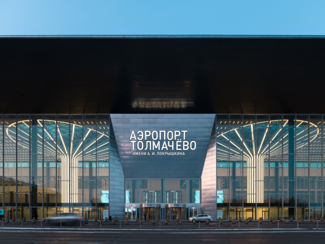
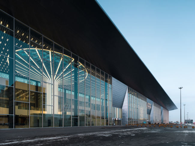
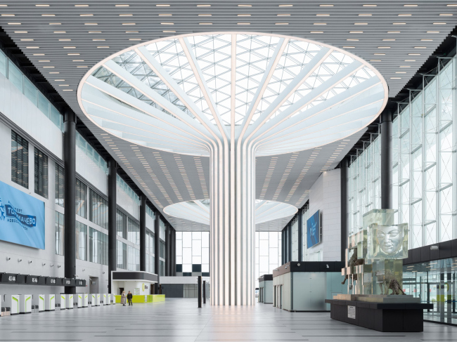
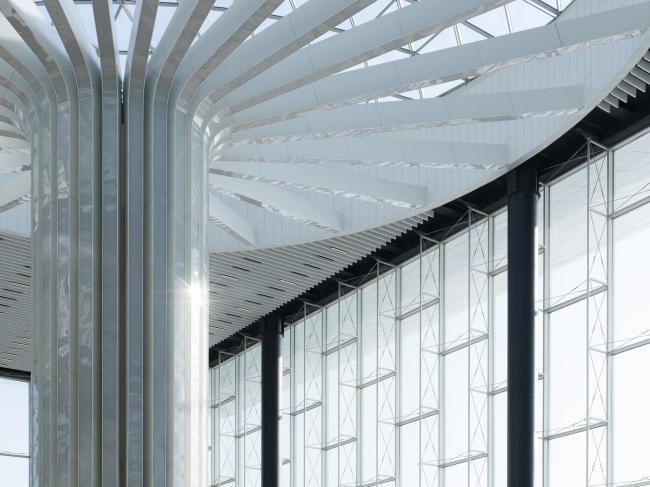
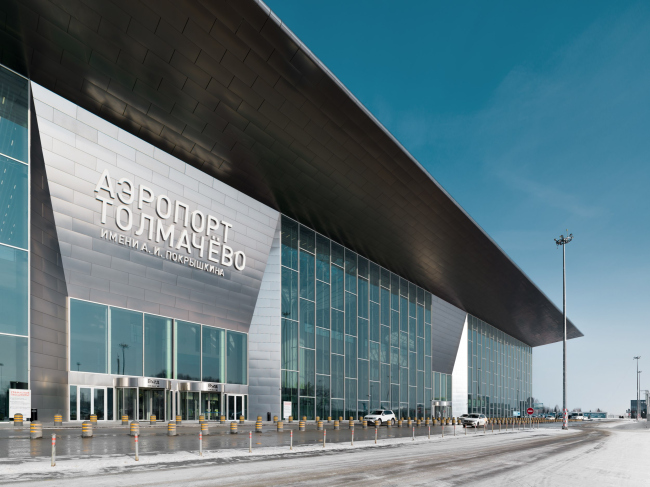
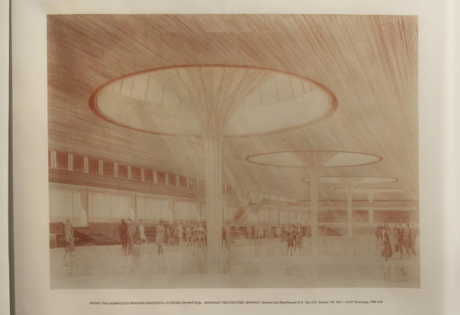
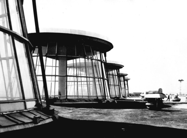
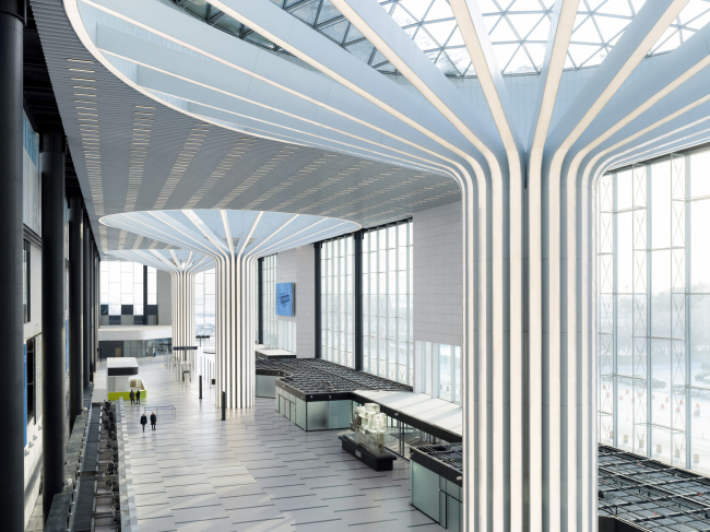
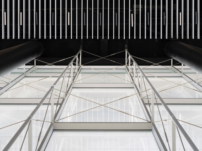
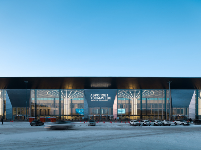
At the beginning of the year, Novosibirsk Tolmachevo Airport opened Terminal C. The large-scale and transparent entrance hall with luminous columns inside successfully combines laconism with a bright and photogenic WOW-effect. The terminal is both the new façade of the whole complex and the starting point of the planned reconstruction, upon completion of which Tolmachevo will become the largest regional airport in Russia. In this article, we are examining the building in the context of modernist prototypes of both Novosibirsk and Leningrad: like puzzle pieces, they come together to form their individual history, not devoid of curious nuances and details. Tolmachevo Airport’s new terminal opened in February 2023 to become, without exaggeration, one of the most important architectural events of the year. Currently, it is collecting industry awards – for example, it was honored by the Golden Capitel – as well as numerous posts in social networks. I have not seen a person who, after flying here and entering the terminal, would not stop to take a photo. The terminal both produces a wow-effect and looks quite original in the context of modern trends. Tolmachevo Airport, Terminal CCopyright: Photograph © Dmitry Chebanenko / provided by SPEECHThe current terminal should become the beginning of the reconstruction of the international airport in Novosibirsk, it is a kind of “first portent”. It is planned to rebuild all the existing buildings in the future. Until the reconstruction is completed, the new Terminal C will work for domestic airlines, while the neighboring Terminal B to the east will continue to function as an international terminal. Terminal C is located on a new site; it “stepped forward” on the square in front of the existing airport complex, taking on the role of the front facade of Tolmachevo. 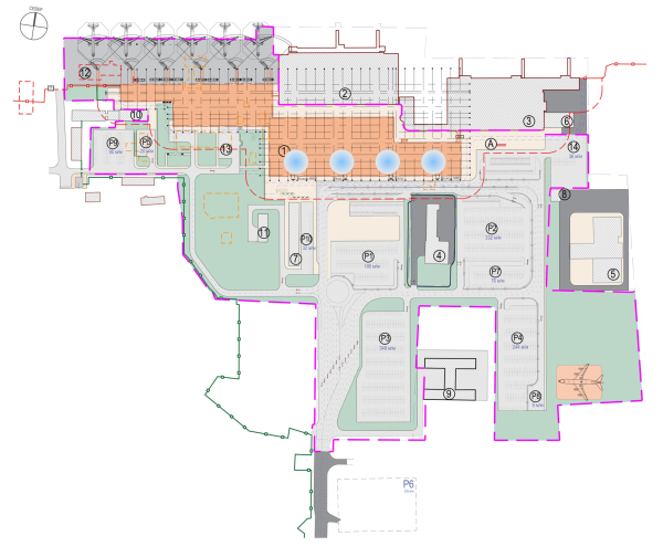 The master plan. The volumes of the new Terminal C are marked in orange. Tolmachevo Airport, Terminal CCopyright: © SPEECH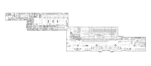 Plan of the new structures. Tolmachevo Airport, Terminal CCopyright: © SPEECHThere are such projects that are usually represented by numbers; they are usually very noticeable, with a prefix of “mega-“, and Tolmachevo Airport is definitely one of them. The height of the columns is about 30 meters, the diameter of their trunk is 5 m; the diameter of the glass domes is 32 m. The height of the ceiling truss is 1.5 meters. The canopy overhang is 11 meters. 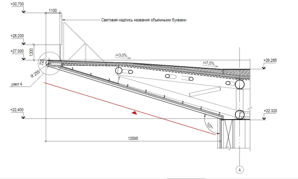 The canopy, section view. Tolmachevo Airport, Terminal CCopyright: © SPEECH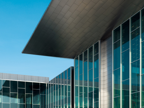 Tolmachevo Airport, Terminal CCopyright: Photograph © Dmitry Chebanenko / provided by SPEECHThe specifics of the architectural solution, as we know, are affected by scale and size, but not always directly. In this case, the luminous umbrella columns as tall as a nine-story building certainly make an impression. The columns make an impression when they glow from within through a stained glass window – a giant display case deliberately devoid of additional illumination – like some kind of energy rods. Tolmachevo Airport, Terminal CCopyright: Photograph © Dmitry Chebanenko / provided by SPEECHAnd they make an impression when the backlighting is off and the columns “bathe” in daylight, abundantly let in by the glass walls on three sides and the domes above. The columns are amazing: their sheer scale, their “striped” structure, and their position in the space – they seem to occupy the whole of it, but they do not clutter it at all. They are both a part of the building and at the same time an exhibit – a glass cover with an openwork, deliberately thin cable-stayed structure was built for them – in order to show them, which seems quite justified. Tolmachevo Airport, Terminal CCopyright: Photograph © Dmitry Chebanenko / provided by SPEECHTolmachevo Airport, Terminal CCopyright: Photograph © Dmitry Chebanenko / provided by SPEECHAnother issue related to the first one has to do with the proportions of the glass “casing”. The length of the glass case is 300 m, width 60 m with the canopy and about 40 m without it. That is, the proportions of the plan inside are practically 1 x 7.5, the front volume being very long. As for airport terminal buildings in general, they can be almost square or, on the contrary, elongated. The latter is explained by the fact that a long building allows more airplanes to be docked to it. If we look at the plan of St. Petersburg’s Pulkovo, we can see that Grimshaw’s terminal is square, while Alexander Zhuk’s Pulkovo-1 terminal, on the other hand, is long, with not just four but five domes. This is important in this context, because Sergey Tchoban calls Pulkovo-1 the prototype of the Tolmachevo terminal and speaks of intentional parallels with the architecture of “classical” modernism.  Sergey Tchoban It is now common to design airports with fluid, non-linear forms – it is one of the most expensive, but at the same time quite simple and sure-fire ways to achieve a WOW-effect. However, Novosibirsk is a modernist city, largely developed after the Second World War. We remembered Akademgorodok; and also the very first terminal of the 1960s, designed and built in Tolmachevo by Anatoly Volovik. And we decided to follow the path of restrained architecture, regular and rational, appealing to modernist examples, even though this did not exclude a spectacular gesture, which, in my opinion, were our columns. For me personally, the key prototype was St. Petersburg’s Pulkovo-1 terminal with its skylights. There, the columns support the roofs at the zeniths of the skylights, and then the roof is suspended from them. In our case, the design is somewhat different: the columns take on part of the weight of the ceiling trusses, and they share the load with the supports on the outer contour. At the same time, they have a constructive meaning and participate in the distribution of bearing forces inside the building. This was important to us. 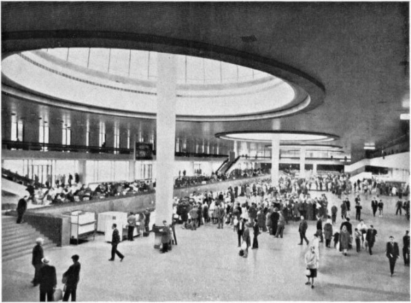 Pulkovo-1 airport, interior, 1978.Pulkovo-1 airport, interior, 1978. Copyright: Zodchestvo (Soviet Architecture). Collection of the Union of Architects of the USSR. vol. 2 (21). 1978 /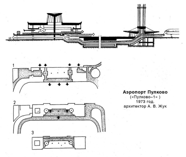 Pulkovo-1 Airport, plans and section viewsCopyright: E.B. Novikova "Interior of Public Buildings (Artistic Problems)". M. Stroyizdat, 1984 /The explanation given here immediately makes the exploration of the prototypes of the airport a fascinating thing to do. Let’s start with the history of Tolmachevo. The first airport was designed by Novosibgrazhdanproekt back in 1963 as an elongated “beam” building with a square entrance volume of the departure lounge, a stained glass window, and a canopy frame. you can see both the project and old photos, and is the most informative view from above. By 2015, the building was replaced by a new domestic terminal, then it was connected to the glass prisms of the neighboring terminal, built to the east of it in 1997. The result is a very long and slightly “wiggling” facade, designed in a generalized style, somewhat pretentious and not matching the quality of materials. In addition to Pulkovo, SPEECH architects cite the example of the House of Scientists in Akademgorodok (1966). However, the format of the new terminal’s glazing can also be compared to another building by Anatoly Volovik in Novosibirsk – the Scientific and Technical Library of the Russian Academy of Sciences (thanks to Marina Ignatushko for the tip). In Tolmachevo, of course, the glazing is of higher quality: structural, Jumbo, 6 x 3 meters, and with thin vertical slats. However, the image of vertical frames with diagonal alternation and at the same time with slopes, are very much resonant with one another. Quote recognized. Tolmachevo Airport, Terminal CCopyright: Photograph © Dmitry Chebanenko / provided by SPEECH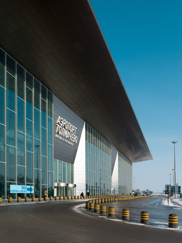 Tolmachevo Airport, Terminal CCopyright: Photograph © Dmitry Chebanenko / provided by SPEECH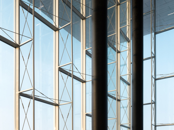 Tolmachevo Airport, Terminal CCopyright: Photograph © Dmitry Chebanenko / provided by SPEECHThe connection to the main prototype – Pulkovo-1 – is even more intriguing. The Leningrad terminal of 1973 is essentially a long parallelepiped with light skylights supported by columns. And so, at the recent “Arkhitekton” in St. Petersburg, at an exhibition devoted to Leningrad modernism, an unrealized version of the project caught my eye, where the columns of Pulkovo-1, now rather soaring up into the sky in a somewhat orphaned manner, were drawn mushroom-shaped. Project of the passenger hall of Pulkovo-Leningrad airport. Interior. Perspective. Variant. Architects Verbitsky J.N., Zhuk A.V., Vlanin G.M. 1967. USSR. Leningrad. GMI SPbCopyright: Photographed at the exhibition Architekton 2023What is more interesting, however, is that when I asked Sergey Tchoban whether this variant was the inspiration for Tolmachevo, he told me that he did not know about it, and that the first time he ever saw this picture was in the exhibition reports. So the synergy between the project and its prototype, at some immanent level, is even stronger, perhaps, than the author himself could have possibly known? We began to check the projects for similarities, and even little-known variants somehow “fell in line”. But then again, if you look at the succession of skylights of Pulkovo-1 and at the Tolmachevo hall space as a whole, with your eyes half-closed, they do begin to look similar. The skylights seem to have been brought to some orthogonal projection and merged into one parallelepiped, but the meaning remains: transparent walls, light, supports, umbrellas. Pulkovo-1 Airport. View on the roof during constructionCopyright: / загруженоIt’s not about repetition or quoting, of course, but about being deliberately in line with a certain context. Mushroom columns are popular in 20th century architecture, and, interestingly, they were used even before modernism: the form dates back to the Neo-Gothic craze that gave the world the fan vault, where the supports merge seamlessly with the ceiling – and at the same time, its development is based on experiments with reinforced concrete technology that only became available a hundred or more years ago. Since then, mushroom-shaped columns, which allow you to free up space and give the ceiling a spectacular plasticity, would be seen here and there. Not to go too far, we can remember yet another project by Sergey Tchoban – the EDGE office building in Berlin, where different-sized wooden “mushrooms”, also plate-like, support the staircases in the atrium space. In that building, by the way, both the shape and the abundance of daylight play a big role, just like they do in Tolmachevo. Airports with similar ideas are also known – for example, in the 2nd terminal of Chhatrapati airport in Mumbai, built according to the SOM project in 2014, mushroom-shaped columns are used, yet of the flexible, mesh-like type. There is no point in talking about borrowings here – rather, we are dealing with a set of ways of organizing large space, common and still perfected in the XX-XXI centuries. In Tolmachevo, the SPEECH architects proposed a version of their own. Meanwhile, the allusions are not the main thing – they simply add flavor by binding the building with strings of local and other meanings. And the main thing here, besides brevity, is the abundance of light. The artificial light of the columns in space is rather akin to some phenomenon of atomic physics, whose dynamics is connected not with the movement accessible to the eye, but with the internal tension of the fields –Akademgorodok, which is located nearby, definitely made its presence known, however indirectly. Tolmachevo Airport, Terminal CCopyright: Photograph © Dmitry Chebanenko / provided by SPEECHAnd there is plenty of natural light too. A large stained glass window in a modern terminal building is rather a norm, but here we can see it not on just one, but on three sides, and the columns visually “open up” the ceiling, pushing its opaque surface open, revealing the sky in domes. The umbrellas can be compared to the fingers of a hand – only there are a lot of them and they are thin and symmetrical. 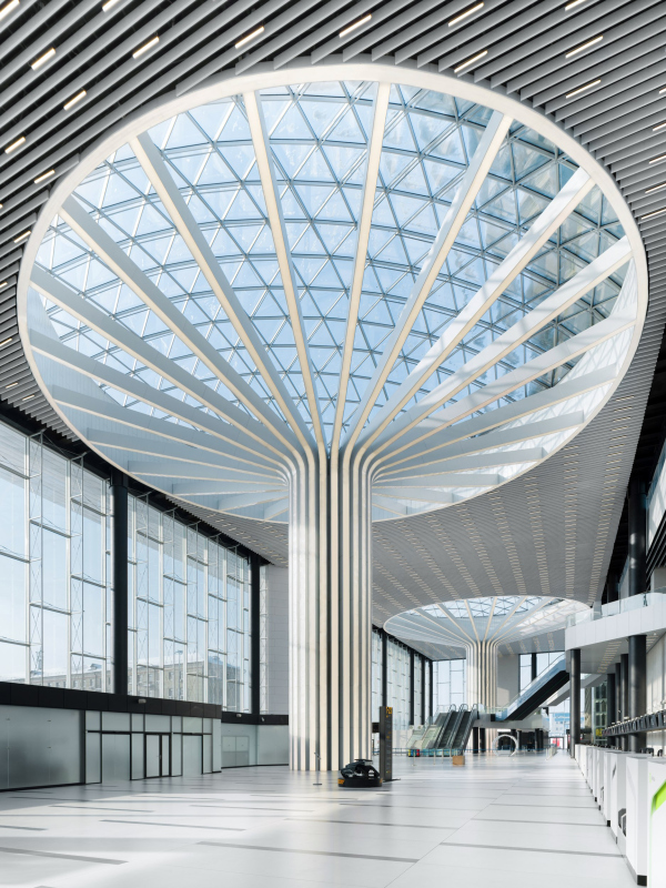 Tolmachevo Airport, Terminal CCopyright: Photograph © Dmitry Chebanenko / provided by SPEECH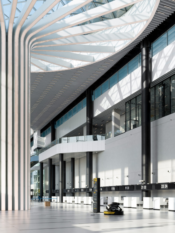 Tolmachevo Airport, Terminal CCopyright: Photograph © Dmitry Chebanenko / provided by SPEECH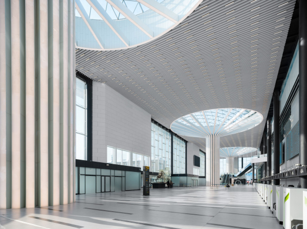 Tolmachevo Airport, Terminal CCopyright: Photograph © Dmitry Chebanenko / provided by SPEECH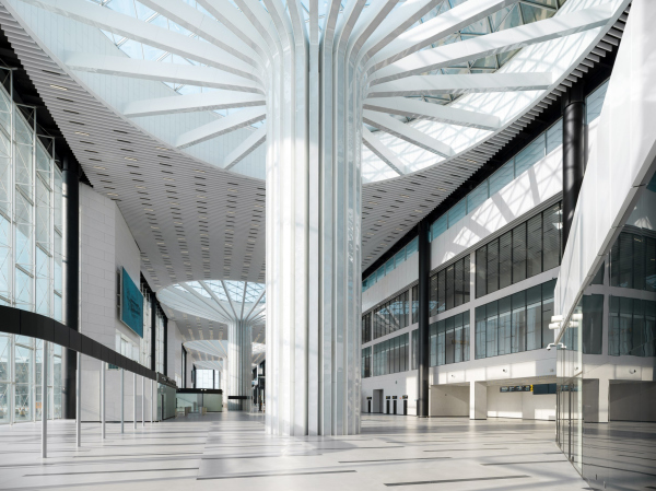 Tolmachevo Airport, Terminal CCopyright: Photograph © Dmitry Chebanenko / provided by SPEECH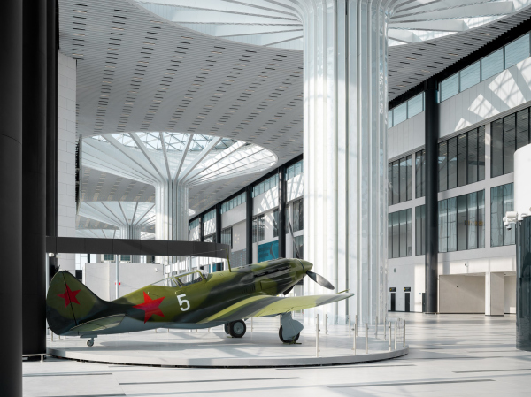 Tolmachevo Airport, Terminal CCopyright: Photograph © Dmitry Chebanenko / provided by SPEECH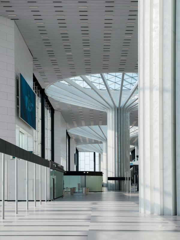 Tolmachevo Airport, Terminal CCopyright: Photograph © Dmitry Chebanenko / provided by SPEECH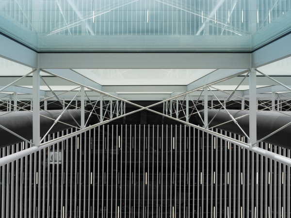 Tolmachevo Airport, Terminal CCopyright: Photograph © Dmitry Chebanenko / provided by SPEECH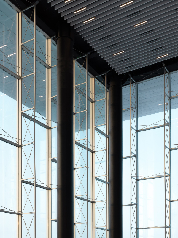 Tolmachevo Airport, Terminal CCopyright: Photograph © Dmitry Chebanenko / provided by SPEECH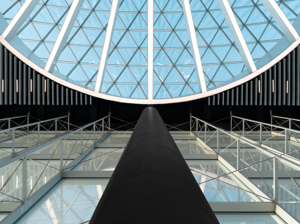 Tolmachevo Airport, Terminal CCopyright: Photograph © Dmitry Chebanenko / provided by SPEECH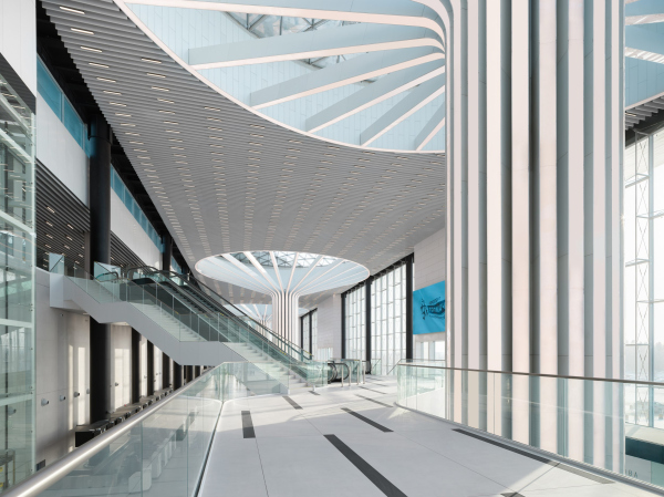 Tolmachevo Airport, Terminal CCopyright: Photograph © Dmitry Chebanenko / provided by SPEECH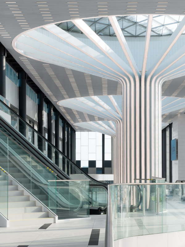 Tolmachevo Airport, Terminal CCopyright: Photograph © Dmitry Chebanenko / provided by SPEECH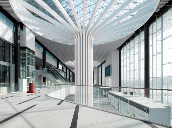 Tolmachevo Airport, Terminal CCopyright: Photograph © Dmitry Chebanenko / provided by SPEECH Tolmachevo Airport, Terminal CCopyright: Photograph © Dmitry Chebanenko / provided by SPEECHIn addition, it is important that the building is technologically advanced. The surfaces of the domes, made up of triangles of different formats, and the thin cables of the main stained-glass walls were developed by the company Nesushchie Sistemy (“Bearing Systems”), founded in Novosibirsk and known for having built the first building with non-linear glass facades in the Russian Federation already in 2011, and also for having built the “glass tree bark” of the hall in Zaryadye. Other technically advanced solutions include the canopy with a large overhang, the ceiling truss, the load distribution between the main “tree” columns and the additional supports that were needed along the glass facades. But there are not many of them, they are tall and thin and not very visible. 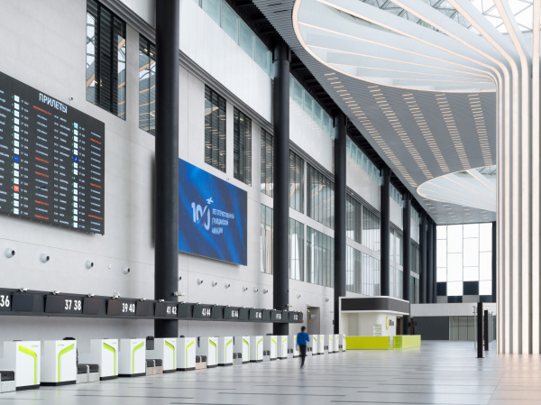 Tolmachevo Airport, Terminal CCopyright: Photograph © Dmitry Chebanenko / provided by SPEECH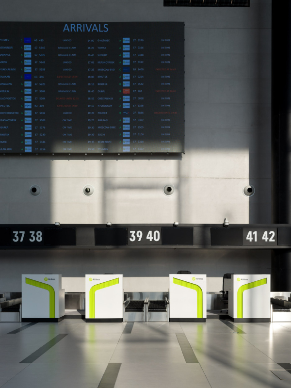 Tolmachevo Airport, Terminal CCopyright: Photograph © Dmitry Chebanenko / provided by SPEECHMeanwhile, there are no “Guinness Book records” here – it’s more about the fact that everything is done at a good level of modern construction: the stretches are thin, the seams of the metal cladding of the portals and the canopy are also thin, they don’t catch the eye, and the steel cassettes themselves are covered with matting varnish so that they shine not too much, but moderately. A certain gentleman’s set of quality, maybe a gloss, not supernatural, but, let’s say, “Metropolitan”. I cannot resist the temptation to say: the way it is supposed to be in the capital of Siberia. After all, after the reconstruction is completed, Tolmachevo will indeed become the largest regional airport. Tolmachevo Airport, Terminal CCopyright: Photograph © Dmitry Chebanenko / provided by SPEECHIf the entrance hall is dominated by white color and light – there is an inversion inside. The screening and baggage claim space, as usual, is somewhat simpler and black is either more abundant in it, or it divides the powers with white roughly in half. Visual “bridges” with the main hall are also provided: round thin fusts of columns remind of supports on the contour, and “daisies” of the lamps embedded in the ceiling unambiguously look like “younger brothers” of the mushroom- shaped columns. 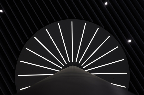 Tolmachevo Airport, Terminal CCopyright: Photograph © Mikhail Abramychev / provided by the press service of Moskomarhitektura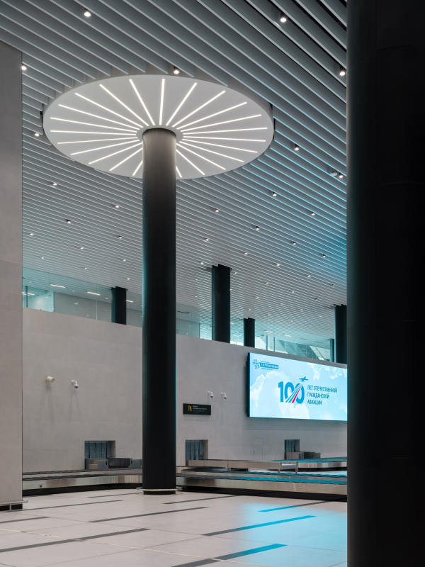 Tolmachevo Airport, Terminal CCopyright: Photograph © Dmitry Chebanenko / provided by SPEECH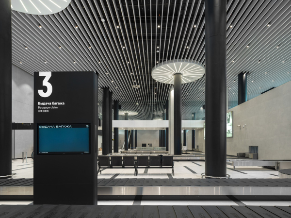 Tolmachevo Airport, Terminal CCopyright: Photograph © Dmitry Chebanenko / provided by SPEECH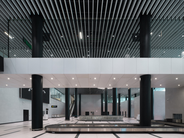 Tolmachevo Airport, Terminal CCopyright: Photograph © Dmitry Chebanenko / provided by SPEECH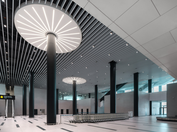 Tolmachevo Airport, Terminal CCopyright: Photograph © Dmitry Chebanenko / provided by SPEECH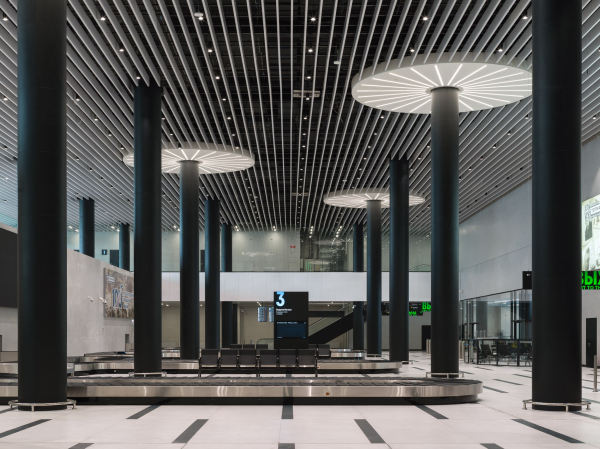 Tolmachevo Airport, Terminal CCopyright: Photograph © Dmitry Chebanenko / provided by SPEECHHowever, the most interesting and informative view is from the outside, i.e. from the square. It defines the building’s place in the complex. It is from here that the whole driving idea can be best appreciated: the luminous “trees”, a kind of Telperions in a casing of transparent and metallic planes. Retrofuturism at its finest: full of meanings, but modern, and WOW-laconic. It is, in fact, not at all an easy task to make a building both as simple as do-re-mi, and addictively exciting. Tolmachevo Airport, Terminal CCopyright: Photograph © Dmitry Chebanenko / provided by SPEECHNow, wait a minute! Isn’t this a portico? A giant glowing portico encased in a sheath! Or, perhaps, a stoa, a public gallery from Ancient Greece! It comes forward, forms a representative facade of the airport, declares its ambitions calmly and confidently, marks the entrance not without Hellenistic pathos, as if telling us: I am in charge here, I have been here, in a sense, always. Like the Library of Celsus – whether there is a library or not, the façade is beautiful. How did it happen? Initially, we were after the simplicity of modernism, but we ended up with a key element of classical architecture? Well, yes, but not quite. First of all, functionally, the airport entrance hall is a public space for those entering the airport, and it has long since become a place of representation, designed to welcome and impress anyone, to present the airport in all its glory. The portico has the same role, and the row of columns, into which the entrance space has been transformed here, declares this with great magnitude. We are definitely entering somewhere, ready to be transported from Point A to Point B, and the space unequivocally tells us so. Not everyone may understand this but it doesn’t matter; I don’t think everyone understood the meaning of the Library of Celsus either. Secondly, already in the 1970s, modernism began to search for points of contact with cultural history in the broadest sense, and the main condition of the search was the non-obviousness of the probable quotation, its translation to the level of innuendo. In Tolmachevo, I think we are witnessing a quite successful attempt to return to the same search, as the technology makes its giant leaps. Which makes the project a really good work with scale and meaning: because when we look closely we see and feel one thing, but when we go outside we see another. However, the most important statement – the almost perfect image of a large airport, the “portico-portal” – is read from afar. It is only then that one realizes that it is about a new beginning. |
|
