|
Published on Archi.ru (https://archi.ru) |
|
| 22.03.2021 | |
|
Binary Opposition |
|
|
Alyona Kuznetsova |
|
| Studio: | |
| Evgeniy Gerasimov & partners | |
|
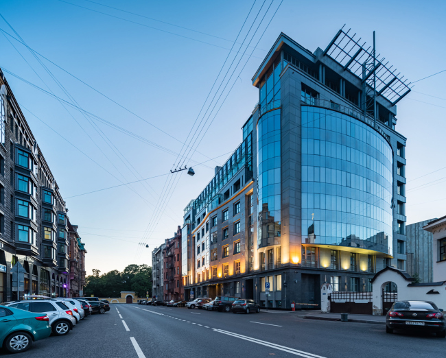
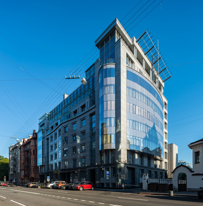
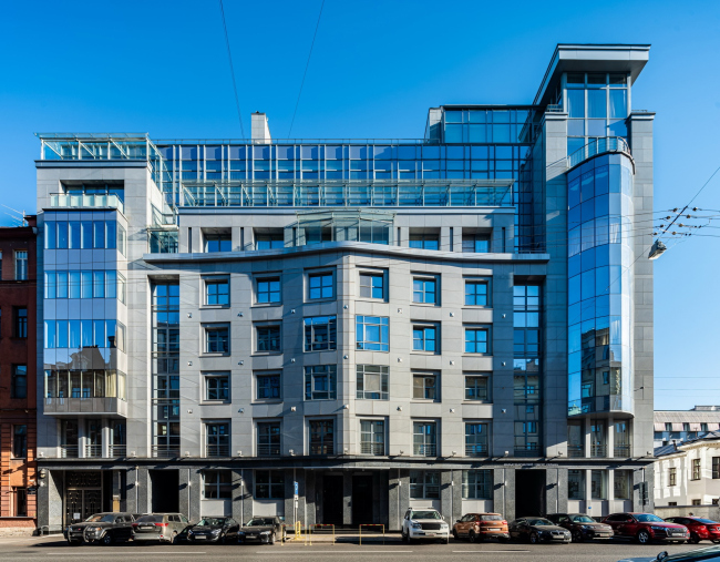
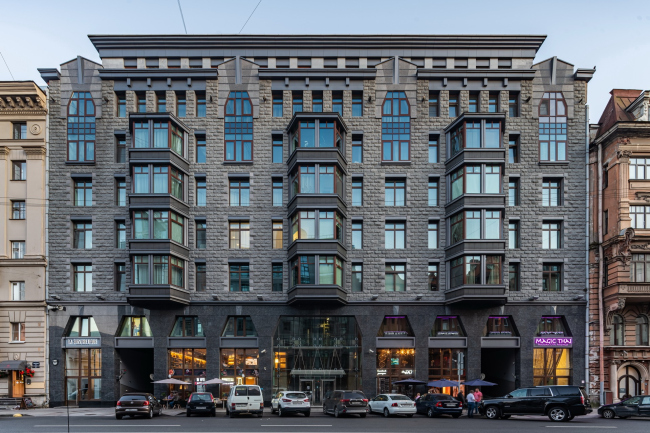
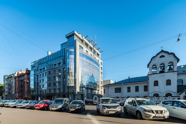
In this article, we are examining a rather rare and interesting case – two projects by Evgeny Gerasimov situated on one street and completed with a five years’ difference, presenting the perfect example of example for analyzing the overall trends and approaches practiced by the architectural company. The Tverskaya Street, which connects the Tavrichesky Garden and the Smolny Garden, was one of the first, with which Evgeny Gerasimov bureau started to work: the pencil sketches for this place appeared still back in 1991, in the year the company was founded. Curiously, at first the architects saw here a building in the style a-la Russ, the dream of which they were able to implement much later. Gradually, however, during the conferences with the client, who owned not just one but two sites on this street, the concept changed. First, in 2004 they built a modernist house on Tverskaya 6, and exactly five years later right across from it appeared its neighbor designed in the style of Northern Art Nouveau. Comparing them reveals some regularities in the work of the company. The residential house at Tverskaya, 6Copyright: © Evgeniy Gerasimov & PartnersCourage to make a statement The two houses on Tverskaya Street present two answers to the question about how you build in a historical center. One way is to look clearly modern and oppose the surrounding context with new forms and materials. The other is to try and learn to speak the language of your predecessors, reconsidering their legacy. Both approaches are known to have their advocates and critics. The Tverskaya Street is a good place for architectural experiments because this area is incredibly rich in architectural styles: within a five-hundred-meter radius, you may find baroque, classicism, eclectics, Northern Art-Nouveau, as well as representatives of Soviet architecture from every decade. Closing two lacunae in this post-perestroika city collage, the architects tried various approaches, pushing the limits of the possible. However, in spite of the fact that the two houses look obviously different, there are things that they do have in common.  Evgeny Gerasimov, Evgeniy Gerasimov & partners What these two houses have in common is the uncompromising drawing on the chosen subject. They are not at all shy of themselves. The mimicry effect is just not the case here. They declare: I am made this way, if you like me – thank you, but if you do not like me – please go on your way. We can say that these houses are competing for your attention. Like in Dostoevsky’s White Nights, remember? We will remind you, just in case: “I know the houses too. As I walk along they seem to run forward in the streets to look out at me from every window, and almost to say: “Good morning! How do you do? I am quite well, thank God, and I am to have a new story in May,” or, “How are you? I am being redecorated tomorrow;” or, “I was almost burnt down and had such a fright,” and so on. Meaning, both houses, which is also quite applicable for other projects by this company, with all due respect for their predecessors, look nothing like the overly “tolerant” background construction, do not dissolve in the context, but with a feeling of dignity show their own unique personality. Now we shall examine each one in more detail. The junction and the merger The house at Tverskaya 6 is a recognizable monument to its time, but, instead of high-tech – Evgeny Gerasimov categorically refuses to recognize the term “” because he says its meaning is too vague – this place could have gotten “a corner of Russian antiquity”. The first sketch with “stone-white” walls and romantic turrets was most likely inspired by the vicinity of the Old Believer Church of the Sign of the Mother of Christ. However, as it seems now, an a-la Russ house does not seem to be such a good marketing idea, as the “Russian House” that appeared 15 years later. In addition, the site from the courtyard side borders on the Archive of Historical and Political Documents and the Archive of Film and Photo Documents, and combining late-Soviet architecture with Old Russian motives would have been quite prudent, to say the least. Therefore, the client and the architects opted for brutal forms, glass and metal. 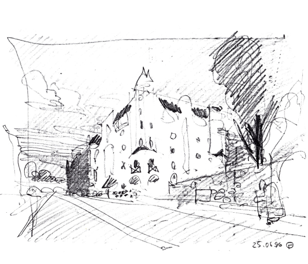 The residential house at Tverskaya, 6. A sketchCopyright: © Evgeniy Gerasimov & Partners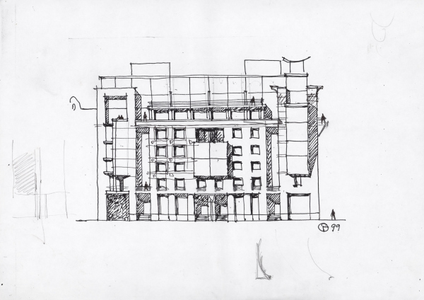 The residential house at Tverskaya, 6. A sketchCopyright: © Evgeniy Gerasimov & PartnersBefore the company came to the land site, it had lain vacant for quite a long time, save for a small wooden house. Nevertheless, the composition of Tverskaya 6 is made in such a way, as if the architects were recreating the structure of the streets and building up some “lost” house above the new volumes. This technique of “building up” traditional architecture with modern forms is quite recognizable, and in the 2000’s when the design and construction of this house were done, was still widely spread. The residential house at Tverskaya, 1Copyright: © Evgeniy Gerasimov & PartnersIt may seem that if you remove the glass volumes, you will be left with a house that could well have been designed today: a shopping gallery, six floors, a three-part build, and a fold quite in the spirit of early Art Nouveau and a noble cladding material – an ideal example of those “70/30” about which Sergei Tchoban often speaks. However, strange as it may seem, the impression from the photographs is deceptive – standing on the Tverskaya, you will not see anything accidental or imposed in this house – just the perfect balance of forms, masses, and materials. The residential house at Tverskaya, 1Copyright: © Evgeniy Gerasimov & PartnersSuch a merger technique – a merger between a more traditional in its scale and structure part of the building and more modernist shapes – was used by Evgeny Gerasimov a few more times: in the “New Star” on the Pesochnaya Embankment, and in “Le Grand” house at Nevsky Prospect, 152. However, already by the end of the 2000’s this technique exhausted itself and became irrelevant, which you cannot say about historicism. 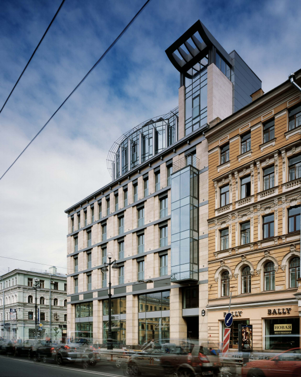 Le Grand housing complexCopyright: © Evgeniy Gerasimov & Partners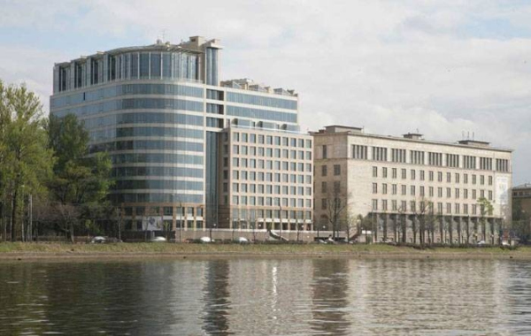 “New Star” housing complexCopyright: © Evgeniy Gerasimov & Partners. Photograph: K.SmirnovMultilayered historicism Tverskaya, 1 is a reconsideration of Northern Art Nouveau, the path of historicism, which is closer to and more understood by the St. Petersburg architects today, yesterday, and, possibly, for generations to come. This trend is something that the company has been exploring and perfecting for decades. Across from it, there are two Art Nouveau houses at once, the on the corner being the first project by Aleksey Buber, whose works inspired many modern architects, while the house was designed by Dmitry Ustrugov. Still another house, the closest neighbor of Tverskaya-1, is a combination of eclecticism and, again, Art Nouveau – it is known for the fact that one of the most famous literary and of its time was held in its tower in the apartment of Vyacheslav Ivanov: Anna Akhmatova, Alexander Blok, Nikolai Gumilyov visited this place; on summer nights, readings could even be held on the roof. The new house picks up the mood of this part of the street and presents an impregnable romantic facade capable of withstanding any St. Petersburg blizzard. The residential house at Tverskaya, 1Copyright: Photograph © A. Naroditsky / Provided by Evgeniy Gerasimov & PartnersWe gave a detailed discussion of the prototypes and references to the Northern Art Nouveau in this article. We will only repeat that, working in historical styles, Yevgeny Gerasimov does not remain within the framework of one direction, and, like in a good book, one more layer can be found in his facades behind the main storyline. In this case, having looked at the rough “fur coat” of rock-face surface and the trapezium of windows with a fine glazing pattern, we will notice that the tectonic logic is reversed and corresponds more to modernism, while the lines of bay windows gravitate towards constructivism, and the “headdresses” above the windows of the topmost-but-one floor convey something Egyptian to the building’s image. The tactile details Yet another fundamental that the company sticks to, and which is something that the two houses have in common is the expressive and tactile details. Evgeny Gerasimov many times said that he strives to ensure that people want to not only look closer at his buildings, but also touch them. On Tverskaya, the contrast in this regard works for the general benefit: if one house is rough and matte, the second one looks even smoother against its background, more glossy and polished. For Tverskaya, 1, the architects used Ukrainian Pokostovsky granite, which was hewn by hand – the rare case when there are no two identical stones on the modern facade. The contrast of materials and expressive texture, which is emphasized by the sun and evening illumination, in this case are successfully replaced by decorative elements. 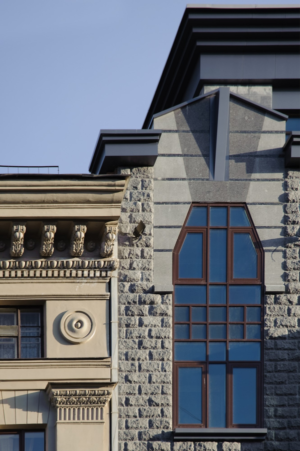 The residential house at Tverskaya, 1Copyright: Photograph © A. Naroditsky / Provided by Evgeniy Gerasimov & Partners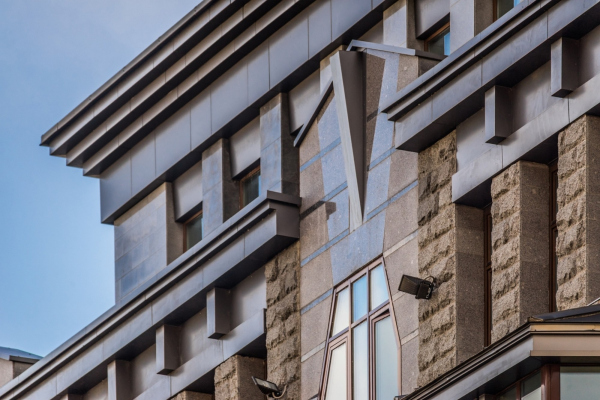 The residential house at Tverskaya, 1Copyright: Photograph © A. Naroditsky / Provided by Evgeniy Gerasimov & Partners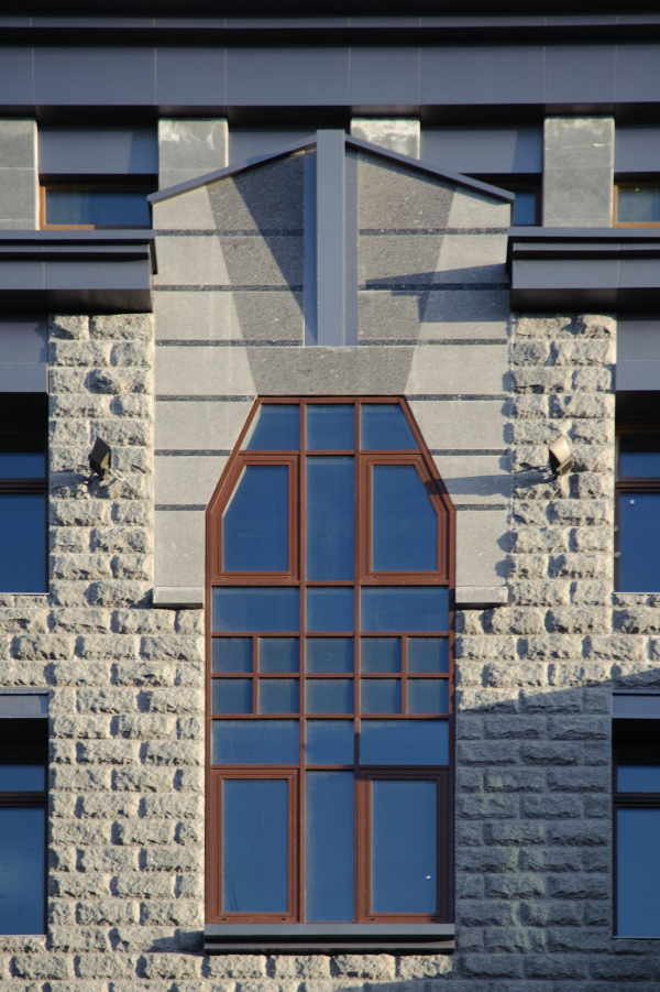 The residential house at Tverskaya, 1Copyright: Photograph © A. Naroditsky / Provided by Evgeniy Gerasimov & Partners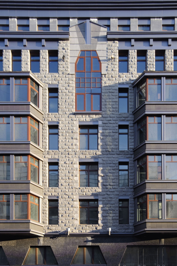 The residential house at Tverskaya, 1Copyright: Photograph © A. Naroditsky / Provided by Evgeniy Gerasimov & Partners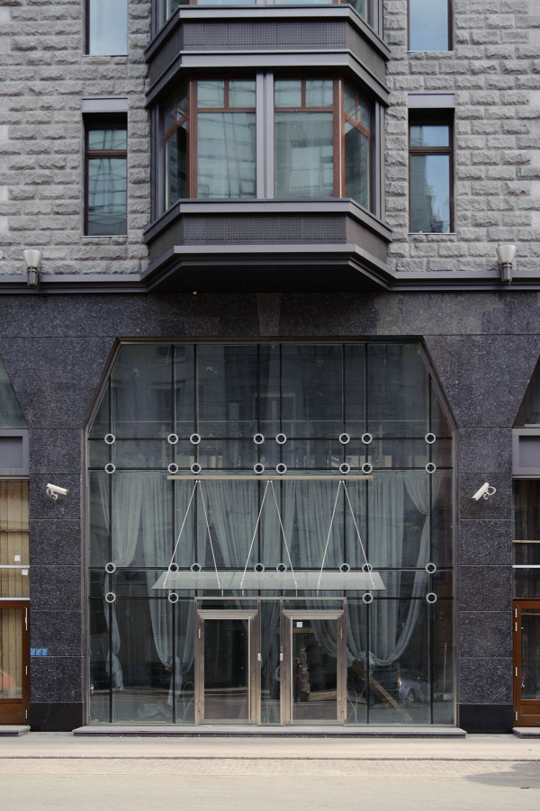 The residential house at Tverskaya, 1Copyright: Photograph © A. Naroditsky / Provided by Evgeniy Gerasimov & PartnersA mirror or a frame As was already mentioned, one of the most important “characters” of the Tverskaya Street is the old believers Znamenskaya Church, authored by Dmitry Kryzhanovsky, which was restored during about the same period as the new houses were built. Tverskaya, 6, responds to the church with a large reflective “screen” – a large elliptic curve with recessed balconies. The residential house at Tverskaya, 6Copyright: © Evgeniy Gerasimov & PartnersIn subsequent years, the architectural company worked with other areas where the tone was set by the church – like a pearl that needs a frame just as beautiful. So, the house in Kovensky lane politely recedes from the walls of the Church of Our Lady of Lourdes, thereby forming a piazzetta and opening the western facade of the temple. Reflective surfaces, by the way, are to be seen there as well. In the “Tsarskaya Stolitsa” complex, the Feodorovsky Cathedral also determines the overall layout – its central position is marked by a semicircular square and beams of streets that open up a perspective of the temple from distant vantage points. In the case of Tverskaya, the interaction with the church is more active and assertive, which is primarily due to the specifics of the site: the house is actually a corner one, and the volumes of the church complex are growing in the opposite direction from it. 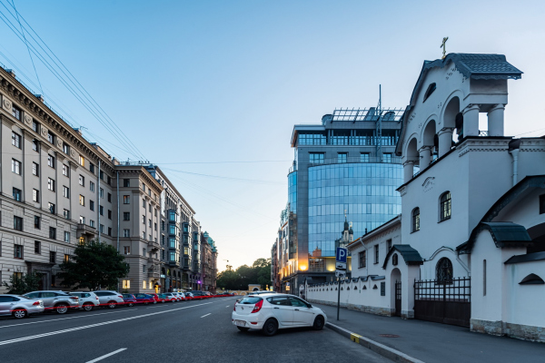 The residential house at Tverskaya, 6Copyright: © Evgeniy Gerasimov & Partners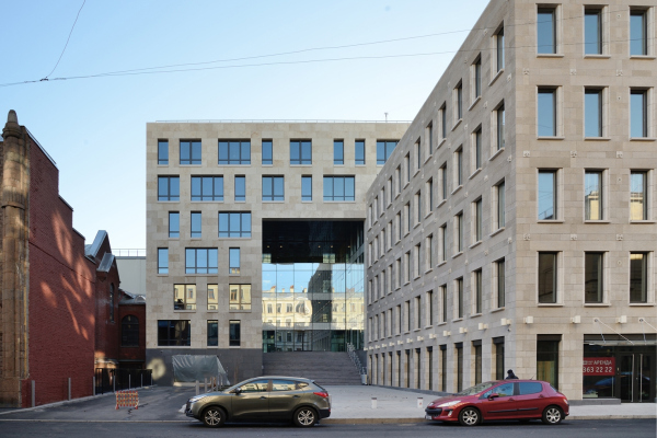 The residential house in the Kovensky LaneCopyright: © Evgeniy Gerasimov & Partners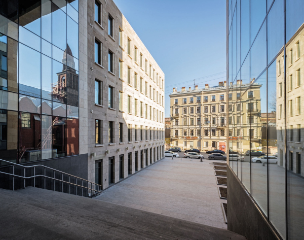 The residential house in the Kovensky LaneCopyright: © Evgeniy Gerasimov & Partners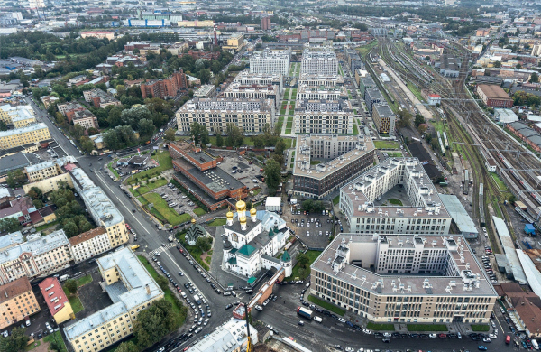 “Tsarskaya Stolitsa” housing complex. A drone photoCopyright: © Evgeniy Gerasimov & Partners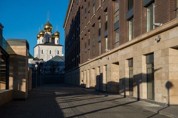 “Tsarskaya Stolitsa” housing complexCopyright: © Evgeniy Gerasimov & PartnersOther couples In conclusion, we will note that similar pairs of houses, located close to each other, but representing completely different approaches, were built by the company in other parts of the city as well. The most vivid example is the house in the Kovensky Lane and the “Russian House”; with a little stretch, we can also name the houses on St. Petersburg’s Nevsky 137 and 152. Which, in fact, once again testifies to the company’s versatility, confirming the words by Evgeny Gerasimov himself: “I would die of boredom if somebody told me that I would draw only pilasters my whole life”. 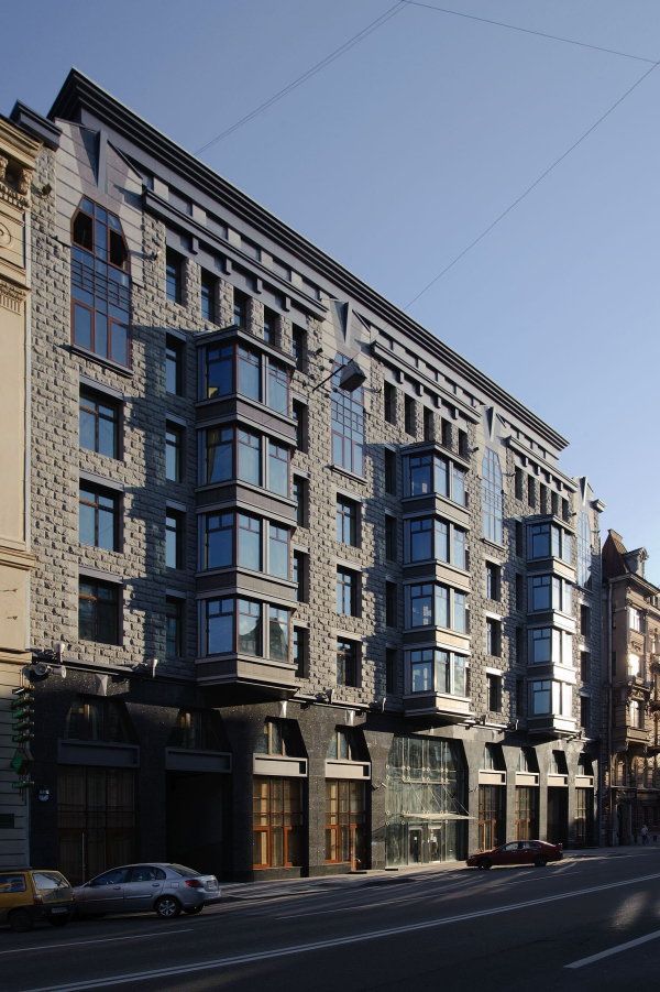 The residential house at Tverskaya, 1Copyright: Photograph © A. Naroditsky / Provided by Evgeniy Gerasimov & Partners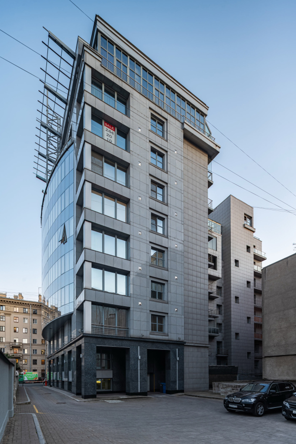 The residential house at Tverskaya, 6Copyright: © Evgeniy Gerasimov & Partners |
|
