|
Published on Archi.ru (https://archi.ru) |
|
| 01.02.2021 | |
|
Springboards and Patios |
|
|
Lara Kopylova |
|
| Studio: | |
| Studio of Roman Leonidov | |
|
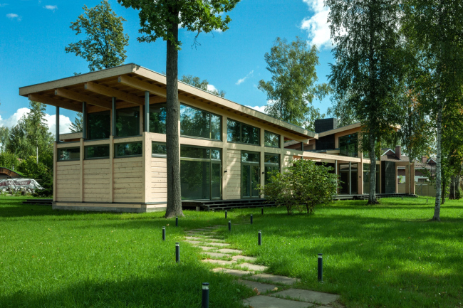
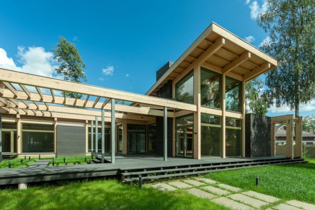
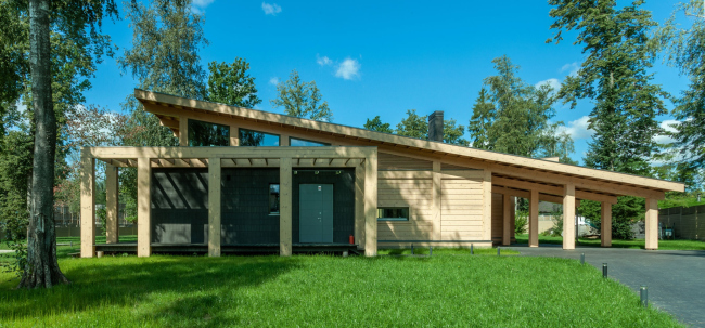
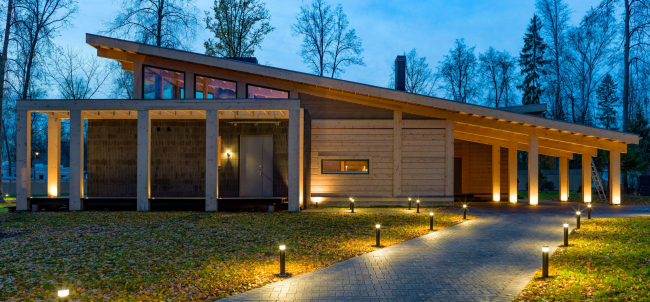
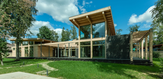
The central element of the manor house in the village of Antonovka, designed by Roman Leonidov, is the inner yard with pergolas, meant to remind its owner about his vacations in exotic countries. The exposed wooden structures emphasize the soaring diagonals of single-pitched roofs. The architect Roman Leonidov calls the houses that he designs “manor” ones for a reason. This term brings up associations with tradition, and reflects the processes of forming the routine of country life and development of the typology of a country residence, which have taken place in Russia over the recent decades. Manor house in AntonovkaCopyright: © Studio of Roman LeonidovThe wooden residence in Antonovka is primarily designed for spending weekends in it, and, hence, it is not very large (324 square meters), composed of a set of essential premises: a living room, a dining room / kitchen, a parents’ bedroom, two children’s rooms, a guest room, and a sauna. On the whole, the house has a U shape, but its floor plan is more sophisticated than just a simple U. The building is mostly single-story, and only in its most important parts, such as the living room and the master’s bedroom, it soars up with a single-pitch roof, making the interior double-height. There is also one more pitched spot, not as steep, which covers the bathhouse. Manor house in AntonovkaCopyright: Photograph © Roman Leonidov, Sophia Leonidova, Vladimir GramadskikhThe owner of the house asked the architect to design for him a space that would remind him of the time he spent at Bali. This is why the center of the composition is a patio, surrounded by a glass gallery from the side of the house, and opened with one of its sides to the garden, which the architect was able to make sure would be kept intact during the construction. It is this part of the house, the one that overlooks the garden, that is its grand façade, the walking and the driving entrances being located on the side, from the right, if you stand with your face to the grand façade. The driving-entrance is also designed in a very interesting way, more of which later. 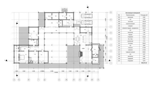 The floor plan. Manor house in AntonovkaCopyright: © Studio of Roman Leonidov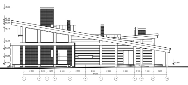 Facade1-12. Manor house in AntonovkaCopyright: © Studio of Roman Leonidov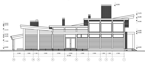 Facade 12-1. Manor house in AntonovkaCopyright: © Studio of Roman Leonidov Facades -1-6, -Е-Иб -6-1. Manor house in AntonovkaCopyright: © Studio of Roman Leonidov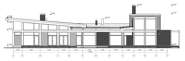 Facade А-П. Manor house in AntonovkaCopyright: © Studio of Roman Leonidov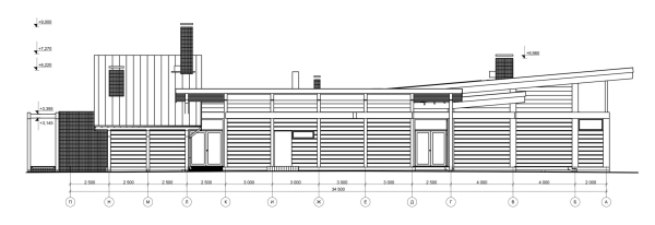 Facade P-A. Manor house in AntonovkaCopyright: © Studio of Roman LeonidovIn Antonovka, Roman Leonidov used his favorite half-timber technology, the wooden framework of the house being deliberately accentuated. It is always a pity when an interesting framework gets masked by fills. For the Antonovka house, the architect came up with a solution how to make this “skeleton” visible. First of all, there are a lot of glazed surfaces here: glass gallery around the patio, glass double doors of the bedroom and nursery, glass walls of the living room and kitchen / dining room. Almost every element that overlooks the garden, and almost every element of the patio is transparent. Hence, the wooden structures are exposed. There are only small brick fills – which play the role of stiffness ribs and partitions wherever this is necessary. The same dark-colored brick is used for coating the fireplace chimney. Manor house in AntonovkaCopyright: Photograph © Roman Leonidov, Sophia Leonidova, Vladimir GramadskikhIn addition, we can see a very interesting technique, where the architect “tears” the roof slope off the lower timber tier and elevates it, very much like a springboard, above the upper glass tier. Generally speaking, Roman Leonidov liked this avant-garde form of a “soaring” roof that came to us from the XX century – you can see something similar in his other projects, such as Cool House. This technique looks particularly dramatic on the drive-in façade. What we see is a solid wooden diagonal of the roof – a plane that starts low from the ground and gradually gains height. Its right-hand part serves as the awning for the cars, and its left-hand part goes past the generalized portico above the main entrance, and soars up again above the second glass tier. Manor house in AntonovkaCopyright: Photograph © Roman Leonidov, Sophia Leonidova, Vladimir GramadskikhAccording to Roman Leonidov, the main entrance to the house is the one underneath the awning, while the portico entrance is just a “status” element; the portico distantly resembles classics, even though the columns here are replaced by five asymmetrically standing timber pillars with an even number of axes, which is not typical for classics. And the portico is not situated in the center, but the entrance (also shifted off-center) is accentuated by an extended intercolumnium. Manor house in AntonovkaCopyright: Photograph © Roman Leonidov, Sophia Leonidova, Vladimir GramadskikhThe block of the master’s bedroom is similarly designed. The roof also “lifts off” from the bottom timber tier, soaring up. The difference is that this movement is directed not parallel to the public building, but perpendicular to it, which gives some extra dynamics to the composition. The roof of the bathhouse is also pointed upwards, and is turned perpendicular to the master’s block. This way, three “springboards” are formed in the volumetric composition of the house, pointing to three of the four cardinal points. Manor house in AntonovkaCopyright: Photograph © Roman Leonidov, Sophia Leonidova, Vladimir GramadskikhThe wooden structures of the roof beautifully show through the glass, particularly in the evening, when the house is glowing with lights. 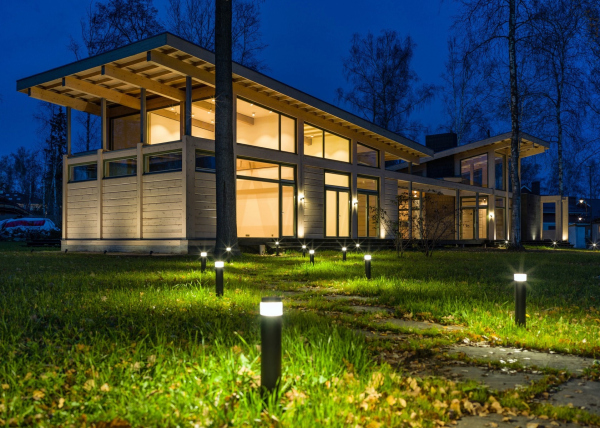 Manor house in AntonovkaCopyright: Photograph © Roman Leonidov, Sophia Leonidova, Vladimir Gramadskikh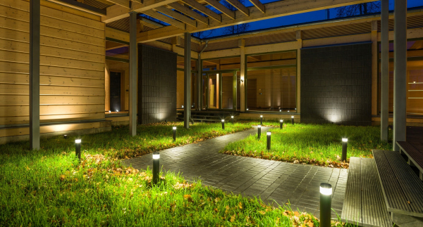 Manor house in AntonovkaCopyright: © Studio of Roman Leonidov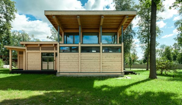 Manor house in AntonovkaCopyright: © Studio of Roman LeonidovThis effect of exposed framework can also be seen in the patio. This space is also “dissected” with wooden beams and steel pillars, due to which it is perceived as being more structured and visually larger. Particularly accentuated is the continuous horizontal, a beam that stretches across the entire grand front on the border with the garden. Besides, these are not just any structures – some of them are pergolas that traditionally create shade, coolness, and coziness, and can be later on entwined with grapevine. (Yet another pergola complements the portico on the entrance façade). The patio consists of several parts: a podium, which separates it from the façade, a partially covered terrace bordering on the living room, and a green lawn with a paved path in the middle. 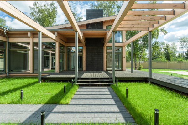 Manor house in AntonovkaCopyright: Photograph © Roman Leonidov, Sophia Leonidova, Vladimir Gramadskikh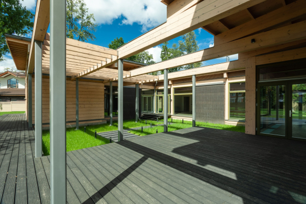 Manor house in AntonovkaCopyright: © Studio of Roman Leonidov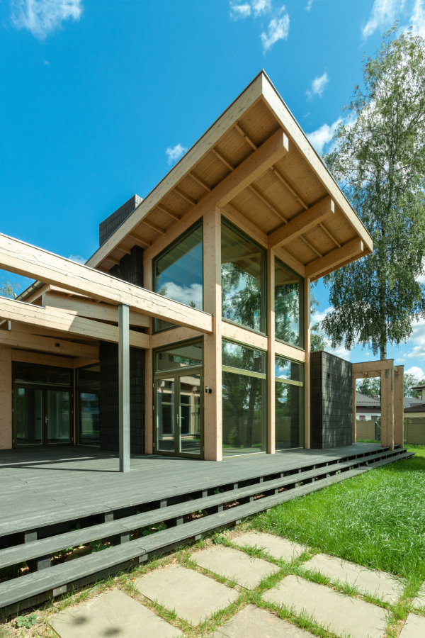 Manor house in AntonovkaCopyright: © Studio of Roman LeonidovThe patio looks a little bit like a stage with a sophisticated setting, all the more so because it is connected with all of the rooms. It was designed in such a way that all the family members could get a secluded place, not attracting too much attention – the rooms are fully independent because they also have doors leading inside the house. The space of the patio underneath the pergolas indeed becomes the center of life in the house; visible from pretty much everywhere – both from the garden and from inside the house – it really looks attractive. The wooden architecture underneath the sky puts you in a relaxed mood. And the fact that the patio is inscribed into the overall half-timber structure, gives rise to a new artistic technique, which can be later on used in other projects. |
|

