|
Published on Archi.ru (https://archi.ru) |
|
| 20.07.2020 | |
|
Moving on the Edge |
|
|
Julia Tarabarina |
|
| Architect: | |
| Vladimir Plotkin | |
| Studio: | |
| Creative Union ‘Reserve’ | |
|
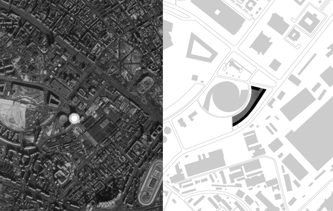
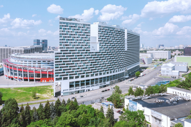
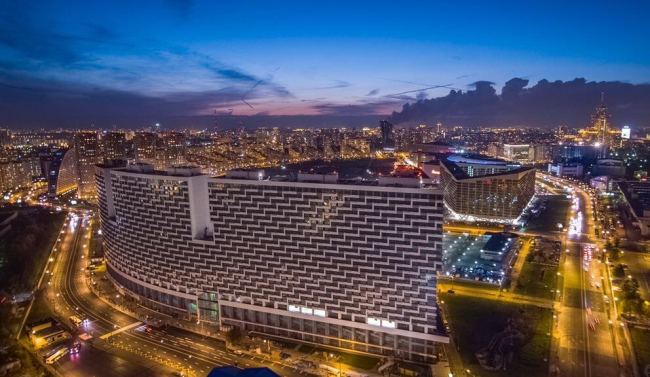
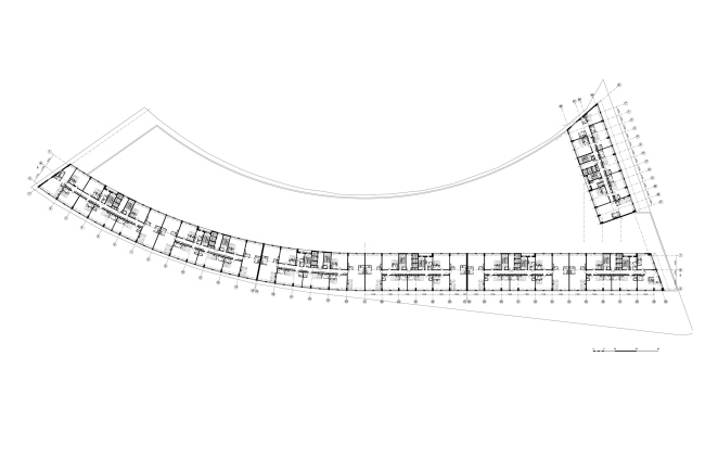
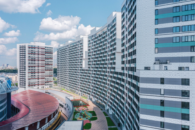
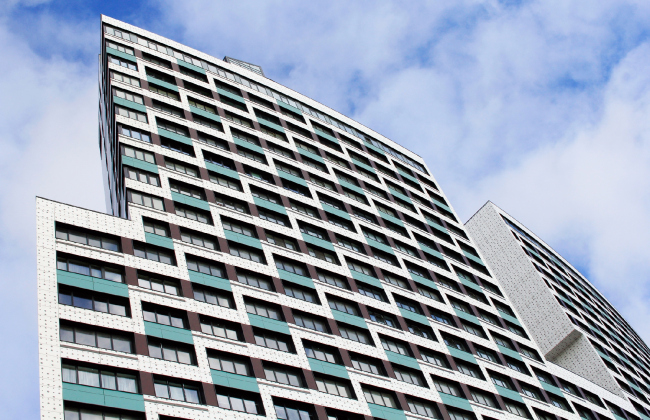
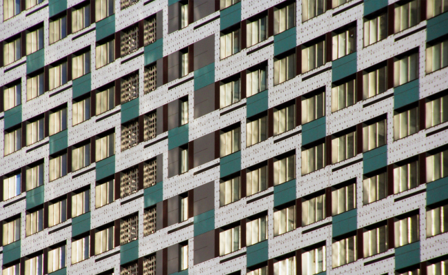
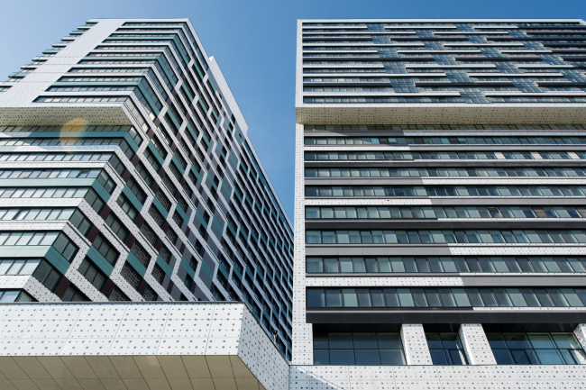
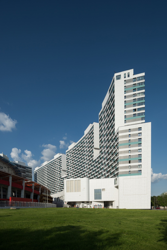
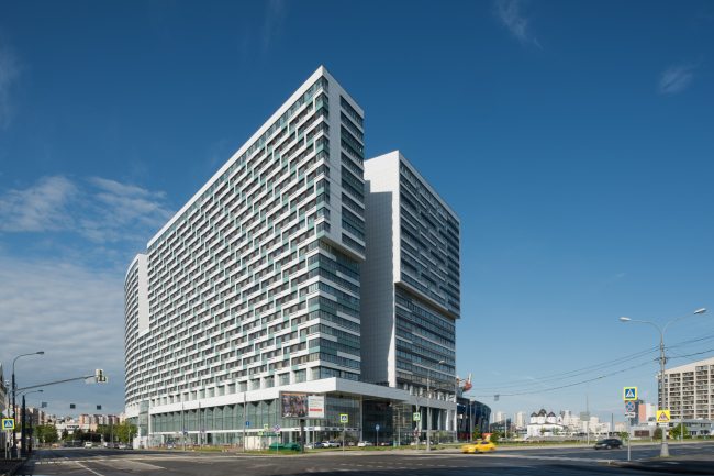
The housing complex “Litsa” (“Faces”) on Moscow’s Khodynka Field is one of the new grand-scale buildings that complement the construction around it. This particular building skillfully tackles the scale, subjugating it to the silhouette and the pattern; it also makes the most of the combination of a challenging land site and formidable square footage requirements, packing a whole number of features within one volume, so the house becomes an analogue of a city. And, to cap it all, it looks like a family that securely protects the children playing in the yard from... well, from everything, really. The Khodynka Field is a former airfield, whose surroundings have been developed so intensively over the last 20 years that this area became the veritable symbol of the post-Soviet construction megalomania. Two thirds of the arc-shaped contour of the field, whose plan looks like an orange wedge with a 1.5 km basis and an arc more than two kilometers long, are occupied by the “Grand Park” housing complex: 43 hectares, about 500,000 square meters of useful floor space, 4,700 apartments. It seems to include every option of a large-scale volume one can possibly think of: the sculptural house “Sail”, a few towers, and an amphitheater of city blocks, stepping down towards the field. The outside contour is formed by two “wall” buildings, one of them being a whopping 770 meters long. Both feature an alternating “saw-tooth” skyline, for which the house on the western corner was nicknamed “hair comb” by the locals. Instantly, the walls of some large ancient city come to mind – Istanbul, Smolensk, or Kolomna – or, rather, what survived of them. Meanwhile, this wall was not destroyed ages ago, but, quite the other way around, was built in the early 2000’s in accordance with the project by “Mosproject-4” under the leadership of Andrey Bokov. Location plan. “Litsa” housing complexCopyright: © Reserve Creative UnionThe house completed the punctured line of the “wall” buildings started by Andrey Bokov, taking on a role of the entrance highlight, something like the propylaea of the Khodynka Field. Standing on the corner facing the nearest driving entrance from the Leningrad Highway, it visually separates the space of the Khodynka from the wide bypass street and the industrial park situated outside, southeast. The parameters of the house are to a large extent “forced” ones because the architects had to design a big volume on a small land site coming up close to the arena, yet logically supported by the theme of a “fortress wall fragment” that has already been set here. Besides, if we are to continue this parallel, we will notice that oftentimes the architectural monuments of the medieval cities are almost leaning against their walls and corners (the St.Anna Church on the corner of Moscow’s China Town, to name but one example). Here, we also have something similar, only multiplied by modern approaches and modern proportions. As if the propeller of the stadium fell down on earth in a corner of a huge city, plowing into the ground. But then again, it was the other way around – it was the wall that surrounded the propeller. “Litsa” housing complexCopyright: Photograph © Konstantin Antipin / provided by Reserve Creative UnionIn a word, it all ended up in a very unusual combination that is anything but classical. Yet still beautiful: it looks as though the house is proudly raising its head, cutting the space around it like a knife cuts butter, at the same time exchanging glances with the Petrovsky Palace of Catherine of Russia on the opposite side of the Leningrad Highway – it is perfectly viewable from here. “Litsa” housing complexCopyright: photo courtesy by Capital GroupDue to the small-sized land site and the large overall volume, the structure turned out to be quite unusual. Underneath the “bent” triangular construction blueprint, there is a three-level underground parking garage, which on the inside (along the driveway that separates the complex from the ice palace) gets another two extra levels. Above the ground, from the outside, there are 4 tiers of commercial urban infrastructure: stores, lobbies, cafes, and a fitness center, alternate with the lobbies of the residential sections. The architects also managed to find room for a whole shopping mall with two escalator groups. The bottom floors along the street are hosting cafes, shops, and a children’s center – these all are open, despite the fact that there is a midsized mall inside, and despite the fact that the traffic here is pretty intense – three lanes in each direction. But then again, the house steps back 11 meters from the edge of the traffic way. What is remarkable is the fact that the house combines the indoor shopping mall and the outdoor urban shopping – generally, these two kinds are deemed to be incompatible. 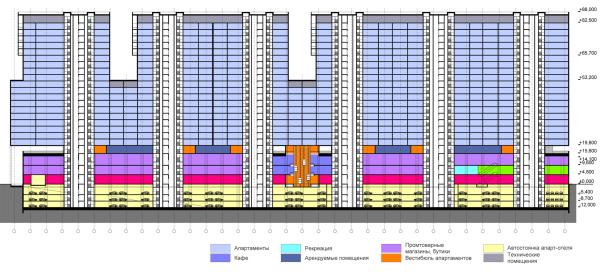 The longitudinal section. “Litsa” housing complexCopyright: © Reserve Creative Union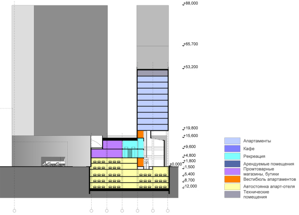 The crosswise section. “Litsa” housing complexCopyright: © Reserve Creative Union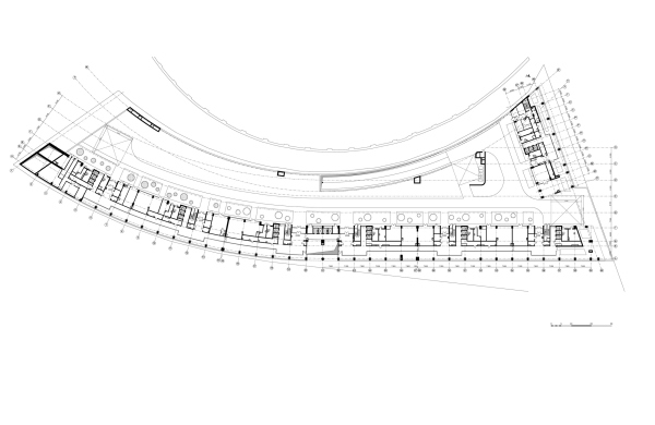 The stylobate plan. “Litsa” housing complexCopyright: © Reserve Creative Union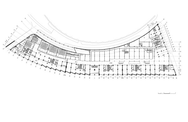 The floor plan at +4.800 elevation. “Litsa” housing complexCopyright: © Reserve Creative UnionThus, “Litsa” turns out to be a really multifunctional complex indeed. The cases when a whole shopping mall was inscribed into the podium of a housing complex are really few and far between – one thing is to include a store, a kindergarten, or a fitness center, and it’s quite a different thing to find room for a full-fledged shopping mall with a multiplex. It is virtually a modern analog of the House on the Waterfront, in which one can live without really going outside; probably, the only thing that is missing is the office function, but then again, we’ve been growing used to working from home, haven’t we? The podium occupies the entire construction blueprint, its residential part consisting of one long (about 300 meters) slab, following the curve of the street, and another one-section slab. The latter was placed at the north end of the site, along the Aviakonstruktora Mikoyana Street, parallel to the driveway that leads sideways to the Khodynka Boulevard. In addition to the arc set by the curve of the Sukhogo Street, the ends of the house are “sliced off” by imaginary rays that meet in one point somewhere near the Ice Palace booking office – it is hard to say whether this can be regarded as an attempt to highlight the neighboring building, but two graceful corners, although not exactly Rossi-style, yet still rather sharp, do appear on the key vantage points. The minor slab got a trapezium-shaped plan, the meeting point of the side lines lying in the center of the yard arc. The residential “slabs” are 17.5 meters thick, which, when projected on the total height of 88 meters, yields a rather thin contour. The apartments range from one or two-room ones on either side of a small corridor to double-sided three-room apartments and the best four-room ones in the top part of the south end. The minor slab includes an occasional two-tier apartment – a rare typological experiment by Moscow standards. “Litsa” housing complex. The standard floor planCopyright: © Reserve Creative UnionThe yard is placed on the roof of the podium – a technique that is common nowadays. What makes it different, however, is the fact that it is situated 20 meters above the ground – about two or three times higher than usual. This is as if the yard were on the roof of a 6 or a 7-story house. No one can see it from the street level; it is quiet and private inside. The yard is chiefly lit by the southwest sun, but the southwest sun fills the whole of it. And the second slab protects it from the north wind, adding reflected sunlight – closer to the evening time, when the children are outside after school. “Litsa” housing complexCopyright: Photograph © Konstantin Antipin / provided by Reserve Creative UnionThe main and most recognizable technique is the facade pattern. The zigzag green-and-white pattern unites longitudinal walls of the long slab, producing various optical effects: looking from the Leningrad Highway, we perceive more and more acutely the horizontals that pull us in; looking from the southeast, we get mesmerized by zigzags, and from some angles – by the ripples of the diagonals. Here is the thing, though: the pattern is the same, yet it looks different depending on the shape, to which it is applied; it also has an ability to change depending on the angle of perception. Not every pattern can do that. 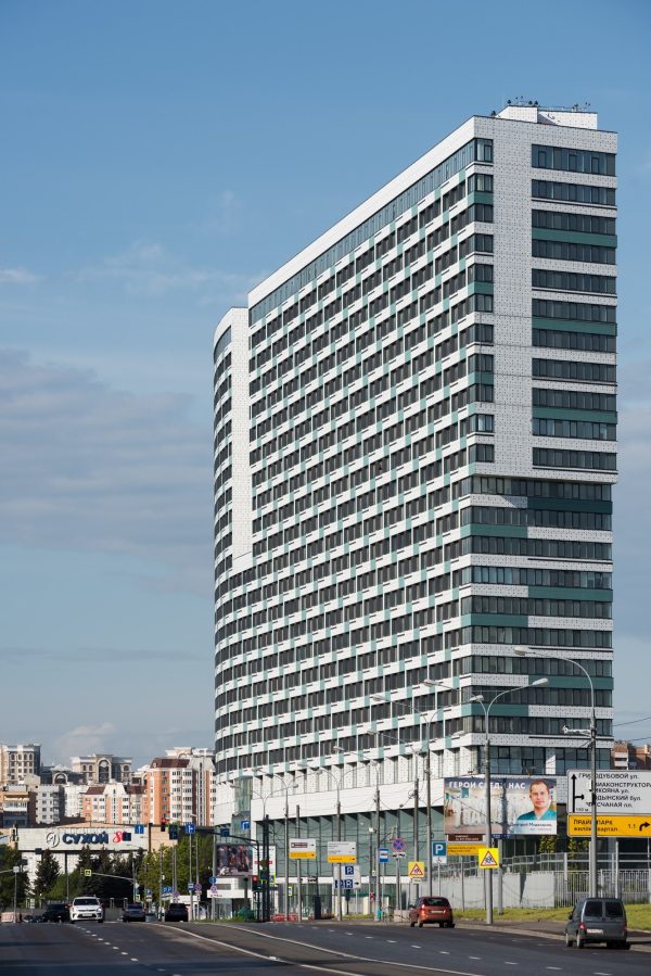 “Litsa” housing complexCopyright: Photograph © Ilia Ivanov / provided by Reserve Creative Union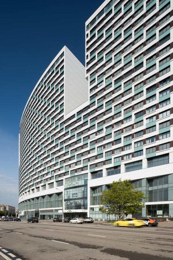 “Litsa” housing complexCopyright: Photograph © Ilia Ivanov / provided by Reserve Creative Union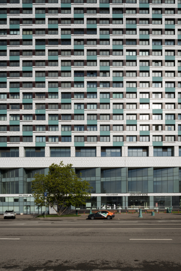 “Litsa” housing complexCopyright: Photograph © Ilia Ivanov / provided by Reserve Creative Union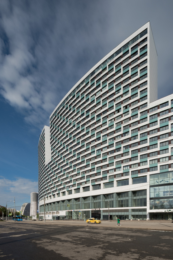 “Litsa” housing complexCopyright: Photograph © Ilia Ivanov / provided by Reserve Creative Union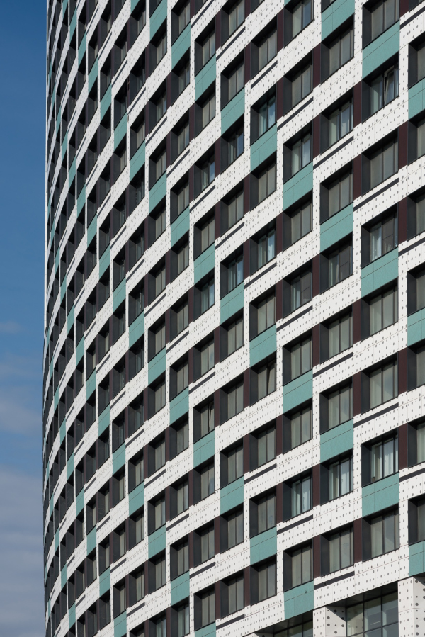 “Litsa” housing complexCopyright: Photograph © Ilia Ivanov / provided by Reserve Creative UnionYet another interesting feature: the pattern almost fully integrates the windows, making them a part of it. We are used to thinking about the facade as alternation of piers and window apertures, are we not? Here, however, the facade produces quite a different impression; one even needs to make a mental effort to make out where the windows are – the first thing that meets the eye is an integral structure governed by its internal laws. The pattern helps alleviate the scale – it is commonly accepted that the best technique in this respect is large spots, yet, by “devouring” the windows, the pattern turns the whole house into a spot with in intricate outline. Meanwhile, everything is constructed here in a very simple and even economical way. The broad “modernist” windows are grouped together in threes horizontally: inside of a group, the piers are dark-brown, and on the sides the piers are white. However, the horizontal of the white zigzag unites two windows instead of three – the remaining space being filled by green inserts that make one perceive the whole house as “green”, even though such elements account for 15-20% of the facade. The panels are of the simple kind, mounted on rivets, even in the bottom floors. However, the white surfaces are covered in white “polka dot” pattern, which, when viewed from a distance, imitates slit metal that turns the rivet circles into a conventionality and alleviates the excessive brightness of the white. The middle window in the group below is highlighted by a black stripe running on white, this stripe hitting the corner of the zigzag and resonating with the dark metal of the deep chamfers. This rapport is not exactly groundbreaking or super-complex, but all these things put together do yield a certain fractal – a great new way to fight the monotony of the look-alike windows. “Litsa” housing complex. The street facade, a fragmentCopyright: Photograph: Archi.ruFrom the side of the yard, the zigzag looks the same, and it develops in the same direction, from south to north, working to create an impression of homogeneous matter of the entire slab. Here, however, the architects are adding slit metallic grates of the staircase halls, whose punctured polka dot pattern looks like the prototype of the circles on the white panels. In the evenings, black metallic piers come into play – they glitter in the rays of the setting sun and get reflected in the windows, adding a deep golden hue. “Litsa” housing complex. The yard facade, a fragmentCopyright: Photograph: Archi.ruOn the side ends, the zigzags turn into horizontal stripes, which also highlight the imaginary uniformity of the material that the buildings are made of: it all looks as if somebody cut a stone with a certain structure, and on longitudinal section it yielded one complex pattern, and on cross section it yielded another one, let’s say, striped. The colored stripes of the long house are, of course, green, while the minor slab, which has neither longitudinal dimension nor zigzags, looks like this: on its north side, the stripes are monochrome, and on the south side they are dark crimson, like an echo of the red ramp of the arena. “Litsa” housing complexCopyright: Photograph © Ilia Ivanov / provided by Reserve Creative UnionWhen viewed from a distance, the bulky volume of the stylobate looks like a base that supports the “wing” houses, which step as far back as possible from the spiral of the Ice Palace, giving it as much “air” as possible. However, the bottom part of the building, occupied by a different function, also shows through on the grand facade that faces the street. Above the stores of the first floor, runs a “saw-tooth” of glass bay windows of the second floor – plastique-wise, they form a semblance of some mechanical band, a track that ensures the bend of the house, while practically they serve to catch the sun – the wide planes of the bay windows face specifically south. Higher up, the house is first crossed by a white strip, then goes a string of horizontal apertures, and then the pattern starts. “Litsa” housing complexCopyright: Photograph © Ilia Ivanov / provided by Reserve Creative UnionThe long house is divided by two deep cuts, each 11 floors high. These divide the slab into three major parts, letting extra sunlight into the yard, the cut in the central bend situated right above the main entrance, highlighting it. “Litsa” housing complexCopyright: Photograph © Ilia Ivanov / provided by Reserve Creative UnionAs for the entrance itself, it must be said that it is marked very delicately, with a white canopy and three alternating projections and depressions that match the building’s logo. The same white canopy, only larger and two stories higher, just as the deepening in the glass wall, is used to mark the entrance to the shopping mall from the side of the Leningrad Highway. 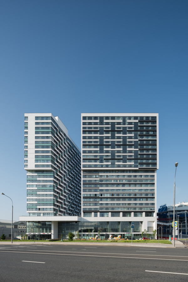 “Litsa” housing complexCopyright: Photograph © Ilia Ivanov / provided by Reserve Creative Union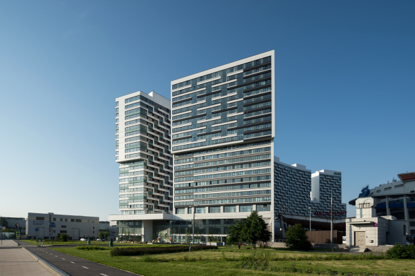 “Litsa” housing complexCopyright: Photograph © Ilia Ivanov / provided by Reserve Creative Union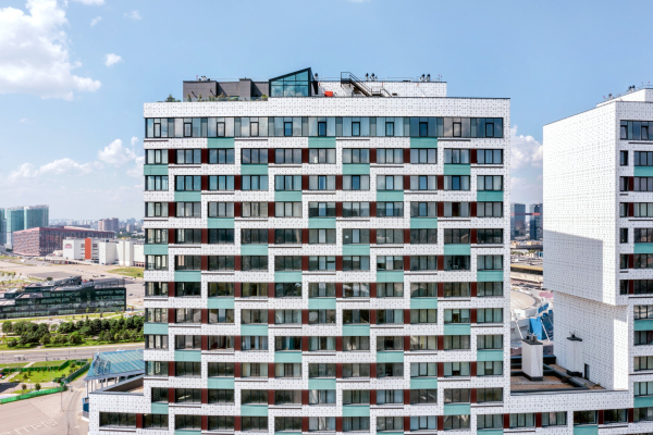 “Litsa” housing complexCopyright: Photograph © Konstantin Antipin / provided by Reserve Creative Union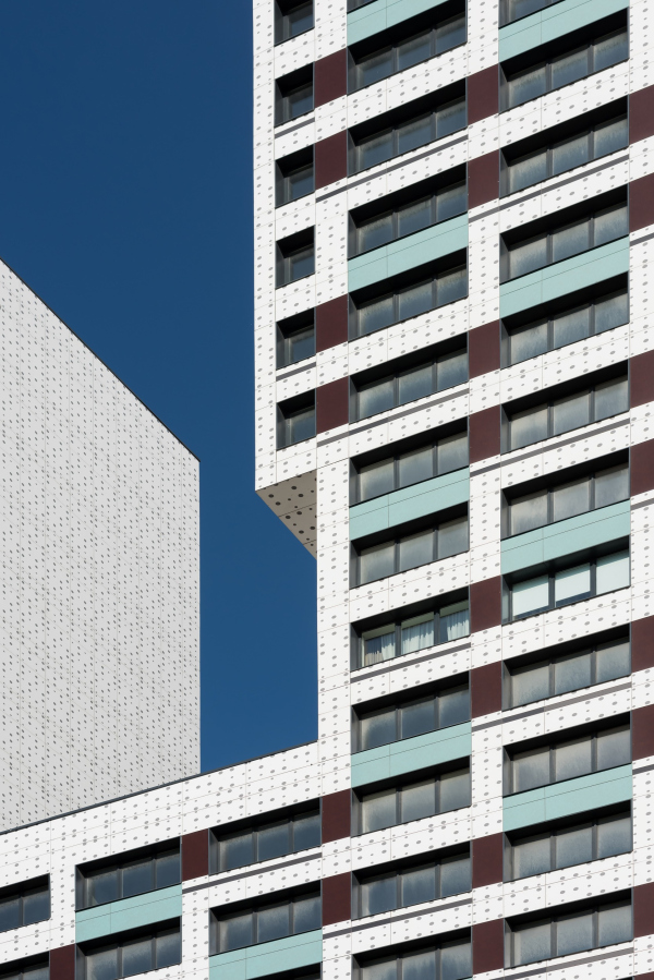 “Litsa” housing complexCopyright: Photograph © Ilia Ivanov / provided by Reserve Creative UnionInside the cuts, the walls are white. The inner side end of the north building is also white, so the interval between the slabs could be interpreted as a third bigger cut – this adds to the integrity of the house that is now perceived as an L-shaped volume, dissected several times, including on the turn. In addition, both inside the cuts and on the side ends, new plastique appears in the form cantilevered structures, not really deep, but running from end to end. In the north part, their height is equal, and one cannot get rid of the idea that these are indeed “the faces”, the house having two faces, in fact – strictly speaking, one can see here two creatures: one, long, is pointed forward, the other is protecting the yard, both looking in the same direction. All this is terminally abstract and very general, akin to Joan Miro finger paint or late Picasso – these creatures are purely imaginary. Meanwhile, the tall arch on the side end of the long house – yet another “signature” opening on a slender support – does look like either a tail or a leg put aside. These metaphors are not all that necessary, of course, but they liven up the image and make the perception of the house fuller. Essentially, this house completed (or, let’s say, nearly completed) the construction of the curve of the Khodynka field, solving a lot of complex tasks, from functional and typological to volumetric and optical. It picked up the theme that was set here by the Andrey Bokov “wall” houses, interpreting it in its own way and taking it to a whole new level. The house is more slender, the “tines” are taller, and the whole thing does not even look like a fortress wall anymore. Here, on the Khodynka Field, probably because of the sheer distance of the land, everything looks powerful and clear-cut: “wall” houses, “pipe” houses, “city block” houses, dissected in a crosswise fashion, and enormous pauses between them. This house, however, built in the most inconvenient, yet obliging, place, turned out to be different – it does make a statement, yet at the same time looks as if it were shivering from time to time in the cold Khodynka wind. |
|
