|
Published on Archi.ru (https://archi.ru) |
|
| 07.10.2019 | |
|
The Inland City |
|
|
Julia Tarabarina |
|
| Studio: | |
| DNK Architectural Group | |
|
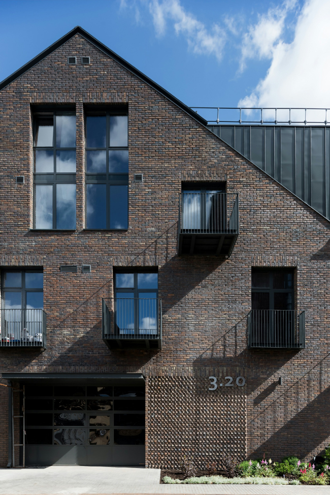
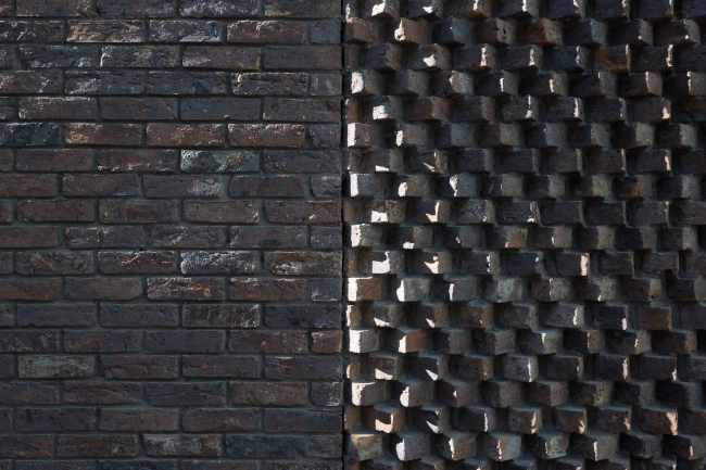
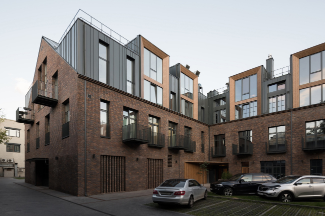
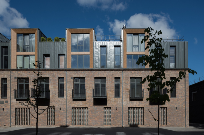
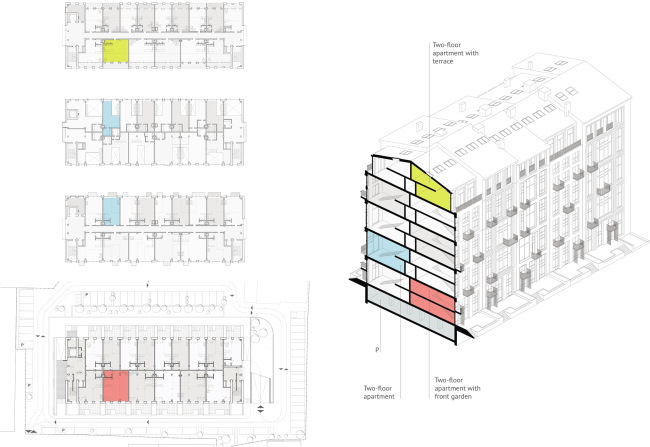
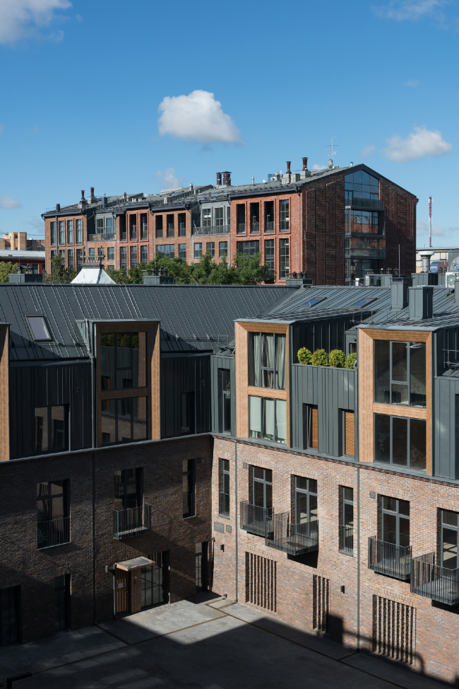
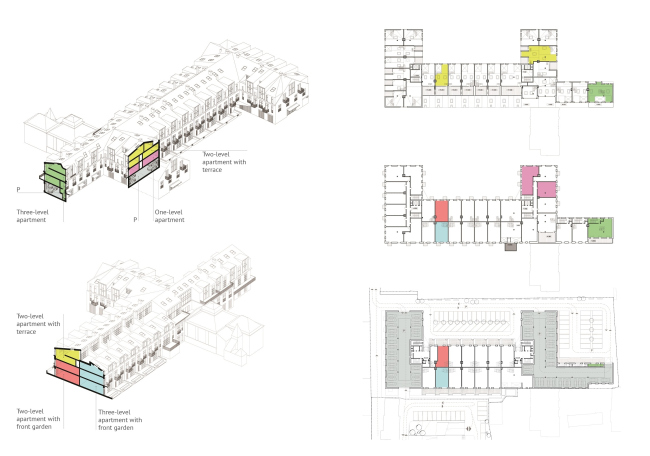
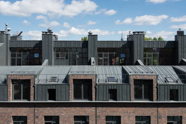
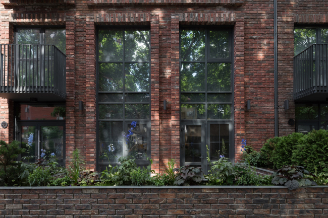
These two buildings standing on the territory of the former Rassvet factory present an example of the architects’ delicate work with the context, form, and, above all, the inner structure of the apartment building that has arguably become a unique one for the modern Moscow. The complex is already known to a certain extent in the professional community. Below we are examining it in detail. RASSVET LOFT*Studio, Building 3.20Copyright: Photograph © DNK ag, Ilia IvanovDesigned by DNK ag, RASSVET LOFT*Studio is essentially the result of reconstructing a few of the buildings that formerly belonged to the Rassvet machinery building plant, situated in Moscow’s district of Presnya, almost in the center of the city. The plant is being gradually transformed; some of its buildings have been rented out almost in their original state, while buildings 34 and 20 were turned into apartments – city houses, whose sheer scale and particularly inner structure are still a novelty by Moscow standards. The project has been developing since 2014, winning numerous professional accolades, ranging from Tatlin Prize at Zodchestvo-2016 festival to being included in WAF’2019 shortlists and getting the Dezeen Prize – in the latter case, it turned out to be the only Russian project. Thus, it comes as no surprise that Rassvet Loft adorns the cover of the second monograph of DNK ag, published by Tatlin Magazine this spring – currently it has become a milestone high-profile project, admired by many architects. RASSVET LOFT*Studio, Building 3.20. PhotographCopyright: Photograph © DNK ag, Ilia IvanovWe already covered the project of Building 34 – a slab of a building standing with its side end towards the pedestrian lane running through the territory of the former factory and visually divided into six similar, yet different in their details, façades, which together forms a semblance of a classic city, but without any historical elements, at the same time keeping up the scale and proportion. Building 20 is not so conspicuous – this low-rise elongated affair with two ledges used to be the factory’s maintenance building added in the Soviet times. It runs parallel to the Rastorguevsky Lane but it is situated deep inside the yard – it starts almost from the corner of Building 3.34, then makes a close pass of the “old” building of the former Shchukin museum of Russian antiquities (now the Timiryazev Biology Museum), and ends at its “new” building on the Novaya Gruzinskaya Street. Such intense involvement in the city fabric is solely explained by the situation of the original maintenance building, whose appearance, it must be said, was uniquely unassuming – but the Soviet industry gave little thought to such irrelevant considerations as monuments of architecture of the XIX century. A couple more words about the two museum buildings: the first was designed and built by Boris Freidenberg, and the second was built two years later by Adolph Erichson. The former one is pseudo-Russian style, the latter is rather neo-Russian; both can be traced back to the “brick mannerism” of the Russian early XVII century, the difference being that the former is covered with bricks and the latter with tiles; yet they are still similar. Both museum buildings make pretty obliging neighbors. But then again, according to the architects, what mattered to them was both the proximity of the Shchukin buildings, and the brick building designed by Roman Klein for the “Mur and Meriliz” factory, and the Polish cathedral designed by Thomas Bogdanovich-Dvorzhetsky standing a city block away – all these buildings ultimately defined the style of the DNK ag projects. Meanwhile, one must note that during the Soviet times the industrial parks were actively developed, and, as a rule, new buildings had a purely utilitarian nature. The now-reconstructed buildings were part of the Sobiet development of the plant, did not have any historical or architectural value, and looked like this: 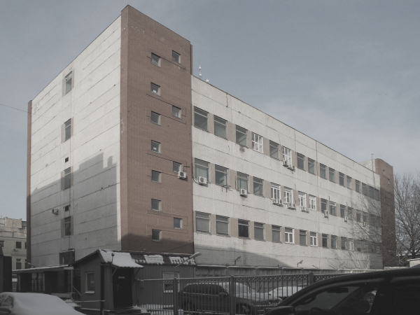 RASSVET LOFT*Studio, Building 34, original viewCopyright: Photograph © DNK ag, Ilia Ivanov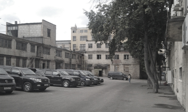 Rassvet, Building 20, original viewCopyright: Provided by DNK agBrick, Metal, Wood Brick façades have won over the modern construction, replacing concrete, glass, and metal in architects’ hearts. Brick allows the architects to achieve a subtle play of the texture, enrich the building’s surfaces, uncover the “soul” of the building, yielding a wide variety of colors, mostly within the range of warm terra cotta tones, pleasing to the human eye. The brick is also the best justification for a conflict-free dialogue with the context, particularly when you are surrounded by industrial architecture or when you are building in its midst, much more so when supported by specimens of architecture of the XIX century, which can in turn be tracked down to the XVII century, yet another golden age of brick patterns. In other words, the choice of brick façades was three times inevitable: because of the nearest monuments of architecture, the immediate surroundings, and the modern preferences. The brick looks good, it is durable, and in this day and age it has taken on a status of an upmarket and expensive material. Thus, the main façade material unites both buildings with their surroundings and with each other as well, endowing them with a respectable look of a good tweed jacket. In the large Building 34, the brick became the basis for the tonal differences between the sections, making them look a little bit like a city street with a few spots that look quite unusual for Moscow but would have been quite typical for Europe, filled with similar, yet different houses standing one next to another. On the elongated façade, the brick frames accentuate the windows, and on side ends they form textured panels that look great in slanted light and are resonant with the symbol of the complex – a striped “spot of light”, an image of the sun hanging above the entrances. 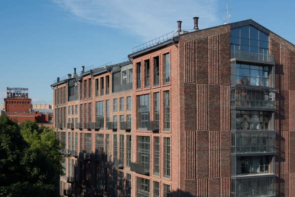 RASSVET LOFT*Studio, Building 3.34Copyright: Photograph © DNK ag, Ilia Ivanov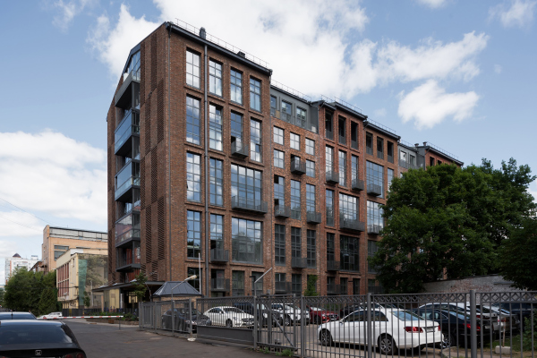 RASSVET LOFT*Studio, Building 3.20Copyright: Photograph © DNK ag, Ilia Ivanov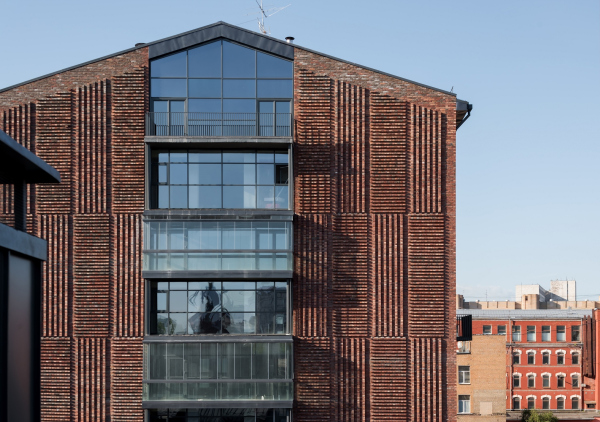 RASSVET LOFT*Studio, Building 3.34Copyright: Photograph © DNK ag, Ilia Ivanov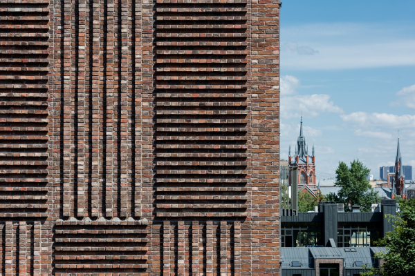 RASSVET LOFT*Studio, Building 3.34Copyright: Photograph © DNK ag, Ilia Ivanov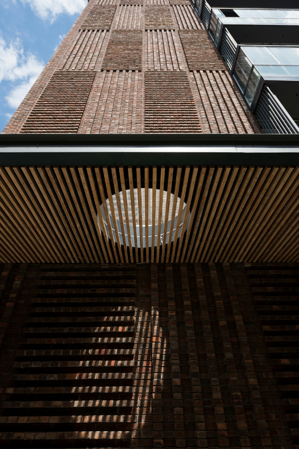 RASSVET LOFT*Studio, Building 3.34Copyright: Photograph © DNK ag, Ilia Ivanov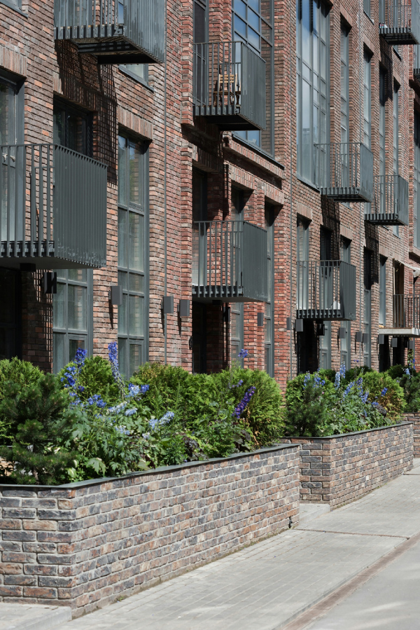 RASSVET LOFT*Studio, Building 3.34Copyright: Photograph © DNK ag, Ilia Ivanov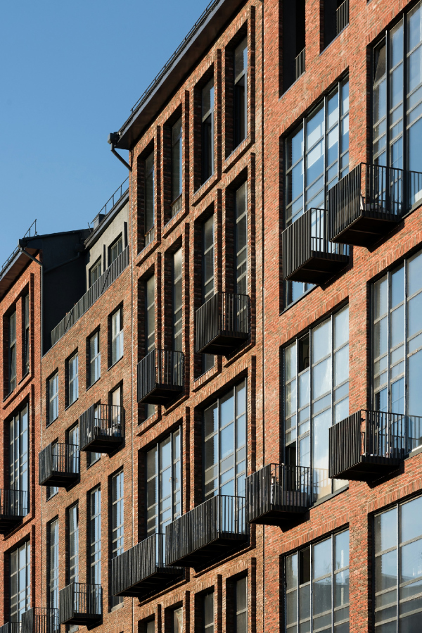 RASSVET LOFT*Studio, Building 3.20Copyright: Photograph © DNK ag, Ilia Ivanov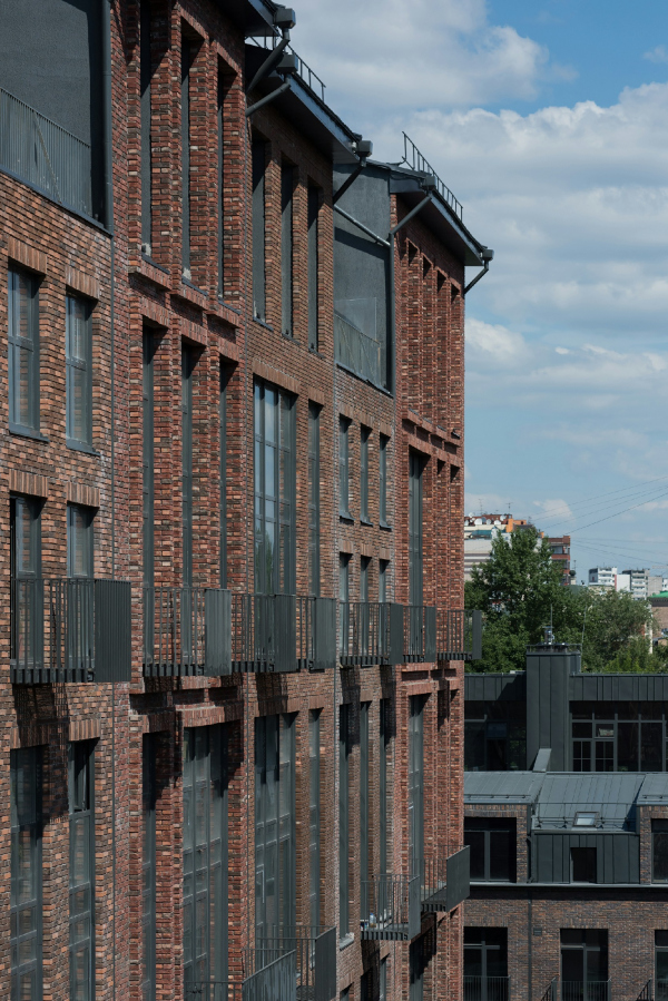 RASSVET LOFT*Studio, Building 3.20Copyright: Photograph © DNK ag, Ilia IvanovHowever, while in the case of the multistory 34, nuances of color and texture prevail, the relief being extremely reserved and limited by an array of bands of large frames and strokes on the side ends, Building 20 is much more reserved; it has more smooth surfaces, which makes a smaller volume look still more laconic and slightly similar to the gable rooftops of the warehouses of Hanseatic merchants. The hand-molded brick, with its oxide film glittering in the sun, looks like mélange fabric from some autumn fashion collection. Yet the texture is also suddenly there – the bricks, installed in the façade in an angular way, create a textured “velvety” surface, accentuating the house number. And, as for the vertical brick grilles combined with glass units in the bottom floors, these let in some extra light to the parking garages (yes, they are situated in the first floors) – at the same time resonating in an ensemble fashion with the façade bands of the neighboring building. 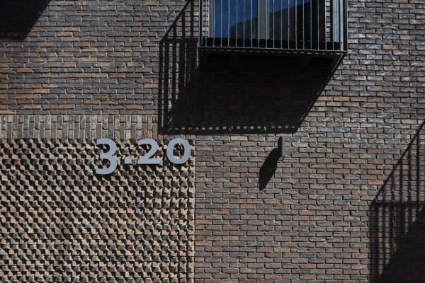 RASSVET LOFT*Studio, Building 3.20Copyright: Photograph © DNK ag, Ilia Ivanov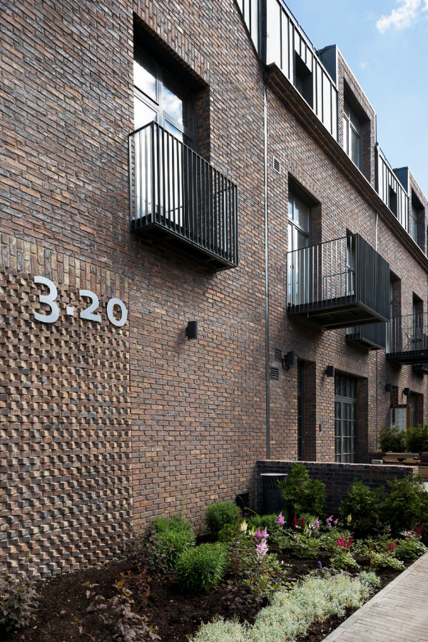 RASSVET LOFT*Studio, Building 3.20Copyright: Photograph © DNK ag, Ilia Ivanov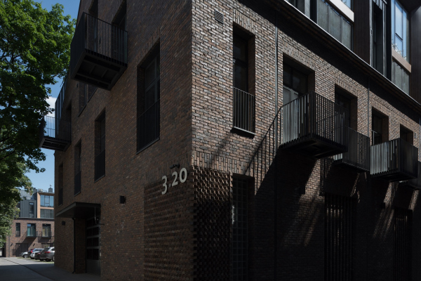 RASSVET LOFT*Studio, Building 3.20. PhotographCopyright: Photograph © DNK ag, Ilia IvanovIn both cases, the roofs form a simple meandering pattern of ledges and cavities, only in the larger house this line is defined by the alternation of the turrets’ heights, and in the smaller one – by the dormer windows (aka lucarnes). The roofs are made of dark-gray metal, the metallic part occupying about a third and sometimes even a half of the second building’s total height, standing out almost as far out as the bricks, and capturing the upper part of the building. The metallic coating is carefully drawn: one can only see the vertical joints; the spaces between them are neither alike nor arbitrary – they form a rhythm very much like a waltz. RASSVET LOFT*Studio, Building 3.20. PhotographCopyright: Photograph © DNK ag, Ilia IvanovMetal also manifests itself in the window sashes and the balcony grilles, designed in a simple manner, yet in the same color. The building has 20 balconies of three types: railings installed in between the chamfers of the French windows; flat balconies standing out about half a meter, and a third type, ones that stand out a whole meter and a half. The French windows are to be seen from time to time, whilst the large and small balconies form a regular rhythm, which organizes and livens up the façades. The stripes of the grilles resonate with the façades of the parking garage; Building 20 is dominated by vertical strokes, which are only occasionally livened up by horizontal ones. 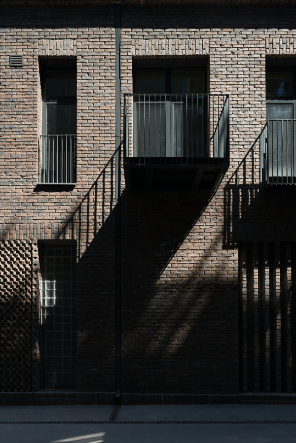 RASSVET LOFT*Studio, Building 3.20Copyright: Photograph © DNK ag, Ilia Ivanov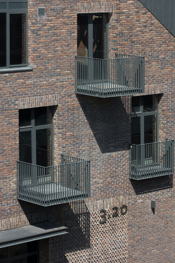 RASSVET LOFT*Studio, Building 3.20Copyright: Photograph © DNK ag, Ilia Ivanov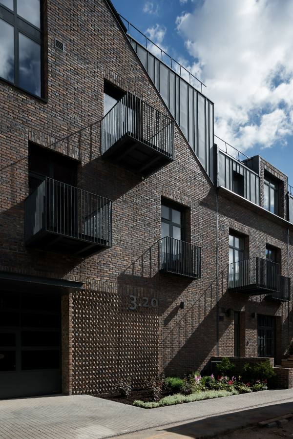 RASSVET LOFT*Studio, Building 3.20. PhotographCopyright: Photograph © DNK ag, Ilia Ivanov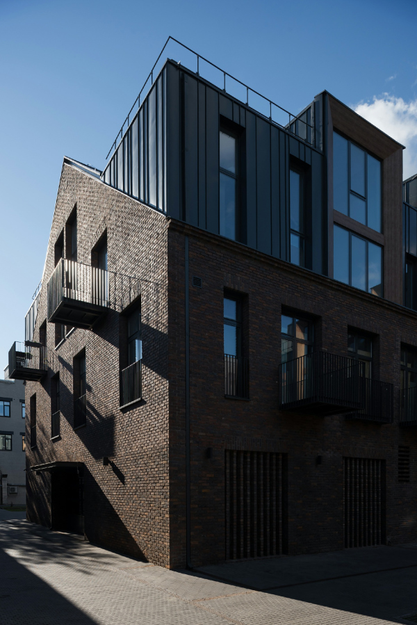 RASSVET LOFT*Studio, Building 3.20Copyright: Photograph © DNK ag, Ilia IvanovThere is less wood, yet it does show up in the key spots – for example, it marks the corner (i.e. the coziest) entrances of the building, and adorns the chamfers of the large mansards, slightly softening the rugged look of the metallic top of the building. RASSVET LOFT*Studio, Building 3.20. PhotographCopyright: Photograph © DNK ag, Ilia IvanovThe same light-colored wood is used in the entrance doors, which also pick up the vertical stroke theme. If we are to develop the earlier analogy with fabric, one might say that wood here takes on the function of “lining” – it is used most often in the spots where the building is more likely to interact with human beings, first of all at the entrance. Wood is the “warmest” material used in minor-scale architecture, and in the first floor its style is close to the “plank” type of design language, while in the upper floors the wooden chamfers say that one will find housing behind them, as opposed to a production facility – which, on the one hand, tactfully enhances the typology, and, on the other hand, sharpens the perception of industrial allusions, which are, of course, present in abundance in the metallic design of the upper floors. 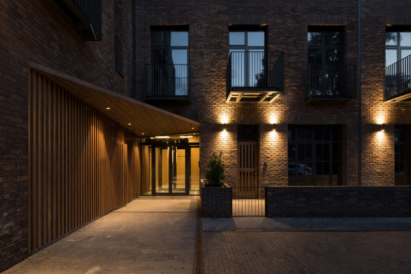 RASSVET LOFT*Studio, Building 3.20. PhotographCopyright: Photograph © DNK ag, Ilia Ivanov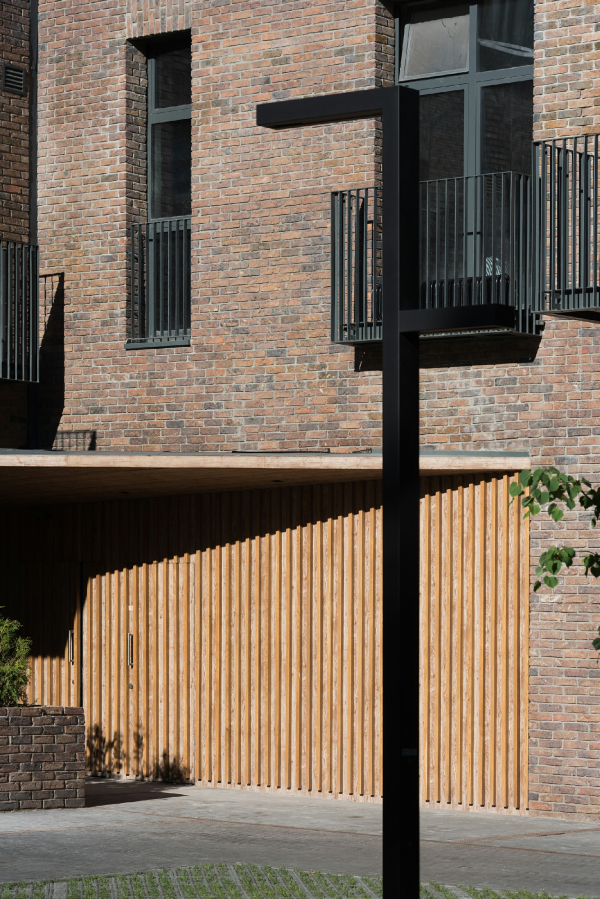 RASSVET LOFT*Studio, Building 3.20Copyright: Photograph © DNK ag, Ilia Ivanov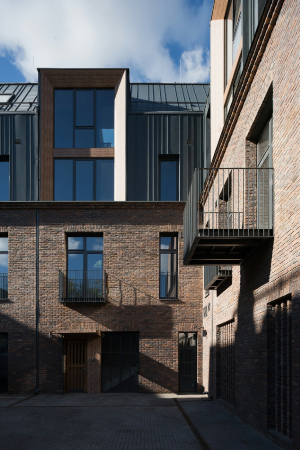 RASSVET LOFT*Studio, Building 3.20Copyright: Photograph © DNK ag, Ilia Ivanov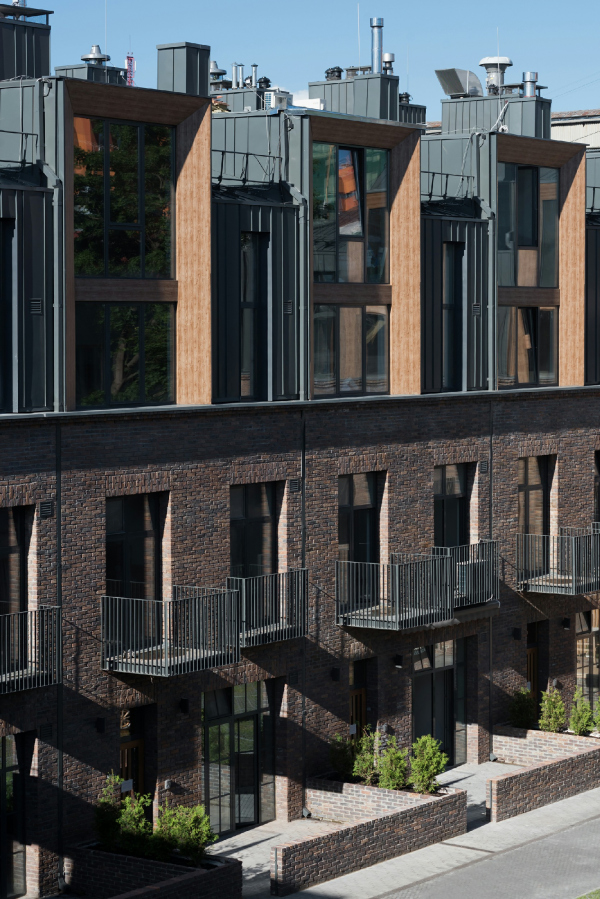 RASSVET LOFT*Studio, Building 3.20Copyright: Photograph © DNK ag, Ilia IvanovThe Structure The most interesting thing about both buildings is their structure – the architects stress. There are few non-typical building layouts in Moscow, the number of freshly designed two-level apartments gradually coming to zero. Here, on the other hand, both buildings consist predominantly of unconventional design solutions: two and three-level apartments, flats with individual exits to the street on the first floor, and apartments with little gardens, balconies, and terraces. This is not just “housing” but places where one can live and work in full accordance with the “medieval” neo-urbanism principle, turning a part of one’s apartment into an office or a workshop, and, according to the architects, the residents are already making use of this opportunity. All of these features are generally popular, and they appear from time to time, sometimes often, sometimes seldom, in various housing projects. What makes Rassvet LOFT different, however, is the fact that it is literally made of unconventional solutions, brimming with them. Naturally, such unexpected and heartwarming diversity is supported by at least two circumstances: the reconstruction status and the central city location, which implies a not-so-cheap, even though not tremendously expensive by Moscow standards, “club” or “closed-doors” housing format. Anyway, Building 34 consists of two-level apartments 6-meters high, and open “lofts” inside each of those, in full accordance with the commandments or Moisey Ginzburg’s, only more capacious; the four top levels are joined by corridors running across the floor; the bottom ones have their own individual exists leading outdoors to the streets and little gardens. The top-floor apartments are equipped, among other things, with zenith skylights, and have terraces and fireplaces in them. RASSVET LOFT*Studio, Building 3.34Copyright: Photograph © DNK ag, Ilia IvanovBuilding 20 picks up on the same theme, but the composition of its constituent parts is more complex: the two-level apartments are joined by three-level townhouses, and, conversely, single-level apartments, which can be conditionally called “the usual ones”, even though they constitute a minority. What also makes the building different is the parking garage on the first floor, even though it is not present everywhere across the building – it is there in traverse volumes, and it is absent in the link between them – here the apartments of the first floors have their little gardens turned towards the street side, which is also important, particularly if you only have a quiet closed-door yard at your disposal. The outdoor parking lot is also there, and is equipped with grass paver. Building 3.20, as we remember, is elongated, not to say lengthy, and is hidden inside the yard. One can take a look at it from the yard of Timiryazev Museum, and from the corner of the side-street – but only if you look hard enough and know for a fact that the building is there. The house is hidden from the city, or maybe even hidden inside of it; maybe this will change one day, but so far it’s a hidden gem. On the other hand, the space between this building and the building that stands along the side street is getting three small, yet very cozy yards; there architects were also able to find some place for the little gardens as well, only in the opposite side, closer to Building 34. RASSVET LOFT*Studio, Building 3.20Copyright: Photograph © DNK ag, Ilia IvanovBack to the layout, though: it is irregular! The elongated building has two wide protrusions aimed northward (actually it is three protrusions that form the yards. Generally speaking, the layout looks like the classic Moscow estate U-shaped layout, yet with a little appendix that connects it to the 1980’s building that joins the museum from the direction of the Malaya Gruzinskaya Street, now know by the fact that it hosts a cafe from the Anderson chain. The complex layout needed to be reinterpreted, and here is how it ended up. The narrow “appendix” behind the museum contains three-level townhouses, with garages in the ground floors. The broad wings that separate the yards contain one-tier and double-tier apartments, there are corridors on the second and third floors, because only double-tier apartments open up to that level. The northern elongated part of the “lintel” between the wings has four tiers in it, the southern three. For this reason, the two-tier dwellings of the second level (which are mostly turned northward) got patios on the operated roof that allow the residents to “scoop” some sunshine from the southern side, and make up with a vengeance for the lack of light through huge windows. The only corridor that is there in the “lintel” runs on the level of the third tier, connecting those apartments with the terrace on the roof. At a first glance, the whole thing looks rather complicated, but, come to think of it, it is interesting, and it ultimately makes perfect sense; it’s not just diverse, but it’s also justified and convenient. I suddenly felt like living in an apartment with a patio; anyone renting one out on Airbnb? No? Too bad! RASSVET LOFT*Studio, Building 3.34Copyright: Photograph © DNK ag, Ilia IvanovThe roof construction, particularly if you are looking at it from above, definitely resembles solutions inherent to industrial architecture; they look like sawtooth skylights, which were popular in lighting factory workshops in the XIX and XX, and they function pretty much in the same way. There are also many skylights and large stained glass windows there with metallic frames that further enhance the loft aesthetics. RASSVET LOFT*Studio, Building 3.20Copyright: Photograph © DNK ag, Ilia IvanovNew, Yet With Roots The very notion of reconstruction in the Russian context still remains pretty vague, even though it keeps on changing its contours. In any case, it is obvious that what we are dealing with is not the “classic” type of reconstruction of industrial architecture but more with preservation of a valuable building, albeit formally not a heritage site, with modern inclusions, which only serve to enhance its antique individuality. The original buildings could not be by any stretch of the imagination referred to the class of ones worthy of preservation; it was not even vernacular architecture but examples of cheap Soviet industrial trash construction staying strictly within the limits of its utilitarian function. Now their appearance has changed beyond recognition; Building 34 stopped being introverted and horizontal, becoming open and “verticalized”, turning into its full antithesis. Building 20 was in fact a barn, and now it got an interesting and readable “face” and image, “we are nothing, let us be all”. The reconstruction became almost transfiguration, and it would be more correct to apply this notion to the territory of the entire factory, so drastically it changed thanks to the transformation of these two buildings. RASSVET LOFT*Studio, Building 3.34Copyright: Photograph © DNK ag, Ilia IvanovIf there is one feature that describes this project best of all, it is its scale. Being dictated by the factory buildings, and having no opportunity whatsoever to grow upwards, it turned out to be quite unique by the modern Moscow standards, which adds new value to the housing spaces in it. Simply speaking, the small-scale and human-proportionate construction has a different effect on us as humans, and here a few circumstances luckily came together so that the architects were able to implement it. Yet another important thing is the image. Considering the original state the buildings were in, they could have been interpreted in any way you liked – they could be turned to glass or covered with orange slit metal sheets; however, the architects and the client opted for brick and dark metal, making the former industrial context the “label” of the project. At the same time, the buildings themselves are not the “factory” type at all; one can see the city shooting up through the layers of industrial architecture, ever so cautiously, that, if you don’t know about it in advance, you may even miss it. Meanwhile, the houses are taking on new features, at the same time adapting those that are already there: for example, the brick frames around the windows, characteristic for Building 3.34, can be found in tenement houses in the nearby yards, while the array of the narrow and tall façades is rather a modern European novelty. Some of the yards, standing in an asymmetric array alongside the long building, are very much “Moscow”, while the multilevel apartments, terraces, and wide Dutch gable are a fresh idea. Thus, it comes as no surprise that the buildings won so many awards – they are not bright in the direct sense of the word, yet they are brimming with various interesting ideas, and look as if they were offering to the city an alternative way of development- pinpointed, creative, context-rooted, yet at the same time using a lot of modern know-how. Whether the city will actually take this path of development is, let’s be realistic, highly unlikely; maybe it will happen in some very distant future. But the very fact of implementation of these ideas looks extremely interesting and inspires much hope. |
|
