|
Published on Archi.ru (https://archi.ru) |
|
| 10.10.2018 | |
|
At the Edge of Avant-Garde and Post-Constructivism |
|
|
Julia Tarabarina |
|
| Architect: | |
| Pavel Andreev | |
| Studio: | |
| GRAN | |
|
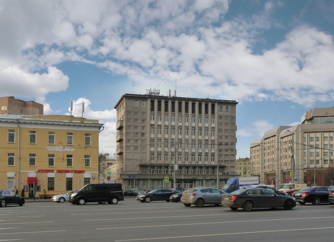
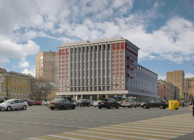
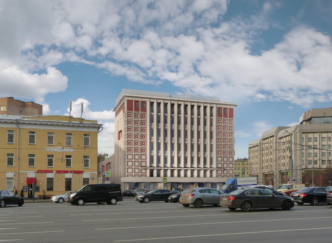
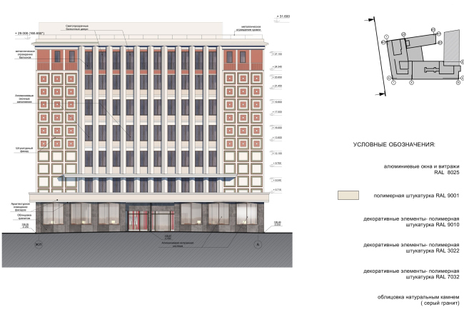
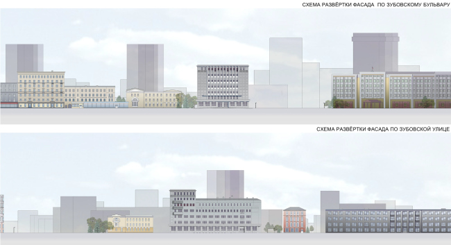
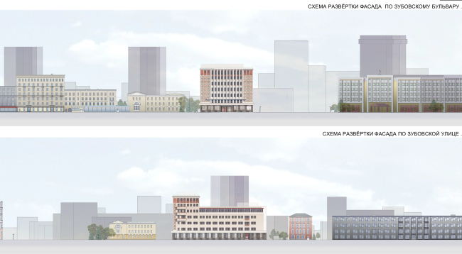
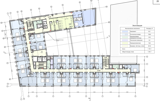
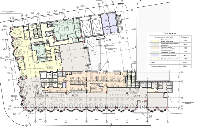
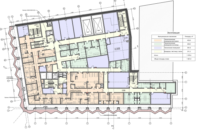
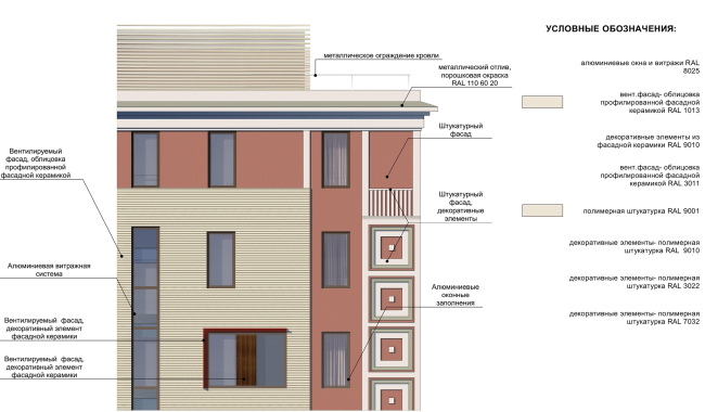
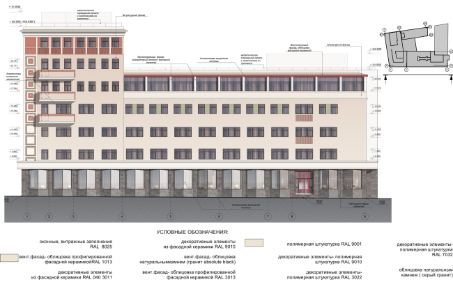
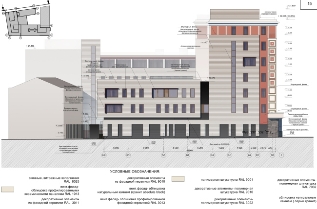
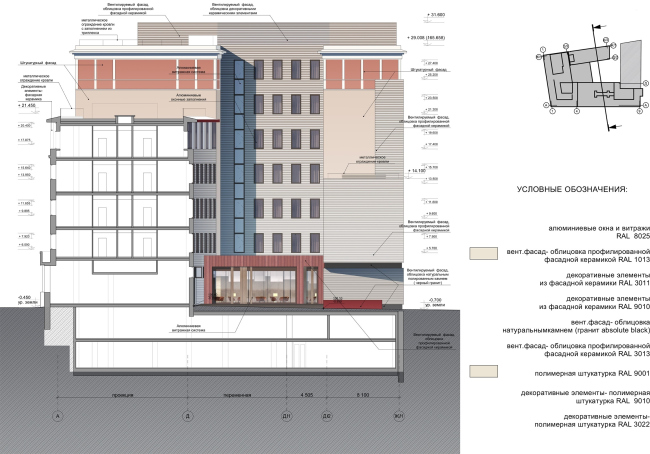
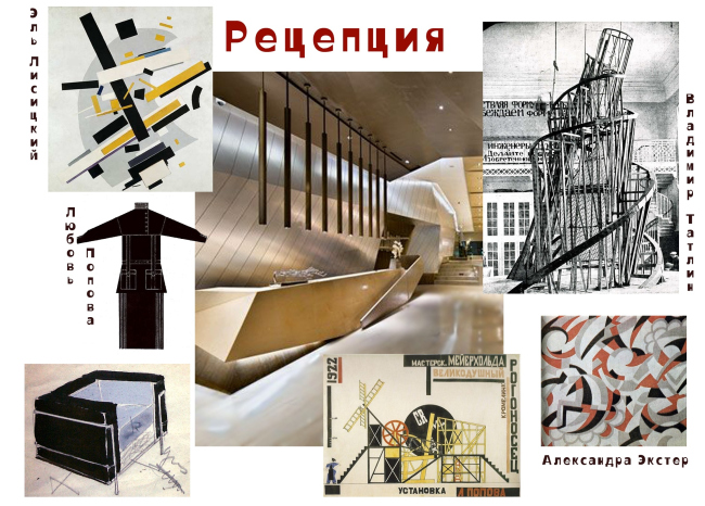
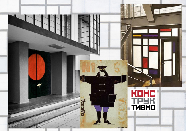
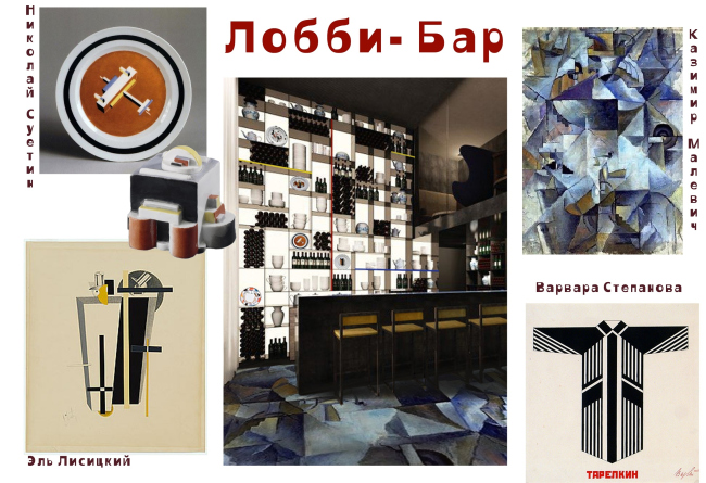
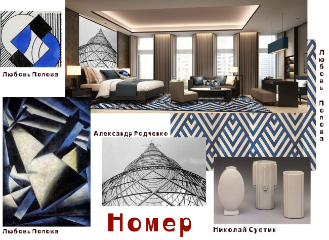
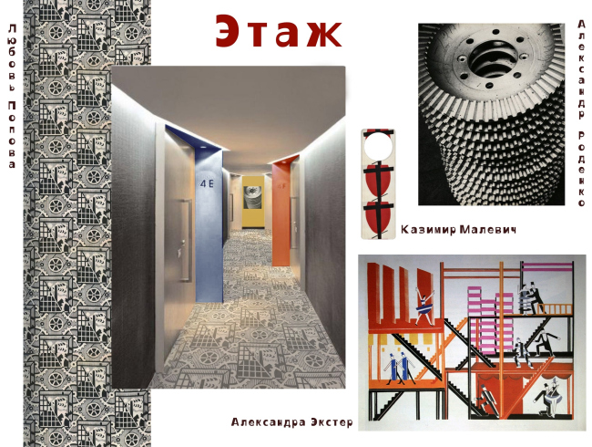
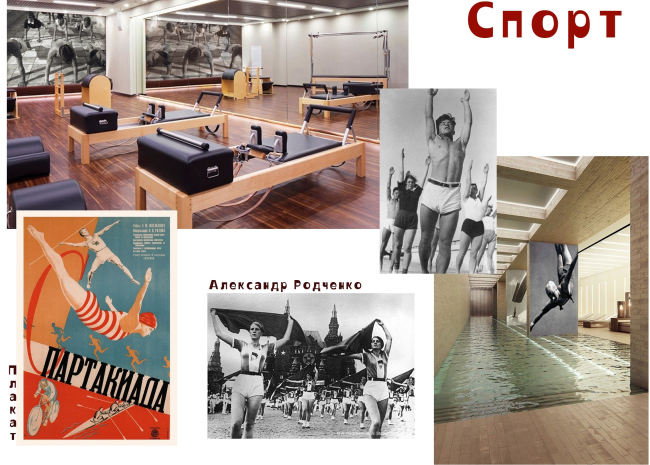
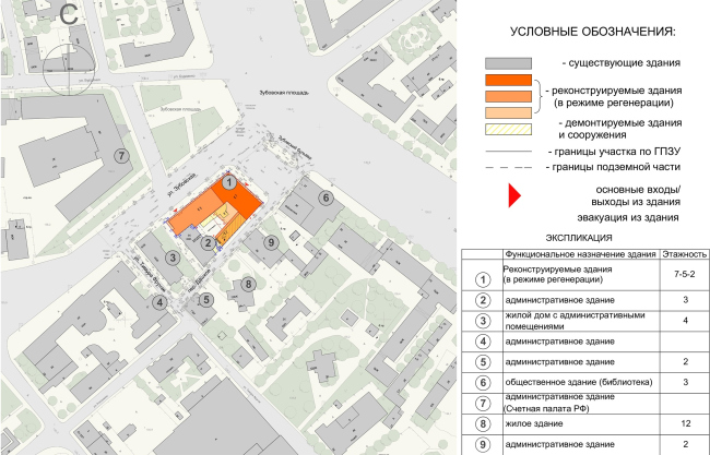
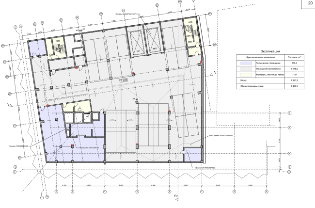
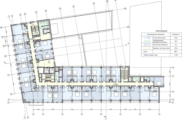
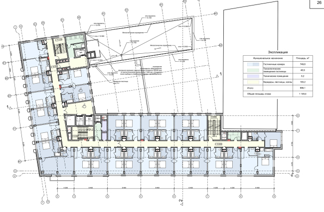
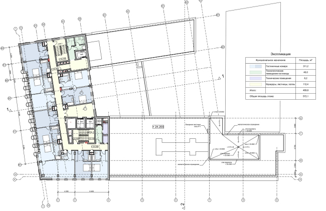
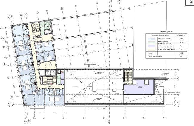
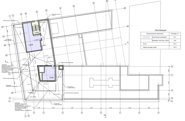
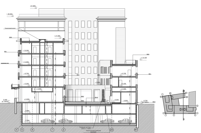
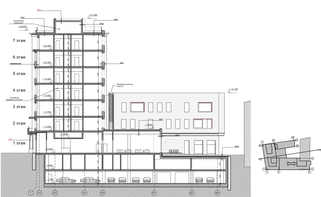
The project of reconstructing the building of the automatic telephone station at the Zubovskaya Square, which includes preserving some of its original façades. Reconstruction of the building at the Zubovskaya Square © "GRAN" architectsThe first building of the telephone station appeared on the Zubovskaya Square back in the 1930, and it was quite small at that time. Then a larger seven-story building overlooking the Garden Ring was built upon the project by Kasyan Solomonov in 1939. The array of pylons in the center of the façade helps the building to “hold together” the square and makes it look like anything but a telephone station because there is a fair amount of windows in between the triangular pylons, which, again, exist since the 1930’s. The pylons also set the dominance of the verticals and accentuate the fact that the façades designed by the architect Solomonov belong to the so-called post-constructivism. On the other hand, the square-shaped recessions that flank the array of pylons, which also definitely place the building in the architectural period of the 1930’s and bear an extra load, remind us of its more famous neighbor – the Frunze Academy, which was designed by Rudnev and Mutz (1932-1934) – highlighting their proximity in an “ensemble” way, and thus serving as the representative of the architecture of 1939, the time when the area of the Devichiy Park was actively developed along with the mottled buildings of the Garden Ring. The telephone station building on the Zubovskaya Square looks like the “tip” of the “wedge” that consists of early-Stalin buildings and widens in the direction of the Novodevichy Monastery, merging with the construction of the 1920’s and growing from it. Probably, because of that, the building of the telephone station ended up being so abundantly decorated, in spite of its purely technical function. Taking down such a wonderful building would have been an atrocity, and Pavel Andreev, the architect who had worked on the reconstruction projects of such monuments of architecture as the Moscow Manezh, GUM department store, and Children’s Paradise department store, proposed to keep intact two outside façades of the telephone station, in spite of the fact that it lacked the status of a cultural heritage site. The function of the building, however, changes radically – as is known, this is the fate of many Moscow’s telephone stations, because digital technologies do not require huge boxes, and thus telephone stations are replaced by hotels and housing projects, the narratives of these adjustments being really diverse (tearing down the building / not tearing down the building, examples one and ). In this specific instance, the telephone station itself will be kept within the land site but it will occupy a small building erected in 1930 in the depth of the yard, while the main building will be occupied by a hotel. Therefore, the project requires a replacement of all of the insides of the building, an introduction of an underground parking garage, and an increase in the height of the public floor. Reconstruction of the building at the Zubovskaya Square © "GRAN" architectsReconstruction of the building at the Zubovskaya Square © "GRAN" architectsAccording to the project, the outside façades of the building that overlooks the Garden Ring will be kept authentic (currently, the building is covered in scaffolding netting but it looks like all the walls behind the wraps are intact), the difference being that, instead of gray, they will take on a slightly more optimistic color that is both in the spirit of Stalin and avant-garde architecture – the main tone is pale blue, with a hint of warm gray, the secondary tone is brick-red, almost crimson: it marks the attic, the outlines of the balconies, and the margins of the square recessions. “Proposing a new color solution and introducing the red color, we wanted, on the one hand, to make the façade more noticeable, and, on the other hand, accentuate its proximity to avant-garde buildings” – Pavel Andreev explains. The windows in between the pylons gradually increase in height, while the pylons themselves, highlighted by a light shade of color, visually stands out and starts looking more like a portico. On top, the building gets a small-height floor of mechanical rooms, related to its new function. Reconstruction of the building at the Zubovskaya Square © "GRAN" architectsReconstruction of the building at the Zubovskaya Square. The current situation, development drawing © "GRAN" architectsReconstruction of the building at the Zubovskaya Square. The project, development drawing © "GRAN" architectsThe ground floor, whose height is increased up to 5.25 meters, will keep its zigzagged outline of the 1930’s, which traces the triangular contours of the pylon ribs, but it will get, while retaining the building structures, stone coating with large frameless windows, more appropriate for a hotel. About two thirds of the ground floor will be occupied by a restaurant, while the remaining third – by the hotel lobby. On the ground floor, the zigzag of the historical wall gives the inside spaces an extra advantage for placing tables in the resulting bay windows; the plan of the minus first floor clearly shows that the foundation of the historical part is not included in the bearing structure, the framework and the walls of the new content of the hotel drawing inwards. The same stylistic device is repeated on the upper floors – the outside historic wall is not loaded – on the contrary, the supports of the framework, which are placed along the contour of the walls, stretch relief beams to it. Reconstruction of the building at the Zubovskaya Square. Plan of the 4th floor © "GRAN" architectsReconstruction of the building at the Zubovskaya Square. Plan of the 1st floor © "GRAN" architectsThe first underground floor is occupied by the mechanical rooms of the restaurant and the hotel, while a small parking garage is situated down below. The low-rise building that stands alongside the Dashkov Lane contains a fitness center and just one apartment, not really large, 83 square meters. Incidentally, the lateral wings are reconstructed more radically – the western one is due to be taken apart and then restored in the same parameters, while the small eastern one will be also built anew, yet with modern façades – and this will be the only place where the façades will truly “face” the city. Reconstruction of the building at the Zubovskaya Square. Plan of the -1st floor © "GRAN" architectsThe same modern style is applied in the design of the façades of the inside yard: thin horizontal RAL ceramic strips of a light-beige color. The new single-story volume with large stained glass windows, which continues the hotel lobby inside the yard, is also covered with ceramics but its bands are broad, vertical and dark-crimson – this way, the modern parts echo the proposed historically accurate colors of the façades, adding a new interpretation of them. The two colors of the ceramics are added by insets that imitate wooden panels. Reconstruction of the building at the Zubovskaya Square. Facade © "GRAN" architectsReconstruction of the building at the Zubovskaya Square. Facade © "GRAN" architectsReconstruction of the building at the Zubovskaya Square. Facade © "GRAN" architectsReconstruction of the building at the Zubovskaya Square. Facade © "GRAN" architectsOriginally, it was planned that the hotel would be part of the Mariott chain; then a decision was made to hand it to AccorHotels. The 1191-room hotel, for the rare exception of an odd single room, with an overall area of 750 square meters, chiefly boasts large apartments on the top seventh floor, which overlook the Garden Ring. The authors of the project – and this was also a first experience for them in that area – proposed an image concept for the interior design of the hotel in the spirit of avant-garde artistic works: the reception area, inspired by the things that Lubov Popova designed, a restaurant and bar in the spirit of Varvara Stepanova, rooms and corridors in the vein of Malevich and Rodchenko – all of these works of art had an influence on literally everything, including not only the bedsheets and the carpet on the floor but also the staff uniform and the cutlery. Not to mention the photographs of the athletes of the 1920’s in the gym and the swimming pool. Reconstruction of the building at the Zubovskaya Square © "GRAN" architectsReconstruction of the building at the Zubovskaya Square © "GRAN" architectsReconstruction of the building at the Zubovskaya Square © "GRAN" architectsReconstruction of the building at the Zubovskaya Square © "GRAN" architectsReconstruction of the building at the Zubovskaya Square © "GRAN" architectsReconstruction of the building at the Zubovskaya Square © "GRAN" architectsThe energy of the Russian avant-garde art of the 1920’s, known for its urge to master all of the areas of human lives, lends itself to the art of design. The huge amount of artistic material allows the architects to easily immerse the guests of the hotel into the atmosphere and culture of that epoch. But then again, it is worth mentioning in passing that the building was actually completed in 1939, which is a decade later than the Russian avant-garde epoch, and it resembles (in its scale, volume, and symmetry) the “Moscow” hotel. And, although what is characteristic of the 1930’s is rather plastered bas-reliefs on the ceiling and bronze chandeliers, it makes still more interesting the idea of the authors of the project to “get back to one’s roots”, breaking the historical accuracy, highlighting the proximity of the avant-garde art. Generally speaking, this “liberty taking” and violation of the historical correctitude (for us, people who know with absolute certainty that constructivism and post-constructivism are rather antagonists than otherwise) contains a different kind of historical lookout: oftentimes, we tend to forget that the super-eventful 1920’s and 1930’s are but two decades; today, an equal amount of time has elapsed since 1998. And, while some of the masters of the avant-garde art really could not accept the “post” reality, the others did accept it – besides, it often happened that both were done by the same people, even though the icons of these two trends were completely different. In addition, the building of an “automatic telephone station”, a purely technical structure that by definition is unfit to perform the housing function and requires for its renovation not only some thought-out engineering measures but also some “imagery” rationale, can quite possibly allow of such a possibility. In other words, at the end of the day, it hardly makes much difference in which of the two possible way you will renovate the historical legacy building: by turning the former telephone station into an early-Stalin micro-palace or by immersing it into the extravaganza of an earlier period – either of the two will be an approximation because the original function is lost any way, and restoring it is out of the realm of possibility. The image concept got the client inspired, the project was accepted and it got all the necessary approvals, but, as is often the case, at this point the communication between the parties stopped, and currently the project is living a life of its own without the participation of its authors. The tasks of drawing the working documents, doing interior design projects, and construction supervision – all of this was handed over to companies that had nothing to do with the creation of the original project. In the situation where copyright and author control is neglected in such a manner, all we can do is hope that the project will be treated carefully and the end result will not be a disappointment. This is the center of the nation’s capital, after all. Reconstruction of the building at the Zubovskaya Square. Location plan © "GRAN" architectsReconstruction of the building at the Zubovskaya Square. Plan of the -2nd floor © "GRAN" architectsReconstruction of the building at the Zubovskaya Square. Plan of the 5th floor © "GRAN" architectsReconstruction of the building at the Zubovskaya Square. Plan of the 3rd floor © "GRAN" architectsReconstruction of the building at the Zubovskaya Square. Plan of the 2nd floor © "GRAN" architectsReconstruction of the building at the Zubovskaya Square. Plan of the 7th floor © "GRAN" architectsReconstruction of the building at the Zubovskaya Square. Plan of the 6th floor © "GRAN" architectsReconstruction of the building at the Zubovskaya Square. Plan of the roof © "GRAN" architectsReconstruction of the building at the Zubovskaya Square. Section view 2-2 © "GRAN" architectsNone |
|
