|
Published on Archi.ru (https://archi.ru) |
|
| 11.12.2017 | |
|
Cultural Code |
|
|
Lilya Aronova |
|
| Architect: | |
| Daniel Lorenz | |
| Natalia Sidorova | |
| Konstantin Khodnev | |
| Studio: | |
| DNK Architectural Group | |
|
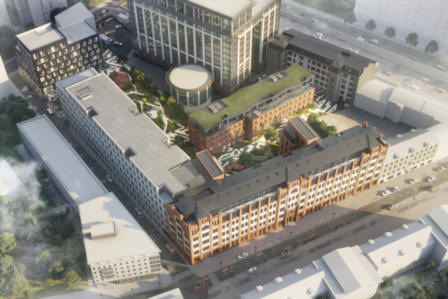
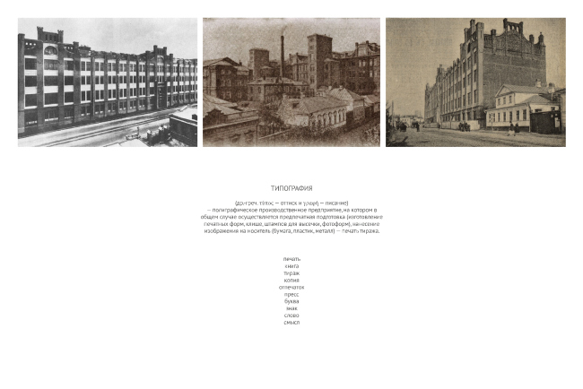
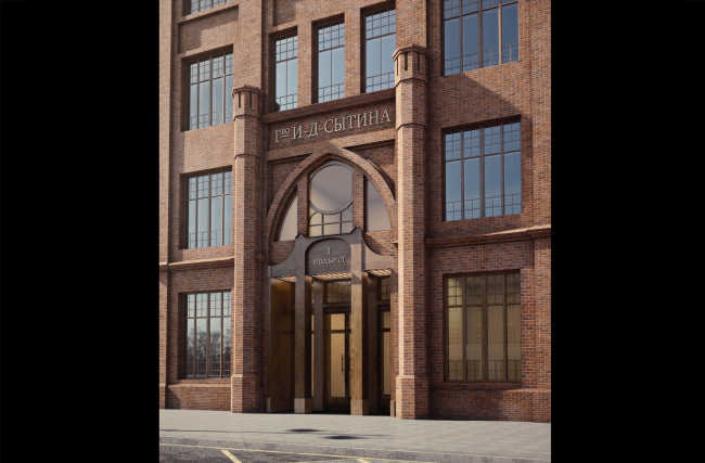
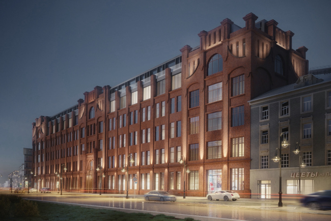
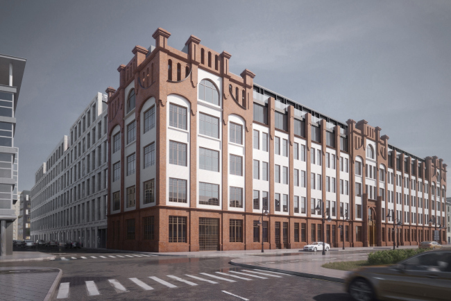
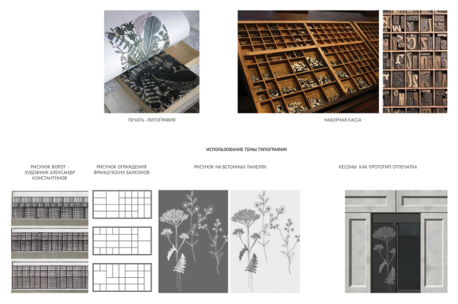
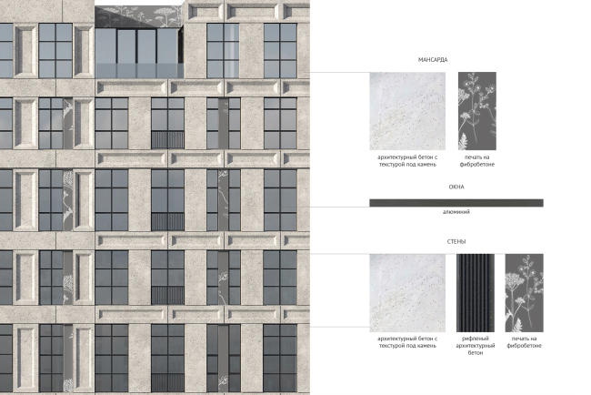
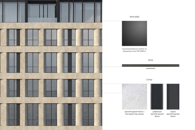
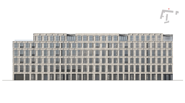
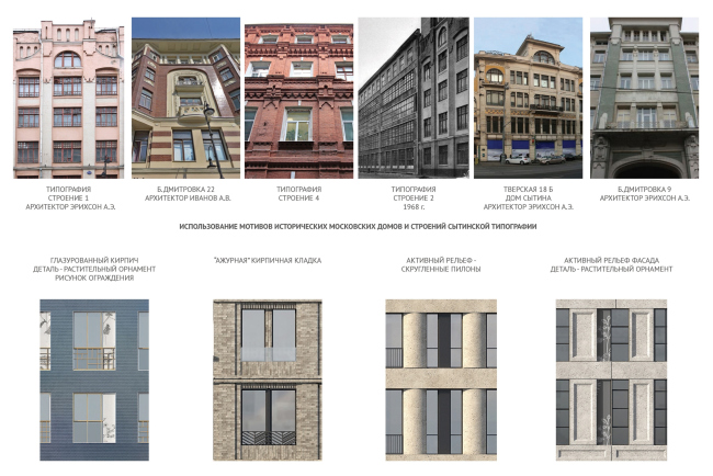
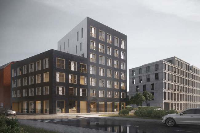
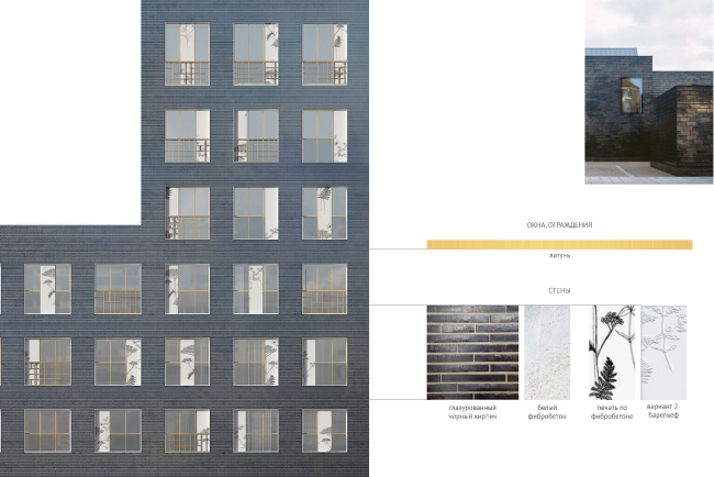
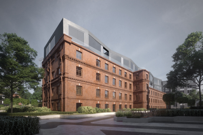
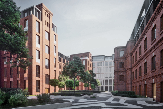
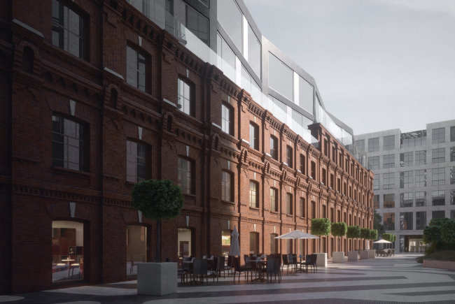
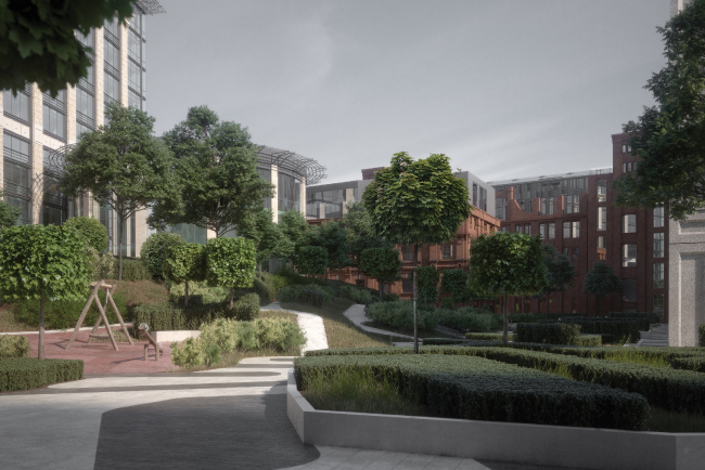
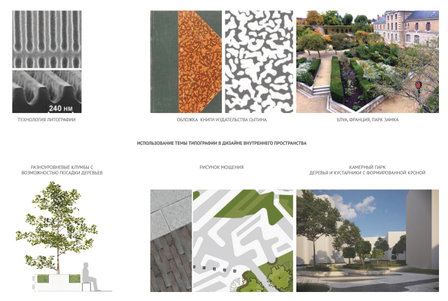
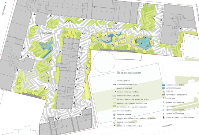
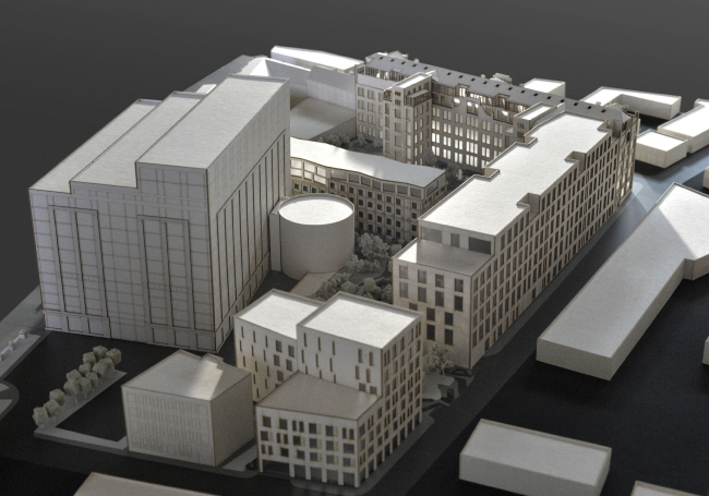
Trying to put together the mosaic of historical and newly-built units of the Sytin Printing House complex, the architects of DNK ag came up with their own lexical paradigm, some sort of a cultural code, based on the subtle play of images and associations. Contest project of renovating the First Exemplary Printing Works © DNK agThe basis for the imagery of the renovation project proposed by DNK ag became, in full accordance with the history of the place, the theme of a printing house, which, as it turned out, nourishes a lot of material and conceptual associations. The “face” of the complex – the main building of the printing house – was restored by the authors in a competent and respectful manner. Restoration of the historical brickwork, as well as the door and the window apertures, and replacement of the “soviet” buildup with stained glass – all this brings the outward appearance of the building towards the original image designed by Adolph Erichson. In order to make the historical silhouette and its intricately designed attics more dramatic, the authors of the project propose to make terraces at the corners of the upper floors of the building – including on the side of the firewall, clearly viewable from the Garden Ring. Considering the makeover from the industrial function to residential, the grand entrance becomes particularly important because now it is the main entrance to the complex. “We are preserving its character as much as we can – the architect, Natalia Sidorova, shares – This historical entrance through a neo-gothic arch must become the must become the main emotional experience for the guests of the complex. Behind it, there is a grand lobby. However, due to the fact that the house must be now entered from the street – which is not very convenient – we slightly sink in its stained glass window with an original ornament, thus showing a more private and secure character of the residential complex”. Contest project of renovating the First Exemplary Printing Works. Historical context © DNK agContest project of renovating the First Exemplary Printing Works. Main entrance from the Pyatnitskaya Street © DNK agContest project of renovating the First Exemplary Printing Works. View from the Pyatnitskaya Street © DNK agContest project of renovating the First Exemplary Printing Works. View from the Pyatnitskaya Street © DNK agThe “soviet” building unit that stretches along the 2nd Monetchikovsky Alley became for the architects of DNK ag the main point of applying their creative thought. Leaving intact the framework of the print house building of the 1930’s, they “dress” it with a new façade, through which, nevertheless, the old structure of the building shows through, creating an effect of historical and stylistic layers piled on top of one another, completely relevant in this case. Living totally up to their name (“DNK” in fact means “DNA” in Russian – translator’s note), the architects of “DNA” ag restore the “DNA chain”, or repair the historical morphotype, if you will. Furthermore, it is these spots of “breakthroughs” of the historical layers, in which the “printed” architectural lexicon that we spoke about earlier manifests itself: the piers are decorated with fragments of engraved plates, with the help of which the prints in the Sytin printing house were created; the geometry of the letter case finds a reflection in the mesh of the fences, while embossing as the basis of book printing shows through in the rows of coffered panels. Contest project of renovating the First Exemplary Printing Works. The concept © DNK agContest project of renovating the First Exemplary Printing Works. Fragment of the facade of Building 2 standing along the 3rd Monetchikovsky Alley. Version 2 © DNK agContest project of renovating the First Exemplary Printing Works. Fragment of the facade of Building 2 standing along the 3rd Monetchikovsky Alley. Version 1 © DNK agIn spite of its small number of floors, this building is rather long – it occupies virtually the whole alley. “We deliberately opted out of fracturing it into three different volumes in order to keep the memory of the place, the historically formed ensemble – Konstantin Khodnev explains – The technique of fracturing things into parts is, of course, present in our project, but it is there on the level of nuances and subtle plastique”. Contest project of renovating the First Exemplary Printing Works. Facade of Building 2 standing along the 3rd Monetchikovsky Alley © DNK agIf one does not look really hard, the difference between the three conditional parts of the façade is but fleeting, read on an almost subconscious level: closer to the Pyatnitskaya Street, the coffers mark the lintels between the floors, in the middle part they decorate the pylons, and in the depth of the alley this architectural detail is present in both versions – vertical and horizontal. At the expense of the lighting difference in the perspective stretching into the depth of the alley, the relief is rather clearly readable. In addition, the boundaries between the fragments are marked by cutaway terraces on the top floor of the building. Incidentally, thanks to this specific solution, if one is to look from the corner of the Pyatnitskaya Street and the 2nd Monetchikovsky Alley – the vantage point, from where the silhouettes of the two main buildings of the complex are viewable equally well – their likeness becomes obvious: the rigid orthogonal cutaways of the terraces of the renovated building rhymes harmoniously with the intricate neo-gothic attics designed by Erichson. Yet another thread that holds together the canvas of the housing complex is the architecture of the Moscow tenement houses that the authors of the project studied in great detail. The starting point was Building 3 on the Valovaya Street that back in the day would host the apartments of the managers of Sytin’s printing company. The arrangement of the window apertures, decoration of the façades, alteration of smooth and rugged surfaces – all these features of this specific typology, although not the subject of direct quotation, are nonetheless to be clearly seen, albeit in a modern interpretation, for example, in the image of a newly-built Building 6, where the windows are also grouped in pairs, while the façade gets decorated with ceramic tiles, characteristic of the tenement houses of the XIX century. The “printing house” theme is also to be traced here: it lies in the matrix structure of the façade, and the façade-decorating elements of etchings with floral motifs, and the materials: zinc and copper alloy, glazed brick, and fragments of white stone, which, when posed against this background, can be perceived as typographic sheets. As far as the volumetric solution of this building is concerned, this is a rather reserved kind of modern architecture, in many ways conditioned by the restrictions imposed by the densely standing surrounding buildings. Contest project of renovating the First Exemplary Printing Works. Context © DNK agContest project of renovating the First Exemplary Printing Works. New building on the 3rd Monetchikovsky Alley © DNK agContest project of renovating the First Exemplary Printing Works. The facade of the new building on the 3rd Monetchikovsky Alley © DNK agJust like any of the constituent parts of the complex, Building 4, which stands inside the yard, also has a theme of its own. In addition to restoring the historical red-brick façades, the project also provides for a built-up mansard that the authors propose to design in a laconic, even minimalist, key – a slender jagged line of a glazed façade, almost dissolving in the sky, gives the building some intermediate scale, a character that is pretty much in the middle between the historical part of the complex and the surrounding modern buildings, chief among them being the Lighthouse business center that overlooks the same yard. In addition, this is the most “intimate” part of this city block, a fragment of the yard space, to which the architects paid special attention. Contest project of renovating the First Exemplary Printing Works. Building in the old yard © DNK agThe landscaping of the yard in the DNK ag project is meant to further cement the already fitting puzzle pieces but its very concept is a noteworthy thing in itself. In the neo-gothic space, closed from all sides, the architects saw even a reference to castle architecture, and proposed an according greenery theme – one that includes geometric ornaments and plants of different height, trimmed bushes and tree crowns. The paving pattern is also based on the contrastive ornament that can be traced back to Sytin’s book covers, while podiums and landscaping elements of different height embody the “embossed” typographic relief. All of this baroque-style beauty spills over into the 2nd Monetchikovsky Alley as a regular mini-promenade with neatly trimmed trees. Incidentally, thanks to the passageway from the Valovaya Street, the entire yard becomes accessible to public – the authors of the project even suppose that with time the first floors may house small elegant cafés. Contest project of renovating the First Exemplary Printing Works. View of the old yard © DNK agContest project of renovating the First Exemplary Printing Works. View of the inner pedestrian street © DNK agContest project of renovating the First Exemplary Printing Works. View of the new yard with a park © DNK agContest project of renovating the First Exemplary Printing Works. Concept of landscaping the yards © DNK agContest project of renovating the First Exemplary Printing Works. Concept of landscaping the yards © DNK agThe expressive and comfortable yard space – together with multilayered historical context, enhanced by accents of modern architecture, and diverse apartments that can fit every taste are the tools that allow the authors of the project to achieve the goal that Konstantin Khodnev put in this nutshell: “It was very important for us to make sure that this complex would be more than just a set of buildings, but a premium-class city block, providing a great living environment”. Contest project of renovating the First Exemplary Printing Works. Model © DNK ag |
|
