|
Published on Archi.ru (https://archi.ru) |
|
| 30.08.2017 | |
|
A Roman Rome |
|
|
Lara Kopylova |
|
| Studio: | |
| M. Filippov Architectural Studio | |
|
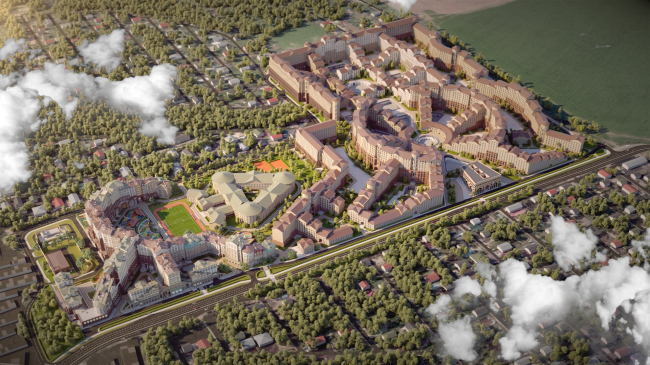
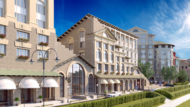
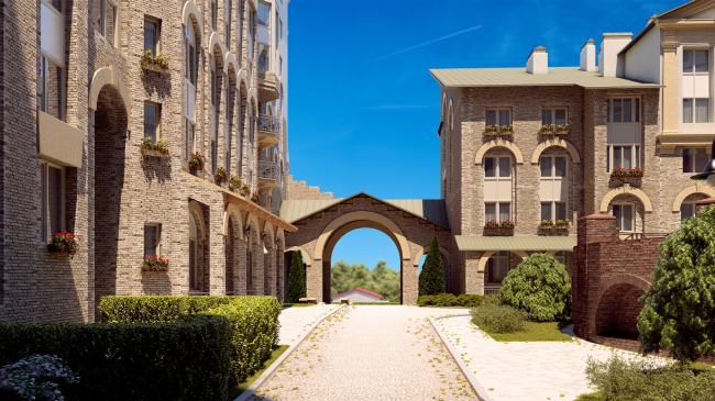
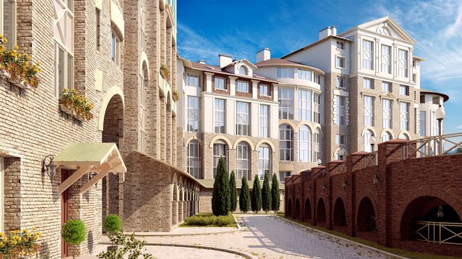
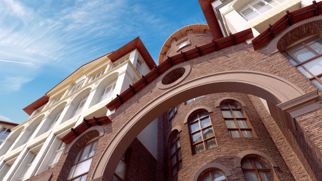
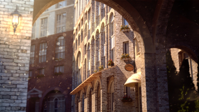
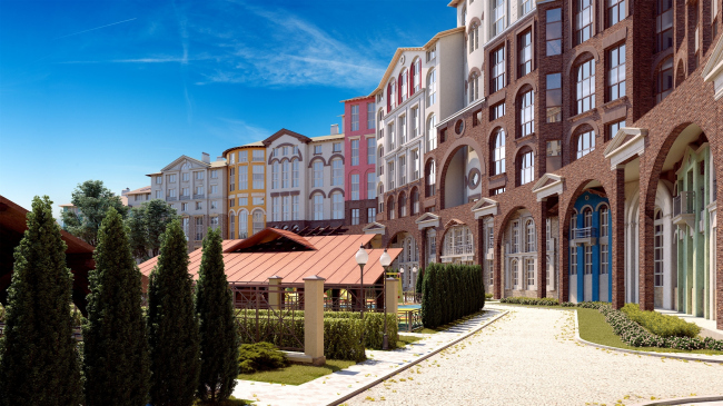
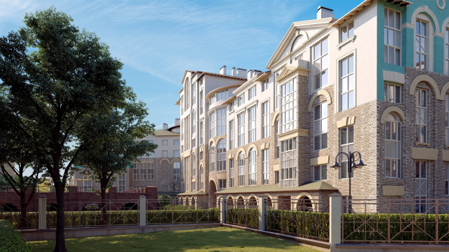
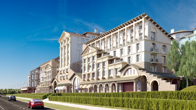
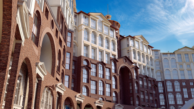
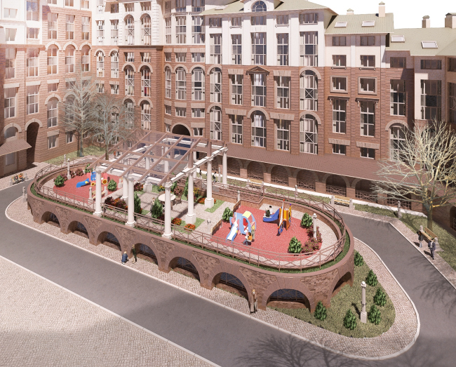
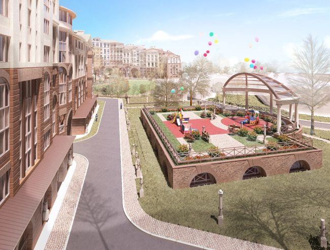
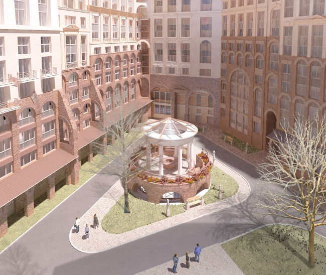
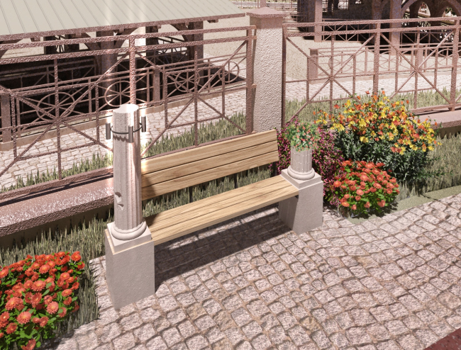
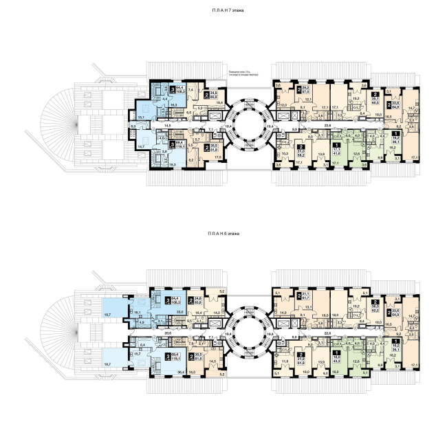
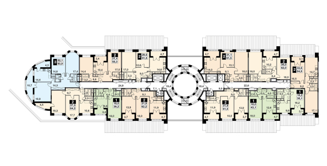
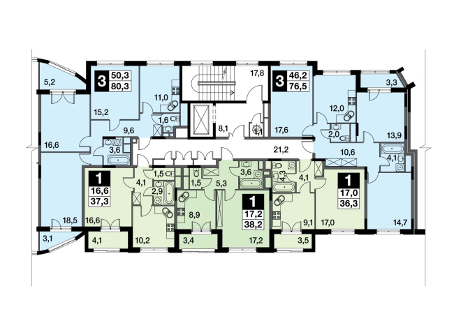
Designed by Mikhail Filippov, the UP-quarter “Rimsky” is being built by FSK Lider at the crossing of the Kashirskoe Highway and the Moscow Ring Road. This place never was either expensive or respectable but the introduction of this unique author-architecture project can make a difference. In terms of its scale, “Rimsky” is not even a quarter or a block but rather a traditional European town consisting of several blocks. The plan of the town looks like the L letter. One of its parts – the one that is currently under construction – includes a 17-section building with a semicircular yard, across a football field from which there is a school that forms a triangle with propylaea. The first stage will be put into operation in the IV quarter of 2018, the entire project due to be completed in 2023. “Rimsky” will in fact be an ensemble of five squares strung on one axis and connected by city streets. The round central square will include cafes and shops, and on New Year’s Eve it will host the Christmas tree; the Harmony Square will host the sports infrastructure; the Beauty Square will host beauty salons and spas; the Fine Arts Square – places for creative activities of adults and children; the Fair Square – a farmers market, so fashionable these days. The sections will be from three to twelve stories high. It is planned that the complex will have several kindergartens; also, the residents will be able to enjoy a developed infrastructure of the surrounding area. The bottom floors are public ones. As for the apartments, they will be of many different types: from studios to a penthouse with a terrace, two-level, loft-type, ones with a bathroom window, and so on. This architecture is the classic “Filippov” signature type. UP-quarter "Rimsky". Project © Mikhail Filippov ArchitectsUP-quarter "Rimsky". Project © Mikhail Filippov ArchitectsContext 1: mass construction. Beginning of the age of beauty Before we start sharing about Mikhail Filippov’s numerous inventions, it is worth mentioning just how amazed we are to live in an epoch when mass housing can look like this. I really think that sociologists and urbanists should invest a fair amount of their time into studying this phenomenon. The fact that the concrete panel buildings are on the way out is a sure sign of the end of the industrial epoch that they manifested – the new creative economies of today are much better suited with versatile and humane architecture that is all about the city with a capital “C”. Just a while ago it seemed that there were no serious alternatives to prefabricated panel construction but over the last seven years some architects and enlightened developers have been able to come up with a concept of housing that, on the one hand, is affordable enough, and, on the other hand, is not devoid of the humane imagery of the traditional architecture – in Russia this happened for the first time since the memorial decree on architectural excesses issued by Nikita Khrushchev back in 1955. This context definitely includes the Maxim Atayants cities built around Moscow, as well as the city of Val-de-Marne near Paris designed by Pier Carlo Bontempi (though of a smaller scale). In the same way were designed the traditional New Urbanist cities, such as Poundbury in Great Britain or Celebration in Florida, USA – but these are smaller in height and closer to a village in their typology. Context 2: other residential areas and cities designed by Mikhail Filippov “Rimsky” is yet another classic Filippov town. Starting with his manifesto of 1984, when Filippov presented a series of watercolor paintings in which a panel residential area was gradually giving way to traditional architecture (still later on, these paintings brought Filippov a victory in the Japanese contest “Style 2001”) the architect has consistently developed and implemented this idea. The 2000’s saw the “Roman House” in Moscow’s Kazachy Alley, the “Italian Quarter” on Moscow’s Dolgorukovskaya Street, the housing complex “Marshal” on Moscow’s Oktyabrskoe Pole, and the Gorky Gorod in Sochi built specially for the 2014 Olympics. Now yet another Roman town will soon appear right next to Moscow. Filippov has always thought about his architecture as the heir of the neoclassicism of the Silver Age, bypassing the Soviet Stalin-era classicism that he considers a compromise. The typology of many of his works can be traced down to a “quarter-house” of the Silver Age like the Benoit House on Saint Petersburg’s Kamennoostrovsky Avenue. Neoclassical architects of the Silver Age considered the street-side façade to be the main or “grand” one, while the practice of adorning the building’s yard side with a colonnade was rather an exception than a rule, most of the yards performing purely utilitarian functions. As for Filippov, however, all of his yards are in fact of the “grand” kind, with elaborated façades and a system of colonnades and arcades. This is the way it is done in “Italian Quarter” and in “Marshal”. The same principle is to be seen in “Rimsky” housing complex, the only difference being that the “quarter-house” grew up to the size of a town. However, the most important thing about “Rimsky” is not its typology. UP-quarter "Rimsky". Project © Mikhail Filippov ArchitectsUP-quarter "Rimsky". Project © Mikhail Filippov ArchitectsUP-quarter "Rimsky". Project © Mikhail Filippov ArchitectsContext 3: a historical city The phenomenon of a historical city that, judging by the tourist flows, most people seem to like, is rather difficult to describe and still more difficult to structurally comprehend and reproduce without copying. Filippov, however, has been doing this his whole life – studying the city through drawing watercolor paintings. The method that he used, among other projects, in Gorky Gorod, and now in “Rimsky”, consists in the following. The beauty of historical cities – Paris, for example – can be explained, according to Filippov, by the superimposition of two different coordinate systems: the “starburst” radial layout and the Hippodamus planning pattern. This superimposition gives birth to picturesque crossroads with interesting viewing points that fill one’s walk around the city with an abundance of visual pleasure. Filippov reproduced this superimposition in Sochi’s Gorky Gorod which resulted in a multitude of amazing views opening up to its visitors. The same principle is applied in “Rimsky”. The streets that run in a starburst fashion from the main city square cross with a rectangular coordinate system, these streets crossing with yet another grid, and so on. It is not enough, however, just to put together a picturesque plan – you also need façades that must be rather articulate and interesting to look at, and in “Rimsky” the houses are dissected into sections with façades 20-30 meters long (just like they should be in a historical city), Filippov’s façade design always being no less than perfect; you also need streets that are not too broad and buildings that are not too high – and in “Rimsky” the houses of different height create a picturesque view of pitched roofs; you need city architectural views that open up in the alleys that puncture the façade line – and “Rimsky” has plenty of those, asking to be made a watercolor painting of. As Filippov himself put it, “the form of the symphony has yet to be filled with melodic content”. Taking this analogy still further, we can safely say that he’s got plenty of “melodic talent”. In Gorky Gorod, for example, the pattern of façades is particularly good, down to the last window sash, and there are rather exquisite colors of stucco, stone and brick (here we are, of course, referring to the buildings that luckily remained unspoiled by the construction companies). In “Rimsky” (specifically, in the buildings of the first construction), the basic principle is slightly different: it is not the classic massive wall with windows of right Alberti architecture proportions but large modern glass windows, in fact, glass screens with orderly decoration that was first in the Silver Age, for example, in the trading house on the Nevsky Prospect. A combination of glass and architectural order is a very promising path for taking the classics to a whole new level. If the aesthetic arguments do not seem to convince you, there are economic ones as well. The eye-walking level, as urbanists explained to us (see the interview with Aleksey Novikov) is extremely important. Because, if on the eye-walking level a person sees beautiful façades of exquisite materials, inviting doors and see-through windows that display life going on behind them, that person will want to walk there, the businesses will flourish, and the people will get diverse necessary functions within a walking distance. UP-quarter "Rimsky". Project © Mikhail Filippov ArchitectsUP-quarter "Rimsky". Project © Mikhail Filippov ArchitectsContext 4: Rome As for Rome, Mikhail Filippov has a soft spot for it. In his works he constantly holds a dialogue with the great architecture of the Eternal City. The colonnade of the Saint Peter’s Cathedral got reflected in the wings that embrace the round yard of the house in the Kazachy, and the Theatre of Marcellus, built up in the ensuing centuries – in the form of “Italian Quarter” on the Dolgorukovskaya. Roman motifs are also to be found in “Marshal” (the slanted ruined wall) and in Gorky Gorod. In “Rimsky”, however, this is more than just individual buildings. I will try to explain the difference. Here is the thing – Rome is something like “avant-garde before avant-garde”. It has a very avant-garde form of city planning: this city stands on hills, these forms creating vertical “modes” of architecture. Lifting your gaze, you see that above the building that you’re looking at there is yet another building, and then still another one, towering up into the sky. And then in your mind’s eye you start hopping up these tiers. I even think that Filippov’s signature “stairway to heaven” technique can be traced back to that. At the same time, this is by no means a Mediterranean terraced “seaside town on the slope” because the upward movement is so unpredictable here. Add to this the already-mentioned superimposition of the starburst and Hippodamus patterns. It does not stop Rome (or any other historical city, for that matter) from having a clear-cut structure of streets and squares. But the most interesting thing is that when the line of Roman façades gets punctured, the opening shows not a yard of a regular shape (as one would expect) but a house standing at an angle or some other sort of angular composition. This “wedge” is to be seen rather often here. It adds so much to the dynamics of the project that the avant-garde “red wedge” seems minor in comparison to that. In “Rimsky”, Filippov literally reproduces this technique, just as the usual-for-Rome inclusions of antique arches or walls carved into walls but 200 years old. The nineteenth century covers up the second one sticking from underneath it. An irregularly shaped piece of ancient wall or arch stands out from the regular classical façade, and this technique is something that Filippov actively uses as well. In a word, Rome is an architectural shape of an incredible power. Plus – the richness of the classical harmony, strength and beauty, power and complexity. Against this background, modernist architecture starts looking pale and weak, and, because of that, it looks so out of place in Rome. It is strange that none of the architects has ever noticed this avant-garde quality that’s inherent to the classic Rome. And Filippov not only did but made it his life’s work. The superimposition of logics and epochs plus beauty is something that a city of today should be about, and this is what Filippov’s architecture is about. Stairway to Heaven UP-quarter "Rimsky". Project © Mikhail Filippov ArchitectsStairway to Heaven is Filippov’s signature technique that travels from project to project. In “Rimsky”, it is embodied in two forms: it is either a stairway of arcades (porticos) on the façade or a terraced composition of several houses. The metaphysical meaning of this is anyone’s guess: from the Led Zeppelin song to a Ziggurat. The “stepping” arrangement of arcades is also to be seen in the historical Rome. It looks approximately like this: next to the main building, there is a later-on addition, and its arcade is situated a little bit lower than the one on the main building – but these two are proportionately connected. Filippov is the perfect master of this technique, and it is to be seen in all of his projects. In “Rimsky”, the façades of Section 5, for example, are decorated with such step-like arcades. What it ends up looking is that on the one side the building has a clear-cut lower tier of arcades – and, generally speaking, the house has a bottom, a middle tier, and a decorated top, which is really important for human perception: one’s eye gets tired of monotonous façades. On the other side, these façades alternate in their height and produce an interesting “moving” effect. If the architect makes a stairway of porticos, he by no means violates their proportions. Developing the classical canon, he leaves the essential things intact, and this is what makes him different from postmodernists. “Rimsky” presents yet another variation of the stairway – the Leonardo da Vinci double spiral staircase of Chambor castle (see interview with Mikhail Filippov). These staircases are to be found in several houses in the towers that connect the residential sections. Ascending one spiral, you can get to the right-hand section, ascending the other – to the left. The staircase towers with their huge windows are pierced through by the sun rays from top to bottom. On top of them, there will be sightseeing platforms. The project also provided for the Chambor staircases connecting the round squares of the upper and lower towns (the first and the second part of “Rimsky”, yet unbuilt) but it’s still unclear if these plans will come to pass. Antique theater Filippov has many times said that he was fascinated by the grandiose ruin – an antique amphitheater, built up in the ensuing century very much like the Theatre of Marcellus. In this theme, the architect saw modern dynamics combined with life-affirming meaning, and he tested it in “Italian Quarter” in other places. In “Rimsky”, this is more than an amphitheater – it is a full-circle theater situated in the right-hand two-level part of the complex near the five squares ensemble. An antique theater very much like a coliseum surrounds the central square. The number of floors in the houses decreases as they near the square. This is like a play of giant substructures of the Roman Coliseum, and at the same time it is a dynamic modern shape that unites many different buildings with different façades. UP-quarter "Rimsky". Project © Mikhail Filippov ArchitectsMaterials For “Rimsky”, Filippov came up with a few know-how’s in terms of construction materials (see the interview). The problem of high-quality craft work is really acute for the classical architecture. The craft industry was destroyed in 1955, there are no educational institutions that provide training for craft workers but this does not mean that they are nonexistent or that they will not learn their trade again if one just gets down to it. For example, Berlin’s Schlüter Palace was restored with a superb quality of craft work. Currently, the situation in the field of classic decor is improving. UP-quarter "Rimsky". Project © Mikhail Filippov ArchitectsUP-quarter "Rimsky". Project © Mikhail Filippov ArchitectsUP-quarter "Rimsky". Project © Mikhail Filippov ArchitectsUP-quarter "Rimsky". Project © Mikhail Filippov ArchitectsUnderground Town and Heavenly City The idea of two-level space, just as the idea of Chambor staircase, was inspired by the works of Leonardo da Vinci. “Rimsky” has become one of Russia’s first mini-cities in which the architect was able to realize a two-level concept that consists in complete separation of the upper pedestrian and residential zone from the lower zone that includes infrastructure projects, cafes and restaurants, where vehicle traffic is allowed and where there is a parking garage underneath. In this project, the lower level is a full-fledged city with active public life and even a system of squares of its own. As for the upper level subjugated to the current principle of “vehicle-free city”, it is safe and quiet, full of parks and recreation; it becomes an Arcadia of sorts, a Heavenly City. If everything is built to plan, this UP-quarter stands every chance of becoming a high-profile landmark not only in terms of neoclassicism imagery but in terms of modern urban planning as well. UP-quarter "Rimsky". Section 13, plan of the 6-7 floors. Project © Mikhail Filippov ArchitectsUP-quarter "Rimsky". Section 13, plan of the 3 floor. Project © Mikhail Filippov ArchitectsUP-quarter "Rimsky". Section 9, plan of the 3 floor. Project © Mikhail Filippov Architects |
|
