The building at the very beginning of New Arbat is the result of long deliberations over how to replace the former House of Communication. Contemporary, dynamic, and even somewhat zoomorphic in character, it is structured around a large diagonal grid. The building has become a striking accent both in the perspective of the former Kalinin Avenue and in the panorama of Arbat Square. Yet, unfortunately, the original concept was not fully realized. In 2020, the Moscow ArchCouncil approved a design featuring an exoskeleton – an external load-bearing structure, which eventually turned into a purely decorative element. Still, the power of the supergraphic “holds” the building, giving it the qualities of a new urban landmark with iconic potential. How this concept took shape, what unexpected associations might underlie the grid’s form, and why the exoskeleton was never built – all this is explored in our article.
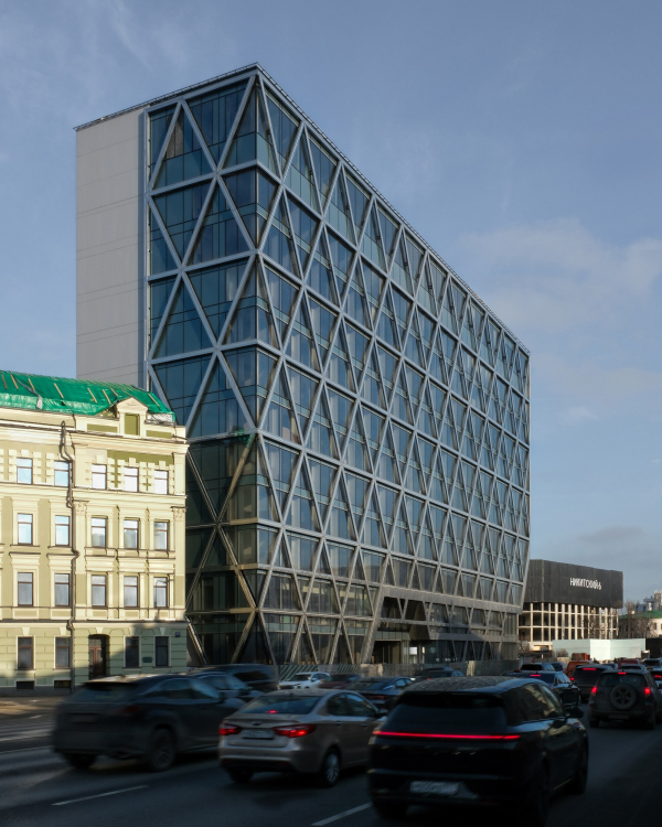
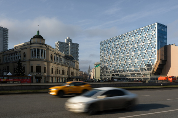
The Cosmos hotel stands at the very beginning of New Arbat, on plot number 2. It is highly visible at the intersection of Vozdvizhenka Street and the Boulevard Ring. The intersection itself is a broad one, with a tunnel running beneath it, and its surroundings – essentially, Arbat Square – consist, due to heavy traffic, of diverse and somewhat fragmented parts that seem to tell different stories. The Khudozhestvenny Movie Theater and the Stalin-era rotunda of the Filyovskaya metro line speak of history and neoclassicism; Praga restaurant and the beginning of Old Arbat evoke the tourist charm of the old city; the Morozov Mansion and its “future relative”, a residential complex with columns of various orders, express eclecticism and historicism.
Cosmos has become the key accent of New Arbat – formerly Kalinin Avenue – one of Moscow’s most iconic modernist projects of the 1960s. Within the ensemble of Arbat Square, it represents the fourth “thematic layer” – that layer being modernity.
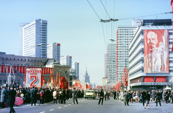
The hotel replaced the House of Communication built back in 1967 – a large facility that housed a post office, telegraph, and telephone exchange. Like many such exchanges in Moscow, it was converted into a hotel with the advent of the digital era. However, for at least fifteen years before that, the building was hidden behind a giant advertising banner.
Several redevelopment proposals were considered: one by Yury Biryukov and ABV in 2017, and another by Julia Romanovskaya and UM Architects in February 2020. It’s now difficult to say which of the early projects envisioned reconstruction with preservation of the structure and which proposed entirely new construction within the same footprint. Most likely, all of them leaned toward new construction – since the building “grew upward”, preserving the outline of the old volume, which itself was never one of the “book buildings” (mind, there are no such “books” on the even side of Kalinin Avenue). It was a striped “slab” with an arched passage leading into Merzlyakovsky Lane.
In August 2020, the Moscow ArchCouncil approved the project by Vladimir Plotkin and Reserve Union. Unlike its predecessors, this design, while fully preserving the original footprint of the former building, slightly altered its shape.
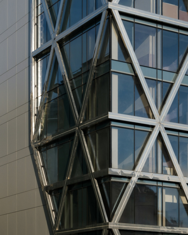
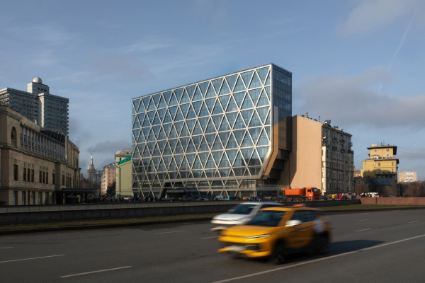
The House of Communication had been a pure parallelepiped stretched along the avenue – as were the earlier proposals. The architects of Reserve searched for the right form for quite some time, producing a lot of variations. First, they trimmed the outer corner of the bottom level, creating more pedestrian space around the underground crossing. Then they “cut” the main end of the building with a stepped cantilever resembling a muqarnas. This version became the final one.
Thanks to this comparatively small intervention, the volume ceased to be “just a slab” and acquired both an urban directionality and a kind of zoomorphic expressiveness. One feels tempted to attribute certain living qualities to it, since it seems, in a way, animate. It no longer simply “stands” – it looks, and even seems to take a step toward the city center, thus marking the beginning of the avenue and assuming the role of its “head”.
It not only closes the perspective but also opens the view from Gogolevsky Boulevard, simultaneously reflecting the avenue’s dynamism through its forward-leaning, center-oriented side view.
And finally, it doesn’t merely clear the passage into Merzlyakovsky Lane – it “steps over” it, with the sharp angles of its “legs”.
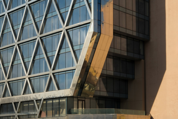
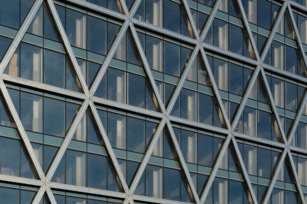
A significant – indeed, a decisive – role in the composition is played by the diagonal grid. It emphasizes the intended zoomorphism while avoiding being excessively literal; it establishes a clear module and visually reduces the building’s mass, since each triangle corresponds to two floors and each rhombus to four. When we look at the new Cosmos hotel, what we actually see first is the grid – the glass infill recedes into the background, along with any sense of inertness typical of a simple glazed volume. The grid functions as a kind of “supergraphic” with the effect of an exoskeleton, visually organizing the entire mass through a single stylistic device, subtly animated by the author’s asymmetric accents – the diagonal bands connecting the arched passage of the lane with the stepped cantilever at the end.
The grid conveys the idea embodied in the building’s volume directly to the viewer, allowing it to be “read” instantly – like an icon or a logo. This gives the structure a symbolic, immediately recognizable quality. The grid also lends the form a sense of focus, sharpness, and even purposefulness, setting it apart from all of the surrounding buildings.
The grid also distinguishes the building not only from its neighbors but also from Kalinin Avenue itself – and not merely due to differences in era or style.
As is well known, the avenue was “cut through” the city fabric in the 1960s, so today New Arbat continues Vozdvizhenka almost in a straight line. Historically, however, things were quite different: four streets on Arbat Square – two meeting it at roughly trapezoidal angles, and two from the west, Povarskaya and Arbat proper, at acute ones. These angles are, interestingly, very close to those of the rhombuses that define the new hotel’s façade. In other words, the pointed “legs” on which this generalized, almost fantastical creature now stands, repeat the geometry of the junction of the two old streets.
And by the way, if you look at the northern corner of the Kremlin, where the Arsenal Tower stands – the angle there is similarly close. That’s the first point.
Second: after the construction of Kalinin Avenue, the geometry of Arbat Square changed, though not entirely. The new lines and vistas were layered over the old. In other words, we don’t always see the new Cosmos against the backdrop or in the perspective of the towers by Posokhin, Mdyants, Makarevich, and Thor. There are many viewpoints where they are absent. The hotel’s nearest neighbors are pre-revolutionary apartment buildings. Rather than directly continuing New Arbat, the building stands as its “fragment” – or even its forward outpost – which gives it further grounds for an independent sculptural statement. That statement turns out clear and coherent; indeed, it seems that the very diversity of the surroundings has prompted this clarity of expression.
The question of demolition also deserves mention. The hotel was built on the site of the former House of Communication, which did have its defenders. In fact, my colleague, Project Russia editor-in-chief Julia Shishalova, chided me about it, saying: “Shouldn’t we be defending modernism?” And of course, modernism should be defended – if it weren’t for a few “buts”. First, the decision to demolish the building was made some time before Reserve was invited to the project. The increased height already seen in the earliest proposals attests to this. In other words, by 2020, the question of reconstruction was no longer on the table, and the architects’ task was to propose the right replacement within the existing footprint. They succeeded in doing so. Incidentally, the underground section retains the main structural elements of the old telephone exchange, including the heat collector running beneath it.
The House of Communication was indeed not a simple telephone exchange, but one combined with public functions – and yet, it was an analog exchange as well. Such buildings are difficult to adapt, and to be honest, if adaptation had been the goal, the city would have had to approach that process differently. The project was, indeed, an original one rather than a standard design. However, in my view, modernist buildings should not be classified merely by the formal criterion of whether they are “standard” or “author-designed” but by their artistic value. From an artistic standpoint, it was a good, but still a standard building – not an architectural accent, not like the Comecon headquarters, whose artistic merit is itself still debated. In my opinion, the real issue is not whether to “demolish everything” or “preserve everything,” but rather what exactly is being demolished and what replaces it. The Comecon building, for instance – again, this is my personal opinion – is an accent and should be preserved. The telephone exchange, on the other hand, was what we would call in relation to the nineteenth century a “background” building – only dating from 1967, and serving that same role within the context of Kalinin Avenue.
It was replaced by a new accent, appropriate to its site. It’s quite clear that both the ArchCouncil and the architects themselves ultimately arrived at the right decision. So I consider the outcome a reasonable one.
Only, the project that was realized was not exactly the one originally approved. After the council’s review, the Design Development and later Construction Documentation stages were handed over to other designers. The original authors began receiving requests for their consent to various changes.
The most significant change was this: the building had been conceived, designed, and even approved not with the “image of an exoskeleton” mentioned earlier, but with an actual exoskeleton.
The grid that we can see now was meant to be not decorative but structural, three-dimensional – intended to bear the loads now carried by the columns visible behind the glass. There were to be no columns. An exoskeleton was also planned for the rear façade, facing Merzlyakovsky Lane.
With a heavy heart, the architects eventually accepted the loss of the true exoskeleton and agreed to the decorative grid that now only imitates it.
A few words can still be said in defense of the decorative solution: in fact, it resonates with the building’s very position. Owing to the original site layout, the structure does not stand freely in space but is “attached” to the former tenement houses and to the side street. In this sense, it recalls the marble masterpieces of the Italian Renaissance, which were joined onto the western façades of the churches. Such façades were both integral to the main volume and largely self-sufficient, created at a different time and on a separate commission. The case of Cosmos looks visually similar, though typologically quite different: it fits into the historicist perimeter development along the red line, where all the buildings were once like this – a richly ornamented “attached” street façade with entirely inert courtyard volumes behind. Yet the imagery of the new hotel is of a different kind – freer, more dynamic. Vladimir Plotkin’s building balances on the edge between connection with the historic block and autonomy from it. This produces an interesting effect: the structure seems caught in the gravitational pull of certain “urban-planning forces” that hold it within the fabric of the block. Hence the complex transition of the cantilevered structure, and the peculiar, atypical corner junction, where, unlike the rotunda of the Praga restaurant, there is a void of urban space.
From here also stems the dichotomy of structural versus decorative – which, as we have seen, ultimately tilted toward the decorative during the design process. One might imagine that some “spirit of the place” – in truth, the spirit of late-nineteenth-century Moscow – worked a little magic and gently “softened” the façade.
And yet, in the final version of the project, the decorative grid was still intended to be made of mirror-polished metal paired with relatively dark tinted glass. This was how it appeared on the mock-up, where everything looked right – but in the actual building the façades were executed with different glass and slightly warped metal panels.
So, the project was not implemented quite as conceived. Nor was the media screen proposed for the party wall of the adjacent tenement house, which was meant to be reflected in the glass of the end façade.
Vladimir Plotkin, Creative Union ‘Reserve’
In the center of Moscow, it’s not as difficult to build a contemporary building as it is in St. Petersburg – and yet, it still doesn’t happen all that often. You’d think that every such opportunity should be used to its fullest, to carry out projects completely instead of simplifying them for no clear reason during implementation. What’s the point? I doubt it saved much money, and a strong idea ended up cut in half.
It’s a pity I didn’t have enough persistence, willpower, and the necessary arguments to defend the original concept.
Indeed, it would have been wonderful to see this building executed with the full three-dimensional truss-grid of a load-bearing façade – both structurally and aesthetically. A true accent, a kind of high-tech engineering insertion in the heart of old Moscow. At Arbatskaya Square, the old city quite literally meets the new, and such a latticed structure would have been a fitting final accent to a long-running dialogue – a statement of a new era, a full stop, or perhaps a semicolon, in an ongoing architectural conversation. A fine tectonic fold at the border between conservatism and innovation.
Even so, about 80 percent of the simplifications listed above are perceptible only to the architects who designed the building. An outside observer might notice, perhaps, only the somewhat sloppy installation of the metal on the grid structure. As critic Alexander Zmeul told me, “It’s not great when you can see that the workers hammered the metal into the façade as if with their fists”. However, that’s only if you’re being picky and looking closely. Yes, of course, it would have been much better to use thicker sheets – ones that wouldn’t warp during installation. Still, we all know what the titanium plates on the “tail” of the Monument to the Conquerors of Space at VDNKh look like. There are plenty of other examples of polished metal, especially of thin strips, warped in the same way as here – and not only in Moscow, but in many other cities and countries as well.
And yet it’s remarkable how, in this case, the grid of lines – even without becoming a true exoskeleton – pulls everything together, making the imperfections of execution hardly noticeable. Physicists speak of “lines of force”; well, in architecture, they exist too. The super-graphics operate on their own, from every distance – the concept reads clearly, speaks clearly, and works as an accent for both the square and the avenue. It forms a worthy contemporary counterpart to the rotunda of Praga, together with it creating a kind of propylaeum – a gateway marking the exit from the city center to the west, which had not existed before. It’s easy to see here a symbol – or, to avoid big words, at least a hint – of Moscow’s dual nature, the city of contrasts that effortlessly combines history with, broadly speaking, the avant-garde. Moscow clearly has no intention of stopping on this path.
P.S. Vladimir Plotkin spoke highly of the hotel’s interiors, designed by Tata Design Group and XAR Studio. On the top floor, as originally planned, a restaurant has opened – with high ceilings, excellent panoramas, and views, among other things, of golden domes. For now, though, reservations are required.


 pastvu.com" title="Kalinin Avenue. 1972 Copyright: Автор:Henri Dorion. Источник: https://monde.ccdmd.qc.ca/ressource/?id=116720 Подпись на вотермарке:uploaded by nb92. pastvu.com">


 Mikhail Mulach" title="The Cosmos Hotel on New Arbat Copyright: Photograph © Mikhail Mulach">
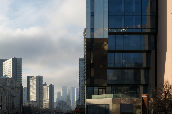 Mikhail Mulach" title="The Cosmos Hotel on New Arbat Copyright: Photograph © Mikhail Mulach">


 Mikhail Mulach" title="The Cosmos Hotel on New Arbat Copyright: Photograph © Mikhail Mulach">
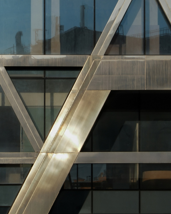 Mikhail Mulach" title="The Cosmos Hotel at New Arbat, 2 Copyright: Photograph © Mikhail Mulach">

 Mikhail Mulach" title="The Cosmos Hotel on New Arbat Copyright: Photograph © Mikhail Mulach">
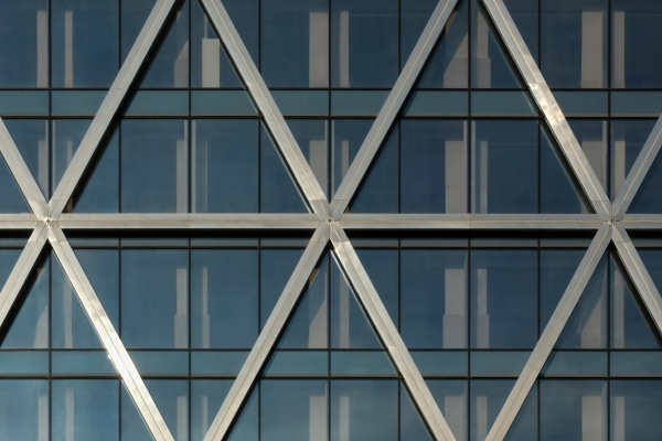 Mikhail Mulach" title="The Cosmos Hotel on New Arbat Copyright: Photograph © Mikhail Mulach">
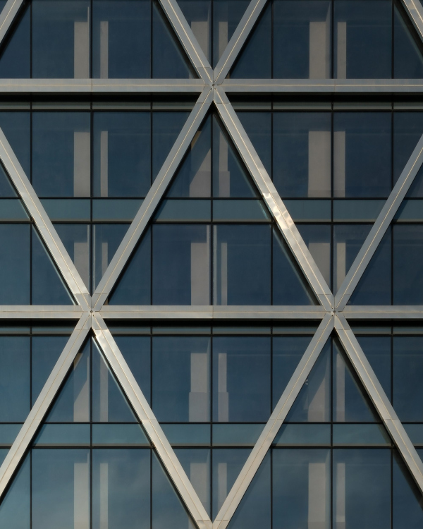 Mikhail Mulach" title="The Cosmos Hotel on New Arbat Copyright: Photograph © Mikhail Mulach">
 Mikhail Mulach" title="The Cosmos Hotel on New Arbat Copyright: Photograph © Mikhail Mulach">
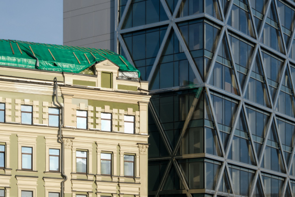 Mikhail Mulach" title="The Cosmos Hotel on New Arbat Copyright: Photograph © Mikhail Mulach">
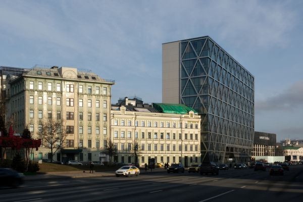 Mikhail Mulach" title="The Cosmos Hotel on New Arbat Copyright: Photograph © Mikhail Mulach">
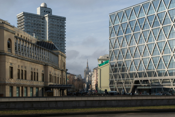 Mikhail Mulach" title="The Cosmos Hotel at New Arbat, 2 Copyright: Photograph © Mikhail Mulach">


 Михаил Мулач" title="The Cosmos Hotel on New Arbat Copyright: Photograph © Михаил Мулач">

 Mikhail Mulach" title="The Cosmos Hotel on New Arbat Copyright: Photograph © Mikhail Mulach">


