|
Published on Archi.ru (https://archi.ru) |
|
| 16.04.2024 | |
|
Part of the Ideal |
|
|
Julia Tarabarina |
|
| Architect: | |
| Vladimir Plotkin | |
| Studio: | |
| Creative Union ‘Reserve’ | |
|
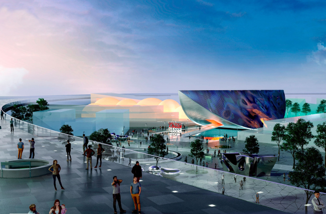
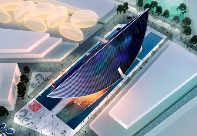
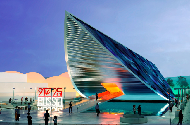
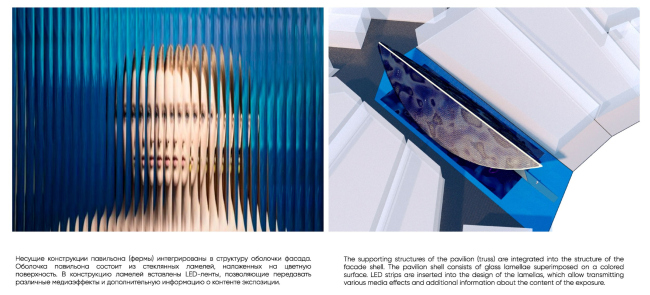
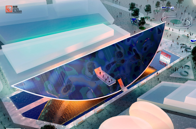
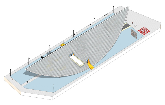
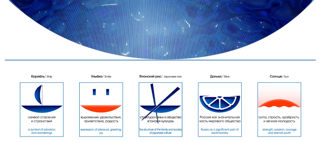
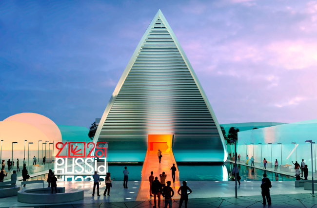
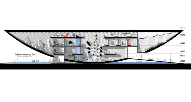
In 2025, another World Expo will take place in Osaka, Japan, in which Russia will not participate. However, a competition for the Russian pavilion was indeed held, with six projects participating. The results were never announced as Russia’s participation was canceled; the competition has no winners. Nevertheless, Expo pavilion projects are typically designed for a bold and interesting architectural statement, so we’ve gathered all the six projects and will be publishing articles about them in random order. The first one is the project by Vladimir Plotkin and Reserve Union, which is distinguished by the clarity of its stereometric shape, the boldness of its structure, and the multiplicity of possible interpretations. Vladimir Plotkin says that in the competition project designed by the Reserve Union for EXPO 2025, the main thing is not textual information but the emotional impulse of architectural form. Russia′s pavilion at EXPO 2025. View from the pedestrian promenadeCopyright: © Reserve UnionAt the heart of the pavilion lies a very simple stereometric shape. It could be perfectly appreciated when viewed from above, from Sou Fujimoto’s ring. Scientifically, this form is called an “off-centered spherical wedge” but in simpler terms it can best be described as an orange segment lying on the table. Only unlike an actual orange, the length of this “segment” is 91 meters. This is a lot – roughly equivalent to 18 cars lined up in a row. Russia′s pavilion at EXPO 2025. Birds-eye viewCopyright: © Reserve UnionVery large cantilevers are formed at both ends, soaring and curved. Importantly, these cantilevers are not flashy additions but an organic part of the shape: here, the entire volume essentially consists of cantilevers, relying on a relatively small “contact patch” in its middle. This solution, defying the laws of gravity, according to Vladimir Plotkin, is entirely feasible: the structure was planned to be composed of inverted steel trusses of segmental side facades, pulled together by horizontal beams at the ends, with the entire volume would be installed on a massive reinforced concrete slab. 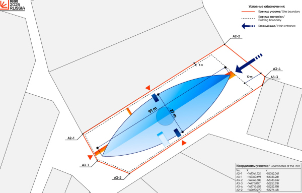 Russia′s pavilion at EXPO 2025. Location planCopyright: © Reserve Union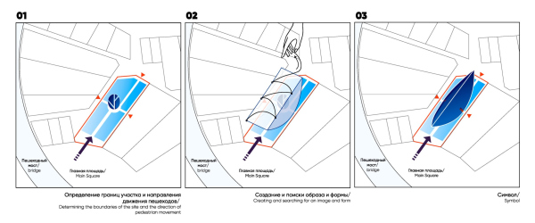 Russia′s pavilion at EXPO 2025. Form makingCopyright: © Reserve UnionAccording to the project, the area was planned to be covered with a shallow pool of water – just 15 cm deep. Therefore, to enter the pavilion through the main entrance, one would have to walk across a bridge, a sort of cosmic “gangway”, smoothly rising above the water. Speaking of the emotional impulse – here one could imagine oneself both under the “belly” of a spaceship, or perhaps underneath a giant sphere, which might start rolling at any moment. Quite a fascinating experience. Russia′s pavilion at EXPO 2025. View from the main entranceCopyright: © Reserve UnionFifteen centimeters of water is just above the ankle height, and here one remembers not only that the entire EXPO in Osaka 2025 is planned on an island but also Brazil’s pavilion in the hot Dubai 2020. I wonder if one could walk on water there too? In the competition brief, a media façade was proposed – apparently to demonstrate innovation. In the project, it exists and is implemented not in a trivial way but is rather “stitched” or “embedded” into the architectural solution, much like how the façade shell is integrated, according to the architects, with the load-bearing structure of the truss. The facades are composed of glass slats on a colored substrate with media backlighting mounted on it. The slats are vertical on the sides and horizontal at the ends. As a result, several effects should occur simultaneously. Firstly, a “moire” effect should arise for the viewer who is in motion, meaning that regardless of the activity of the media backlighting on the façade there would be a wave effect. Secondly, the media backlighting would enhance this effect and control it, but not directly, since any image is blurred due to the slats. And finally, it seems that dark blue water flows on the sides, so the form is not only clean but also “washed” – in a metaphorical sense, of course. Russia′s pavilion at EXPO 2025. The facade designCopyright: © Reserve UnionWhile the outer surface is cool, all the entrances, on the contrary, are friendly and sunny, as if inviting you to come in. The reflection in the pool of water gives the illusion of the existence of an underwater sun, which is also an archetypal and very ancient theme. Russia′s pavilion at EXPO 2025Copyright: © Reserve UnionA significant detail is the observation balcony protruding from the inclined façade at the level of the third floor, and with quite some outreach. Thanks to it, the form ceases to be just a “thing in itself”; it opens up and demonstrates its inhabitability. And you can step out to get some fresh air, which is important for any exhibition space – I remember how delighted I was when they opened the balcony at the Central House of Artists. Moreover, the balcony is in fact the architect’s signature technique: such “captain’s bridges” designed by Plotkin can be seen in his early projects, in the “Seasons of the Year” and in the recent project of the museum of Moscow’s Novodevichy Convent. Russia′s pavilion at EXPO 2025. AxonometryCopyright: © Reserve UnionBeing strictly stereometric in front and in profile, the form creates geometric “sign” figures: a triangle, reminiscent again of the “signature” Reserve Union pyramid, and a semicircle, or more precisely, a sector, because our spherical wedge is non-central, and the “orange segment” is essentially incomplete. The architects endowed the pavilion’s silhouette with a whole range of meanings. Here you can see the already mentioned “orange segment” – perhaps that’s why the entrances to the pavilion from the inside are orange? – and the infamous “sixth part of the land” (that being Russia) and a bowl of rice, and the rising sun – probably the one that is reflected upside down. And a smile. And a boat, “a symbol of salvation and wanderings”. Russia′s pavilion at EXPO 2025. The facade, associationsCopyright: © Reserve UnionFrom the boat, we come to the project’s name of “Ark”. It responds to the EXPO’s theme of “Designing future society for our lives”, that is, the main message of the pavilion is that, very much like an ark, it offers to take with you into the future or even save for the future all that is good. Like any ark, this is a complex theme that allows for different interpretations. However, at the same time, it must be acknowledged that sometimes you really want to jump into some ark and sail off into the sunset. Or sunrise, for that matter, since the exhibition is in the land of the rising sun. By the way, speaking about Japan! The image, especially from the end perspectives, turned out to have quite strong Japanese associations, from the simple shape itself – raising associations with the country’s flag with its round sun – to the combination of colors in the 3D visuals. Blue with a hint of Berlin azure, turquoise, and orange-golden; it’s hard to say how it would have been in reality, whether this “candy-like” taste of the picture would have been preserved if the project had been implemented, but in the images, the pavilion quite noticeably also resonates with modern Japanese culture. This is also very interesting – interesting that the pavilion is not “Russified” through recognizable and familiar identity elements. On the contrary, the pavilion looks quite global, or, should I say, “above-global”? I can imagine that if the project had been realized, some people might have exclaimed: what? Is this Russia? It’s a very quality approach to “estranging” the theme – quite the right thing to do when you are supposed to talk, as proposed at EXPO in Osaka 2025, about the future. Russia′s pavilion at EXPO 2025. View from the main entranceCopyright: © Reserve UnionThe interior of the pavilion matches its outer shape – meaning it consists of amphitheaters rising in two directions along the curved slopes. Steps, gentle stepped ramps, seats, and exhibition showcases are integrated into the rises of the curves. 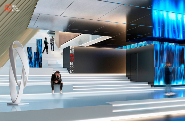 Russia′s pavilion at EXPO 2025Copyright: © Reserve Union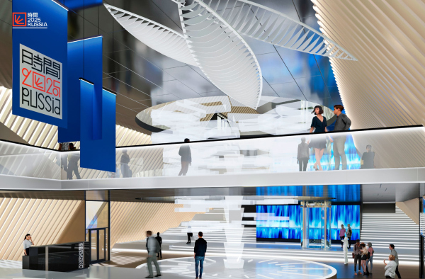 Russia′s pavilion at EXPO 2025Copyright: © Reserve UnionModern exhibition solutions know two polar approaches: one based on a “chain” path, and the other implying a more free choice of path by the visitor. The Reserve Union solution tends toward the latter option – in the cohesive space of the amphitheaters, objects are arranged, bridges and platform levels are crossed, and the balconies sometimes lead into two- and three-tiered halls. In the center, on the central axis of the pavilion, the Tree of Time is placed – a spatial installation reaching the full 17-meter height of the pavilion. You can’t move around it (sadly); but it pierces all the floors, creating a vertical circular atrium around it, visible from all levels. Russia′s pavilion at EXPO 2025. Section viewCopyright: © Reserve UnionIn the cantilever above the entrance, a conference hall is located, its enclosed amphitheater hanging above the visitors’ heads – also nicely situated on the curved surface. Behind the Tree, there is an elevator, also penetrating all the floors, allowing for easier and faster movement. A bit further away is the volume of the café with an entrance from the opposite side. It’s interesting that while the name of “Tree of Time” resonates with the competition brief, where Time is defined as the “Big Idea” of the pavilion, the rest of the project’s exposition is based on the sub-themes of the EXPO: “Saving lives” / “Empowering lives” / “Connecting lives”. 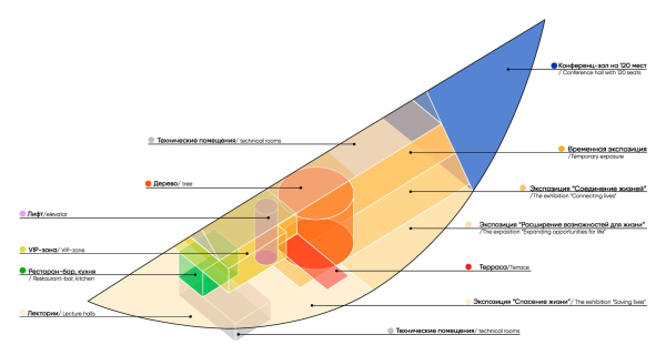 Russia′s pavilion at EXPO 2025. The functional zonesCopyright: © Reserve Union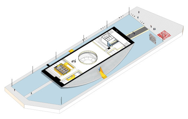 Russia′s pavilion at EXPO 2025. AxonometryCopyright: © Reserve Union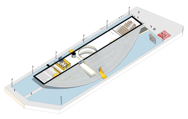 Russia′s pavilion at EXPO 2025. AxonometryCopyright: © Reserve Union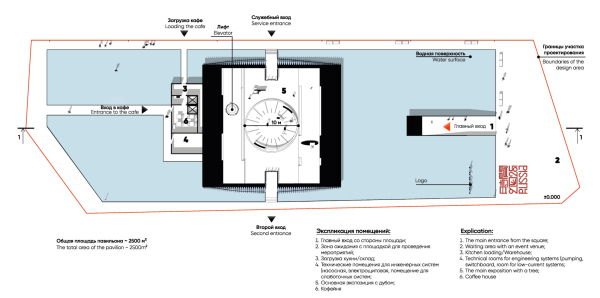 Russia′s pavilion at EXPO 2025. Plan at +1.400 elevationCopyright: © Reserve Union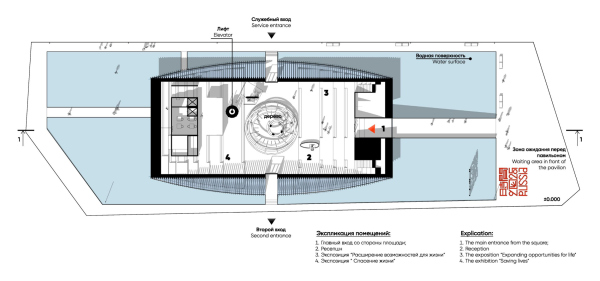 Russia′s pavilion at EXPO 2025. Plan at +4.400 elevationCopyright: © Reserve Union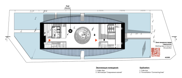 Russia′s pavilion at EXPO 2025. Plan at +6.000 elevationCopyright: © Reserve Union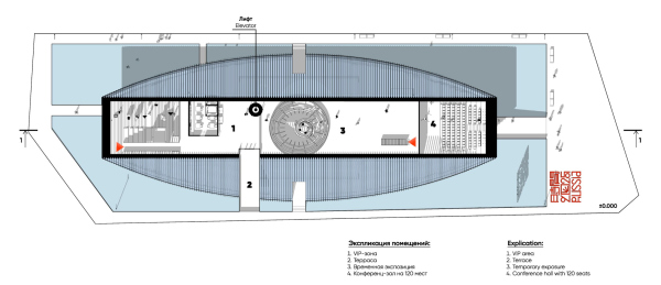 Russia′s pavilion at EXPO 2025. Plan at +10.200 elevationCopyright: © Reserve Union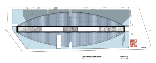 Russia′s pavilion at EXPO 2025. Plan at +14.200 elevationCopyright: © Reserve UnionBack to the “orange segment” volume, though! It looks very much like a boat because of the water in the pool, the entrance gangway, or the captain’s bridge at the top – but such a boat that would be drawn in cartoons of the seventies, that is, reduced to a very simple, archetypal design. It must be said that a simple stereometric shape is a challenge that not everyone will take on – even for an exhibition. It is impressive, but it is important not to overgeneralize. For example, the pavilion of Saudi Arabia, which was chosen as the best at the 2020 exhibition in Dubai, was a parallelepiped, angled into the ground, with a mirrored inclined surface above the entrance and bright, to the point of dazzling, aggressively colorful media screens around the perimeter, and it was really on the heavy side. This pavilion is not lightweight either; it also operates with the category of mass and is designed to produce a wow effect, with a hint of gravity defiance. However, the organization is more precise here, the silhouette is more interesting, and the media screens are not so bright. Moreover, the idea resonates with both the circle on the Japanese flag and the layout of the entire exhibition, which Sou Fujimoto enclosed in a ring – as if this circle was “taken in volume” and then cut by two planes to form that very spherical wedge we talked about earlier. And it also brings to mind how at the “Quality Standard” exhibition in 2017 Vladimir Plotkin brought a marble sphere, explaining that the sphere was the perfect shape. Well, here a part was sliced away from the sphere – probably to make sure that it wouldn’t be completely perfect; or, at any rate, not overly simple. |
|
