|
Published on Archi.ru (https://archi.ru) |
|
| 28.10.2022 | |
|
The Comb of Strelna |
|
|
Julia Tarabarina |
|
| Architect: | |
| Rais Baishev | |
| Studio: | |
| Ostozhenka Bureau | |
|
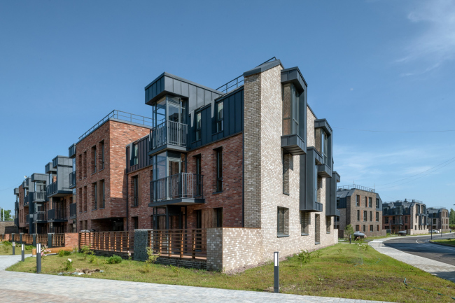
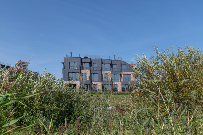
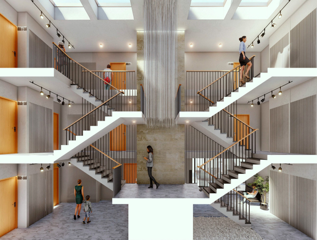
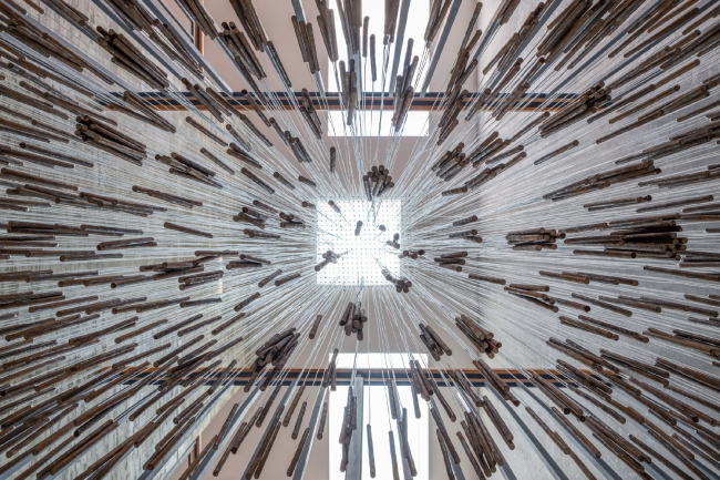
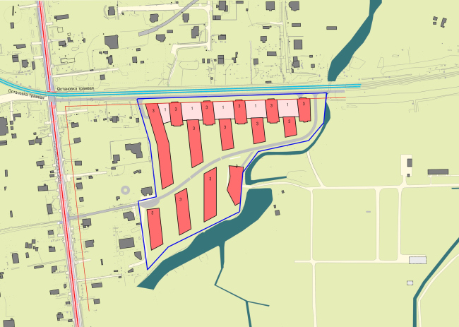
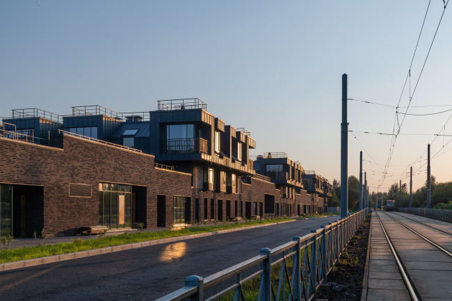
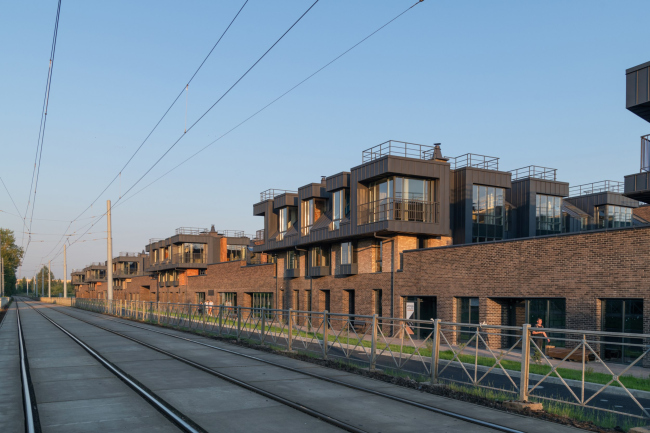
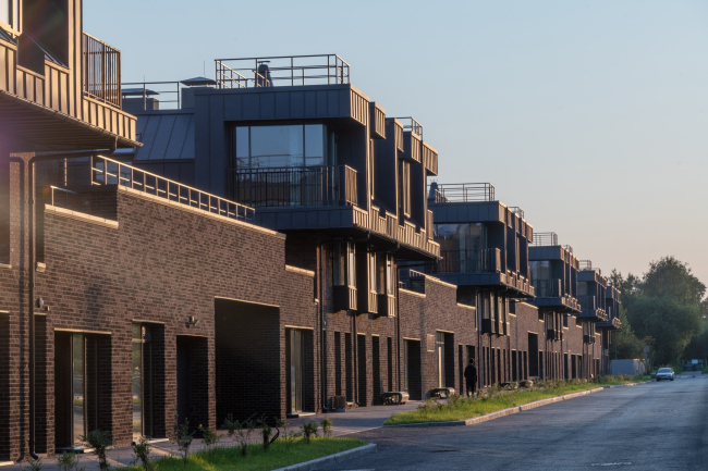
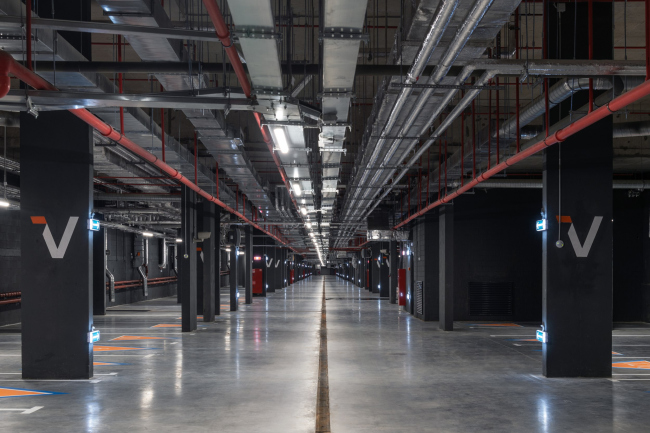
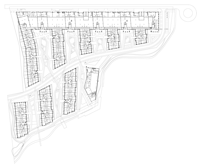
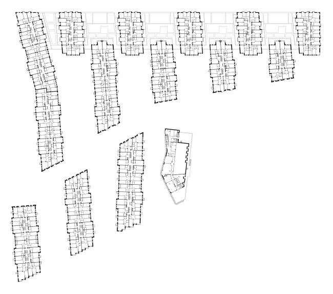
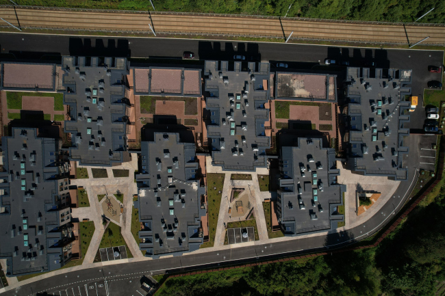
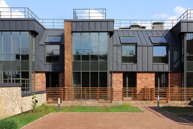
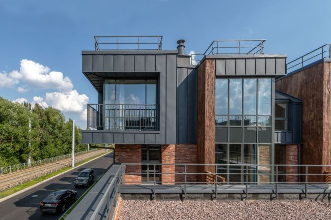
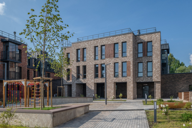
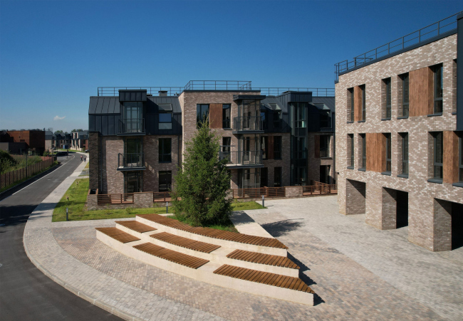
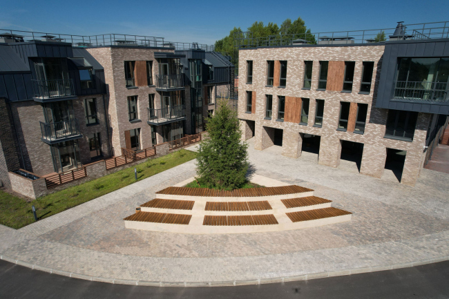
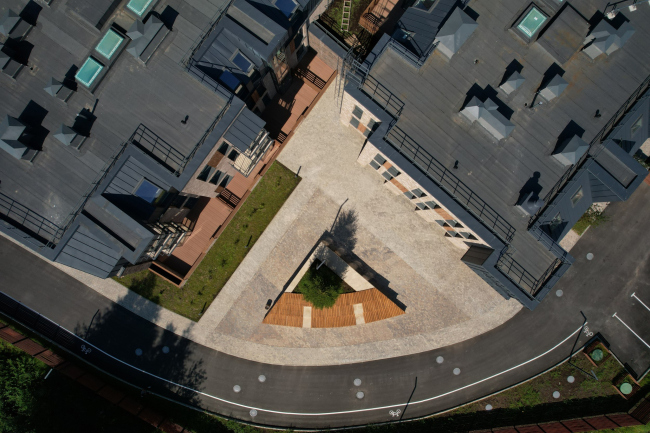
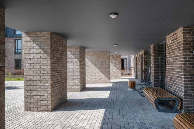
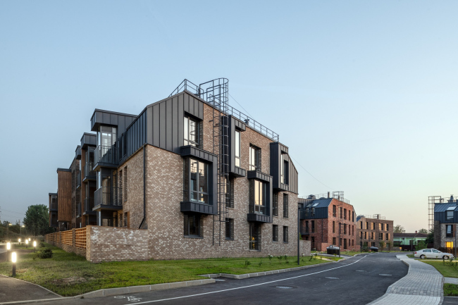
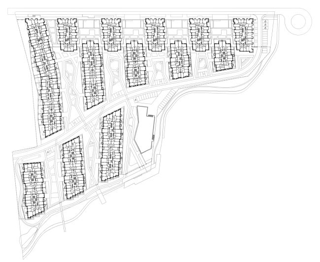
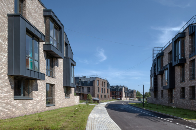
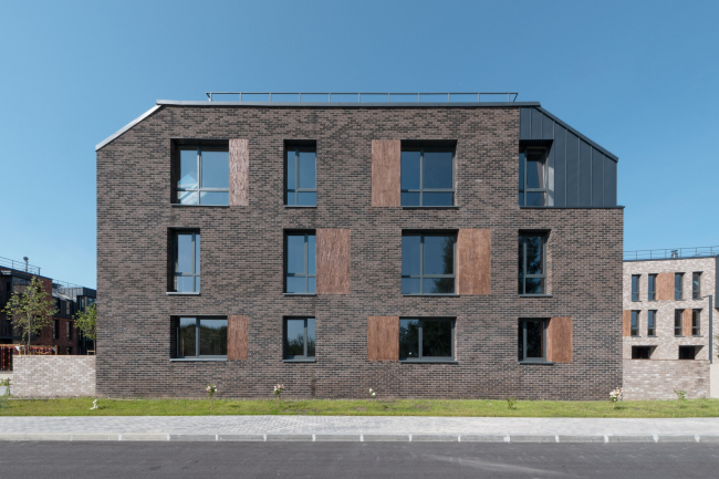
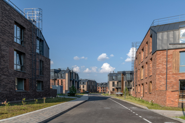
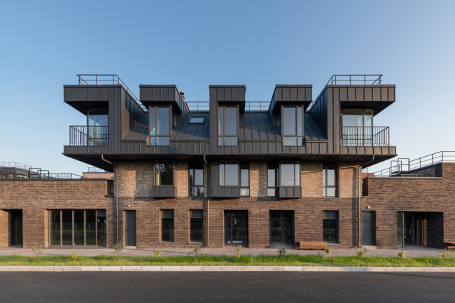
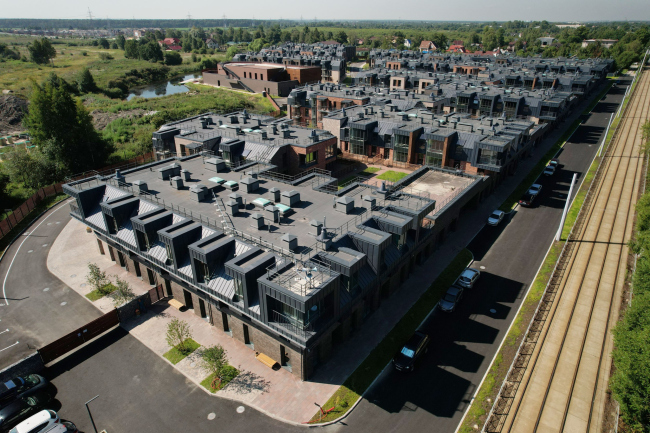
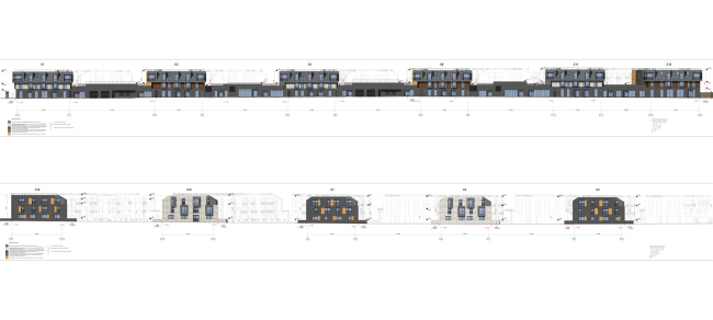
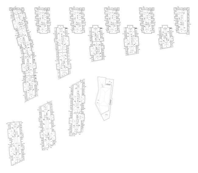
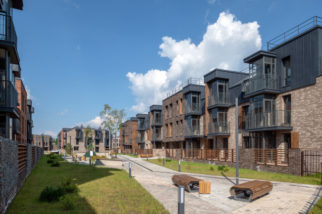
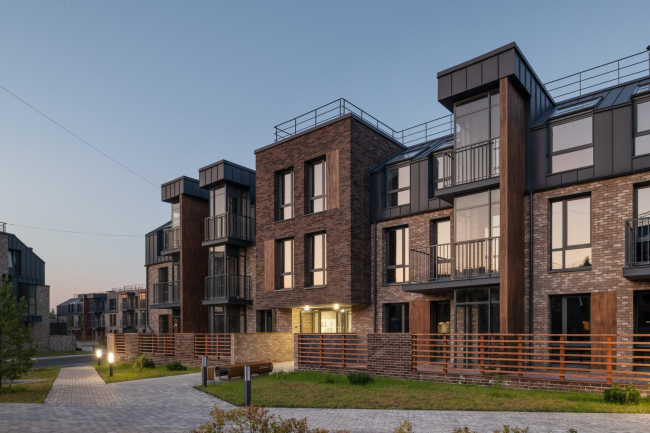
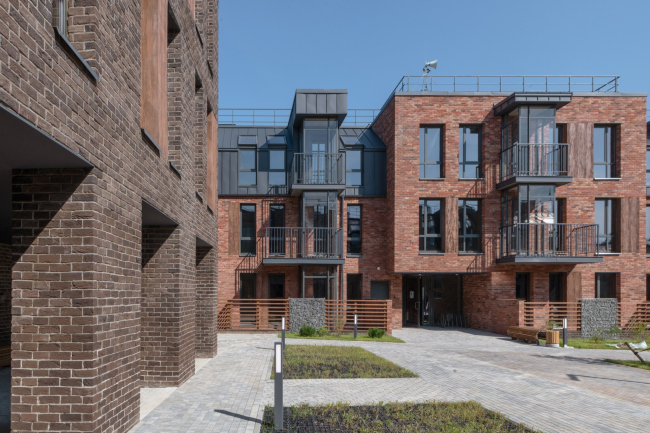
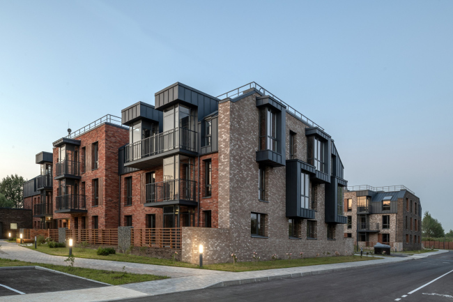
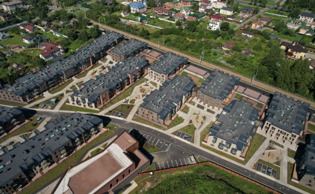
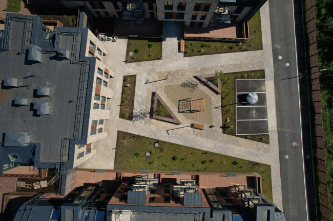
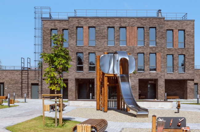
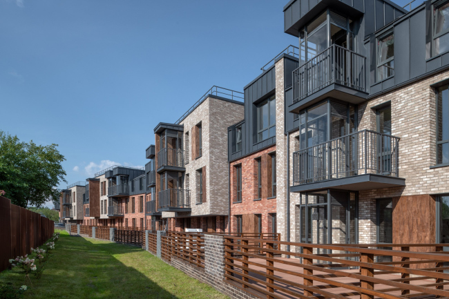
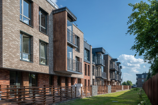
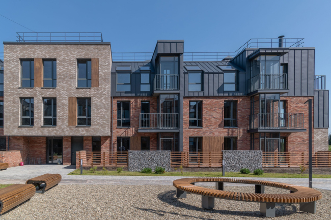
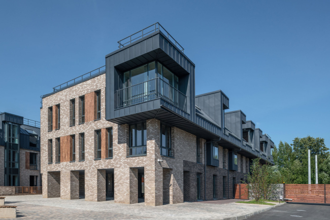
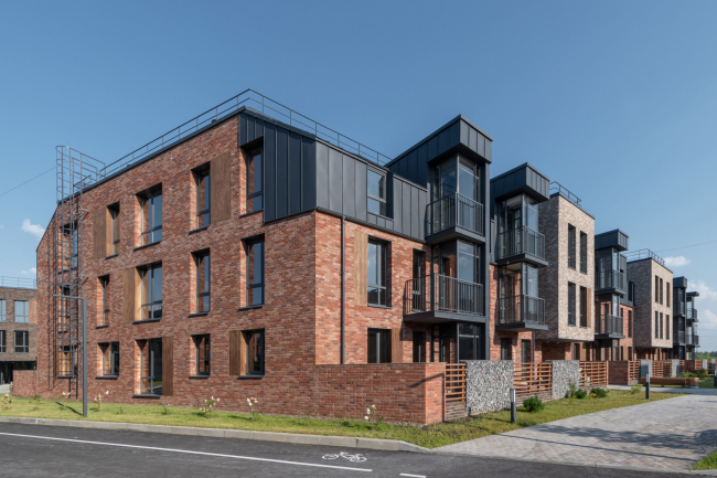
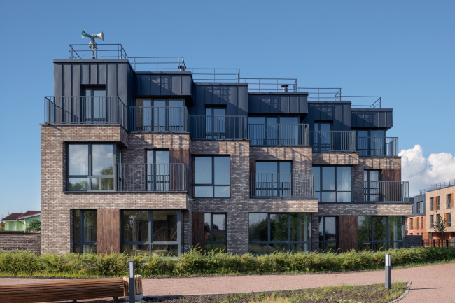
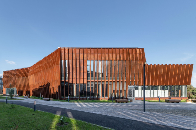
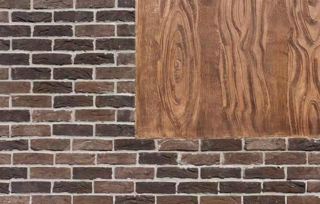
In this issue, we are taking a close look at the project that won the “Crystal Daedalus” award – the “Veren Village” housing complex in Strelna, designed by Ostozhenka. Its low-rise format became a trigger for typological and morphological experiments – seemingly, we are seeing recognizable trends, yet at the same time there are a multitude of subtleties that are a pleasure to go into. Having studied this project in detail, we think that the award is well-deserved. The judging panel of the Zodchestvo festival awarded the housing complex Veren Village, designed and built by Ostozhenka in Strelna, the highest possible award – the Crystal Daedalus. As we already said, one of the interesting facts is that three years ago the project was already honored by another high prize – the Tatlin award. Generally speaking, every year lots of awards are given at the festival, but there are only two main prizes: one for an implemented building and one for a project. The Veren Village won both. For all we know, this is the first case of such full recognition. We decided to take advantage of the news break to examine the project in detail. Veren Village housing complexCopyright: Photograph © Aleksey naroditsky / provided by OstozhenkaView of the opposite bank of the creek. Veren Village housing complexCopyright: Photograph © Aleksey Naroditsky / provided by OstozhenkaThe first thing about the complex is that it is a low-rise one. The reason for that is a 10-meter height restriction that has to do with the neighboring federal heritage site, the Konstantinovsky Palace. Literally across the road, you can already build up to 15 meters, but here it is only 10, which yields no more than three stories. Veren Village housing complexCopyright: Photograph © Aleksey naroditsky / provided by OstozhenkaHowever, “low rise” in this case is just a starting characteristic. One must admit that we have a stereotype of low-rise housing as something unassuming and inexpensive, whose main advantages are low construction density, low height… that’s about it. Here it is not the case, and we will explain to you why.  Rais Baishev, Ostozhenka Bureau We were lucky to get into a zone where human regulations apply. Restrictions are a very positive thing, thanks to them there is an “architecture below the trees.” I must say that you don’t get a chance to work with low-rise buildings very often. For us, this has been the first implemented low-rise complex in years. Therefore, the task seemed particularly interesting. On the one hand, we took it as an opportunity to reflect on a comfortable urban environment for a person – so much has been said about it lately. On the other hand, the format allowed us to apply some unconventional solutions. It’s not that this project is mega-experimental and totally groundbreaking. The set of modern solutions here is as predictable as recognizable: hand-molded brick of different tones and black folded metal, terraces and fireplaces, shops and cafes, an open-air amphitheater, a fitness center with a swimming pool, landscaped yards and river banks; the yards, of course, are vehicle-free. All these are habitual components of a “correct” modern housing complex, packed with things attractive for the future residents. What matters here are seemingly insignificant tiny details. These are pretty numerous, and we don’t even know where to start. Let’s start from the inside. The architects focused on the structure of communication units in each of the sections. First, this has to do with the fact that there are only three floors, and it was possible to light the staircases by day through skylights. Second, the client wanted each landing to have no more than five apartments, and the architects responded to this challenge by a very unconventional staircase design: on either side of the elevator vertical. The elevators also open on both sides, which means that the residents will meet a limited circle of neighbors. This solution is rare, not to say unique by the standards of these latitudes; it can be traced to the avant-garde urge to optimize as much as possible the organization of inner spaces. Veren Village housing complex. Project, 2017Copyright: © OstozhenkaThe skylights produce a very fresh impression: walking upstairs, we literally ascend to light. In the biggest halls, the left and right staircases are separated by a “rain” of suspensions that zones the space and partially serves as an art object. Veren Village housing complexCopyright: Photograph © Aleksey Naroditsky / provided by OstozhenkaThe white slender staircases framed by black metal grilles sometimes diverge to the sides and sometimes form a baroque “sweep” running forward and up to the third floor. The space takes on an intriguing multilayered quality, and the staircase, from a purely utilitarian element, grows to a means of organizing the impression and emotion components. Its stripped casing rhymes with the texture of the walls; my personal favorite, however, were the white marbles before the first staircase – you instantly feel like letting your kids have fun in them. Summing this part up, you can say that this technique is indeed groundbreaking because the staircases are no longer placed next to glass walls, but are moved deeper into the building, which saves up a lot of natural light for the apartments. 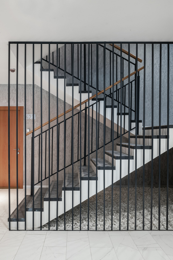 The entrance group. Veren Village housing complexCopyright: Photograph © Aleksey naroditsky / provided by Ostozhenka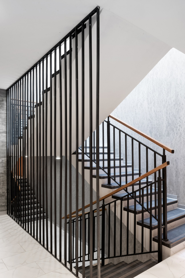 The entrance group. Veren Village housing complexCopyright: Photograph © Aleksey Naroditsky / provided by Ostozhenka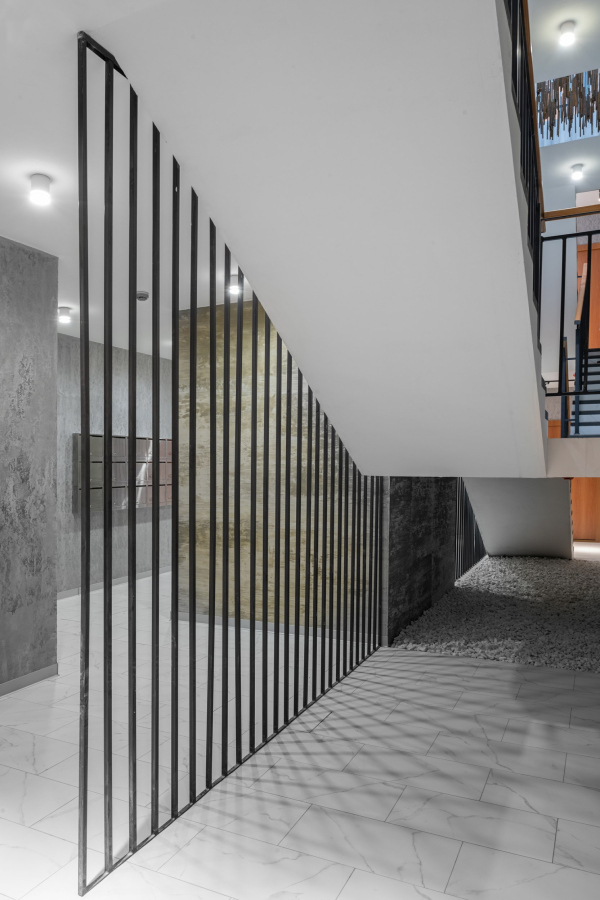 The entrance group. Veren Village housing complexCopyright: Photograph © Aleksey naroditsky / provided by Ostozhenka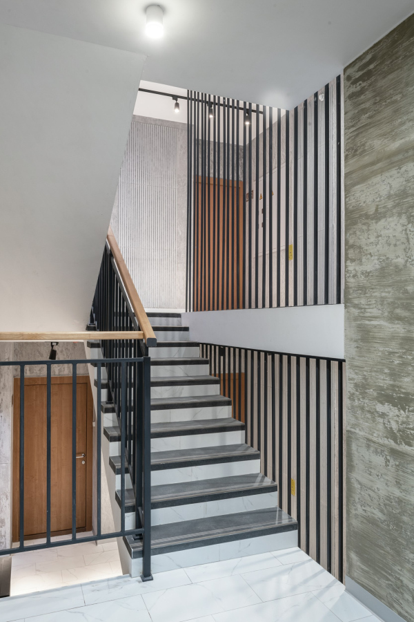 The entrance group. Veren Village housing complexCopyright: Photograph © Aleksey Naroditsky / provided by Ostozhenka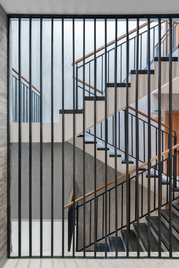 The entrance group. Veren Village housing complexCopyright: Photograph © Aleksey Naroditsky / provided by Ostozhenka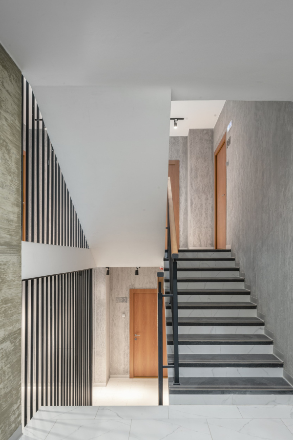 The entrance group. Veren Village housing complexCopyright: Photograph © Aleksey Naroditsky / provided by Ostozhenka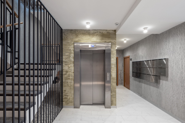 The entrance group. Veren Village housing complexCopyright: Photograph © Aleksey Naroditsky / provided by Ostozhenka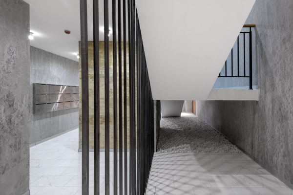 The entrance group. Veren Village housing complexCopyright: Photograph © Aleksey Naroditsky / provided by OstozhenkaJust as important is the structure of the complex in its entirety. The main idea is that it develops in a gradient fashion: from straight, closed-door, and predominantly “urban” building in the north – to the open “natural” contour in the south, where the territory borders on the flooded creek named Strelka. Rais Baishev defines this version of the composition as a “comb”. The difference from a real comb is that the rows of its “prongs” – the residential buildings that stretch meridian-wise from north to south – are shifted three times in a checkered pattern, which allows the architects to maintain the balance between the openness and closeness of the space. The houses form little parks of the yards, yet do not close then, leaving plenty of “airy” passages. Speaking of air – one must note it is really fresh here. Location plan. Veren Village housing complexCopyright: © OstozhenkaThe north longitudinal building is drawn by the ruler. On this side, one can see the tracks of an old, once “dacha”, tram, which you can ride down here from St. Petersburg. Parallel to the tracks, Veren Village formed a new street – of an urban type, with premises for cafes and shops: a tram, a street, and shop windows are a truly “urban” combination. Veren Village housing complexCopyright: Photograph © Aleksey Naroditsky / provided by OstozhenkaVeren Village housing complexCopyright: Photograph © Aleksey naroditsky / provided by OstozhenkaVeren Village housing complexCopyright: Photograph © Aleksey Naroditsky / provided by OstozhenkaThe retail is grouped at the outer border of the north building, which can generally be defined as the only one possessing a stylobate here: its “backbone” is composed of a single tier of the underground parking garage. The garage is sunk a few steps into the ground; it has a tall ceiling and an elegant black space, the slender flat supports almost do not oust it. Veren Village housing complexCopyright: Photograph © Aleksey Naroditsky / provided by OstozhenkaPlan at the 1st floor elevation. Veren Village housing complexCopyright: © OstozhenkaRhythmically, at regular intervals, the housing sections are inserted into the long “beam” of the stylobate. Between them, there are yards on the roof of the parking garage – patios of sorts, accessed by the apartments on the 2nd floor. From the outer street in the north, they are covered by a wall of the maintenance buildings of the stores and the car park; from the south side, the side ends of the next row of residential houses step up – but they do not obscure the whole of the patio outlines, just as the north sections do not obscure the whole of the side ends of the large “park” yards. Plan at the 2nd floor elevation. Veren Village housing complexCopyright: © OstozhenkaTop view of a part of the north building. Viewable are the yards on the roof of the car park and the wall of the maitenance premises. Veren Village housing complexCopyright: Photograph © Veren / provided by OstozhenkaThe patio on the roof of the car park. Veren Village housing complexCopyright: Photograph © Julia Tarabarina, archi.ruVeren Village housing complexCopyright: Photograph © Aleksey Naroditsky / provided by OstozhenkaThe inner contour of the stylobate has a row of storage boxes for the residents. The entrances to the north row of the houses are situated here as well – they all are interpreted as recessed balconies with colonnades, about five meters deep – and you can easily hide underneath them from rain, snow, and sun, and this is one more kind of space, semi-open, backlit at night. 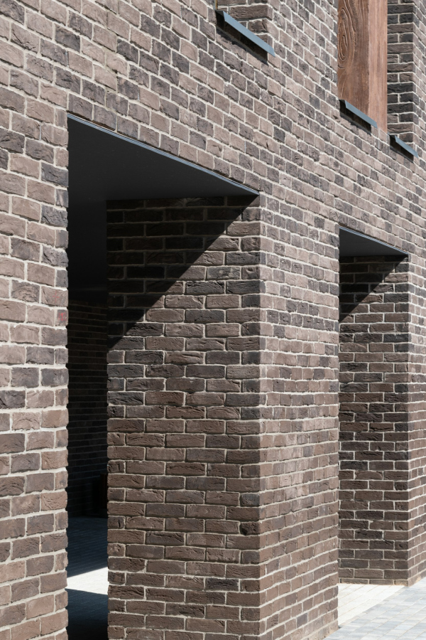 Veren Village housing complexCopyright: Photograph © Aleksey Naroditsky / provided by Ostozhenka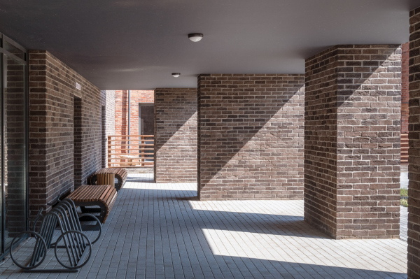 Veren Village housing complexCopyright: Photograph © Aleksey Naroditsky / provided by OstozhenkaWe will note that such galleries, which can be typologically traced to antique porticos and the yards of monasteries and palazzos, are a favorite technique with Ostozhenka in general and with Rais Baishev in particular, and it is always present, in this or that form, in many housing complexes designed by them, big and small. It is there in different forms, sometimes as an asymmetric inclusion, sometimes as a fragment before the entrance, sometimes on the outside, but more often on the inside, enriching the yard space. Veren Village housing complexCopyright: Photograph © Aleksey Naroditsky / provided by OstozhenkaIn this specific case, the solution is rather regular, “antique”, and it can be regarded as something in the middle between a house portico and a “torn” city gallery. The latter is felt particularly acutely where the colonnade of the eastern section forms a mini-plaza at the entrance with an amphitheater at the hypotenuse of a triangular lawn with a large fir tree in the middle that will come in handy on Christmas. There is something from the De Chirico metaphysics about this plaza. Veren Village housing complexCopyright: Photograph: provided by Veren GroupVeren Village housing complexCopyright: Photograph © Aleksey Naroditsky / provided by OstozhenkaThe entrance plaza with an amphitheater, top view. Veren Village housing complexCopyright: Photograph © Veren / provided by Ostozhenka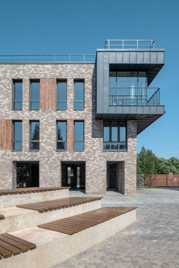 Veren Village housing complexCopyright: Photograph © Aleksey Naroditsky / provided by Ostozhenka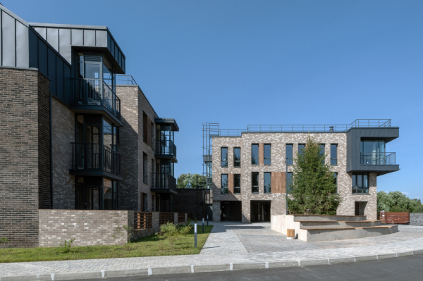 Veren Village housing complexCopyright: Photograph © Aleksey Naroditsky / provided by OstozhenkaVeren Village housing complexCopyright: Photograph © Aleksey Naroditsky / provided by OstozhenkaThus, the northern “stylobate” building really forms the “urban” narrative, yet in two different ways: on the outside facade it is done by the shop windows, and in the inner facades it is done by the pylons. What comes next is defined by Rais Baishev as “gradual dissolution”. For example, in the second row of houses, more elongated and multi-sectional, the entrances are marked not by colonnades but by ledges underneath cantilevered risalits. 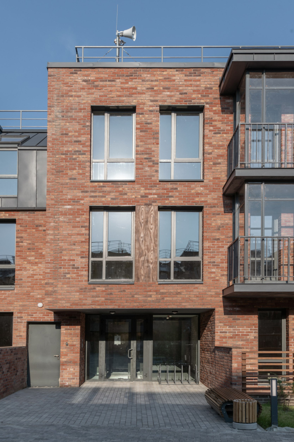 Veren Village housing complexCopyright: Photograph © Aleksey Naroditsky / provided by Ostozhenka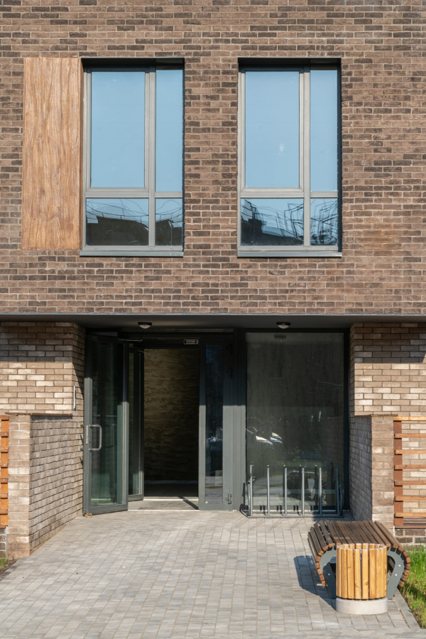 Veren Village housing complexCopyright: Photograph © Aleksey Naroditsky / provided by OstozhenkaThere is an inner street running across the strings of housing sections – its bend is drawn as “arithmetic average” between the straight line of the northern building and the contour of the creek bank: the street makes a slight turn, thus forming viewing angles very much like those that intrigue us in small European towns. Veren Village housing complexCopyright: Photograph © Aleksey Naroditsky / provided by OstozhenkaPlan at the elevation of the 3rd floor. Veren Village housing complexCopyright: © OstozhenkaAt the same time, the architects make an accent on the “slice” narrative: while the inner facades of the north sections look complete and even “grand” to a certain degree, at least thanks to the symmetry of the risalits, then the strings of sections standing along the street look as if they were sliced – the houses stand with their silhouettes turned to the observer, which look like firewalls (for example, on Moscow’s Borovitskaya Square you can see a house with a similar firewall with chamfered corners, currently, the firewall displays the portrait of Kutuzov). Veren Village housing complexCopyright: Photograph © Aleksey Naroditsky / provided by OstozhenkaVeren Village housing complexCopyright: Photograph © Aleksey Naroditsky / provided by OstozhenkaVeren Village housing complexCopyright: Photograph © Aleksey Naroditsky / provided by OstozhenkaThe south row of the houses stands with a “saw” of triangular prongs pointed towards the river, thus giving the side-end apartment blocks as many river views as possible. The terraces, of course, are also there. There is a public “trail” running along the river; the axis of each “boulevard” yard is continued in a wooden pier hovering above the water. 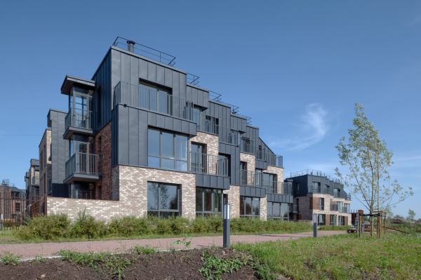 Veren Village housing complexCopyright: Photograph © Aleksey Naroditsky / provided by Ostozhenka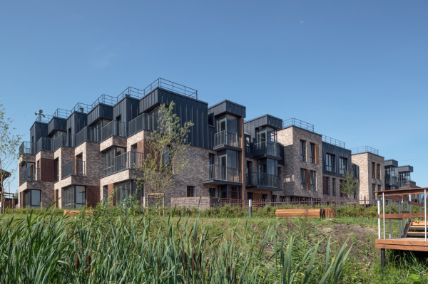 Veren Village housing complexCopyright: Photograph © Aleksey Naroditsky / provided by Ostozhenka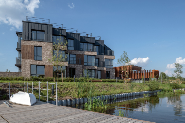 Veren Village housing complexCopyright: Photograph © Aleksey Naroditsky / provided by Ostozhenka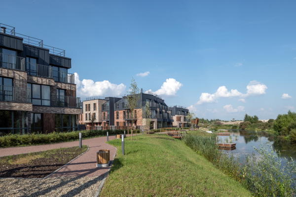 Veren Village housing complexCopyright: Photograph © Aleksey Naroditsky / provided by OstozhenkaThe architectural “fabric” of the residential houses gradually changes – it “dissolves” from a city street towards the pond banks, following the same logic as the town-planning one. The northern row of the houses is arranged in a stiff, to the point of brutal, row: the silhouette of the outer street resembles large battlements; the metallic mansards of the third floors, overhanging in large cantilevers, also have a “prong-like” quality about them. One can even think that they reflect the planning “comb” on a volumetric scale – the plastique here, on the north side, looks serious to the point of harshness. Veren Village housing complexCopyright: Photograph © Aleksey Naroditsky / provided by OstozhenkaIn this photo taken at the southern position of the sun, the three-dimensional prongs of the mansards cast a jagged shadow to the right, while the planning “comb” goes to the left. They seem to mirror each other. Veren Village housing complexCopyright: Photograph: provided by Veren GroupSweep drawings: at the top – along the outer northern facade, at the bottom – along the southern facade of the inner street. Veren Village housing complexCopyright: © OstozhenkaThe rows of sections that go deeper into the block, are characterized by a greater amount of asymmetry, complexity, and seemingly unpredictable alternation of ledges and depressions, three colors of brick, and glass recessed balconies framed with black metal. Another thing that is asymmetric is the metallic frames of the bay windows where they appear on the facade chamfers along the inner street. Thus, while the northern volume is all about symmetry and rhythmic repetition, all the other houses in the inner yard of the complex look as if they were “swinging” a little – they are less tense, and this is another plastique (and emotional) nuance. Plan of the roof. Veren Village housing complexCopyright: © OstozhenkaVeren Village housing complexCopyright: Photograph © Aleksey Naroditsky / provided by OstozhenkaVeren Village housing complexCopyright: Photograph © Aleksey Naroditsky / provided by OstozhenkaVeren Village housing complexCopyright: Photograph © Aleksey Naroditsky / provided by OstozhenkaVeren Village housing complexCopyright: Photograph © Aleksey Naroditsky / provided by OstozhenkaAll these picturesque subtleties that do not even meet the eye at first are carefully thought-out and calculated.  Elena Kopylova, the Chief Architect of Veren Village, Ostozhenka This is one of our favorite projects, and we worked on it carefully, in several stages: therefore, there are three lists in the author’s team. We asked a lot of questions, and we did a lot of meticulous drawing. The variety of impressions was one of our tasks. We carefully alternated the shades of brick – at first it was planned that the brick would be brighter – red, white and black – but then we settled on more restrained natural shades and man-made texture. For example, if one yard is closed with a light-beige house, then the other is red, terracotta, the next is dark, and so on. On the facades of the extended sections, the colors also alternate. A lot of attention has been paid to landscaping: we have different playgrounds in all yards – and different trees. Trees do not repeat themselves, so you can say “maple yard”, “pine yard”, “birch yard”, and so on. The trees here are indeed different, even though they are still to grow up to a full size. But then again, the landscape design is also carefully drawn and is aesthetically pleasing. The landscaping project, incidentally, is characterized by the absence of winding trails, while the trails that cross at a right angle are pretty numerous. Veren Village housing complexCopyright: Photograph: provided by Veren GroupVeren Village housing complexCopyright: Photograph © Aleksey Naroditsky / provided by OstozhenkaThe playgrounds are also different, which provides an opportunity to walk between the yards because the residents have full access. But the “Elephant” slide in the yard with chestnut trees is above all praise… Veren Village housing complexCopyright: Photograph © Aleksey Naroditsky / provided by OstozhenkaI want to share two more details. The first one is the balconies and terraces – something like transition spaces that complement the apartment as such. These are unexpectedly numerous, of all kinds. Nowadays, front gardens are popular for ground-floor apartments, but as a rule, if they are made, then only fragmentary, and not everywhere. In Veren Village, however, the front gardens have turned into terraces slightly raised above the courtyard level, that is, apartment residents will not need to cut their grass or plant flowers. But such terraces are virtually everywhere where you can get out of the first floor. Their wooden fences are interspersed with gabions, they frame courtyards, significantly affecting the perception of space. The apartments on the second floors, which overlook the patio on the roof of the stylobate, also have such private terraces. Next on the list: the glass verticals of the “Finnish balconies” are pushed a meter and a half forward; the stop against the grilles of the open balconies, large on the second floor and tiny on the third. Veren Village housing complexCopyright: Photograph © Aleksey Naroditsky / provided by OstozhenkaAny of the apartments provides access to this or that place, and at the same time the glass verticals – sometimes the reach down to the ground and sometimes don’t, sometimes they are marked by a sidewall, and sometimes aren’t – form, acting together with the “cantilever” risalits, active facades: their matter almost completely consists of ledges and depressions, as if it were constantly preparing “to make the next step”. 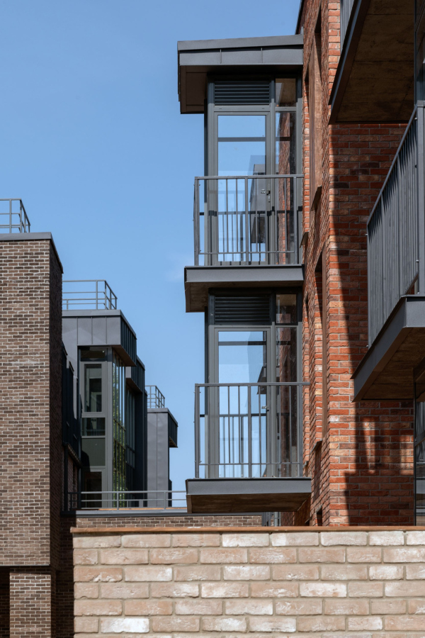 Veren Village housing complexCopyright: Photograph © Aleksey Naroditsky / provided by Ostozhenka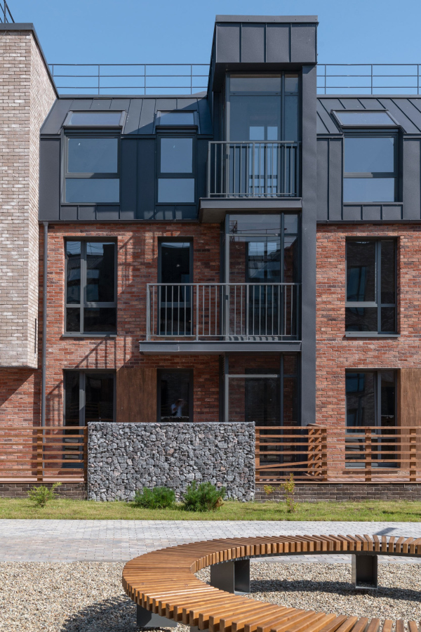 Veren Village housing complexCopyright: Photograph © Aleksey Naroditsky / provided by OstozhenkaVeren Village housing complexCopyright: Photograph © Aleksey Naroditsky / provided by OstozhenkaThe fact that a balcony is a dramatic means of plastique expression is something that the architects have long since understood. But it seems that this is the first time that they were used to their full potential. The mansards, however, are a different matter. They are known to be loved by developers, but not so much by architects, due to their resemblance to Haussmannien Biedermeier. Another commonly known fact is that for the last ten years it has been a common practice to decorate the bottom floors of low-rise houses with bricks, and the upper ones with folded metal, predominantly black, or, as the only variation, copper green. Those architects that are not afraid of the Biedermeier style, or even purposefully aim at its effect, make the mansard shape quite regular: at the bottom there is a steep, almost vertical slope, at the top there is a sloping gable roof, like in Paris. Others decorate the attic part vertically, like a wall, only it is made of metal. In this instance, the architects proposed a third option, based upon three prerequisites: 1. One of the conditions stipulated in the brief was gable roofs; 2. The third floors command better views. They also have fireplaces in them, and they are generally better, so it would make sense to make them larger; 3. Ostozhenka does not really like gable roofs. The combination of these circumstances yielded the following result. The third floors in some sections, particularly in the north, are designed as cantilevered structures. They are metallic black, with an austere outline, and look like curious fungi on the respectable bodies of the brick buildings. The “mansard” windows are also shifted forward: in the north building they are moved in the direction of the common cantilever, and in the other houses they are moved forward together with the ledges of the glass volumes; in all other places, their surface is on a level with the facades. In all of the cases, the level differences between the gable roofs abs the cantilevers of the “mansard windows” are very dramatic, they yield the same “volumetric comb”, and they are completely alien to the Haussmannien “cuteness”. It seems to me that a somewhat new, sculptural and brutal approach to the attic floors has been found here, and it is based not so much on historical prototypes, but on a more rigid imagery that is provided by the folded metal. Veren Village housing complexCopyright: Photograph © Aleksey Naroditsky / provided by OstozhenkaIn addition, the metal behaves differently, following the same idea of gradual dissolution: in the north, it overhangs in cantilevers; in the central part, it sometimes creeps on the facades in spots, and sometimes shows through in the form of bay windows; in the south near the creek it steps back in the form of balconies. Veren Village housing complexCopyright: Photograph © Aleksey Naroditsky / provided by OstozhenkaVeren Village housing complexCopyright: Photograph © Aleksey Naroditsky / provided by OstozhenkaVeren Village housing complexCopyright: Photograph © Aleksey Naroditsky / provided by OstozhenkaAnd, finally, the land site of a skewed shape, formed by the bend of the creek in combination with a chiefly orthogonal plan of the residential blocks, is occupied by a fitness center with a swimming pool, a gym, a stadium on the roof, and children’s sports clubs. It is expected that it will be opened not just for the local residents. Its building definitely takes on the role of a “unique landmark” – it is strikingly different from all the housing blocks. These are fractured by balconies and risalits; two thirds of them are clad in hand-molded bricks of natural tones – the volume of the fitness center is formed by broad planned standing at angles, and is subjugated to vertical lamellae. Rais Baishev once called it a “Stealth House”. Veren Village housing complexCopyright: Photograph © Aleksey Naroditsky / provided by OstozhenkaThe main thing here is the integral sculptural form. It is contrastive to the residential houses, it highlights them, accentuating the difference of the function and the content of the environment, both impression-wise and typologically. You at once feel that the space is not rural but highly urban, if such an object can be present in it. 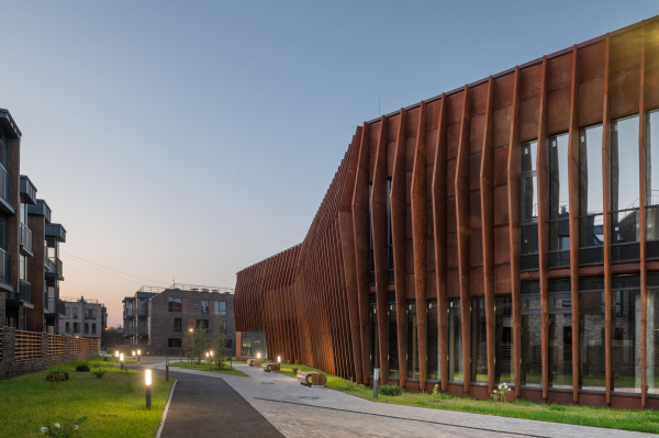 The fitness center. Veren Village housing complexCopyright: Photograph © Aleksey Naroditsky / provided by Ostozhenka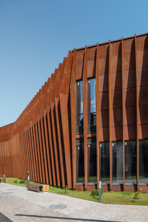 Veren Village housing complexCopyright: Photograph © Aleksey Naroditsky / provided by Ostozhenka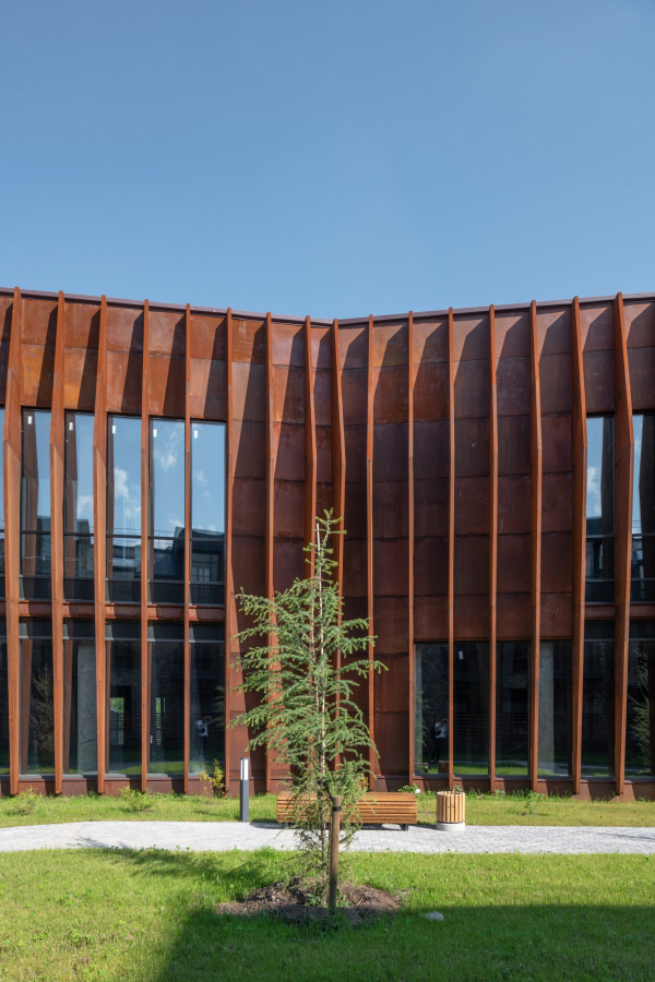 Veren Village housing complexCopyright: Photograph © Aleksey Naroditsky / provided by Ostozhenka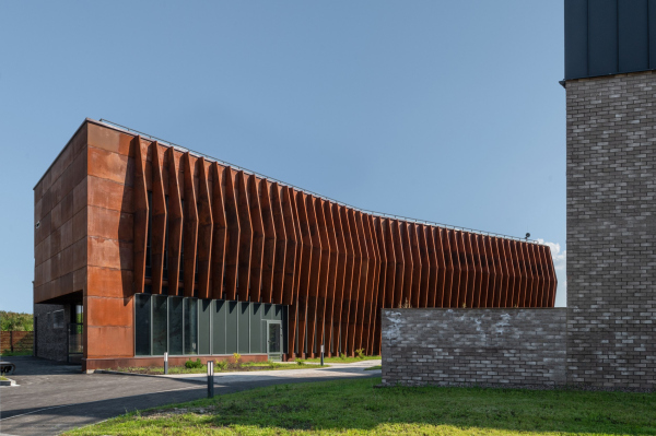 Veren Village housing complexCopyright: Photograph © Aleksey Naroditsky / provided by Ostozhenka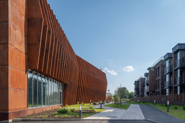 The fitness center. Veren Village housing complexCopyright: Photograph © Aleksey naroditsky / provided by Ostozhenka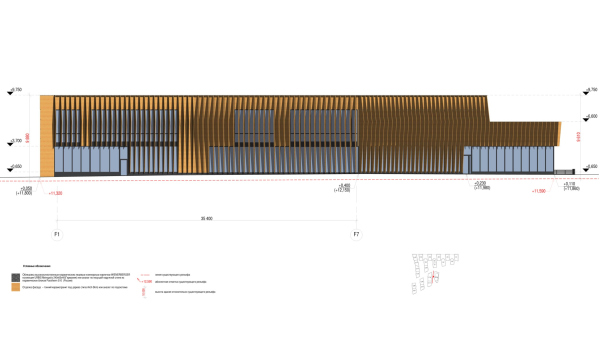 The facade of the fitness center. Veren Village housing complexCopyright: © Ostozhenka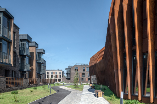 The fitness center. Veren Village housing complexCopyright: Photograph © Aleksey Naroditsky / provided by OstozhenkaThe Corten facades were a solution proposed not by the architects but by the developer. Initially, it was planned that the surface of the fitness center would imitate wood and echo both wooden little fences of the terraces and the facade inserts. Eventually, the fences remained but the Corten cladding was agreed. The wooden inserts of the facades, however – again, at the developer’s decision – were replaced by cement with a textured wood effect. The authors like this solution less than the originally planned composite panels – but in my opinion this solution is also OK, it even slightly resembles the reliefs of Soviet modernism. Veren Village housing complexCopyright: Photograph © Julia Tarabarina, Archi.ruMaking a recap, we will repeat: at first sight, Veren Village may seem like “another low-rise housing project”, executed in accordance with the rules of the modern urbanism – in a conveniently quiet place, with the right set of functions and creature comforts, such as terraces, fireplaces, two-floor apartments, a river, piers, shops and cafes, and even a tram route; everything is within a walking distance. Meanwhile, in this project one can see a model example for developing the environment “from urban to suburban” – unobtrusive, transitional, but not as loud and large as we can see in most of the modern housing complexes. One of the problems with the modern suburban development lies in its extreme contrast, when instead of a rural scenery you suddenly see high-density blocks consisting of 14, or even 22-story houses, like crates dropped in a field. This problem was discussed still in Soviet time, when the edges of cities were built with standard prefab houses – but it is still relevant today. Veren Village provides an example of the opposite approach because this is an attempt to think through, draw and implement an example of a “smooth” merger between the village and the city. This task has one very interesting consequence. The functional content, the landscaping, and other urbanist ideals have become so commonplace in recent times that you don’t even feel like mentioning them – we will just say that all of them have been implemented here. What is interesting is how this architectural task was solved in these, rather favorable, conditions. And it seems to me that, having set themselves the goal of creating a “gradient”, a kind of Gaussian transition between the urban and natural environment, the architects simultaneously formed a kind of fusion of the ideals of modernism and environmental historicism, relatively speaking, a garden city and a provincial Northern Italian town with its mix of Gothic and Renaissance. And what else can you expect from Ostozhenka, which began its career from researching the principles of parceling the historical city of the 19th century and gave us so many examples of pure modern form? 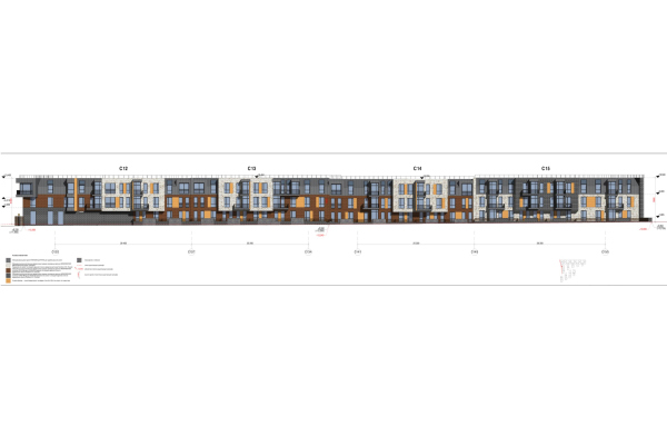 Facade. Veren Village housing complexCopyright: © Ostozhenka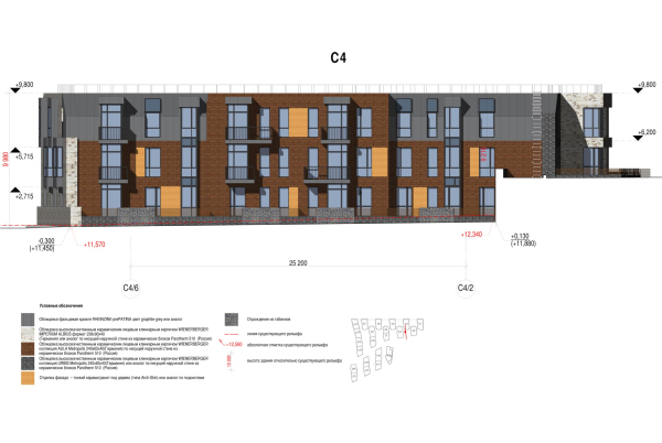 Facade. Veren Village housing complexCopyright: © Ostozhenka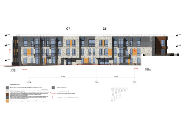 Facade. Veren Village housing complexCopyright: © Ostozhenka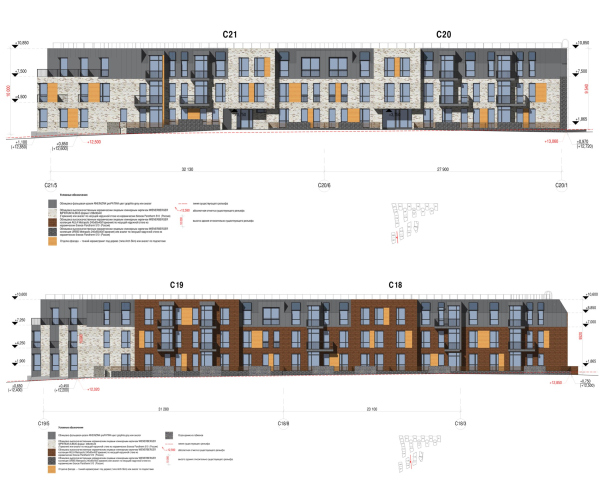 Facade. Veren Village housing complexCopyright: © Ostozhenka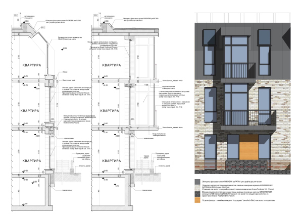 The facade nodes. Veren Village housing complexCopyright: © Ostozhenka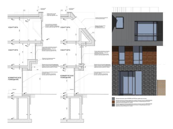 The facade nodes. Veren Village housing complexCopyright: © Ostozhenka |
|
