|
Published on Archi.ru (https://archi.ru) |
|||||||||||
| 12.09.2022 | |||||||||||
|
Aleksey Kurkov: “Navigation is all about a dialogue with space and manifestation of what it wants to say” |
|||||||||||
|
Alyona Kuznetsova |
|||||||||||
| Studio: | |||||||||||
| NRDN | |||||||||||
|
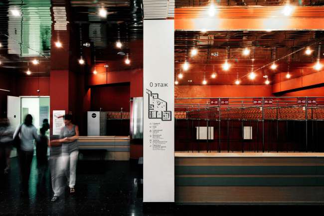
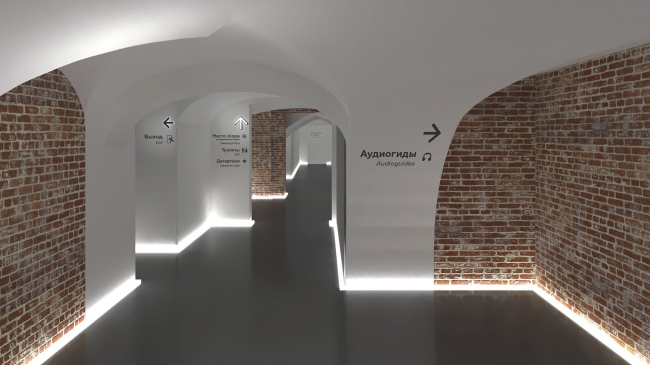
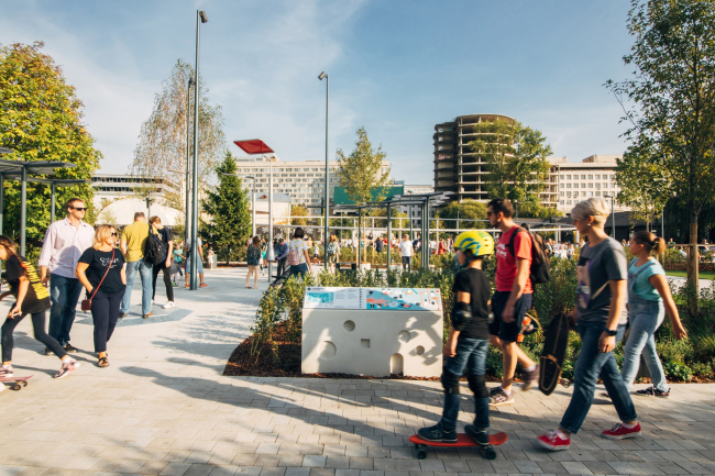
One of the specialties of Narodny Arkhitektor (“People’s Architect”) company is navigation systems in public spaces. Andrey Kurkov shared with us about why this seemingly minor branch is in fact a serious architectural task, solving which not only allows you to make the place clear and comfortable, but also to keep its memory and add extra value to it. Archi.ru:  Interior navigation in the Museum of ArchitectureCopyright: Photograph © Arseniy Rossikhin / provided by “narodny Arkhitektor” Interior navigation in the Museum of ArchitectureCopyright: Photograph © Arseniy Rossikhin / provided by “narodny Arkhitektor” Interior navigation in the Museum of ArchitectureCopyright: Photograph © Arseniy Rossikhin / provided by “narodny Arkhitektor” Interior navigation in the Museum of ArchitectureCopyright: Photograph © Arseniy Rossikhin / provided by “narodny Arkhitektor”How do you approach the task of designing a navigation system? Of course, you have to jam-pack the information and insert it in space but what other fundamentals are there? The navigation system always ends up being different – this is affected by the parameters of the venue, the historical context, and the streams of people. Every space wants to communicate some kind of message to its visitors, and each such message is unique. We try to hear this message, and find the right language to convey it. Sometimes, it’s very important to make sure you don’t add “visual trash”, and sometimes you really need to make bright visual accents and attract attention with an art object. Navigation does not necessarily come down to arrows and signs. For example, you can use music or light. In the Veretyevo Brodsky park, for example, you will hardly want to see plaques and signs because in their case navigation is in a pamphlet.  Navigation system in the Vorontsovsky Park, 2022Copyright: Photograph © Arseniy Rossikhin / provided by “narodny Arkhitektor”Second, you need to make sure that your information carriers are adequate – there should be enough of them, but no more than that. Your signs should not be invasive, and, besides, each module costs money.  The rules of conduct and navigation on the “Salute” section, Gorky Park, Moscow, 2018Copyright: Photograph © Arseniy Rossikhin / provided by “narodny Arkhitektor”Your navigation modules often contain extra informational content – is this your personal approach, is this what the customers want, or is this a trend? I would say that this is our approach that, for all intents and purposes, is likely to become a trend. Considering the unprecedented growth of map applications, an individual will rather lay a path in their smartphone than pay attention to the signs. This is why when there is a ready space, the kind that a person knows and knows the boundaries of, the navigation may take on a new function that you sometimes need to invent. When we work with developers, for example, we do navigation in the yard of apartment blocks. People stay here on a daily basis, and they soon start getting their bearings here, so we added to the navigation some information about the history of this place, and shared about the flora and fauna that exists here. The city is used by a huge number of people, and its navigation must be as simple as possible, with no double meanings. However, in a small park it is quite alright to do navigation that is close to art objects, yet at the same time you don’t litter the space with them, and allow the tourists to independently get as much information as possible. Hybrids and multifunctionals are all around now, and navigation is no exception.  Navigation system in the Vorontsovsky Park, 2022Copyright: Photograph © Arseniy Rossikhin / provided by “narodny Arkhitektor”One can easily see that your navigation projects are not connected by any single style… That’s because we try to never forget that navigation is not our statement. This is something that the park, the museum, or the district is trying to communicate. And it is important to find the right style for this communication. If we thought that, let’s say, the Vorontsovsky Park was to “speak” with neon signs – we would have gone in that direction. But in Vorontsov Park, information boards are made in the form of delicate frames, historical information is written in serif font, and infrastructure information is written in an ordinary, calm way – classics in a modern interpretation.  Navigation system in the Vorontsovsky Park, 2022Copyright: Photograph © Arseniy Rossikhin / provided by “narodny Arkhitektor”If we work with architects, we adapt to their architectural vocabulary. A landscaping project already has some rules and fundamentals in it, because the tiles, benches, and street lights have already been chosen, and when we do our navigation project we try to find matching materials, colors, and textures. If the architects opt for wood, we will probably opt for wood as well; if they have some polished materials, probably we will do a similar thing.  The rules of conduct and navigation on the “Salute” section, Gorky Park, Moscow, 2018Copyright: Photograph © Arseniy Rossikhin / provided by “narodny Arkhitektor”Don’t you worry that, working with navigation, you as an architect stoop down to tasks that are too small for you? What does this segment give you as an architect? I cannot agree that this is a “small” thing to do. For a public space, navigation is the finishing touch that tells you that this space has been completed, that it wants to speak to the visitors, and wants to open up its cards. This is as much of an architectural task as a design one. The exciting thing about it is that one team’s work is enriched by the work of others. The architect understands the streams of visitors and the accents, while the designer sees it through his own eyes.  Navigation system and interior concept in the Yusupov Palace on Moika, 2018Copyright: Photograph © Arseniy Rossikhin / provided by “narodny Arkhitektor”Can you say that working with navigation has become one of your specialties? Yes, we are planning to explore this direction, and work more with developers, who start to increasingly realize that navigation is just as much of a competitive advantage as landscaping or environmental projects. Courtyards, inner-city boulevards and parks are becoming more complex and diverse, and developers need to broadcast their approach. Navigation helps with this. We work with different types of spaces, we can combine navigation with the edutainment function, and we always try to enrich spaces that we work with. People trust us, we already have a reputation for practicing an approach that is far from “standard”. Each of our projects is individual and unique. ***
|
|||||||||||
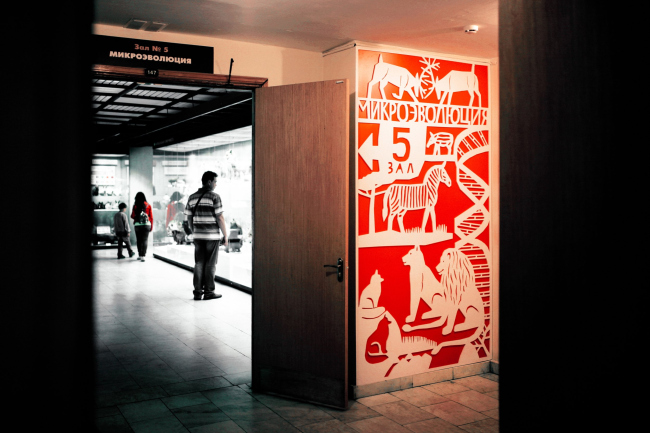
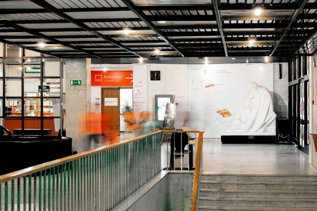
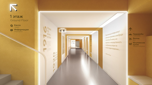
Navigation system in the Darwin Museum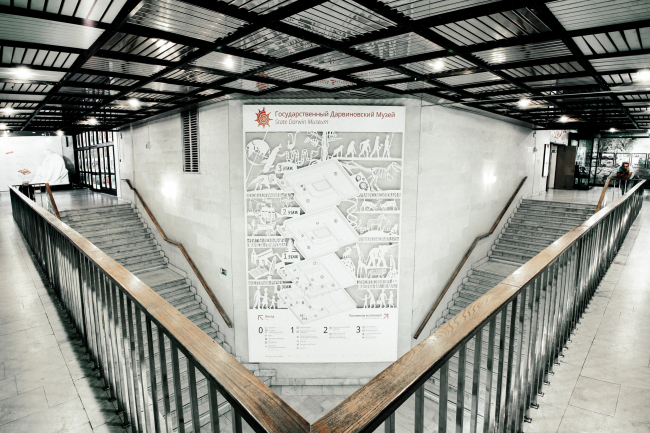
When we first came to the Darwin Museum, we realized that it was too much on the lively side. If the main building of the 1980’s was built expressly as a museum, then the tower attached to it in the 1990’s was intended for storage and administration, but as a result, something happens on each of its seven floors, and you can only enter the building through the basement. The museum has a complex structure, two cloakrooms and two ticket offices – we had to bring everything to a common denominator.
The main exposition occupies three floors and seven halls, each of which tells its own story – the origin of life, microevolution, and macroevolution. To identify these spaces, illustrator Rodion Kitaev came up with compositions made in different techniques – from stylization for children's drawings to the cut out technique and woodcuts. We made the navigation modules pretty austere because there are many bright exhibits in the museum as it is. The floor plans resemble an explosion diagram and clearly show how the halls are connected. We marked different buildings with color: orange was used for the main building, and blue was used for the annex. Where it is necessary to emphasize something, we allowed ourselves large bright objects, otherwise we kept it simple. 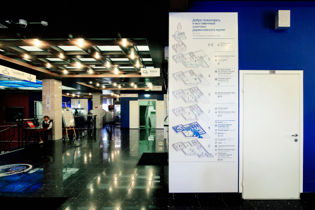

|
|||||||||||
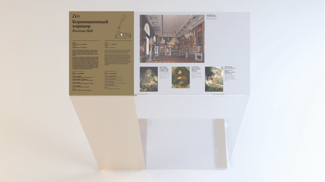
Navigation system and interior concept in the Yusupov Palace on Moika
The Yusupov Palace first set us the task of a new zoning of the basements, where the infrastructure is concentrated – a buffet, toilets, a shop, and only after that did we do the navigation throughout the museum, as well as in the garden.
Due to the fact that we couldn’t alter the historical plan of the basement floor, we came up with new designations of the premises, and new directions for movement. For the intuitive navigation in space, we proposed to accentuate two corridors – one, with the vaults, was to be cleared from stucco, and the other, with the windows, was to be painted yellow, with plaques about the history of the palace hanging on the walls. Not everything was implemented, but we did succeed in one main thing – moving the cloakroom and the cash desk, organizing a roundabout, adding an entrance from the Decembrists Street, and separate the streams of groups and individual visitors. For the floors with historical interiors, we chose a more reserved solution: golden pedestals and a “palace” style of the pictographs. Each hall is unique, and the navigation modules also turned out to be unique. In the garden, the navigation is minimally sufficient because the park is essentially a heritage site, and it does not have that many objects to point to. 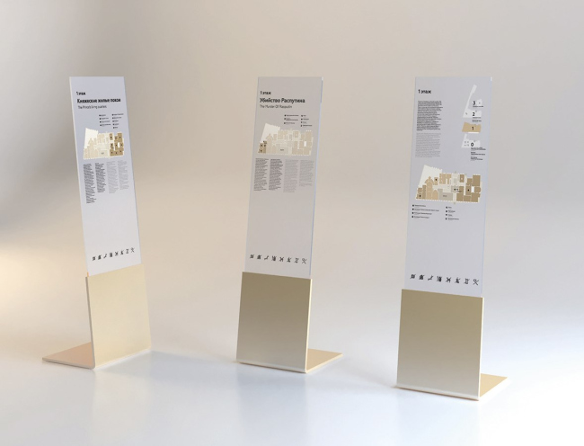
|
|||||||||||
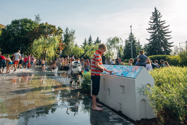
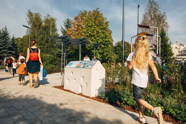
The rules of conduct and navigation on the “Salute” section, Gorky Park, Moscow
In Gorky Park, they commissioned us with navigation for a children’s playground. We proceeded from the concept by the AFA architects that kids are explorers – you don’t have to tell them what is waiting for them around the corner. This is why we focused on two elements – the map that allows you to cover everything at once, and on the rules of conduct that were developed in cooperation with psychologists.
To broadcast the rules, we came up with comics with characters who “live” in concrete houses – navigation modules with six working sides. Each house has its own size and design: the kids have lower houses, the older ones have higher ones. In total, there were eight houses and two cards. A plaque that tells you what you can and cannot do is some kind of inevitable thing for such places, and often it looks pretty invasive. But here, however, the way I see it, the little houses did fit in just fine. 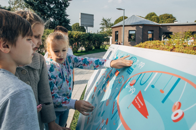
|
|||||||||||
The navigation system in the Vorontsovsky Park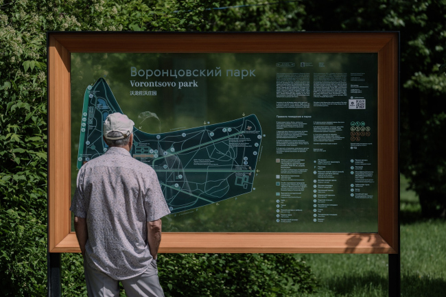
This manor park is an architectural ensemble, and we wanted to make navigation as non-invasive as possible, at the same time highlighting historical objects. We came up with two formats of navigational modules: for the existing and the lost historical objects we used frames, the kind you use for pictures, and for the infrastructure projects we used steles made from wood and metal.
Frames made of larch with matte “canvases” do not obscure the views, but at the same time they are packed with information – maps, diagrams, texts and visual reconstructions. They tell stories that maximize the experience of staying in the park – about the main manor house, which has not been preserved, about the oak grove, which is more than a hundred years old, about the dachas of the beginning of the XX century and the landing of the airship described in “War and Peace”. And, finally, the transparent overlay gives the effect of augmented reality. All the information is duplicated in Braille, there are relief maps the size of two human palms – it seems to us that the visually impaired can get the whole image of the place at once, after which it will be easier for them to navigate. 


|
|||||||||||