|
Published on Archi.ru (https://archi.ru) |
|
| 11.07.2022 | |
|
Triangle Function |
|
|
Tatiana Shovskaya |
|
| Architect: | |
| Yuliy Borisov | |
| Studio: | |
| UNK | |
|
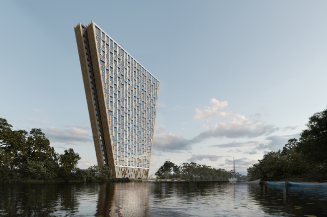
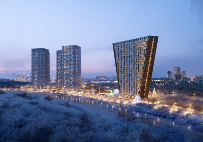
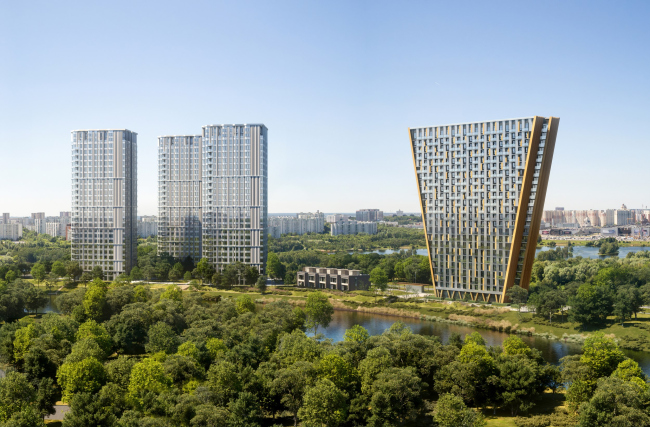
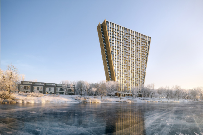
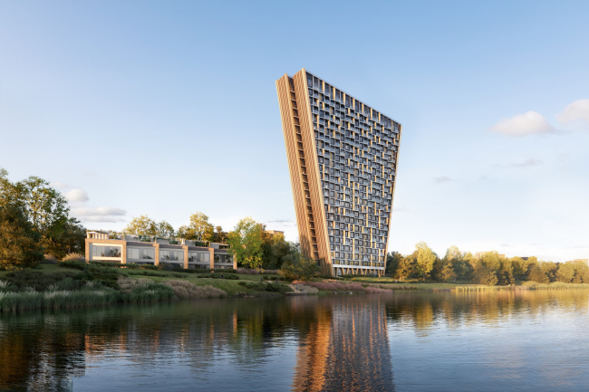
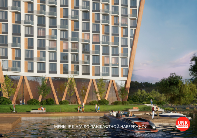
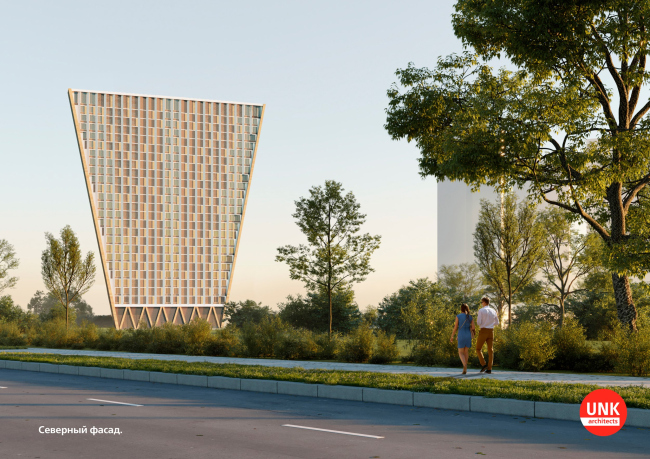
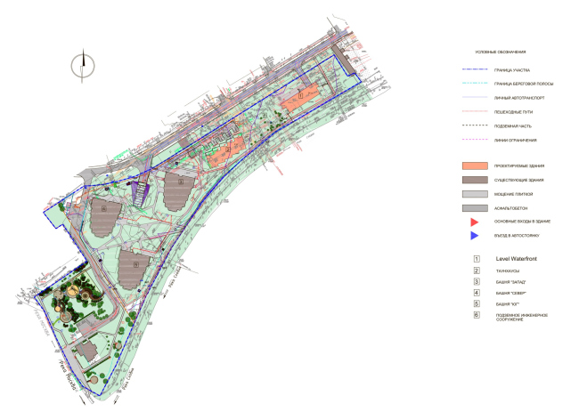
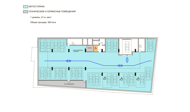
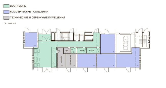
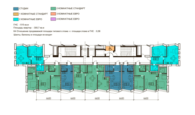
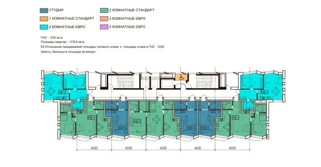
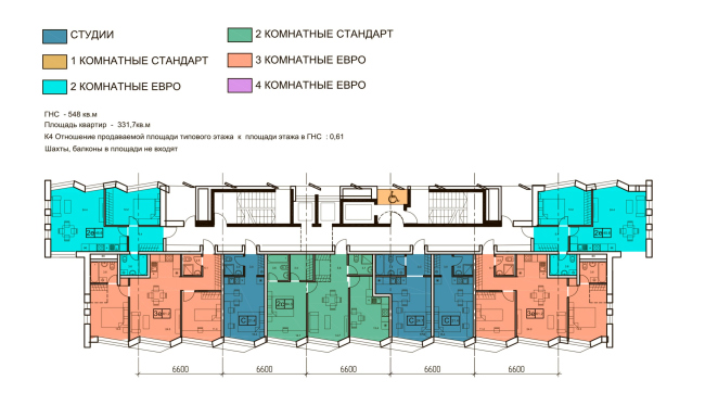
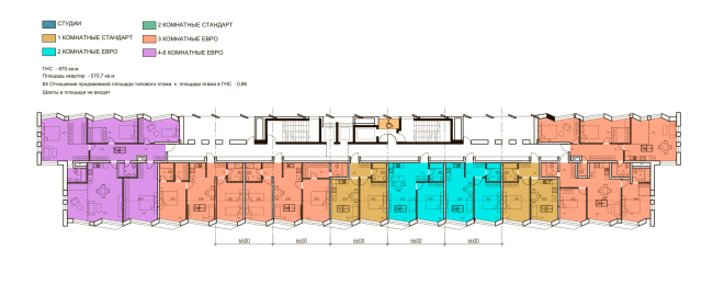
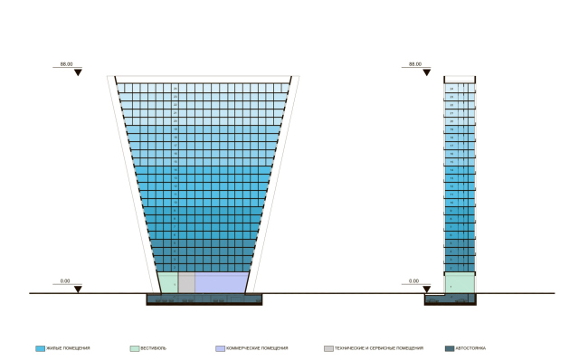
The eccentric shape of this thin slab that expands upwards is not a formal gesture but the UNK architects’ response to the site’s requirements and the technical and economic performance specifications. The solutions are modernist, cost-effective, and functional. The building is terraced, the side ends are accentuated with a “slab” shift, and the wide facades are composed of triangular bay windows. One of the main trends of Moscow’s housing construction of the recent five or seven years are panoramic river views from the windows, which give rest to the eyes of the residents of our quickly growing megalopolis. The apartment complex Level Streshnevo is situated not just near water but on a spit, in the estuary of the Skhodnya River. The Moskva River is known to be pretty wide in these parts, sometimes 250, and sometimes even 350 meters wide; opposite from this place are the Spassky Backwater, a peninsula, and a park; in a word, greenery and water are abundant here for getting as many sweeping views as you like. Level Streshnevo “Vostok”Copyright: © UNK / provided by the press service of Level GroupAll the parts of the complex – the architects share – are connected by color but otherwise the authors tried to create an environment that would be diverse, and, hence, would not be perceived as “purposefully designed”. Such an environment provides a large selection of housing scenarios; often, it is based on contrasts, due to which it looks dynamic and has, unlike mass housing construction, the advantage of a custom design approach. Level Streshnevo “Vostok”Copyright: © UNK / provided by the press service of Level GroupThe triangular slab has 24 floors in it. At the same time, despite the considerable overall size of the site, the construction blueprint is comparatively small. Naturally, the architects took into account the height restrictions as well. All these conditions resulted in an unconventional shape of a triangle expanding upwards: the area of each consecutive floor is larger than that of the preceding one, and not as cantilevers, as one might expect, but through a reverse tilt, which yields a more integral and laconic shape, and, on the other hand, is cost-effective construction-wise. The image of the house became lightweight and even bold to some extent. In addition, more room appeared around the construction blueprint for landscaping and greenery – the architects emphasize. The shape of an “inverted triangle”, chosen by the architects, required a number of customized solutions, and, as a consequence, a high strain on the intellectual power of all the stakeholders of the project: the architects, the designers, the engineers, and the utility line specialists. In addition to the predictable design challenges, for which they were prepared, the authors were faced with a whole lot of other subtleties: specifically, you could not have here the water riser running the entire height of the building, quite habitual for any high-rise; the underground utility lines got in the way of building a ramp for the underground parking garage, and so on. This is why the architects liken their work on this project to unraveling a multilevel charade. It is important to note that the project task, solved in a complex way, made it possible to make the construction much more cost-effective, and, hence, the apartments more affordable. Level Streshnevo “Vostok”Copyright: © UNK / provided by the press service of Level GroupThe building will occupy a site in the immediate vicinity of the shoreline, and the architects made sure that every apartment commands a river view. This goal became the key factor in forming the concept of the layout. The architects based themselves on the gallery building type, pretty rare for Moscow housing, but quite habitual for southern seaside towns. As a result, all of the housing premises command river views, while the elevators, staircases and landings are placed on the yard side. All the residents get apartments with sweeping views, the top floors commanding not just panoramas of the Skhodnya River but the entire landscape of the Stroginskaya Poima. Level Streshnevo “Vostok”Copyright: © UNK / provided by the press service of Level GroupThe gallery-type planning allowed the architects to make the depth of the building relatively small, and they also tried to make it look even smaller by designing the sidewalls in such a way that the building looks as if it were composed of two slabs slightly shifted in respect to one another. In fact, however, the width of the “front” slab is slightly smaller on both sides. The side facades imitate wooden finish, putting one in the mind of the eco theme. This combination of a thin volume and a wood effect produces a feeling of lightness, referring to the motifs of modern Japanese architecture with its ever-quaint shapes and with its love of laminate, which – consciously or unconsciously – the authors of Level Streshnevo imitate with “wooden” strips on the side ends of the slab, thus making the entire volume look as if was composed of plywood sheets. However, the main thing that makes this architecture akin to Japanese modernism is its being 100% based on function, and this is where the desired architectural freedom lies. Level Streshnevo “Vostok”Copyright: © UNK / provided by the press service of Level GroupYet another successful solution in the area of imagery is that the facade reflects the shimmering surface of the water. Its surface, facing the Skhodnya River, looks as though it were covered with ripples; it vibrates and glitters. This effect is achieved through a combination of several techniques. The shallow volumetric plastique is based on a pattern of angular asymmetric and slightly protruding bay windows that crown each cell (=room) of the building. Some of the bay windows are fitted with aerial summer balconies that form a casual pattern of their own, reminiscent of the casual specs of light upon the water. In addition, the tone of the finish is not uniform – it smoothly flows from a lighter shade to a darker one and back again. All of this, put together, makes the facade breathe, making it alive and agile. Level Streshnevo “Vostok”Copyright: © UNK / provided by the press service of Level GroupThe eye-catching image of the building appeared due to its very shape, and this, in turn, appeared as a response to the complex of existing tasks and requirements. The building brings up various associations: someone sees in it a reinterpretation of one of the remarkable projects of Soviet modernism – “houses on legs”; someone sees a vis–a-vis of the famous “Worker and Peasant” monument that stands near the VDNKh; someone sees its connection with wooden architecture, feeling an allusion to a plowshare in the ripples of the facade, but in any case the building evokes impressions and awakens emotions. It must be noted that the building’s large and memorable shape also takes on urban planning significance – thanks to this quality, it is able to speak out for a whole district, becoming another landmark in our giant city. Level Streshnevo “Vostok”Copyright: © UNK / provided by the press service of Level GroupLevel Streshnevo “Vostok”. The master planCopyright: © UNK / provided by the press service of Level GroupLevel Streshnevo “Vostok”. THe plan of the -1 floorCopyright: © UNKLevel Streshnevo “Vostok”. The plan of the 1 floorCopyright: © UNKLevel Streshnevo “Vostok”. The plan of the 2 floorCopyright: © UNK / provided by the press service of Level GroupLevel Streshnevo “Vostok”. The plan of the 3 floorCopyright: © UNKLevel Streshnevo “Vostok”. The plan of the 4 floorCopyright: © UNKLevel Streshnevo “Vostok”. The plan of the 24 floorCopyright: © UNKLevel Streshnevo “Vostok”. A section viewCopyright: © UNK |
|
