|
Published on Archi.ru (https://archi.ru) |
|
| 11.06.2021 | |
|
A Flyover in Watercolor |
|
|
Alyona Kuznetsova |
|
| Studio: | |
| Evgeniy Gerasimov & partners | |
|
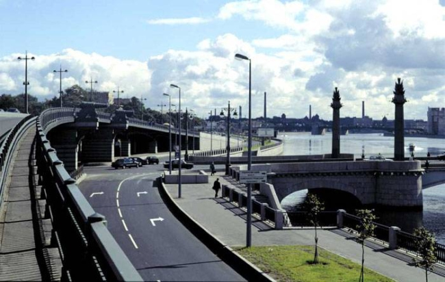
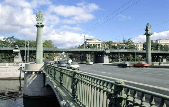
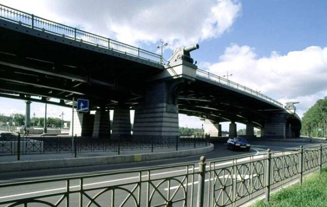
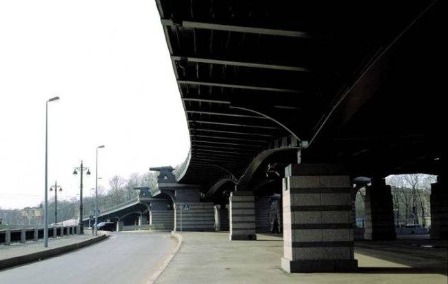
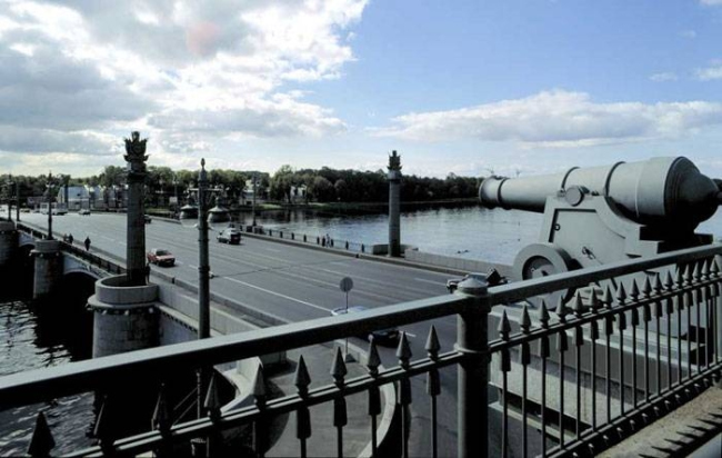
For the 100th anniversary of Vladimir Vasilkovsky, the architectural office of Evgeny Gerasimov is reflecting on the Ushakov Flyover, which was designed with input from this artist and architect. In this article, we are showing its watercolors and sketches, including the preliminary ones that were not included in the final project, as well as speaking about the importance of architectural drawing. The Ushakov Flyover has merged with the surrounding scenery so completely that it is hard to imagine that there was a time when it was not there. Just as hard is imagining the sheer scale of traffic jams that occurred on the Kamennoostrovsky and Primorsky avenues before this flyover was built – today, this is an important transportation hub with stoplight-free traffic, rare for this city, which makes it easier for the cars to leave from and get back to the Primorsky residential area during the week, and to get to gulf and the lakes of the Kurortny area on the weekend. NoneThe city had long (since the late 1980s, most likely) planned to build a flyover in this place, also considering the tunnel option. The location of the flyover is not just strategic but semantic as well: it serves as the dividing line between the historical part of the city and the area of new construction. This is where the granite-clad waterfronts end, and lush parks, tenements and mansions give way to prefabricated houses and massive modern residential complexes. The view of the neoclassical building of the Maritime Academy, and the garden and mansion of Elizaveta Saltykova that the Ushakov Bridge commands is the last “historical” one in this direction, and this is why it was important for the architects to avoid ruining it by blocking the perspective by an engineering structure. Incidentally, when the flyover of the Kolomyazhsky passage was built, the city was not too scrupulous about it – it is just a highway made of asphalt and concrete, just like all of its surroundings. NoneThe general designer of the flyover was Lengiproinzhproekt; the subcontractor was the Transport Institute, and it was the subcontractor that invited Evgeny Gerasimov to take part in the architectural part of the project. Evgeny Gerasimov, in turn, invited Vladimir Vasilkovsky, one of the authors of the Ushakov Bridge, an active architect, artist, and ceramist, who at that moment was already 78 years old. NoneNoneThe Ushakov Bridge was something that Vladimir Vasilkovsky designed half a century before he was invited to design the Ushakov Flyover: in the 1950s, the wooden bridge of the Bolshaya Nevka River (not to be confused with Neva) was replaced by a metallic one, with massive granite supports and a drawbridge span – the old drawbridge pavilion is currently occupied by the chapel of the Most Holy Mother of God icon at the Church of the Nativity of John the Baptist. The bridge, originally called “Stroganov”, was renamed into Ushakov, and decorated with columns with a magnificent completion of banners and bas-relief images of naval commanders; an ornament with a composition of an anchor, a star and a laurel was put on the cast-iron railings. None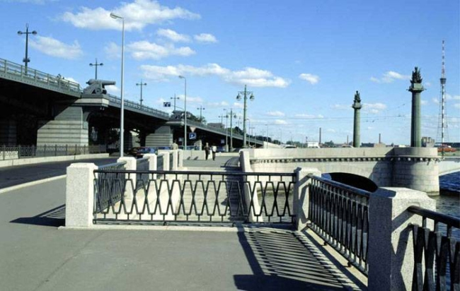 The Ushakovskaya road junction. Construction, 2000 © Evgeny Gerasimov and PartnersThe task of Yevgeny Gerasimov's studio was to give the utilitarian construction an aesthetic embodiment – to find a memorable and appropriate image, which, at the same time, would not draw too much attention. Due to the fact that the flyover was to become a part of the already complete architectural ensemble, the architects had no doubts that they would have to develop the naval theme, which is present both in toponymy and the decoration of the Ushakov bridge and the Ushakov academy. To make the construction lighter, the architects drew the trusses, referring to the landing stage of the Vitebsk railway station – they created a transparent and openwork look. As for the highlights, there were many options. The chief architect of the project, Viktor Khivrich, shows sketches on which he drew rotundas, similar to those that can be seen on the Staro-Kalinkin bridge or the Lomonosov bridge – ranging from quite classical to Art Nouveau or very modern in the spirit of steampunk of the 2000s. On another sheet, the spars and rigging, combined with the fence balusters and structural elements of the floors, turn the flyover into a kind of shipyard. Dozens of options for street lights, steering wheels, anchors, masts and heraldic elements clearly demonstrate the creative search that future architects will probably be exempt from because they are planning to cancel the creative exam. 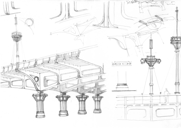 None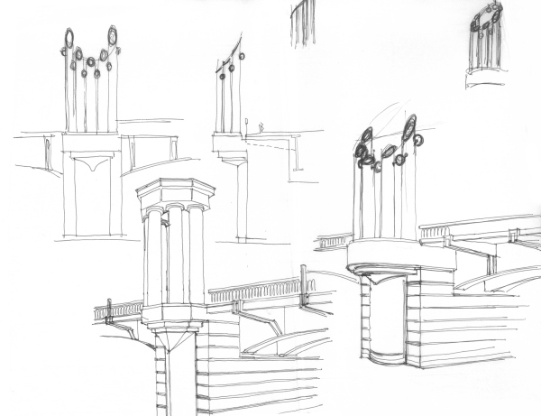 None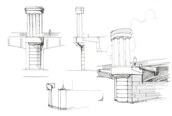 None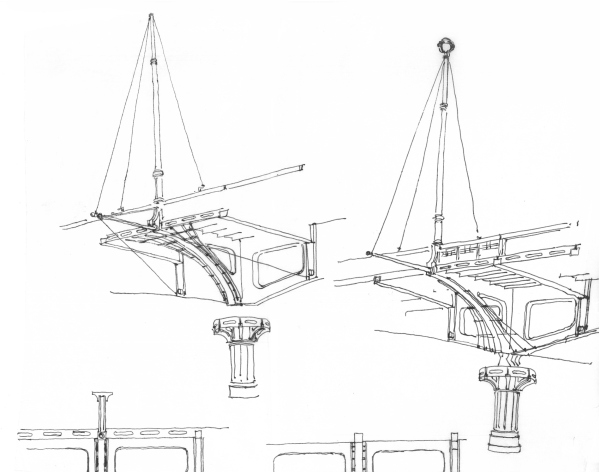 None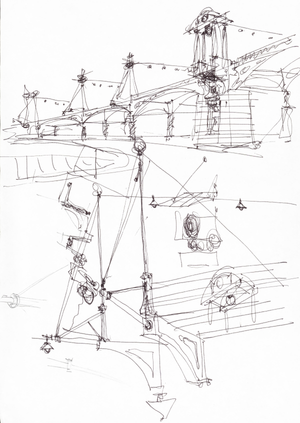 None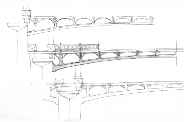 None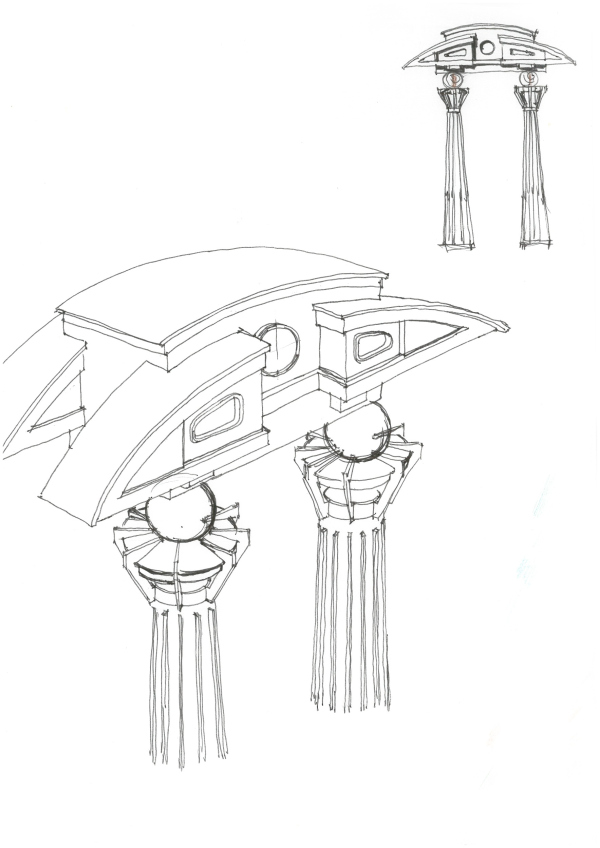 None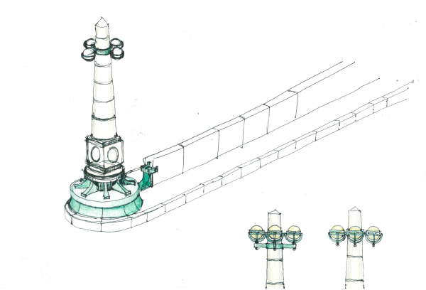 None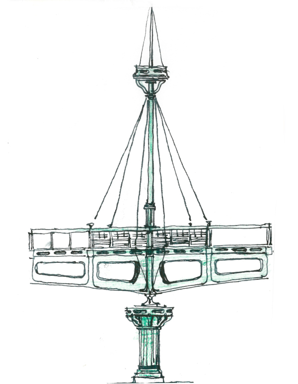 None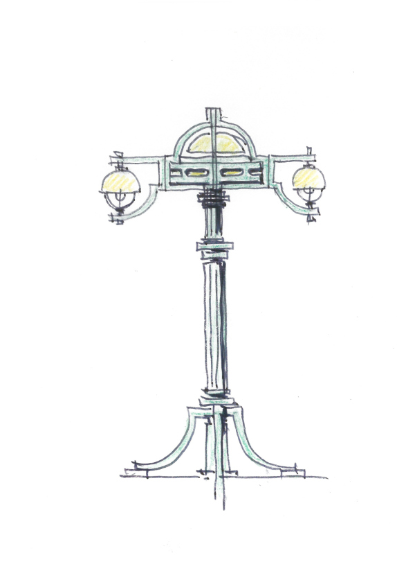 None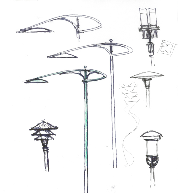 None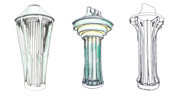 None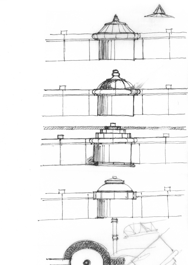 None Evgeny Gerasimov, Evgeniy Gerasimov & partners My belief is that an architect who cannot draw is not quite an architect. The computer itself cannot produce anything; it is just a tool. An architect must have a trained eye and a trained hand, which is something that can only be achieved by drawing. All working material for projects is born through drawing; the idea from the head is displayed by hand on a sheet of paper. If you have this skill, your eye and your hand become a single whole – and only then you achieve a result. Most of the elements drawn by the architects were not included in the final project, which is only natural because the idea crystallizes only after a good deal of preparation work and a good deal of accumulated “texture”. The sketches are the underground part of the iceberg that the observer cannot see but can surely sense. The quality of execution, on the other hand, makes these drawings look like anything but “sketches” – these are fully-fledged works of architectural graphics. Particular awe in the spirit of “they don’t do such things anymore, the secret is lost” is caused by the presentations of Vladimir Vasilkovsky – with watercolors glazed and calligraphic signatures, even where the reason is quite common – like “I’ve gone on sick leave, here is my phone number”. Looking at these drawings, you see what pleasure the master took in his work, and the productiveness of this state when you don’t have to hurry anywhere. 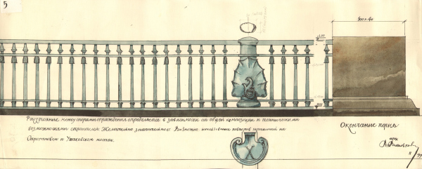 None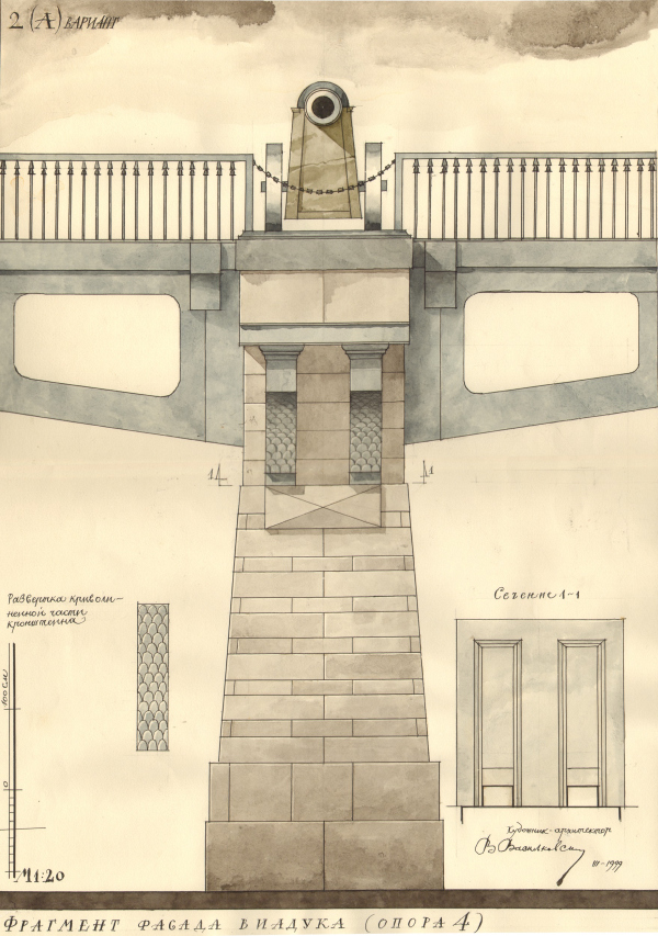 None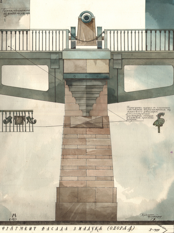 None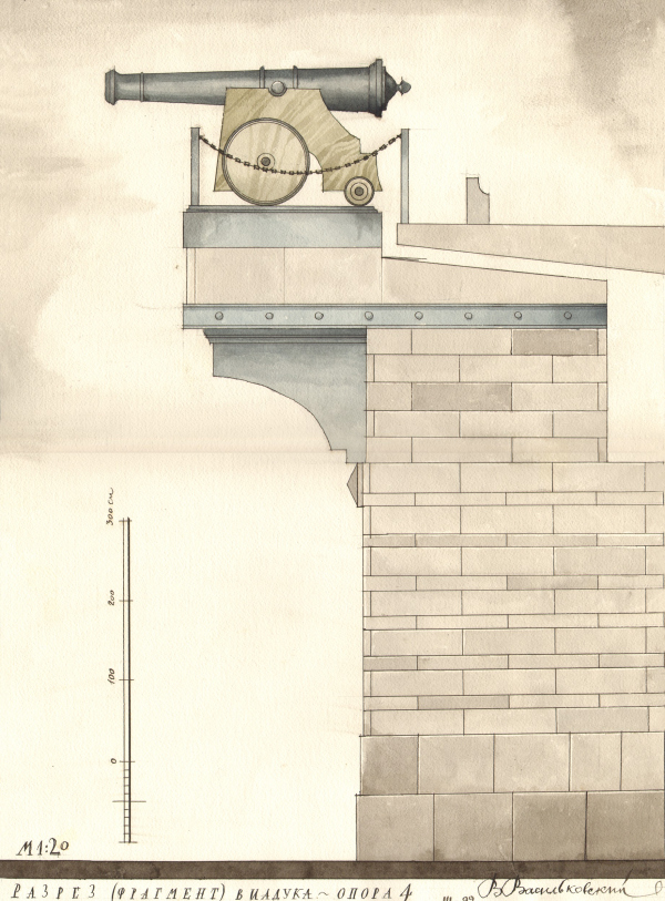 None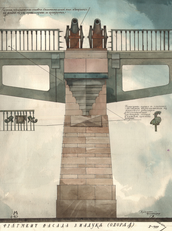 None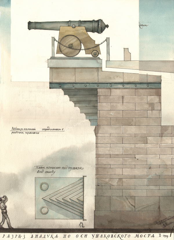 None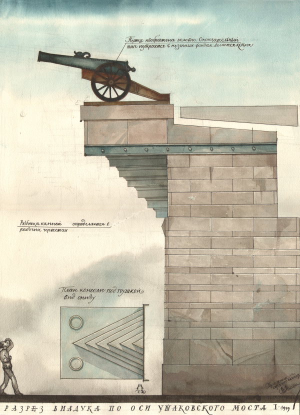 None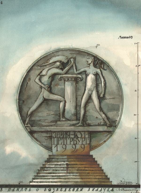 None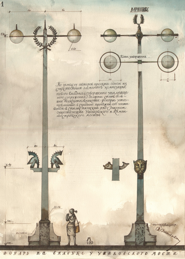 None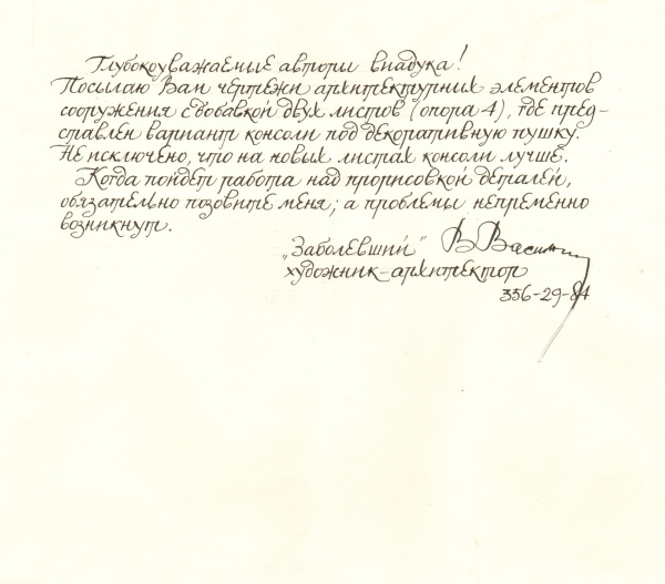 NoneAt the insistence of the then chief architect of the city, Oleg Kharchenko, the abundance of ideas had to be “quieted down” somewhat: rotundas, masts and steles would have blocked the view of the Naval Academy. Then the idea was born to decorate the flyover with ship cannons – this is a small and calm element in outlines, but at the same time quite expressive. Parts for the cannons were made at the Vulkan factory – they are hollow inside, the prototype was the model can be seen in the Artillery Museum. The cannons stand on granite supports, the striping of which should resemble a sailor’s vest. The metal brackets supporting the pylons are decorated with scale ornaments. Flanking the central span of the flyover, the cannons and pillars became the main focus of the entire structure. 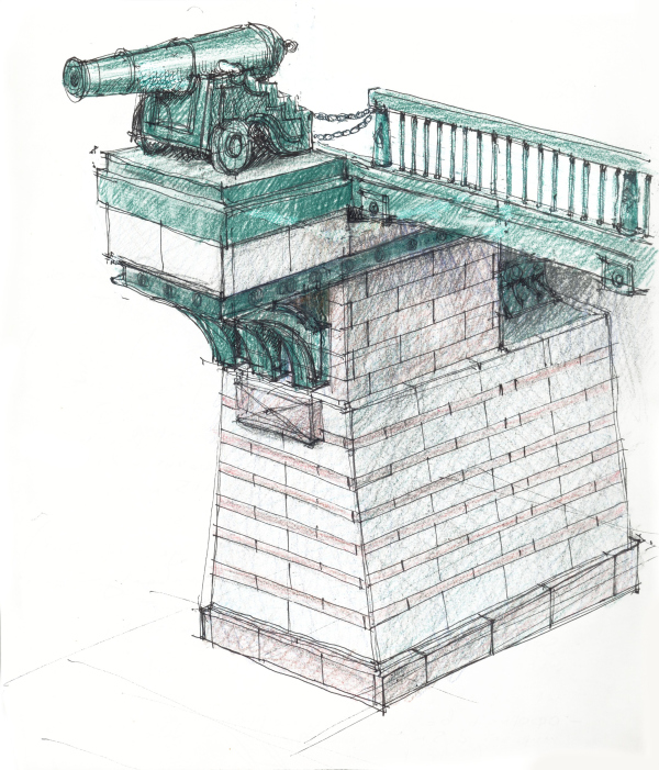 None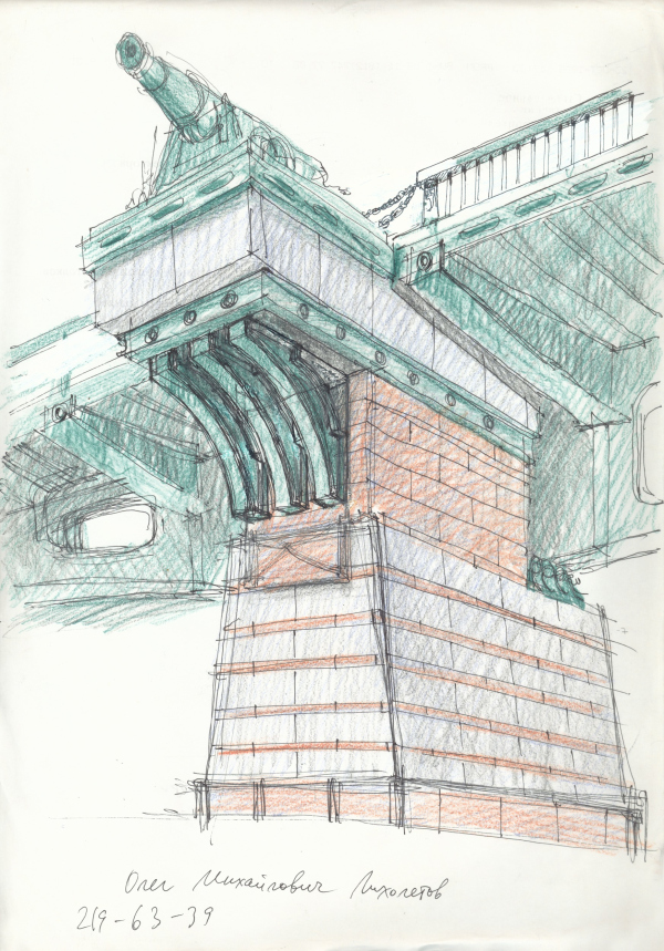 None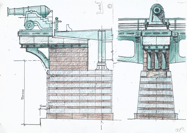 None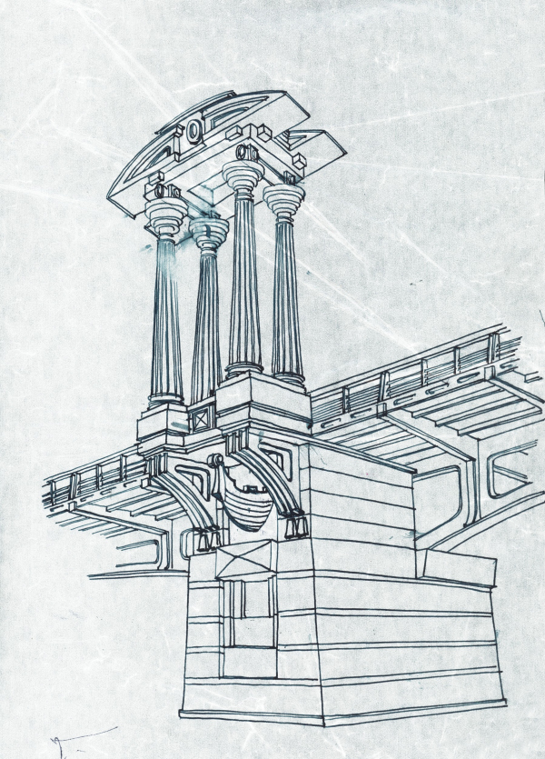 None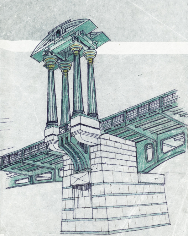 None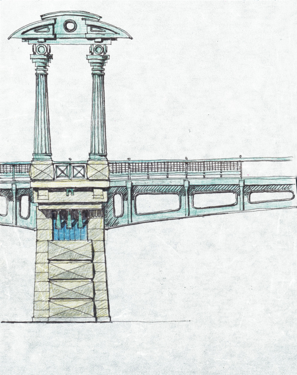 None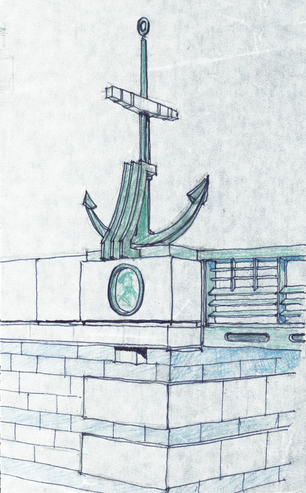 None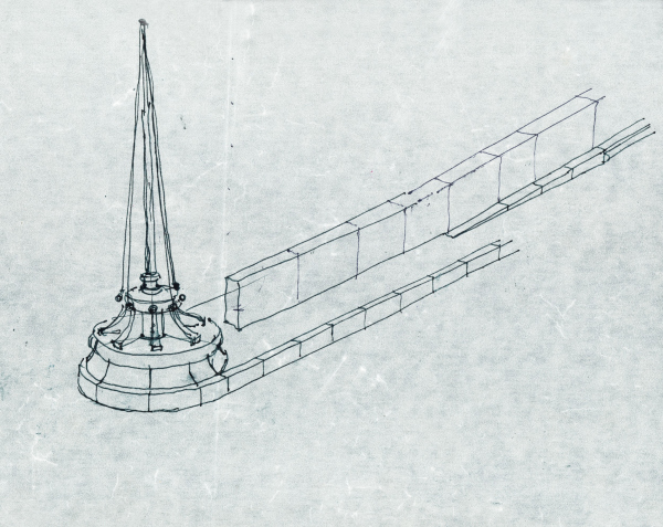 None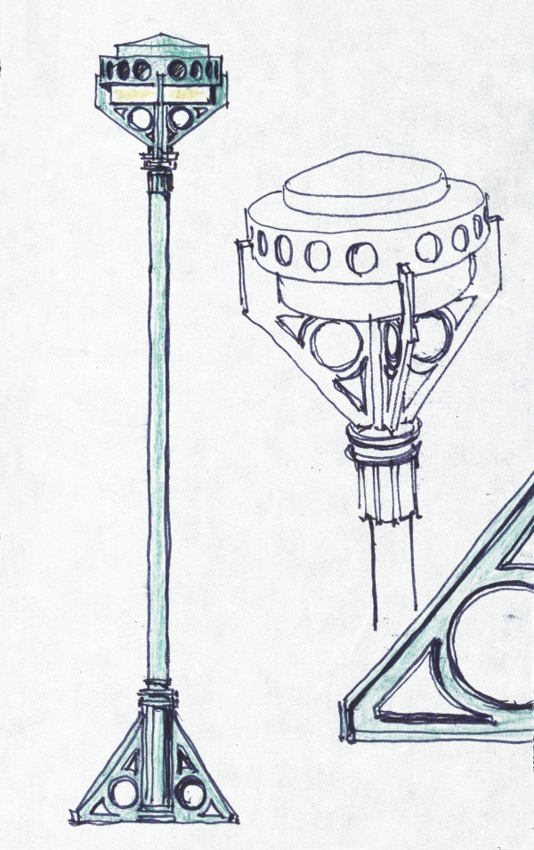 None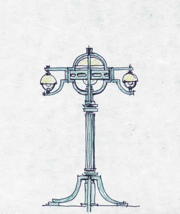 None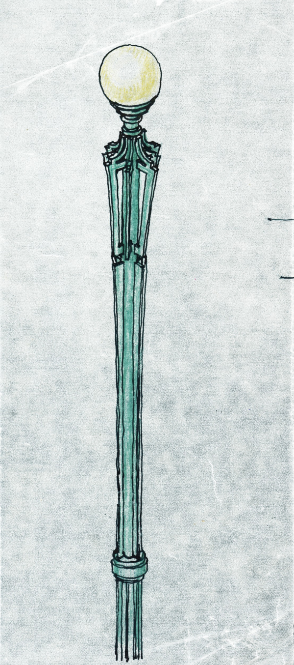 None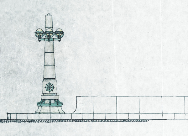 None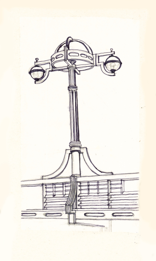 None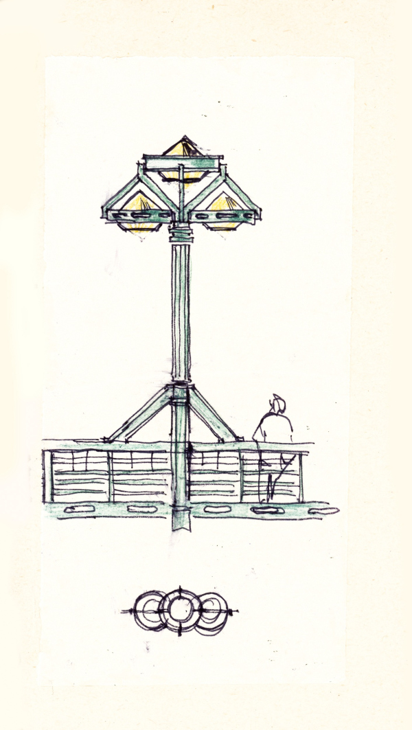 None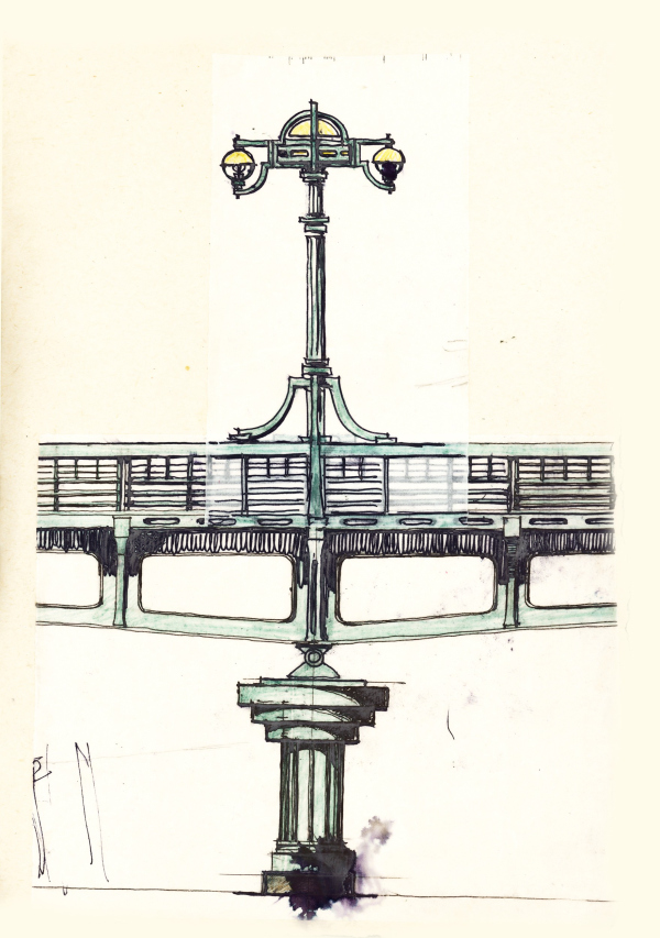 None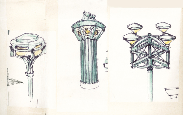 None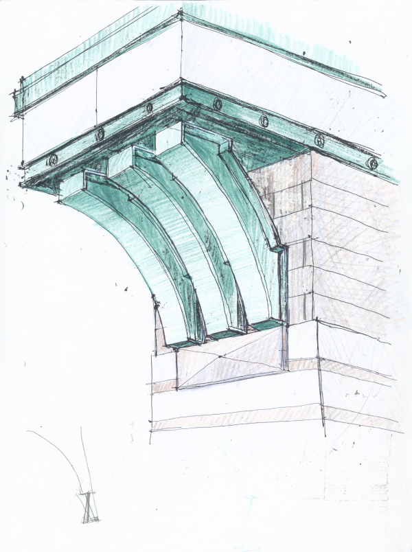 NoneIn accordance with the sketches by Vladimir Vasilkovsky, to decorate the dual street lights, they manufactured helmets and fish figures – a little bit fairy-tale-like and ironic, very much in the spirit of the master. According to the reminiscences of his contemporaries, Vladimir Vasilkovsky, even in his old age, remained “the fountain of ideas”, and retained an amazing strength of his hand and clarity of mind. Another thing that was not implemented was, for example, a round shield with an allegory of two elements that are eternally controversial in St Petersburg – earth and water. And the street lights became the main accent for those who drive on this flyover. 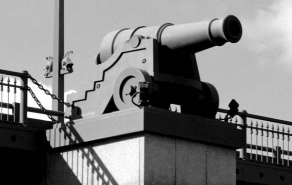 None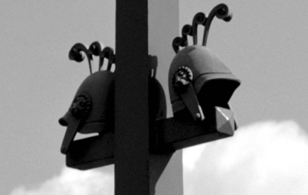 None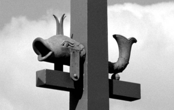 NoneCompared to the sketches, the Ushakov Flyover looks more reserved, and it seems that few interesting details survived into the final project, but ultimately every constructive element got full artistic justification and “tied” the flyover to its surroundings so strongly that it became the flesh and blood of this place. The way we see it, dozens of sketches made the author focus and meditate on this place, thus transferring his genius on paper and making it form the new spirit of this city, just as native and animate as its caryatids and Mephistopheles. |
|
