|
Published on Archi.ru (https://archi.ru) |
|
| 08.04.2021 | |
|
Man and the City |
|
|
Julia Tarabarina |
|
| Architect: | |
| Gregorios Gavalidis | |
| Studio: | |
| GAFA Architects | |
|
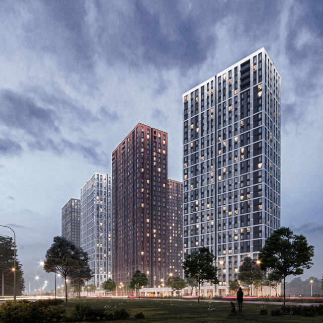
Designing this large-scale housing complex, GAFA architects accentuated two types of public spaces: bustling streets with shops and cafes – and a totally natural yard, visually separated as much as possible from the city. Making the most out of the contrast, both work together to make the life of the residents of EVER housing complex eventful and diverse. The large-scale housing complex EVER, designed by GAFA Architects, is built by TEKTA Group not far away from the crossing of Profsoyuznaya and Obrucheva streets, on the territory of an industrial estate that is being actively renovated. So far, it still includes garages of commercial fleets, surrounded by Soviet research institute buildings, but the place has huge potential: in addition to the fact that we are speaking about Moscow’s southeast, the most attractive area of the nation’s capital by default, the nearby projects include School 1514, one of the nation’s best, two parks – Vorontsovsky and the Southeast, and the Kaluzhskaya metro station, situated a 5-7 minutes’ walk away from here. Thus, it comes as no surprise that several residential complexes have appeared around here, with several more being built right now, EVER being one of them. EVER residential complexCopyright: © GAFAThe construction process was divided into two phases, and the stylobates were divided accordingly: each carries three buildings, the gap between them becoming a “gorge” of sorts – an inner street, which, when the housing complex is complete, must become a full-fledged city space with cafes and shops. There are plans for throwing a pedestrian bridge over this street, which will connect the yards on top of the stylobates of the first and second phases. This way, the city space is also T-shaped, with an elongated link along the Vlasova street and a “leg” between the two groups of the houses. 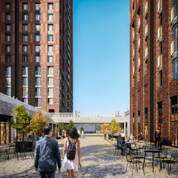 EVER residential complexCopyright: © GAFA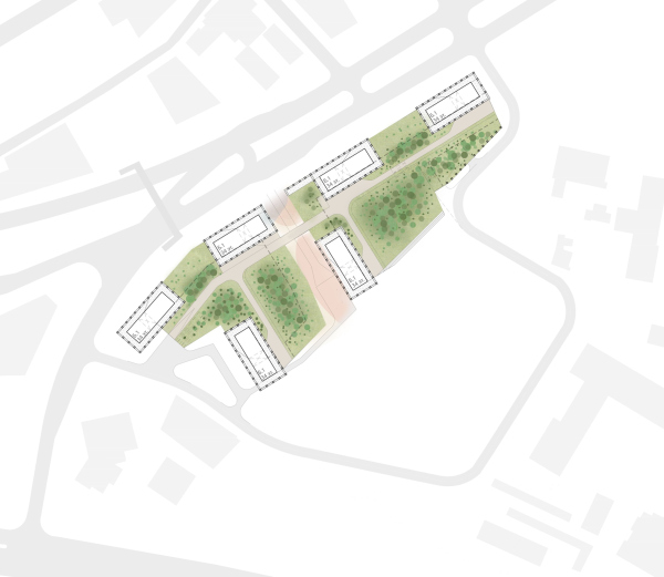 The master plan. EVER residential complexCopyright: © GAFACurrently, the first phase has been fully designed and is being built: the three houses on a stylobate in the south part of the grounds; the design of the second phase has already begun. Due to the fact that the complex is a high-density one – 34 floors on a 2.7-hectare land site – the architects, as they share, paid maximum attention to creating a comfortable living environment: visual, tactile, and functional diversity at the pedestrian level. Some of this diversity is ensured by the front of cafes/shops and a new street running between the two podiums. 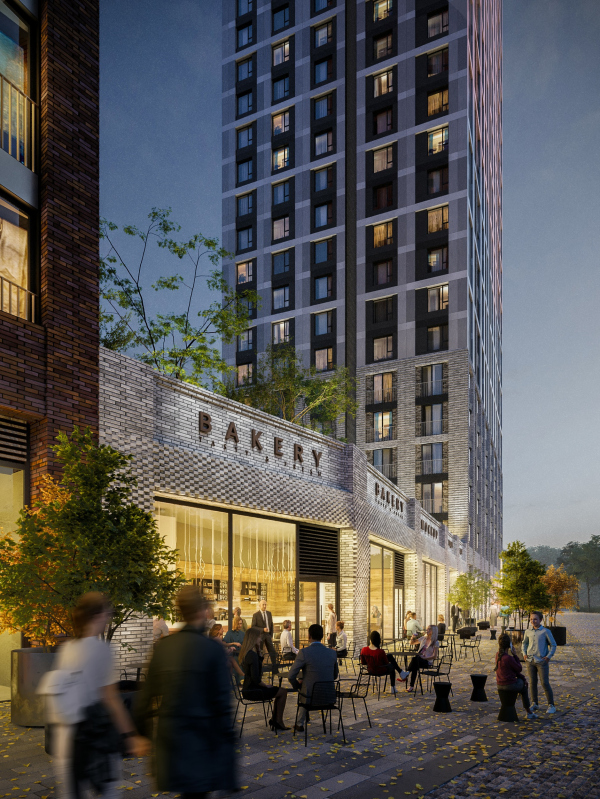 EVER residential complexCopyright: © GAFA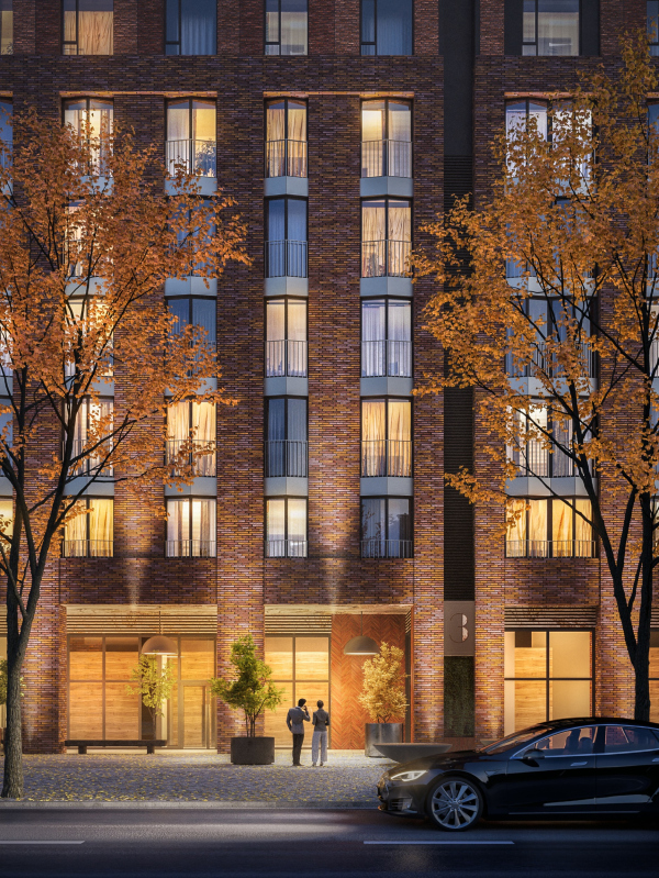 EVER residential complexCopyright: © GAFAAnother important part is the yard on top of the stylobate. By contrast, it is designed as a natural one, even sporting some “naturally non-man-made” elements. 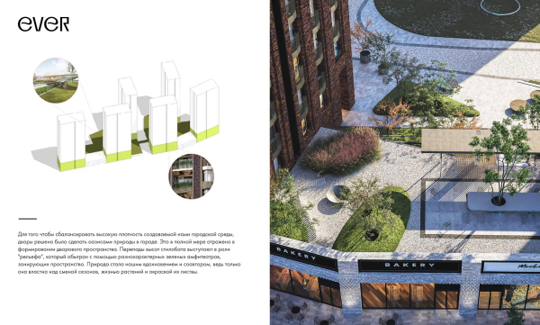 EVER residential complexCopyright: © GAFA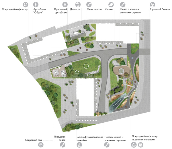 The master plan of Phase 1. EVER residential complexCopyright: © GAFA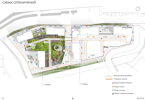 EVER residential complex. The landscaping project.Copyright: © GAFA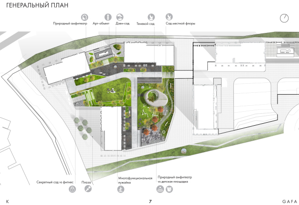 EVER residential complex. The landscaping project.Copyright: © GAFA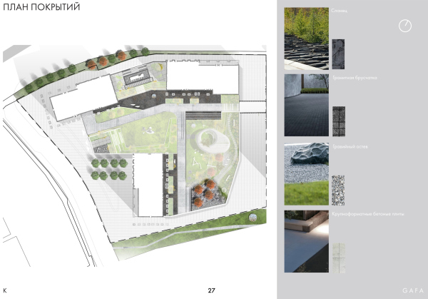 EVER residential complex. The landscaping project.Copyright: © GAFA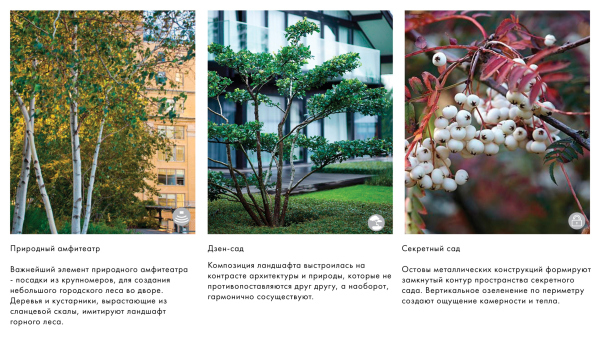 EVER residential complex. The landscaping project.Copyright: © GAFA EVER residential complex. The landscaping project.Copyright: © GAFAThe two-story “lintels” of the city front of the stores between the residential buildings surround the stylobate almost from three sides, their height in the facade part being 6 meters from the pavement level. Meanwhile, the middle part of the yard is situated lower, and it looks like a “saucer” with edges elevated 2-3 meters from the middle. This means that being inside, a person will be alternately surrounded by houses or slopes, which are interpreted by the authors of the project as park ones, combining greenery and other natural forms with amphitheaters, allowing you, on the one hand, to go up and down, and, on the other hand, just sit down on the stairs. The elevated outlines, like green bulwarks, will protect the yard partially from the street noise and partially from the visual one: they create a feeling of security, and channel one’s senses towards contemplating this, however small, but still a private park. This way, the city, which will be bustling all around and literally beneath the walls, will be separated from the inner “oasis” of the yard by volumetric and spatial means. 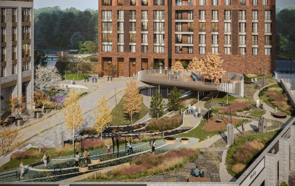 EVER residential complex. The landscaping project. The natural amphitheater: the slate mountain and the pergolaCopyright: © GAFA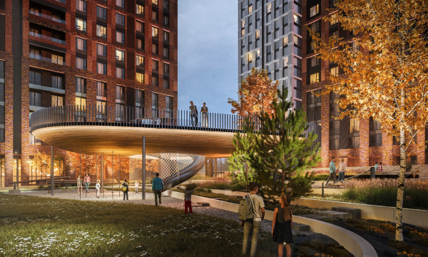 EVER residential complex. The landscaping project. PergolaCopyright: © GAFA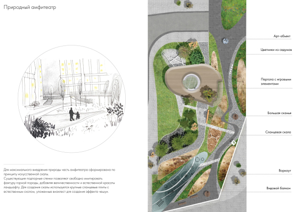 EVER residential complex The landscaping project. The natural amphitheaterCopyright: © GAFA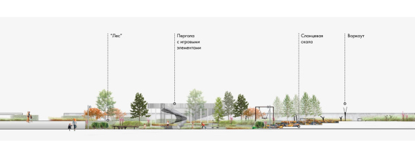 EVER residential complex The landscaping project. The natural amphitheaterCopyright: © GAFAVisually isolating the yard, the architects did everything possible to interpret this space as a park: they filled it with trees, for which tubs were provided, as well as other natural elements. The main pride of the architects is a slate hill in the eastern part of the grounds: a fragment of a “forest on a mountain” should appear here, a landscape not entirely Moscow, and perhaps – judging by the abundance of flowers among fragments of stone – even Alpine by character. Its ascent is decorated by curved lines; there is a playground lying next to it, from where the children will be able to climb this mountain. Still higher up, there is a streamlined pergola with a sightseeing platform on its roof – the yard’s biggest attraction, it also allowed the architects, like the slopes at the edges, to play with the levels of space perception. The pergola will be built by a detour around the trees, and a roller coaster will probably descend from the center: if all this is eventually implemented, it should become an attractor for both children and adults. 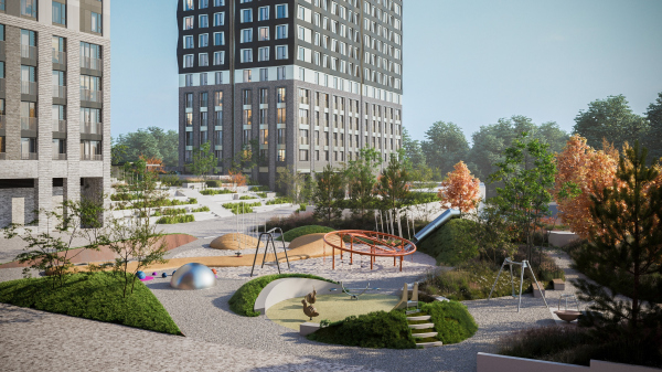 EVER residential complexCopyright: © GAFA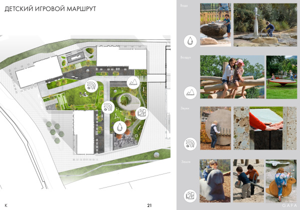 EVER residential complex. The landscaping project.Copyright: © GAFA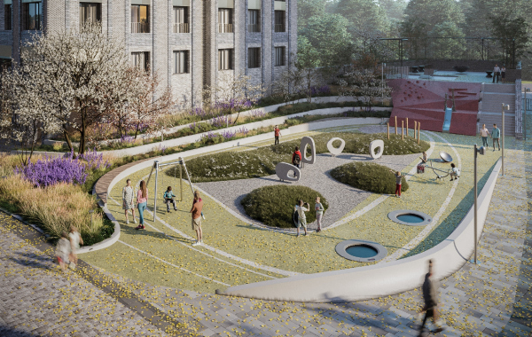 EVER residential complex. The landscaping project.Copyright: © GAFA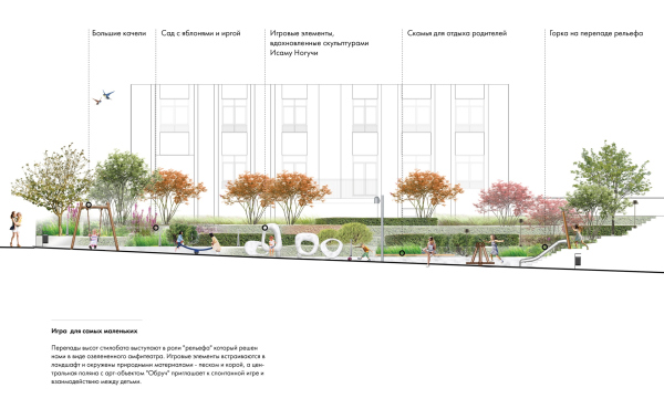 EVER residential complex. The landscaping project, the natural playground. A section viewCopyright: © GAFAA large part of the yard is stitched with a children’s game route. 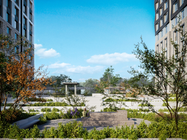 EVER residential complex. The Zen gardenCopyright: © GAFA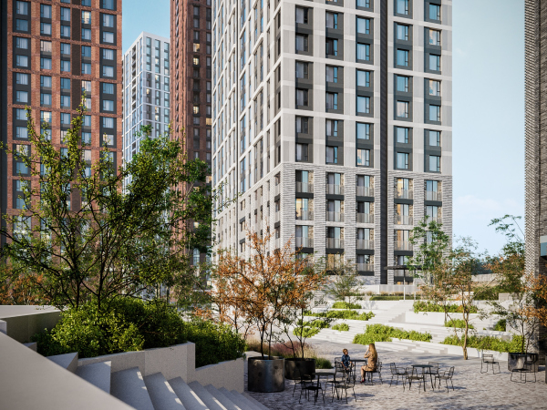 EVER residential complex. The Zen gardenCopyright: © GAFA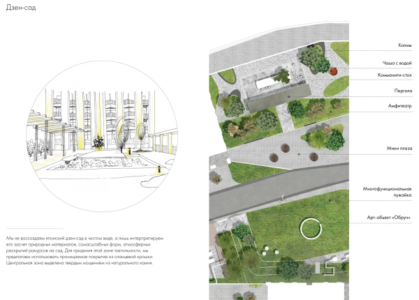 EVER residential complex. The Zen gardenCopyright: © GAFAThe yard is also zoned and divided into active and quieter parts. For example, above the Vlasova Street appeared a Zen garden with a pergola for meditation, and the roof of the parking garage ramp has a “secret garden” on it. Both of them are separated by “amphitheater” ascents, and, while the northwest slope is designed for children, this place could be equally used by adults. At the same time, everything – the pergolas, different paving patterns, lawns, knolls, and even the emergency vehicles lanes – is treated as a cohesive multifunctional space with an accent on natural forms and materials and a maximum of possible vegetation: “a person must have an opportunity to take a break from the urban rhythm, and this is why we invested so much effort into making this yard look like a fragment of true nature” – the architects emphasize. 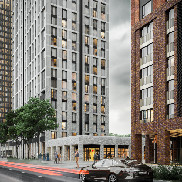 EVER residential complexCopyright: © GAFA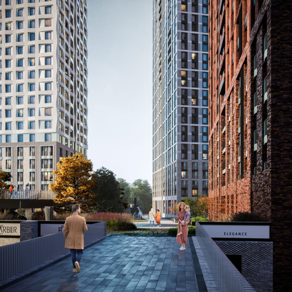 EVER residential complexCopyright: © GAFAThe architecture of the residential buildings is also based on the principle of color and texture diversity. Their volumes are almost identical, but the solution of the facade in each of the buildings of both phases are ostentatiously different. Different are the colors: terra cotta brick, pale beige, white and black- everything within the framework of natural hues. The window patterns are also different: the windows are sometimes grouped in twos and fours vertically, and sometimes are drawn on their own. The facades of one of the three buildings of each of the construction stages are designed as “oscillating” volumetric mesh with protruding and sunken points – on the corners, they form a zigzag. In the first part, this house will be light, almost white, while in the second part it will be black. The facades of these two towers will be modular. 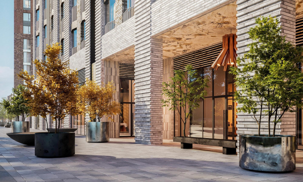 EVER residential complexCopyright: © GAFA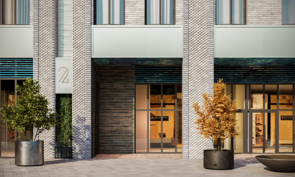 EVER residential complexCopyright: © GAFAIn addition, the facades are divided into a few parts based on the requirements of visual perception. When you look up from the ground up to the sixth floor inclusively, solid body brick is used with various types of masonry of different tones and textures. This falls in with the “rule of six floors” – the height, comfortable to perceive from the pedestrian level. Currently, the architects are selecting the right kind of brick, and are making mock-ups to find the exact material and pattern. Above the sixth floor, in addition to modular elements, painted panels and Klinker tiles a will be used. Still more attention is paid to the textures on the first floors, galleries, and entrance zones: here we can see special kinds of brick, for example, the plinth-shaped elongated kind, and glazed surfaces, each building being assigned a color of its own: blue-green, beige-gray, and red, all with majolica gradients and different brickwork patterns, vertical, horizontal, and “herringbone” respectively. Furthermore, there are plans for decorating the ceilings of the outdoor galleries with porcelain stoneware with imitation of different minerals sawn-off – this way, the architects not just add gorgeous-looking decoration but also pay homage to geologist Vladimir Obruchev, in whose honor the street was named. 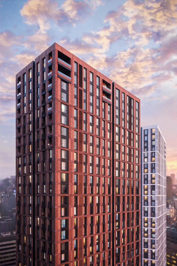 EVER residential complexCopyright: © GAFA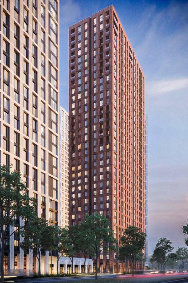 EVER residential complexCopyright: © GAFA Yana Nemenko, GAFA Architects We worked a lot with the detailing of the lower area of the facades and now we continue to work with suppliers – all these solutions are very precious to us: options for brickwork, colors, and so on – we would very much like to preserve all this and bring it to fruition, creating a rich visual environment for people who will walk here. Wherever the eye falls, we should have something attractive, beautiful, and interesting. After all, people are not birds, they do not fly, they walk on foot, and in our opinion it is very important that what a person sees from the ground level is neatly drawn and thought out. Some of the brickwork offered by us will be created by the suppliers for the first time. I would very much like to see all this come true. We are also very enthusiastic about the landscaping project, a lot of work has also been done in that field, and we would like the proposed idea of a “virgin” environment to come true: it will allow a person who constantly lives in the context of a dense development of a big city to switch for a while and, relatively speaking, feel like a “savage on a rocky shore”. The apartments are quite diverse: the towers have more than 30 types of layouts, “fine-tuning” which was quite a challenge. The windows the bottom floors, up to the sixth inclusively, are designed as French balconies; the height of glass here is 2.4 meters, two windowpanes opening like doors. Some of the apartments in the middle and upper tiers got open-air recessed balconies two meters deep, accessed through “window” doors reaching to the floor; sometimes the penthouses have two such doors, or – if the recessed balcony is on the corner- even three. Penthouses with raised floors occupy several floors, from 2 to 4, in the top part of each of the towers. 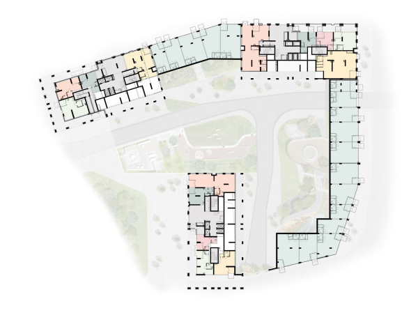 EVER residential complex. Plan of the 1st floorCopyright: © GAFA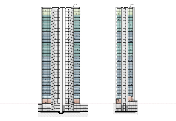 EVER residential complex. A section viewCopyright: © GAFAThe air conditioning units will be hidden in vertical recessions, dissecting the facades from top to bottom. In addition, some of the utility lines have been routed out of the apartments and grouped closer to the elevator chutes, which allowed the architects to save up a lot of floor space and give the future designers as much as possible freedom in handling the space. This way, this large residential complex was thought out by the architects down to the last detail with a special emphasis on the scenarios of its life and the peculiarities of the perception of different parts: the upper floors received a relatively large drawing, the lower ones received detailed textured work, the streets, treated as urban, will feature shops and cafes, probably in the future with tables for outdoor terraces, and the courtyard will become a space fenced off from the city, the atmosphere of which is designed as being as natural as possible. We will note here that the stylobate yard stands little chance of becoming a “real wild jungle”: Moscow is not Singapore, and the land site is considerably small. Still, this place has a lot to offer for alternating and concentrating impressions, angles, and routes, meant to make up for the acutely urban environment. |
|
