|
Published on Archi.ru (https://archi.ru) |
|
| 10.03.2021 | |
|
The Wall and the Tower |
|
|
Alyona Kuznetsova |
|
| Studio: | |
| OSAArchitects | |
|
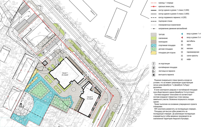
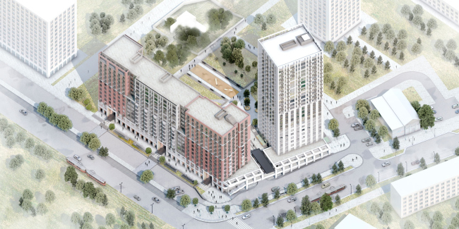
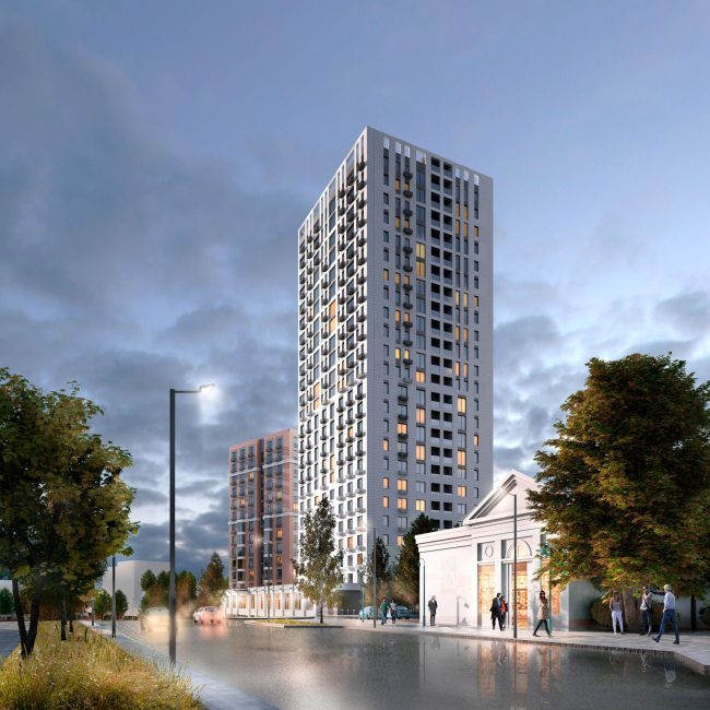
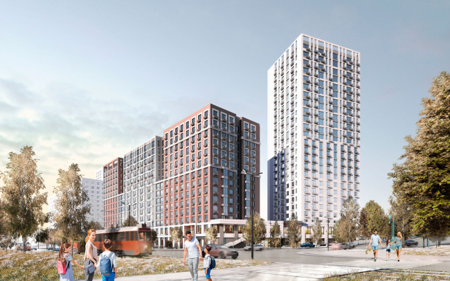
The OSA architects have been searching for solutions that could be opposed to the low-rise construction in the center of Khabarovsk, as well as an opportunity to say a new word in the discourse about mass housing. Looking at the map of Khabarovsk, one can see that, besides the Amur, there are two other rivers flowing through the city, important from the town-planning standpoint – the Plusninka and the Cherdymovka, or, as they were called earlier, Uri and Buri. Today, the rivers have been routed to collectors and buried underground, and along their former beds through the entire central part of the city, connecting parks and embankments, green boulevards are laid – the Ussuriysky and the Amursky. NoneThe OSA architects received a land site with a pre-approved master plan, according to which the slabs of residential houses form the Amursky Boulevard, with pinpoint towers standing inside the block. The first to be constructed is the corner with the Dzhambula Street, which will be marked by a 25-story tower and a three-section house almost half of its height. On the level of the two bottom floors, the houses will be united by a retail gallery. With such a layout, the role of the centerpiece, which usually accentuates the corner of the crossroads, is played by an empty space. This, according to the architect Veronika Fomina, is one of the strong points of the master plan: the height of the complex logically lowers towards the Amursky Boulevard, while the fact that the tower faces the peripheral street paradoxically removes the unpleasant “overhanging” effect, forming an inviting angle and a few interesting city views. NoneConsidering the preset limitations, the architects could not alter either silhouette or master plan. In spite of this, the OSA architects were nonetheless able to use their signature techniques and breathe life into the unromantic “technical and economic performance” indicators. First of all, the architects had to avoid monotony at all costs and find solutions that could at least to some extent make up for the “human-friendly” nature of the torn-down houses, even if dilapidated. Initially, the OSA architects set itself the task of coming up with a new architectural language that would allow the complex to become a new symbol of the railway compound that once was there, and would not become obsolete for a long time. Accepting the givens, the architects decided to emphasize the strong points of the existing master plan, not to mask the wall, artificially drawing a silhouette, but on the contrary honestly convey its massiveness and brutality.  None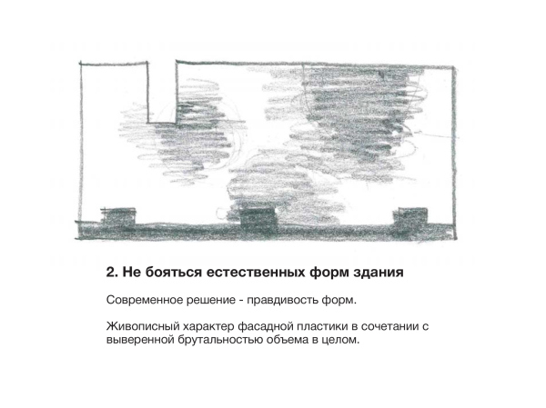 None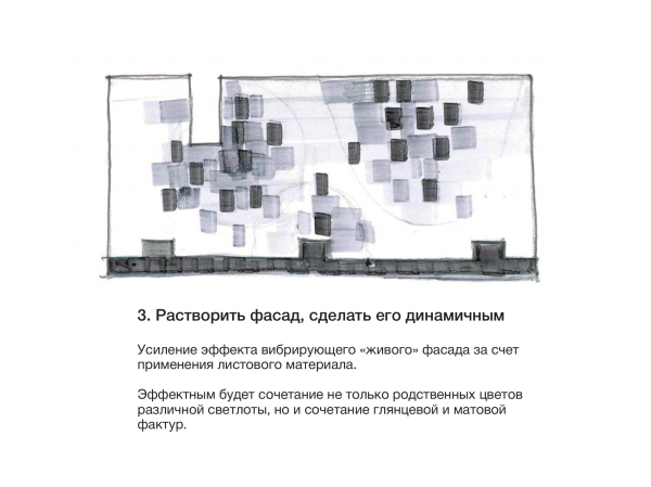 None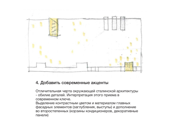 NoneIn the first version, they used a solution contrastive to the surrounding development. The buildings were united by a common façade grid, white color, and “copper” accents, created with aluminum panels with anodized coverage. The developer, who had worked with the land site for a few years, had a hard time getting used to the new image of the complex. This is why in the second version the architects returned to the fractured volumes and an abundance of traditional details, such as pilasters, bay windows, a colonnade, and a gallery. The monochrome solution that they chose spoke honestly about the size of the complex. At the next stage, the customer asked them to add color. 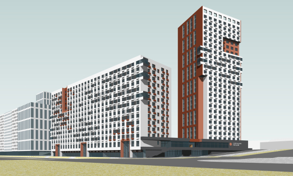 None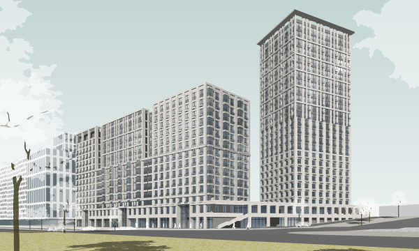 None Veronika Fomina, architect In an ideal world, this house would have been quite different. But the beauty of the role of an architect is that with such a variety of constraints, it is possible to find solutions that for this place seem not just the least damaging, but oftentimes the most advantageous. Balance is the biggest challenge, frustration, yet, at the same time, the biggest joy that this project gave us. The final version, although it does look like a compromise compared to the first one, still without a doubt speaks the language of the OSA’s, and not the developer’s, and has its strong points. The tower here is relieved of the hassle of vertical fracturing, and it “keeps its back straight”. The main façade, turned to the Dzhambula Street, is a simplified gradient. While its bottom part is more massive due to piers of the same color and a regular grid of windows, its upper part gradually loses weight thanks to the increasing amount of glazing. The tower is crowned by a signature “OSA” pergola, with air moving freely among its supports. Thanks to the backlighting, this element turns into a real landmark. NoneDesigning the facades of the slab, the architects also opted for large shapes. The three sections are articulated with color and recessions; horizontally, the volume is split by a band. This way, six massive blocks appear, each one being slightly different in terms of color, window or balcony type, or the rhythm of the piers. All these techniques, as well as the façade material – the fiber cement panels – make the building akin to the surrounding Stalin houses. NoneThe architects paid special attention to the plastique and the tactile feel of the bottom floors, which form the street space. The entrances to the housing complex are marked by portals two stories high, rhythmical “tongues” of the canopies, and décor of cut metal. Here the architects prudently provide space for designer’s work – it is planned that a design code will be developed for the complex, and the niche of the portal is one of the places where its solutions will be applied. 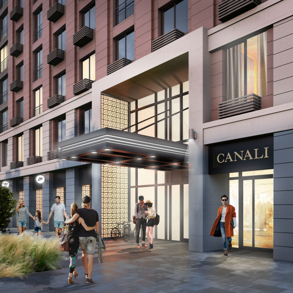 None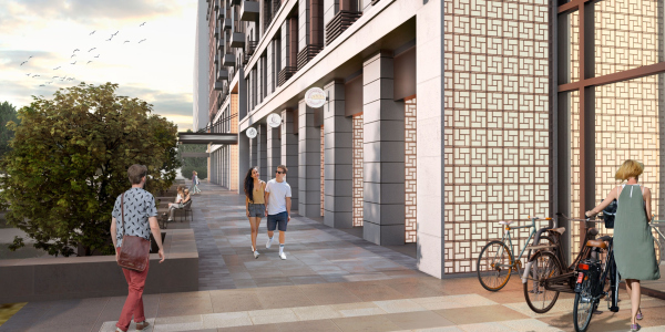 NoneThe architects made the most of the 5-meter terrain drop from the side of the Dzhambula Street by building a two-level shopping gallery. This way, the complex forms not one, but two streets with several attraction points, making them active and justifying their central location. The cars are routed to an underground parking garage, on which a yard rests. 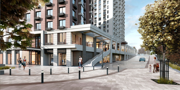 None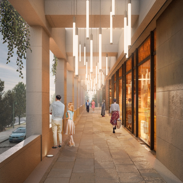 NoneThe compact staircase and elevator block without long corridors made it possible to increase the useful floor space of the apartments. The apartment layouts were designed in accordance with the marketing survey, which the developer conducted still before the design stage. The upper floors are occupied by luxury apartments with fireplaces. 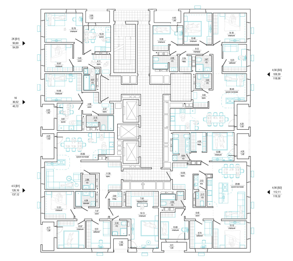 None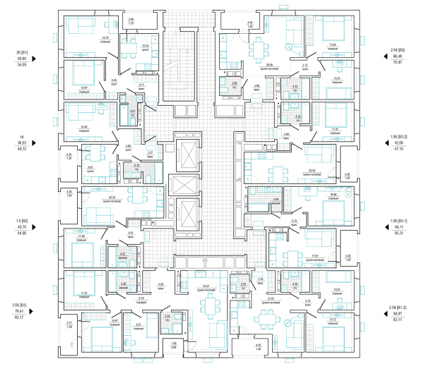 None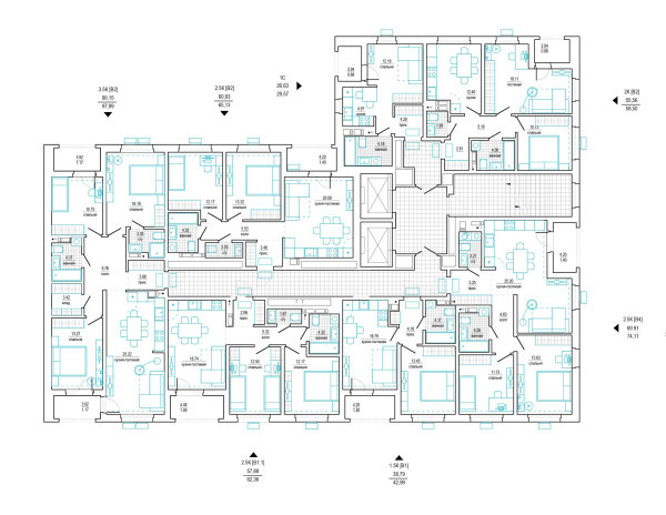 NoneThe Amursky Quarter is yet another example of the Russian architects pulling a balancing stunt between the construction regulations, technical and economic performance expectations, and the developer’s specifics. Despite all the limitations and hard facts of life, OSA provides Khabarovsk with solid modern architecture, and I can only hope that the next stages of the complex will be up to its level. |
|
