|
Published on Archi.ru (https://archi.ru) |
|
| 19.03.2021 | |
|
Raising the Yard |
|
|
Natalia Koriakovskaia, Arina Strigova |
|
| Architect: | |
| Andrey Romanov | |
| Ekaterina Kuznetsova | |
| Studio: | |
| ADM | |
|
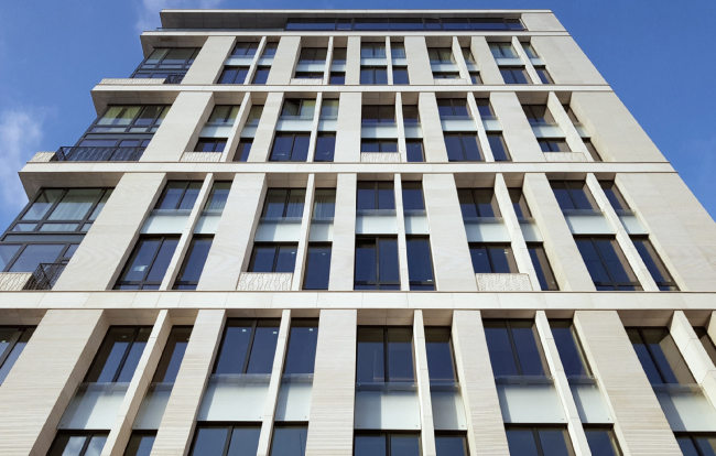
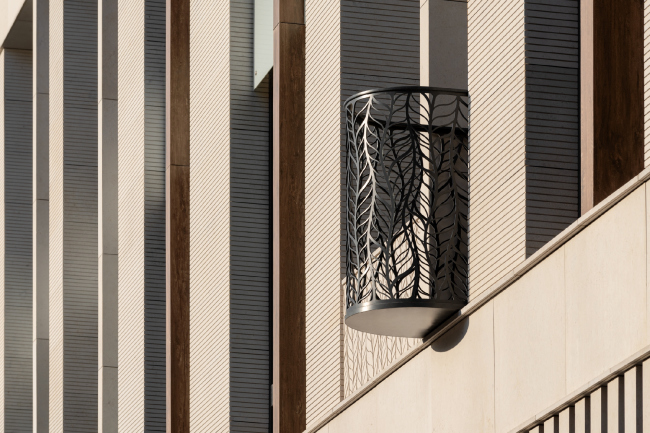
The housing complex Renome consists of two buildings: a modern stone house and a red-brick factory building of the end of the XIX century, reconstructed by measurements and original drafts. The two buildings are connected by an “inclined” yard – a rare, by Moscow standards, version of geoplastics that smoothly ascends to the roof of the stores lined up along a pedestrian street. The housing complex Renome, about the project of which we wrote in 2016, is situated inside the blocks between three streets: Novoslobodskaya, Palikha, and Sushchevskaya – and one in-block pedestrian passageway that connects the exit from the Mendeleevskaya Metro Station and the Sushchevskaya Street. In our particular case, the passageway, winding amongst a conglomerate of old Moscow houses, is more attention worthy than all the surrounding streets because recently it has turned into a cozy urban hangout with lots of bars and small shops, colorful signs and lights hanging on strings – in a word, this something like Moscow’s Covent Garden. Making a turn underneath the arch, the pedestrian way, starting from the metro station, leads past the restaurants of the Atmosphere business center, an office complex built by ADM Architects in 2011-2013, and presenting a result of painstaking reconstruction of a fragment of city development of the XIX century, consisting of low-rise buildings of a weaving factory. There are grounds to believe that the public bottom floors of Atmosphere, its cozy little yards, and the end-to-end passage to Palikha became one of the drivers for the development of the pleasant “go-for-a-stroll” environment near the Mendeleevskaya metro station. 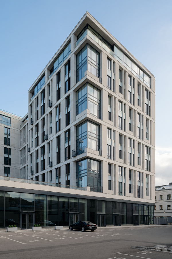 Renome housing complexCopyright: Photograph © Yaroslav Lukyanchenko / provided by ADM architects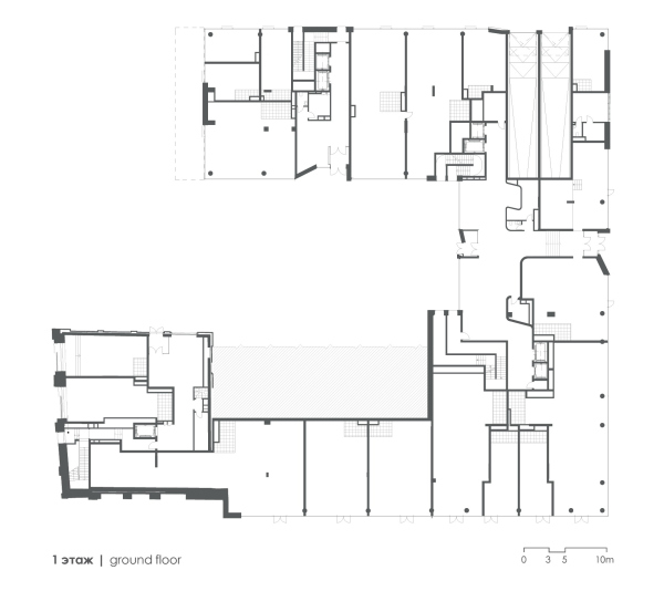 Plan of the first floor. Renome housing complexCopyright: © ADMThe retail “link” building closes the courtyard of the complex from the south side and becomes the basis for the most interesting – well, at least, rare by Moscow standards – part of the spatial and volumetric solution. Considering the fact that the shop buildings will turned to the yard with their dull technical side, a “cold wall”, which will be casting an almost permanent shadow, the architects proposed to raise the landscaped yard on one side, designing it as a gently sloping “mountain” – a kind of green amphitheater that leads to the operated roof of the shops. 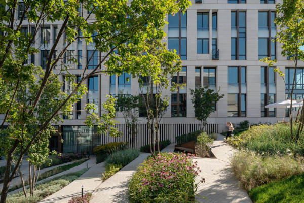 Renome housing complex / ADM architectsCopyright: Photograph © Yaroslav Lukyanchenko / provided by ADM architects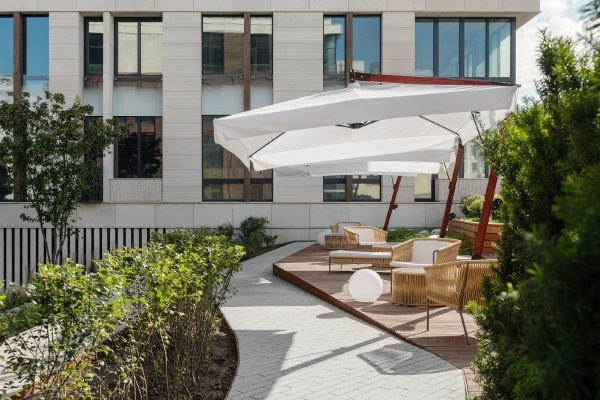 Renome housing complexCopyright: Photograph © Yaroslav Lukyanchenko / provided by ADM architects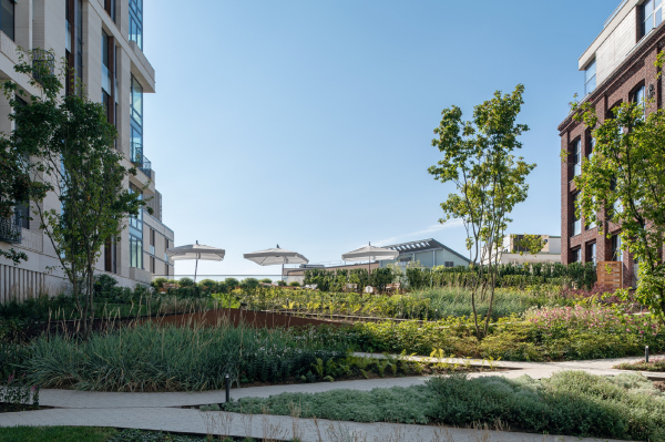 Renome housing complexCopyright: Photograph © Yaroslav Lukyanchenko / provided by ADM architectsThe inclined surface of the yard is structured by a diagonal grid of trails with a slight tilt, comfortable to ascend. Its flexible shape looks a little bit like paper garlands with slits. The rhombuses, appearing between the ramps, host flowerbeds and recreation areas – the architects made the most out of the surface, making each of its fragments useful; the geometric pattern of the garden looks great from the apartment windows. The upper part is paved with wood, and in the summer there are wicker chairs and umbrellas: a small resort oasis that smoothly grows out of the garden on the slope. The artificial relief here turns out to be something more significant and interesting than the usual geoplastics of the hills. In addition, the upper part is well lit by the rays of the southern sun, and the plants of the slide get the light in full – this unconventional move made it possible to completely avoid the “shadow pocket” effect. And we will also note here the urban space itself turned out to be delicately, yet clearly, zoned: on the one side, there is a private courtyard, on the other side, there is city retail – they exist in the same space, but almost without touching each other, except that the tops of green bushes on the roof can arrest the gaze of some passer-by. 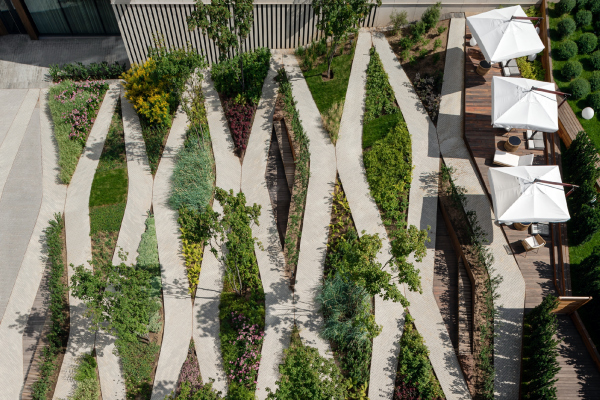 Renome housing complex / ADM architectsCopyright: Photograph © Yaroslav Lukyanchenko / provided by ADM architects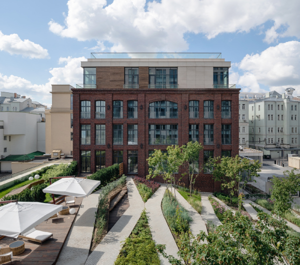 Renome housing complex / ADM architectsCopyright: Photograph © Yaroslav Lukyanchenko / provided by ADM architects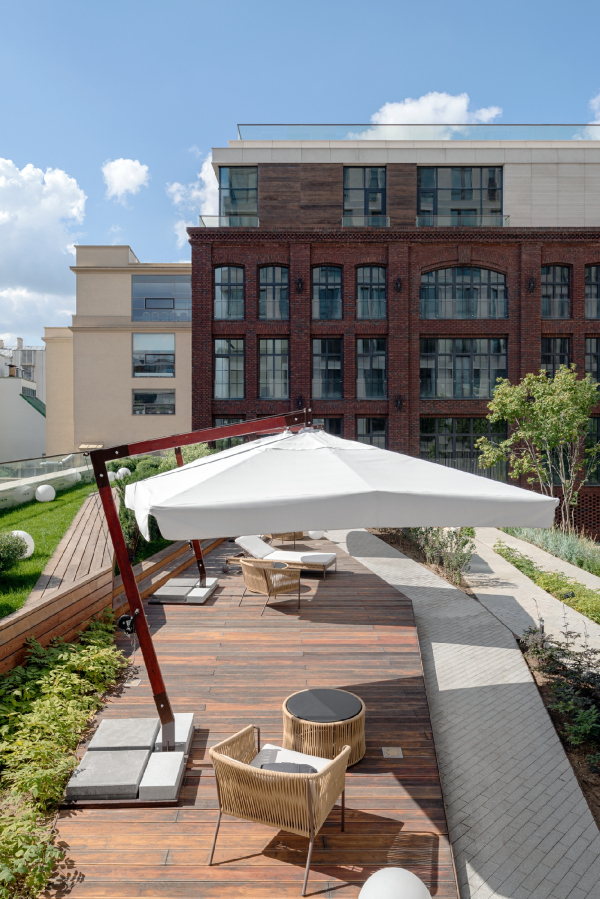 Renome housing complex / ADM architectsCopyright: Photograph © Yaroslav Lukyanchenko / provided by ADM architectsThis solution is also interesting from the typological standpoint because, although it was implemented on flat relief, one can nevertheless trace typical Moscow features in it: Moscow is known to be a hilly city, at least in some places, and somewhere, especially in the neighborhood of Maroseyka or Serebryaniki, you do come across inclined yards and terraces. Back to the residential buildings, though! While the string of shops in the link building continues the Atmosphere business center function-wise, the L-shaped building picks up its light tone and texture, only in a more expensive material – stone as opposed to the ceramic tiles of the business center. Stone verticals with striped grooves vary in width and frequency, interspersed with thin lintels, the lintels being light stone on the outside, and mostly dark wood on the side of the courtyard. Panels of the same “wood-like” time appear in the entrance portals, and in the finish of the lower surface of cantilever above the pedestrian walkway at the western end – in all cases, wood adds to a homely feel of the place. 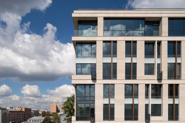 Renome housing complex / ADM architectsCopyright: Photograph © Yaroslav Lukyanchenko / provided by ADM architects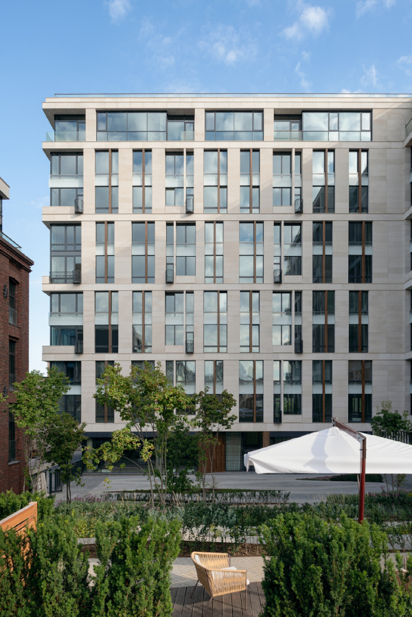 Renome housing complex / ADM architectsCopyright: Photograph © Yaroslav Lukyanchenko / provided by ADM architectsThe floors are vertically grouped in twos, the pairs dissected by the flat horizontals of the friezes. However, the intermediate floor is masked not by dark tinted glass, as is often done nowadays, but by glass with silk-screen printing of a white raster gradient – their whiteness makes the house brighter and softens the tension of the vertical rhythm. In addition, some of the windows are actually windows, and some of them are glazed recessed balconies (Andrey Romanov calls them winter gardens); they are sunk in the facade plane at different depths, which is why there is a surface oscillation barely noticeable to a superficial glance. This way, when viewed from a certain angle, the line of the white glass forms a zigzagging horizontal, as if some kind of thread was running through the facade. Renome housing complex / ADM architectsCopyright: Photograph: Archi.ruThin strips of corrugation on the stone are complemented by carvings of graceful rectangular flower pots, as well as plastic forged fences and “smoker’s balconies”; in every case, the ornament is built on a single flowing plant motif. The small open balconies are semicircular on the plan and – the architects especially emphasize this – are fundamentally different from the decorative baskets without a bottom for air conditioners that are now commonly accepted in Moscow construction. These balconies have a sturdy base made of a cast iron plate about 5 cm thick, which can support the weight of more than one person. In a word, what we are seeing are distant relatives of the cast iron balconies of Moscow of the XIX century, which gracefully resonate with the surrounding context: they liven up the facade not only with their rounded plastique and lacy shadows but also functionally because the architects indeed designed them with people in mind. Renome housing complex / ADM architectsCopyright: Photograph © Yaroslav Lukyanchenko / provided by ADM architectsThe other building of the complex, made of red brick, square on the plan, and situated closer to Novoslobodskaya Street, was inherited from the weaving factory. In the process of working on the project, the architects planned to preserve two of its surviving facades of the late XIX century and to complete the other two walls, which had been depersonalized by restructuring during the Soviet era. However, due to the fact that the there was an underground parking garage occupying the whole space underneath the complex, preserving the walls of the building, which did not even have a protected status turned out to be rather problematic, and ultimately the architects and the client came up with the idea of restoring the factory building according to measurements , using artificially aged Belgian bricks, reminiscent of the historical ones. 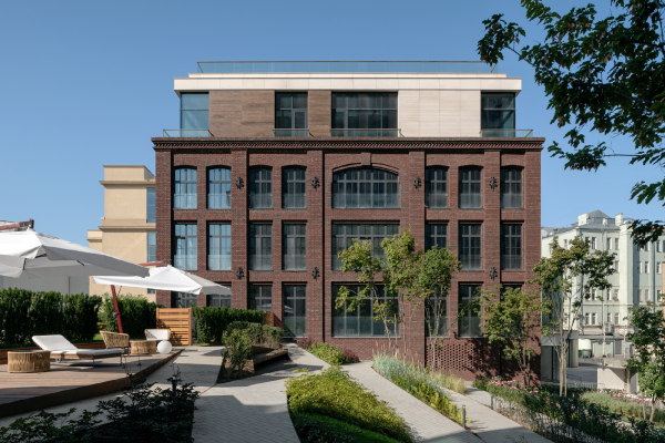 Renome housing complex / ADM architectsCopyright: Photograph © Yaroslav Lukyanchenko / provided by ADM architects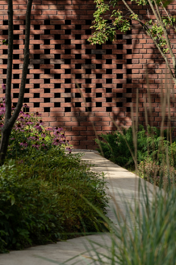 Renome housing complex / ADM architectsCopyright: Photograph © Yaroslav Lukyanchenko / provided by ADM architectsWhich they did, and rather carefully, too – preserving the types of historical brickwork: all-stretcher bond on the walls and alternation of all-stretcher and header bonds on the blades, they also restored the figured cantilevers and metalwork, for example, decorative fastening of internal ties, according to measurements and archival drawings. The bearing structure of the house is monolithic concrete; moreover, it bears the upper floor penthouse, which echoes in color with its stone neighbor. However, the brick facades correspond to the historical ones, adjusted to correct the microscopic difference in the size of the windows and the slight curvature of the lines. “There were no inaccuracies on the historical drawings; the windows were designed to be exactly alike. The minor discrepancies appeared in the XIX century on the construction site; we corrected them. The proportions, the eaves, and other details – we were meticulous” – Andrey Romanov emphasizes. 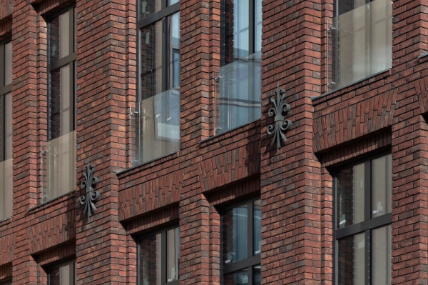 Renome housing complex / ADM architectsCopyright: Photograph © Ярослав Лукьянченко / provided ADM architects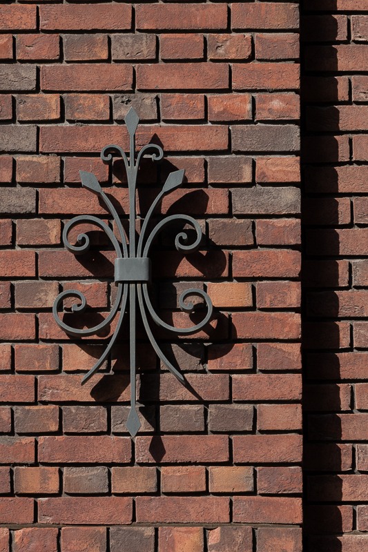 Renome housing complex / ADM architectsCopyright: Photograph © Yaroslav Lukyanchenko / provided by ADM architectsThe red-brick building is called Héritage; the L-shaped one is called Nouveau, both names are French. The main name Renome literally means in French “famous” or “well-known” but somehow in Russian it is perceived more like “reputation”. Curiously, Héritage and Nouveau are written on the signs in French, but Реномэ is written in Russian: it appears that the marketing logic is loosely based on the idea that preserving (or restoring) heritage and buildings new things are two main components of a good reputation. Even though here it is rooted in reality, generally it is not always the case. 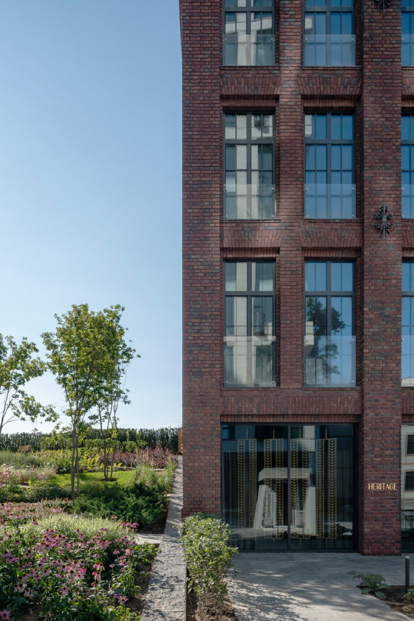 Renome housing complex / ADM architectsCopyright: Photograph © Yaroslav Lukyanchenko / provided by ADM architects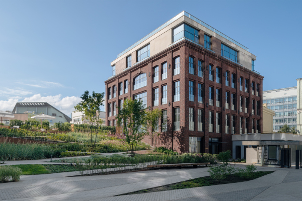 Renome housing complex / ADM architectsCopyright: Photograph © Yaroslav Lukyanchenko / provided by ADM architectsThanks to the brick house, the new residential complex, inscribed in the space of this Moscow neighborhood, acquires a quite palpable “difference in time” on the level of emotions, a variety of styles, appropriate in the local environment and looking as if it was exactly what this environment needed. It is difficult to say which texture – red or white is more interesting and: a varied masonry made of aged bricks or an airy ensemble of carved light stone. But then again, considering the fact that both are within an arm’s reach if you just walk in the yard, being that close, the house has no right to remain indifferent – both parts are equally responsive to the demand for tactility and variety of impressions. We will also note here that the restoration of a historic building involving the completion of its walls is the only such case in the portfolio of ADM architects. The architects are vocal critics of stylization – they still seem to be second-guessing the righteousness of this solution. Indeed, one could argue: perhaps it would have made more sense at the moment – when the impossibility of preserving the original building of the XIX century became obvious – to remake the project altogether, completely abandon reconstruction and build something modern instead of the lost one? Because making an opposition of new and old, the east they did in the Wine House residential complex in Sadovniki, was something that they would not be able to do here anyway. And, upon closer inspection, the dents on the bricks give away artificial aging. And the hue of the real XIX century brick is generally redder, while this has too much brown about it – the dark bricks that occasionally pop up in the masonry also give away a modern approach. But then again, such critical attitude reeks of “Venetian” purism. After all, the actual authenticity of the factory building may interest one or two researchers, but they must be knowledgeable about the history of old buildings in any case. On the other hand, if we are to speak about the atmosphere of this place, it definitely benefited from this project: the building is interesting, and the contrast is exciting. Furthermore, the historical building to a certain degree became the starting point and the prototype for further development of the ensemble: after a while, another pair was added to it, a counterweight, another house, whose modern architecture nevertheless echoes the “factory” building and even “grows” out of it in compositional terms. More about that in our next article. 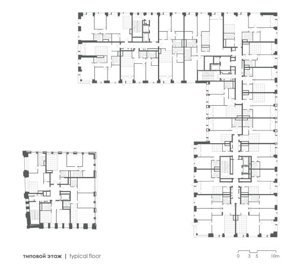 Plan of the standard floor. Renome housing complexCopyright: © ADM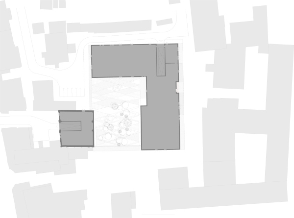 The master plan. Renome housing complexCopyright: © ADM |
|
