|
Published on Archi.ru (https://archi.ru) |
|
| 12.03.2021 | |
|
Semantic Shift |
|
|
Julia Tarabarina |
|
| Architect: | |
| Vladimir Plotkin | |
| Studio: | |
| Creative Union ‘Reserve’ | |
|
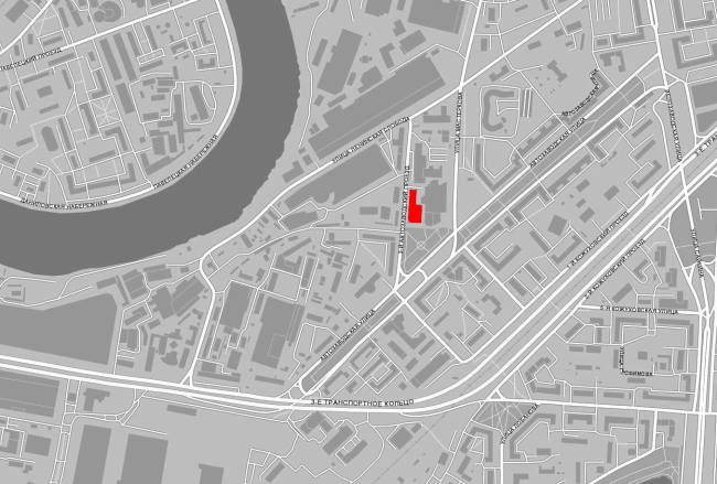
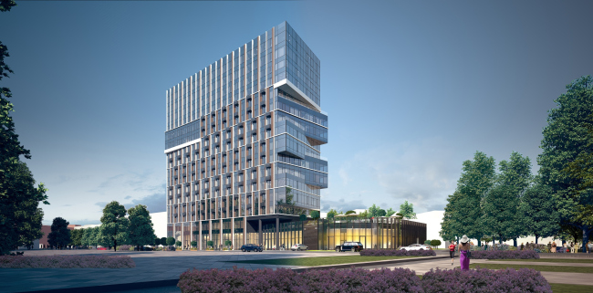
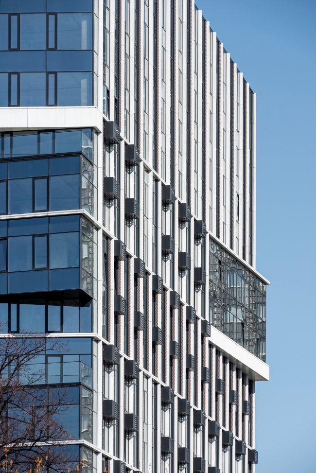
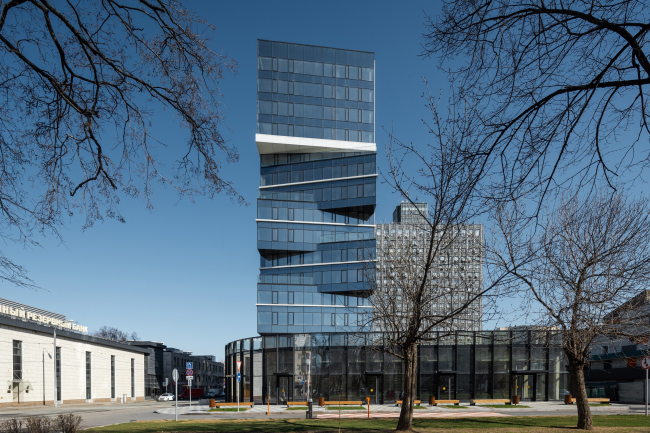
The high-end residential complex STORY, situated near the Avtozavodskaya metro station and the former ZIL factory, is delicately inscribed in the contrastive context, while its shape, which combines a regular grid and a stunning “shift” of the main facade, seems to respond to the dramatic history of the place, at the same time, however, allowing for multiple interpretations. The business-class housing complex STORY was built by the StoneHenge development company by a TPO Reserve project, at the northeast edge of the ZIL industrial estate, not far away from Moscow’s “construction project of the century”. However, this project has nothing to do with the ZIL design codes and master plans: the site is located in the part of the land that belongs to the city, and has long since been developed. The main facade of STORY faces the triangular Avtozavodskaya Square, with the entrance to the metro station right across from it. STORY apartment complex. Map of the siteCopyright: © TPO ReserveThe relatively small 0.29-hectare land site, stretching along the 3rd Avtozavodskoi Drive, came to TPO Reserve with an already built two-level underground parking garage and the client’s request to keep as much as possible of the already existing structures, which determined the parameters of the base and the grid of columns. The final project was approved in 2017; the construction was completed in 2019. The house has 16 floors in it; the first floor is a public one, 5 meters high. The commercial premises with individual entrances are situated on all sides; there is a small pedestrian gallery running on the rear side, which makes it possible to circle the building, at the same time bypassing the backyard. The main commercial leaseholder – the restaurant – is situated in the south part: here the first floor significantly stands out forward and to the right with its glass volume, marked by slender black lamellas. In addition to the restaurant, it includes the ramp of the entrance to the parking garage, while on the roof appeared a place for the summer terrace and a private resident-only yard about 500 qm. The little park serves as a visual continuation of the recreational area on the roof of the stylobate, while the restaurant and other shops in the “box of glass” are perceived as the functional addition to the park. 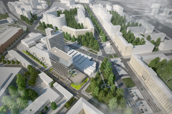 STORY apartment complex, project, 2017Copyright: © TPO Reserve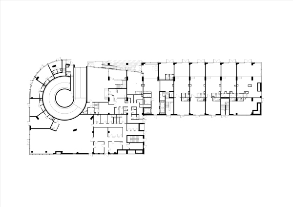 STORY apartment complex. Plan of the 1st floorCopyright: © TPO Reserve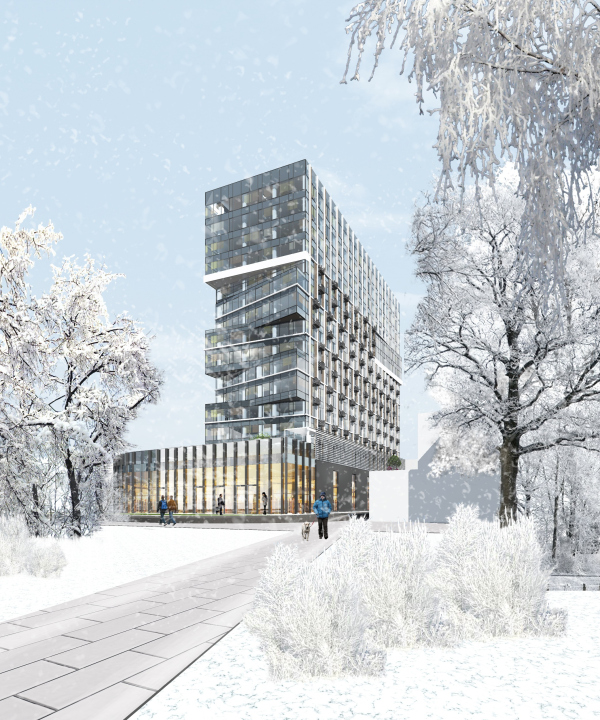 STORY apartment complex, project, 2017Copyright: © TPO Reserve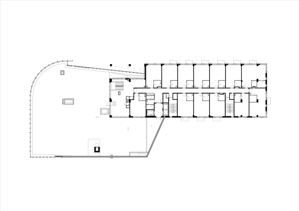 STORY apartment complex. Plan of the 2nd floorCopyright: © TPO Reserve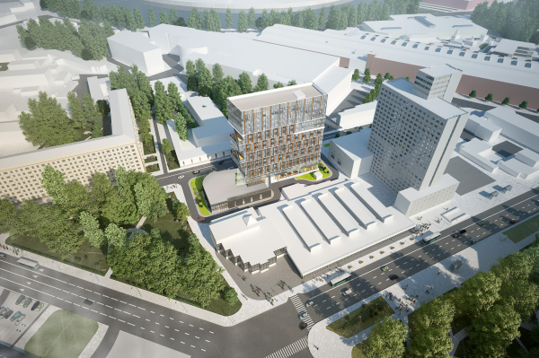 STORY apartment complexCopyright: © TPO Reserve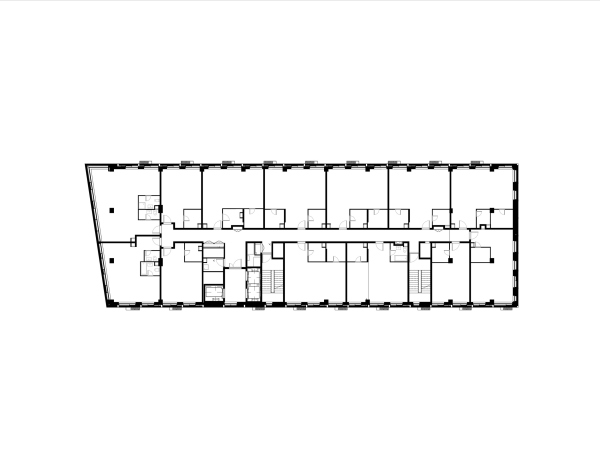 STORY apartment complex. Plan of the 9th floorCopyright: © TPO ReserveFrom the side of the 3rd Avtozavodsky Drive, the stylobate ledge is chamfered inside, while the two supports of the framework remain exposed – it looks if either the house “treads” on the restaurant with its slender black “legs” or maybe the “glass thing” steps forward, very much like a magnifying glass from its case on a hidden pivot. The balcony behind the supports accentuates the entrance to the restaurant from the driveway side, “inviting” pedestrians, walking towards the metro station, to come in. STORY apartment complex, project, 2017Copyright: © TPO ReserveFrom three sides, the facades are similarly designed: they are subjugated to the grid that unites the floors vertically in order to make the proportions look more slender. They form a textured multilayered structure: glass, dark striped terra cotta, and the dark elegant casings of air conditioning units are all united to form a checkered pattern, made even more sophisticated by mirror reflections of the elements and black inserts at every other level. Interestingly, the reference module consists of a couple of vertical rectangles, whose joint contour is close to the perfect square – yet, at first glance, everything just sways slightly in balanced mobility. 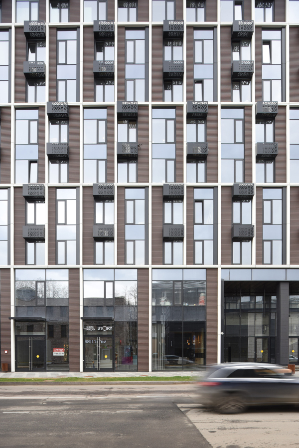 STORY apartment complexCopyright: Photograph © Ilia Ivanov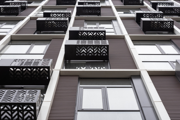 STORY apartment complexCopyright: Photograph © Ilia IvanovThe structural clarity of the facades’ faceting is ensured by a fine white mesh – a light decorative external skeleton, bringing the oscillations of the textured part to order. For a decorative material, the lines stand out pretty far, by about 25-30 cm, and they are perfectly even: in a section view, they yield something very close to a square, the verticals also do not differ from the horizontals in terms of thickness – only the latter are accentuated by a thin groove running down the middle. Thanks to the relief, the white mesh “works” well in the foreshortening: at some point, if, for example, you drive quickly past, the facade will seem to be composed of white verticals (a similar technique can be seen in the Nebo residential complex, but in the case of Nebo the mesh has larger cells and plays a more noticeable role, while the fluctuations are given by a slight hint, here it is the other way around). STORY apartment complexCopyright: Photograph © Ilia IvanovThe four top floors (the “penthouses”) have no cases for the air conditioning units because the ventilation has been routed directly to the roof; there are fewer inserts and more glass here, so one feels like comparing the white mesh devoid of cornice molds with an unfinished basket. These are all details, though. The most noticeable thing about STORY is the plastique of the main side facade, composed of triangular glass ledges. The ledges are large, they, just like the grid, group the floors in twos. These ledges contain the best-lit apartments, since this end of the house faces south, and the windows are panoramic across their entire width, albeit not “reaching to the floor,” but 2.2 meters high. On the roofs of the four ledges, triangular balconies are formed overlooking the park and the Avtozavodskaya Street. 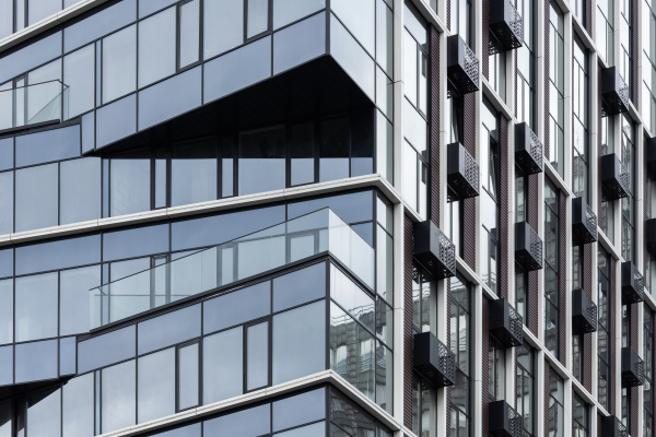 STORY apartment complexCopyright: Photograph © Ilia Ivanov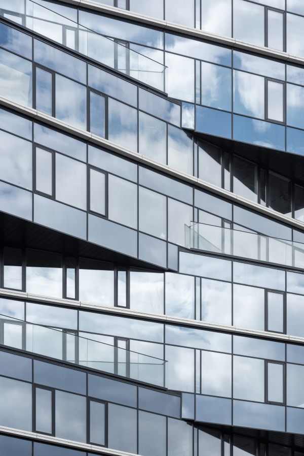 STORY apartment complexCopyright: Photograph © Ilia IvanovThe panoramic windows and the balconies are important but they are not the main thing here. What matters most is the imagery of each of the facades, which presents the house to the city, turning it into an accent, noticeable behind the trees of the park. The bay windows, if we may call them so in this case, look like clenched fingers – the house looks as if it was looking in the direction of ZIL, wondering what they would build there next. Or they maybe look even more like an element of some mechanism, some polished gears of a giant loom, arrested in the process of transformation. The topic is further developed by two extra bay windows in the north part, turned symmetrically at a slight angle to the south; they look as if it’s enough to press on them hard enough, and the south facade will fold in. Well, it will not fold in, of course, because it’s a house, after all – it just demonstrates some latent movement of the volume within the grid, from which only the white horizontals remain on the south facade, the pairs of floors being shifted here by one step and the white stripes not separating the tiers, but drawing them in the middle of the height, as if they are holding the movement. Thus, the offset of the triangles turns out to be quite energetic and even baroque. 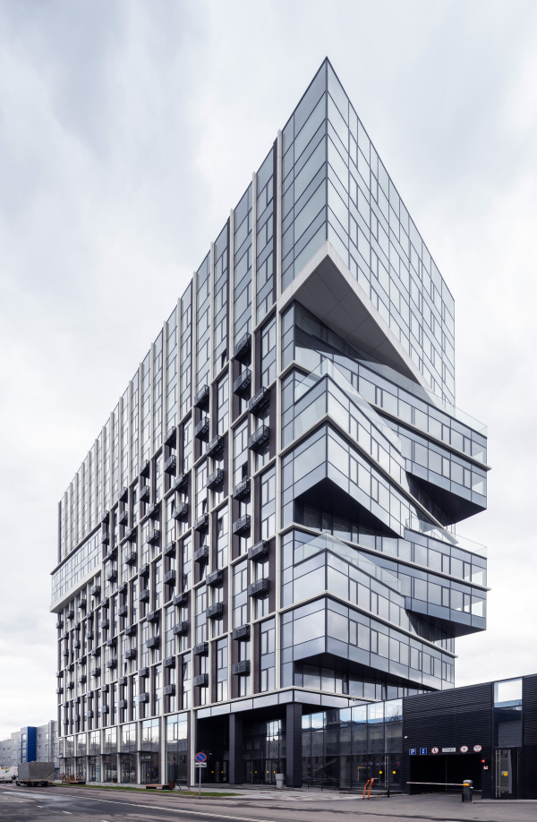 STORY apartment complexCopyright: Photograph © Ilia Ivanov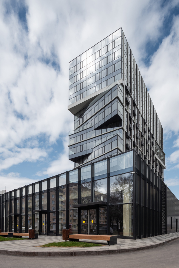 STORY apartment complexCopyright: Photograph © Ilia IvanovOne must note that this kind of “broken sidewall” has been showing in the works of Vladimir Plotkin for a long time, probably starting with the “Airbus”, where the edges of huge lattice plates were, according to his author’s definition, designed as “torn fractures”. A similar glass sidewall “fracture” is also something that we can see in the second project design for the Bumazhny Drive, and in one of the Moscow City projects. At Ingosstrakh’s headquarters, the two buildings also seem to be separated by an uneven glass gorge. That is to say that this technique has its roots; however, in this particular case it is applied in a more consistent and regular way – and I will repeat myself here – rather like a mechanism than a cut or pleating. Meanwhile, the south sidewall still looks as if it had been “broken off”, or, at any rate, abruptly separated from something. Indeed, the construction line of the 3rd Avtozavodskoy Drive is interrupted here – the house could stretch all the way to the street, but “it met the square and stopped”. It is also possible that this “break” is a response to the indentation of the southern end from the stylobate with a green roof. The triangular bay windows also help to manifest the tiers, set in the facade grid, and the alternation of stories (yes, pun intended). They may even remind someone of drawn drawers of some chest or other storage unit. However, the house is called STORY – here’s why. The building standing next to it, the brutal 20-story gray high-rise of the engineering building of the Dynamo factory was built in the 1980’s exactly on the spot of the so-called “Liza’s Pond”, the very one in which Karamzin’s Poor Liza, the main heroine of Russian sentimentalism, drowned herself. This place is sort of sacred for the local guides, because it is a very vivid example of how something industrially brutal treads on the pastoral past. In the marketing brand of the residential complex, an indication of the history of the place can be easily traced – the circles in the interiors of public areas and the round cursor on the site unambiguously indicate that STORY is the same story, and not some other one. There is a great temptation to decide that the architecture of the house is in one way or another dependent on this idea: for example, to imagine that the glass circle of the first floor is a pond, and the house grows from it like that tower from the 1980’s. All the more so because a keen observer may see even some parallels between the white grid of the house and the aluminum grid that covers the facades of the Soviet tower – although, of course, the design solution of the new house is much more aesthetically appealing. STORY apartment complexCopyright: Photograph © Ilia IvanovHowever, it is just as probable that some of the drama that is noticeable here does not come from a specific narrative, but from the contrast inherent in the history of the place as a whole. For a long time, this southern suburb of Moscow was a monastic and rural, pastoral place of romantic reflections on Russian history (well, it was not by chance that it was chosen by Karamzin, the author of the first Russian history). Little by little, due to the proximity to the river, factories of the industrial revolution of the XIX century began to develop here – until after the Great October Socialist Revolution it became one of the key points of growth of proletarian consciousness: it was here that more than half of the Simonov Monastery was destroyed / built up by the factory, and one of the buildings that “tread” on the monastery, like the tower to the pond, was the famous ZIL community center designed by the Vesnin Brothers; it is here that the old buildings of brick factories contrast with the avant-garde of the 1920’s, brick Stalin houses, and subsequent Art-Nouveau inclusions. There are many traces of old changes, the transition from the peasant and bourgeois city to the industrial one, and there are enough new changes as well: a new transition, now from industrial to post-industrial. This part of the city seems to be “shaking” all the time, everything here happens abruptly, and to the fullest. So the metaphor of a glass shift, which successfully attracts the eyes of those passing through the Avtozavodskaya Street, must be admitted as appropriate, regardless of any stories. |
|
