|
Published on Archi.ru (https://archi.ru) |
|
| 17.07.2020 | |
|
Visual Stability Agent |
|
|
Julia Tarabarina |
|
| Architect: | |
| Pavel Andreev | |
| Studio: | |
| GRAN | |
|
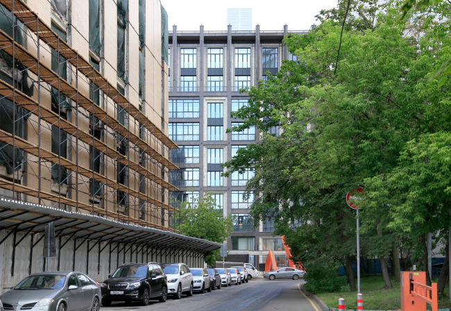
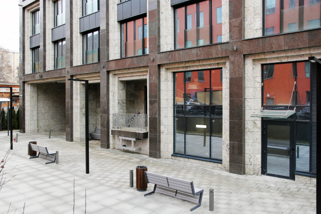
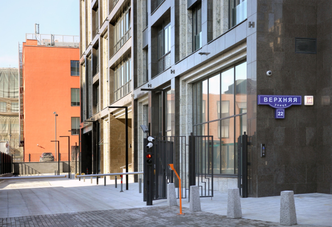
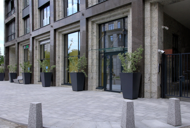
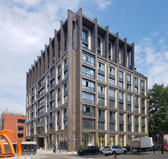
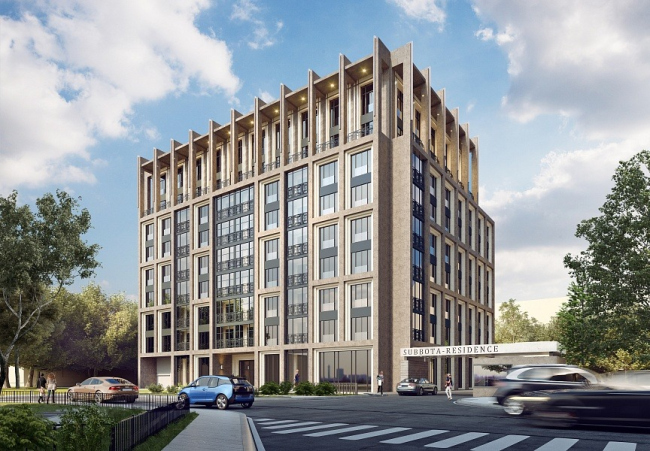
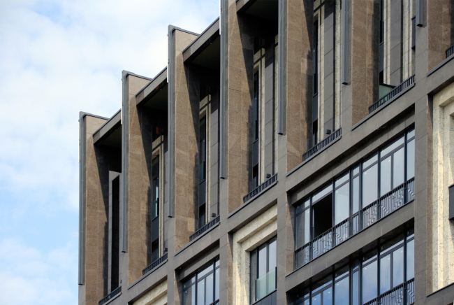
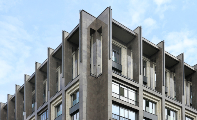
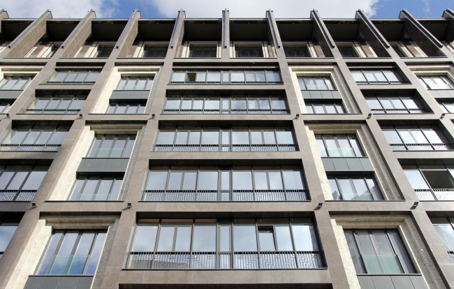
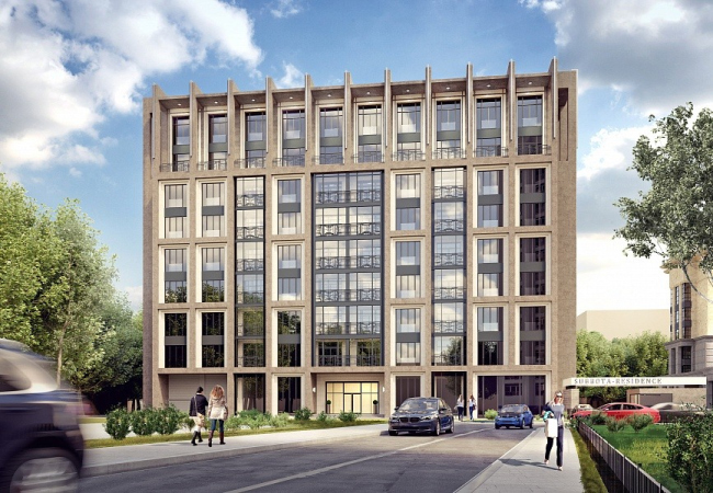
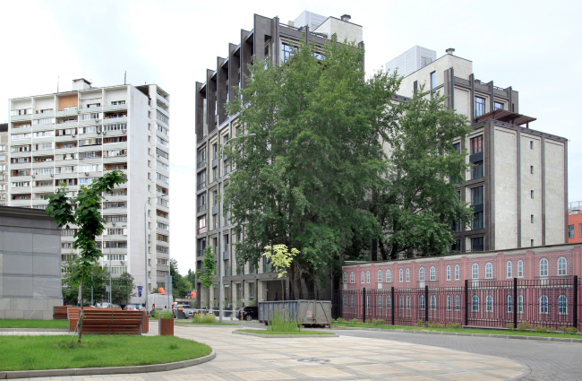
A comparatively small house standing on the border of the Bolshevik Factory combines two diametrically opposite features: expensive materials and decorative character of Art Deco, and a wide-spaced, even somewhat brutal, facade grid that highlights a laminated attic. The boutique residential complex “Olivkovy Dom” (“Olive House”) has been built in one of the most dynamic areas of Moscow: not far from the intersection of the Leningrad Highway and the Third Transport Ring, and at the same time only a ten minutes’ walk away from the Belorussky Railway Station. One corner of the land site touches the bend of the Verkhnyaya Street, the other three sides are surrounded by the territory of the former candy factory “Bolshevik”, which five years ago was turned into an office and apartment complex featuring the “Museum of Russian Impressionism” – its reconstruction is still in progress, and directly next to the house in question they are dismantling a telephone station built in 1989. “Olive House” apartments / GRAN (Pavel Andreev Architects)Copyright: Photograph: Archi.ruHowever, the new house is separated from the Bolshevik territory not only by a formal border but also by height difference; from the northwest, its small land site borders on a sustaining wall, and it is rather quiet inside. “Olive House” apartments, the yard from the side of the Bolshevik Factory / GRAN (Pavel Andreev Architects)Copyright: Photograph: Archi.ru“Olive House” apartments / GRAN (Pavel Andreev Architects)Copyright: Photograph: Archi.ruOn the opposite side, there is a small pedestrian space in front of the house. “Olive House” apartments / GRAN (Pavel Andreev Architects)Copyright: Photograph: Archi.ruOriginally, the Olive House was designed on a land plot that was common with “Residence Saturday” as a part of the complex, but currently it is an independent project. Its much larger neighbor, “Residence Saturday”, is built by the same developer, Donstroy, and the two projects even have a common website, even though they were designed by different architects: the facades of “Saturday”, more based on the postwar “Stalin” architecture with its pinnacles, pilasters, and all shades of beige stone, were developed by UNK Project, whilst “Olive House”, whose area is about five times smaller, was designed and fully built, including designer supervision, by Pavel Andreev architects. There is a semi-pedestrian street with an auto barrier running between the houses; a store in one and a children’s club in the other are “looking” at one another, forming city space on either side of the semi-pedestrian driveway, restricted by the auto barrier. The reflections multiply in one another’s windows. 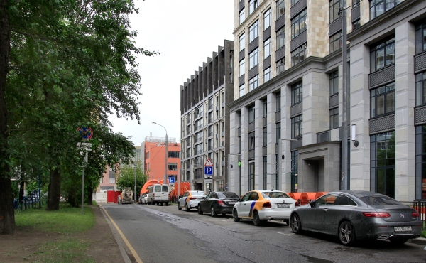 “Olive House” apartments in the center, “Saturday” on the right / GRAN (Pavel Andreev Architects)Copyright: Photograph: Archi.ru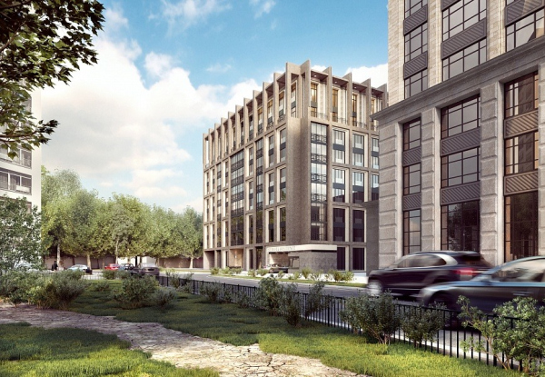 “Olive House” apartments, a projectCopyright: © GRAN (Pavel Andreev Architects)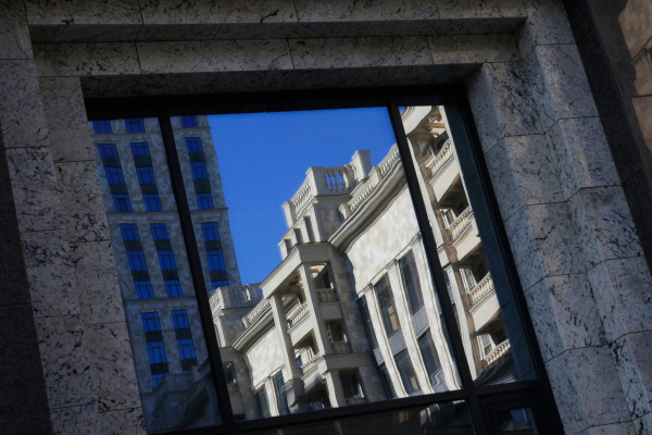 “Olive House” apartments / GRAN (Pavel Andreev Architects)Copyright: Photograph: Archi.ru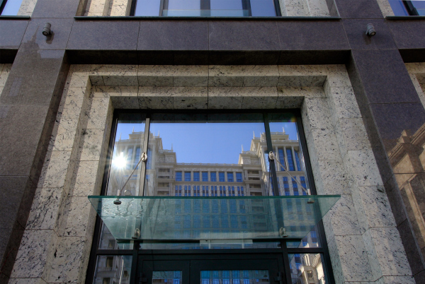 “Olive House” apartments / GRAN (Pavel Andreev Architects)Copyright: Photograph: Archi.ruThe volumetric composition of the two houses, one big and one small, is largely similar: both are designed in a U shape, both rising to a crowning bar. What makes “Olive House” different is the fact that it faces northeast, in the direction of the Leningrad Avenue, whilst “Saturday” faces northwest, in the direction of yet another residential complex, the wings of both growing lower in ledges. Thus the two houses get connected not just socially through the inner street, but also plastique-wise. However, this is where the similarities end. Designing “Olive House”, the architects chose a less recognizable style; while “Saturday” is pretty obvious allusion-wise, one will have a hard time finding analogies to the new boutique apartment building. It looks as though it responds with some steady plastique to its varied surroundings: on the right, we have “Stalin” architecture of a few different periods here, on the left a few towers of the common II-68-01 series. These set a very pristine tone, yet, at the same time, nearby we can see the mottled ornamental brick style of “Bolshevik” and the neo-modernist “aluminum can” of the museum. Three different architectural directions create an “imagery cyclone”, and, as everyone knows, it must be absolute quiet in the eye of the storm. Therefore, the new house offers us something on the verge of the prewar American Art Deco – which was not and could not be there in the Soviet Russia, even though architectural historians do not give up their attempts to find some parallels and similarities – and some techniques of the 70’s architecture. “Olive House” apartments / GRAN (Pavel Andreev Architects)Copyright: Photograph: Archi.ru“Olive House” apartments, a projectCopyright: © GRAN (Pavel Andreev Architects)For example, for the attic, composed of laminated “arc-boutant” ribs with very distant gothic roots, one can find analogies both in Art Deco and amongst modernist experiments. “Olive House” apartments / GRAN (Pavel Andreev Architects)Copyright: Photograph: Archi.ruBoth were busy searching for latent classics, a tectonic structure that is “stripped down” of any excessive decoration, yet with a visually prominent framework. The framework in this particular case is formed by a large-cell grid of piers and intermediate floors. The modules that join the broad windows in twos are encased in frames with large step-like contour; the dark-colored faceting stone on the front surface of the facade (Norwegian granite Labrador Antique) echoes the color of the metallic lintel between the windows, while the stone of the ledges between them is light-colored, with a prominent pattern: Brazilian granite Delicatus White. Both stones are polished, which paradoxically makes the image not just “glamorous” and of the interior-grade quality, but also tough looking, as if encased in a cage of dark copper. 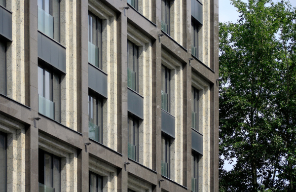 “Olive House” apartments / GRAN (Pavel Andreev Architects)Copyright: Photograph: Archi.ru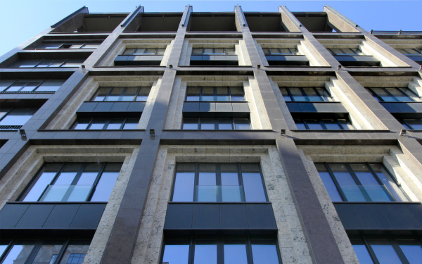 “Olive House” apartments / GRAN (Pavel Andreev Architects)Copyright: Photograph: Archi.ru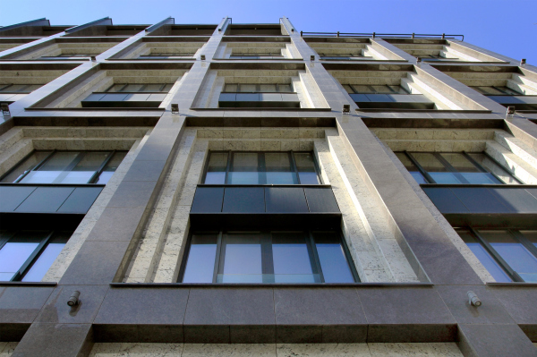 “Olive House” apartments / GRAN (Pavel Andreev Architects)Copyright: Photograph: Archi.ru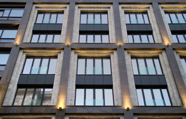 “Olive House” apartments / GRAN (Pavel Andreev Architects)Copyright: Photograph: Archi.ru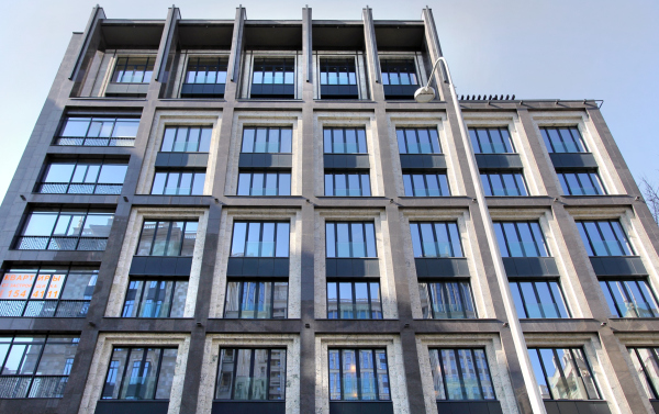 “Olive House” apartments / GRAN (Pavel Andreev Architects)Copyright: Photograph: Archi.ru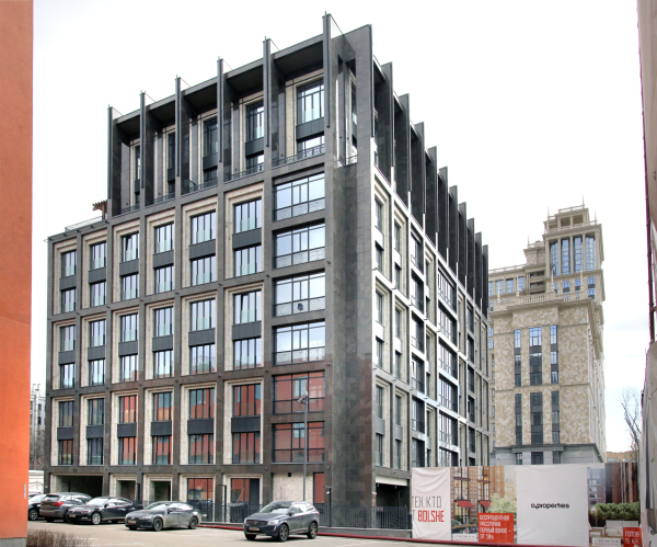 “Olive House” apartments, view from the territory of the Bolshevik FactoryCopyright: Photograph: Archi.ruOn the corners, the house takes on a cross-shaped look – if one is to observe the entire volume from the corner, they will get an impression that it has been assembled like an erector set or a volumetric puzzle, where one piece is fitted into another. “Olive House” apartments / GRAN (Pavel Andreev Architects)Copyright: Photograph: Archi.ruAll of the panel fill-ins follow this logic of a large and laconic structure, and are continued in the lobby of the first floor, the only difference being that the interior is ruled by light-colored stone, and wood appears in it. 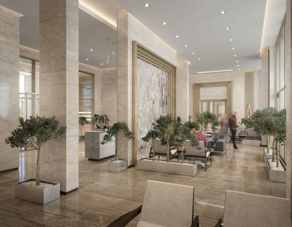 “Olive House” apartments, interiors of the public zones, a projectCopyright: Photograph: Archi.ru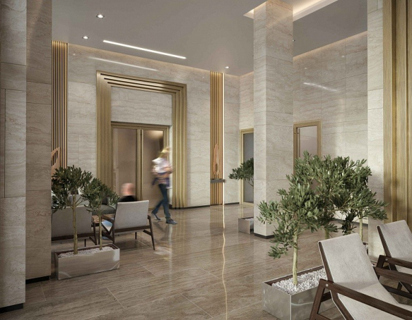 “Olive House” apartments, interiors of the public zones, a projectCopyright: © GRAN (Pavel Andreev Architects)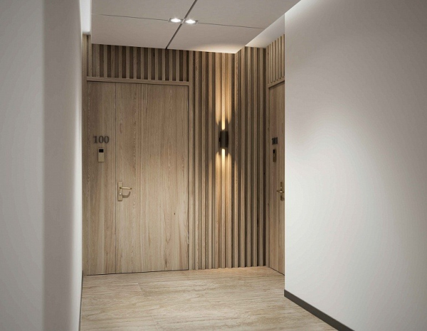 “Olive House” apartments, interiors of the public zones, a projectCopyright: © GRAN (Pavel Andreev Architects)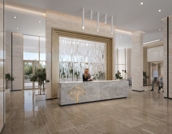 “Olive House” apartments, interiors of the public zones, a projectCopyright: © GRAN (Pavel Andreev Architects)The framework grid is not exactly uniform – it has a basic cell, and it has wider spaces in it that appear in the groups of recessed balconies reflected on the facade with broad bands of glass without the frames of the “perspective portals”. “Olive House” apartments / GRAN (Pavel Andreev Architects)Copyright: Photograph: Archi.ruThe pairs of recessed balconies above the main entrance highlight it with a broad band of horizontal elements: they balance out the moderately vertical proportions of the entire house, at the same time echoing the recessed balconies on the side wall of the Soviet house across the street. On the other side, the axial symmetry of the main facade and the whole volume in its entirety make it typologically similar to the century+ old tenement houses, while on a more abstract level one can even read here a “palace” composition – it is all about the optical illusion: the house balances on the verge between representative and classical decorative techniques, and a more brutalist approach, which miraculously goes very well together with the polished stone of the facades. “Olive House” apartmentsCopyright: © GRAN (Pavel Andreev Architects)The northeast facade is more laconic than all the others because there is no point in trying to catch the light here, and this side of the house comes up close to the Bolshevik buildings, so the sidewalls, covered with abundant treetops reaching up to the ninth floor, are interpreted as firewalls; this side is only overlooked by two strings of bathroom windows (such bathrooms, lit with natural light, are one of the advantages of the apartment planning here). This side, the one that is opposite the street, is the inner one. The house lowers its height in this direction, forming a “stair” between the penthouses of the 9th and 8th floors; their residents are getting spacious patios with wooden pergolas. “Olive House” apartments / GRAN (Pavel Andreev Architects)Copyright: Photograph: Archi.ruThe entrance to the two-level underground parking garage is situated on the left of the main entrance, but the driving entrance to the yard is situated on the diagonally opposite side, which creates a wide end-to-end driveway in the first tier of the building’s wings; although its function is purely technical, it still allows people to peek into the yard, making the house more open and transparent, looking a little like a traditional arch of the old town. The two-level underground parking garage occupies the entire small construction blueprint of the building. 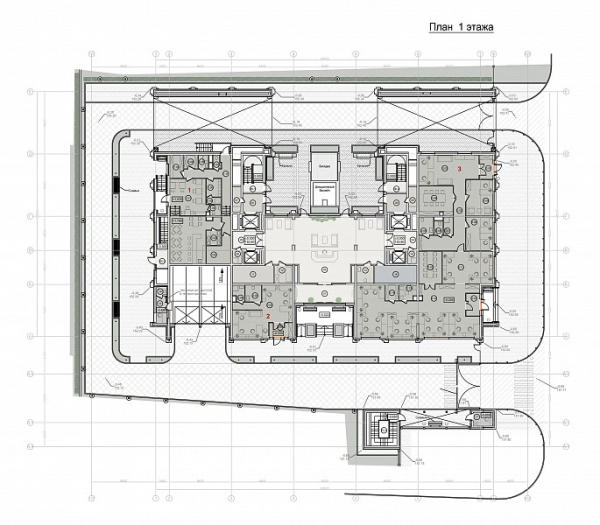 “Olive House” apartments / GRAN (Pavel Andreev Architects)Copyright: © GRAN (Pavel Andreev Architects)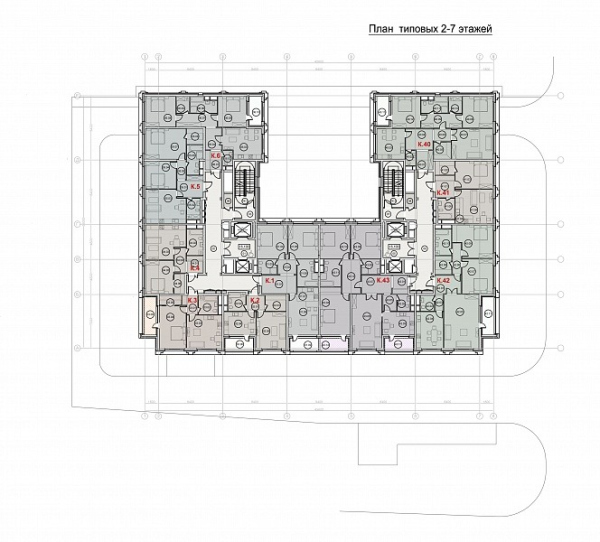 “Olive House” apartmentsCopyright: © GRAN (Pavel Andreev Architects)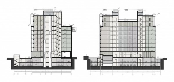 “Olive House” apartmentsCopyright: © GRAN (Pavel Andreev Architects)The house completes the perspective of the Verkhnyaya Street. If the building of the telephone station is dismantled and replaced with something lower in height, “Olive House” will be perfectly viewable from the Skakovaya Street – first of all, thanks to the large-spaced grid, which is probably absolutely necessary in this strange place where the street makes a bend, and the houses are placed sometimes alongside it, sometimes crosswise, and sometimes diagonally. It can be interpreted as a spatial pivot of sorts: it dissects and puts in order this varied, and at some places even lopsided city fabric around it (we will note in passing that the orange construction of the benches that encircle both buildings of the “Saturday” complex so far look like a continuation of the construction chaos). The house looks as if it manages to find orthogonal Hippodamus directions amongst the chamfers and bends. And, although it has not been assigned an official role of the “traffic controller”, somehow it does play it here – for example, if we are to look from the Bolshevik territory, it clearly marks the direction of the street that is not there, but most definitely should be. Such visually prominent performance in the context of the chaotically agile city space, very Moscow-like, very uncertain, and at places yet in the formative stage, is possible due to the aforementioned combination of glamorous Art Deco and large-scale plastique, coarse to the point of brutal, which is further highlighted by the full absence of any ornaments, both decorative and belonging to architecture of orders, for the sole exception of the laconic metallic grates and the natural pattern on the light-colored granite. The large scale adds to the glamorous image of the house some kind of energy of an almost industrial kind. Which, nevertheless, does not spoil it at all, but only adds certainty and visual stability. |
|
