|
Published on Archi.ru (https://archi.ru) |
|
| 02.06.2020 | |
|
Rational Arrangement |
|
|
Julia Tarabarina |
|
| Architect: | |
| Vladimir Plotkin | |
| Studio: | |
| Creative Union ‘Reserve’ | |
|
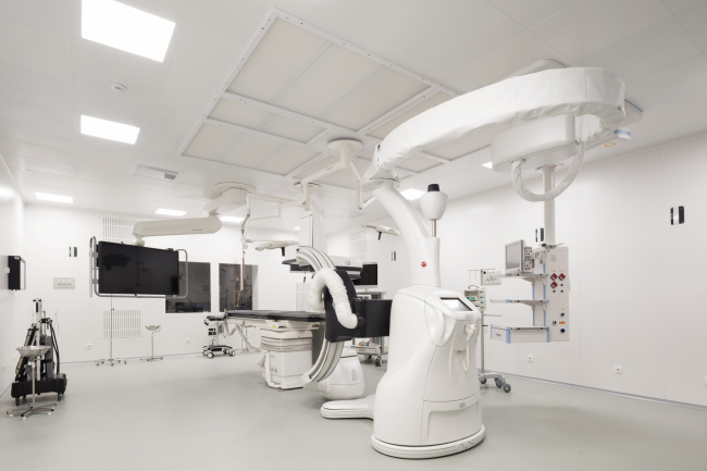
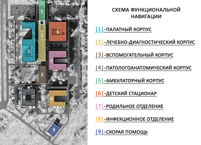
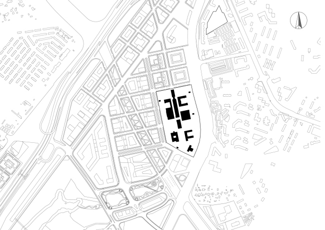
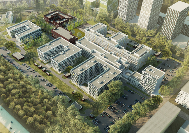
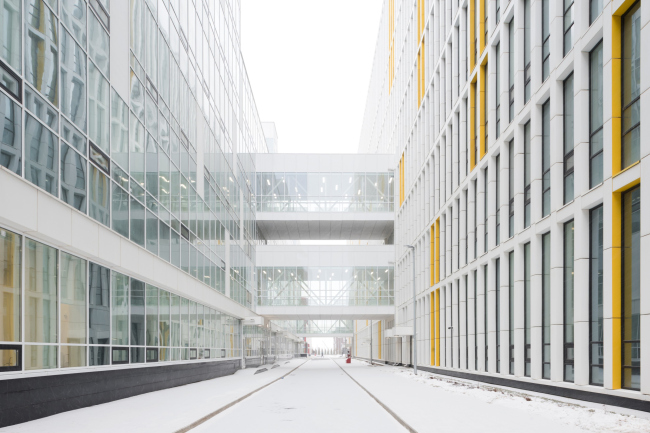
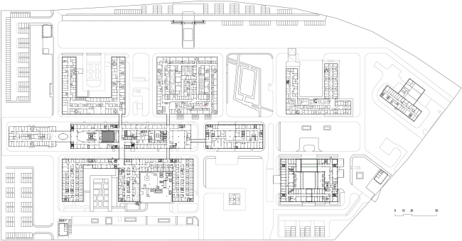
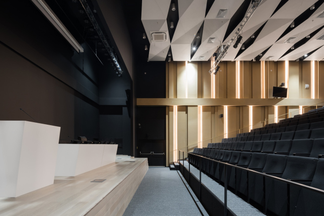
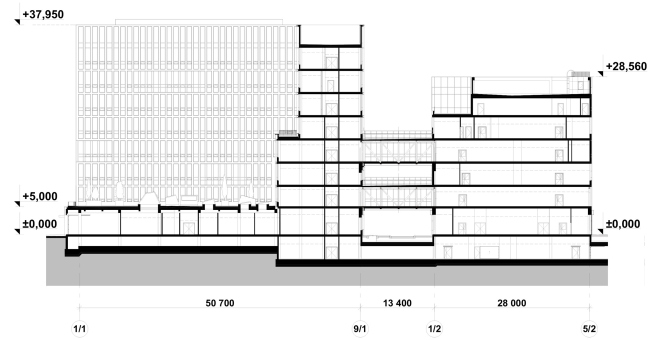
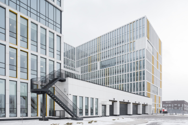
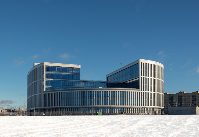
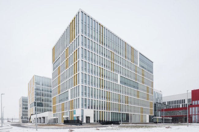
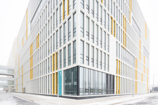
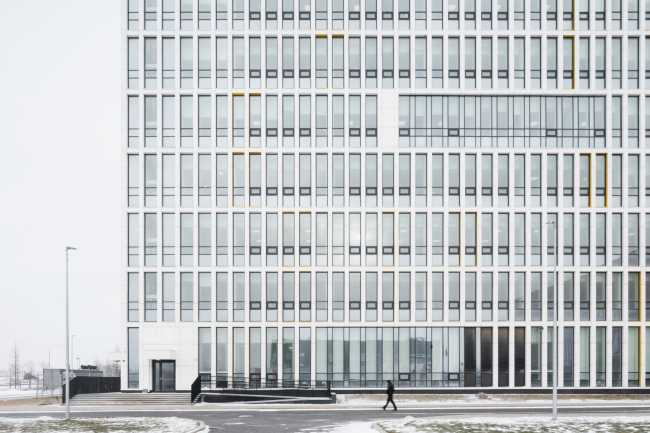
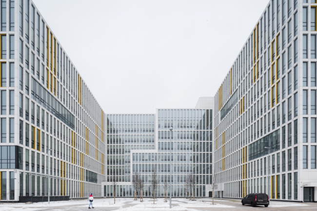
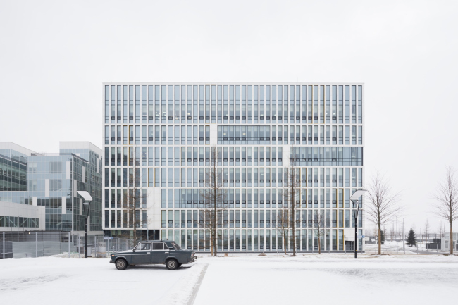
In this article, we are examining a complex of buildings and interiors of the first stage of the project that has recently become extremely popular – the Kommunarka clinic. The project of the new clinic won the architectural competition, which was held in 2016, and then, without significant deviations from the main concept, was built by the contest winner, Vladimir Plotkin and Reserve Union. In July 2019, it received the Mayor’s Architectural Award and the Moscow Architectural Council Award; right about that time it also became known that the project got shortlisted for WAF. Multipurpose medical center “Novomoskovsky” in KommunarkaCopyright: Photograph © Ilia Ivanov / provided by Reserve UnionThe hospital was designed first of all as the place for treating the residents of Troitsky and Novomoskovsky Administrative District, South Butovo, Solntsevo, and Novoperedelkino – districts, which, according to the Moscow mayor, contain a population of about 5 million people living with a 10-kilometer radius. The construction began in January 2017; three years later, December 27, 2019, the four blocks of the first stage were inaugurated: a ward block for 606 beds, the main treatment and diagnosis block, an auxiliary unit, and a forensic unit with morphological and genetic laboratories. The second stage will include completing the children’s clinic, a maternity hospital, and an emergency care block in the eastern part of the territory; their frameworks have generally been set up already but the work is not yet complete. Multipurpose medical center “Novomoskovsky” in KommunarkaCopyright: © Reserve UnionIn May 2020, as soon as it opened, the clinic was the first one in Russia to take in patients with suspected Covid-19, soon becoming a symbol of fighting the pandemic. In the first half of May, the number of patients here was teetering on the edge of 500, and in the end of April, north of the medical center they began the construction of a quick-mount coronavirus center, reportedly, for follow-up care, with another 500 beds. Today, everybody in Russia knows the name of the chief physician of the Kommunarka Hospital, Denis Protsenko. The facades of the clinic became more than recognizable, and, although the subtleties of the architectural solution and the plans for creating a truly versatile medical facility were upset by the coronavirus outbreak, we still hope that this is only temporary. Of course, it was a great stroke of luck that at least half of this state-of-the-art clinic opened before the beginning of the pandemic, but we still hope that one day things will be back to normal, and the hospital will operate not in the emergency mode but in accordance with the multiple medical specialties that were originally planned here. So! The medical complex is situated 4 km outside the Moscow Ring Road on the Kaluzhskoe Highway, in the center of the territory allotted for the Administration and Business Center of Kommunarka – the center for governing this “protuberance” of New Moscow. Its nearest neighbor – the building of the Prefecture of Troitsky and Novomoskovsky Administrative District, completed in 2017 – was also designed by Reserve Union; it is situated more to the north and closer to the highway. Otherwise, the territory, which borders on the Kommunarskaya metro line (under construction) in the east and the Sokolnicheskaya metro line (active) in the west, has not yet been developed, and is essentially a construction site of the future, cleared from trees and other vegetation. Meanwhile, the master plan provided for building housing projects all around, grouped in blocks of an approximately square shape with a side length of about 135 m; some of the streets between them have already been marked. The clinic’s land site, stretching from north to south, occupies the area of about seven such squares, its plan following the matrix of the square blocks, even if slightly altered in terms of being more compact and stepping back from the borders of the land site to make room for the parking lots along the perimeter. The master plan. Multipurpose medical center “Novomoskovsky” in KommunarkaCopyright: © Reserve UnionThe complex consists of nine buildings standing in three lines. Two of them, which are on the sides, are designed as U-shaped “frames” open on one side, between which a rather large number of variously sized yards is formed, from green ones to ones that are paved from wall to wall, the chief idea being to create diverse, yet independent places for walking. Another planning idea is more abstract, yet also readable: even though the clinics will probably be always surrounded by fences, the architects treated this particular one not as an unassailable fortress, but visually opened it up. This way, the patients will be able to see not just the clinic’s yard, looking out their windows, but lots of other places as well. The central line – the backbone of the project – coincides with the line of the street that comes here from the north, from the Kaluzhskoe Highway, and from the Prefecture side. Essentially, it is a string of three narrow elongated buildings: the yet-unfinished day hospital, the treatment and diagnosis block, and the auxiliary unit. The first is designed for the day patients, essentially it is an outpatient hospital, i.e. the place where the clinic is most of all exposed to the city – it is moved forward, to the very border of the territory; it will welcome people coming here. The small-sized 7-story tower of the day hospital, moved forward, looks like the head of some creature, especially if we are to compare it to the buildings on the sides of the “backbone” with paws or wings. Is is not just stretched forward, but it overcomes a slight height difference about a meter high: in one of the earlier versions it was proposed to design it as a bridge, but then the building was moved even further forward. Multipurpose medical center “Novomoskovsky” in KommunarkaCopyright: © Reserve UnionThe complete and active treatment block – the main place where the doctors work – follows in the same central line immediately after the day hospital. Its facades are chiefly glass; it stretches into the depth of the site, and is separated from the side blocks by driveways, yet with four of the side buildings it is linked by overpasses on two levels. Multipurpose medical center “Novomoskovsky” in KommunarkaCopyright: Photograph © Ilia Ivanov / provided by Reserve UnionThis makes moving around much easier: the treatment block is the nucleus of the clinic, and the path to it (from whatever location) has been made as short as possible. Multipurpose medical center “Novomoskovsky” in Kommunarka. Plan of the 2nd floorCopyright: © Reserve UnionThe main entrance to the treatment block (and to the entire clinic, for that matter) is also made from the north side end, directly behind the Consultation and Diagnostic block, through a small portal with a circular skylight – it leads to a two-level atrium lobby. The space of the atrium is almost completely white; the balconies, the reception desk, and the benches at the bases of the round columns, all have streamlined shapes, and are highlighted by flowing curves of white light. The light bands also form a decorative network of triangles on the central “pillar” – the volume, whose facial surface displays the navigation plan, and which contains the elevator shafts. The interior, flowing and glowing, may resemble the foyer of “Zaryadye” concert hall – distantly, of course, and with allowance for a different scale and a different and function. 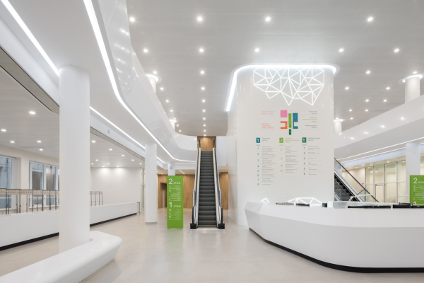 Multipurpose medical center “Novomoskovsky” in KommunarkaCopyright: © Reserve Union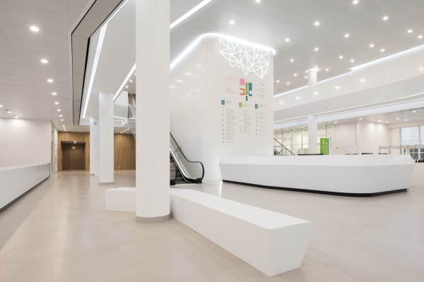 Multipurpose medical center “Novomoskovsky” in KommunarkaCopyright: © Reserve Union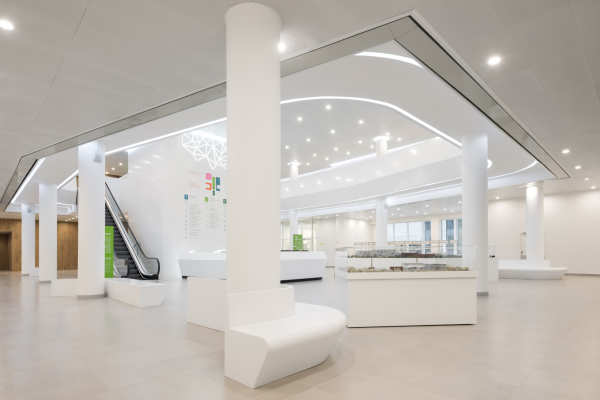 Multipurpose medical center “Novomoskovsky” in KommunarkaCopyright: © Reserve UnionTwo escalators lead from the atrium to the second floor where the entrances to the conference hall are situated: inside the conference hall, the white is offset with black, the curves giving way to faceted planes. The ledges on the wall surfaces, decorated with ochre golden stucco, are backlit with reflected light – it enhances the plastique, highlighting the aisles, but, being not too bright, is not distracting at all. Multipurpose medical center “Novomoskovsky” in KommunarkaCopyright: © Reserve UnionThe ward block, complete and active, is situated more to the west. It is bigger than the other buildings, and its plan looks like the E letter, stretching along the entire treatment block, with three “stroke” wings on the sides of two yards. The space between the treatment block and the ward block contains two groups of overpasses; in addition, some extra communication can be provided by the joint level of underground space. The yards between the wings are organized differently: the north one is completely open, the other is filled with a podium containing driving entrances to the ambulance reception ward – on the inside, it is lit by wide cones of the upper light lamps. Multipurpose medical center “Novomoskovsky” in KommunarkaCopyright: © Reserve UnionThe roof of the podium of the south yard will have vegetation on it; people will be able to walk on it. The area will be accessed by a laconic black staircase with a nice-looking rounding at the bend: against the background of the pristine, white, and laconic structure of the building, it becomes a noticeable highlight and is perceived almost like an art object. Multipurpose medical center “Novomoskovsky” in KommunarkaCopyright: © Reserve UnionEssentially, the image of this building is based on a fine, white, and strictly vertical network of piers – first of all, it makes the building rhyme with the Prefecture of Troitsky and Novomoskovsky Administrative District, highlighting the integrity of the ensemble of the two buildings, “strung” on a common axis and ultimately forming the nucleus of the future administrative center. The prefecture building is smaller, yet is definitely perceived as a more significant one due to the more energetic “comma” shape that faces the clinic with its cylindrical side, and the big, two stories high, scale of the network. The administrative and business center of the Troitsky and Novomoskovsky administrative districts of MoscowCopyright: Photograph © Aleksey Naroditsky / provided by Reserve UnionThe shape of the hospital building is simpler and more practical, while the network of its facades, more “humanized” (because it is one story high), is lightened up by the “sunny” yellow color of the piers, a classic technique that can remind us about the “Marseille Unit” by Le Corbusier. The colorful piers are grouped in 2,4, and 6, distributed over the facades in an asymmetric fashion and yield colorful spots in perspective. Multipurpose medical center “Novomoskovsky” in KommunarkaCopyright: Photograph © Ilia Ivanov / provided by Reserve UnionYet another inclusion of color appears due to navigational reasons: each block is assigned a color of its own: the ward block #1, for example, is bluish green. Multipurpose medical center “Novomoskovsky” in KommunarkaCopyright: Photograph © Ilia Ivanov / provided by Reserve UnionEn face, the color is all but unseen. However, the network is also livened up by the pauses – strips of glass without vertical glazing pattern, and their antipodes, white rectangles, which appear around the entrances, and, chiefly, at the side ends of the glass bands: as if somebody flipped a few piers aside, and they gathered at the edge. All of this forms some sort of a still life on the facades, some sort of a musical or mathematical play. Multipurpose medical center “Novomoskovsky” in KommunarkaCopyright: Photograph © Ilia Ivanov / provided by Reserve UnionAt times, a fancier theme appears: for example, the inside side-end walls of the yards “flake” in big zigzags, which mask and decorate the change of tiers – the elongated part of the ward block rises twice from north to south. The zigzags are getting small terraces, on the level of the 2nd and 5th floors, which will obviously also give the doctors and the patients to get a breath of fresh air. So, yes, everything is simple, but not simpler than that – there are lots of subtleties possible within the framework of one system. Multipurpose medical center “Novomoskovsky” in KommunarkaCopyright: Photograph © Ilia Ivanov / provided by Reserve UnionStill, however, the system that these facades are based upon requires a lot of accuracy and precision. For this reason, the ledge of the mechanical floor is completely masked by the attic wall – it is this wall that makes the tier look like it has two stories, which gives the building a look reminding us about the architecture of orders. But the main thing is that no ledges are to be seen from any angle, and the contour of the volume is honed to perfection. Definitely, if the box of the mechanical floor on top of the building were visible, the impression would be quite different. Multipurpose medical center “Novomoskovsky” in KommunarkaCopyright: Photograph © Ilia Ivanov / provided by Reserve UnionMeanwhile, the clinic is a complex conglomerate; we will remind you at this point that there are 9 buildings here, and only 4 of them have been put into operation. The “network” pattern could never be applied to the facades of all of the buildings; the pristine structure was employed in the building that stands on the direct visibility axis with the prefecture building; the other volumes are designed differently. For example, the auxiliary volume behind the treatment block in the depth of the territory is crimson red, which is a cool-looking contrast to the whiteness and glass. The windows of the children’s clinic and the maternity hospital got wide square outlines, while the silhouette of the central treatment block is busy and full of ledges, which is very noticeable near the pristine outline of its west neighbor, and the white insets, deliberately scattered over its glass surface, looking as if they were hovering in the air. 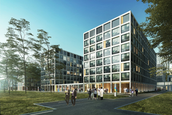 Multipurpose medical center “Novomoskovsky” in KommunarkaCopyright: Photograph © Ilia Ivanov / provided by Reserve Union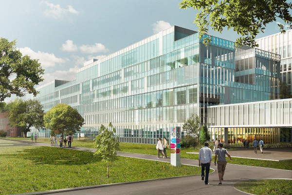 Multipurpose medical center “Novomoskovsky” in KommunarkaCopyright: © Reserve Union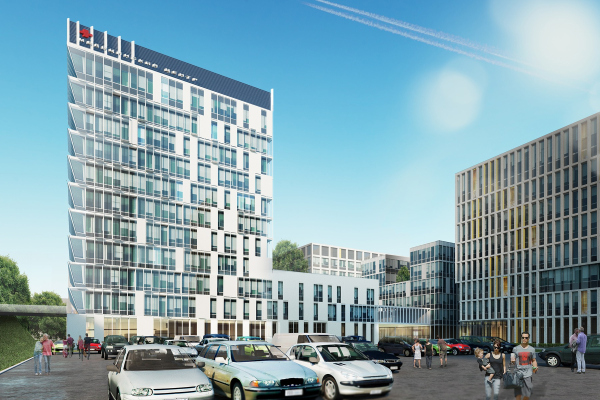 The outpatient block, project, 2015. Multipurpose medical center “Novomoskovsky” in KommunarkaCopyright: © Reserve UnionOf course, a clinic of such magnitude and degree of complexity is inevitably a city within a city, a system with its own internal laws, and the more reasonable they are not the better. The clinic by default is not meant to become some high-profile flashy project; it is built on the municipal (even if metropolitan) budget, which, one way or another, makes economy inevitable: in the case of a medical facility, it is obvious that the money must be spent not on expensive-looking facades but on the medical equipment. So, what we have here is the solution based on a rational approach – a rational approach to organizing the traffic outside and inside, as well as to lighting and alternating buildings and yards. What is also important is the fact that the rationality manifests itself in the proportions of the buildings: in the light facade network, in the absence of visual pressure, in the “positive vibes” of the yellow inclusions, and in the glowing of the white entrance hall. It’s hard to say just how important architecture is for someone who’s sick. Yet, still, it is a great thing that they did not save up on the proportions here. |
|
